1. Two-Leaf Promise on the Outer Upper Arm
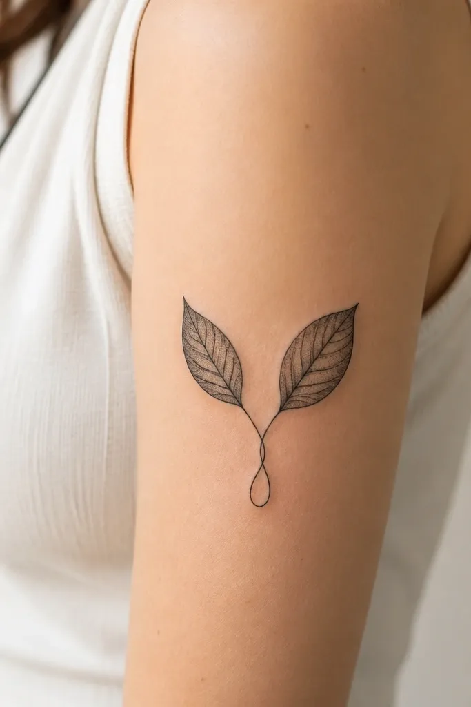
This works because it uses symmetry without forcing the whole piece to be identical. The paired leaves read as a promise, but the dotwork in the shadow areas gives depth when light hits your arm. Blackwork keeps it clean and photo-ready, and the curling base adds movement so it doesn't look like a sticker. The outer upper arm is also a sweet spot for leaves because the shape follows the bicep curve.
Ask for leaves sized to take up about 8 to 10 cm tall, with the widest leaf around 3 to 4 cm. Keep the line weight slightly thicker on the outer leaf edge and thinner on the inner veins for contrast. Place the loop around mid-bicep so it doesn't get stretched too hard when your elbow bends.
Pro tipBring a reference of real leaves you like and ask the artist to trace the vein direction, not just the leaf silhouette.
AvoidAvoid ultra-thin hairline veins that are less than 1 mm wide - they disappear faster than you expect.
2. Matching Coordinates With a Compass Rose Frame
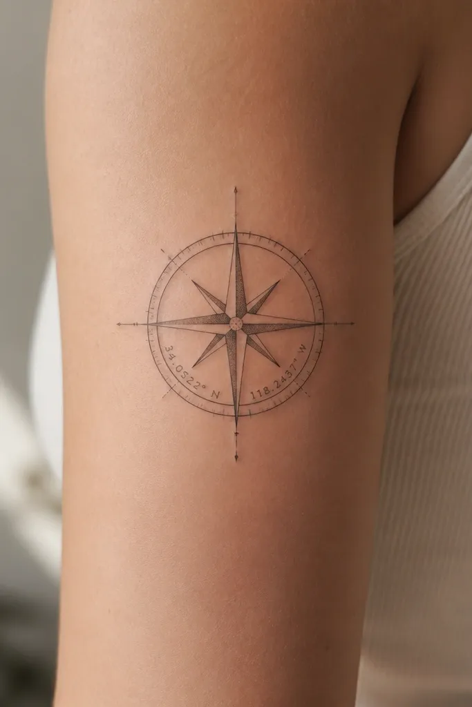
Coordinates feel meaningful and personal, and the compass rose keeps it aesthetic instead of looking like a label. The frame gives structure, so your brain reads the numbers quickly. Linework with light dot shading around the compass points adds dimension without turning dark. This is especially pretty on the outer upper arm because the compass points can angle slightly with your muscle line.
Have the compass frame about 6 to 7 cm across. Keep the coordinates in a font style that has clear spacing - ask for a slightly rounded serif style or clean sans with consistent stroke thickness. Place the compass so the numbers sit roughly at the mid-point of your upper arm, not too high.
Pro tipIf you want the pair to match, use the exact same compass orientation on both arms, not just similar size.
AvoidAvoid squeezing the coordinates into a tiny space - numbers under 4 mm tall often blur together.
3. Birth Flower Buds on a Soft Ribbon Band
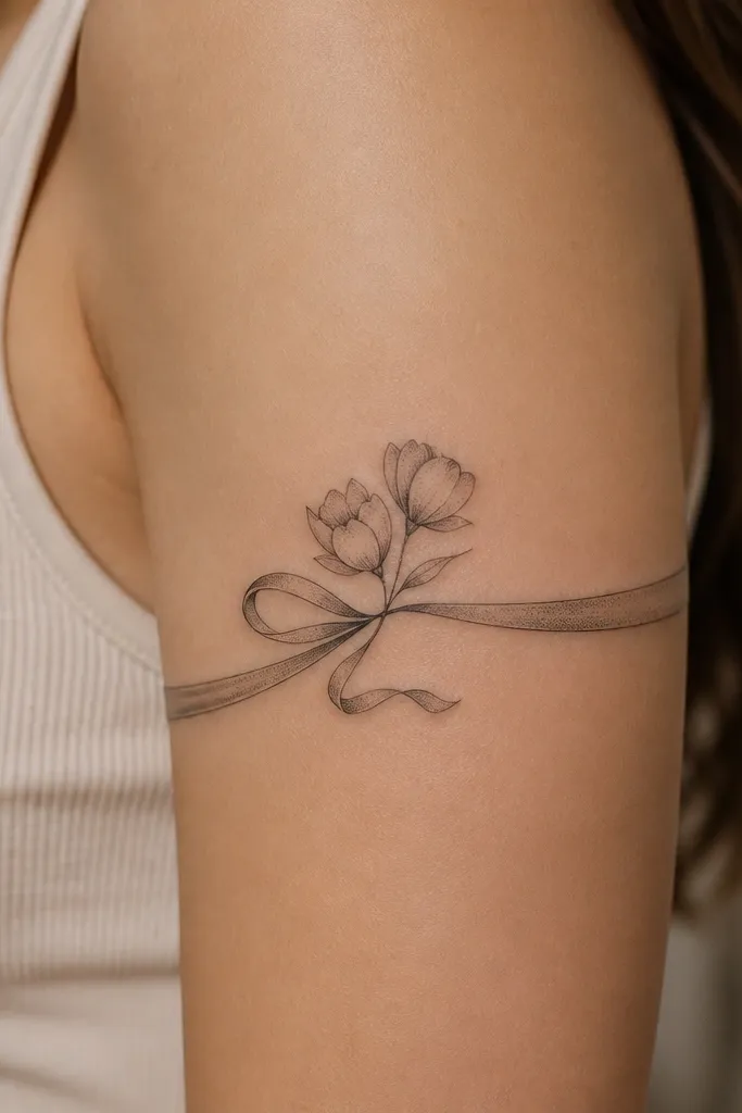
Birth flowers give real meaning, and the ribbon band makes it look intentional and feminine. The ribbon's curvature follows the bicep, so it stays flattering when you flex. Dotwork shading on petals adds a gentle gradient that still reads after healing. This design also hides minor unevenness in skin texture better than heavy black fills.
Pick two flowers that share a similar petal structure so the pair feels cohesive. For size, keep the ribbon length about 10 to 12 cm, with each bud about 2.5 to 3 cm wide. Ask for the ribbon lines to be slightly thicker at the top edge, like a real folded band.
Pro tipChoose a ribbon color effect by using grayscale dotwork density: lighter dots near the top edge, heavier near the bottom.
AvoidAvoid fully filled petals in solid black - they can look like blobs over time.
4. Infinity Knot With Hidden Date Threading
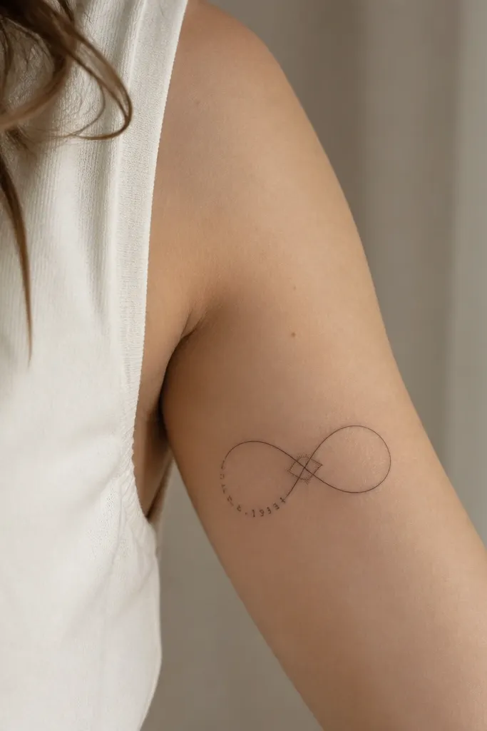
An infinity knot reads romantic without getting cliché, especially when the date is hidden inside the line. Fine-line work looks airy, and the dot shading at the crossover points makes the knot feel dimensional. This is a great option for couples because it's one shape with a shared secret. The inner upper arm placement keeps it close to your body, which makes the hidden date feel personal.
Make the infinity span about 9 to 11 cm wide so the loops don't compress. The date text should be small but legible - aim for 4 to 5 mm tall characters. Keep the knot line consistent thickness; if one side is thicker, it can look lopsided when healed.
Pro tipAsk the artist to stencil the knot on your arm with your arm relaxed and then again when bent, so the hidden date stays aligned.
AvoidAvoid placing the infinity too high near the armpit - it stretches and distorts when you move your shoulder.
5. Feather With Two Micro-Names Stitched Into the Shaft
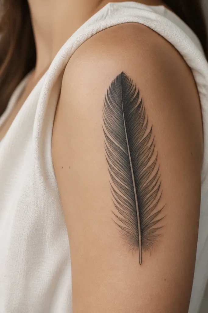
Feathers look delicate, and they have a natural direction that flatters the upper arm. Micro-names stitched into the shaft make the piece meaningful without adding extra icons. The key aesthetic is the contrast between sharp barbs and a gently shaded base. When done right, the feather reads like movement instead of decoration.
Keep the feather height around 12 to 14 cm. Put the names along the center line, following the feather's taper, and keep each name under 3 cm total so it doesn't crowd the barbs. Use soft gray shading near the feather base, not heavy black fill.
Pro tipWrite the names in the exact style you want on paper first - cursive that looks good on a page often needs spacing tweaks for tattoos.
AvoidAvoid dense black shading under the feather tip - it can swallow the barbs during healing.
6. Small Sunburst Behind a Portrait Silhouette
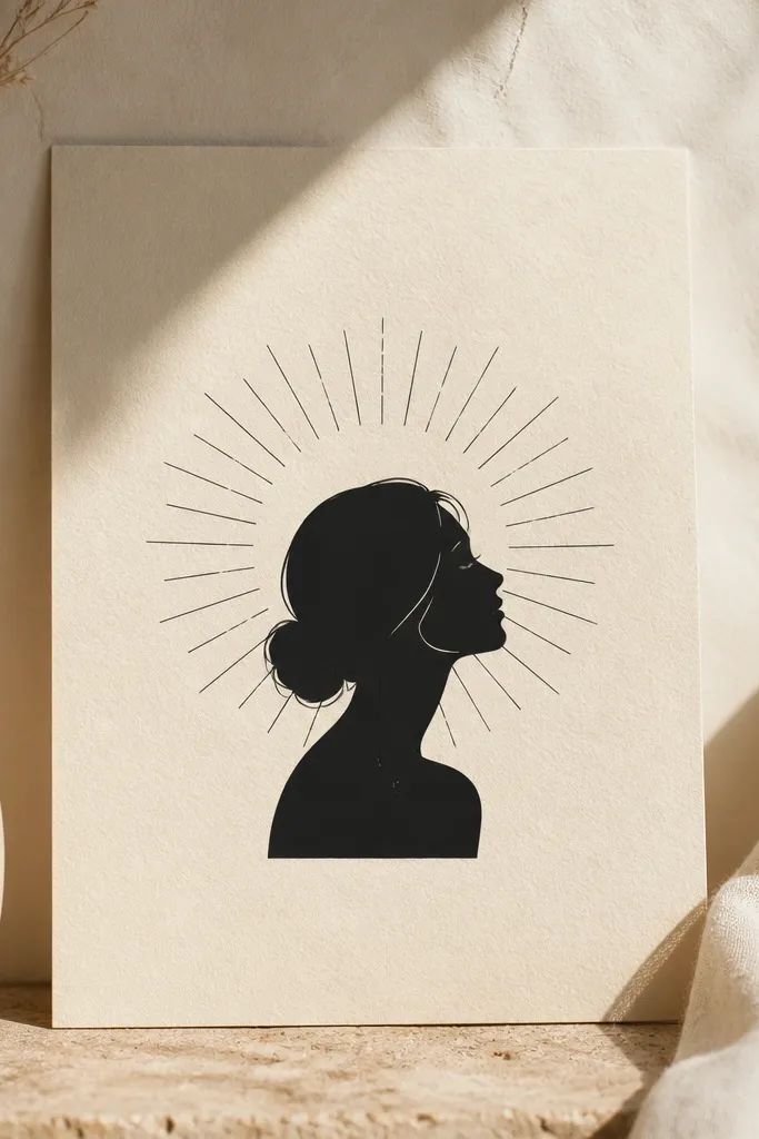
This is a meaningful design for people who want identity without a full realism portrait. The sunburst creates a halo effect, and the flat silhouette keeps it clean. Dot highlights add a soft glow that looks good in natural light. Upper arms are perfect for this because the rays can follow the curve of your bicep.
Keep the portrait silhouette about 4 to 5 cm tall and the sunburst about 7 to 9 cm across. Use black ink for the silhouette and linework, then add dotwork only in 2 to 3 small areas so it doesn't turn muddy. Place it on the front outer upper arm where you can see it when you wear short sleeves.
Pro tipBring one photo with strong contrast and one with soft lighting, and ask the artist to pick the strongest features for the silhouette.
AvoidAvoid tiny realism details inside the silhouette - it will blur.
7. Serpent Heart Loop on the Back Outer Arm
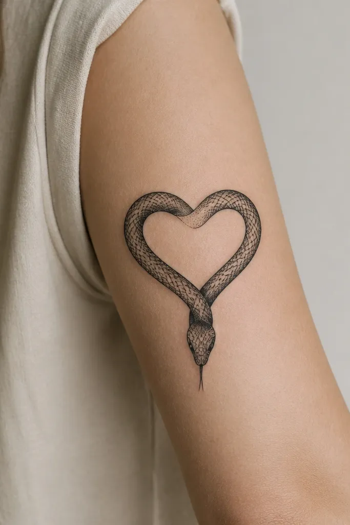
A serpent heart feels intense but still romantic, and the loop shape is naturally aesthetic on the upper arm. Scale texture adds interest without needing color. Dot shading on the serpent belly makes it look like it has depth. Placing it on the back outer arm keeps it stylish when you wear tank tops or open-back tops.
Size it so the heart loop is about 9 to 10 cm across. Keep the serpent line weight slightly thicker at the outer edge and thinner inside the curves. Ask for the scale marks to be short and spaced, not packed tightly.
Pro tipChoose the serpent's curve so the heart point aligns with your bicep's widest area - the shape looks more flattering in photos.
AvoidAvoid solid black scales throughout; it turns into one dark patch.
8. Goddess Eye Oval With Two Spark Dots
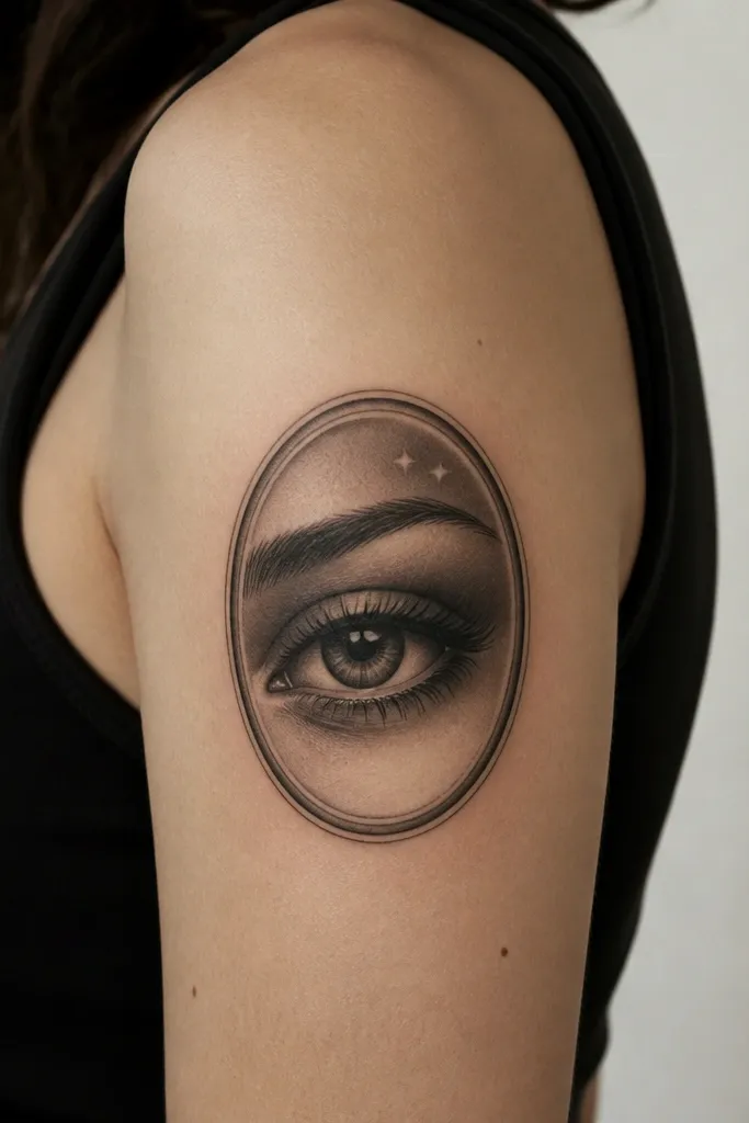
This design is meaningful if you connect it to protection, intuition, or guidance. The eye oval reads emotional, and the two spark dots add a sweet, feminine touch. Gray shading around the eye creates depth without needing heavy black. It's a strong Upper Arm Tattoos For Women aesthetic because the eye shape naturally fits the arm curve.
Keep the eye oval around 6 to 8 cm tall. Use a darker gray for the pupil and lighter gray for the eyelid shading so it doesn't look flat. Place it on the outer upper arm, slightly angled upward, so it looks like it's watching when you stand.
Pro tipAsk for the spark dots to be the same size as the pupil's highlight dot so the whole piece feels intentional.
AvoidAvoid putting the eye too close to the elbow - the shape will stretch and distort.
9. Geometric Hex Frame With a Small Moon Crescent
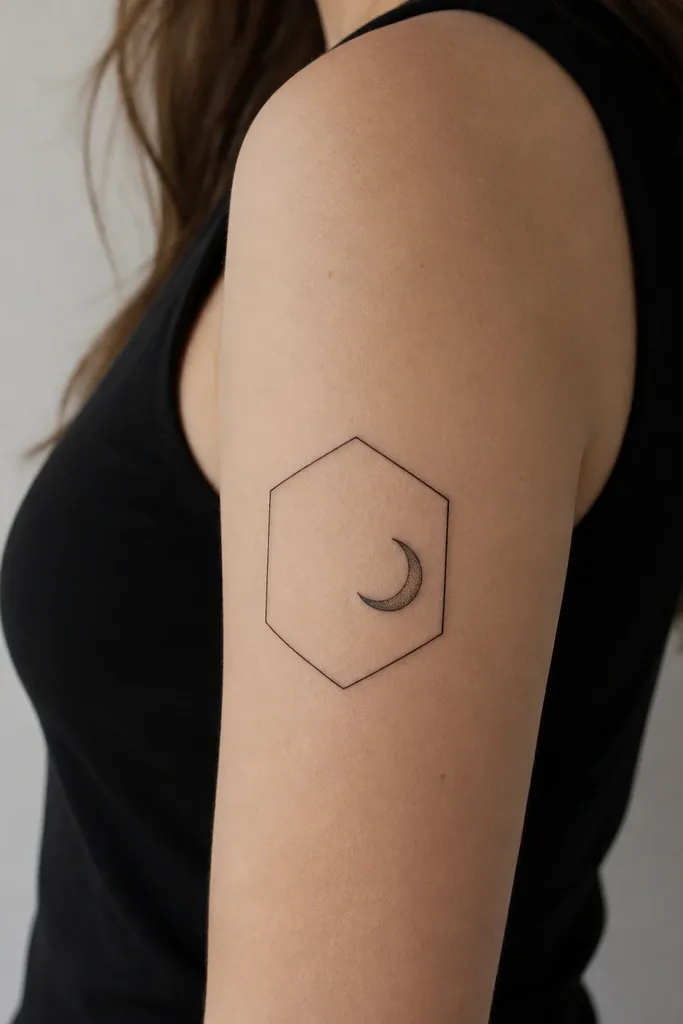
Geometric frames look clean and modern, and a tiny crescent gives meaning without clutter. The off-center placement keeps it from feeling symmetrical and stiff. Fine-line geometry stays crisp longer when lines are consistent and not overly thin. This one is perfect for couples because you can do matching crescent phases or mirror the moon position.
Draw the hex frame about 7 cm wide and 8 cm tall with line thickness around 2 to 3 mm. Place the crescent about 3 cm wide and keep dot shading minimal - a small cluster under the crescent's inner curve. Put it on the inner upper arm where the geometry stays visible in fitted sleeves.
Pro tipIf you want two matching tattoos, keep the hex frame identical and only change the crescent phase or orientation.
AvoidAvoid shaky linework; geometry looks cheap fast when the lines wobble.
10. Two Hands Holding a Tiny Key
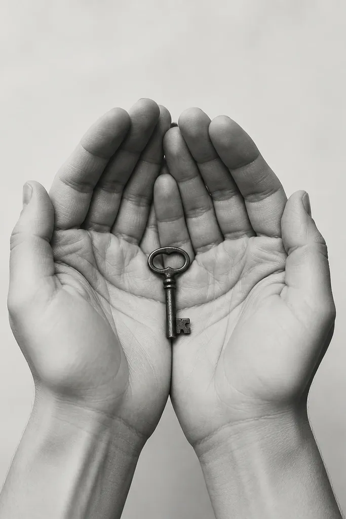
Hand tattoos hit a deep meaning moment because they read like action, not decoration. The tiny key gives a clear symbol for trust, opportunity, or commitment. Soft gray shading on knuckles adds realism without going full portrait. Upper arm placement keeps the key legible and the hands flattering when you bend your arm.
Keep the hands small - about 5 to 6 cm overall height - and the key about 2.5 to 3 cm long. Use light gray shading only where light would naturally hit: knuckle tops and key edges. Place the piece on the front inner upper arm so it looks like it's cradled toward your body.
Pro tipBring a key reference photo with the exact shape you want - the tooth pattern matters more than you'd think.
AvoidAvoid oversized keys; big keys can look heavy and cover up the hand details.
11. Micro Constellations on a Curved Star Path
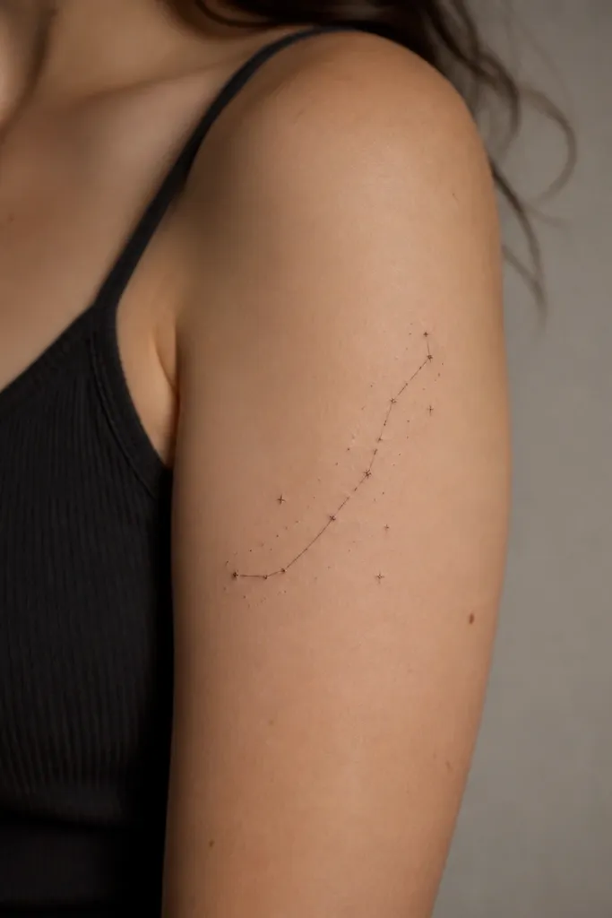
Micro constellations are meaningful because they map to dates or locations, and they look airy. The curved star path follows the arm's natural line, so the tattoo looks good when your arm moves. Use dots of different sizes for depth - a few larger dots act like anchors. This is a clean Upper Arm Tattoos For Women aesthetic because it stays subtle but still personal.
Plan the whole piece width at about 8 to 9 cm. Keep the smallest stars as tiny dots, but include 3 to 5 larger stars for contrast so it doesn't blur into one gray haze. Place it on the outer upper arm where natural light hits during daily life.
Pro tipIf you're using a real constellation, use a screenshot from a planetarium app and match star spacing, not just star shapes.
AvoidAvoid connecting every dot with lines; too many lines makes it look like noise.
12. Ribbon Bow With Two Tiny Initials at the Center
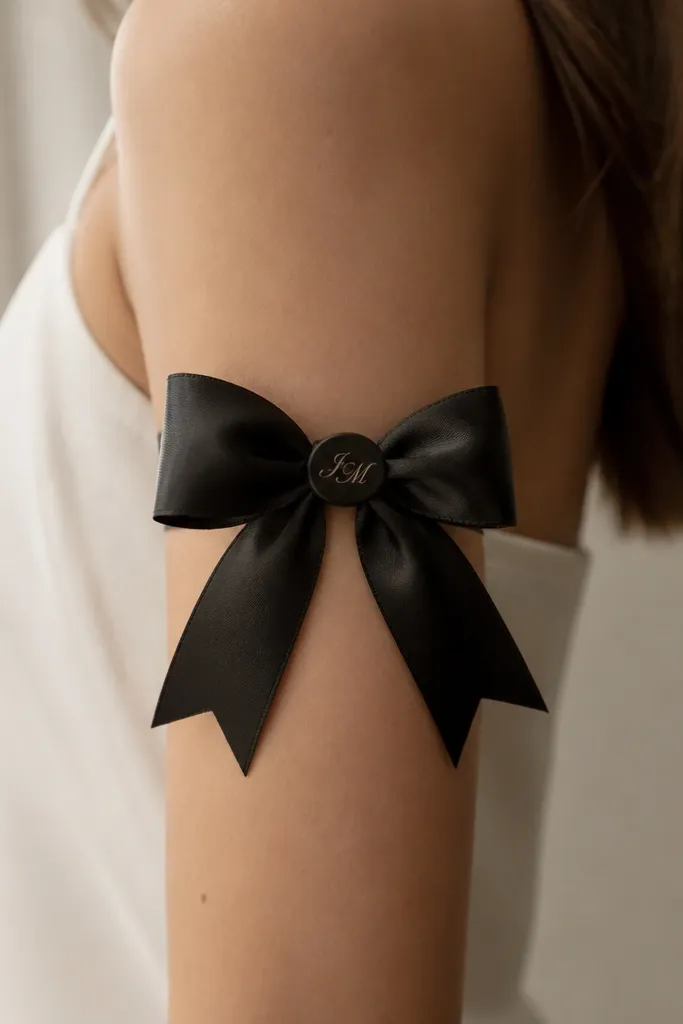
A bow reads feminine and romantic, and the initials make it personal. The aesthetic comes from fold shading: thin gray lines that suggest the ribbon's thickness. The center knot gives a focal point, and it's easy to keep it crisp during healing. This design also works well for couples because each person can have the other's initials or the same initials in mirror placement.
Keep the bow about 9 to 10 cm wide. Place initials in the knot area so they're surrounded by ribbon edges, which helps readability. Use gray shading on the underside folds and keep the top folds mostly black linework.
Pro tipChoose initials that have clear upstrokes and downstrokes - thin loop-only letters blur.
AvoidAvoid placing initials too close to the ribbon edges; they get distorted as the ribbon moves.


