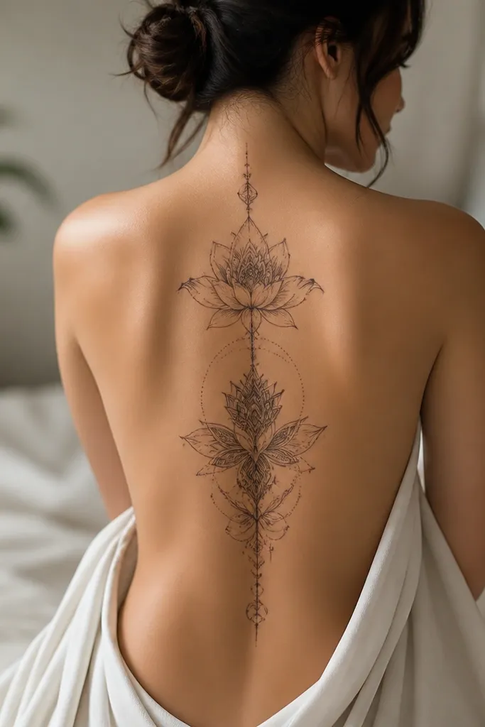
1. Mid-Spine Celestial Arc With Star Clusters
This is the type of back tattoo that still looks "busy" without turning into a blur. The arc gives the eye a clean path along the spine, and the star clusters let you pack detail into a small height. I like it because the black ink stays readable even if the tattoo softens slightly after healing, since the stars are separated into distinct groups.
Place it from just below the bra-line down toward the upper-mid spine - around 18-20 cm tall. Keep the arc width narrow, about the width of two fingers at its widest, so it doesn't fight your shoulder blade curve.
Pro tipAsk for one cluster to be slightly denser than the other so it looks intentional in photos taken from the side.
AvoidAvoid a perfectly uniform star grid - it heals flat and looks like a sticker.
2. Two-Leaf Mirror Vine Over the Shoulder Blade
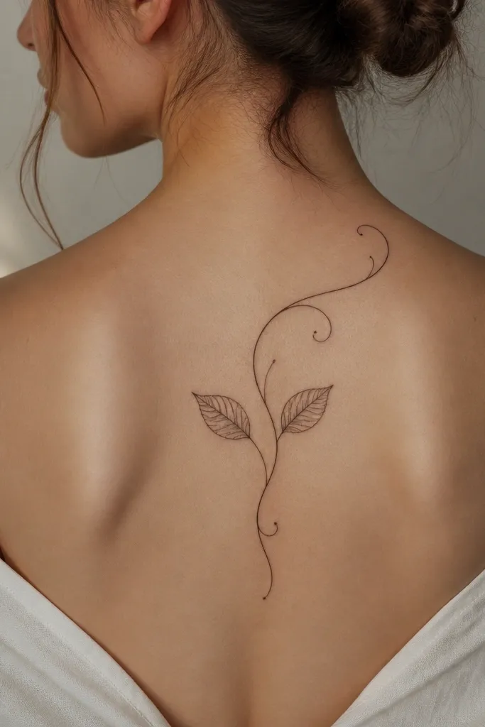
Mirror-vine tattoos look elegant because they frame the shoulder blade without turning it into a full back project. Leaf veins are perfect for "beautiful detail small space" because thin lines can be controlled and they create depth without heavy shading. The tiny dots at the vine tips catch light and make the piece feel airy, not crowded.
Keep the vine length short, 16-19 cm from top curl to the lowest leaf. Position it so the highest curl sits just below the shoulder seam, not on top of the shoulder cap.
Pro tipPair black leaf veins with one soft gray wash leaf underside so the shape reads even after healing.
AvoidDon't let the vine cross the spine line - it makes the symmetry look accidental.
3. Small-Scale Japanese Watercolor Waves With Dark Anchors
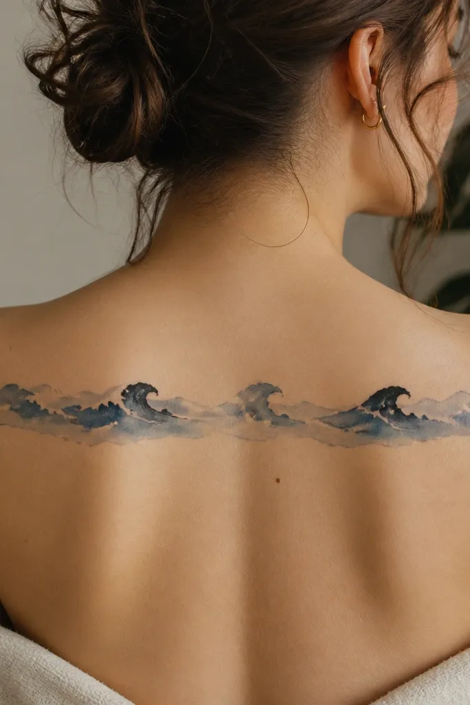
Watercolor waves can look stunning on the back, but only when the artist adds dark anchors. Those solid black crests keep the tattoo readable and give the gray wash something to "lean on." The white foam gaps also help the design stay crisp rather than turning into a flat gray strip.
Place across the upper back near the shoulder blade line, about 12-15 cm tall. Keep the main ink band narrow so it doesn't spread into the sides when you twist.
Pro tipWear a low-back top for the first month - sun exposure and friction are what dull watercolor detail fastest.
AvoidAvoid full-coverage watercolor with no black anchors - it blurs into one tone.
4. Fine-Line Butterfly With Dot-Shadow Wings
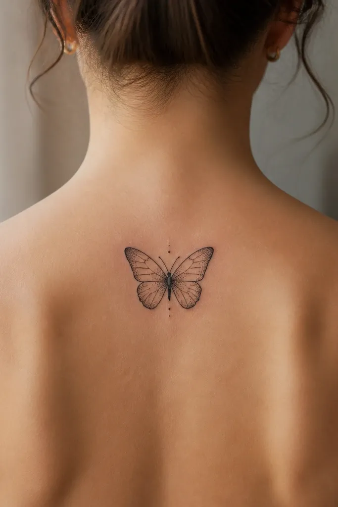
Dot-shadow wings are one of the best ways to keep detail small-space without heavy color. The outline stays sharp, and the dots build a soft gradient that reads as "texture," not smudged gray. This design looks good on skin that moves, because the dot pattern holds shape better than wide gray blocks.
Target 10-13 cm wingspan, placed slightly above mid-back so it doesn't get stretched by posture. Keep the body thin and centered; thicker bodies can overwhelm the wing detail.
Pro tipAsk for dot density higher near the wing base and lighter at the edges - it prevents the wings from looking like a single blob.
AvoidAvoid thick outlines - they make a small butterfly look cartoony.
5. Couples Broken Compass With Matching Center Needle
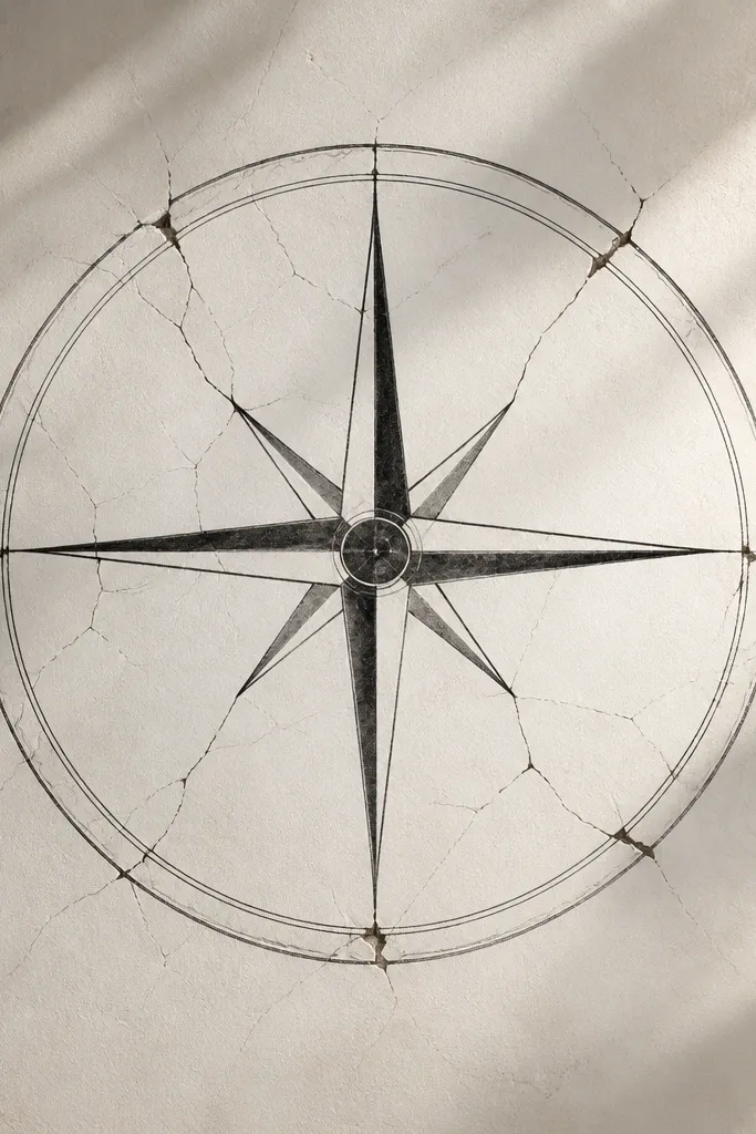
This one works because the "detail" is in the cracks and needle contrast, not in filling a big area. For couples, each person can get half the compass - same center needle shape - so it looks like one shared symbol when you stand back-to-back. The thin crack lines make the tattoo feel personal without needing color.
Place one half on each person's upper-mid spine, about 16-18 cm tall. Make sure the center needle sits on the spine line so alignment holds in photos.
Pro tipMatch the crack count - even if the cracks aren't identical, the number of radiating lines should be the same for symmetry.
AvoidDon't make the compass too big - the cracks turn into gray haze.
6. Orchid Branch With Micro Petal Veins
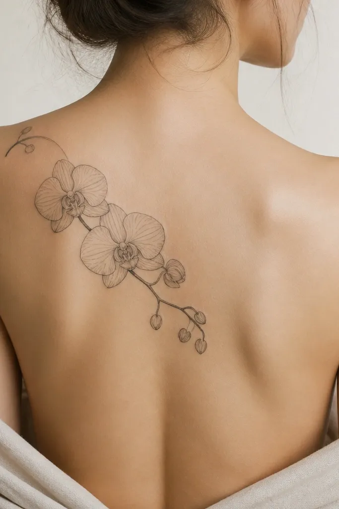
Orchids look premium on the back when the petals have real vein structure. Micro petal veins are small-space friendly because they create dimension through line density, not heavy fill. I like the clean stem too - it keeps the tattoo from looking like a big patch.
Keep it vertical and slightly diagonal, covering 18-22 cm. Place the main bloom near the upper-mid spine line, not too close to the neck.
Pro tipAsk for one petal shadow line that's darker than the others - it makes the bloom look layered.
AvoidAvoid thick petal outlines - they kill the delicate orchid look.
7. Triangle Frame With Quote-Like Lettering (No Script)
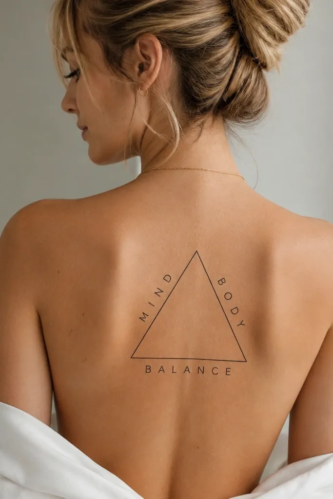
Lettering on the back needs restraint. A triangle frame keeps the spacing stable, and uppercase block-style letters survive healing better than flowing script in small areas. The frame also gives the tattoo structure when it stretches across the back.
Choose 9-12 cm height for the frame for small-space backs. Keep letter height around 2-3 mm, and avoid letterforms with tiny internal gaps.
Pro tipBring the exact font you want printed and have the artist trace it - small spacing changes matter a lot at 2-3 mm.
AvoidAvoid ultra-thin cursive - it turns into a gray line fast.
8. Feather Pen Study With Layered Barbs
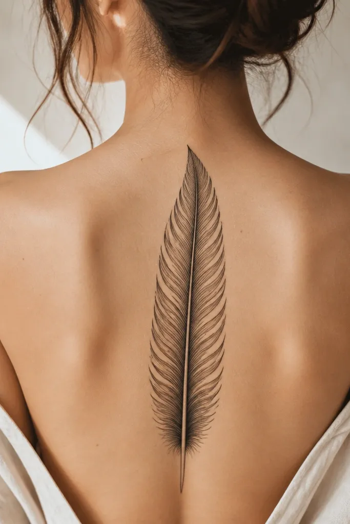
A feather is a small-space win because the shape naturally follows your back's centerline. Layered barbs create detail that stays visible even when the tattoo softens. The thicker quill acts like an anchor so the feather doesn't look like random lines.
Place it from mid upper back to just above the bra-line, about 20 cm tall. Keep the feather width narrow at the top and slightly wider at the base, matching your shoulder blade curve.
Pro tipAsk for a tiny break in the barb line near the base - it adds realism and prevents a flat "drawn" look.
AvoidAvoid a feather that's too wide - the barbs merge together after healing.
9. Small Mandala Corner Piece on One Shoulder Blade
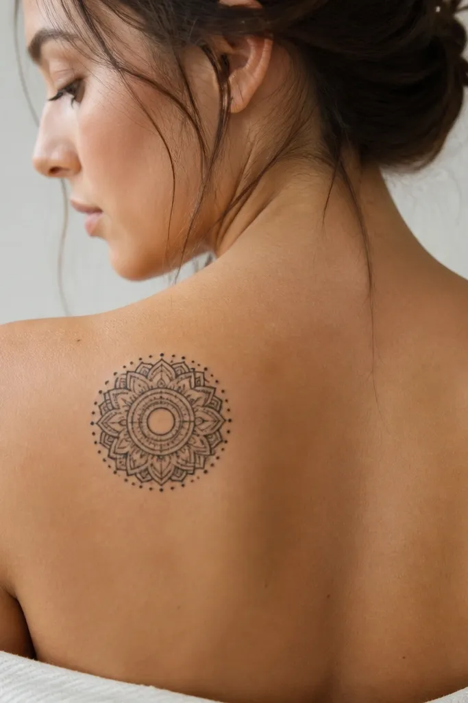
A corner mandala looks intentional because it uses the shoulder blade as a natural canvas. Dot rings and petal segments give you "beautiful detail" without needing a full symmetrical back mandala. Minimal gray keeps it crisp and reduces the risk of muddy shading.
Keep it 10-14 cm across. Place it so the mandala's bottom edge clears the bra strap area by a few centimeters.
Pro tipUse a dot ring as the outer boundary - it frames the mandala and helps the design read from a distance.
AvoidAvoid heavy full shading - it turns a small mandala into a dark blob.
10. Matching Lock and Key With Interlocking Teeth
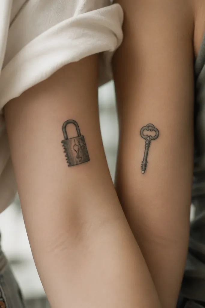
For couples, this is one of the cleanest ways to make matching look personal. The detail is in the teeth geometry - crisp lines and cutouts - which stays readable at small sizes. When you stand close, the interlocking shapes make the pair feel like one story.
Each person gets a piece about 12-16 cm tall on the upper back. Place the lock slightly higher if you want it to balance the key's length; keep the key's bow near the shoulder blade center.
Pro tipHave the artist draw tooth spacing to match the same measurement on both sides, like 1 mm tooth gaps.
AvoidAvoid rounded teeth - they lose the precise "interlocking" look.
11. Sun and Moon Micro Icons on the Spine Line
Micro icons are perfect for small-space back tattoos because they don't demand a large canvas. The sun and moon share the same line weight, so the pair looks cohesive in photos. Tiny crater dots add detail without needing shading.
Place the sun about 8-10 cm above the moon, with total height around 16-18 cm. Keep icons small: sun diameter 2.5-3 cm, moon 2.3-2.8 cm.
Pro tipAsk for the rays to be evenly spaced and the moon craters to be asymmetrical by one crater - it looks more natural.
AvoidAvoid big rays - they crowd the centerline and distort in healing.
12. Lace-Inspired Negative Space Rose
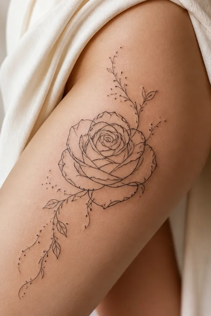
Negative space lace roses look like couture because the gaps do the work. Your skin becomes the light area, so the tattoo doesn't rely on heavy shading to look dimensional. The lace gaps also help small details stay crisp because there's less ink density overall.
Place the rose on one side of the spine, about 17-21 cm tall. Keep the lace gap pattern consistent across petals so it doesn't look random.
Pro tipTell the artist you want at least 25% skin exposure within the rose shape - it keeps the lace effect.
AvoidAvoid dense black fill inside petals - it ruins the negative space look.


