1. Feather Spine With Graduated Black Ink
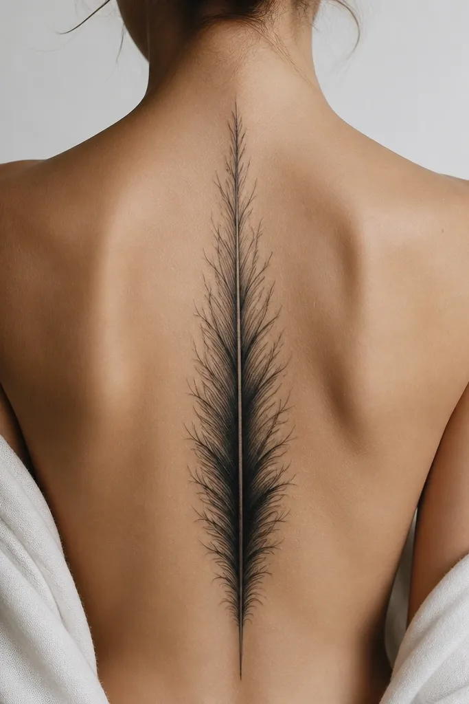
This one works because a feather naturally creates a sense of motion - the barbs fan out, then tighten again as they descend. I like a single feather placed slightly offset so it catches light differently as you move your shoulders. The graduated line weight - thin at the top, heavier around mid-back - makes it look like it's flowing rather than sitting flat.
Ask for a quill spine that starts around the base of your neck and ends around the upper lumbar area, roughly 2-3 inches above where your waistband hits. Use black and gray with a smooth taper on the barb tips so the ends don't look blunt. If you want a couples version, keep the same feather shape and shift only the height by 1-2 vertebrae for fit.
Pro tipWear a low-back top for the stencil fitting. Seeing it in the mirror with your actual outfit seam lines makes the spacing click.
AvoidAvoid a feather that's the same thickness the whole way down - it looks like a logo instead of a moving form.
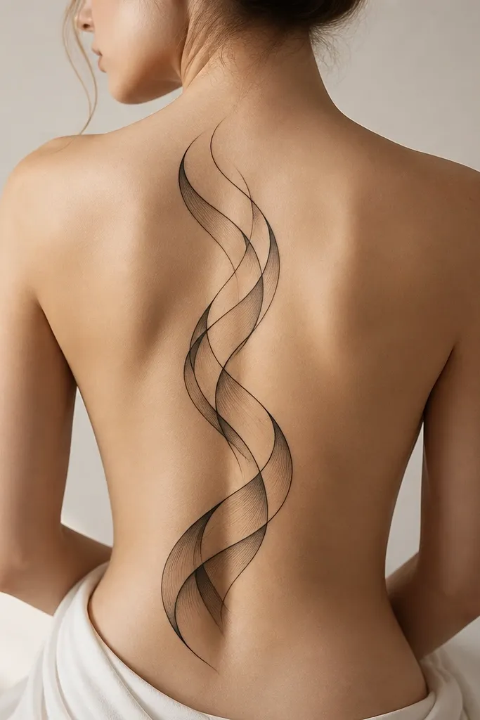
2. Double Vines With Tiny Buds and One Swirl Core
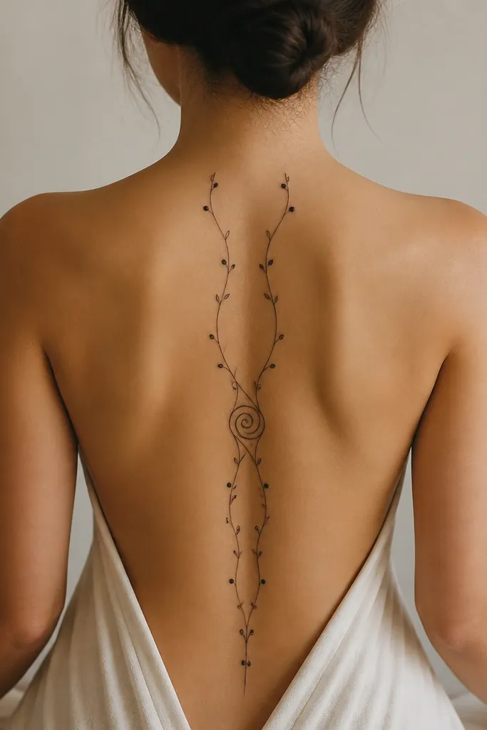
Two vines create a modern "movement corridor" along your back. The tiny buds act like visual beats, so your eye travels down the spine without stopping. The single swirl core gives you a focal moment without turning the whole piece into a dense patch.
Have the vines start near the top of the scapula area and run down toward the lower ribs, keeping the gap between vines about the width of two fingers. Keep buds spaced roughly 1 to 1.5 inches apart, and make the swirl core small - about the size of a quarter. For matching couples, mirror the vines so both people have the same core swirl but different vine tilt angles to suit shoulder width.
Pro tipIf you want it extra clean, ask for the vines to use a slightly textured gray wash only at the swirl core, not along the entire length.
AvoidSkip overcrowding buds every few millimeters. It turns into a dot stripe that ages muddy.
3. Serpent Linework With Negative-Space Ridges
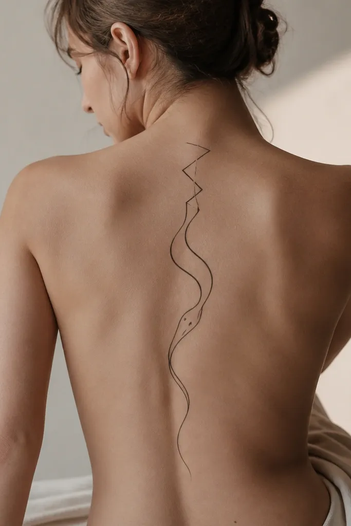
Linework serpents look modern when they use negative space like a design element. The ridges created by gaps make the tattoo feel dimensional even without heavy shading. Placing the head at mid-back gives you a focal point that doesn't compete with neck tattoos or collarbones.
Keep the line weight consistent but add tiny tapering at curve peaks so it feels alive. The head can sit around T7-T8; the tail should end above the waistband zone by 2-3 inches. Use solid black for the eye and a single small tooth mark so it reads clearly after healing.
Pro tipRequest stencil placement with your hair down and pulled back. The hairline changes how the top curves read in photos.
AvoidDon't add thick scales all the way down. Dense scale patterns blur faster than clean linework.
4. Arcing Constellation Dots With a Spine-Truth Curve
Constellation tattoos look best when the "connectors" follow your body curve instead of aiming for a perfectly straight line. The dot size variation keeps it from looking like a printer pattern. A denser cluster at mid-back gives flow a natural rhythm - like a song with a chorus.
Use 3 sizes of dots: micro dots, medium dots, and a few small solid circles as anchors. Keep connecting lines thin and short, no longer than 1 inch between major dots. If you're doing matching couples, keep the connector layout identical and adjust only the vertical start point based on torso length.
Pro tipAsk your artist to do a quick mirror check of the stencil from both sides. The constellation should feel balanced with your scapula width.
AvoidAvoid big thick star points. They heal into blobs on fine-line placements.
5. Japanese Wave Ribbons in Black and Soft Gray
Wave ribbons create flow because they fold over themselves. The overlap gives depth, and the taper keeps the design from looking like a tall banner. I like black and soft gray here because it stays modern and doesn't turn into heavy traditional filler.
Plan for a height of about 7 to 10 inches depending on your torso. Make the top wave start near the base of the neck, then let the middle band sit around T7-T9. Keep overlap minimal - about 3 to 5 mm - so lines don't merge after healing.
Pro tipIf you want it to look extra clean in photos, ask for crisp outline only on the outer edges, with inner folds done in gray.
AvoidSkip overly aggressive contrast everywhere. Too much black under gray washes can look like bruising after healing.
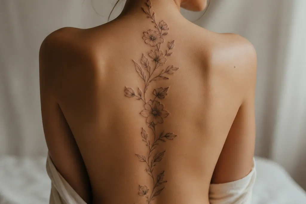
6. Lotus Stem With Two Tiny Side Blossoms
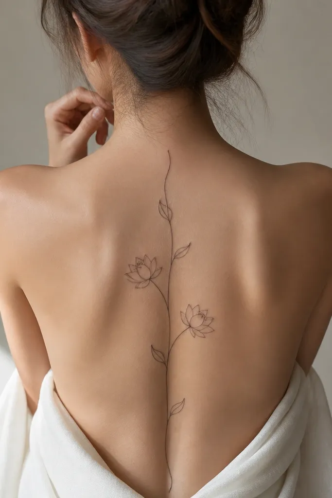
A lotus stem creates a calm flow that doesn't feel busy. The side blossoms add balance without expanding width too much, which matters around the shoulder blade area. Clean petal linework ages better than heavy filled petals if you keep the lines thin and consistent.
Place the main stem slightly off-center so it visually hugs your curve. Put the side blossoms around the same level on both sides - about T8 - but let one blossom be 2-3 mm smaller to keep it from looking mirrored and robotic. If you're matching with a partner, keep the stem shape identical and swap which side blossom is smaller based on each person's shoulder asymmetry.
Pro tipBring a sketch of your bra style. If your bra has a high back, you need those leaves to sit below the band line.
AvoidAvoid thick black-filled petals with thin stems. The stem disappears first.
7. Minimal Crown Bow With a Spine-Line Tail
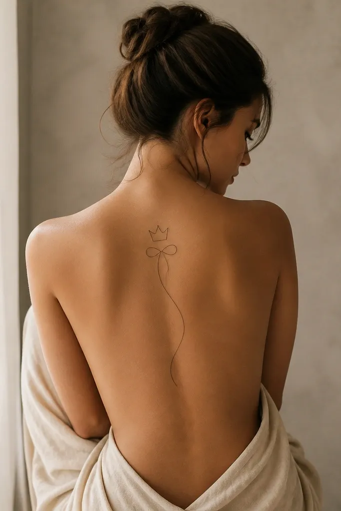
This design looks modern because it's tiny at the top and controlled in width. The crown gives a symbolic focal point, while the ribbon tail creates the "flow" down your back. Outline-only elements stay crisp when they're kept small and spaced.
Keep the crown about 1 to 1.25 inches wide so it doesn't fight your shoulders. The ribbon tail should run from the crown base down the center line, ending around the upper lumbar area. For couples matching, do the same crown size but angle the ribbon tail slightly toward one side based on how each person's spine line looks in a mirror.
Pro tipChoose a placement that clears your bra strap seam. If it crosses the strap, it looks messy in everyday wear.
AvoidAvoid adding extra spikes around the crown. Too many points turn into soft blobs.
8. Orbit Lines With a Small Compass Needle
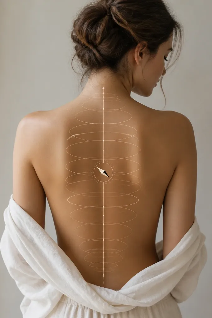
Orbit lines make flow feel intentional, like motion along your spine rather than decoration. The compass needle gives you a single readable element that doesn't need shading to stand out. Keeping everything thin and geometric keeps the tattoo modern and photo-friendly.
Draw the central spine line as the main axis, then add 2 to 3 orbit arcs that touch it gently. Put the compass needle around T7-T8 and keep it small - about the width of a thumb nail. If you're matching, use the same orbit arcs but rotate the needle direction to match each person's dominant side.
Pro tipAsk for the orbit arcs to stop short of the shoulder blade edge. When they hit bone irregularities, they distort visually.
AvoidSkip heavy dot fills inside the orbits. They age into a gray haze.
9. Single-Line Butterfly With a Long Spine Tail
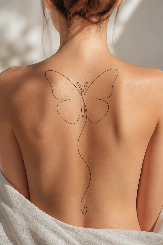
Single-line tattoos look best when the line is consistent and the design has one clear motion path. The butterfly wings create width at the top, and the long tail restores it into a clean vertical flow. I like this for women because it reads feminine without turning into thick, traditional fill.
Place the butterfly center around the upper back near the shoulder blade midpoint, then let the tail run down the spine for 6 to 8 inches. Keep the wings open but not wide enough to cross your bra band. For matching couples, do identical butterfly shapes but adjust tail length so both people end at the same visual height above the waistband.
Pro tipWear a fitted backless top during stencil check so you see how the line breaks with your body silhouette.
AvoidAvoid double outlines. They thicken as they heal and ruin the single-line effect.
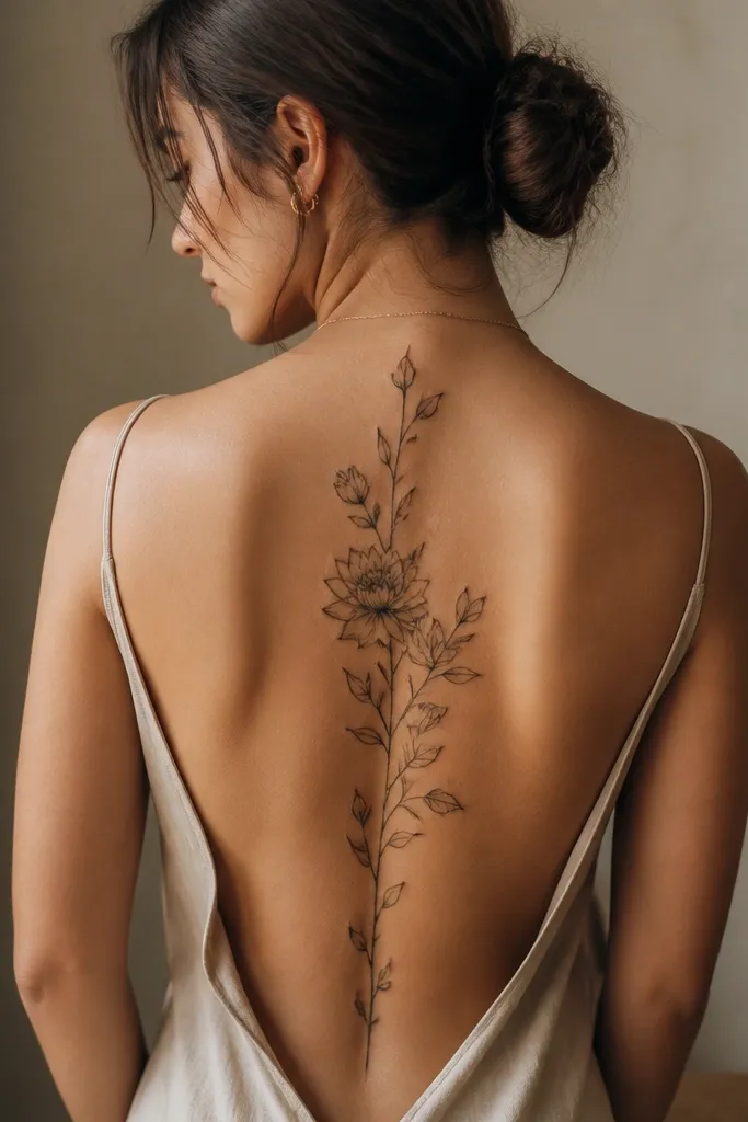
10. Rose Stem With Thorns That Spiral Once
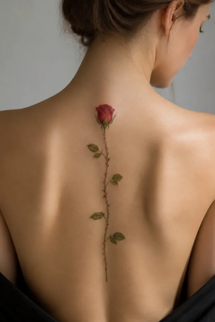
A rose stem gives you a classic motif, but the modern part is the controlled spiral - one twist only. The spiral reads like motion and keeps the rest of the stem clean. I prefer a rose bud over a full bloom for spine pieces because it doesn't balloon into the shoulder area.
Keep the rose bud small, about 1.5 inches tall, and place it just above the shoulder blade line. Let the spiral happen around T8, with the thorns pointing outward for 1-2 inches. Use thin gray shading under the rose petals only, so the stem stays crisp in the years after.
Pro tipAsk for thorns to be short. Long thorn lines cross too much skin texture and blur.
AvoidSkip heavy black rose fills. They age fast on spine placements where skin moves a lot.
11. Geometric Chevron Spine With Soft Angled Shading
Chevron geometry creates flow because it naturally points your eye forward and down. The slight left-right offset makes it feel like a wave traveling along your back. Soft gray shading adds dimension without turning it into a thick patch.
Use 6 to 10 chevrons total for a mid-size piece, keeping each chevron height about 1 inch. Taper the first and last chevrons so it doesn't look like a rigid ladder. For matching couples, keep the chevron count identical, then adjust starting level by 1 chevron so both designs align with their bra strap zones.
Pro tipStencil with your shoulders relaxed, not pulled back. Tension changes the chevron angles and makes the tattoo look "off" later.
AvoidAvoid spacing chevrons too tightly. In healing, the lines merge and the pattern loses the chevron shape.
12. Waterline Script That Follows the Spine Curve
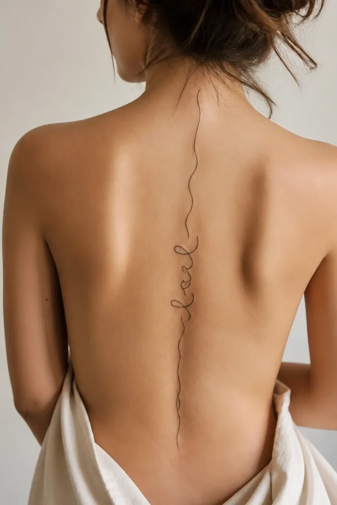
Script spine tattoos look beautiful when they behave like a ribbon, not like a flat font. The waterline style - thicker at the base stroke and thinner at the top stroke - makes your ink look like it moves with your body. I like a short phrase or a single word fragment that sits around T8, then the rest of the line becomes decoration.
Keep the text tiny and readable only up close. The mid-back letter cluster should be about 1.25 to 1.75 inches wide, with the vertical line extending above and below. For couples matching, use the same script font and size but place each person's word cluster at their best viewing height - usually different by 1-2 vertebrae.
Pro tipBring the exact font reference you want printed small. Tattoos that use big, fancy letters often look like squiggles on the spine.
AvoidSkip thin hairline-only text. It can heal too faint and disappear on the spine.


