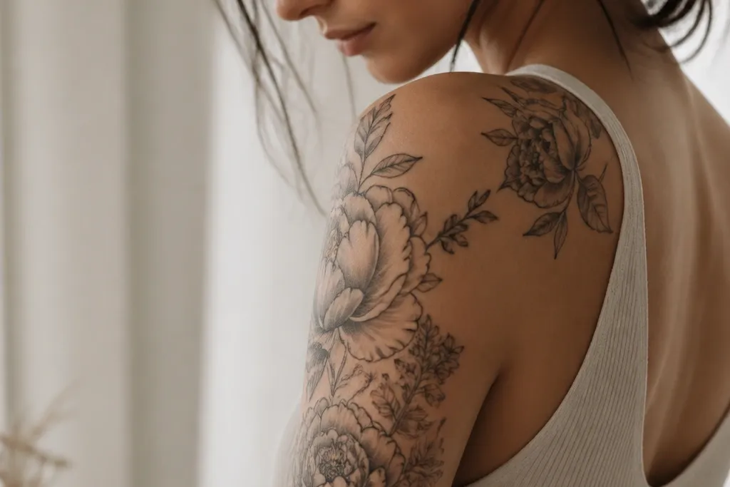

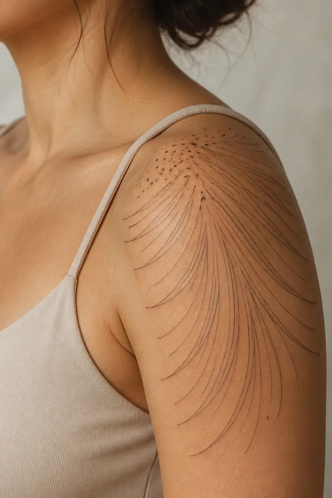
1. Deltoid Cap Rose With Soft Motion Veil
This works because the rose anchors the shoulder cap while the curved "veil" lines create movement across the outer arm. The light gray shading keeps it modern and not heavy, and the dot highlights mimic light catching fabric. The negative space between the veil lines prevents that boxed-in look that happens when people fill too much of the upper arm.
Have the rose center land where your deltoid looks roundest when your arm is bent 45 degrees. Keep the veil lines starting at the rose outer edge and taper them into 6-10 skinny arcs across the bicep. Use a cool gray palette for shading, and limit warm color to a single tiny dot cluster near the upper petal edge.
Pro tipAsk your artist to draw 2 stencil options: one that hugs the shoulder cap and one that slightly crosses the outer bicep. Pick the one that looks best in a tank-top mirror photo.
AvoidAvoid dark full-color packing across the shoulder cap; it flattens the shape and makes the tattoo look older fast.
2. Matching Couples Wave Linework (One Symbol, Two Silhouettes)
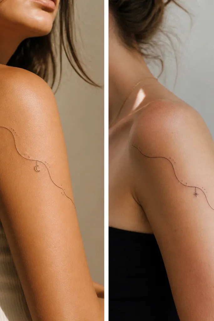
Couples look best when the tattoo reads like the same sentence written in two fonts. The wave line gives you shared direction, and the tiny charm at the midpoint gives individuality without breaking the overall silhouette. Micro dots add softness and keep the lines from looking too graphic.
Place the wave's origin at the outer shoulder crease, not the front center. Keep both tattoos about the same height (roughly 9-11 cm from shoulder cap to the lower edge). Use identical line weight on the wave, then swap the midpoint symbol only.
Pro tipIf you're matching with a partner, bring a photo of both arms in the same pose. I've found it prevents "mine looks lower" disappointment.
AvoidAvoid thickening the wave line on one person and keeping it thin on the other; it makes the pair look mismatched.
3. Sunset Haze Ombre Over Outer Bicep
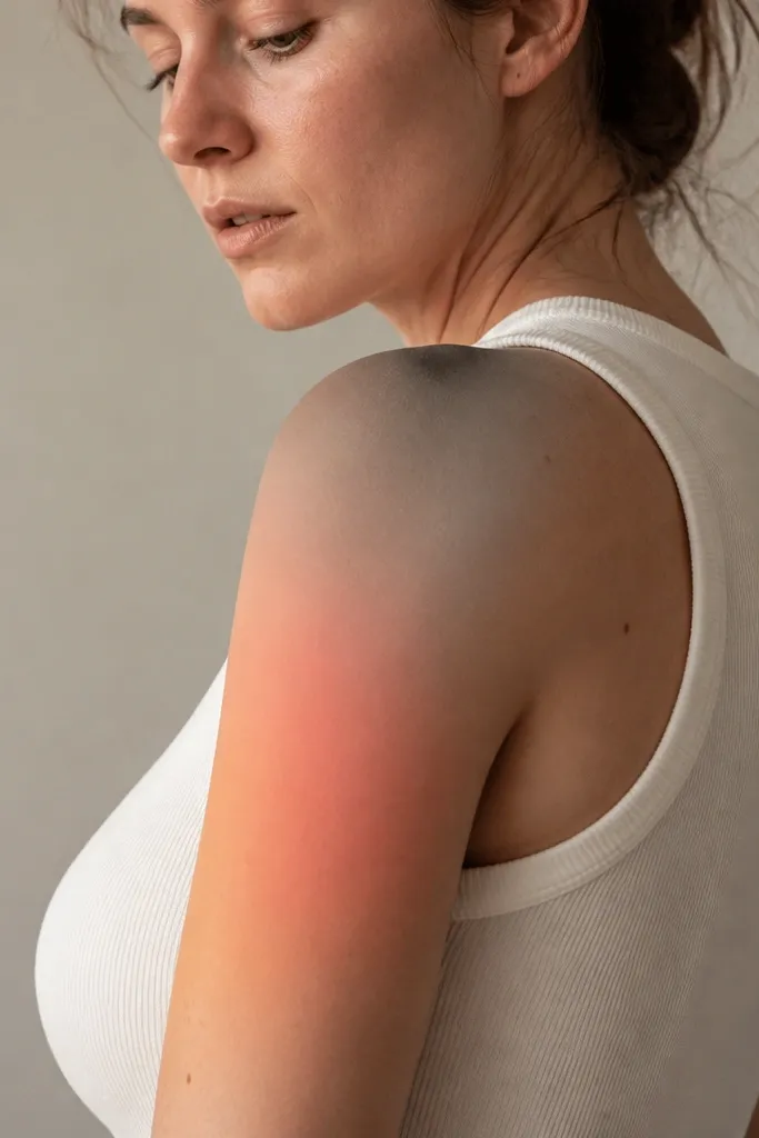
A modern shoulder and upper arm tattoo can be atmospheric instead of literal. The ombre haze creates a dreamy glow that looks good in motion and under warm indoor light. Keeping the haze gradient light prevents it from turning into a "stain" later as it fades.
Ask for a soft packed gradient using a tight stencil outline only for placement. Start the warmest part near the outer shoulder and fade toward the lower edge of the upper arm. If you add any linework, keep it minimal - one tiny dot constellation at the edge works.
Pro tipChoose ink colors that match your skin tone undertone. If you're warm-toned, peach-coral reads dreamy; if you're cool-toned, go more into mauve-gray for a smoother look.
AvoidAvoid sharp, dark borders around the haze; that border ages faster and makes the tattoo look like a sticker.
4. Feather Fan Curves With Tiny Black Seed Dots
Feather fans look modern when they stay airy and directional. The curve radiates with your arm shape, and the seed dots add texture without turning into clutter. The black seed dots also give contrast so the gray shading doesn't disappear on camera.
Keep the feather "ribs" thin and slightly uneven so it doesn't look printed. Place the densest dot cluster near the shoulder cap, then thin out the dots as the feathers spread. Use a soft gray for feather shading, not full black gradients.
Pro tipBefore you tattoo, test a temporary transfer on your skin for 2 hours. If the dots make your arm look busy in photos, reduce the dot count by half.
AvoidAvoid symmetrical feather spacing that's too perfect; it can read mechanical and older.
5. Serpent Ribbon Around the Outer Arm (No Full Wrap)
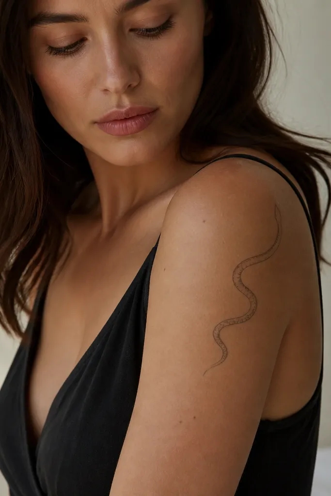
This is modern because it respects your anatomy. A partial wrap ribbon follows the outer arm contour while leaving room for skin breathing. The implied scales keep detail crisp without overworking the skin in a big area.
Place the serpent's head near the shoulder cap, angled slightly upward. Keep the ribbon width narrow (about 1.5-2 cm at the thickest point), and stop it before the armpit crease. Use black linework with small gray scale shadows only where the ribbon turns.
Pro tipIf you want it to look extra fluid, ask for the linework to vary in pressure - slightly thicker at turns, thinner at straight sections.
AvoidAvoid a full circular snake wrap; it often warps as your arm bends and can look cramped after healing.
6. Micro Lily Cluster With One Curved Stem
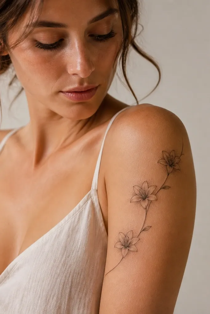
A cluster with one stem looks intentional because your eye tracks the motion line. Micro lilies stay modern when petals are fine-line and shading is minimal. The tiny leaf cuts add structure so the design doesn't look like scattered stickers.
Keep each lily about 2.5-3 cm wide so the cluster stays airy. Place one bloom at the shoulder cap, one slightly lower on the outer bicep, and one between them. Use micro dots only at petal bases for texture.
Pro tipPick one accent element (a single tiny gold-tinged dot or a small warm highlight) so the tattoo has a focal point.
AvoidAvoid adding too many leaves; the cluster gets heavy and loses that clean modern look.
7. Geometric Crescent + Soft Gray Smoke
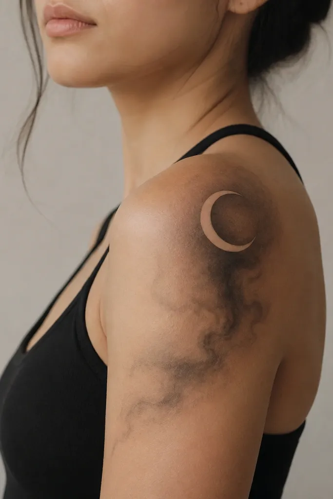
This mix of sharp and soft reads modern because it gives contrast without chaos. The crescent gives structure, while the smoke shading adds dreamy flow. It also photographs well because the geometric part stays crisp while the smoke adds atmosphere.
Size the crescent so it fits the shoulder curve: roughly 6-8 cm tall. Keep the smoke shading lighter than you think - it should feel like a haze, not a filled background. If you add linework, keep it strictly inside the crescent edges.
Pro tipAsk your artist to test the smoke intensity with a quick stencil pass. If you can see it clearly from 2 meters away, it's too dark for a modern airy vibe.
AvoidAvoid full black crescent fills; they age fast and flatten the smoke effect.
8. Butterfly Landing Strip With Negative Space Wings
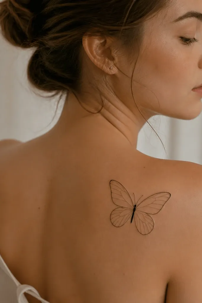
Negative space wings look current because they rely on your skin tone as part of the design. The fine-line veins keep it delicate, and the tiny dot thorax adds a focal point. Placement on the outer shoulder makes it look like the butterfly is landing on your shape, not pasted on top.
Keep the butterfly width around 4-6 cm so it doesn't spill into the armpit. Have the wings angle slightly toward the back of the arm, which flatters the curve in photos. Use very light gray shading only near wing bases, not across the whole wing area.
Pro tipIf you're worried about fading, choose a slightly thicker line weight for the wing outlines - it holds up better than super-thin lines.
AvoidAvoid heavy solid shading on the wings; it turns the butterfly into a blob once it heals.
9. Dreamcatcher Loop on Shoulder With Real Feather Edges
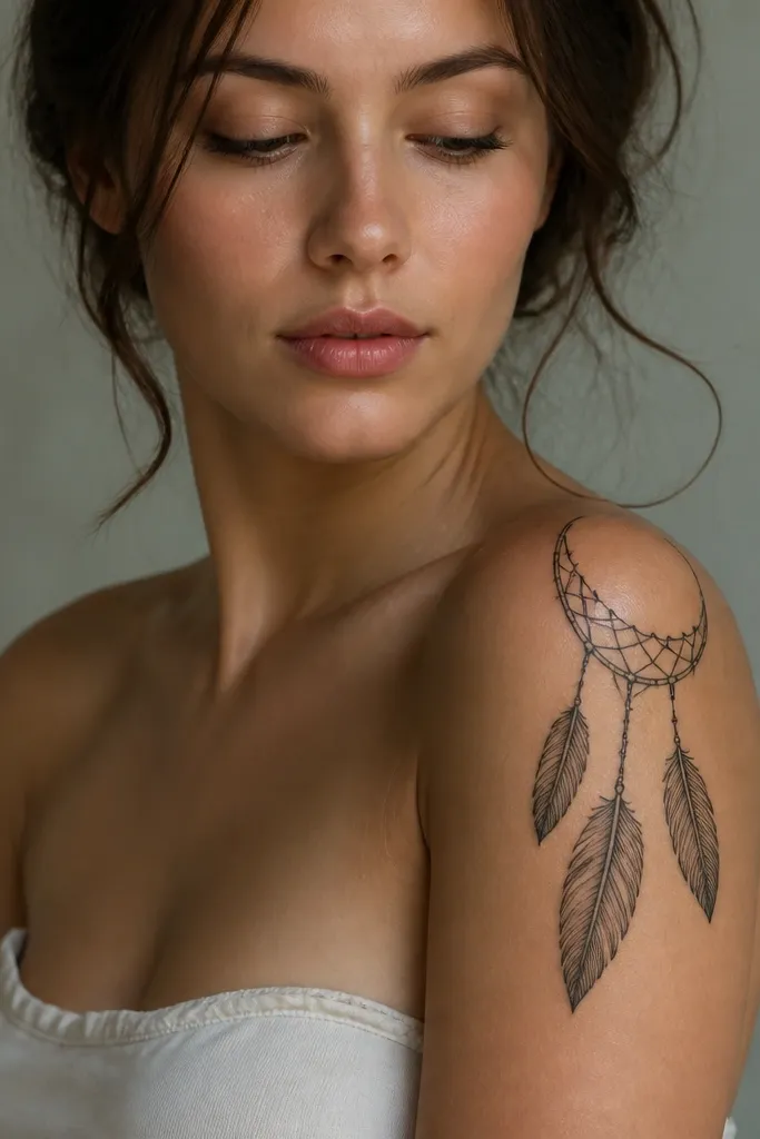
This reads modern because it's not the full, old-school dreamcatcher. The open loop matches the shoulder curve and keeps the design from wrapping too tight. Feather edges look best when they're drawn with clean, slightly tapered silhouettes instead of thick fills.
Place the loop so the open gap faces slightly forward. Hang feathers down 3-5 cm, and keep the web lines thin with a few micro dot knots. Use gray shading only on feather bases so the feathers look dimensional.
Pro tipFor couples, swap the feather count: you do two feathers, your partner does three, while keeping the loop size identical.
AvoidAvoid dense webbing across the whole loop; it turns into a dark ring that loses the dreamy look.
10. Half-Moon Star Map With One Floating Line
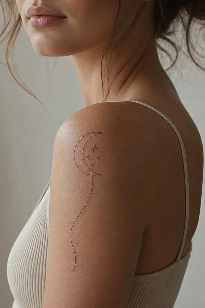
Star maps look modern when they're minimal. The half-moon frames your shoulder curve, and the floating line gives you that "dreamy flow" without filling the whole arm. Tiny stars keep it airy and prevent the design from feeling like a single heavy graphic.
Keep star sizes varied: three micro stars (1-2 mm), two small (3-4 mm), and one slightly bigger (5 mm). Place the floating line so it ends near the outer bicep midpoint. Use black linework with gray haze only at the half-moon edge if you want extra softness.
Pro tipIf you want it to look cohesive with other tattoos, keep all elements on one diagonal - shoulder to outer bicep.
AvoidAvoid too many constellations; it becomes a busy patch instead of a modern flow piece.
11. Calla Lily Watercolor Wash on Outer Shoulder
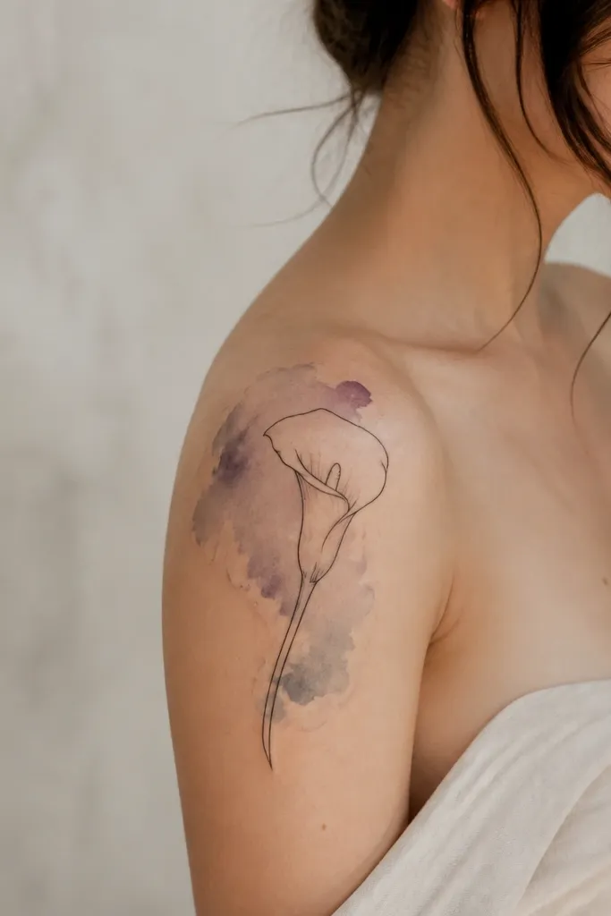
Watercolor effects look best when the tattoo has a clear outline anchor. The calla lily gives structure, and the wash stays behind it so you don't lose the flower shape. Pale lavender on the shoulder looks dreamy in daylight and doesn't overpower your skin tone.
Use a thin black outline only for the lily's main silhouette. Keep the watercolor wash light and mostly behind the outline, with a few wispy blooms toward the lower edge of the upper arm. Plan the wash so it doesn't cross the armpit crease; that area gets rubbed and fades faster.
Pro tipAsk for a test patch of the stencil placement with a quick wash color reference. If it looks too intense on skin, your artist can pull it back before ink goes in.
AvoidAvoid bright neon watercolor; it looks harsh on skin and fades unevenly.
12. Bra Strap-Friendly Vine With Tiny Buds
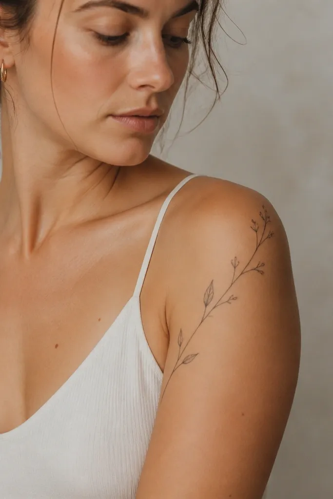
This placement is practical and still pretty. When the vine stays high on the shoulder and outer bicep, it peeks out under straps and looks intentional rather than hidden. The buds add rhythm, and the small leaf shapes keep the line from looking like a single cord.
Keep the vine width narrow - about 6-8 mm at the thickest spot. Place 4-6 buds along the vine, with one slightly larger bud near the shoulder cap. Use soft gray shading in the buds only, and keep leaves mostly outline.
Pro tipWear the bra or tank top you live in and do a quick mirror check. Mark where the strap hits; design should sit above that line.
AvoidAvoid letting the vine dip too low. If it crosses the armpit crease, it blurs faster from friction.


