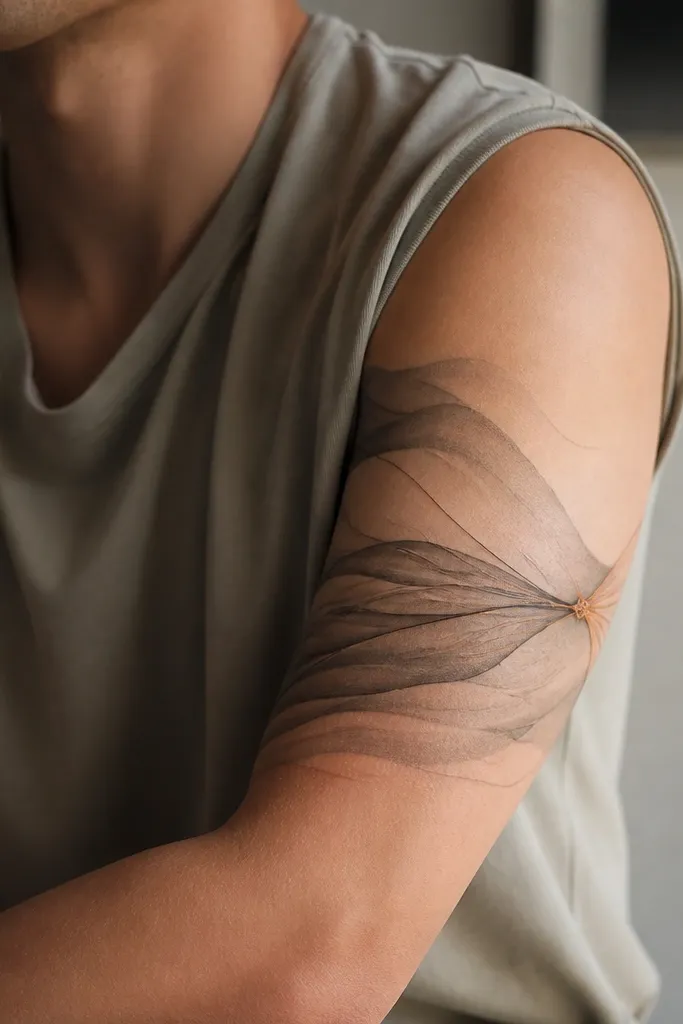
1. Lantern + Dotted Warmth Half Sleeve
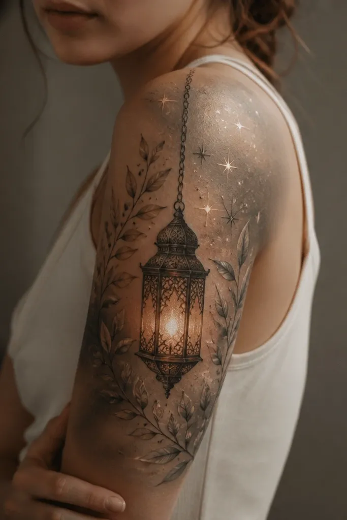
This design reads cozy because the lantern shape naturally signals comfort and protection. The dotwork inside the lantern creates a soft "light" effect without looking like harsh neon. I like the warm gray-to-light gradient because it makes the background breathe - your skin still shows through, so the tattoo doesn't feel heavy. Terracotta around the lantern glow gives a warm tone that looks good with gold jewelry and neutral outfits.
Ask for the lantern to sit slightly higher on the outer bicep, angled about 10-15 degrees so it follows your arm curve. Build the background with fine dotwork bands that thin as they move toward the inner arm. Keep the line thickness consistent - medium thin outlines for the leaves, and a slightly thicker outline only on the lantern frame.
Pro tipWear a scoop-neck or off-shoulder top for the first couple weeks after healing so you can see the lantern edge clearly in daylight.
AvoidDon't go full black fill on the lantern frame or it turns cozy into bulky.
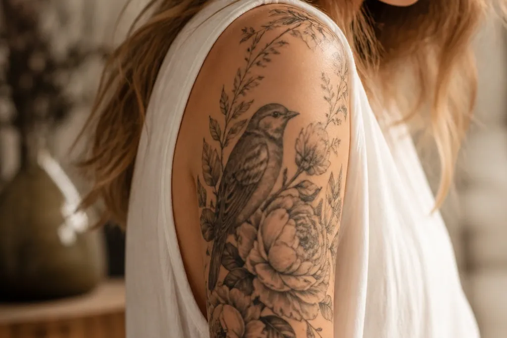
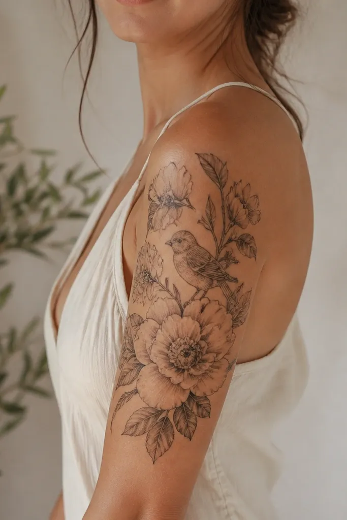
2. Matching Hands Holding a Charm (Upper Arm Cozy Pair)
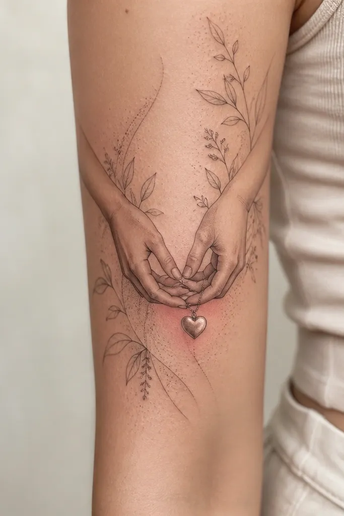
Hands holding a charm feels meaningful because it's about specific connection, not just a symbol. The cozy part is the skin-like shading on the palms and the light blush tone around the charm. A thin chain keeps the piece delicate and wearable, especially on upper arm where you see it often. Botanical linework around the hands makes it feel personal and lived-in instead of sterile.
Place the clasp point of the hands on the outer upper arm so it catches the light when you raise your arm. Keep the fingers slightly curved toward the center; flat, straight fingers look stiff and age less gracefully. For matching couples, keep the hands and charm identical, then change the background flower - one partner gets small daisies, the other gets tiny wild roses.
Pro tipIf you want it to read cozy in photos, add a very light warm blush in only 1-2 spots near the charm, not across the whole background.
AvoidSkip thick black outlines on fingers; they blur faster and kill the gentle look.
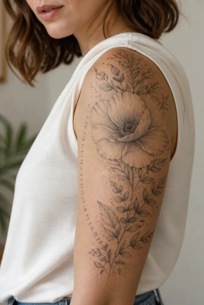
3. Soft Rose + Tiny Lettering Strip (Meaning Half Sleeve)
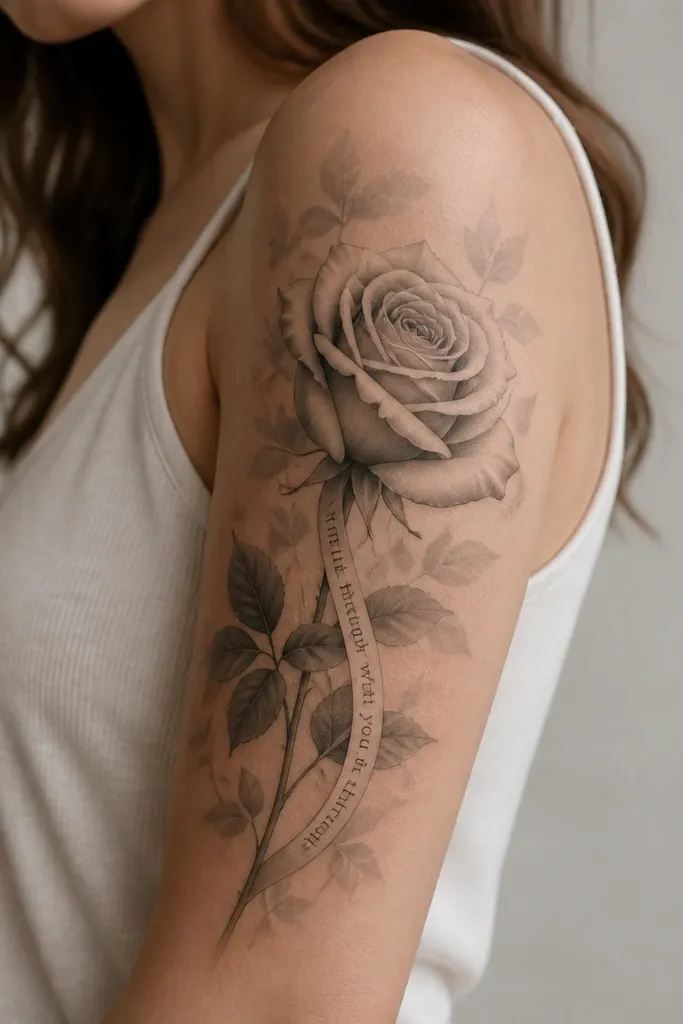
This one works because the rose gives a clear focal point while the small lettering strip anchors the meaning. I like tiny lettering placed on a curved strip instead of floating text - it looks intentional and stays readable longer if the font is clean and the size is not too small. The cozy feel comes from the soft petal shading and the restrained background. Use grayscale for the rose and keep the strip in a similar gray so it doesn't look like sticker text.
Choose lettering that fits 1-2 lines max. Keep it around 6-8 mm tall for upper arm readability, and ask your artist to match the curvature to your bicep. Put the rose bloom near mid-upper arm, and let the stem drift diagonally toward the inner arm so the composition feels wrapped.
Pro tipBring the exact phrase you want printed in plain font, then have your artist adapt it into a slightly arched script so it follows the arm.
AvoidDon't pick ultra-thin microtext fonts; they fade into gray fuzz.
4. Crescent Moon + Wrapped Cloud Lines
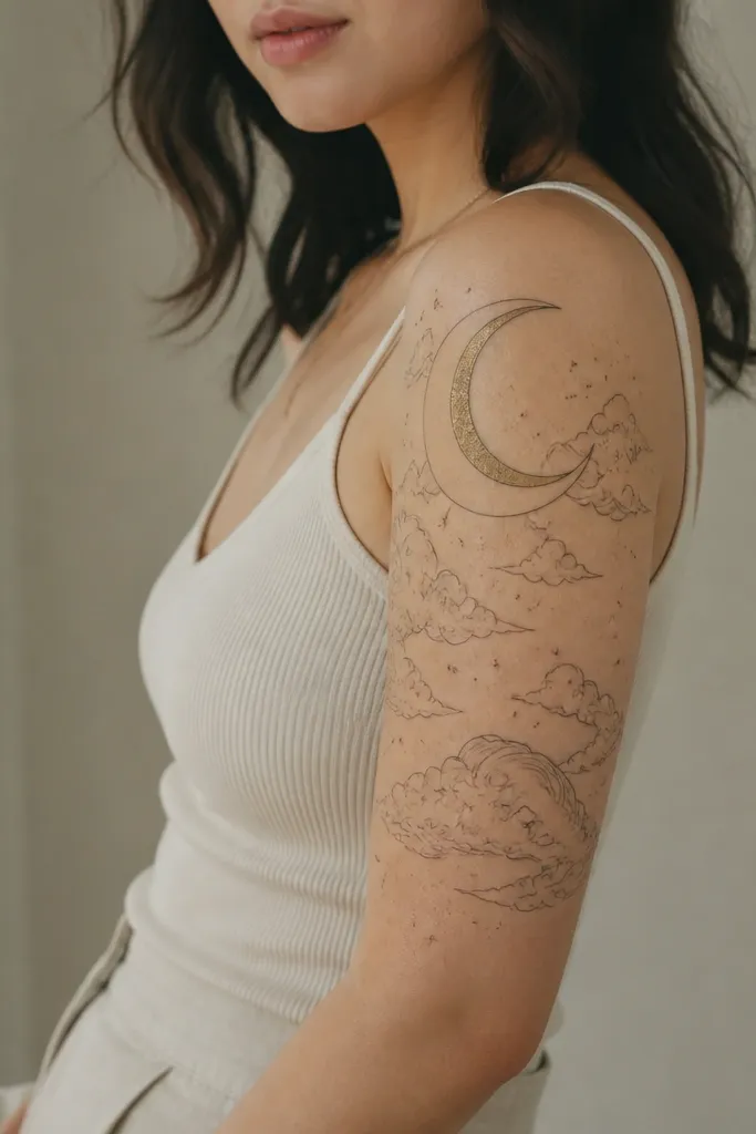
Crescent moons feel meaningful when they represent timing, hope, or a shared "we met" moment. The cozy look comes from the cloud lines - they're curvy and gentle instead of sharp. Thin linework with soft shading keeps the design airy, so it still looks good under short sleeves. The honey-gold wash gives warmth without turning the whole tattoo into a cartoon.
Ask for the moon to sit at the upper third of the arm, with the cloud lines wrapping from outer to inner arm. Keep stars small and sparse - more than about 20 across the half sleeve starts to look busy. Use a subtle honey-gold only in the moon highlight, not in the clouds.
Pro tipIf you're sensitive to tattoo brightness, request the gold to be a light wash rather than solid pigment.
AvoidAvoid heavy black shading under the moon; it makes the piece look like a sticker.
5. Cozy Coffee Cup + Steam Heart
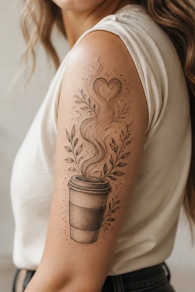
This is for couples who want meaning that feels everyday, not ceremonial. The steam heart reads sweet and cozy because it's implied, not overly literal. I've seen this design heal beautifully because most lines are thin and the shading is light, so it doesn't turn muddy. The cup outline gives structure while the dotwork keeps it warm and soft.
Keep the cup slightly vertical, with the lid sitting around the outer upper arm. Steam should curve backward toward the bicep so it doesn't fight elbow movement. For a matching set, swap the cup label: one partner gets a simple line icon (like a star), the other gets a tiny initial monogram on the band.
Pro tipChoose a grayscale cup with one warm accent in the steam heart - dusty rose looks extra cozy on warm skin tones.
AvoidDon't add thick steam swirls; they expand as they heal.
6. Infinity Loop With Warm Botanical Frame
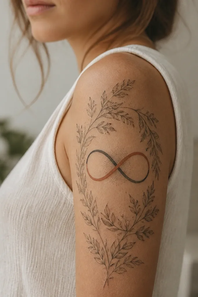
Infinity tattoos feel meaningful for couples because they're about continuity and shared "always." The cozy version adds a botanical frame so it feels like care, not a math sign. The terracotta tint on only one side of the infinity creates warmth and dimension while keeping the design balanced. Light dot shading behind the symbol keeps the center legible without heavy black blocks.
Have the infinity sit about halfway down the outer arm, not at the shoulder. Make the loops slightly wider than your fist so they don't look cramped when the arm bends. For couples, keep the infinity identical and change the botanical species - one uses lavender buds, the other uses small eucalyptus leaves.
Pro tipAsk for the frame to "break" slightly at the inner arm edge so the tattoo looks wrapped, not boxed.
AvoidAvoid symmetrical heavy leaves on both sides - it makes the infinity look trapped.
7. Handwritten Coordinates on a Soft Map Background
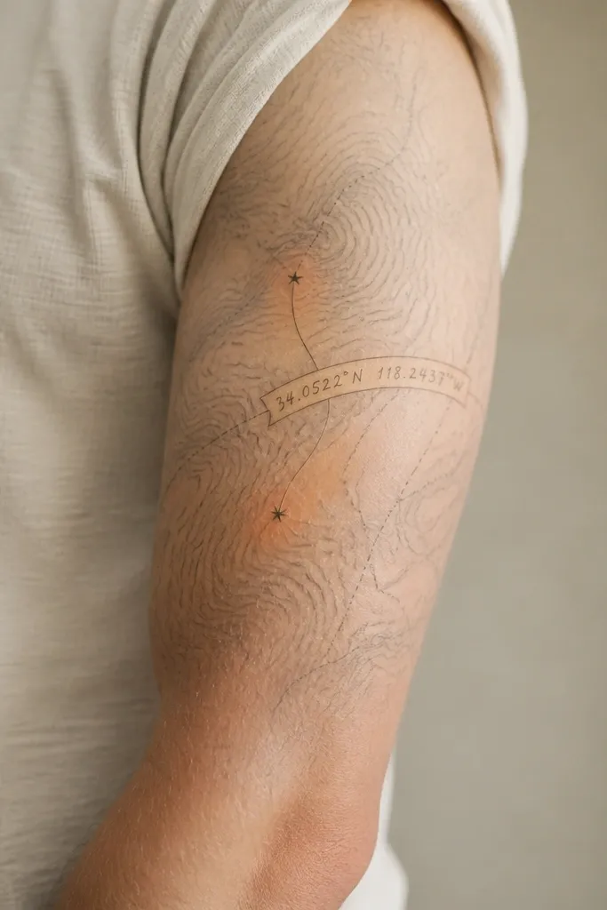
Coordinates feel meaningful because they tie to a real place, not a generic quote. The cozy look comes from keeping the map background very light and letting the handwritten coordinates lead. Star dots add warmth and focus without clutter. I like a faint warm wash near the marked points (honey gold or dusty rose) because it makes the ink feel like light on paper.
Use map lines that are thin and spaced - if the topo lines are too dense, they blur together after healing. Place the coordinates along the outer arm curve so you can read them when you look down at your arm. For matching couples, keep the font and strip identical but swap the marked locations for each person.
Pro tipPrint the coordinates in the exact format you want first (including commas) so your artist matches spacing.
AvoidDon't pick a map style with heavy black contour lines; it turns into a gray smudge.
8. Warm Sunburst Over a Sleeping Heart
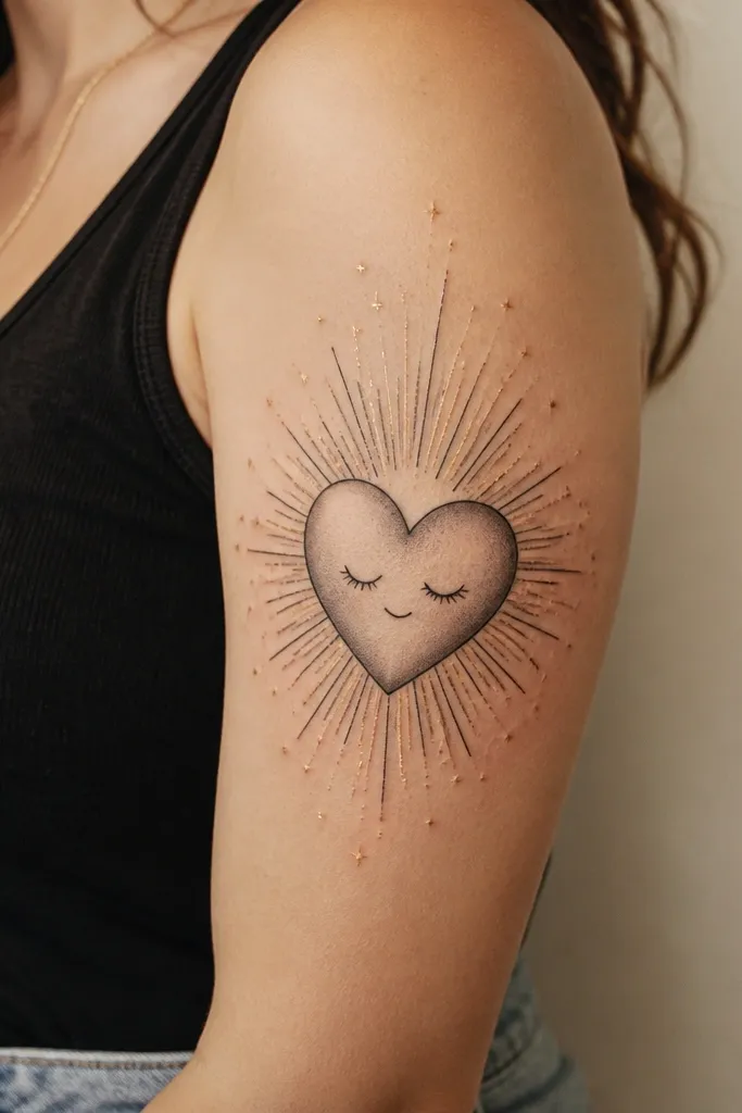
This tattoo reads cozy because it feels like rest and safety. The sleeping heart is expressive without being childish when you keep the face minimal and the shading smooth. The sunburst rays give meaning (warmth, "we'll make it") while staying light enough for upper arm placement. Gold highlights only in the rays keep it warm, not flashy.
Place the heart slightly lower than mid-bicep so it sits comfortably when your arm is relaxed. Keep rays short and evenly spaced, roughly 1-2 mm wide at the base. For matching couples, mirror the heart expression - same closed eyes and shading - but give one partner a small crescent moon charm on a string near the top edge.
Pro tipIf you want it to feel extra cozy, request a soft gray shadow under the heart to make it look resting on skin.
AvoidAvoid thick, long rays; they look aggressive on upper arms.
9. Candle Flame + Leaf Smoke Effect
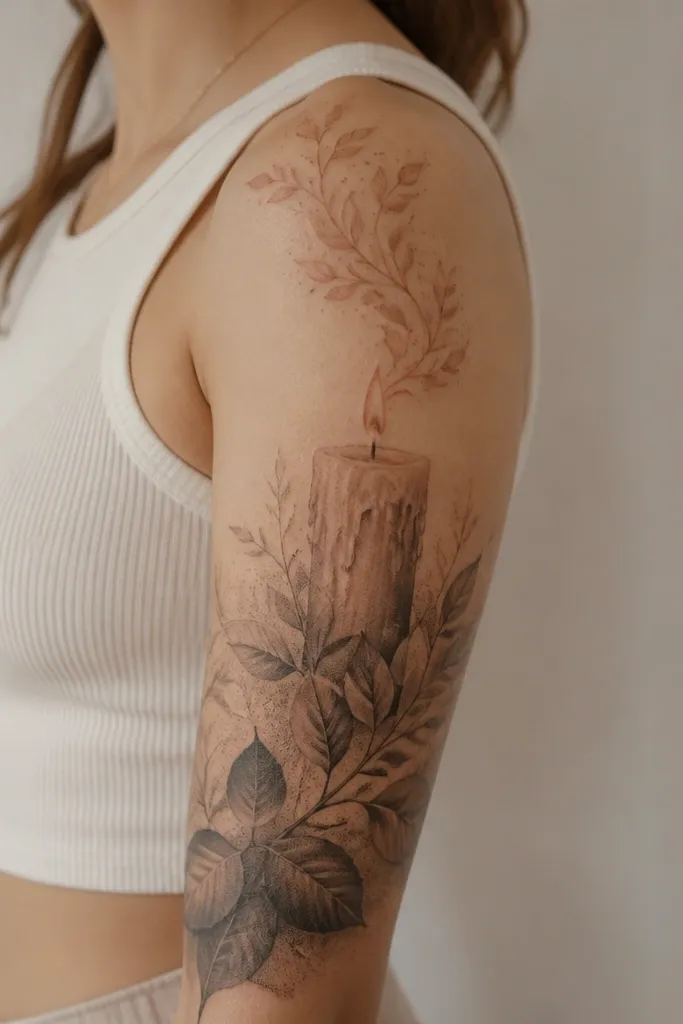
Candle tattoos feel intimate because they connect to time, rituals, and "we keep each other going." The leaf smoke effect makes it cozy instead of dramatic - it looks like comfort drifting upward. A gradient flame stays soft on skin compared to solid fills. Dotwork smoke keeps the transition smooth so the background doesn't look cut out.
Keep the candle wick and flame linework fine, then add a small terracotta tint only in the flame center highlight. The smoke should fade as it approaches the mid arm, thinning into dots. For couples, keep the candle shape identical and personalize the leaf type - one partner gets ivy leaves, the other gets small maple-like leaves.
Pro tipAsk for the smoke to wrap slightly toward the inner arm so it follows your bicep curve.
AvoidDon't add heavy black shadows under the candle; it creates a harsh block.
10. Peony + Hidden Symbol in the Petals
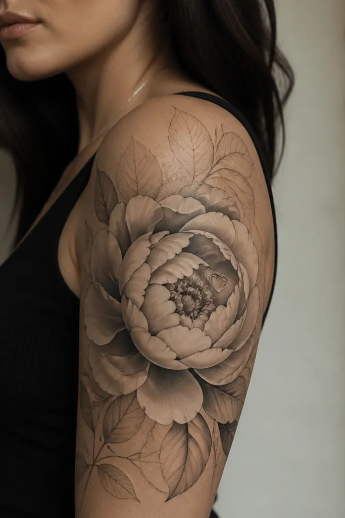
This one is meaningful because it contains a private detail only you notice. Peonies look cozy because their petals are layered and soft, and grayscale shading makes them feel like fabric rather than ink. The hidden symbol keeps the tattoo personal without adding clutter. Light dot shading around the flower edge makes the bloom feel warm and dimensional.
Place the peony so the bloom reaches toward the shoulder but the stem anchors near mid outer arm. Keep the hidden symbol small - around pencil eraser size when drawn - and make sure it's placed on a petal ridge so it stays visible. For matching, each partner gets the same hidden symbol but swap the peony color tint: one gets a dusty rose wash, the other gets a warm peach wash.
Pro tipBring a reference photo of a peony petal pattern so your artist can match the petal spacing and keep the hidden detail readable.
AvoidDon't put hidden symbols in the flat background; they disappear during healing.
11. Waves + Thread Lines Ending in a Knot
Waves tied with a knot feels meaningful for couples because it's about holding on through movement. The cozy look comes from how the waves are drawn - thin, rhythmic curves instead of heavy ocean scenes. Thread lines add a handmade feel, and a warm accent near the knot makes the ending point feel like comfort. It stays interesting when you wear short sleeves because the lines shift with your posture.
Ask for wave spacing that stays consistent, about 4-6 mm between major wave lines. Thread lines should cross the waves diagonally, then tighten into the knot at mid outer arm. For matching, keep the knot identical and change the warm accent: terracotta for one, honey gold for the other.
Pro tipIf you want it to look cozy in photos, keep the background minimal so the knot reads instantly.
AvoidAvoid realistic ocean shading; it makes it look colder than you want.
12. Cozy Birth Flower + Tiny Promise Dates
Birth flower tattoos feel meaningful because they're personal without needing a big story. The cozy look comes from fine linework and light stippling - it looks like delicate embroidery. Tiny promise dates add a "private meaning" element that doesn't dominate the whole design. I like the dates placed on the inner curve because it hides a little when your arm is relaxed, then shows when you flex.
Choose one main flower per arm. Keep the dates small and clean, around 5-7 mm tall, and ask your artist to use a simple font style that won't thicken as it heals. For couples, match the flower placement and dates format, then swap the flower species and the dates themselves.
Pro tipIf you're worried about readability, write the dates yourself in the exact spacing you want and bring it printed for reference.
AvoidDon't add long paragraphs of text; the inner arm edge blurs fast.


