1. Mini Crescent Moon + Micro Stars on Outer Calf
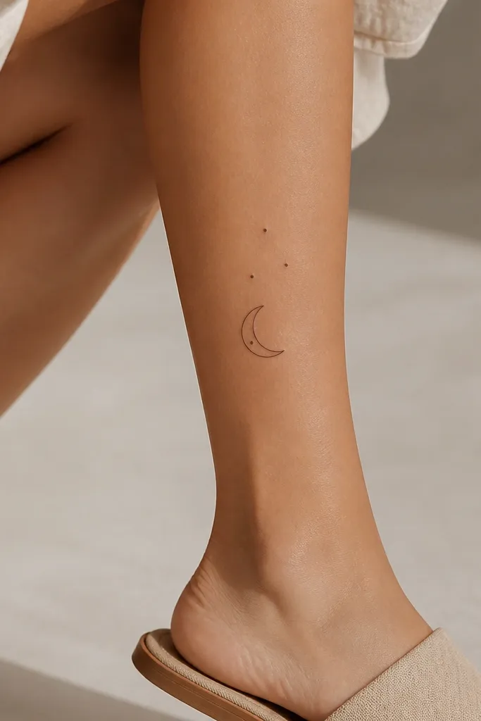
This design looks classy because the crescent gives you a clean silhouette and the micro stars act like controlled sparkle. I like dot stars (not tiny filled stars) because they heal with a soft, even texture instead of looking like ink freckles. The spacing matters - there's a visible gap between the crescent edge and the closest star.
Place it about 3 finger-widths below the knee crease on the outer calf. Keep the moon about 1.5 inches tall and the full star cluster under 2.5 inches wide. Line weight should be consistent - ask for a single needle style for the outline so it doesn't look patchy.
Pro tipIf you're doing this as a matching piece, keep the moon size the same and only vary the number of micro stars. That reads intentional, not like two random tattoos.
AvoidAvoid stars that are all the same size and packed too close - they merge into a single dark blob after healing.
2. Feather Tip Trail with One Tiny Dot Shading
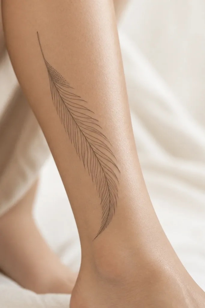
A single feather tip looks dainty because the curves guide the eye. The one dot shading cluster adds dimension without turning the whole thing into a heavy black mass. The barbs stay crisp when the artist uses consistent spacing and doesn't overwork every micro line.
I place this slightly off-center on the back of the calf, with the quill end closer to the knee. Target 3 inches total length. Ask for the feather barbs to start thin and slightly taper so the top doesn't look blunt.
Pro tipWear a pair of shorts or leggings during the stencil check - the leg flexes and you'll see if the curve drifts when you move.
AvoidSkip thick black fills in a feather - they make it look like a patch instead of a delicate trail.
3. Tiny Botanical Sprig Along the Natural Calf Curve
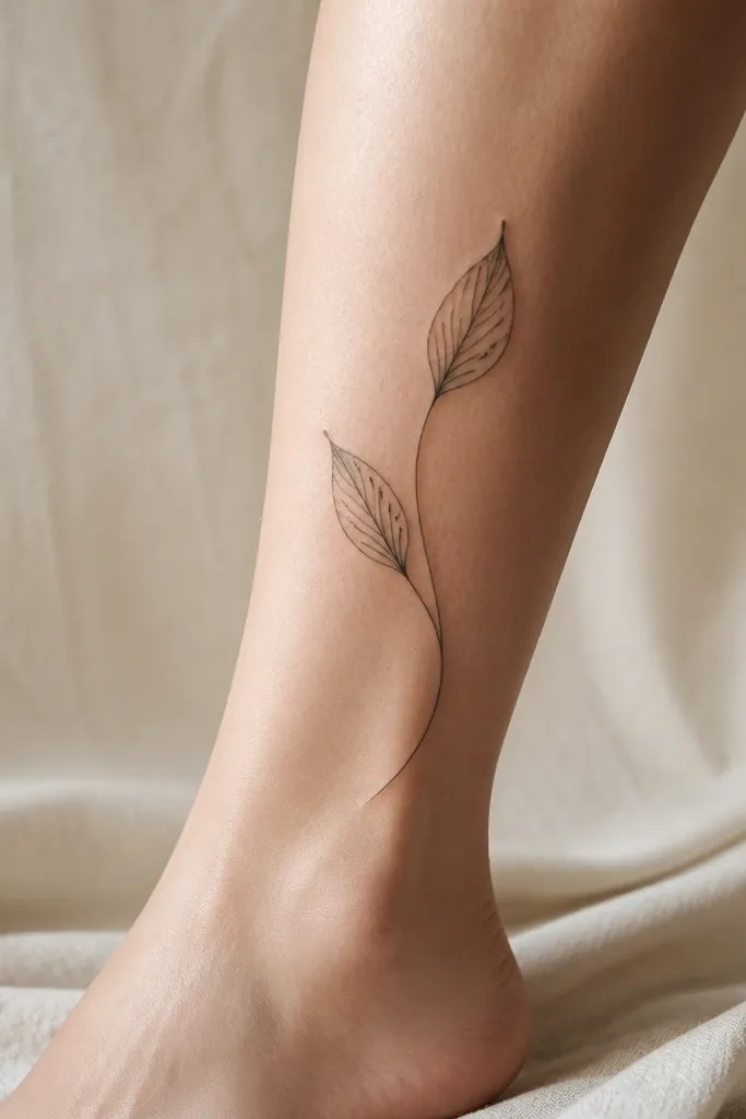
Botanical linework looks classy when it hugs the body's curve. The calf has a natural arc, and a sprig that follows it looks balanced instead of floating. Simple leaf veins add detail without requiring dense shading.
Place the stem vertically leaning slightly outward, about halfway between knee and ankle. Keep it 2.5 to 3.5 inches long. Use linework with light dot or no dot shading so the leaves don't darken too much as they heal.
Pro tipIf you want it to stay low-maintenance, avoid adding tiny text under the sprig. Fine lettering fades faster than the plant lines.
AvoidDon't center the sprig too high on the calf - it can distort when you sit.
4. Single Line Heart with a Small Split at the Bottom
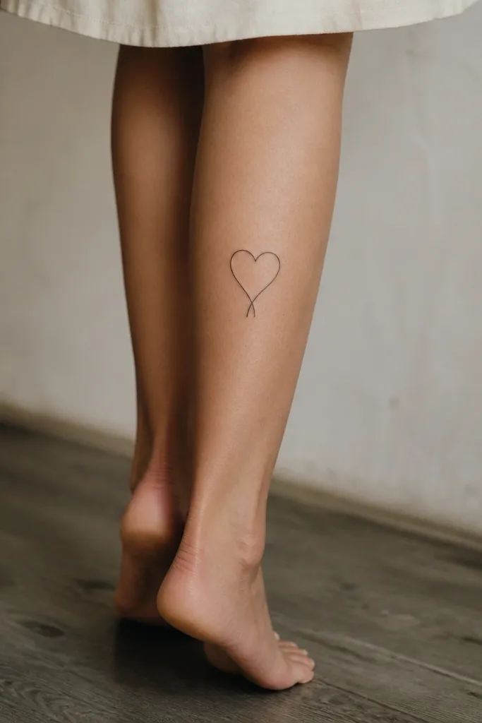
This is classy because it's minimal but still has a design twist. The split at the bottom gives meaning without adding clutter. One-line work also ages well when the line weight is controlled and the artist avoids retracing the same stroke too many times.
Put it on the inner calf where it's visible in a backless dress but hidden when you sit. Size it around 2 inches tall. Ask for a smooth, single continuous line - the split should be a deliberate small detail, not a shaky accident.
Pro tipFor couples, mirror the heart split direction on each person so it matches from the front but still feels personal.
AvoidAvoid very thin "hairline" outlines if your skin is prone to redness - they can heal lighter than expected.
5. Micro Butterfly Wing on Upper Outer Calf
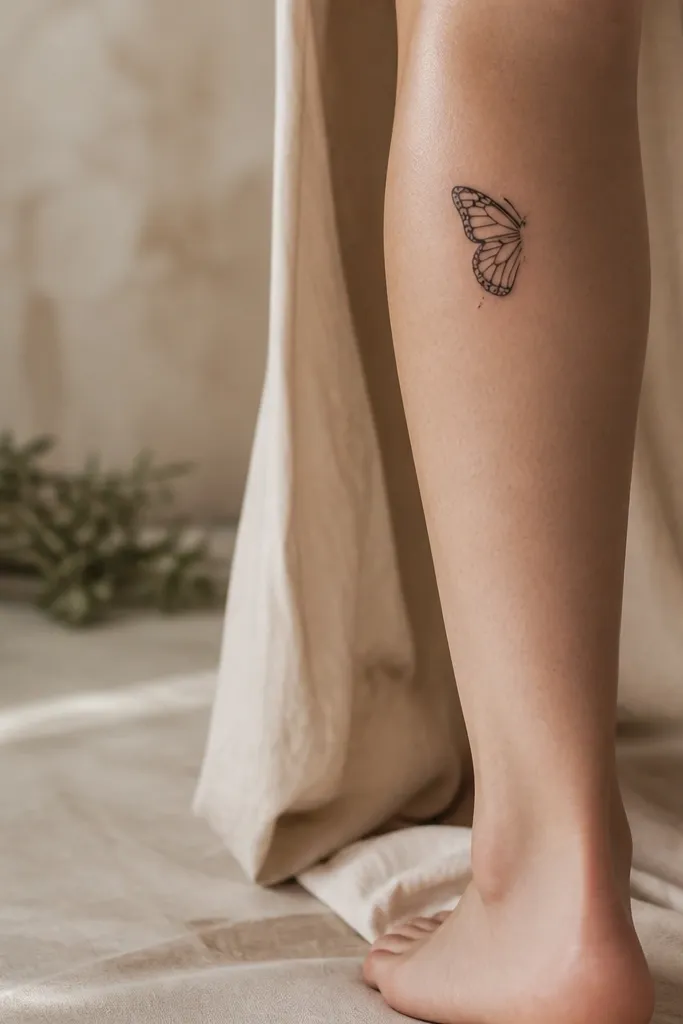
A butterfly can look juvenile if it's overly filled. Keeping it to one wing shape with dot speckles keeps it grown-up. The dot speckles add texture like fine lace, and the curvy inner line pattern gives it movement without heavy shading.
Place it between the outer knee crease and the mid-calf area. Keep it 2 to 3 inches wide. Ask for dot speckles to be sparse - think "pepper," not "sprinkles."
Pro tipSchedule it when you can avoid tight leggings for a few days so dotwork doesn't get irritated from friction.
AvoidDon't do a full butterfly with thick black fill - it will look bulky on the leg.
6. Mini Infinity Loop with a Tiny Gem Dot
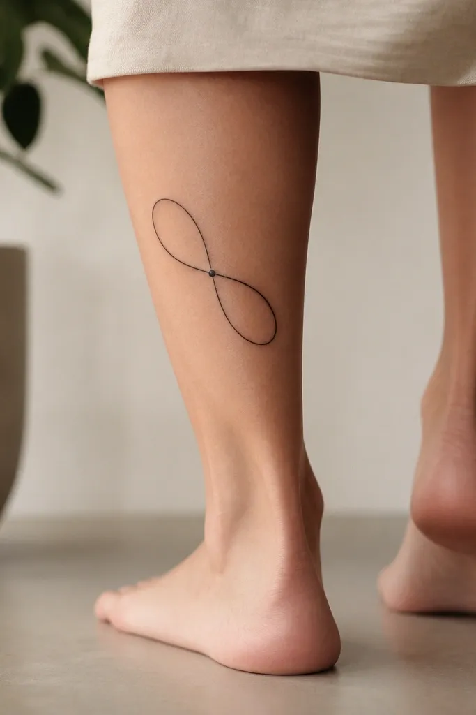
Infinity symbols look classy when they're clean and slightly angled. The tiny gem dot makes it feel finished, like a pendant, without turning into a heavy cluster. This design also heals well because it's mostly continuous linework with one small anchor.
Place it slightly above mid-calf, angled with the loops following the leg's curve. Size around 2.5 inches across. Ask for smooth line turns at the crossing point so it doesn't look jagged.
Pro tipIf you sweat a lot in workouts, pick dotwork anchors sparingly. One dot is easier to keep clean than multiple micro accents.
AvoidAvoid adding extra swirls around infinity - they crowd the line and reduce clarity.
7. Small Lace-Style Bow at the Back of the Leg
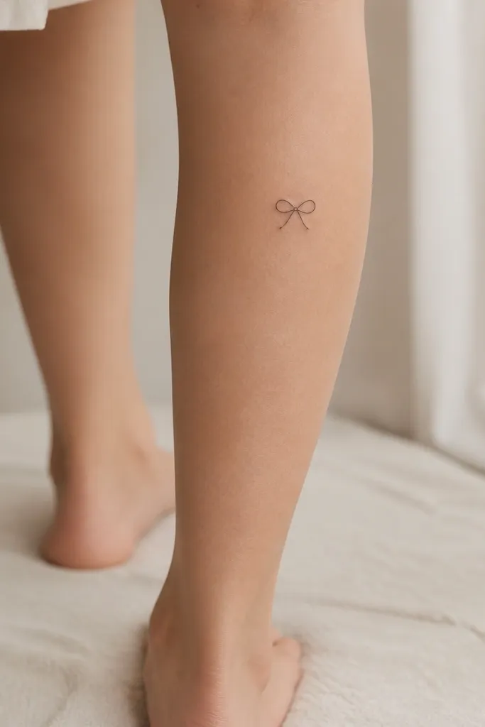
Lace-style details can look expensive when the outline is crisp and the inside lines are minimal. This bow keeps the shape clear, then uses micro interior lines to suggest texture. It reads dainty because the bow footprint stays small and doesn't spread outward.
Place it high on the back of the calf, close to the knee but not on the crease. Size it around 2.25 inches wide. Ask the artist to keep interior lines short so they don't over-darken during healing.
Pro tipWear a skirt or dress that shows it when you walk. These bow placements look best when they catch light from movement.
AvoidAvoid thick black outlines on lace motifs - they kill the delicate look.
8. Three-Line Starburst with Negative Space
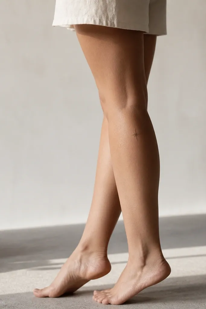
Starbursts look classy when they're not crowded. This one uses just enough geometry to feel intentional, and the negative space keeps it airy. I like three-line bursts more than five-point ones because they look lighter and less "tacky tattoo flash."
Place it about 2 finger-widths below the knee on the outer half of the calf. Keep it under 1.5 inches wide. Ask for sharp line ends and no extra dots around it unless you want a subtle sparkle.
Pro tipIf you're worried about aging, keep the lines slightly thicker than you think. Leg skin texture can make very thin bursts fade unevenly.
AvoidDon't add a full outline circle around the starburst - it turns it into a badge.
9. Mini Peony Bud Outline with One Soft Dot Cluster
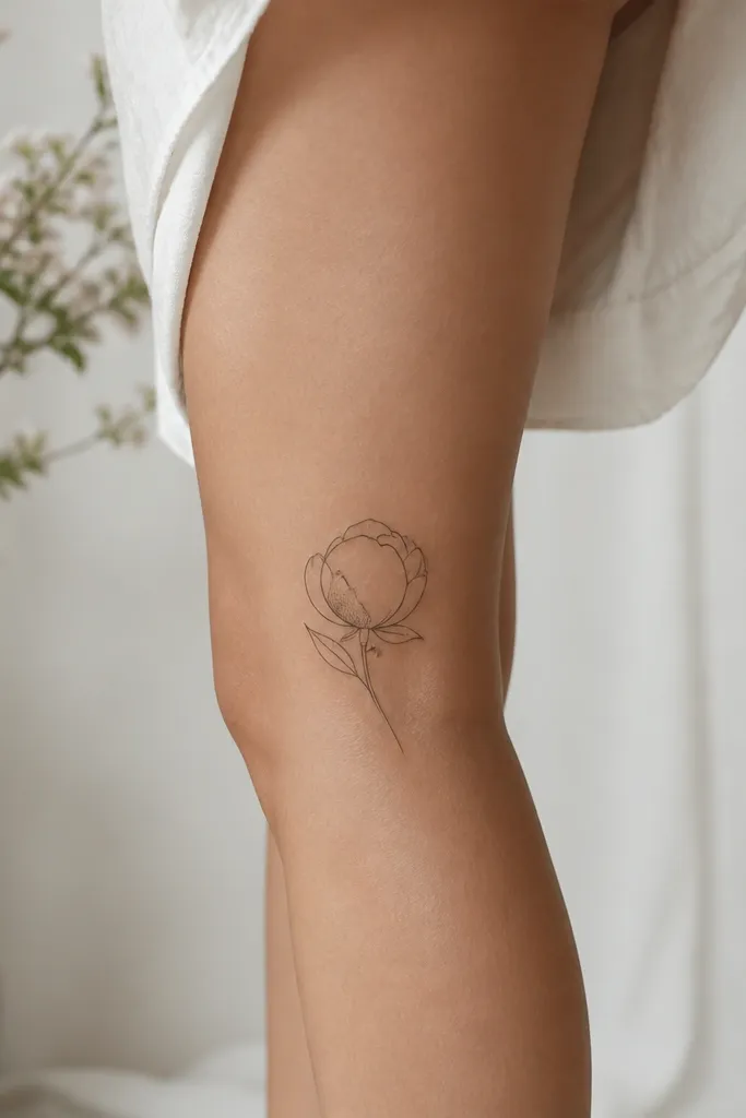
Peonies can get heavy fast, but a bud outline stays dainty. The single dot cluster gives depth without turning the whole flower into a dark ink mass. Petal linework looks best when the artist uses curved, consistent strokes rather than tiny angular hatching.
Place it on the outer back of the calf, slightly lower than mid-calf. Size it 3 to 4 inches tall so the bud doesn't look like a random scribble. Ask for dot shading only on one area so it heals with a soft gradient.
Pro tipIf you want it low-maintenance, skip color. Black line + light dot shading ages more predictably than color in high-friction areas.
AvoidAvoid filling multiple petals with dense dots - it will look muddy as it fades.
10. Tiny Roman Numeral Date Under a Small Leaf
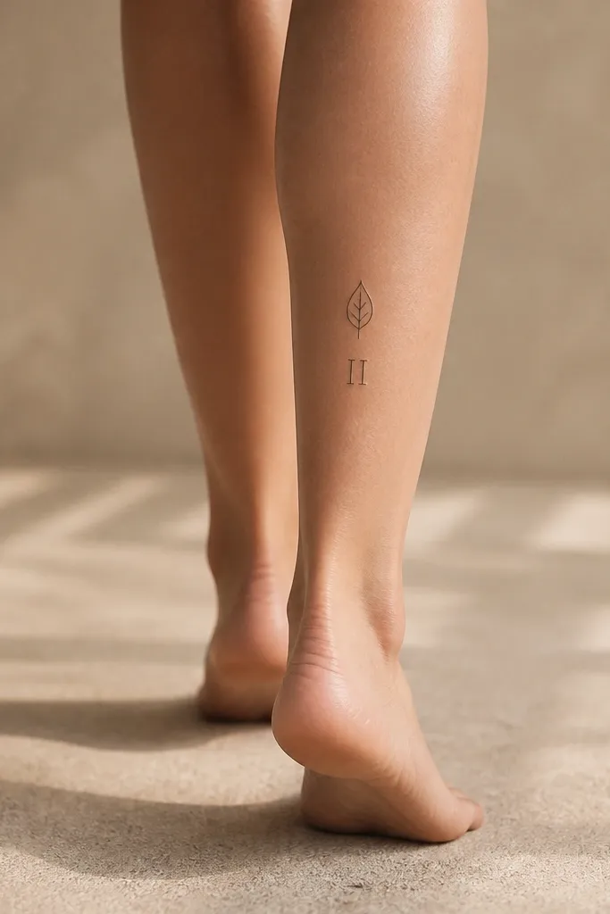
This combo looks classy because the leaf frames the meaning and the numerals stay readable. I like Roman numerals in thin linework only when they're large enough to be legible after healing. The leaf adds softness, so it doesn't look like a label.
Place the leaf and numerals on the inner outer edge blend - basically the area that catches light but avoids heavy crease. Target 2.5 inches total height, with numerals about 1 inch tall. Ask for the numerals to be straight and aligned, not curved to match the leaf.
Pro tipBring the exact font you want on paper. If the artist free-hands the numerals, you can end up with uneven spacing.
AvoidAvoid tiny numerals under 0.75 inches tall - they blur faster than the leaf lines.
11. Thin Line Sunburst with Two Micro Rays
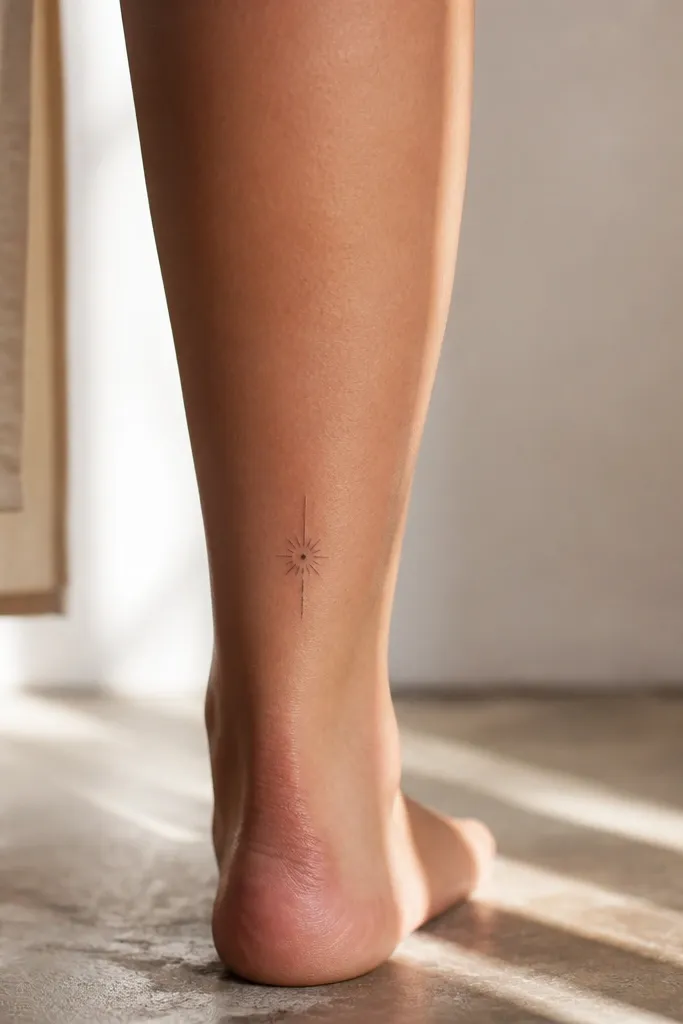
A minimal sunburst reads like jewelry. The dot center gives you a focal point, and the mix of two longer rays keeps it from looking like a simple scribble. This works because the design is structured but still light.
Place it close to the ankle side of the calf, about 1 to 2 inches above where your sock line hits. Keep it about 2 inches wide. Ask for the center dot to be slightly filled, not just an outline circle.
Pro tipIf you wear boots or tight socks, put it a little higher so fabric friction doesn't chew the lines.
AvoidDon't pack lots of rays around the center - it turns into a star smudge.
12. Curved Mini Arch of Dots Like a Bracelet Charm
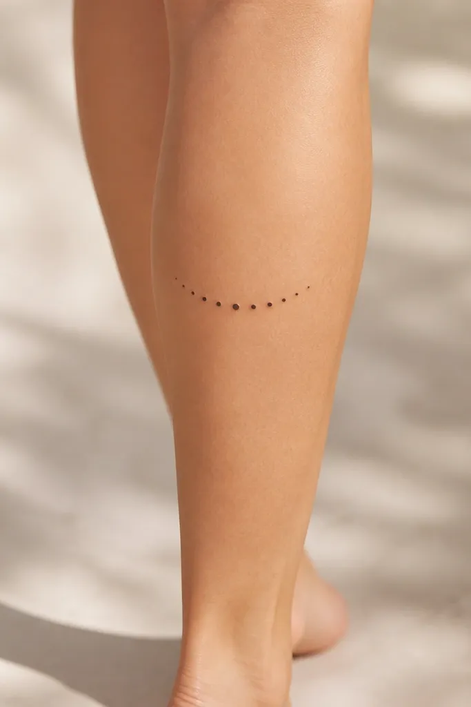
Dot arches look classy because they resemble jewelry settings. The slight dot size variation makes the center pop without adding extra shapes. This is also one of the most low-maintenance options because there are no thin line segments that can break during healing.
Place it mid-calf on the outer side so it shows when you turn. Size it around 2.75 inches across. Ask the artist to keep dot spacing even - uneven spacing is what makes dotwork look cheap.
Pro tipChoose this design if you want something that still looks good with light scarring or uneven skin texture. Dots hide small healing variations better than single hairline strokes.
AvoidAvoid a dot arch that's too thin and stretched - it can look like a scratch when it fades.


