
1. Micro Chain Link Arrow
This design stays classy because the arrow shape gives direction without needing thick shading. The chain links add texture while keeping the lines delicate. Dot highlights near the head catch light and make the tattoo look crisp even when it's faded. It also pairs well with a low-back dress because the arrow reads cleanly from the side.
Place it centered, about 6-7 cm tall, with the arrowhead sitting just above the shoulder blade line. Keep link thickness consistent - each link should be about the same width as the line weight. Ask for black ink with tiny stipple dots only where the arrowhead curves.
Pro tipTell your artist you want "one anchor, no clutter." The links should not branch into extra curls.
AvoidAvoid adding extra swirls around both sides - it makes it look busy and harder to heal.
2. Dainty Crescent With Star Dust
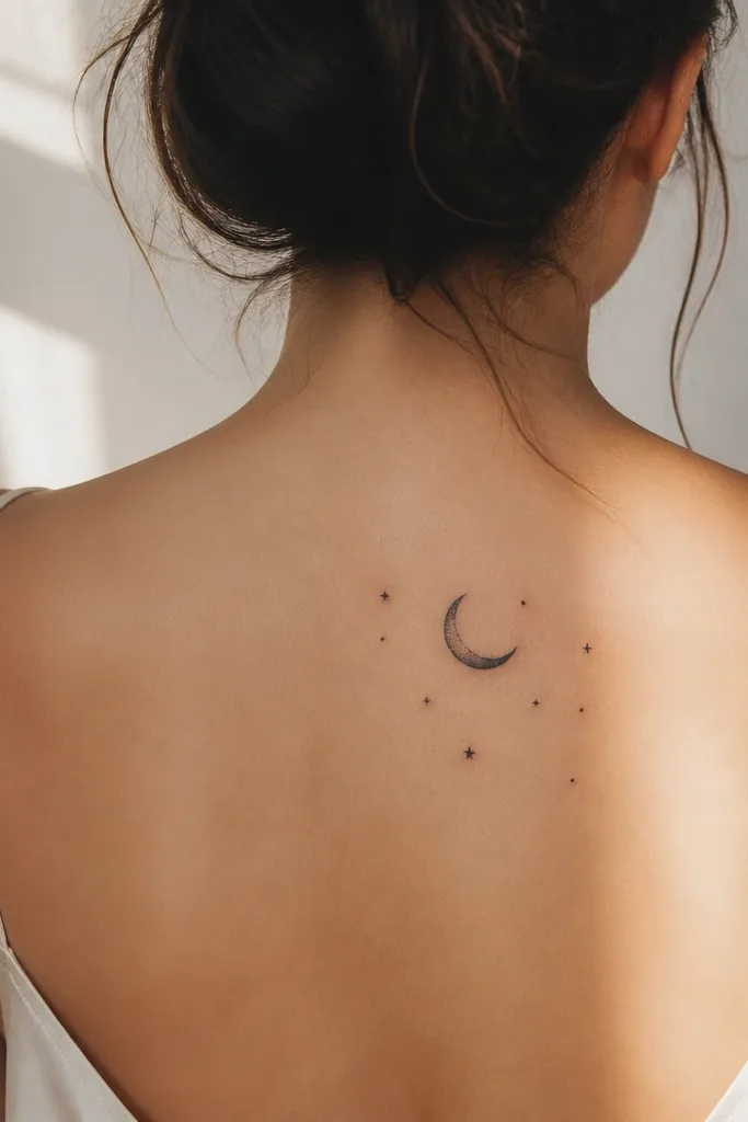
A crescent is naturally elegant on the back because it follows the body's curve without needing big lines. The star dust dots make it feel airy instead of heavy. When the stars are tiny and spaced, they age better than large filled stars. This one looks especially classy with silver jewelry because the dots mimic sparkle.
Target 5-6 cm for the crescent, with the stars spread within a 7-9 cm area. Keep the stars mostly dot-only, with no thick outlines. Use soft dot shading under the crescent's inner edge to give it depth.
Pro tipChoose placement slightly higher than you think, around the top outer shoulder blade, so it shows under a strappy dress.
AvoidSkip thick black stars - they scab thicker and blur faster.
3. Single Rosebud On The Spine Line
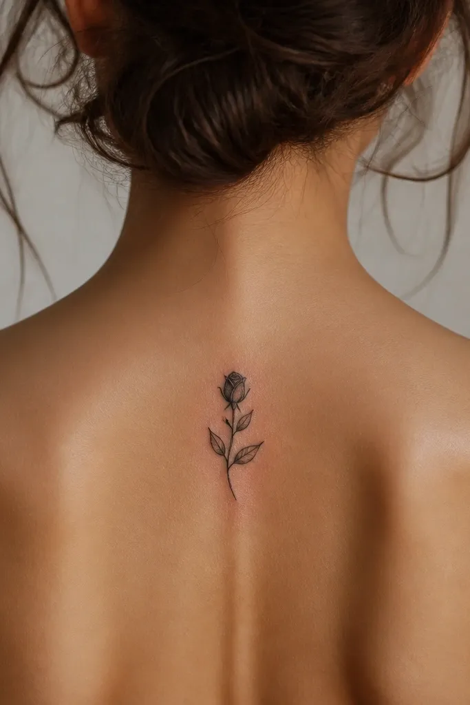
One rosebud reads refined when it's restrained. The petal separation lines create classy detail without needing full realism. Fine leaf veins keep it interesting up close but still look delicate from a distance. I like this for women who want something romantic but don't want a full back garden.
Place it along the spine line between T4 and T6. Size it around 7 cm tall, with the bud tip pointing slightly upward. Ask for black ink only, with very light gray dot shading inside the petals.
Pro tipBring a reference for "rosebud, not full bloom." Full blooms spread and look heavier on the back.
AvoidAvoid large shading gradients - they turn into muddy gray on skin.
4. Tiny Butterfly With One Line Wing
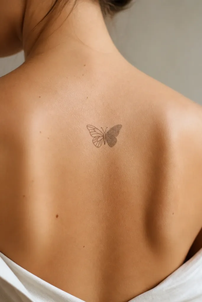
This butterfly looks classy because one wing is minimal and the other has texture. The contrast keeps it readable as it ages. Dot texture gives movement without dense fill. It also looks good with low-back tops because the upper outer blade area shows the wings nicely.
Keep it small - about 4.5-5.5 cm across. Place it slightly angled so the body sits parallel to your shoulder line. Ask for a crisp black outline on the body, then micro dot shading only on one wing.
Pro tipRequest that the artist leaves tiny gaps between dot clusters so the skin still shows through.
AvoidSkip symmetrical full-dot wings - they can look like a blob after healing.
5. Slim Feather With Negative Space Barbs
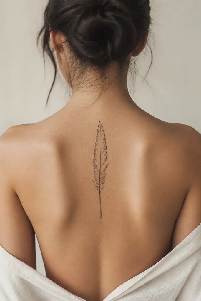
Negative space makes feathers look higher-end. You get fine "barb" detail without filling everything in, so the tattoo stays light and classy. The empty interior also helps it age - there's less heavy ink to blur. This is a great pick if you want something airy but still clearly a feather.
Choose a vertical placement about 6-8 cm tall, centered or slightly off-center near T5. Ask for thin line barbs that don't crowd - leave at least a small gap between barbs. Use only light gray for a single shadow line along one edge.
Pro tipIf you wear high-neck bras, place the feather slightly higher so it doesn't get covered and faded early.
AvoidAvoid thick feather fill - it heals slower and loses the feather shape.
6. Mini Mandala Quarter-Circle
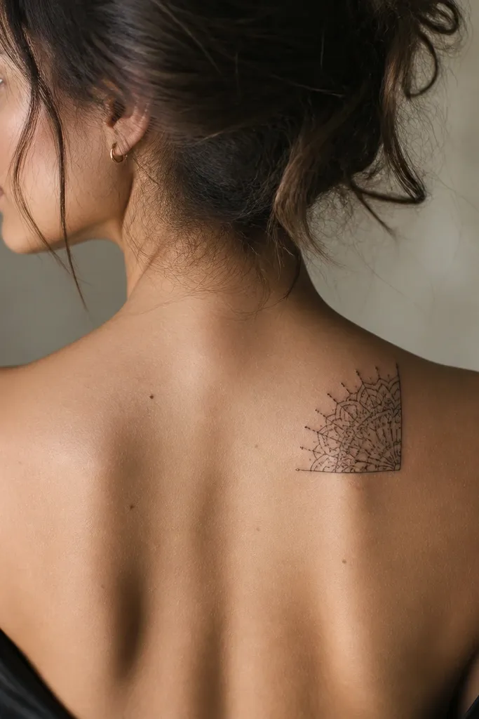
A quarter-circle mandala looks classy because it's structured but not overwhelming. The radial lines create order, and the dots add a soft sparkle effect. Keeping it to a quarter avoids the "full mandala heaviness" that can feel too busy on the back. It also looks great in photos because it frames your shoulder blade naturally.
Size it to fit within 8-10 cm wide and 6-8 cm tall. Place it so the straight edge sits closer to the spine, and the curved edge follows your shoulder blade curve. Keep the linework fine and the dot clusters small - no dense ring fills.
Pro tipAsk for a "line hierarchy" - thicker outer dots, thinner inner lines.
AvoidSkip full circular mandalas on the upper back - they crowd easily.
7. Dainty Keyhole With Tiny Heart
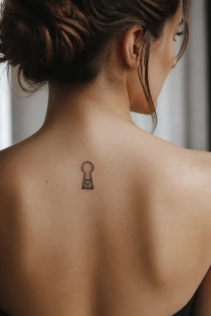
Keyholes feel classy because they're graphic and clean. The tiny heart gives the meaning without turning it into a big romantic tattoo. Dot shading around the heart adds depth while staying light. It reads well under thin straps and looks intentional from the side.
Keep it 5-6 cm tall, placed slightly off the spine at T5-T6. The keyhole opening should be narrow, not rounded wide, so it stays dainty. Use black ink with a few micro dots only in the lower curve of the keyhole.
Pro tipBring a reference that matches the keyhole shape you want - some keyholes look too old-school and heavy.
AvoidAvoid thick solid keyhole fills - they turn into a dark patch.
8. Sakura Petal Trio Behind The Shoulder
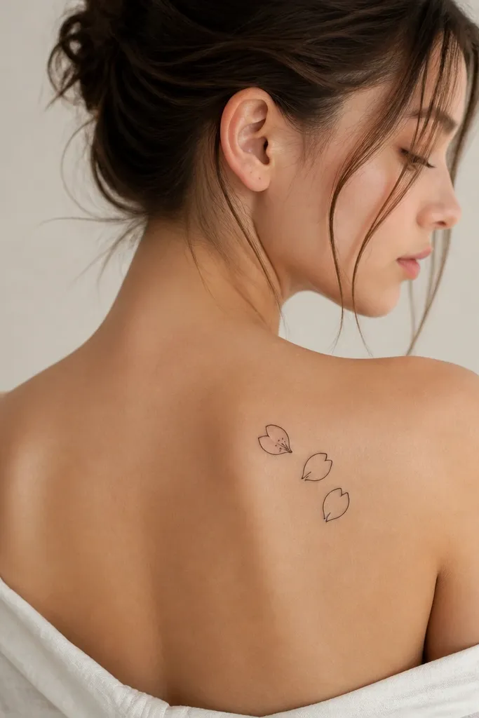
Three petals look delicate and feminine without needing a whole branch. The light pink accent keeps it classy because it's small and controlled, not a big color block. Dot centers add a soft focal point. This one looks especially good if you wear off-shoulder tops and want a peek of color.
Place it on the upper outer shoulder blade, around 7-9 cm wide. Keep petals separated with negative space between them. Ask for black outline with a tiny pink wash inside one petal only, plus micro dot shading in the centers.
Pro tipUse watercolor-style pink, not opaque color - it fades more gracefully.
AvoidAvoid multiple pink petals - it can turn into a faded bruise-looking patch.
9. Mini Wave Crest With Single Dot Spray
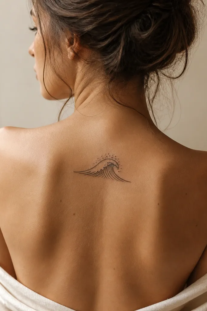
Waves look classy when they're minimal. Fine lines keep the crest airy, and a single dot spray adds texture without clutter. This design ages well because it doesn't rely on large filled areas. It also looks great with clean, modern outfits because it feels calm and simple.
Size it 6-7 cm wide, placed at T4-T5. Keep the wave lines thin and slightly curved to match your shoulder blade. Put the dot cluster only above the highest point of the crest.
Pro tipAsk the artist to keep the dots smaller than the wave line thickness.
AvoidSkip thick curved shading - it turns into a dark band.
10. Tiny Roman Numerals With Leaf Ends
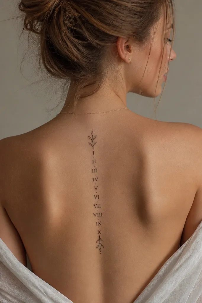
Roman numerals with leaf ends look classy because they're readable and still delicate. The leaf flourishes soften the typography so it doesn't look like a calendar sticker. Fine linework keeps it dainty, and the leaf ends add a natural rhythm. This is a good option for couples who want matching dates without huge script.
Keep the numerals around 3-4 cm tall and add leaves that extend another 1-2 cm. Place it centered along the spine at T6. Use black ink only, with leaf veins shown as two or three fine lines.
Pro tipChoose numerals with simple shapes like IV, VI, or IX. They hold up better than tiny ornate fonts.
AvoidAvoid ultra-thin cursive script - it disappears fast.
11. Micro Sunburst Dot Halo
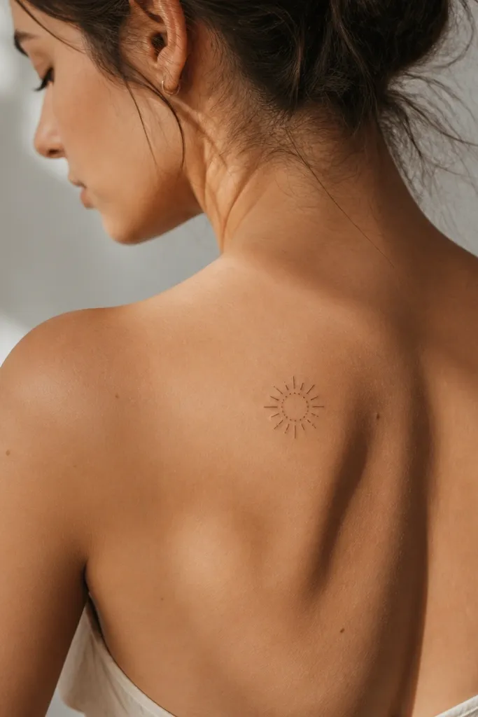
A dot halo gives you a "glow" effect without heavy shading. The short rays add energy while staying dainty. This design looks classy from a distance because it reads as a clean circle and from close up because you see the dot texture. It also pairs well with gold jewelry and warm-toned outfits.
Size it 5-6 cm across. Place it slightly above the shoulder blade center so it doesn't get stretched when you reach overhead. Ask for dot halo in black with a few short rays in the same line weight, no thick fills.
Pro tipRequest a perfectly even circle - even spacing makes it look intentional.
AvoidSkip long rays - they look messy as they blur.
12. Dainty Butterfly Chain With Two Charms
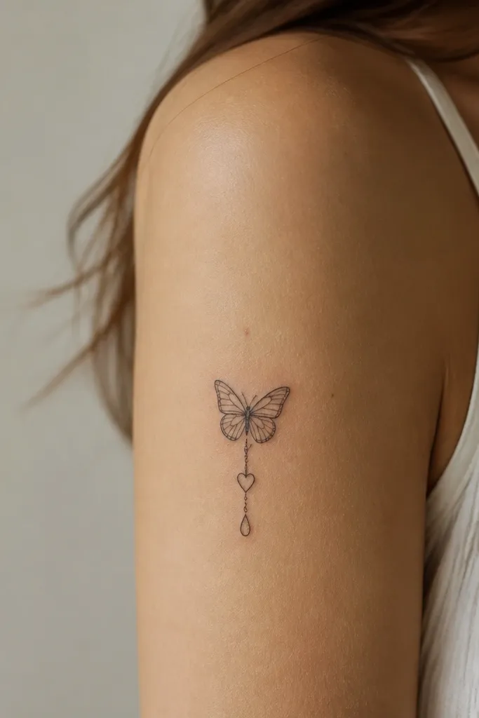
Charms make the piece feel personal without turning it into a cluttered bracelet. The butterfly keeps it feminine, while the two charms add detail you can read clearly. I like this because it has multiple focal points but stays within a small footprint. It also looks great for couples when each person gets one charm detail.
Keep the piece 7-8 cm tall. Place it on the upper outer back, not directly on the spine, so it doesn't warp with posture. Ask for thin chain links connecting butterfly to charms, and keep charm outlines crisp with tiny dot shading only inside the teardrop.
Pro tipPick charm shapes that are simple - heart outline and teardrop outline - no mini script.
AvoidAvoid three or four charms - it starts looking crowded on the back.


