1. Moth Wing With Compass Dotwork
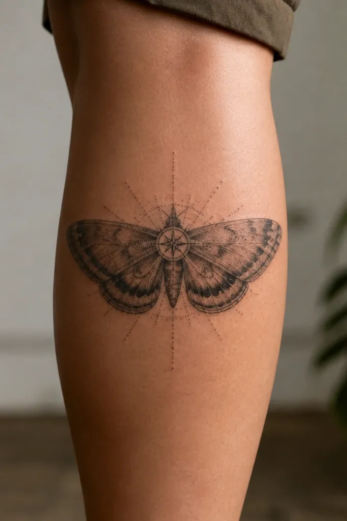
This works because the moth wing gives you a strong silhouette, and the dotwork gives you "stylish detail" without heavy black that can smear over time. The compass rose creates structure - it tells the eye where the center is even when the leg moves. I like the contrast: soft gray wing shading with crisp black dot clusters at the compass points.
Ask for the wing to sit higher on the calf, with the widest part around mid-calf. Keep the compass small enough that it doesn't compete with the wing - around 1.2 to 1.8 inches across in my experience looks balanced. Use a gray wash range from light mist to medium smoke for the wing, then add tight dotwork for the compass bearings.
Pro tipHave your artist draw a curved guide line on your leg first so the dotwork radiates along your calf bend.
AvoidAvoid full-coverage black shading on the wing - it heals flatter and can blur faster than gray wash plus dots.
2. Thin-Line Snake With Moon Phase Highlights
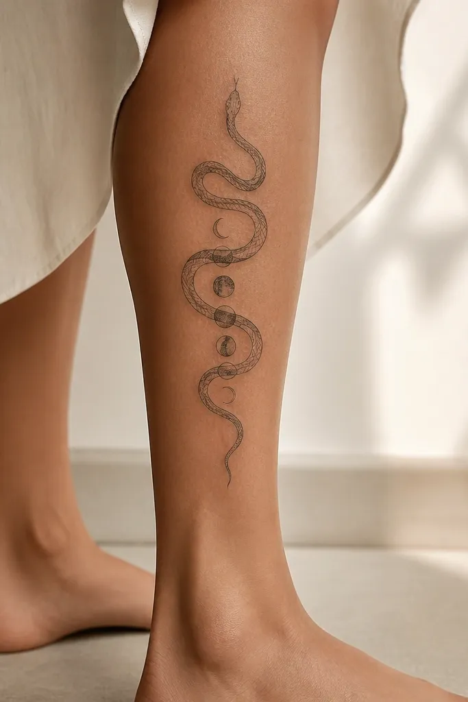
Fine-line snakes look classy when the design has breathing room. The moon phases add that stylish detail without forcing dark fill, so the tattoo stays crisp as the leg stretches. I like how the snake's spine becomes a "timeline" - it reads clean from a distance because the moon shapes break up the linework.
Keep the snake width narrow, about the thickness of a pencil line. Place moon phases on the top half of the calf where your leg looks longer in photos. Use black ink for the outline and let the moon phases stay mostly negative space with light shading, not full black discs.
Pro tipIf you want it to look extra polished, ask for the snake line to taper at both ends - it frames your leg better than a uniform thickness.
AvoidDon't pack tiny moons too close together; spacing is what keeps fine-line detail from healing into one dark mass.
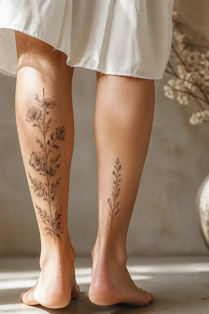
3. Botanical Stem With Watercolor-Style Petal Edges
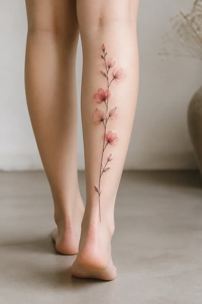
This is the back-calf version of a "statement but delicate" tattoo. The black stem anchors everything, and the watercolor-style edges add a dreamy look without turning into a heavy color block. I've seen this age best when color is concentrated at the petal tips and fades quickly into the skin, so it doesn't become a dark bruise over time.
Choose one main flower - like a small rosebud or peony - and keep it in the mid-to-upper calf. Ask for a limited color set: muted blush pink and soft sage green. Let the stem and leaves stay mostly black with minimal gray wash so the color remains the highlight.
Pro tipWear it with a skirt or fitted jeans at least once during healing - tight fabric can irritate color areas, so you'll learn quickly what to protect.
AvoidAvoid bright neon pink or saturated green; those pigments look harsh as they fade and can look uneven.
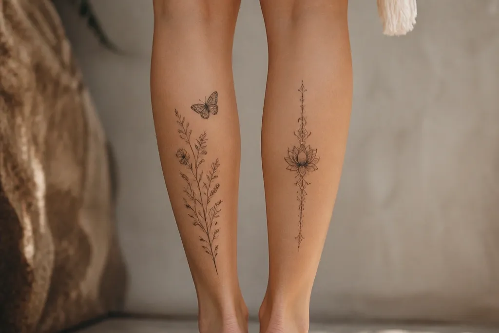
4. Orchid Cluster With Micro-Branch Dot Shading
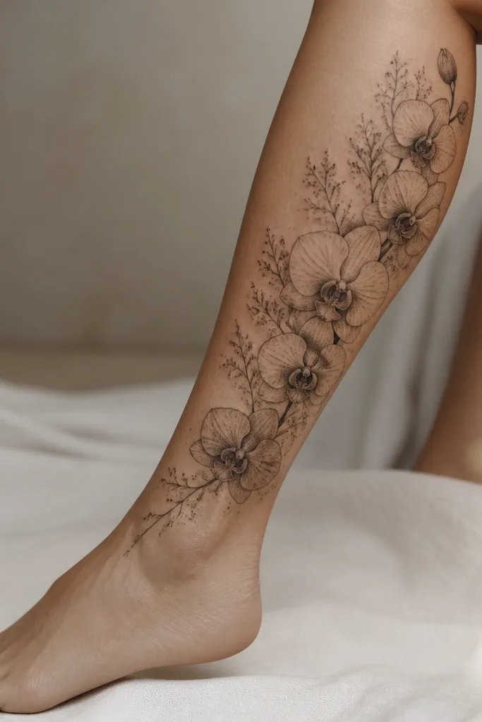
Orchids read feminine and styled because the petals naturally create curves that follow your leg's shape. Micro-branch dot shading makes the negative space look intentional instead of empty. I like adding tiny highlight dots near the orchid centers - they catch light and make the tattoo feel "finished."
Keep the cluster height around 6-8 inches and slightly diagonal so it hugs the calf curve. Use dot shading only in small pockets, not full gradients, so it stays sharp. If you want extra detail, add two thin leaves that point outward like a frame.
Pro tipAsk for a stencil that shows where your calf flexes; place the tightest petal detail where your skin stretches least.
AvoidDon't add too many orchids - three blooms with a clean stem looks more expensive than five crowded blossoms.
5. Ribbon Bow Tail With Geometric Corners
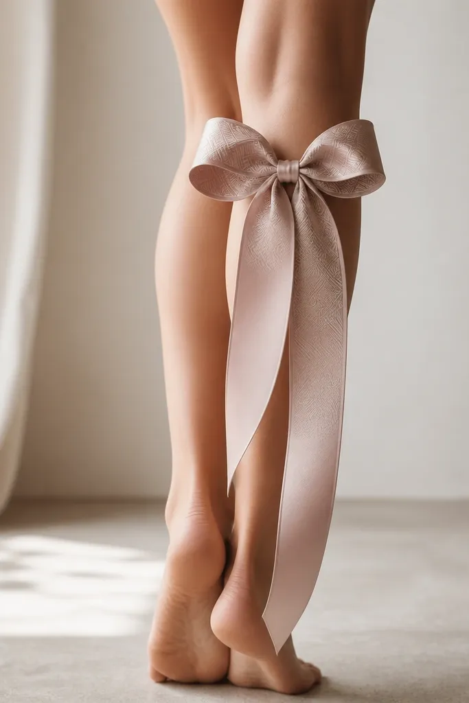
Ribbons look styled because they give you clean curves plus a strong center. The geometric corner fills add detail that feels modern, not just decorative. This combo works because the bold bow silhouette stays readable while the geometric lines add texture without requiring dark fill.
Place the bow slightly above mid-calf, centered on the back of the leg. Keep the tail narrow and slightly twisted so the ribbon "moves" with your stride. Use black ink for outlines and gray wash for the ribbon folds, then add geometric linework inside two or three bow panels only.
Pro tipChoose a ribbon fold pattern that matches your artist's line stability - smooth folds heal better than lots of tiny overlapping lines.
AvoidAvoid full cross-hatching everywhere; it looks heavy during healing and can blur into a gray slab.
6. Japanese-Style Wave Ribbon With Fine Clouds
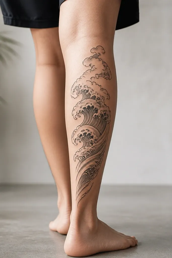
Wave ribbons look stylish because they follow motion. The fine cloud swirls add depth without covering the whole area in dense ink. I like the balance: crisp outlines on the wave, light gray gradation for the ribbon body, and small cloud details that stay airy.
Ask for the wave ribbon to start near the outer calf edge and curve toward the center as it goes down. Keep clouds small and clustered near the top so the tattoo doesn't crowd your ankle. Use gray wash in bands that match the wave's peaks so the shading stays aligned.
Pro tipBring a photo of your preferred wave style and ask your artist to match the line thickness across the peaks and troughs.
AvoidDon't let the wave shading turn into solid black streaks - it makes the design look like it's "stuck" instead of flowing.
7. Half-Sleeve Look Without Arms: Lace Panel
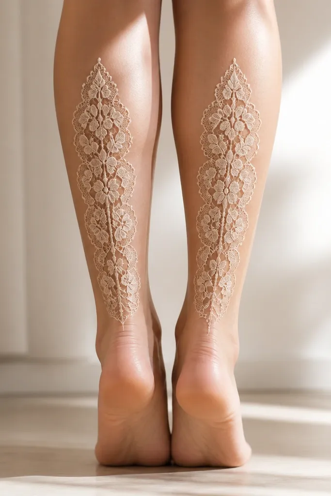
Lace tattoos look expensive because the pattern creates structure. On the back calf, the lace panel feels like a skirt or stocking detail. The best version uses a repeating motif with open spaces, so you get texture without turning it into a dark sheet.
Plan a panel height of about 7-9 inches with a scalloped top edge. Use black linework for the lace loops and add tiny dot connectors only where the motif would otherwise look broken. Add a soft gray wash behind the densest lace sections, not across the entire panel.
Pro tipIf you want it to look extra clean, ask for consistent spacing between lace loops so it reads like one fabric pattern.
AvoidSkip thick black "background" fills - lace should look airy, or it loses the whole point.
8. Sunflower Seed Head With Tiny Constellation Dots
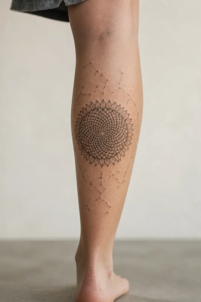
This tattoo reads like nature plus night-sky detail, which is why it looks stylish in both daytime and evening photos. The sunflower spiral gives you a natural flow line, and the constellation dots add crisp sparkle without heavy shading. I've found it ages well because the seed spirals are mostly linework and the dots are small accents.
Place the sunflower slightly above mid-calf so the head sits where your leg looks widest. Keep the seed spirals tight and consistent, then scatter 8-15 tiny constellation dots around it, not across the whole calf. Use black outline with light gray for depth at the seed head underside.
Pro tipPick constellation dots that match the spacing of the seed spiral - it makes the whole tattoo feel designed, not sprinkled.
AvoidDon't add thick starbursts; they heal bold and then fade unevenly.
9. Micro Rosary Chain With Cross Negative Space
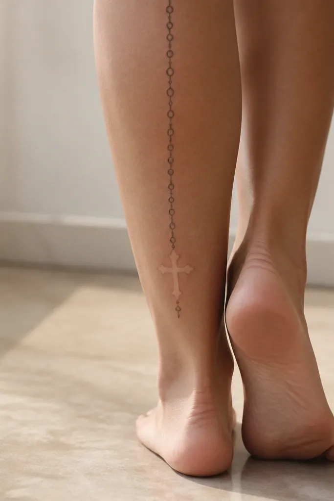
Micro rosary chain tattoos look clean and stylish when the links are consistent and the cross uses negative space. The back calf is perfect because the chain line follows your leg's vertical axis, so it looks intentional even when you wear shorts. I like leaving the cross mostly uninked so it stays crisp as it heals.
Keep links small, about 1.5-2 mm, and ask for uniform link spacing. Place the cross around the lower third of the calf so it doesn't get swallowed by the knee. Use thin black ink for links and a slightly thicker line weight only for the cross outline.
Pro tipTell your artist you want the chain to align with your shin line when you stand - that alignment is what makes it look "custom."
AvoidDon't overcrowd the chain with extra beads; the spacing is what keeps it readable.
10. Feather With Porcelain-White Dot Veins
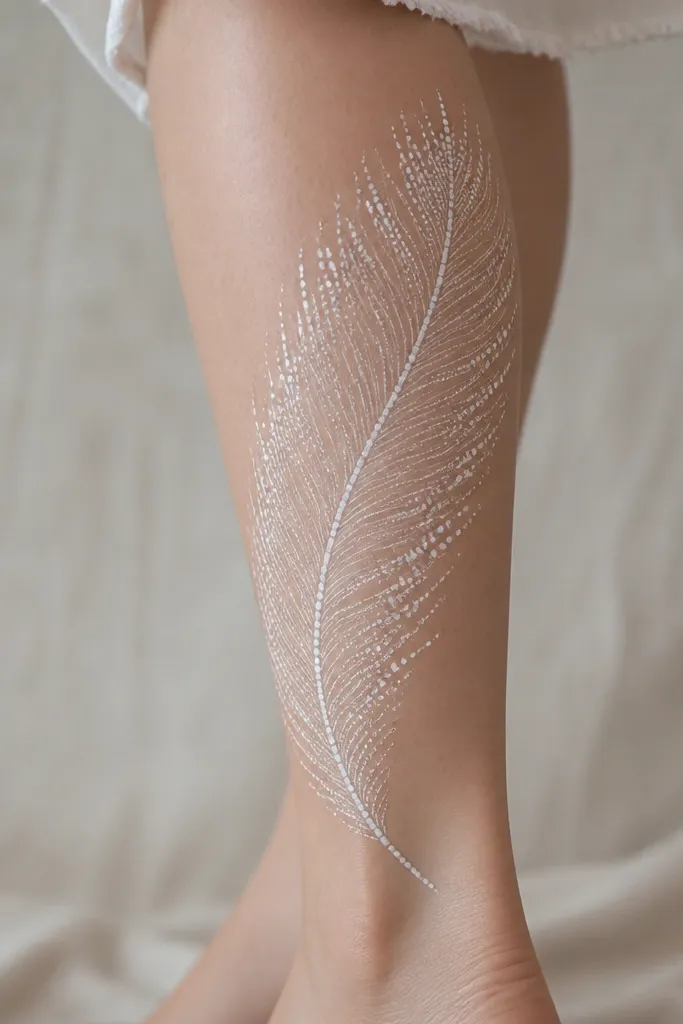
Feathers look elegant when the barbs are drawn as distinct lines and the detail sits along the center vein. The dot clusters mimic tiny highlights, which gives "stylish detail" without using large color areas. In my experience, this style ages well because the main structure is linework and the dots act like controlled accent texture.
Ask for a diagonal placement from upper outer calf down toward inner calf. Keep the feather tip thinner than the base so it feels aerodynamic. Use black ink with gray wash for depth, then add dot highlights along the vein and a few edge barbs.
Pro tipWear short sleeves to your appointment and ask for photos of the stencil on your leg in daylight; feather placement looks different under warm lighting.
AvoidAvoid heavy solid shading in the feather body; it turns the feather into a blur after healing.
11. Starburst Mandala With Only One Dense Ring
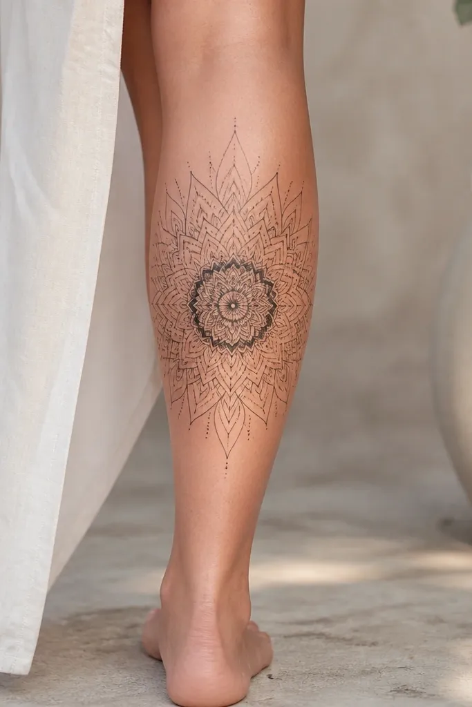
Mandala tattoos can look messy if everything is equally dark. This version looks stylish because it limits density to one ring, giving you a clear focal point. The starburst pattern adds motion, and the open space keeps the design light enough to stay readable.
Center the mandala slightly above mid-calf and keep it around 3.5-5 inches wide. Use thin linework for outer petals and add one dense ring with dotwork or stipple shading. Keep the rest mostly negative space with minimal gray wash so it doesn't turn into a dark circle.
Pro tipAsk your artist to test the line spacing by drawing a grid on your leg with the stencil; it prevents the mandala from drifting as the skin stretches.
AvoidSkip full mandala fill; it looks flat and heavy after a couple years.
12. Butterfly Wing Outline With Micro-Contour Lines
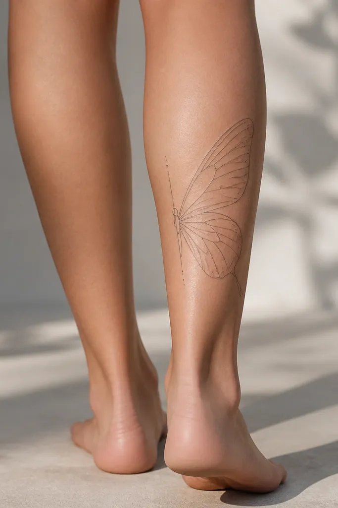
Butterfly tattoos look cute, but the stylish version is about restraint. A clean outline plus micro-contour lines gives you texture like fabric embossing. This works on the back calf because the wings naturally follow the curve of the leg, and the micro-lines stay crisp when they're short and consistent.
Place the butterfly so one wing sits near the center of your calf and the other wing extends slightly toward the outer edge. Keep the body thin and add only a few dot accents near the top and bottom of the wings. Use black ink with gray wash only where the wing bends inward.
Pro tipBring a reference that shows micro-lines length; ask your artist to keep them similar length across the wing so it doesn't look chaotic.
AvoidAvoid long, sweeping fill lines; they smear more than short contour marks on moving skin.


