1. Inner Wrist Script With Micro Star Sparkles
This works because script names look best on the inner wrist when the letters follow the natural curve of your pulse line. The micro stars add dainty detail without adding heavy shading, so the tattoo stays light and readable. Black ink keeps the sparkles from turning grayish as they age, and the negative space between stars keeps everything crisp.
Place the name about 1/2 inch above the wrist crease so the skin stays smoother when you bend your wrist. Keep the tallest letter height under 0.35 inches and space the stars roughly one letter-width apart. Ask for hairline star tips - the points should be sharp, not rounded.
Pro tipBring a photo of your wrist in natural light and ask your artist to mock the baseline on your skin before inking.
AvoidAvoid adding thick outlines around the letters - it makes thin script look like a sticker.
2. Roman Numeral Name With Double-Line Accent
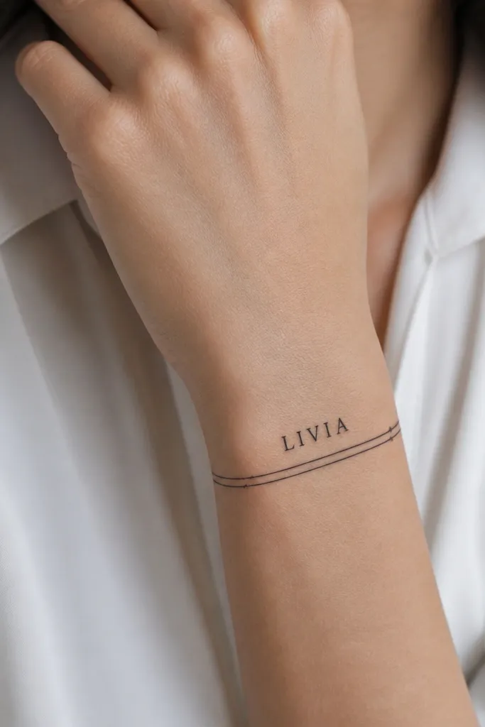
Roman-style letterforms read sharp on the wrist because they rely on straight strokes and stable geometry. The double-line accent gives structure, so the name looks intentional even when the letters are small. This style ages well when the line weight is consistent and the underline spacing is kept narrow.
Make the name horizontal on the inner wrist, with the underline sitting about 1/8 inch below the baseline. Keep the double lines about 1-2 millimeters apart. Choose a font with visible serifs on I, V, and M so the details don't blur together.
Pro tipIf you wear a watch, position the underline above the strap line so the double lines don't get rubbed down first.
AvoidSkip heavy crosshatching - it kills the crisp look of roman letters.
3. Tiny Gothic Name With One Teardrop Dot
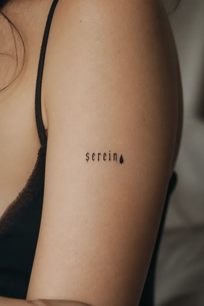
Gothic letterforms can look dainty if the strokes stay thin and the spacing stays tight but readable. That single teardrop dot works like a punctuation mark, giving the tattoo a finished edge. The dot also helps your eye focus, so the name doesn't feel like it's floating or unfinished.
Keep the name short - about 2 inches total length - and avoid looping flourishes that add too many micro corners. Place it on the outer wrist for better contrast against natural skin folds. The teardrop dot should be about the width of the thickest letter stroke, not bigger.
Pro tipAsk for the dot to be slightly filled solid while the letters stay line-only for a clean hierarchy.
AvoidDon't cram extra symbols around gothic letters; it turns into a gray clump fast.
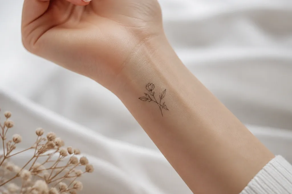
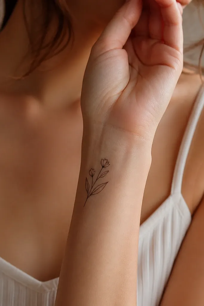
4. Name in Minimal Serif With Sideways Leaf Skeleton
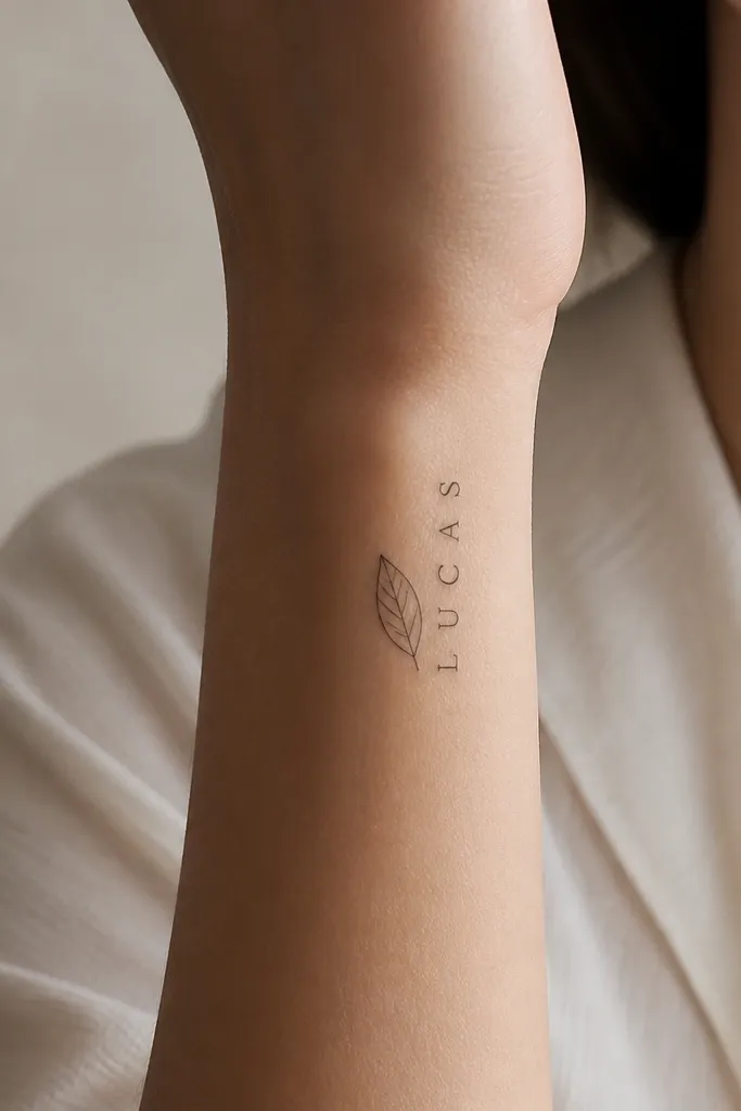
Minimal serif letters stay legible because the strokes are simple and the serifs stay small. The leaf skeleton adds dainty detail without filling in big shapes, so the tattoo stays airy. A single vein line gives a natural focal line that looks good when your wrist moves.
Turn the name slightly diagonal - not perfectly straight - so it matches how your wrist naturally curves. Keep the leaf about the same height as the middle letters only, roughly 1 inch tall. Tell your artist to keep the leaf veins hairline and avoid shading the leaf.
Pro tipWear a thin bracelet when you heal so you don't rub the leaf area - the leaf's fine lines are the first to soften under friction.
AvoidAvoid filled leaves or heavy shading; they blur and make the name harder to read.
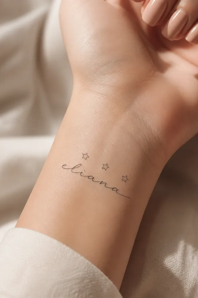
5. Cursive Name With Tiny Heart Halo Above
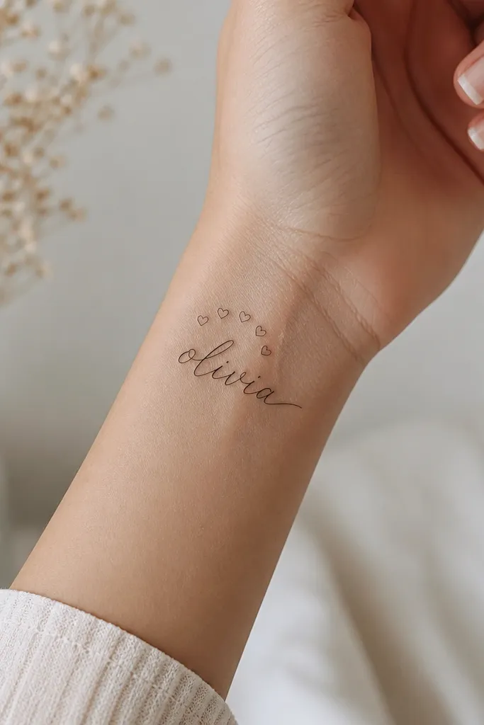
A heart halo gives a sweet look without turning into a big cartoon symbol. Because the hearts are small and evenly spaced, they frame the name instead of competing with it. The inner wrist placement makes the halo feel personal when you look at your own skin.
Place the halo about 1/4 inch above the first letters so the gap stays visible after healing. Keep the hearts about the size of a pinhead - any larger and it stops reading dainty. Use a cursive font with consistent stroke width so the halo aligns cleanly.
Pro tipAsk for the halo hearts to be the same line weight as the name so everything heals together.
AvoidSkip thick heart fills - they age into a dark patch and swallow nearby details.
6. One-Line Name With Micro Chain Border
A one-line name feels delicate because it avoids thick overlaps. The micro chain border adds a jewelry effect, and that framing makes the name look intentional even when it's small. This style also photographs well because the chain border gives texture without heavy shading.
Keep the chain border narrow so it doesn't widen the tattoo too much - aim for about 1/8 inch from the outermost letter edge. The name should sit centered, with the chain ovals consistent in size. Choose a font where letters don't require big loops that would break the one-line flow.
Pro tipIf you have a thinner wrist, reduce the chain border height so it doesn't creep into the wrist crease area.
AvoidDon't add extra swirls to fill space - negative space is what keeps the chain looking clean.
7. Name With Thin Wave Baseline and Two Dots
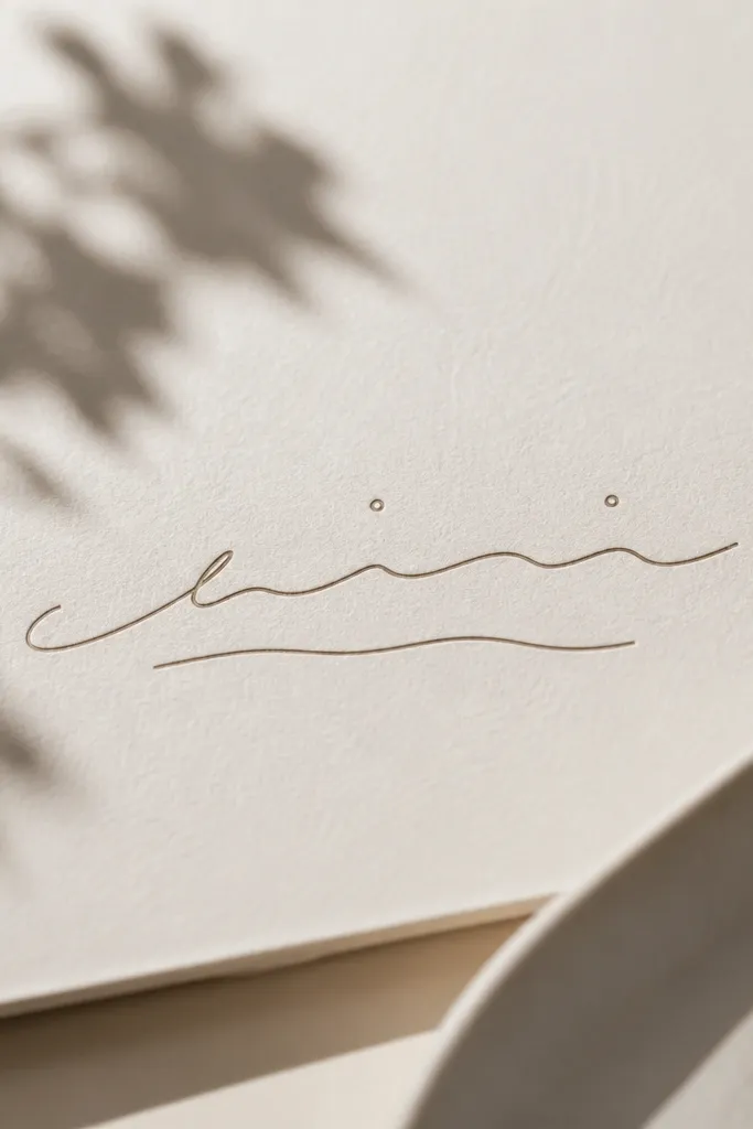
The wavy baseline gives motion while staying minimal, and waves hold up well because they're simple curves. The two dots act like punctuation and add a dainty rhythm above the letters. With thin strokes and lots of skin between elements, the tattoo stays readable as it heals.
Place the wave baseline about 1/8 inch below the letters and keep its amplitude small - no big ocean waves. Dot size should match the thinnest stroke thickness, not larger. This design sits best on the underside of the wrist where you see it when you flex your hand.
Pro tipTell your artist to draw a test line first so the wave sits level with your hand orientation.
AvoidAvoid thickening the wave to make it "show more" - it will overpower the name.
8. Vertical Name With Tiny Bookmark Tab
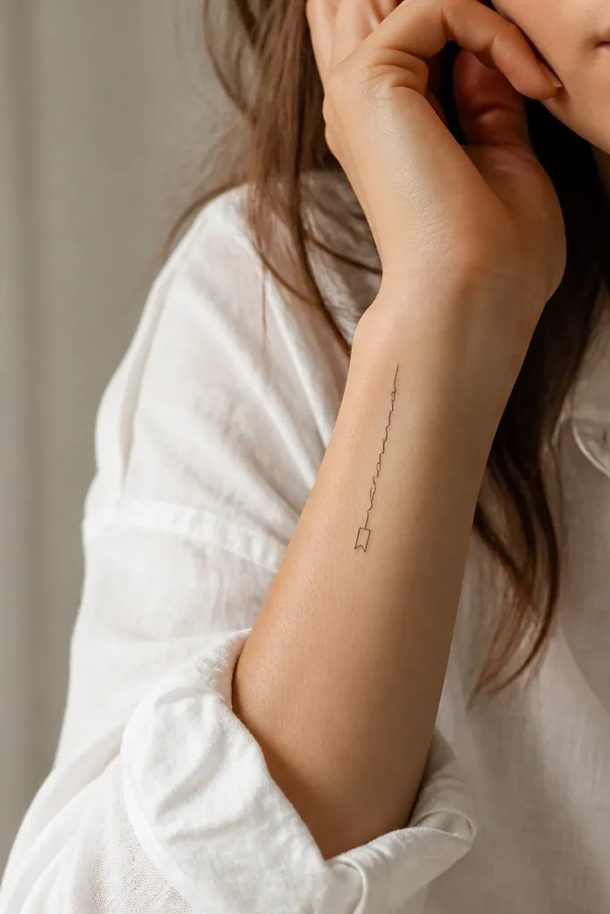
Vertical names look clean when the letters are narrow and aligned to the wrist's natural length. The bookmark tab gives a neat finishing piece so the tattoo doesn't feel cut off. Because the tab is line-only, it stays dainty and doesn't turn into a thick blob over time.
Keep the name vertical within about 2.5 inches so it doesn't wrap too far around your wrist. The bookmark tab should be about half the width of the name and centered on the last letter. Use a font with narrow stems and small serifs so the details survive the healing stage.
Pro tipIf you have a lot of hair on your forearm, shave the area the night before your appointment so the artist can place the vertical line accurately.
AvoidDon't let the last letter touch the tab - a tiny gap keeps the shapes separate.
9. Name in Thin Typewriter Font With Micro Cross
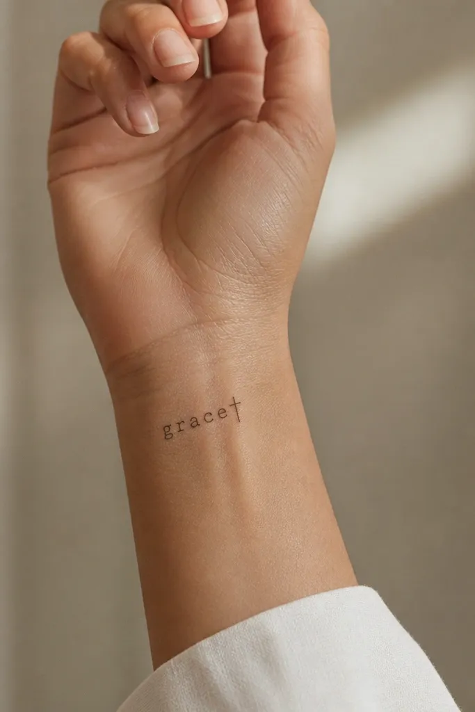
Typewriter fonts look dainty because they have uniform stroke widths that hold up on small placements. The micro cross adds a subtle accent without adding extra clutter. This design stays crisp because you're not relying on elaborate flourishes that can blur.
Choose a font where the letters aren't too wide - you want a long, narrow name. Place it just off the center of the inner wrist so the letters sit above the most mobile skin. The cross should be about the height of the letter's dot or serif, not larger.
Pro tipAsk for the cross to be aligned with the baseline, not tilted - it keeps the whole piece looking intentional.
AvoidAvoid adding additional religious symbols; one micro detail is enough.
10. Name With Micro Blossoms Around One Letter
Clustering blossoms around one letter makes the design feel focused instead of scattered. Line-drawn blossoms stay dainty because they rely on negative space and thin petals. When you tie the blossoms to one anchor letter, the name stays the main event.
Pick one letter with a curve that can visually "hold" the blossoms. Keep the blossoms no bigger than the width of that letter stroke. Place them on the outer wrist so the petals catch light when your hand moves.
Pro tipTell your artist to draw the blossoms first in pencil on your skin so you approve the spacing before ink.
AvoidSkip filled petals - they thicken and blur into a gray flower.
11. Signature-Style Name With Tiny Underline Spark
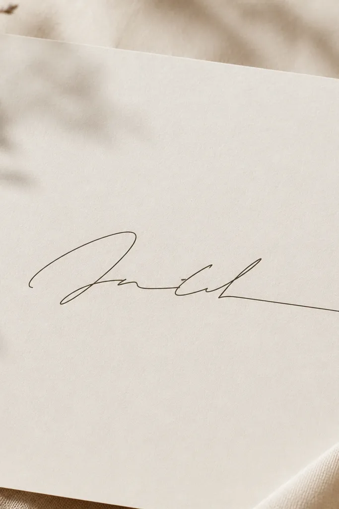
Signature-style lettering looks best when it has one clean underline and no extra swirls competing for attention. The tiny spark at the end reads like a pen flourish and keeps the design from looking too plain. With thin strokes and a single accent, it stays dainty and readable.
Keep the underline under 1 inch long so it doesn't stretch the wrist placement. The spark should be about the height of a lowercase letter x. This works well on the inner wrist where you see the signature when you turn your palm.
Pro tipBring a reference signature so your artist can keep letter flow natural and avoid stiff letter spacing.
AvoidDon't trace over your own signature too many times in the stencil - it creates thick ink where you don't want it.
12. Name With Delicate Constellation Dots
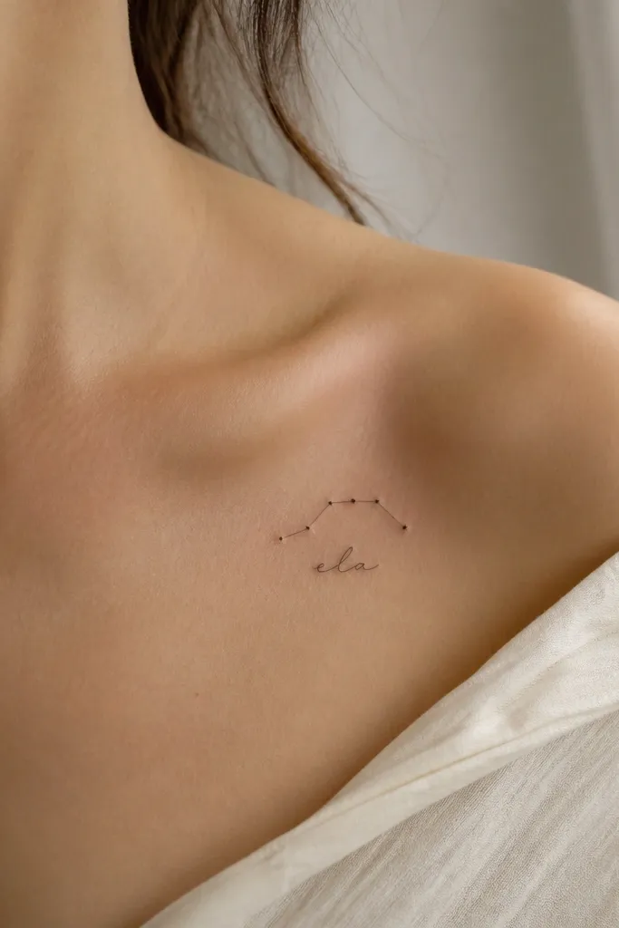
Constellation details look dainty because dots create light texture without heavy shading. When the dots connect with short lines, your tattoo reads like an intentional mini-map, not random decoration. The name stays the focus because the constellation stays smaller than the letter height.
Place the constellation above the name, aligned so it starts above the first third of the word. Use 6 to 8 dots total - fewer reads too empty, more crowds the wrist. Keep line connectors short and hairline.
Pro tipAsk for dot diameter consistency; one big dot makes the whole constellation look off.
AvoidAvoid long connecting lines - they wrap the wrist and distort as you bend.


