
1. Inner Wrist Micro Script with a Tiny Heart Dot
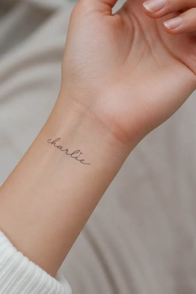
This works because wrist skin shows the name often, and micro script stays cute without looking loud. The tiny heart dot adds sweetness without turning the tattoo into a decoration. Black ink keeps the script readable as it heals, and the heart gives a focal point when the name is glanced at quickly. I like it most when the name has at least one letter that can carry the heart dot naturally.
Ask for a stencil that fits within a 1.25 to 1.6 inch width. Keep line weight thin but not hairline - you want the letters to hold up after the first peel. Place it on the inner wrist where the skin is smoother, slightly closer to the palm than the wrist crease so it doesn't stretch as much.
Pro tipIf your boyfriend's name has two short syllables, split it into one continuous script line to avoid breaks that thicken as the tattoo fades.
AvoidAvoid ultra-thin "hairline" fonts on the wrist - they blur fast when the area gets rubbed by sleeves.
2. Collarbone Name with a Delicate Outline Heart Frame
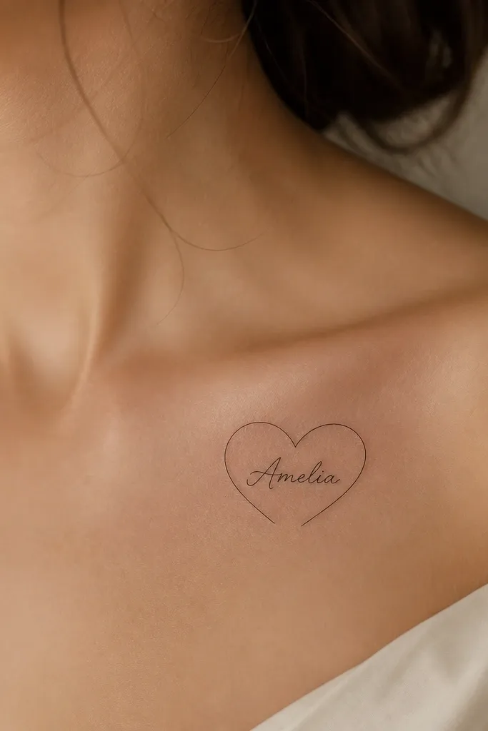
Collarbone placement looks romantic in a subtle way because it sits where light hits your skin. The outline heart creates a cute border without adding heavy fill that can thicken. The name stays the main focus because the heart is just a single line weight. I've seen this style age better than filled hearts since there's less ink mass to blur.
Keep the heart frame about 1 inch tall and leave clear space between the name and the outline. Do the name in clean cursive, not chunky lettering. Ask the artist to angle the stencil so the script follows the collarbone curve.
Pro tipBring a plain top and a bra strap scenario when you book - you want the tattoo to sit where you'll actually see it, not tucked under fabric.
AvoidAvoid thick black hearts on the collarbone - they can look like a blob once the skin texture shows through.
3. Outer Upper Arm Name with a Mini Star-Spark Trail
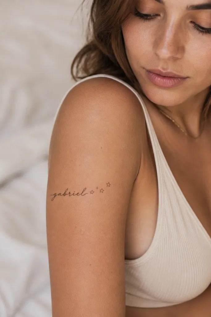
This gives "cute" through motion without needing a big design. The star trail makes the name feel like it's part of a tiny story, but it stays minimal. Outlined stars keep the tattoo airy, and the trailing placement follows the natural line of the arm. I like it for names that end with a loopable letter, because the stars can sit right where the loop finishes.
Aim for a total size around 2 inches long, with the name taking about 1.5 inches and the stars spanning the last half inch. Place it on the outer upper arm where you can see it in short sleeves. Keep star strokes thin and spaced so they don't merge during healing.
Pro tipIf you want extra cuteness, add the spark dot as a single filled circle - it reads clearly even after fading.
AvoidSkip large filled stars - they steal attention from the name and look heavy against cursive.
4. Side of Rib Name with a Small Flower Accent
Rib tattoos look sweet because they wrap with your body, and the movement makes the name feel alive. A tiny flower is a gentle feminine cue that doesn't overpower the lettering. Stippling shading adds softness, but you keep it small so it doesn't become gray mush later. This style works best when the name is short enough to fit on the rib's curve.
Choose placement on the side rib where you can stand straight and the stencil stays smooth - avoid the bony front edge. Keep the flower under 0.5 inch. Ask for stippling that stays light and concentrated, not a big gray patch.
Pro tipWear a soft, breathable top the first week after your appointment so the rib stays comfortable during healing.
AvoidDon't choose a super long cursive name for the rib - it stretches and reads messy after swelling.
5. Behind the Ear Name in Tiny Serif Letters
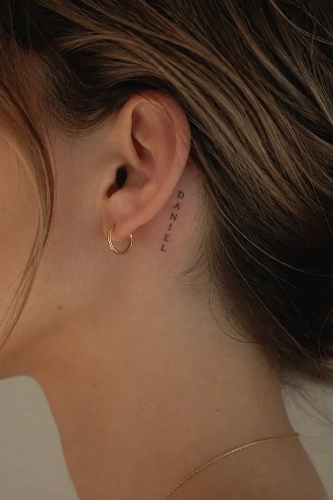
This is the most "cute but private" spot I've done for names. Behind the ear keeps the tattoo hidden most of the time, which makes the name feel personal instead of public. Serif letters hold shape better than ultra-swoopy script at small sizes. It's also a great option when you want something that won't compete with hair or earrings.
Keep it tiny - about 0.8 to 1.2 inches wide. Use a stencil that sits on the softer skin behind the ear, not right on the fold. Ask for consistent letter spacing so the name doesn't look crowded after healing.
Pro tipIf you wear hair up, place it slightly higher so it still shows when your hair moves.
AvoidAvoid heavy shading behind the ear; thick ink can look dull and smudgy in that area.
6. Wrist to Thumb Loop Name with a Thin Arrow
This style feels cute because the arrow gives direction without adding a big graphic. The name stays centered, and the arrow line helps the eye follow it. I like it when the boyfriend's name has a strong ending letter that can anchor the arrow point. It also looks great in photos because the line catches light when your hand moves.
Keep the arrow line thin and about 1 inch long, starting near the wrist and pointing to the last letter. Don't let the arrow head get too thick. Place it where you can move your wrist without the stencil cracking - avoid the tight crease.
Pro tipHave your artist test the design with your hand bent slightly, so the script doesn't stretch into a weird angle.
AvoidAvoid thick arrowheads - they overpower the name and make it look like a label.
7. Forearm Name with a Minimal Dainty Ribbon Underline
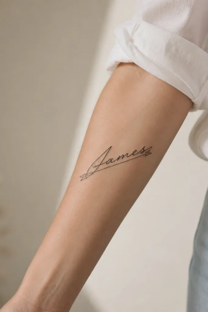
A ribbon underline makes the name feel gift-like while staying clean. The trick is keeping the ribbon narrow so it reads as a detail, not a separate tattoo. This also works well for names that look better with a single line baseline. I've found that ribbon accents can hide tiny healing inconsistencies because the underline gives the design a consistent shape.
Place it on the inner or outer forearm where your skin stays flat when you rest your arm. Keep the ribbon under the name, with about 2 to 3 millimeters of space between letters and underline. Keep curls small - no big loops.
Pro tipIf your name has letters with tall loops, place the ribbon slightly lower so it doesn't crowd the descenders.
AvoidSkip wide ribbon banners - they look flat and cheap once the lines soften.
8. Ankle Name with a Tiny Moon and Star
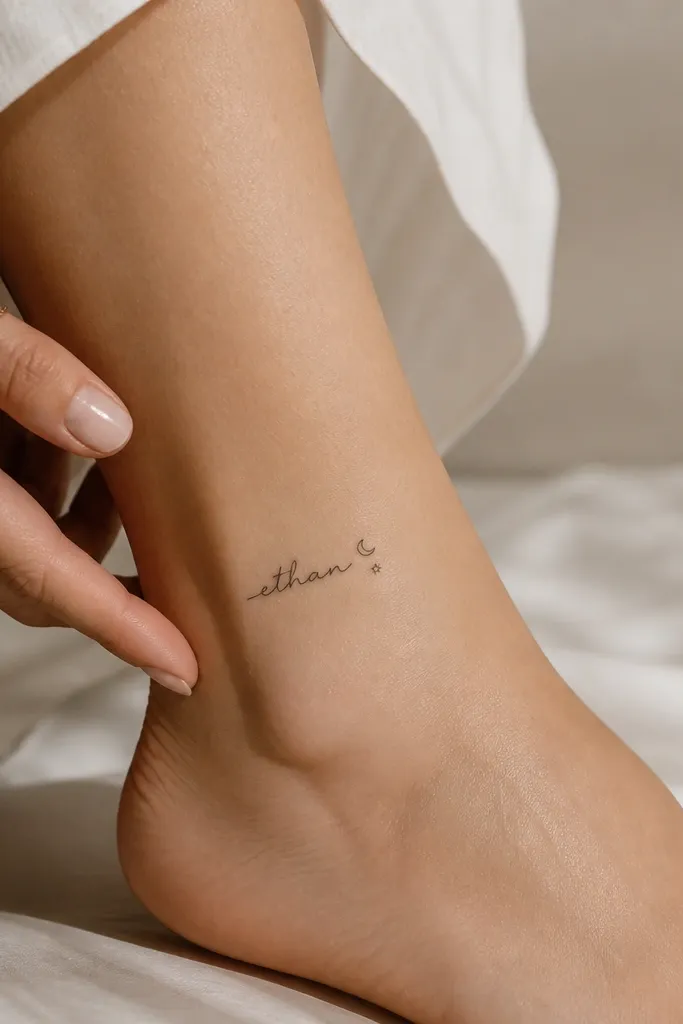
Ankle placements look cute because they're easy to dress up with sandals and socks. The moon-and-star combo feels sweet without being too babyish. Outline icons stay light and crisp, and they frame the name instead of competing. This one is best for boyfriend names that are short enough to stay centered between the moon and star.
Keep the whole piece around 1.5 to 2 inches. Place the moon above or beside the first letter and the star near the last letter. Ask for a thin outline so the crescent doesn't turn into a thick gray shape.
Pro tipIf you shave the ankle often, do it gently and avoid irritation right before your appointment.
AvoidAvoid filled moons at the ankle - they fade unevenly where shoes rub.
9. Upper Arm Name in Rounded Bubble Script with a Single Heart
Bubble script reads extra cute because it looks playful and friendly, not overly romantic. The single heart keeps it from turning into a "school doodle" by tying it to a clear theme. Thick-ish line weight in bubble letters holds up well compared to thin cursive. I like this look for names that are short and have repeating letters or smooth curves.
Keep the letters thick enough that you can see the edges clearly at arm's length. Place the heart small - about the same width as one letter stroke. This style looks best on the outer upper arm where you can keep it flat and not too close to armpit creases.
Pro tipAsk for slight letter bounce - tiny height differences make it feel handmade.
AvoidAvoid super thin bubble fonts; if it's bubble, it needs weight.
10. Shoulder Cap Name with a Feather Line Accent
This style works because the feather line adds softness and movement next to the name. Keeping it line-only keeps the tattoo clean and prevents the feather from turning into a gray smear. The shoulder cap is also a flattering spot when you wear off-shoulder tops. I've done this with both short and medium names - the feather fills the negative space so the tattoo doesn't look lonely.
Keep the feather about 1 inch tall. Angle the feather so it follows the shoulder curve, not straight up. Place the name slightly lower than the feather so it doesn't feel like it's floating.
Pro tipIf your boyfriend's name has an "S" or "R," use a slightly longer tail on that letter to connect visually to the feather.
AvoidAvoid full shaded feathers; those need more maintenance and they blur faster.
11. Thumb-Side Name in Tiny Handwritten Style with a Heart Outline
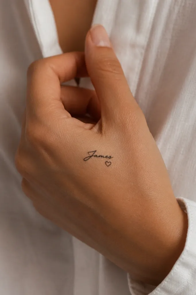
Hand tattoos are bold, but this version stays cute because it's tiny and placed where you notice it when you move. A heart outline underneath gives a sweet cue without covering the name. Handwritten style looks real when the letters have slight natural wobble, but still stay readable. I recommend this when you want the tattoo to feel like a secret message.
Keep it under 1.2 inches wide because hand skin changes shape and healing is slower. Use durable black ink and avoid tiny gaps that can fill in unevenly. Place the heart outline small and centered under the last letter to avoid clutter.
Pro tipPlan your appointment for a time you can wear gloves for dishes or cleaning for a few days after.
AvoidAvoid placing it across a joint; the lines will stretch and distort.
12. Calf Name with Double-Line Heart Bracket
Calf tattoos have more room, so you get cute without crowding. The double-line heart bracket adds charm while staying light - it looks like a frame rather than a heavy icon. This design also ages well because larger spacing between lines helps it stay crisp as it settles. I like it for names that are medium length and need breathing room.
Size the heart frame around 2 inches tall, with the name sitting centered inside. Keep the double lines close enough to feel intentional, but far enough that they don't merge. Place it on the outer calf where the skin is smoother and less bony.
Pro tipIf your boyfriend's name has lots of tall letters, tilt the script slightly so it follows the calf curve naturally.
AvoidAvoid cramped spacing inside the heart - tight spacing turns into a dark blob.