
1. Tiny constellation on forearm with matching star positions
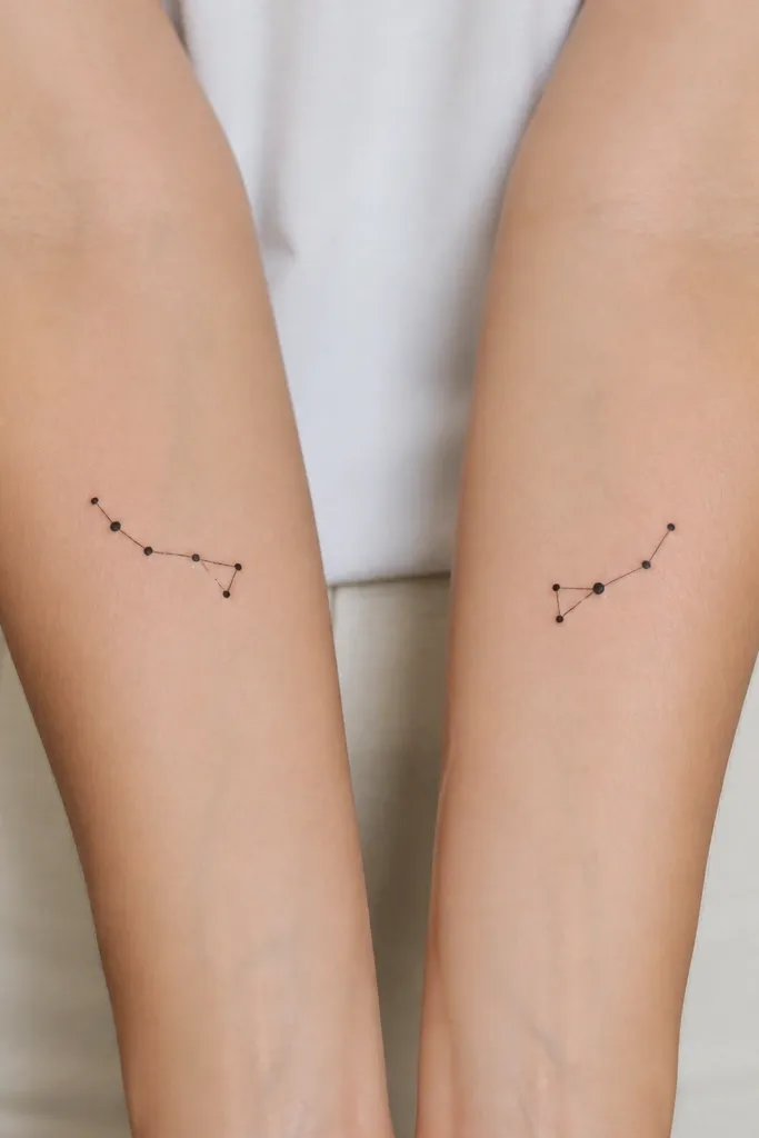
This works because constellations are naturally "rule-based." You can keep the same dot pattern and line style while changing the overall size by 20-30% for comfort. I like thin black ink with crisp dot edges - it stays readable as it ages. Add a single dot in a soft warm tone only if your artist can keep it smooth, like a tiny birthstone star.
Place one constellation on the inner forearm (closer to the thumb side) and the other on the outer forearm so the dots face outward when your arms hang naturally. Keep the longest line under 3.5 cm so it does not blur. If one of you wants it smaller, remove one of the outermost dots and keep the biggest dot in the same relative position.
Pro tipAsk for dot diameter consistency - the smallest dots should look like the same "stamp" across both tattoos.
AvoidAvoid thick lines or heavy shading; constellation tattoos look muddy when the ink spreads.
2. Two-leaf botanical mirror with different leaf counts
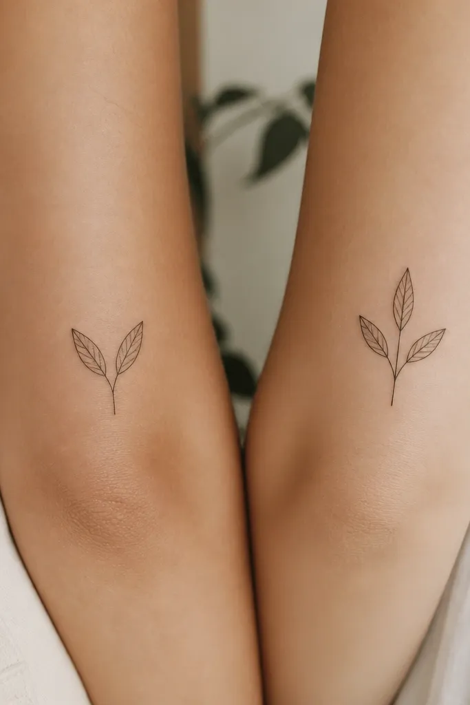
Botanical work looks matching when the leaf shape and stem angle match. The leaf count can change - that's your child variation - and it still reads as the same plant family. Fine-line black without fill ages clean and keeps the tattoo airy. You can add a tiny dot "pollen" accent near the top on one person only.
Put the sprig on the outer upper arm or outer calf so it sits along the natural curve of the body. Keep the leaf length around 1.2-2.0 cm per leaf. If the daughter wants a bigger piece, add one extra leaf but keep the stem length the same so it still feels like a set.
Pro tipBring a real leaf photo and ask your artist to trace the silhouette, not the veins. Veins add time and blur if they're too dense.
AvoidAvoid tiny fill shading inside leaves; it turns gray and soft fast.
3. Birthstone ribbon dates in same banner style
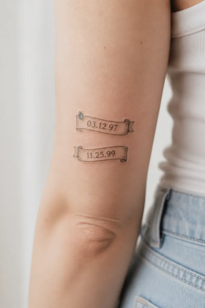
Banner tattoos can match without copying the exact same wording length. Keep the banner shape and the script style identical, then swap the dates and one tiny color accent. This gives you the "we share a story" feeling even when the text differs. The color accent should be small and controlled so it does not look like marker ink later.
Place one banner on the collarbone underside or upper chest (near the center collarbone) and the other on the top of the shoulder or upper arm. Keep text short - month and day only - because long dates wrap awkwardly on skin. Choose one accent color each (your birthstone) but keep the rest black-only.
Pro tipAsk for the date to be letter-spaced like a label, not cursive connected. It stays legible at small sizes.
AvoidAvoid super-thin script with lots of loops; it fades faster and reads like scribbles.
4. Matching hand-drawn heart outline with different internal symbols
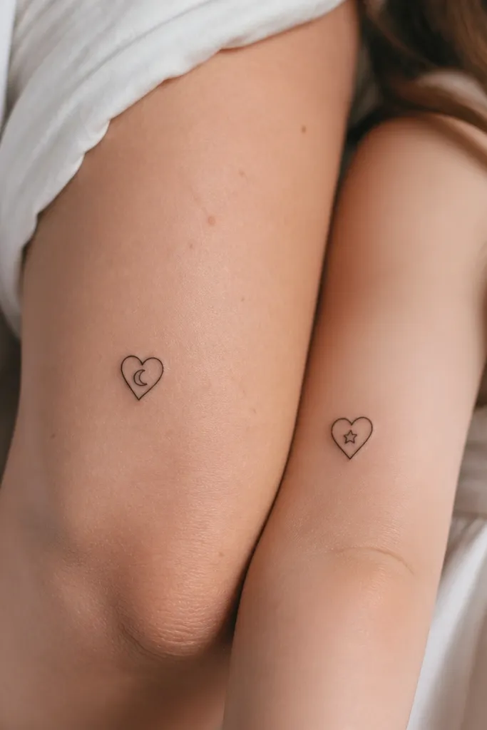
A single line-heart outline is forgiving and looks intimate. Keeping the outline style identical - same wobble, same stroke taper - makes it feel like a matched set. Swapping the internal symbol gives you individuality without losing the heart connection. This also ages well because the outline carries the design.
Place them on the wrist (dorsal side) or the upper inner arm where the skin is smooth. Keep the heart size around 2.2-2.8 cm tall. If your artist can, use a single-needle or thin liner approach for the outline to keep the texture human.
Pro tipPick one internal symbol that has a clear silhouette at tiny size. Crescent moon and star are both easy to read.
AvoidAvoid shading inside the heart; it can turn into a dark blob under skin texture.
5. Sun and moon halves that complete together on arms
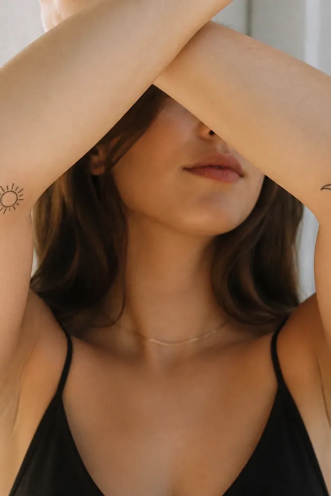
This style works because the symbols are instantly recognizable and naturally "pairable." Keep the ray style the same: either straight rays or rounded rays - do not mix. The sun and moon contrast reads as matching even if one is slightly larger. It also looks good without color because the icons are strong.
Put the sun on the outer forearm and the moon on the inner forearm so your hands can come together naturally. Keep the spacing consistent - about 1-2 cm between the icon and where it sits on the arm. If one person wants extra detail, add tiny dots around the moon, not heavy shading.
Pro tipDo a quick placement check in a mirror with your arms in the "show" position before you commit to size.
AvoidAvoid mixing ray styles (straight vs. Curved). That makes the pair look like two unrelated tattoos.
6. Matching "family" coordinates with the same font weight
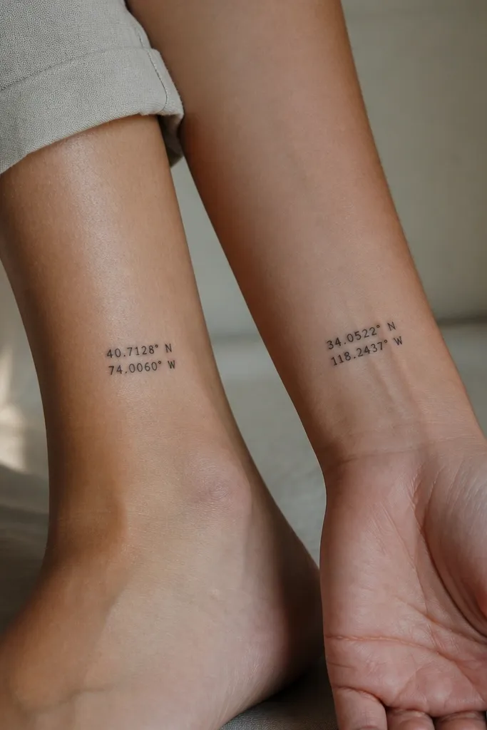
Coordinates look matching when the typography looks identical, including number thickness and spacing. You can change the numbers for your shared place or separate places that matter. I like black-only coordinates because color makes them look like a novelty map print. The clean font keeps it readable after healing.
Use a compact font with consistent stroke width. Keep the whole coordinate block under 2.5 cm tall so it stays crisp. Place one on the inner ankle and the other on the outer wrist, but keep the text orientation vertical on both.
Pro tipAsk your artist to print a stencil at actual size on paper and tape it on your skin for 10 minutes.
AvoidAvoid thin, high-contrast fonts at small sizes; the numbers blur together.
7. Mother and daughter owl with shared eye shape
Matching characters work when one feature stays the same. Here, the eye shape and placement do the heavy lifting. You get that "same creature" feeling even if the body details differ. Keep it line-only for a beginner set - fewer shading passes means faster healing and less blur.
Put the mom owl on the upper arm outer edge and the daughter owl on the forearm. Keep the eyes as the focal point and avoid adding too many feathers. If the daughter wants it smaller, reduce body size but keep the eye diameter close to the mom's.
Pro tipHave your artist draw the eyes first on the stencil and adjust until both feel "alive."
AvoidAvoid heavy black fill on the face; it can swallow the eye details as the skin relaxes.
8. Matching infinity loop with tiny hidden initials
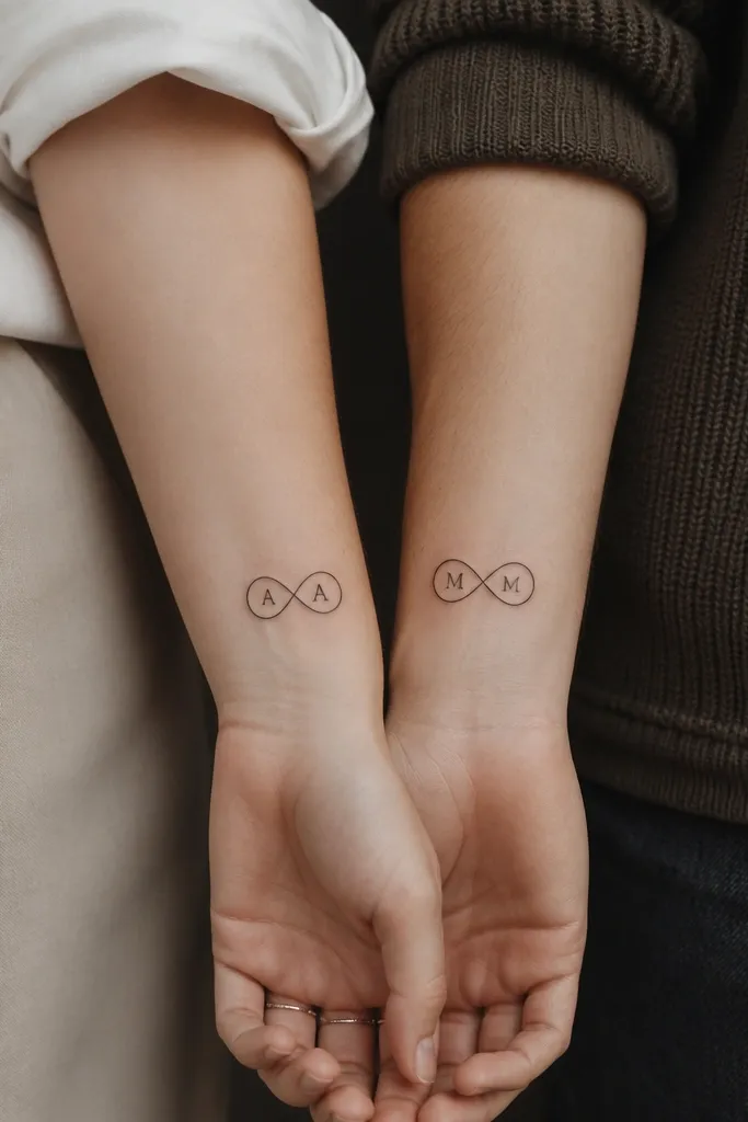
Infinity symbols look matching because the shape is symmetrical and easy to scale. The hidden initials are your child variation and add meaning without changing the overall look. This design also reads well from a distance because the infinity outline is bold and simple. Keep the initials small but crisp so they don't turn into dots.
Place on the inner wrist or the side of the ankle where skin is smooth. Size the infinity around 2.0-2.6 cm wide. Use a simple serif or block letter - avoid cursive for the initials. Keep initial placement centered inside each loop.
Pro tipAsk for a stencil with the initials visible clearly in good lighting, not just daylight.
AvoidAvoid extremely tiny cursive initials; they heal into unreadable smudges.
9. Matching lace-style frame with one gemstone dot
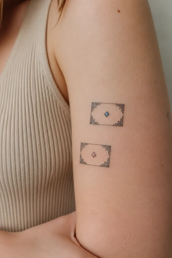
A frame tattoo looks classy and still beginner-friendly because the lines are controlled. The corners give you that "matching set" feel, while the single colored dot personalizes each piece. I've seen these age well when the lace lines stay thin and the gemstone dot stays small. Color accents should be muted - think dusty rose and slate blue.
Place the frame on the upper arm near the outer seam or on the side of the calf. Keep the frame width under 3 cm so the lace corners don't blur. Ask your artist to keep the colored dot under 4 mm and surrounded by black outline for stability.
Pro tipChoose a gemstone color that matches your real jewelry tones - it looks intentional the first day and the fifth year.
AvoidAvoid fully colored lace; it turns busy and flat.
10. Matching wave lines with one shared crest
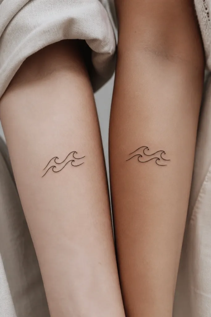
Waves work because they have a simple rhythm. Keep the crest dot position and the wave curvature the same, and you can vary the number of waves - that's your mom/daughter difference. This style looks good as a matching pair because it reads instantly as "ocean" even if the sizes differ. Line-only ink keeps healing straightforward.
Place one on the lower outer arm and the other on the upper outer arm so the waves align visually when you stand side by side. Keep wave length around 4-6 cm. For variation, add one extra small wave line on the daughter piece but keep the crest dot identical.
Pro tipAsk your artist to keep the line ends rounded, not sharp. Rounded ends hold up better.
AvoidAvoid lots of extra swirls; too many details make it look like a doodle.
11. Matching feather silhouettes with different feather tips
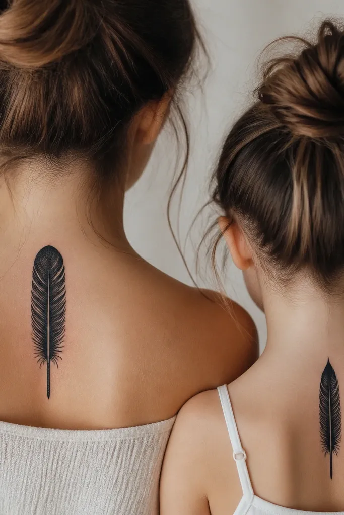
Feather silhouettes look matching because the overall shape and shaft thickness stay consistent. Swapping only the tip shape keeps the meaning while making the pair feel personal. I prefer silhouette-style with one central line because it reduces shading passes. It also ages better than lots of micro-detail.
Place vertically on the forearm or along the spine-side of the upper arm. Keep the feather length between 5-9 cm depending on your skin stretch and pain tolerance. Keep the central line centered and ask for it to be slightly lighter than the silhouette so it stands out after healing.
Pro tipIf you're worried about blur, choose a silhouette with no interior feather barbs or keep barbs extremely minimal.
AvoidAvoid micro-barbs on a very small feather; they fade into gray fuzz.
12. Matching small floral burst with negative space petals
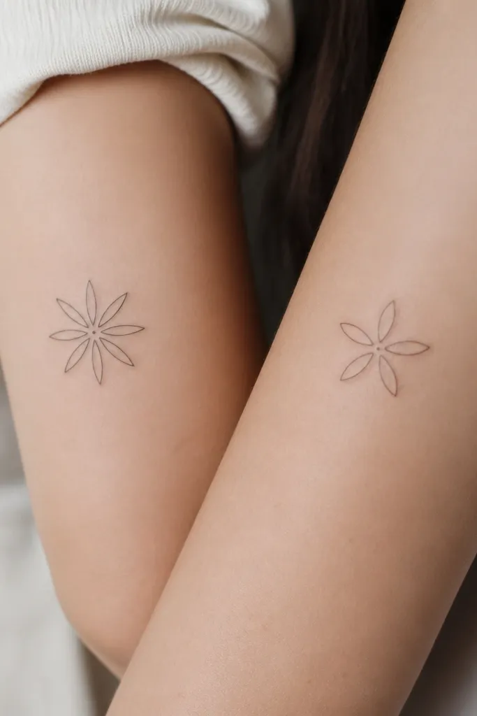
Negative space petals look clean because your skin becomes part of the design. Keeping the petal outline style and center dot size the same makes it match even with different petal counts. This is a great beginner idea because it needs fewer shading steps. The design stays crisp because there's less dense ink.
Place on the outer wrist or upper ribs side (if you already know you tolerate that area). Keep the burst diameter around 2.5-3.5 cm. If one person wants bigger, add one more petal but keep the petal outline thickness identical.
Pro tipAsk for a stencil that shows how much open skin you'll have inside the petals - that's the look.
AvoidAvoid filling petals with solid black; the burst loses its airy shape.