
1. Tiny Birth Flower Nesting
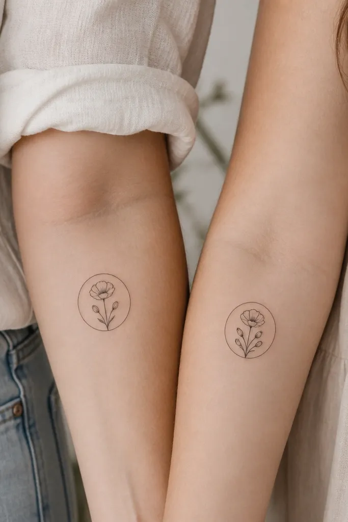
This pairing works because birth flowers already carry a built-in meaning, and linework keeps it readable as it fades. I've done versions with black ink only, using thin petals and a light dot shading under the center so it doesn't turn into a blob over time. The ring detail makes the two tattoos feel like a set without forcing the exact same petal count.
Size them around 2.25-3 inches tall for clean healing. Put mom's on the inner forearm closer to the wrist; put daughter's slightly higher so the ring doesn't hit the same crease line. Ask for one consistent style - same line weight and same center dot pattern - then change only petal count to match the specific flower.
Pro tipBring the birth-month flower names written out and ask the artist to match the botanical shape, not a generic "flower doodle."
AvoidAvoid heavy solid fills in the petals; they blur faster than you expect on small pieces.
2. Mother-Daughter Constellation with One Shared Star
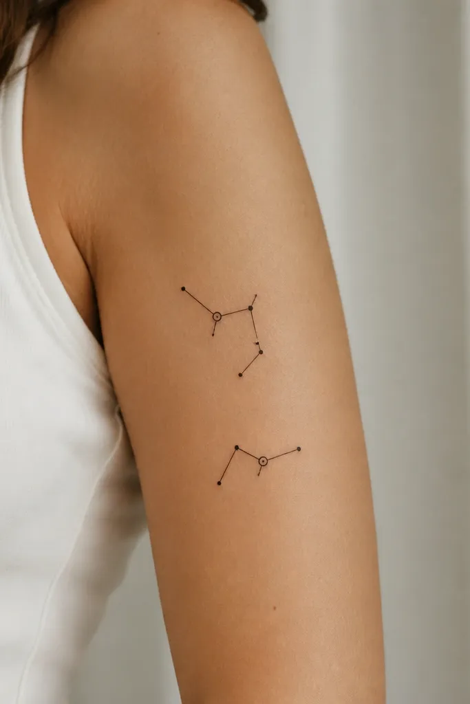
Constellations look sweet because they're personal but still minimal. The "shared star" detail is the connection - it's the one element that's identical between both tattoos. I like this style because it stays delicate without needing color, and the dots heal well even when they're small.
Keep it compact: about 2.5 inches across. Place mom's on the outer upper arm; daughter's mirrors it on the inner upper arm so the pair is readable when you stand side by side. Use the same dot spacing style for both - ask for tiny dots with consistent diameter so it ages evenly.
Pro tipChoose a night-sky reference date (birthdates or a special day) and give the artist the star pattern you want mapped.
AvoidDon't add too many dots. More dots means more tiny spots that can fade or blur into each other.
3. Infinity Knot with Initials in the Loop
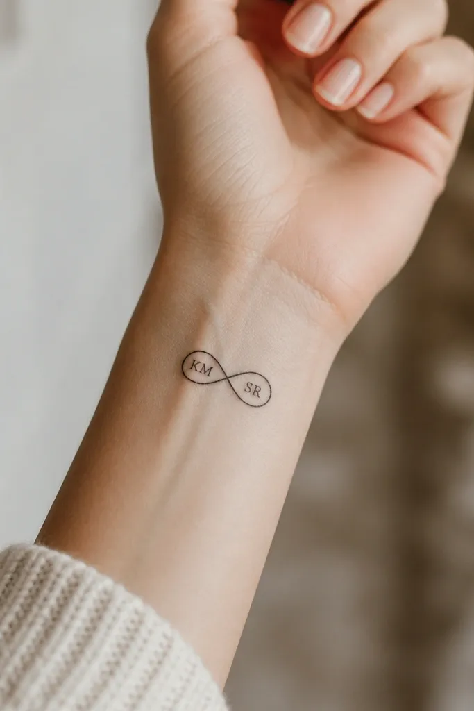
Infinity tattoos work because the meaning is instant and the shape naturally pairs. Putting initials inside the loops keeps it personal without turning into a long script that gets messy. I've found the cleanest look comes from a single consistent line thickness and tiny lettering that stays centered within the loop.
Wrist tattoos are small - aim for 1.75-2.5 inches wide so it doesn't stretch when you move your hand. Use serif or block letters, not cursive, for better long-term readability. If you want both tattoos to match, keep the infinity size identical and swap initials.
Pro tipAsk the artist to draw the initials on paper first and check legibility from two feet away before they ink.
AvoidAvoid super thin cursive inside the loop; it disappears faster than you think.
4. Matching Heart-Locket Outline with Tiny Dates
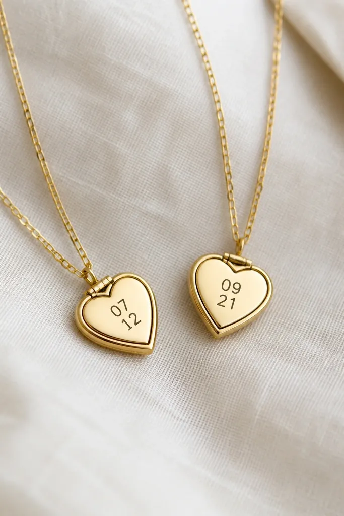
Lockets feel sweet because they read like a shared keepsake. The outline-only style keeps it from looking heavy, and micro dates inside make it meaningful without adding a paragraph. I like this for mom and daughter because you can use an anniversary date, a birth year, or the day you met the artist for the tattoo.
Place mom's on the collarbone or upper chest side; place daughter's on the same side of her collarbone for symmetry. Keep it small enough for a clean heal: about 1.8-2.2 inches tall. Use black ink for the outline and keep the date text to two to four digits per line maximum.
Pro tipIf you want dates, pick ones that fit without shrinking - use one date per locket, not two.
AvoidDon't add shading behind the heart; it can turn into a dark smudge around the tiny numbers.
5. Feather + Leaf Pair with One Shared Stem
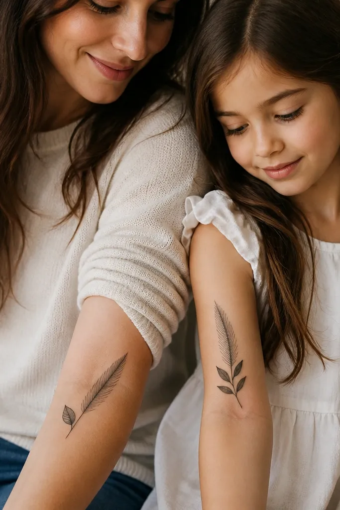
Feathers and leaves are gentle symbols - growth, protection, and the idea that both of you keep moving forward. The trick to making it match is using one shared stem line style: same curve, same length, same dot spacing along the stem. When you repeat that stem, the tattoos feel like one illustration split between two bodies.
Keep the feather slim, around 2.5-3 inches long. Place mom's closer to the elbow; daughter's closer to the wrist so the art "faces" the same way when arms hang down. Ask for the feather shaft line to be identical on both - that's what people notice first.
Pro tipChoose a matte black ink look (no glossy overwork) so the fine lines stay crisp.
AvoidAvoid adding multiple small feather barbs at the tip; the tip blurs first.
6. Sun + Small Star Rays
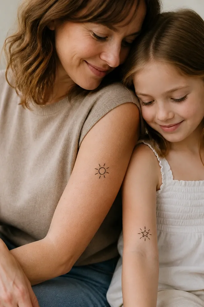
This pair looks cute because it reads like "you're my light." The matching ray style ties the two pieces together even though one is a sun and the other is a star. I love designs that repeat one visual rule - same ray count, same line thickness - because it makes the pair feel made by one artist, not two separate choices.
Sun size: about 2.2-2.8 inches across. Star size: about 1.5-2.2 inches wide so it doesn't feel unbalanced. Place both on slightly visible areas - upper arm for mom, outer forearm for daughter - so they show when you wear short sleeves.
Pro tipAsk for the rays to be evenly spaced and not too long. Long rays on small tattoos fade into soft halos.
AvoidSkip thick black fills for the sun center; keep it outline-only with a tiny dot if you want a focal point.
7. Same Quote, Different Line Length (Short Word Only)
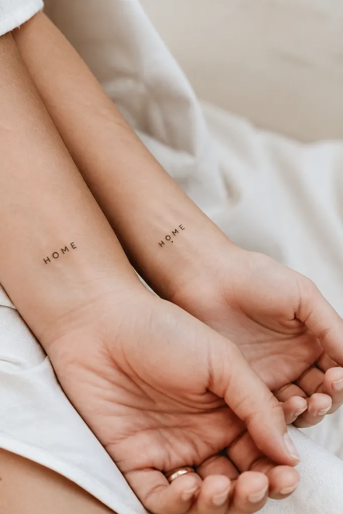
Text tattoos work when they're short and consistent. This is one of my favorite matching setups because you don't need a long quote to get the meaning - you need one word that you both claim. I've seen "HOME," "LOVE," and "STAY" heal beautifully when the font is simple and the letters are spaced properly.
Use a simple uppercase font or a clean handwritten block style. Keep each tattoo under 1.5 inches wide to reduce distortion over time. Place mom's slightly higher on the wrist crease; daughter's mirrors it so the word sits flat when her wrist bends.
Pro tipBring a reference print of the font size on paper and ask the artist to match it exactly on skin.
AvoidAvoid cursive scripts that require tiny flourishes; those flourishes disappear.
8. Matching Mismatched Halves of a Small Heart
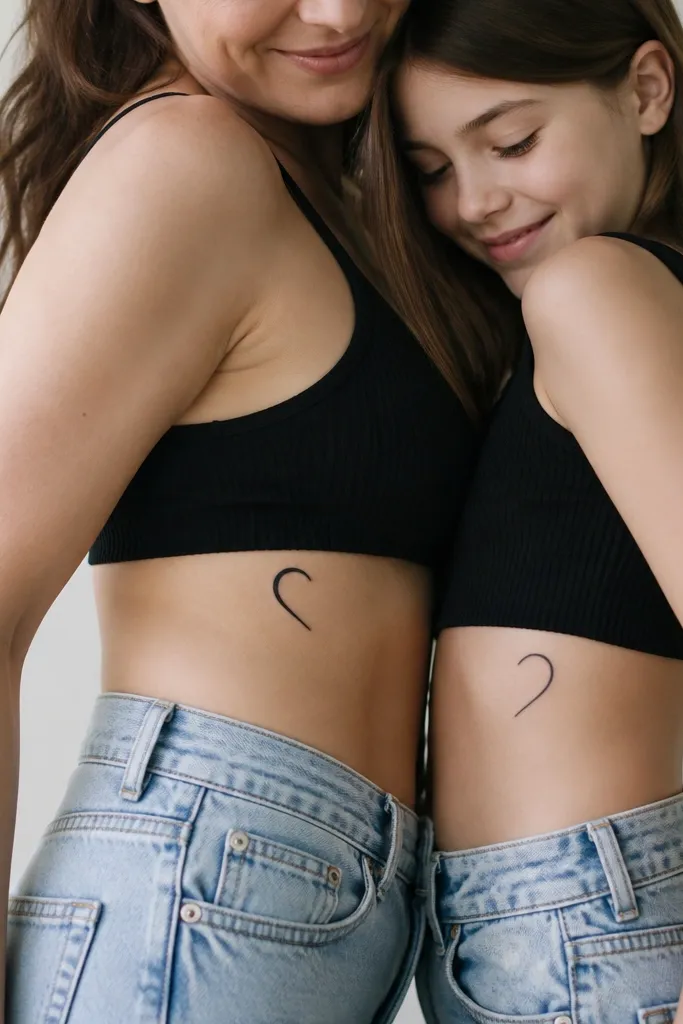
This works because it's interactive. The meaning feels stronger when the halves only fully make sense together, and it's still sweet even if you never line them up perfectly in daily life. I like rib placements for this type because the shape follows the body's curve, but you have to keep the design small to avoid distortion.
Size it around 2.5-3 inches total height when combined. Place mom on the left side rib under the breast line; daughter on the right side rib at the same relative height. Use a clean outline with minimal internal marks so it stays crisp through healing.
Pro tipAsk your artist to place the stencil with you standing in front of a mirror, then mark the exact spot for both tattoos.
AvoidDon't put the halves too close to the waistband or bra line - rubbing kills fine lines.
9. Two Matching Koi with One Shared Wave
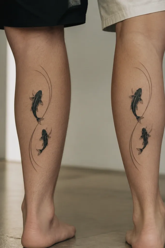
Koi can mean strength and growth, and the matching wave line makes it a true pair. I've done this with black-and-grey only, using negative space to suggest scales. The shared wave line is the key: it gives continuity so the tattoos don't look like two separate fish.
Keep each koi around 3 inches long so the fins stay readable. Put mom's slightly higher on the calf; daughter's slightly lower so the wave line looks like it continues when you place your legs side by side. Ask for scale marks only along the body - not too many - so healing stays clean.
Pro tipIf you want it to look extra crisp, request no heavy shading under the fish; let the skin be the light tone.
AvoidAvoid full black fills in the tail. Fine edges need breathing room.
10. Palm Tree Seedling Growth Pair
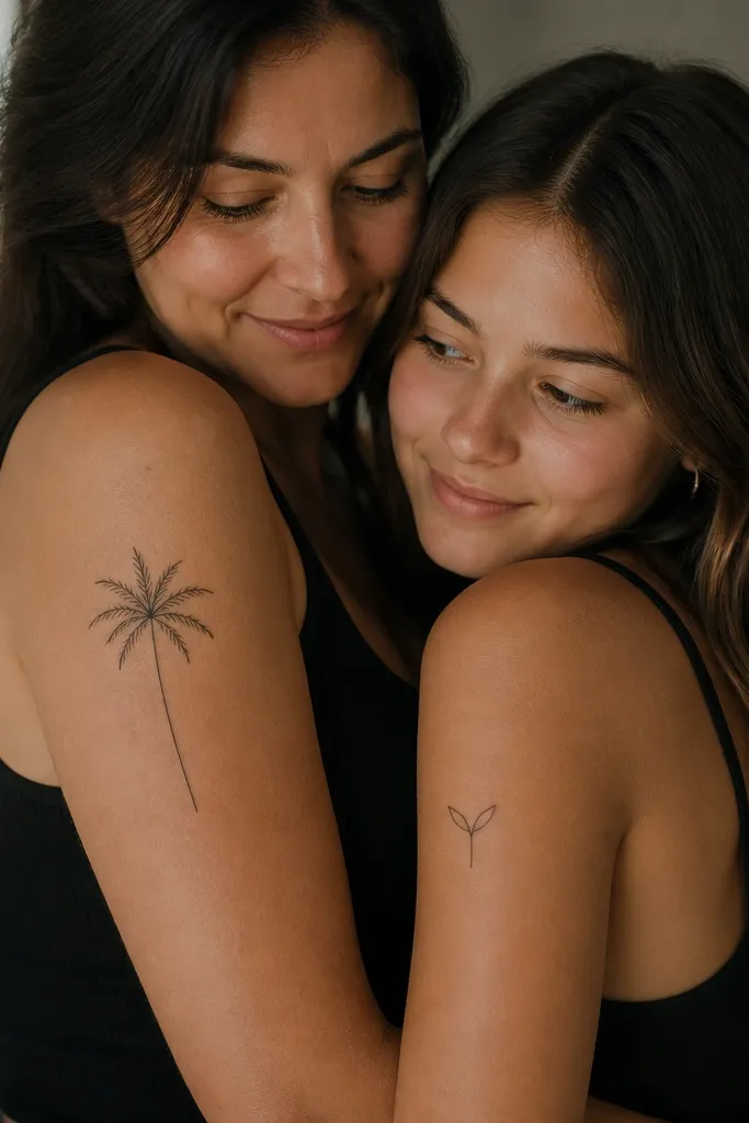
Growth tattoos feel meaningful without needing a big story. The palm tree reads as "older, grounded, steady," while the seedling reads as "starting, learning, reaching." I like this idea because you repeat the same line style and leaf shapes, so the pair looks like it comes from one sketchbook.
Keep mom's palm around 3 inches tall and daughter's seedling around 2 inches tall. Place mom on the outer upper arm; daughter on the inner upper arm or near the bicep. Use the same leaf shape on both - even if the seedling only has two leaves, make them match the fronds' curve.
Pro tipAsk the artist to draw the leaf veins as simple lines, not dots - dots look muddy at small sizes.
AvoidSkip lots of tiny shading around the trunk; it blurs into a dark patch.
11. Matching Anchor with Two Tiny Ropes
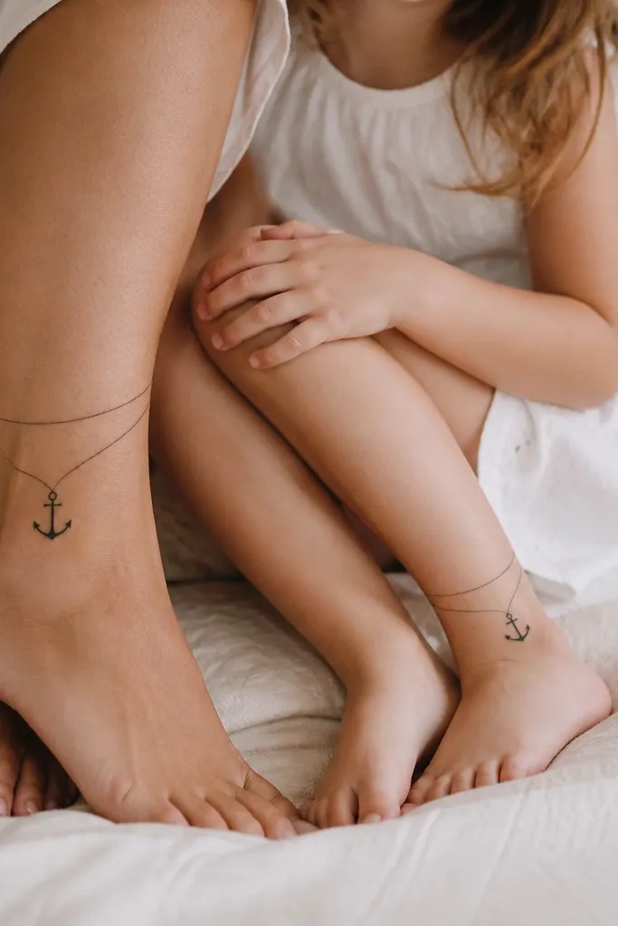
Anchors mean stability, and this pair stays sweet when you keep it minimal. Two rope lines add a "we hold each other" feel without needing extra symbols. I've found ankle tattoos look best when the anchor is a clean outline with simple rope curves - no heavy shading.
Size around 1.7-2.3 inches tall. Place mom and daughter on the inner ankle to reduce rubbing from shoes; if that's not comfortable, do outer ankle but avoid the shoe contact area. Keep the ropes consistent - ask for the same rope curve on both tattoos.
Pro tipTell the artist the exact shoe type you wear most. Stencil where the shoe edge hits so you don't place it on the friction zone.
AvoidAvoid thick black shading on ankles; it can fade into a heavy outline over time.
12. Matching Peony Buds with One Color Accent
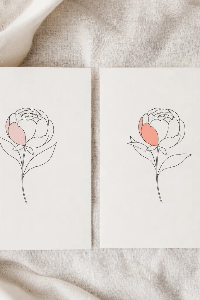
Peonies look soft and feminine, and the single color accent keeps the tattoo from looking like a sticker. I've seen blush and coral age better than bright reds because they fade into a gentle tint rather than turning muddy. The matching bud shape makes the pair feel coordinated even with different accent tones.
Keep the tattoo size around 2.5 inches tall. Place mom's on the shoulder blade edge or upper arm outer side; daughter's on the upper arm inner side so they don't rub against the same bra strap. Ask for a light watercolor-style wash only on one petal - small and controlled.
Pro tipPick accent colors that match your skin tone better than a random Pinterest palette. Blush often flatters more than saturated pink.
AvoidDon't color the entire flower. Full color on small peonies blurs as it heals.