
1. Black Rose With Hidden Letter Lines
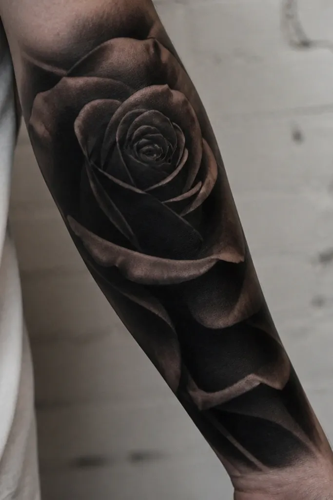
This works because the rose has naturally repeating curves that visually interrupt straight letter strokes. I've used deep black and charcoal gray layering so the center reads like a single mass, not a bunch of strokes. If your name was in cursive, the rose's swirl pattern pulls attention away from the old script direction.
Ask for a rose that fills about 70% of the available space, with the thickest blacks centered over the darkest parts of the name. Keep the highlights in the outer petals - a soft gray sheen on the edges - so the middle stays heavy. This looks best on forearm or upper arm where you can let the bloom sit slightly off-center for a cleaner flow.
Pro tipBring a photo of your old tattoo and point to the exact letters that are darkest. Tell the artist you want the darkest shading to land over those parts, even if it shifts the rose placement.
AvoidAvoid a rose that's mostly outlines with light shading - it will let the old letters ghost through.
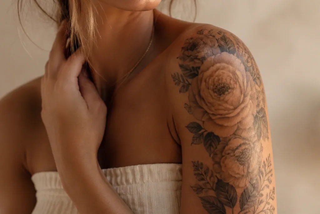
2. Peony Bloom Cluster With Bold Shadow Blocks
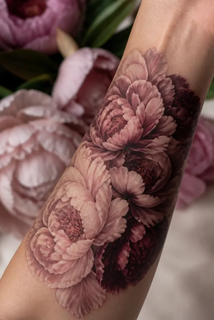
Names disappear faster under petal layers when the artist uses shadow blocks, not just color. The mauve and plum create mid-to-deep contrast, so the old ink gets absorbed into the new depth. The peony shape also gives you lots of curved edges that hide letter endpoints.
Choose a palette that includes one saturated color - like deep plum - plus two softer tones for transitions. I like petals that overlap in threes, with shadow pockets placed behind the densest letter sections. Placement that helps: upper arm outer side or forearm where the tattoo can fan out without stretching too hard.
Pro tipAsk for the darkest tones to go under the petals, not only around the outline. Under-petal shadow makes the cover-up read as one solid bloom.
AvoidSkip super pale pink-only peonies - they look pretty but don't cover packed black well.
3. Orchid With Thick Black Veins
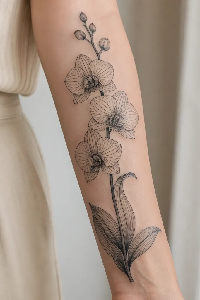
Orchids are built for hiding because the structure is already line-driven, so the old letters get drowned in the new "vein" logic. Thick black veins act like anchors; they make the negative space look intentional instead of empty. When the petals are pale with gray shading, the dark veins guide your eye away from any faint letter remnants.
Go for a composition that's vertical, with the biggest petals centered over the name. Use a mix of gray wash and tight black lines for the veins, then add one or two dark leaf shadows to fill gaps. Inner forearm and upper arm work well because the vertical flow stays readable as you move.
Pro tipRequest a stencil that places the orchid's thickest veins directly over the densest letters, even if it means the flower is slightly wider.
AvoidAvoid thin, delicate orchid linework - it leaves too much skin tone for old ink to peek through.
4. Botanical Sleeve With Marigold Orange Centers
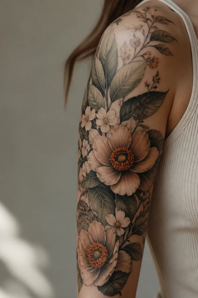
Orange centers are a cheat code for cover-ups because they sit between skin tone and black ink on the value scale, so they blur letter shapes. The leaf shadows give you the heavy contrast needed for packed names. I like this look because it reads as a cohesive sleeve, not a single "cover patch."
Ask for marigold orange centers with a darker ring - think burnt orange to deep amber - so the center looks dimensional. Build around the name area with leaves that overlap and tuck under each other, leaving no straight gaps. This is ideal for forearm or upper arm where you can extend past the name edges.
Pro tipIf your name is wide, don't try to cover it with one flower. Use 2-4 focal flowers and let the leaves fill the rest so the name doesn't show through as one block.
AvoidDon't place all the color only on the top layer. Under-shading is what hides the old ink.
5. Starburst Panel Over Script Name
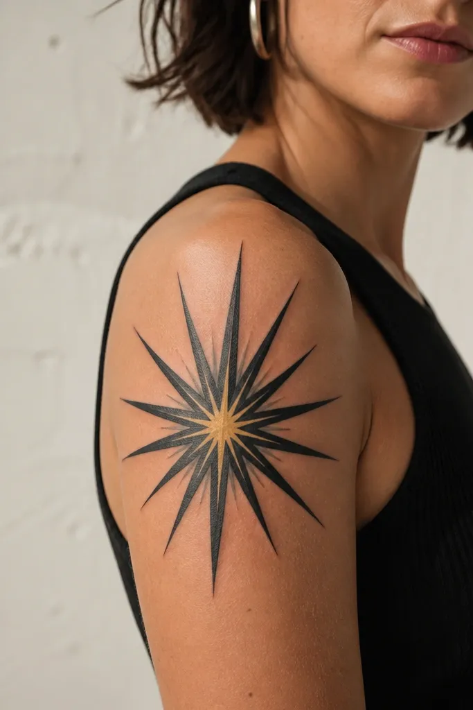
Graphic starbursts cover names because they break the language-like flow of cursive. The sharp rays create an aggressive geometry that makes letters look like part of the background. If you keep the center dark and let the highlight be small, the cover-up looks intentional instead of patchy.
Choose a starburst that spans the full name width and goes at least 1 to 2 inches beyond the letter ends. Keep most rays in dark gray/black, then add one small pale highlight - like muted butter yellow - to give it dimension. Upper arm and shoulder work best because you can hold the rays steady as skin moves.
Pro tipAsk your artist to add a subtle outline around the starburst shape. That boundary helps the tattoo read clean and prevents the old tattoo from bleeding into the surrounding skin.
AvoidAvoid super-light gray rays - they don't overpower dark script.
6. Celtic Knot Border With Dense Fill
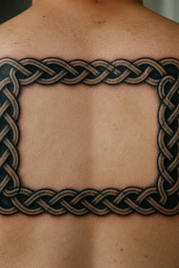
A knot border works when your name sits in a rectangular or band-like area. The interlacing bands create layered edges that hide letter strokes at multiple angles. Dense rope shading gives you enough black mass to cover older ink without turning the whole piece into a flat blackout.
Keep the knot bands thick - about the width of two fingers on your forearm scale - so the negative space is small. Put the densest shading where the name is darkest and let the rope highlights run along the top edges only. This looks best on forearm, upper arm, or calf where you can frame the name rather than wrap it tightly.
Pro tipRequest a border that continues past the name edges by at least half an inch on each side so the cover-up doesn't look like it's "stopping" at the old tattoo.
AvoidSkip thin line Celtic knots - they look airy and let old letters show between bands.
7. Butterfly With Black Wings and Soft Violet Underfade
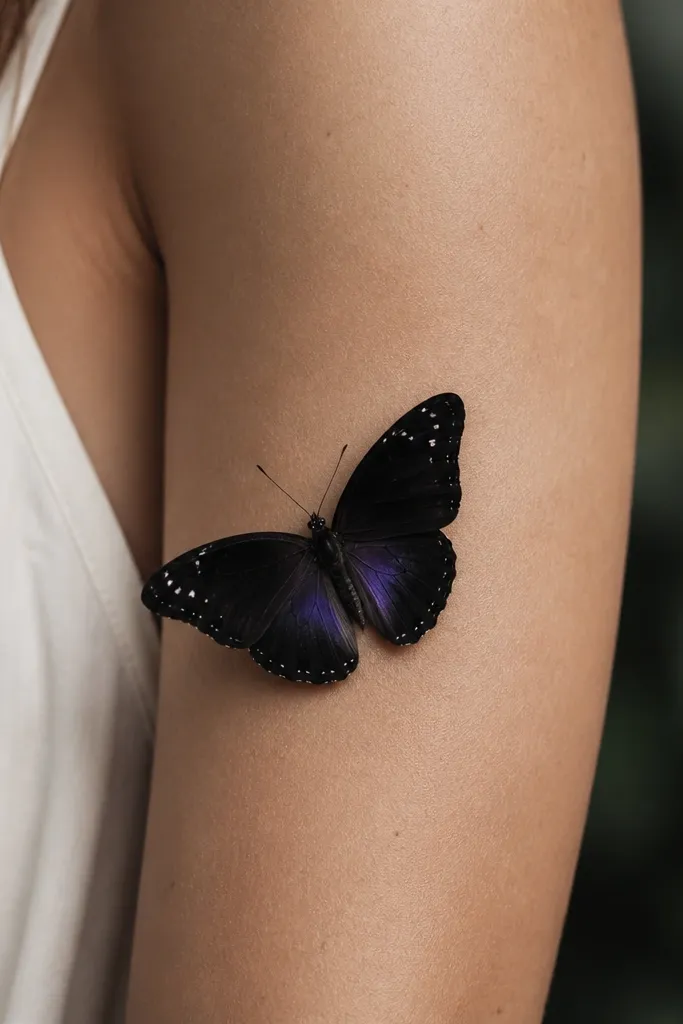
Butterflies cover names because the wing structure is layered and symmetrical, which makes old letter angles feel out of place. The black wings provide the coverage; the violet underfade adds softness so it doesn't look like a heavy patch. I've seen this style work even when the original name was bold black script.
Ask for black to dominate the wings, with violet placed under the wing edges - not on top of the densest black. Add small negative-space specks only in the outer wing areas so the center stays solid. Outer upper arm and shoulder are great because the butterfly shape stays flattering in motion.
Pro tipTell your artist you want the butterfly body centered over the thickest part of the name. The body is a visual "stop" that hides the transitions.
AvoidAvoid tiny butterflies - you need enough wing area to cover the whole name.
8. Sunflower With Charcoal Petal Depth
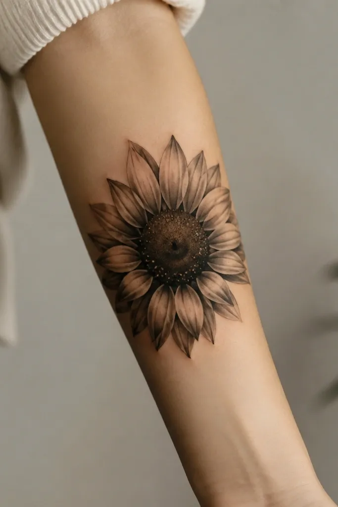
Sunflowers are built for cover-ups because the petals overlap and the center is naturally a dark mass. Charcoal gray shading hides letter edges without turning the tattoo into a full blackout. The speckled highlights keep it from looking flat and helps the new design hold up as it heals.
Go for a center that's dense dark brown with a slightly lighter ring, so it reads dimensional. Petals should be layered in multiple rows, with darker shading near the base and lighter gray toward the tips. Forearm and upper arm are best because the sunflower's round shape stays readable as your arm bends.
Pro tipIf your name is horizontal, tilt the sunflower slightly so the petal overlap direction breaks the old line of text.
AvoidAvoid super thin petal lines - they don't cover and they heal blurry.
9. Lavender Spray With Dark Stem Anchors
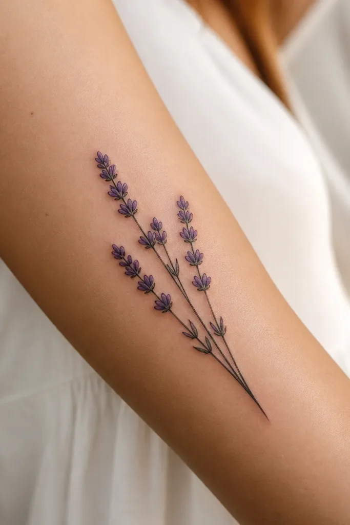
Lavender looks delicate but it can cover if the artist uses dark stem anchors and layered bud clusters. The buds create texture that breaks up letter shapes, while the dark stems provide the heavy ink needed for real coverage. I like this when the original name is small and packed, because the bud clusters can swallow the lettering.
Ask for a spray that covers at least 1 inch beyond the name edges, with buds layered in a tight cluster. Use two purples - one muted lavender and one deeper violet - then add black or very dark gray under the bud bases. Side forearm and outer upper arm are good because the spray direction stays natural.
Pro tipBring a reference photo and point to where your old letters sit. Tell the artist to place the darkest bud bases directly over those spots.
AvoidSkip lavender that's only soft pastel purple - it won't overpower black script.
10. Letter-Over Floral Frame With Black Background Wash
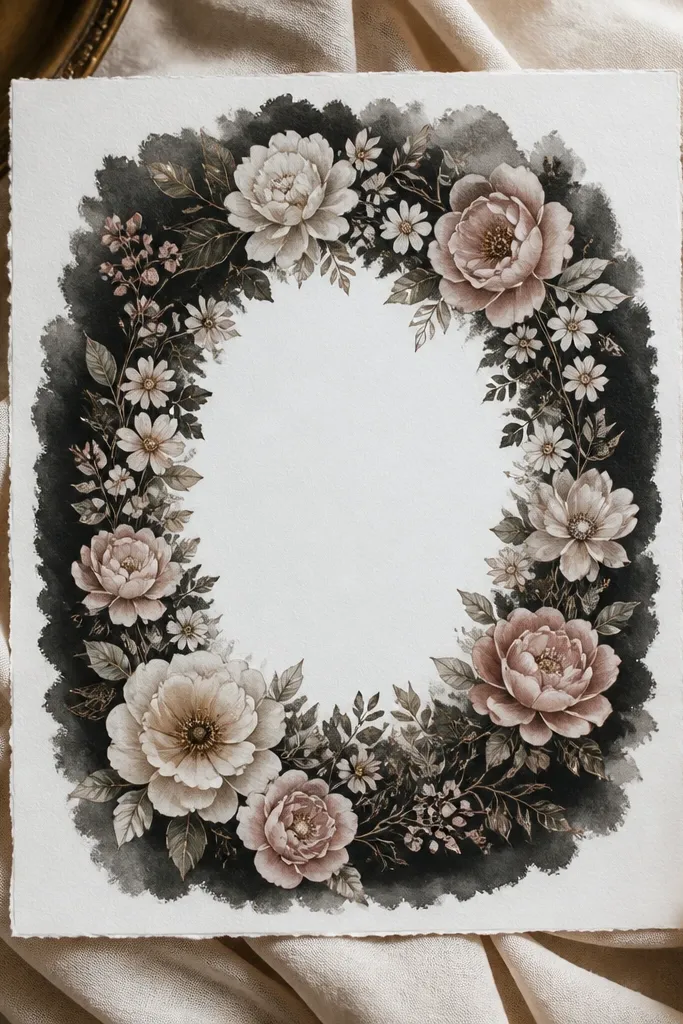
This is the "pretty blackout" approach. The black wash kills the old letters visually, while the floral frame keeps it feminine and readable. When the flowers have gray outlining and light highlights, the result looks designed instead of like a cover patch.
Use a frame shape - like a rounded rectangle or oval - that fully contains the old name. Put the black wash behind the flowers and also behind the negative space inside the frame so no letter strokes peek through. Great placement is upper arm, ribs, or calf where you can fit a clean frame without distortion.
Pro tipAsk for the floral outlines to be slightly thicker than you'd expect. It keeps the healed tattoo crisp against the black background.
AvoidAvoid skipping the background wash. Linework-only frames are a common failure for cover-ups.
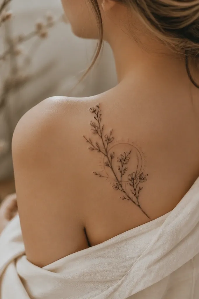
11. Cherry Blossom Branch With Dense Cherry Shadows
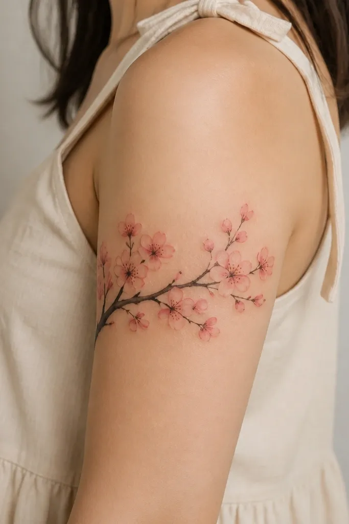
Cherry blossoms can cover names when the blossoms have dense shadow pockets. Those pockets add the value contrast needed to hide old ink, while the branch gives a clean "movement" line that makes the piece feel intentional. The trick is not making everything too light - the shadows are what do the heavy lifting.
Ask for a branch that crosses the name diagonally so it breaks up the text flow. Each bloom should have a darker base - gray or charcoal - and a pink outer petal layer. Upper arm and shoulder are best because the diagonal branch reads smoothly and doesn't stretch as much as the wrist.
Pro tipIf your name is thicker in the middle, concentrate the densest blooms there and thin out the ends. That keeps the cover-up from looking like an even blur.
AvoidDon't choose watercolor-only cherry blossoms. They fade and the name can reappear as contrast changes.