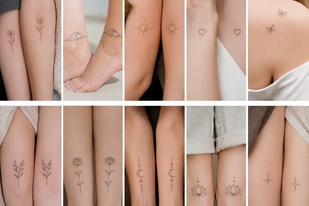
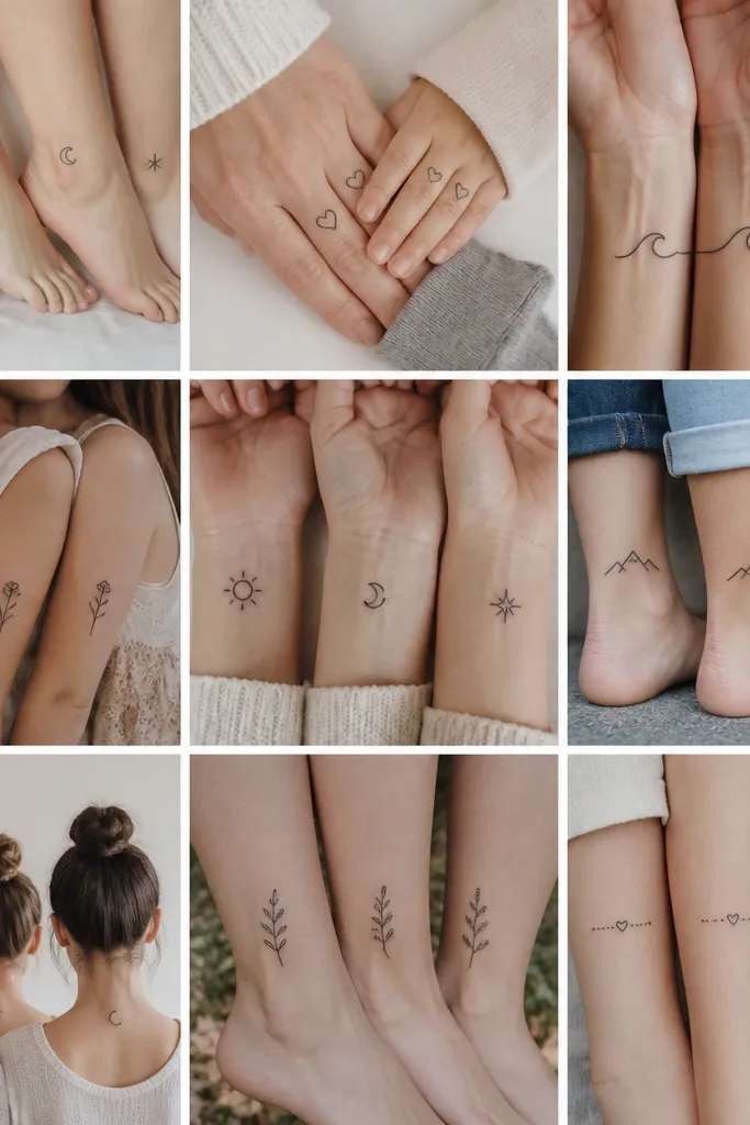
1. Birthstone Constellation Mirror Set
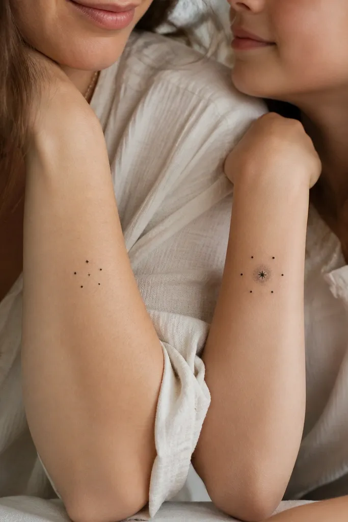
This works because constellations read as "same universe" without forcing identical shapes. The mom tattoo looks poised with smaller dot sizes and a tighter cluster; the daughter tattoo can be a touch more open so it feels like her version of the same story. Luxe shows up in the spacing - the dots aren't touching, and the star point is the only thing that feels bold. Keep it black ink only if you want it to stay sharp and not drift into uneven gray over time.
Place mom on the outer forearm, about 2 finger-widths above the wrist crease. Place daughter slightly higher on the same arm side so the set feels coordinated when arms are down. Use a design size difference of about 15-25%: daughter's cluster can be bigger, but the dot count stays the same so it's still "matching."
Pro tipAsk the artist to draw a spacing map first - mark how many millimeters between dots - then ink only after you approve the gaps.
AvoidAvoid adding extra stars after the sketch - every new dot increases the chance the cluster turns muddy with healing.
2. One Line, Two Languages Flower Stem
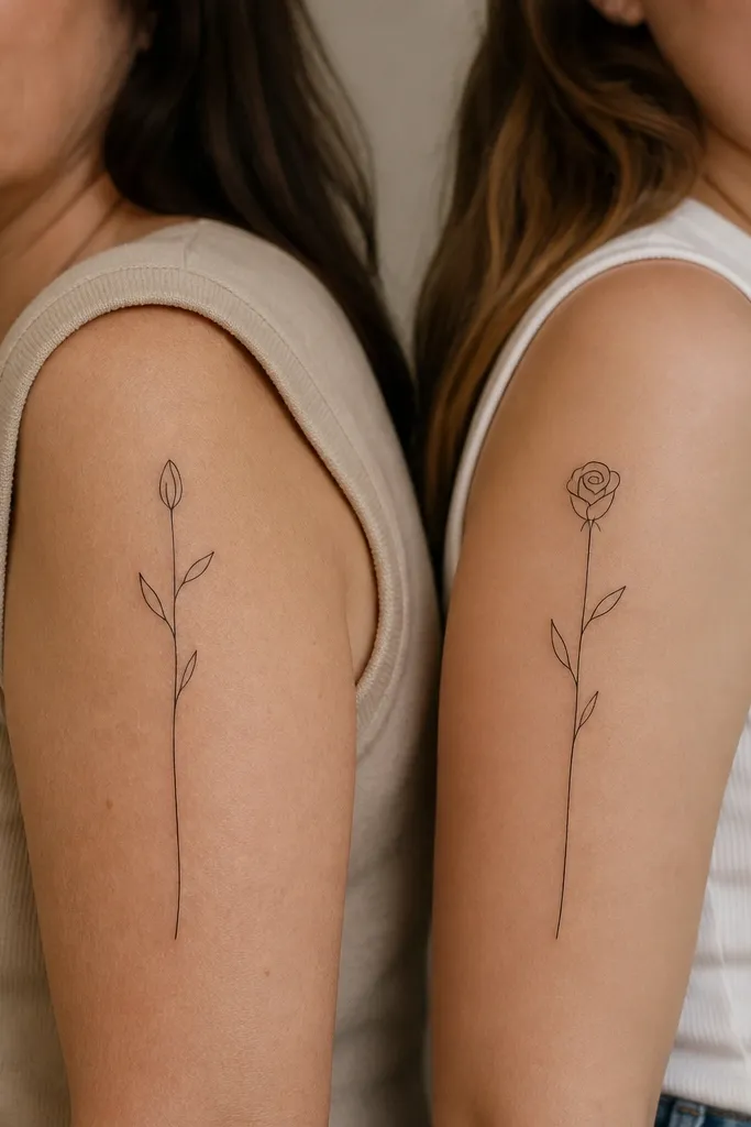
This is luxe because it keeps the line logic consistent while allowing a personal twist. The same stem shape makes the set feel connected even if the bud style changes. Fine-line works best when the artist uses consistent taper on every curve; that's what keeps the tattoo looking expensive instead of sketchy. Negative space around the leaves is part of the look - don't fill every gap.
Mom goes upper outer arm, about halfway between shoulder and elbow, with the stem angled slightly toward the back of the arm. Daughter goes on the same general spot but rotate the stem a few degrees so it sits naturally with her arm length. Keep the bud size within one third of the total piece height so the stem still reads as the main element.
Pro tipBring a photo of the two of you standing side-by-side and ask the artist to match how your arms naturally angle - the stems should align visually, not mechanically.
AvoidAvoid heavy shading under the leaves; it turns a crisp one-line piece into a gray blob.
3. Script Phrase With Birth Year Anchors
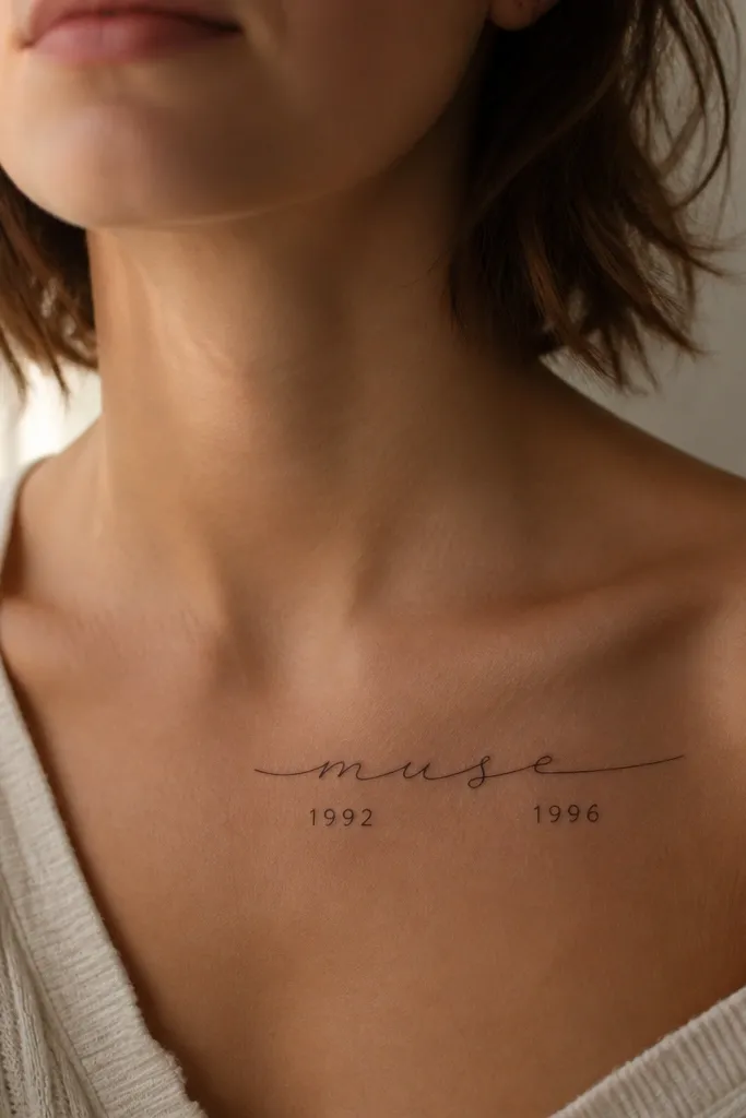
Script looks luxe when it has air and when the anchor elements are simple. The birth years keep the set grounded and give you a reason to match without copying the exact same phrase. The numerals act like weights that balance the movement of the script. If the script is too bold, it ages fast; if it's thin and controlled, it stays delicate.
Place mom's script slightly more horizontal on the collarbone, and daughter's script a touch more vertical. Keep the script height around 1.5 to 2.5 cm for a collarbone placement so it doesn't stretch with weight changes. Put the years in tiny block numerals about 2-3 mm tall, centered under the script.
Pro tipAsk for a line-weight check by measuring the thinnest strokes on the stencil - if the artist can't explain it, you're guessing.
AvoidAvoid long phrases that wrap - cramped script near the collarbone heals unevenly.
4. Matching Waves, Different Tide Mark
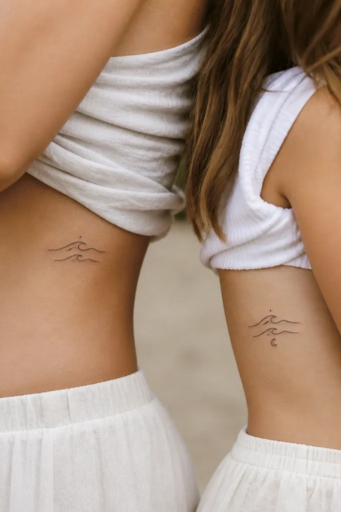
Waves feel sentimental without looking like a cookie-cutter heart. Different tide markers mean each tattoo has its own "moment," so it doesn't read like a copy-paste. Luxe comes from restraint: thin arcs, consistent spacing, and no thick outlines. If you keep the waves minimal, they heal clean and keep their contrast.
Place mom slightly higher on the side ribs, under the bra line but not directly on the band. Daughter goes a little lower so the set looks layered when you hug. Keep each wave arc about the same thickness, then let the tide marker be the only variation.
Pro tipDo a quick standing test in your mirror - ribs move with posture, and you want the waves to sit where your skin is most stable.
AvoidAvoid placing waves on the exact center of the rib where breathing motion causes extra stretching during healing.
5. Infinity Knot With Negative-Space Heart
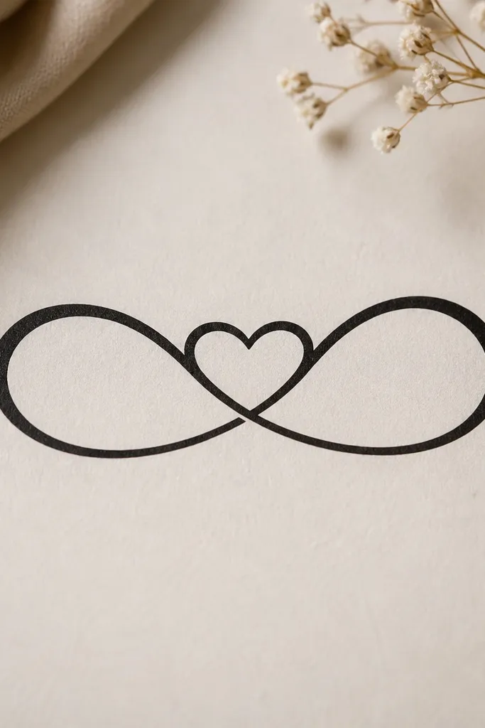
Negative-space hearts read clean and high-end because your eyes do the work of seeing the shape. The infinity knot ties you together; the heart cutout gives it a soft emotional punch without extra shading. This design stays elegant when lines are consistent and when the loops have enough gap for the heart to read. It's one of the few "matching" designs that looks good even when one tattoo is smaller.
Put mom's infinity on the inner forearm and daughter's on the outer forearm so the loops face outward differently. Size mom at about 4-5 cm across; daughter can be 5-6.5 cm across. Keep the negative-space heart centered and make sure the loops don't pinch too tight at the center.
Pro tipAsk the artist to stencil the negative-space heart twice: once at full size and once at your smaller size. If it disappears at smaller scale, adjust now.
AvoidAvoid thickening the lines to "help it show" - thicker lines erase the negative-space heart.
6. Feather Outline With Micro Dot Gradient
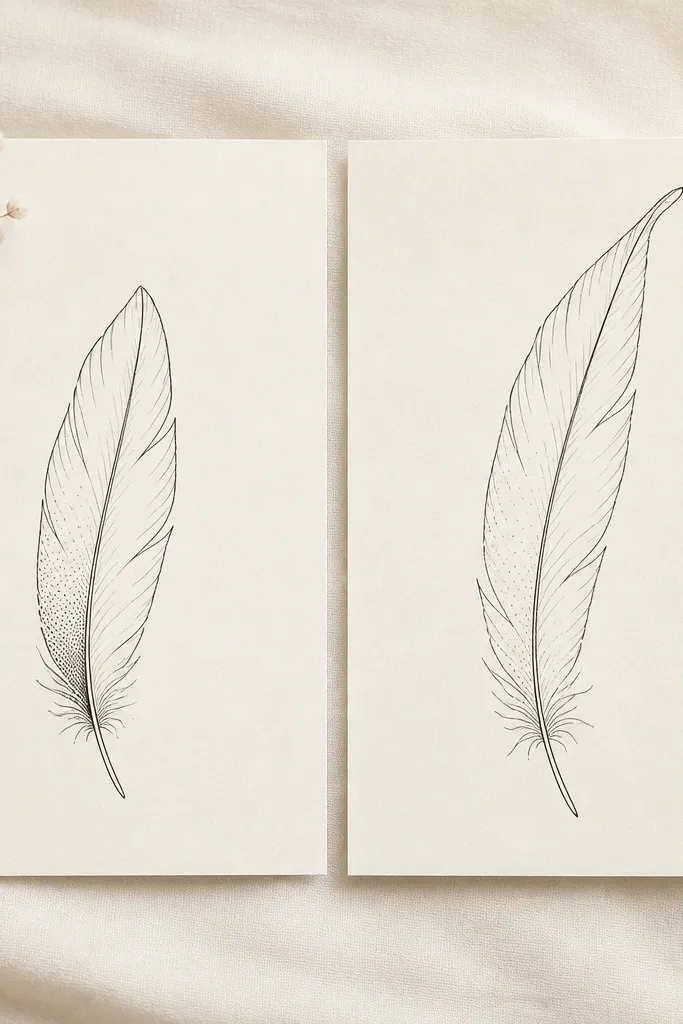
This is luxe because the shading is controlled and directional. One-side micro dot gradient gives depth without turning the feather into a gray wash. The outline stays crisp, and the dots look intentional instead of accidental. Mom and daughter can share the same feather structure while the dot density subtly changes the personality.
Choose a placement on upper arm outer side or shoulder blade edge where the feather has room to lie flat on skin. Keep mom's feather about 7-9 cm tall and daughter's about 9-11 cm. Only shade one "barb side," leaving the other side clean for contrast.
Pro tipBring a reference photo of a real feather and point to where the darkest area sits - the dot gradient should follow that exact direction.
AvoidAvoid full feather fill with dots; it makes the tattoo look flat and older faster.
7. Sun + Moon With One Shared Ray
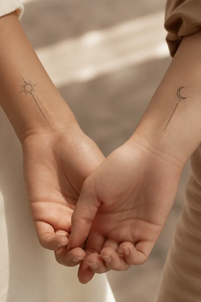
This set looks expensive because the "shared element" is tiny but unmistakable. Sun and moon are classic, yes, but the luxe part is matching the internal geometry: same ray length, same dot spacing, same line taper. It feels like a set even when the shapes are different. Keep it black ink and skip color - color can blur as it heals.
Mom gets the sun on the inner wrist (closer to thumb side), daughter gets the moon on the inner wrist (closer to pinky side). Keep both designs under 4 cm so they stay readable as skin shifts. Make the shared ray the same length in both stencils.
Pro tipAsk your artist to test the stencil on your skin with a temporary marker for 10 minutes - wrist skin moves and you'll see if the design warps.
AvoidAvoid putting the sun and moon too close to the crease lines on the wrist.
8. Minimal Archangel Wings With One Feather Detail
Wings can get overworked fast, but minimal outlines look luxe when they stay airy. The best part is the single feather detail that differentiates you without breaking the set. Negative space between wing lines is what makes it look high-end - the skin should show through clearly. If you keep shading near zero, the tattoo ages with clean edges.
Place mom's wings on the upper outer shoulder blade, about 3-4 cm below the collarbone. Daughter places hers slightly lower so the wings don't overlap with the shoulder seam of clothing. Keep both at similar width, then add the extra feather only on daughter's outer edge.
Pro tipTell the artist you want "print-like linework." If they start talking about heavy shading, switch artists or redesign.
AvoidAvoid thick outlines that turn the wings into a sticker look.
9. Interlocking Hearts, Split by Skin Tone Space
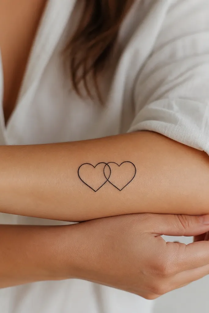
Interlocking hearts feel sentimental, but this version stays luxe because it refuses to overfill. Leaving the overlap as skin makes the tattoo look light, modern, and expensive. The outlines must be thin and consistent, and the hearts must have enough gap so the overlap reads as intentional negative space. Mom and daughter can share the same concept while one heart is slightly larger.
Place mom's hearts on inner forearm with the points angled slightly up. Daughter's hearts go on outer forearm, angled to match her natural arm curve. Size difference should be around 20% - the smaller heart should still be readable from arm's length.
Pro tipDo a quick "hand test" - close your fist and relax it. If the hearts distort too much around the joint, change placement.
AvoidAvoid filled hearts with thick black - the overlap area becomes a dark smear after healing.
10. Compass Rose With One Shared Letter
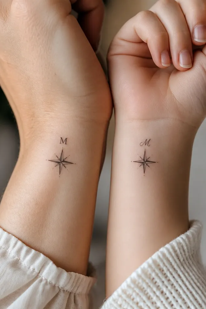
A compass rose looks luxe because it has structure - straight lines, controlled symmetry, and clean geometry. The shared letter ties it to you both, while the font difference lets each person feel like it belongs to her. This set ages well when you keep shading minimal and rely on crisp linework. It also looks good on different skin tones because there's no color blending to muddy.
Place mom on the upper outer arm, just above the bicep line. Daughter goes on the outer forearm or upper arm so the compass stays visible. Keep the rose about 4-6 cm across and set the letter small enough that it doesn't overpower the compass points.
Pro tipAsk the artist to print stencil outlines with the same scale for both tattoos before you approve placement.
AvoidAvoid heavy dot shading in the compass petals; it can make the geometry blur.


