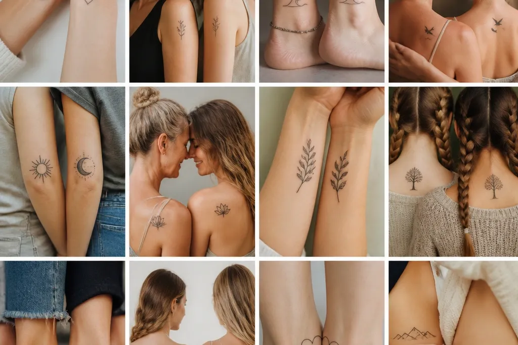

1. Birth-Flower Pair With a Shared Stem Shape
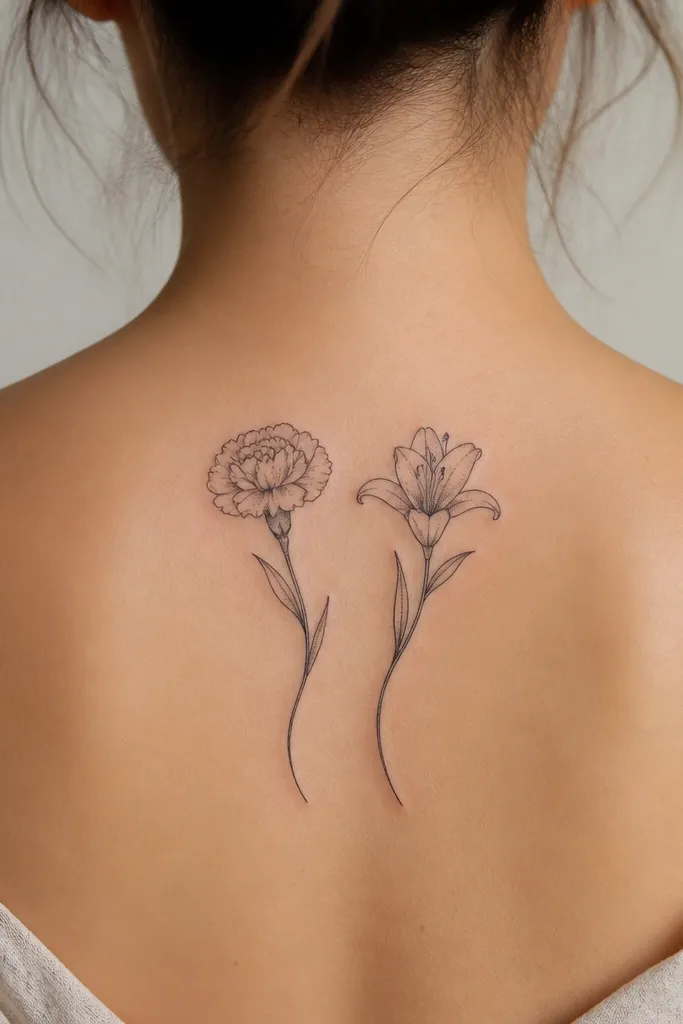
This works because the flowers give clear meaning without needing a long explanation, and the shared stem line makes it feel like a set. I like using two different flowers with the same line weight and the same leaf count - it keeps the composition matching while each person gets their own identity. Colors can stay black-and-gray for longevity, or you can add one accent color like a muted burgundy in the mother's petals and a pale peach in the daughter's petals using a limited palette.
Put the mother's flower slightly higher on the forearm or upper arm so both pieces "read" as balanced when you stand side-by-side. Keep petals under 1.5 inches wide for wrists and inner forearm so healing doesn't blur the edges. Use fine liner for the stem and medium shading only in the petal centers; too much gray makes it look muddy.
Pro tipAsk for a stencil that includes the exact stem curve - if the curve doesn't match on both bodies, the set won't feel intentional after it heals.
AvoidAvoid mixing two different styles for the flowers and stem - it makes the set look like two unrelated tattoos.
2. Coordinates Under a Thin Constellation
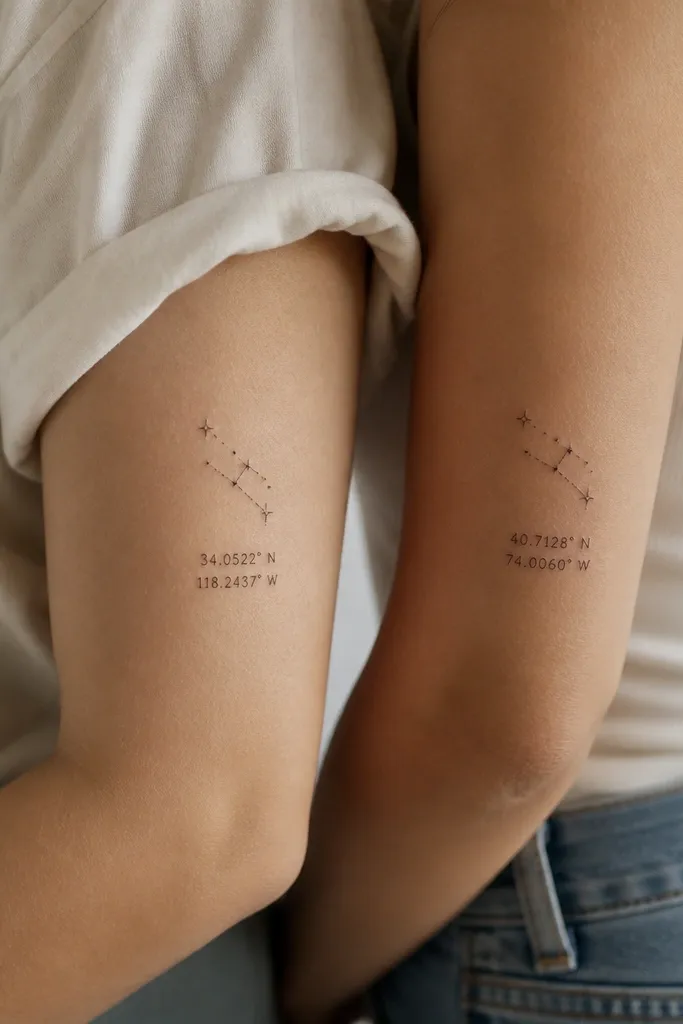
Constellations are perfect for meaning because they let you share a theme (a night, a place, a memory) while keeping the coordinates different. The constellation lines act like a visual anchor so the text doesn't carry the entire tattoo. I've found that bold, thick coordinate fonts fade into a gray smear, so I prefer tight, thin lettering with plenty of spacing between numbers.
Place it on the upper arm, outer forearm, or upper rib where you can keep the numbers readable. Keep the coordinate text to one line per person, and use a font that feels handwritten but legible - no ultra-thin script. The stars should be small and consistent: dot size should match across both tattoos so the set looks like it was designed together.
Pro tipHave the artist write the coordinate string on a paper stencil at the final size and check it under bathroom mirror lighting - that's where readability decides everything.
AvoidAvoid using tiny text with cramped spacing; it looks crisp on the day you get it and then turns into a dark line later.
3. Matching Handwriting With One Changed Word
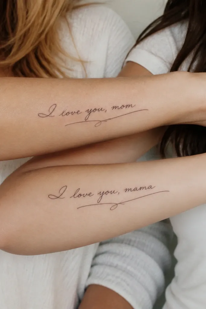
Handwriting tattoos feel intimate because they're literally your words. This idea works best when you keep the structure identical and swap only one word - like "home" for the mother and "us" for the daughter, or "stay" vs "grow." That keeps the matching look while making each person's meaning real. I also love adding a faint underline flourish that stays the same on both - it visually ties the pair together.
Choose a phrase that fits in 6-10 words so the artist can keep it readable. Don't use all caps; mixed case looks more like real writing and heals better. For placement, the inner forearm and outer forearm both work if the artist keeps the baseline parallel to the arm's natural lines.
Pro tipBring the exact writing sample you want (a photo of the note or card), and ask for a stencil traced directly from that sample, not redrawn from memory.
AvoidAvoid copying a font from the internet; it looks generic and it won't match the real emotion of your handwriting.
4. Moon Phases Timeline, Same Night - Different Phase
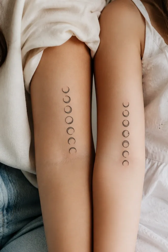
This is a smart matching concept because moon phases look "paired" even if the exact phase differs. The meaning can be timing - like the moon on the day each person was born - or it can symbolize growth and seasons of life. I like clean negative space in the crescent cutouts; it keeps the tattoo sharp as it heals.
Do a vertical layout on the calf, upper thigh, or outer arm so the phases line up neatly with the body's movement. Keep each moon about the size of a dime to quarter depending on placement, with consistent spacing. Use only black ink and a tiny amount of gray at the shaded edge of the highlighted moon.
Pro tipAsk your artist to draw the phases on a printed grid so both tattoos line up in size and spacing - your eye will catch even small differences.
AvoidAvoid heavy gray washes on moon phases; the shaded parts blur and the crescent edges lose their crisp shape.
5. Infinity Knot With a Hidden Initial in the Loop
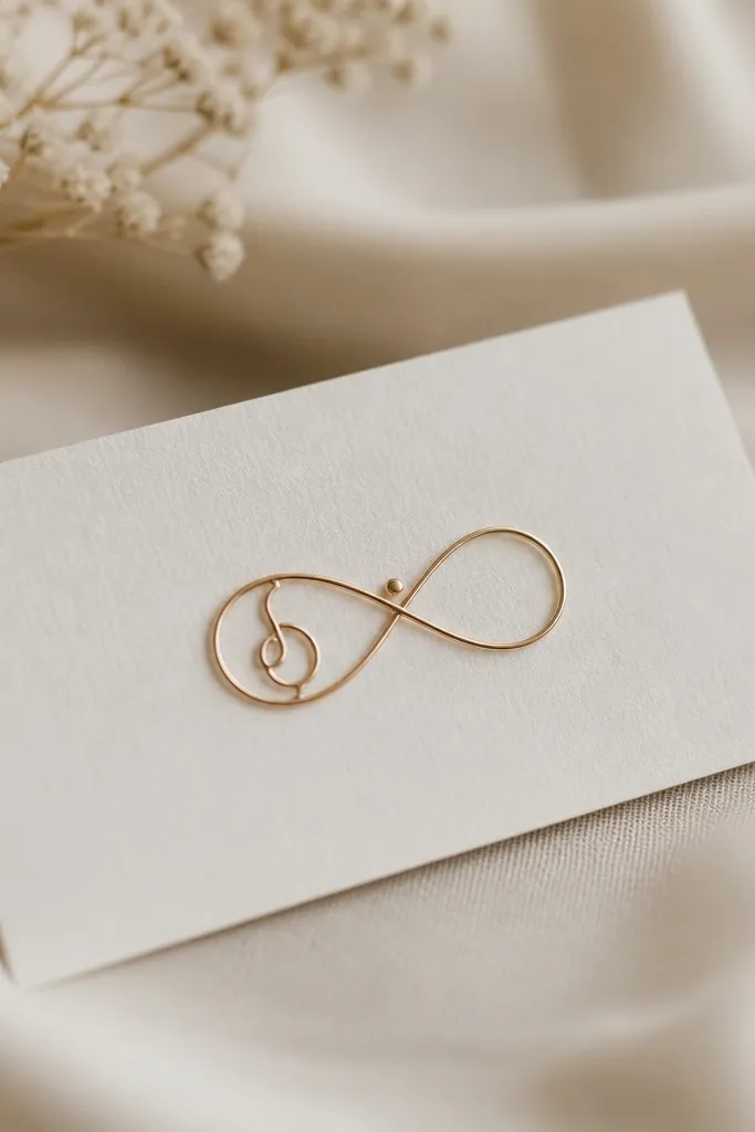
Infinity is the obvious matching choice, but the trick is making it personal without clutter. Hiding an initial inside one loop makes it meaningful for each person while keeping the overall shape identical. The design looks light and clean, especially with a single dot accent that stays the same on both tattoos.
Place it on the inner wrist, ankle, or collarbone where the lines can sit flat and heal well. Keep the infinity lines thin but not hairline - think clean fine line that still has weight. The initial should be small, centered, and not too busy; one simple monogram style beats decorative fonts.
Pro tipUse one consistent initial style for both - same font and stroke thickness - so the set reads as intentional, not random.
AvoidAvoid tiny initials on a large infinity if the loop is too small; it turns into an unreadable blob.
6. Tiny Lighthouse and Waves, Same Blueprint
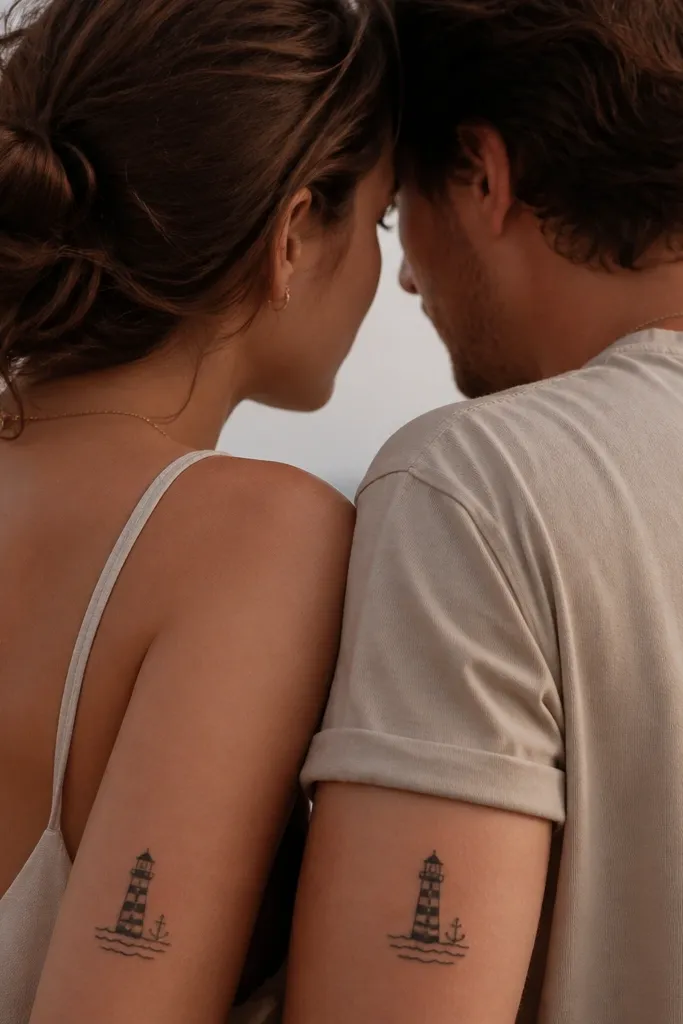
Lighthouses are one of those symbols that carry meaning without needing a paragraph. This works for mom and daughter because it can represent guidance, safe returns, or "I always know how to get you home." I've seen it look especially good in black-and-gray with crisp negative space so the waves don't turn into a dark band.
Put it on the side of the upper arm, shoulder blade edge, or upper rib with enough room for the waves to breathe. Keep the lighthouse about 1.5-2 inches tall and keep wave lines consistent in thickness. Add a small anchor or star on one side for each person - same position, different symbol.
Pro tipAsk for a stencil that includes the wave spacing - if the waves don't match across both tattoos, the set loses its "together" feel.
AvoidAvoid packing the lighthouse with extra details; it reads as a smudge after healing.
7. Palm Tree Leaf Pairing With One Different Leaf Shape
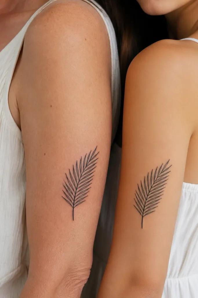
Leaves work because they're organic and forgiving - they still look good even if your skin texture shifts a little with time. The shared frond base makes the set cohesive, and the one leaf shape change tells each person's story. I like this for families who want a matching nature vibe without copy-pasting the exact same design.
Place it on the upper arm, outer forearm, or side of calf where the frond can curve with the body. Keep the frond linework clean and use minimal shading under the leaf folds. The "different leaf tip" should be subtle enough that it doesn't look like a mistake - think one extra notch or a slightly different split.
Pro tipChoose the same leaf orientation on both bodies so it looks like one family story when they stand together.
AvoidAvoid heavy dot shading on leaf folds; it darkens fast and eats the leaf detail.
8. Matching Heartbeat Line With Different Dates at the End
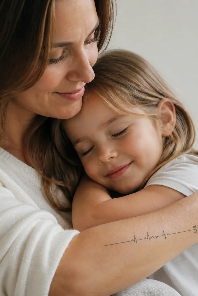
Heartbeat lines are instantly recognizable and they connect emotionally without being cheesy. The meaning comes from the dates - birth dates, adoption date, or the day someone overcame something. Keeping the same overall heartbeat rhythm makes it match, while the date swap makes it personal.
Keep the heartbeat line length about 3-4 inches so the spikes remain distinct. Use simple date formatting like 06.14.1997 so it stays readable as it fades. Place it on the inner wrist or forearm where the line can be clean and flat.
Pro tipHave the artist redraw the date characters inside the stencil - I've seen copy/paste lettering look fine on paper and then fail on skin.
AvoidAvoid super stylized numbers; too much flair turns into unreadable marks.
9. Two-Color Rose Outline With Shared Stem Wrap
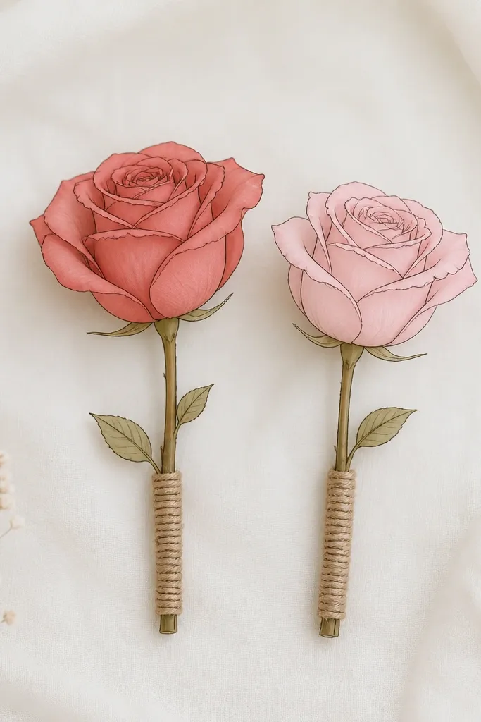
If you want color but you're worried it'll look harsh later, outline roses with light tint are the way I've seen work best. The shared stem wrap keeps the pair matched, while the petal tint color change gives each person their own identity. I like muted tones because they heal calmer than bright magentas.
Keep the rose mostly linework and use color only as a light wash inside petals, not full fill. Place it on the forearm or upper arm where you can see it and where the skin doesn't crease too hard. The stem wrap lines should be identical in length and thickness for both tattoos.
Pro tipPick two tint colors that are close in saturation - muted red and muted pink look like a set; neon shades look like two separate tattoos.
AvoidAvoid full black-and-gray realism on one person and flat color on the other unless you're matching style across the whole design.
10. Mother's Crown, Daughter's Feather - Same Crown Base
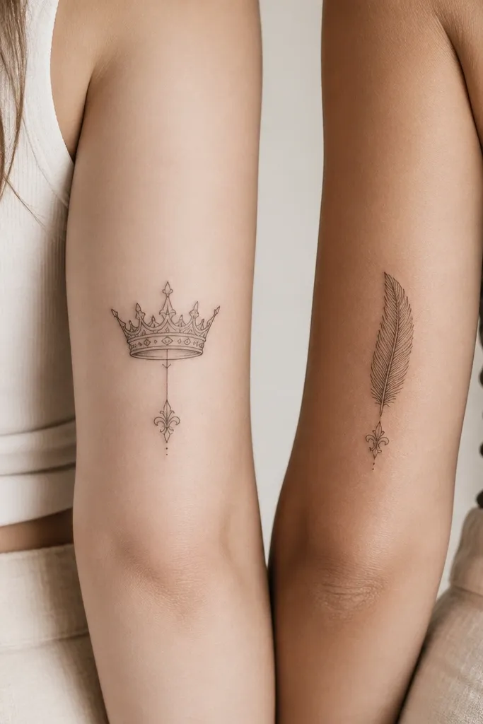
This is a clever "matching without being identical" set. The crown can represent leadership or protection for the mom, and the feather can represent freedom or voice for the daughter. The shared base ornament makes it feel like one design family even though the symbol changes.
Place the crown and feather on symmetrical spots like outer upper arm or shoulder blade edge. Keep them the same height and use the same line weight so they look paired when you wear short sleeves. The base ornament should be small and consistent - one curved flourish that repeats in both pieces.
Pro tipAsk the artist to print both stencils at the same size and put them on your skin next to each other before the appointment day.
AvoidAvoid choosing wildly different sizes; even if the symbols are meaningful, size mismatch makes the set feel accidental.
11. Song Lyric Waveform With Shared Melody Notes
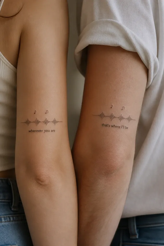
Waveform tattoos feel personal fast because they tie to a specific song. The shared melody notes keep the set consistent, and the lyric fragment can be different for each person - the mother's line and the daughter's line that both connect to the same memory. Use black ink with light gray under the waveform to keep it readable.
This works best on upper forearm or calf where the waveform has enough space to breathe. Keep the lyric fragment short - 2-6 words - so the letters don't shrink into mush. The music notes should be placed at matching heights to preserve the visual rhythm.
Pro tipPick a lyric that you can stand to see every day; I've had clients regret long lines that feel too heavy once the novelty fades.
AvoidAvoid tiny lyric blocks; if it looks like it needs a magnifying glass, it will age badly.
12. Key and Lock With a Shared Heart-Shaped Keyhole
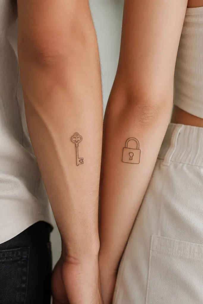
This set is direct and sweet without being childish. The heart-shaped keyhole gives you the mom-daughter bond symbol, and the key/lock split means each person has their own role. I like thin linework with a small amount of gray shadow under the key teeth so it has dimension but stays clean.
Place on the wrist, ankle, or upper arm where the key and lock can sit without bending too much. Keep the key teeth count consistent and simple - too many teeth look crowded. The heart shape should be identical in both pieces so the set reads as one story.
Pro tipBring a real keychain photo to your artist; the proportions of real keys help the tattoo look believable and not cartoonish.
AvoidAvoid thick outlines that overpower the heart shape; the heart becomes a blob after healing.


