1. Birth Flower + Hidden Word in the Leaves
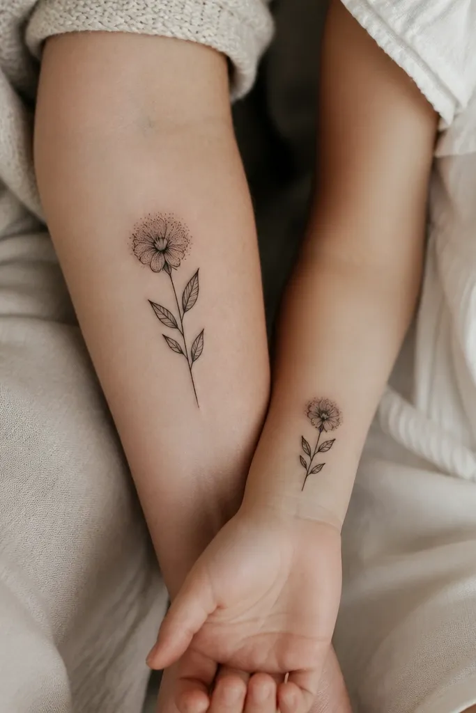
This works because the flower reads instantly as a shared "we grew together" story, and the hidden word adds sentiment without clutter. The negative-space leaf gaps act like a secret - you only see it when you're close, which feels intimate between mom and daughter. Dot shading around the petals keeps the design soft instead of harsh, so it doesn't look like a copied stencil.
Have the mom piece placed where her wrist-to-elbow skin is flatter (inner forearm or outer forearm). For the daughter, keep it smaller on the wrist so the leaves don't stretch across tendons. Use the same flower type for both, but vary petal count by 2-3 to make each tattoo feel like it belongs to that person.
Pro tipAsk your artist to mock the hidden word in placement on a photo of your skin so the word doesn't warp with the leaf veins.
AvoidAvoid putting the hidden word in solid linework - it blurs faster than negative space.
2. Constellation Map With One Shared Star and Different Dates
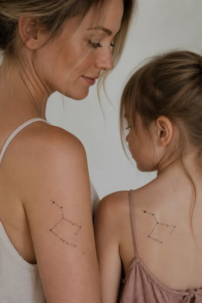
Constellations look clean because they use point-to-point structure. The shared star is the anchor - it visually links both tattoos even when the rest of the pattern shifts. Adding different dates makes it personal while keeping the overall design family consistent. The fine-line approach keeps the tattoo airy, which matters for shoulder and upper arm areas that move a lot.
Keep the constellation lines under 2mm thickness for a crisp look. Put the mom's tattoo on a flatter curved surface like upper outer arm; place the daughter's on shoulder blade where the skin is smoother when her arm relaxes. Use the same star map layout concept, but adjust scale so the points don't crowd.
Pro tipBring your artist the actual date/time reference you want represented, then let them convert it into a stylized constellation rather than copying a photo-real chart.
AvoidSkip dense micro-stars - too many tiny dots in one area turn into a uniform haze.
3. Heartbeat Line With a Tiny Heart at the End
Heartbeat lines are sentimental without being cheesy because they look like a symbol first, then a story second. The line itself is the anchor, and the ending marker is the personal twist that makes each person's tattoo feel unique. Keeping the line steady and not too jagged helps it age better and prevents it from looking like a medical diagram.
On collarbones, keep the design narrow and centered - it should sit parallel to the collarbone line. For the daughter, try a forearm or upper rib placement where the line can travel without stretching too much. Have the artist keep the stroke consistent - no thick-to-thin changes.
Pro tipAsk for a slight taper near the end so the final symbol looks intentional, not like it was pasted on.
AvoidDon't add lots of extra icons along the heartbeat line; it breaks the clean read.
4. Matching Ribbon Bow With Different Charm Icons
A ribbon bow is instantly readable and feels like "care" and "tie-together" energy. The bow shape works well in black-and-gray because folds show through with line weight and subtle dot shading. Different charm icons let you keep the same design language while giving each person a personal symbol (a key for one, a tiny book for the other).
Keep the bow width about 1.5-2.5 inches on the wrist so it stays crisp. On the mom's upper arm, you can go slightly larger for symmetry. Pick one charm icon style for both - same line thickness, same dot shading method.
Pro tipUse the same ribbon knot orientation on both tattoos so they feel like a matched set when you stand side by side.
AvoidAvoid thick outlines on the ribbon folds; it makes the bow look heavy and older quickly.
5. Infinity Loop With a Hidden Initial in the Center
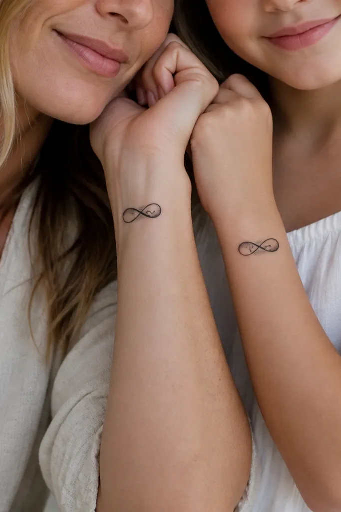
Infinity looks good because it's simple, and simplicity heals better. Hiding an initial in the center loop feels personal without adding a separate text block. The dot shading on only one edge gives dimension without turning the whole thing gray. It also reads well from a distance, which matters for wrist tattoos.
Make the infinity about the same physical width on both bodies, even if the initials differ. The hidden initial needs enough negative space - keep it thin and legible. Place it on the inside wrist where the skin is smoother; avoid over the thumb-side where the loop stretches.
Pro tipShow your artist a sample of the exact font you want for the initial, then ask them to convert it into a single-stroke style so it doesn't thicken after healing.
AvoidDon't use cursive script inside the loop; it turns into mush as the wrist flexes.
6. Same Animal, Two Poses (Cat, Fox, or Dove)
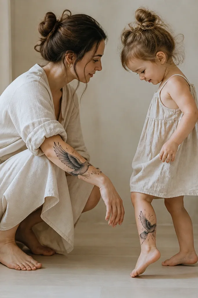
Animal tattoos feel warm when the design language matches. Two poses keep the set from looking like a copy-paste pair, but the shared feather pattern ties them together. Black-and-gray feather lines heal well when the strokes aren't too close together. You also get a clear silhouette, so it still reads years later.
Pick an animal with clear shapes (dove, cat, fox, owl). Keep line density consistent across both tattoos - for example, if the mom has 6 feather lines per wing, the daughter should have the same count style. Choose placement where the silhouette isn't squeezed by curves - forearm and calf are forgiving.
Pro tipAsk for a tiny shared element like the same star above the head or a small leaf under the feet on both designs.
AvoidSkip hyper-realistic fur textures on small animals; they don't hold crisp detail.
7. Mom's Hands + Daughter's Hands With One Shared Detail
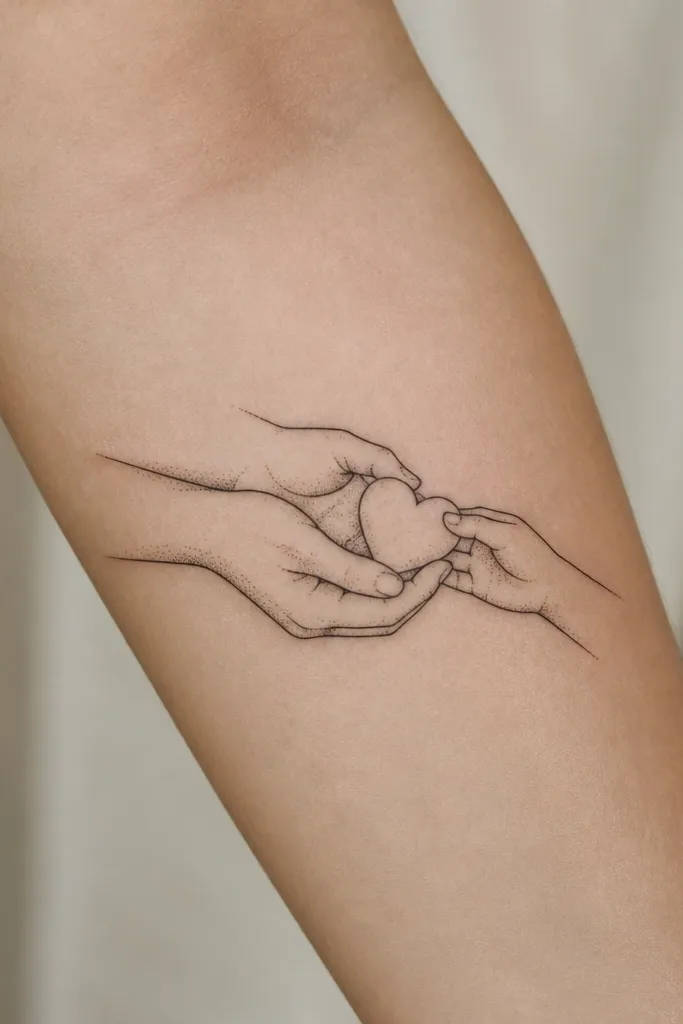
Hands tattoos hit hard because they show care without needing words. The heart is the anchor detail that links both pieces, and the different angles make it feel like each person's perspective. The line-and-dot style keeps it soft and intimate, not harsh. It also works well for fine-line artists who can draw fingers accurately.
Place mom's hands on the upper arm or forearm where fingers can be simplified without looking cramped. Daughter's hands look great on the inner forearm or side of the wrist. Keep the shared heart small enough to stay crisp, and use the same heart outline on both tattoos.
Pro tipBring a photo of hands that match the pose you want - even a phone photo in good lighting helps the artist nail proportions.
AvoidDon't go too detailed with nails and knuckles; it blurs faster than the linework.
8. Book Page Quote Fragment With Matching Margins
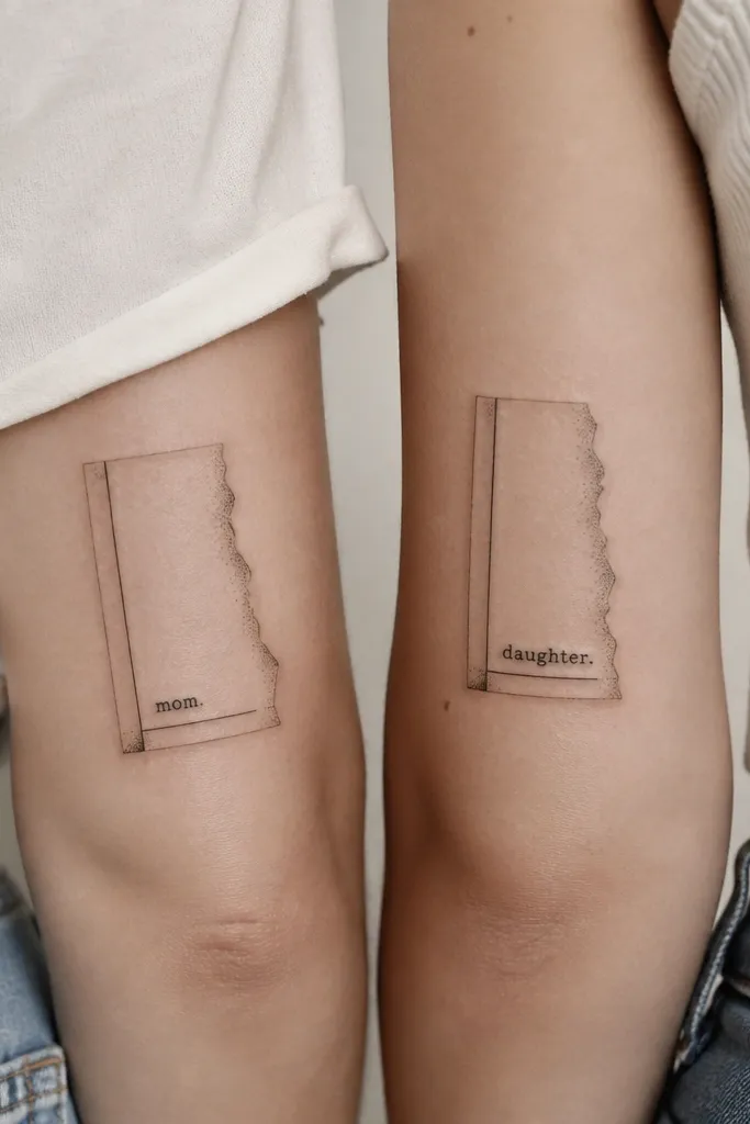
A book page fragment feels personal because you're using the vibe of a memory, not generic hearts. Matching margins give you the "set" look, while different quote fragments keep it honest to each person. Dot shading along the torn edge prevents the page from looking like a sticker. The typography stays readable when it's short and bold enough.
Keep the text under 8 words per tattoo so it doesn't turn into a block. Use a simple serif font style and avoid ultra-thin type. Place mom's piece on outer forearm; put the daughter's on upper arm or calf where the page edges can follow the body curve.
Pro tipAsk your artist to simulate the tattoo size on a printed outline of your arm so the letters don't get too small for healing.
AvoidAvoid full paragraphs - they heal into gray smudges.
9. Sun and Moon With One Shared Celestial Line
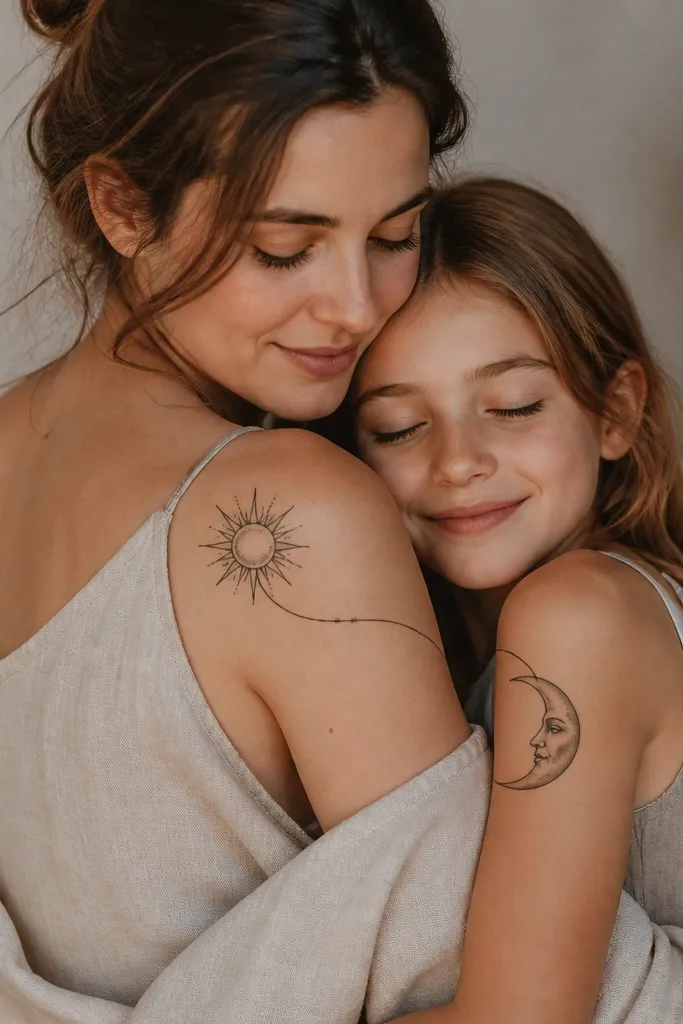
Sun and moon pairs look gorgeous because they're simple shapes with meaning built in. The shared orbit line ties them together so it feels like a single story between two people. Dot highlights add a gentle sparkle effect without turning into heavy shading. This one ages well because the core shapes stay bold.
Use the same orbit line thickness on both tattoos, then make the sun rays a little longer on the mom if you want a stronger anchor. Place mom near the shoulder where rays can radiate; place daughter slightly lower so the moon doesn't get squished by the shoulder joint. Keep the face details minimal - just a few line cues.
Pro tipHave your artist draw the orbit line first, then build the sun rays and moon curve around it so spacing stays consistent.
AvoidSkip detailed cloud textures on the moon; they take up space and blur.
10. Same Feather With Different Color Accent Spots
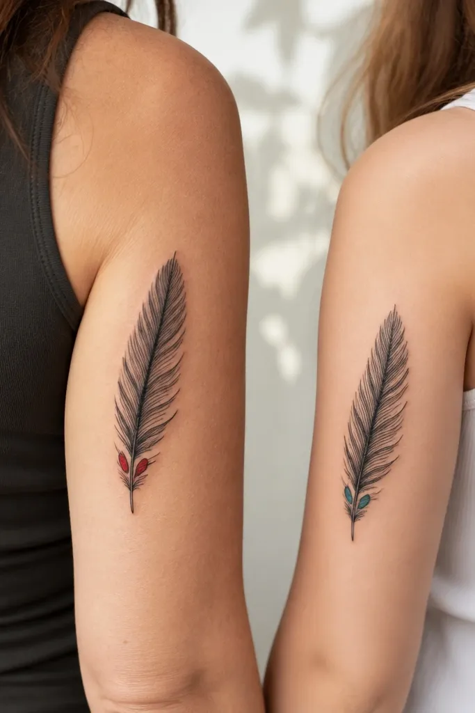
A feather is a clean symbol for growth, and the accent spots make it feel modern. I like keeping most of it black-and-gray because it ages predictably, then adding tiny color only where the tattoo has solid line support. The deep red and teal accents look intentional, not accidental, and the matching feather structure keeps the pair connected.
Keep the color spots small - think pinhead to pea-size, not big patches. Place mom's feather on the outer upper arm or shoulder blade; place daughter's on inner forearm where you can see the barbs. Use the same feather length ratio on both - the barbs should align to the quill at the same spacing style.
Pro tipAsk for a test placement with temporary ink or marker for color spot size before committing.
AvoidAvoid large full-color feathers; color saturation fades unevenly and can flatten the design.
11. Matching Coordinates With a Small Landmark Icon
Coordinates read as real and specific, which makes the sentiment feel grounded. The landmark icon makes the pair personal without adding long text. A minimal compass rose line adds direction without clutter. Keep it black ink with crisp numerals so it stays legible after healing.
Use a font size that stays readable at 1-2 feet. Place mom's on outer bicep or upper arm; place daughter's on ankle or upper calf where the numerals have room. Keep landmark icons tiny but solid - no micro-shading that can fade.
Pro tipPick the exact coordinates you want and ask your artist to convert them into a clean, consistent format like 41.40338, 2.17403 - no extra zeros.
AvoidSkip decorative swirls around tiny numerals; they thicken and blur.
12. Infinity + Feather Combo With a Hidden Date Under the Loop
This is a great option when you want more than one type of sentiment - the infinity gives the ongoing bond, and the feather adds growth. The hidden date keeps the tattoo meaningful for you two without forcing readable text everywhere. The under-loop placement hides the date from casual viewing, which feels private and special.
Rib and thigh both stretch, so the hidden date should be small but not tiny. Use bold numerals with clean line edges, and keep the feather barbs minimal so they don't turn into a gray smear. Match the feather orientation relative to the infinity loops for both tattoos.
Pro tipAsk your artist to mark where the tattoo will land when you stand and when you bend - hidden dates get warped if placement ignores movement.
AvoidDon't place hidden text over deep curves where the tattoo will fold constantly.


