1. Wraparound script with a small crescent underline
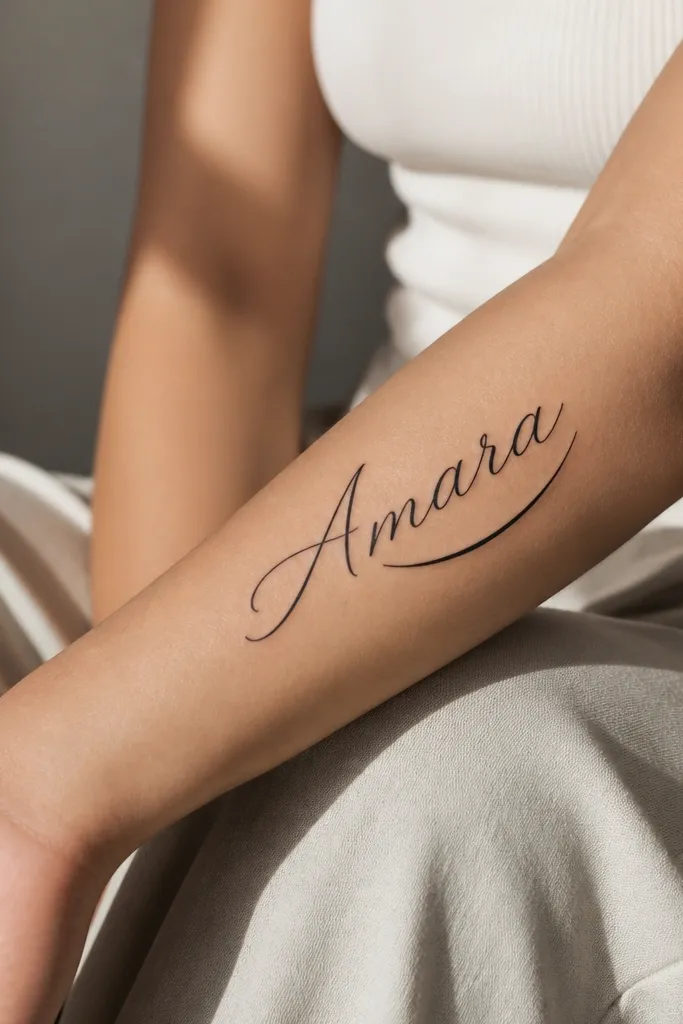
This works because the name follows the forearm's natural curve instead of fighting it. The crescent underline adds direction without turning into a heavy border, so the letters stay readable. I like solid black for this look because the underline stays crisp and doesn't fade into gray wash. The contrast between smooth script strokes and the clean crescent shape makes the tattoo feel finished.
Place the first letter about 2-3 fingers above the wrist crease, then let the script rise gradually. Keep the underline about 10-15mm long, starting under the last two letters. Ask your artist to use consistent line weight on the script - if the strokes thin out too much, the loops will blur.
Pro tipChoose a script with medium stroke weight, not delicate "hairline" cursive. If you can see the letter stems clearly on a paper stencil after 30 seconds, it usually heals better.
AvoidAvoid very thin cursive with tight loops - it looks cute on paper and turns cloudy after healing.
2. Bold italic serif name with a single dot divider
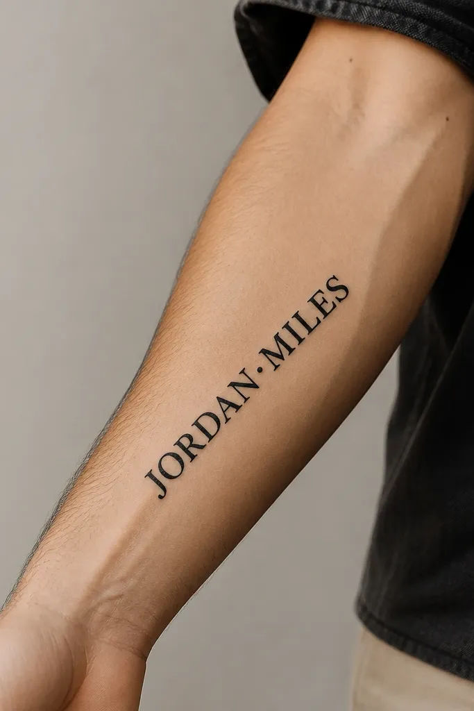
Italic serif letters read clean on skin because the strokes are thicker and the serifs give the eye a clear edge. The single dot divider acts like a punctuation mark, so the name doesn't feel like one continuous block. I've seen this style age well because the letterforms already have weight, which helps them survive normal fading. It also looks sharp under watch straps and long sleeves.
Keep the baseline nearly straight along the forearm - don't curve the serifs into an arc. Size the name so the tallest letters sit around 45-60mm from bottom to top, depending on how long the name is. The dot divider should be small (about the width of a typical serifs stem), not a big circle.
Pro tipBring a printout of the exact letter style you want and ask for a stencil test photo on your arm before final ink.
AvoidSkip decorative serifs that look "busy" - extra flourishes make fine lines blur into each other.
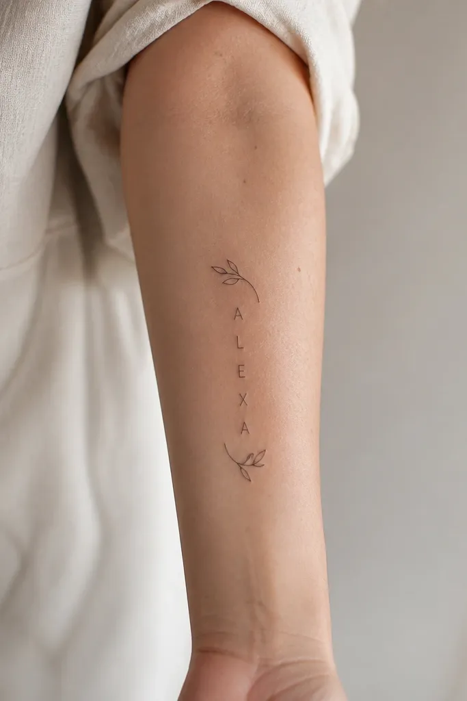
3. Micro name with a vertical line of coordinates
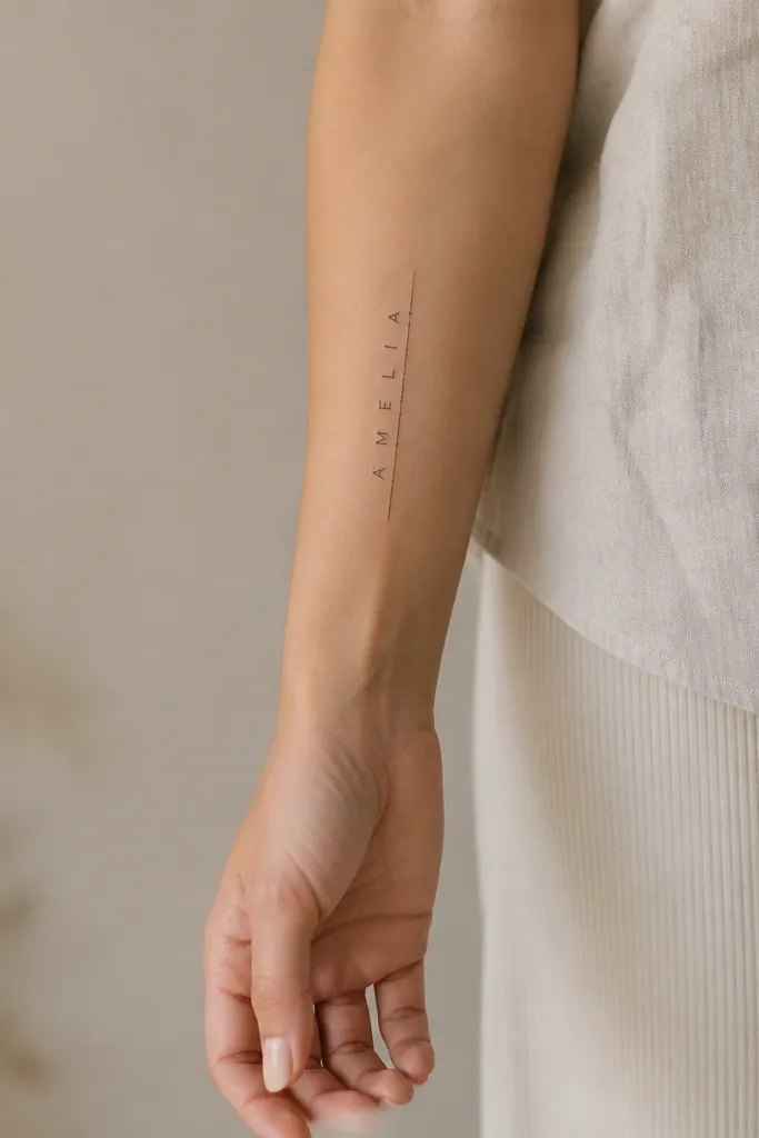
Micro tattoos work when you keep the design simple and give the artist enough space to keep line edges sharp. The vertical line gives structure, so the name feels intentional even at small scale. I like this for people who want a personal tattoo that still looks clean in bright daylight. The negative space is the design - it keeps the ink from looking crowded.
Place the name along the inner forearm or outer forearm where the skin is flatter. Keep the micro letters tall enough to read, usually around 3-5mm letter height per character for most names. The coordinate line should be thin and straight, with two marks that are about half the thickness of the line.
Pro tipAsk for a stencil that includes a ruler overlay on your arm so you can confirm the letter height in millimeters.
AvoidAvoid tiny lettering that depends on thin highlights - if it can't be read from 2 feet away, it won't age well.
4. Name in uppercase blocks with a thin border frame
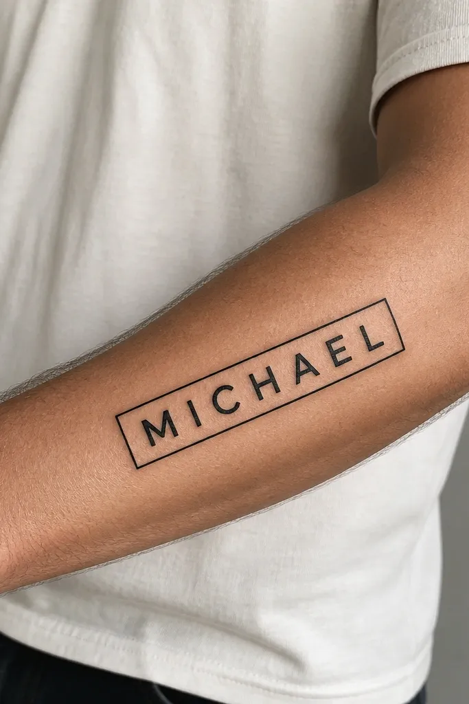
Uppercase blocks look bold on the forearm because the letter geometry matches the long horizontal space. The thin border frames the name without adding weight like a full banner. This design looks graphic and clean, especially when you wear short sleeves or roll up your cuffs. It also hides well if you want to keep it private under long sleeves.
Use a letter style with consistent stroke width, like a simple condensed sans. Leave 4-6mm of space between the letters and the border. The frame thickness should be thinner than the letter strokes, so the letters stay the hero.
Pro tipHave your artist measure the border width first - if the frame is too tight, the design looks cramped and heals unevenly.
AvoidDon't use a thick black frame around thin letters - it makes the center look washed out as the ink settles.
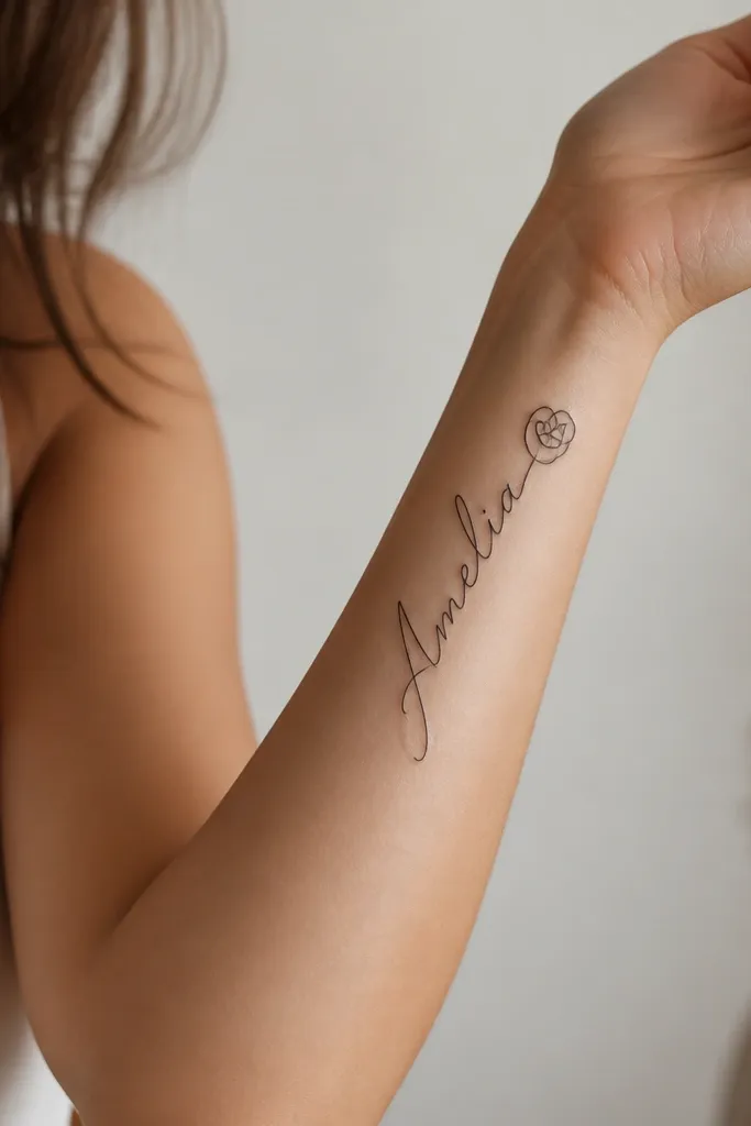
5. Script name with small birthstone dot behind the last letter
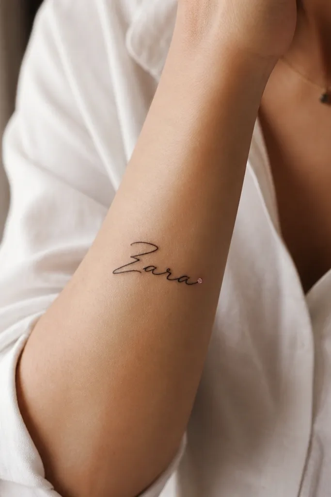
Adding one tiny color accent keeps the tattoo personal without turning it into a full-color piece. I like a single dot because it stays sharp and doesn't require heavy blending. The colored ink catches light differently than black, so it feels like a hidden detail. When the dot is behind the last letter, it looks like it was meant to be there.
Pick a birthstone color that matches your skin tone in real light. For fair to light-medium skin, a soft blue or pale green dot works well; for deeper skin, a bright ruby red or emerald green pops. Keep the dot small - around 2-3mm - and ask for a clean black outline only if your artist can keep it crisp.
Pro tipBring a reference photo of the exact color ink you want (not just "blue"). Show a quick swatch image so the artist can match brightness.
AvoidAvoid multiple colored elements - extra color points usually blur together as they age.
6. Name with a fine-line date ribbon that stays readable
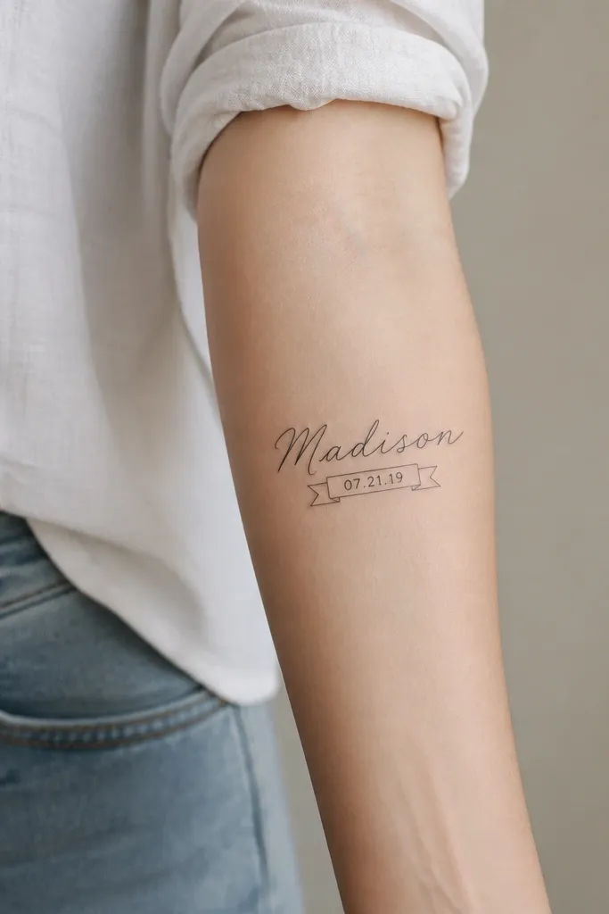
This works when the date is short and the ribbon is thin but not delicate. The date adds meaning, and the ribbon gives it a dedicated space so it doesn't crowd the name. Fine-line tattoos can heal well if the line weight is consistent and the numbers are large enough to read. I've seen dates fail when they're too small, so this plan gives the date room.
Place the ribbon so it sits under the center of the name, not under every letter. Keep the ribbon height around 6-8mm and make the date numbers at least 2mm tall. Use a simple font for numbers, like a classic serif numeral style, rather than swirly script.
Pro tipAsk for a stencil test that includes the date blurred slightly on purpose - if you can still read it, you're in the safe zone.
AvoidSkip tiny dates in ultra-thin script - the numbers turn into gray smudges.
7. Inner forearm name with a minimal leaf bracket
A leaf bracket frames the name and adds softness while staying mostly linework. The bracket shape is important: it guides the eye inward, which makes the name feel centered. I like this look because it works with many names and doesn't require heavy shading. It also looks good even when the rest of your tattoos are minimal.
Place the name so it starts around 1-2 inches above the wrist bone line. Keep the leaf outlines small, about 8-12mm tall, and put them slightly off the letter edges with a gap of 3-4mm. Use black linework only - no gray wash - so it stays crisp.
Pro tipTell your artist you want the leaves to be "outline only," even if they suggest shading. Outline-only ages cleaner for this placement.
AvoidDon't add thick leaves touching the letters - it makes the name harder to read.
8. Outer forearm name with a tiny heart knot
This style gives you a clear "ending" point, which is why it looks intentional on the outer forearm. The heart knot adds romance without covering the name in a big symbol. I like it because the heart is compact, so it doesn't compete with readability. The flourish also helps the tattoo flow with arm movement.
Start the name low enough that the end flourish lands where your outer forearm curves outward, usually mid-forearm. Keep the heart knot small and symmetrical, about 12-18mm wide. Ask for a smooth transition from script stroke to heart outline so there's no sudden thick-to-thin jump.
Pro tipIf your name ends with a letter that doesn't naturally flourish, choose a script that supports a long exit stroke. The flourish is what makes the knot look planned.
AvoidAvoid heart symbols that are too big - they steal attention from the name.
9. Name in single-line continuous script with a break at the middle
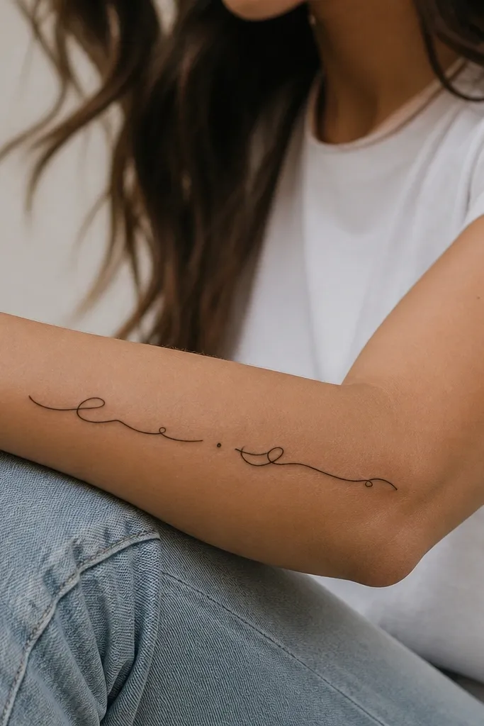
Single-line script looks modern and light, but it only works when the line is strong enough to survive healing. The intentional break gives the eye a rhythm and prevents the middle letters from crowding. I like the tiny dot marker because it makes the break look intentional, not like an artist stopping mid-stroke. This look is great if you already have other bolder tattoos and want something airy.
Choose a script where the letter connections don't require ultra-thin hair strokes. Make the line weight consistent - ask for a slightly thicker single-line than you might expect. Place the break at the midpoint of the name so it feels balanced, and keep the dot small, around 1-2mm.
Pro tipAsk your artist to stencil it, then do a quick "squint test" from a couple feet away. If you can still read the name, it's a good candidate for single-line.
AvoidAvoid hollow single-line tattoos with very thin needles - they fade unevenly and look patchy.
10. Name in brush lettering with a subtle shadow offset
Brush lettering adds personality because the stroke tapers look alive, not mechanical. The shadow offset gives depth while keeping the tattoo readable in motion. I like this combo because it makes black-only tattoos feel dimensional without using lots of colors. It also hides minor healing variations better than ultra-flat linework.
Pick a brush style with clear thick-to-thin transitions, but don't let the thinnest parts get too hairline. The shadow should be offset by about 1-2mm, and it should be lighter than the main strokes. Place the name along the forearm length so the tapered strokes follow the curve naturally.
Pro tipTell your artist you want the shadow "ghosted," not filled. If the shadow is too dark, it turns into a muddy block as it heals.
AvoidAvoid heavy drop-shadows - they blur into the skin tone and reduce the crispness of the letters.


