1. Tiny Matching Constellations With One Shared Star
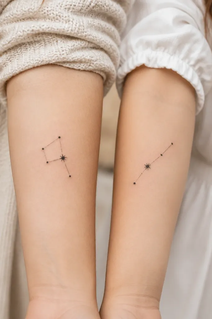
This works because constellations read as "pattern" even when the exact star order changes. The shared star gives you instant cohesion, while the different layout keeps it personal. Black dot stars hold up better than tiny colored ink in small sizes, and the thin line work still looks crisp when it's spaced correctly.
Place Mom's constellation on the inner forearm or outer wrist with the longer axis horizontal. Put Daughter's slightly higher on the forearm so the diagonal layout doesn't overlap skin creases. Keep star dots at about 1.5-2.5 mm and connecting lines thin but not hairline - I ask for consistent line weight across both.
Pro tipAsk the artist to draw the constellation on a paper stencil over your actual measurement - 12-18 mm width is usually the sweet spot.
AvoidAvoid adding too many stars; more than 8 points turns into a dark speck field on small skin.
2. Mini Birth Flower Pair With One Color Theme
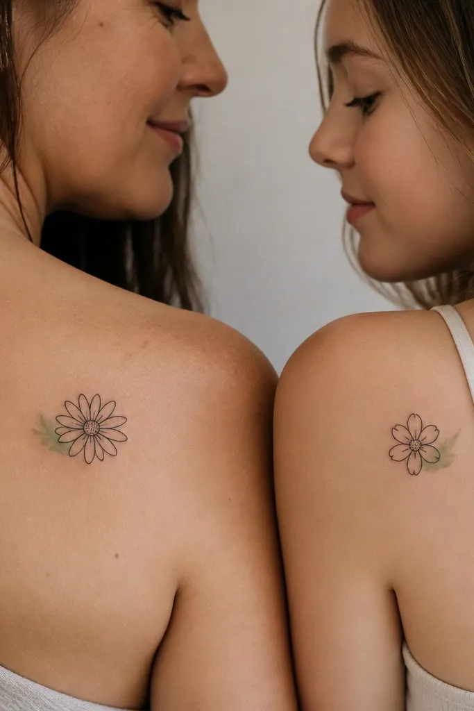
Birth flowers look sweet in small size when the petals are outlined with clean edges and the center is a tiny dot, not a shaded circle. The shared color theme ties them together even if the flowers are different. A small green accent is easier to keep readable than multiple colors, and it adds a little "life" without turning muddy.
For Mom, choose a daisy or sunflower-style outline that can fit around 18-25 mm. For Daughter, pick the flower that has fewer petal points so the artist can keep lines bold. Use black line work for everything, then limit color to one accent patch - no more than 5-8 mm of color total.
Pro tipIf you want color, do it as a light wash near one petal edge, not inside the whole flower.
AvoidSkip heavy watercolor gradients - small gradients blur fast and lose the flower shape.
3. Matching Heart Skeletons With Different Heart Sizes
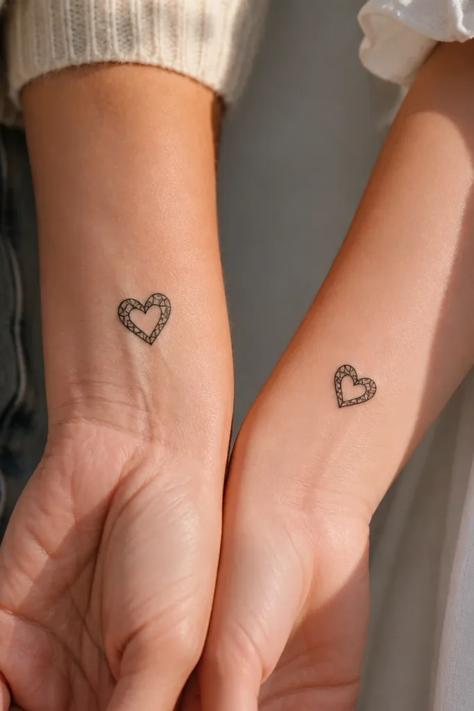
Skeleton hearts give you that modern, artsy look without relying on tiny shading. The hollow center keeps the piece airy, which helps it stay readable as it heals. Keeping the same skeleton line pattern on both tattoos makes the set feel designed, not accidental.
Put Mom's heart at about 20-28 mm on the side of the wrist, Daughter's at about 15-22 mm on the inner wrist. Keep the internal lines at a consistent thickness so they don't vanish on smaller skin space. Rotate Daughter's heart slightly so it feels like her version, not a photocopy.
Pro tipAsk for a stencil test with the exact rotation - skeleton lines look different when angled over wrist contours.
AvoidDon't make the internal lines too thin; they disappear when the tattoo settles.
4. Small Script Word Pair With Matching Letter Height
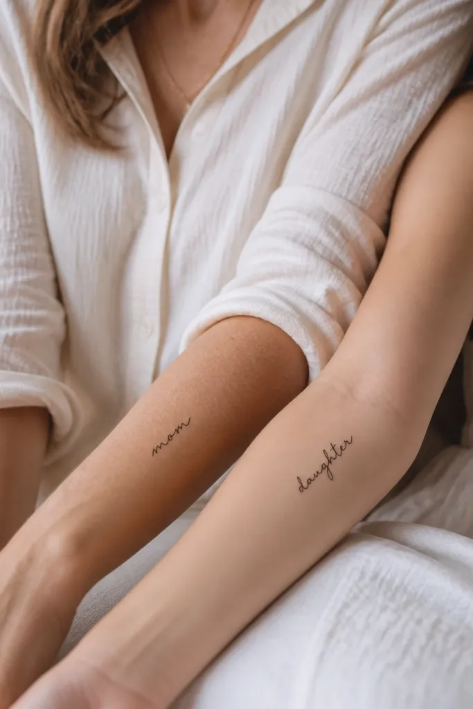
Script tattoos look classy in small sizes when the letter height is consistent and the downstrokes are thick enough to age. You want the same handwriting "weight" in both pieces, even if the words differ. This set works because your eyes read the style first, then the meaning second.
Pick a word length that fits the space: 6-10 characters works well for a forearm. Place Mom slightly lower than Daughter so they don't look like they're competing if you stand side by side. Keep the line thickness consistent - I ask for downstrokes that are bold enough to hold black after healing.
Pro tipBring a font reference you like in the same size - then test stencil width before tattooing.
AvoidAvoid ultra-thin cursive loops; they blur into a gray smear.
5. Tiny Matching Anchor Top With Different Chains
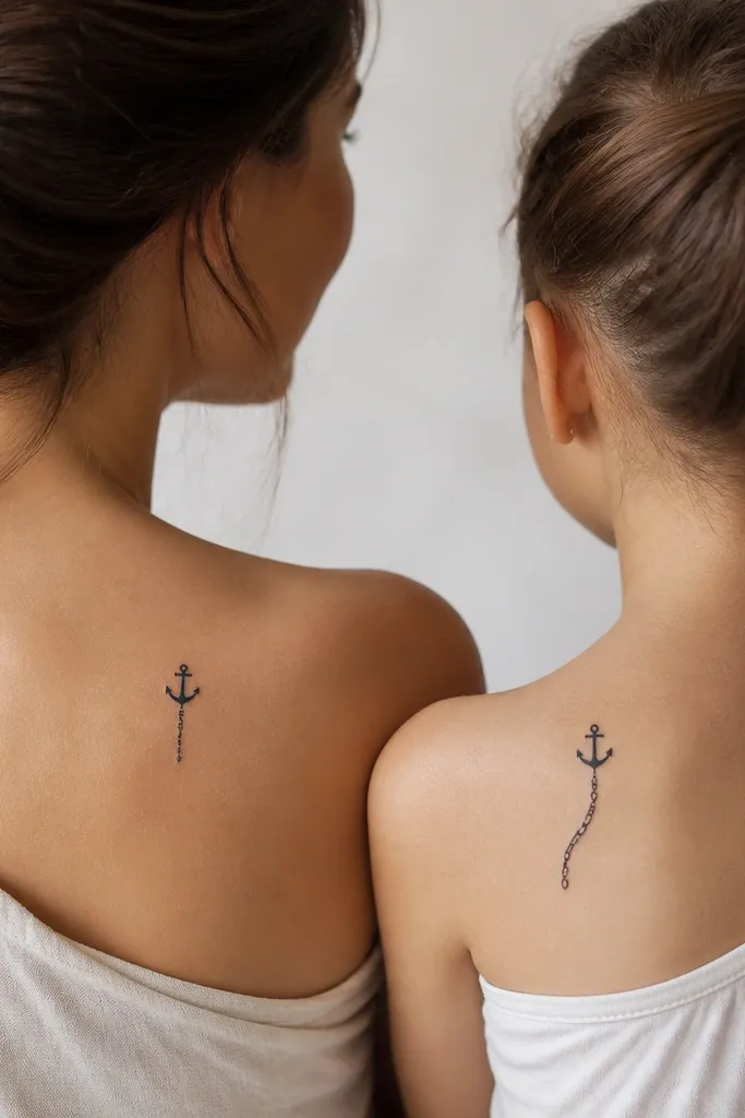
Anchors are one of the easiest motifs to scale down because the top silhouette stays readable. Changing the chain style gives you individuality without breaking the theme. Solid black anchor shapes heal well, and the chain links can be simple dots or short lines depending on size.
For a small set, aim for 18-30 mm total height. Place Mom on the outer wrist where the chain can hang downward, and Daughter on the inner forearm so the longer chain doesn't hit skin folds. Keep chain links larger than you think - tiny links vanish.
Pro tipAsk the artist to draw the chain links with 2-3 mm link spacing so you can see each one after healing.
AvoidDon't cram the chain links close together; it turns into one dark line.
6. Paired Tiny Feathers With One Shared Tip Detail
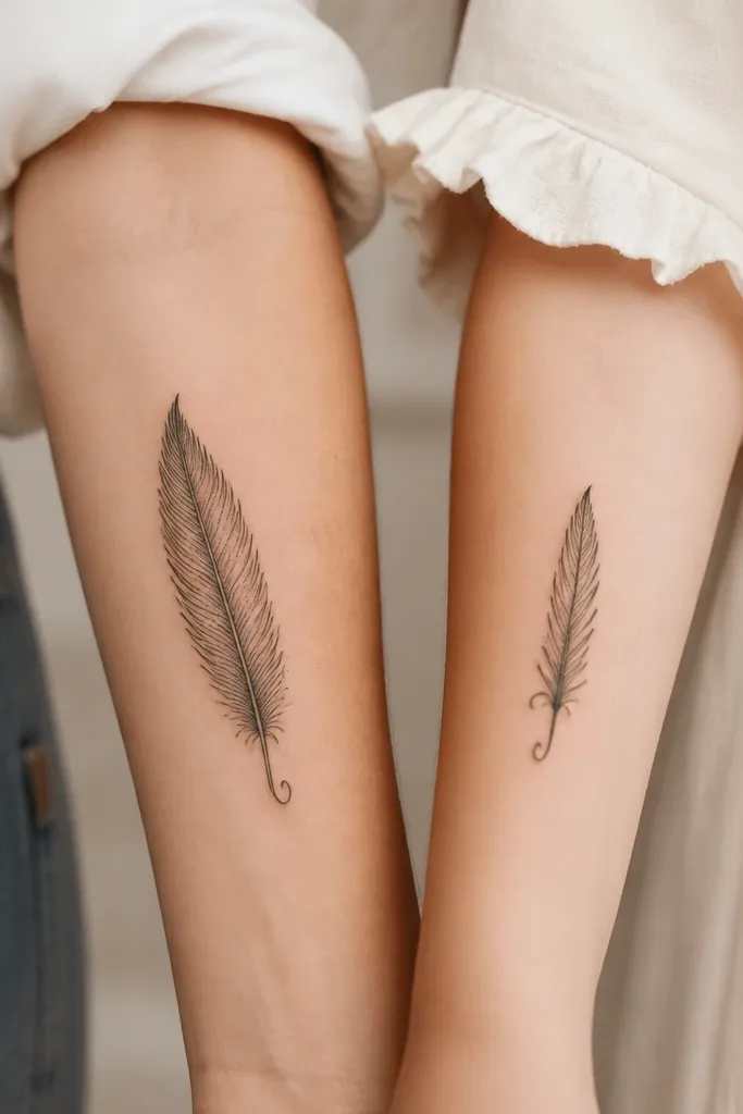
Feathers look delicate but still hold up if you avoid super-fine micro barbs. The shared tip curl is the "signature" that makes the pair feel intentional. Stipple shading near the center adds texture without turning into a muddy blob if it stays light and limited.
Place Mom's feather on the outer forearm, 25-35 mm long, with the shaft thicker than the barbs. Place Daughter's feather on the back of the upper arm or inner forearm, around 18-28 mm. Limit stipple to a narrow strip - I like it only where the feather would naturally darken.
Pro tipTell the artist you want barbs at least 1 mm wide so they stay visible.
AvoidSkip heavy gray wash - it ages unevenly on small feathers.
7. Matching Tiny Sunbursts With Same Rays Count
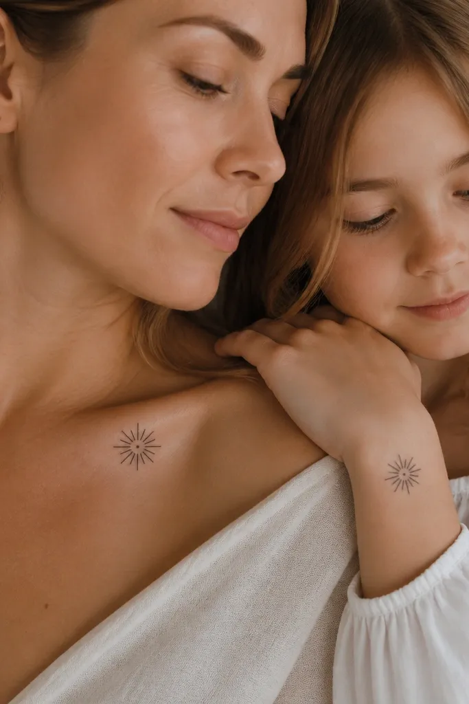
Sunbursts are graphic, so small versions still read. If you keep the rays count the same, the pair feels matched even when the scale differs. Using solid black rays and a simple center keeps it bold through healing.
For collarbone placement, keep the sunburst around 20-28 mm so it doesn't stretch across the bone area. For wrist placement, go smaller (14-20 mm) and shorten the rays proportionally. Keep rays evenly spaced - uneven spacing makes it look accidental.
Pro tipAsk for a stencil with the ray count locked in before you ink.
AvoidDon't mix ray thicknesses; varying thickness makes the sun look lopsided.
8. Small Infinity Loop With a Hidden Mom-Daughter Date Mark
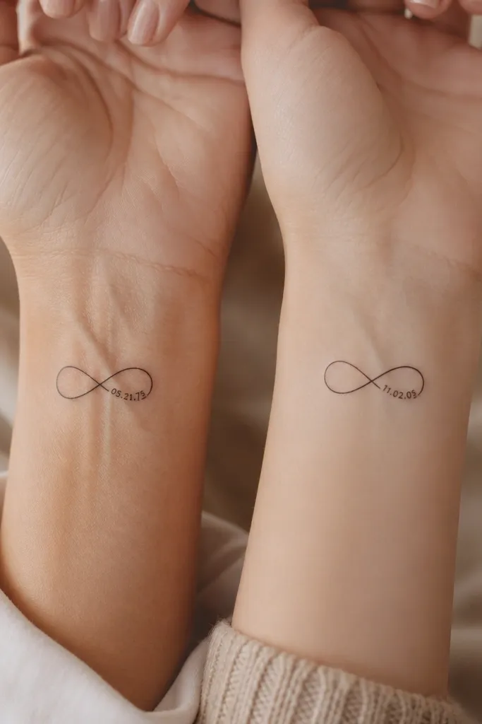
Infinity loops give you a clean silhouette that stays readable even at 15-25 mm. The hidden date mark is a clever detail that makes the tattoos feel private, not generic. Keeping the date as a short line of text (or tiny numerals) prevents it from becoming illegible clutter.
Put the infinity on the inner wrist with the loops stacked so the date sits centered. Keep the hidden date very short - 3-6 characters or a tiny vertical line mark. Use bold line work for the loop and keep the date in solid black only.
Pro tipTest legibility by taking a close-up photo of the stencil in daylight - if you can't read it at arm's length, shrink the date or simplify it.
AvoidAvoid cursive dates; the loops will blur and the numbers melt together.
9. Paired Tiny Roses With Black Only and One Petal Gap
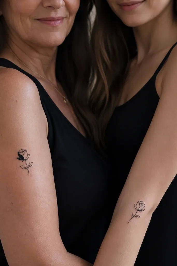
Black-only roses look crisp when the design uses outlines plus small solid fills, not dense shading. The shared petal gap is a subtle matching feature that makes the set feel like it came from the same sketch. This style ages well because it relies on shape, not gradients.
Keep the rose around 20-35 mm, depending on placement. Place Mom on the upper arm where there's room for the rose to breathe; place Daughter lower on the forearm with the same orientation. If the rose has a gap, make that gap a clear negative space shape, not a smudgy missing line.
Pro tipAsk the artist to show two sizes on the stencil - 22 mm and 30 mm - and pick the one that keeps the petal gap sharp.
AvoidDon't add tiny veins or micro dots in the petals; they turn into grain.
10. Small Geometric Heart Fragments With Shared Line Direction
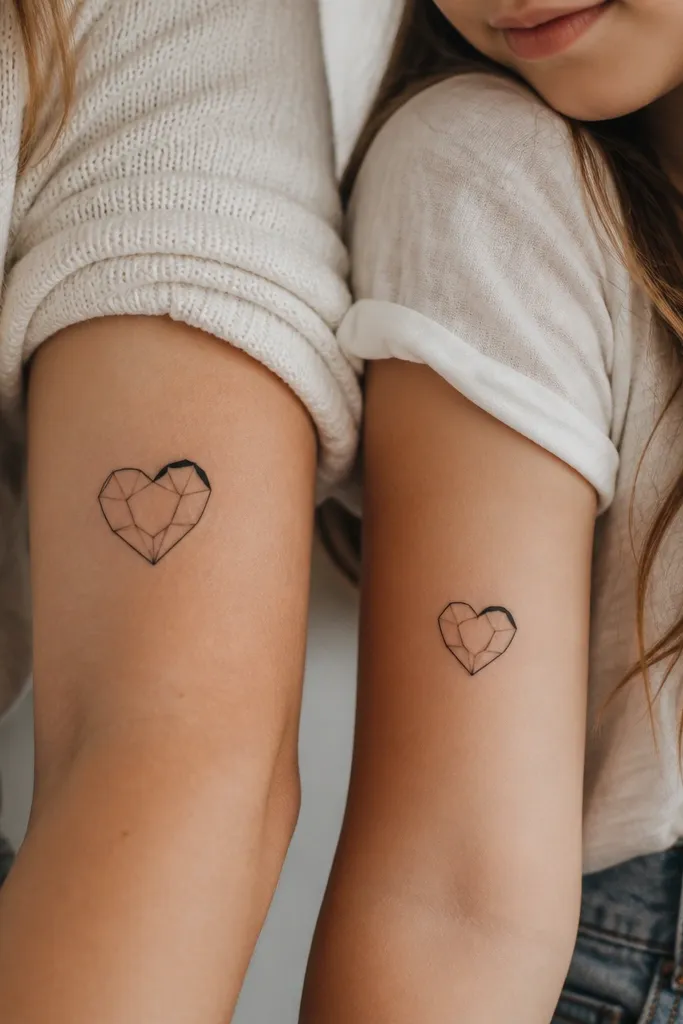
Geometric hearts look modern and stay clean because they use straight edges. The shared thick segment direction makes the pair feel connected even when the fragment count differs. Thin polygon lines need good spacing, so the design has to be drawn with intention, not "random triangles."
Place Mom on the outer upper arm or side of the ribcage where the lines won't warp from tight clothing rub. Place Daughter on the side of the forearm at a slightly smaller size. Keep polygon lines uniform in thickness, and make the "thicker segment" about 2x the width of the others.
Pro tipI ask for a stencil overlay on a mirror - if the heart tilts when you move your arm, the angles feel wrong after healing.
AvoidAvoid cluttering the heart with too many tiny polygons - they blur into a dark patch.


