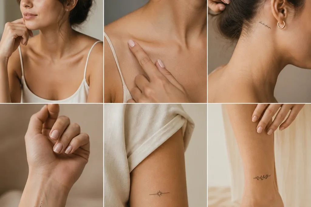
1. Side-Upper-Arm Script That Reads in One Glance
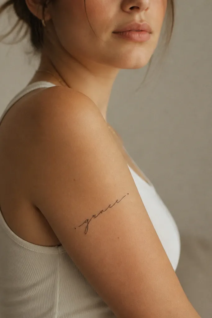
I love side-upper-arm names because you get a clean viewing angle when you raise your arm. The skin here stays fairly steady, so thin cursive holds up better than you'd think. Keep the baseline running along the arm's natural curve, and add tiny end flourishes to pull the eye to the start and finish of the name. Black ink keeps it readable long-term, especially with script styles that rely on consistent stroke thickness.
Ask for a layout that spans about 8 to 12 cm depending on your name length. Place it on the outer upper arm, not the front bicep - the front moves more with flexing. If your name has tall letters like "l" or "b," tilt the whole line only 10 to 20 degrees so the letters don't look like they're sliding off the curve.
Pro tipDo the stencil test with your arm relaxed and then flexed - the name should stay readable in both positions.
AvoidAvoid placing the script directly over the bicep peak where your muscle creates a sharp fold during workouts.
2. Shoulder-Cap Name With Soft Curves
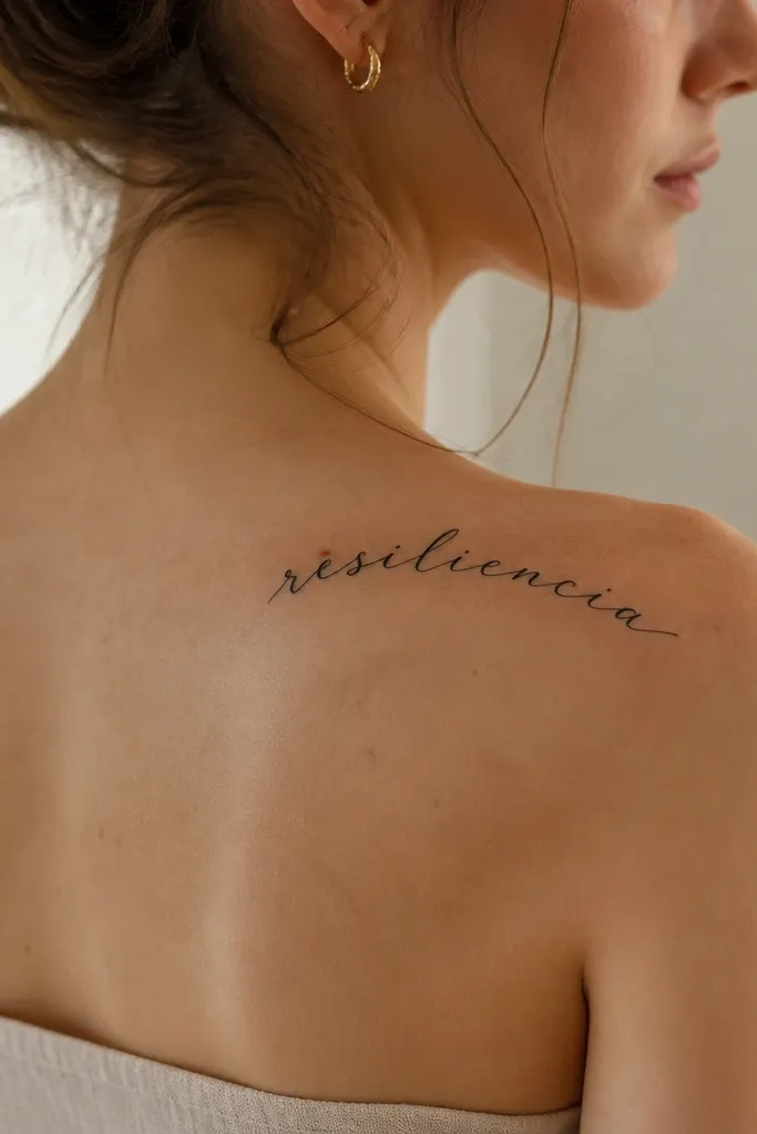
The shoulder cap is one of the best spots for names that you want to look "styled," not hidden. The curve helps the script sit naturally, so your letters don't look stretched. I like this placement for names with mixed letter heights because the arc gives you room without squishing. With the right line weight, the tattoo looks crisp even after the usual shoulder movement.
Aim for a curved layout that follows the shoulder bone - not the slope of your neck. Keep the tattoo width proportional: if your name is 7 to 9 letters, you can usually fit it in a 10 to 13 cm arc. Your artist should thicken the downstrokes slightly so the cursive doesn't turn into fuzzy gray after healing.
Pro tipChoose a font with consistent stroke contrast if you want the arc to look intentional.
AvoidSkip super-thin micro-script on the shoulder if your artist won't adjust line weight for healing.
3. Outer Forearm Name With a Clean Baseline
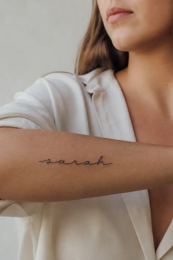
Outer forearm name tattoos stay readable because you're working on a long, mostly flat surface. The baseline stays consistent when your wrist rotates, so the letters don't warp visually. I've seen this placement look sharp in both casual and dressed-up settings because you can roll up sleeves and control visibility. Black ink plus spacing between letters is what keeps it crisp.
Place it along the outer forearm, roughly 5 to 10 cm above the wrist crease. Keep at least 3 mm of breathing space between letters for script, especially if your name has repeated curves. For longer names, use a slight diagonal rather than forcing everything into one line.
Pro tipPick a font where the "tails" don't overlap - overlapping tails heal less cleanly.
AvoidDon't wrap the name around the radius of the forearm - it makes the letters distort when you turn your hand.
4. Inner Forearm Name With Minimal Movement Chaos
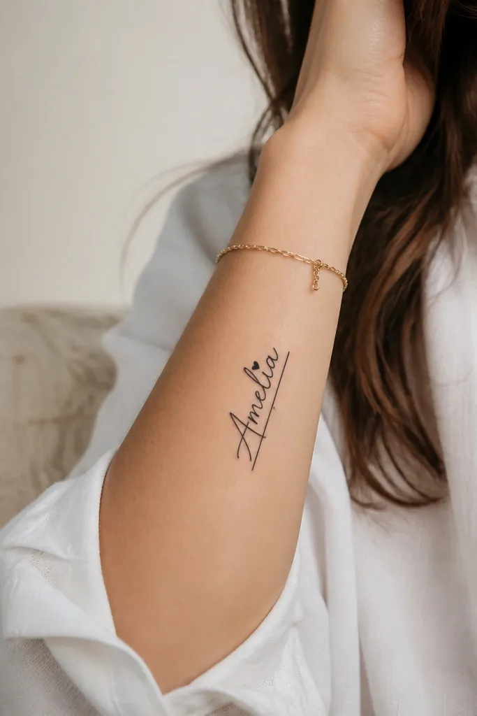
Inner forearm can work beautifully if you keep the tattoo modest in size and avoid areas that stretch hard. This is a good choice when you want something more personal, since it shows when your arm is bent. The key is keeping the letters tall enough to stay readable, but not so tall that they take over the whole forearm. A small underline or dot detail adds charm without crowding the name.
Keep the design width narrow, about 2.5 to 4 cm wide for most single-line names. Place it about halfway between your wrist and elbow so it doesn't sit right on a crease. If your name has many loops, reduce the flourish size and keep the stroke contrast moderate.
Pro tipTest the final size by printing the name at actual scale and holding it to your skin in daylight.
AvoidAvoid placing it too close to the wrist where skin texture changes and healing can look uneven.
5. Ribcage Name in a Vertical Stack (Only If You Adjust Line Weight)
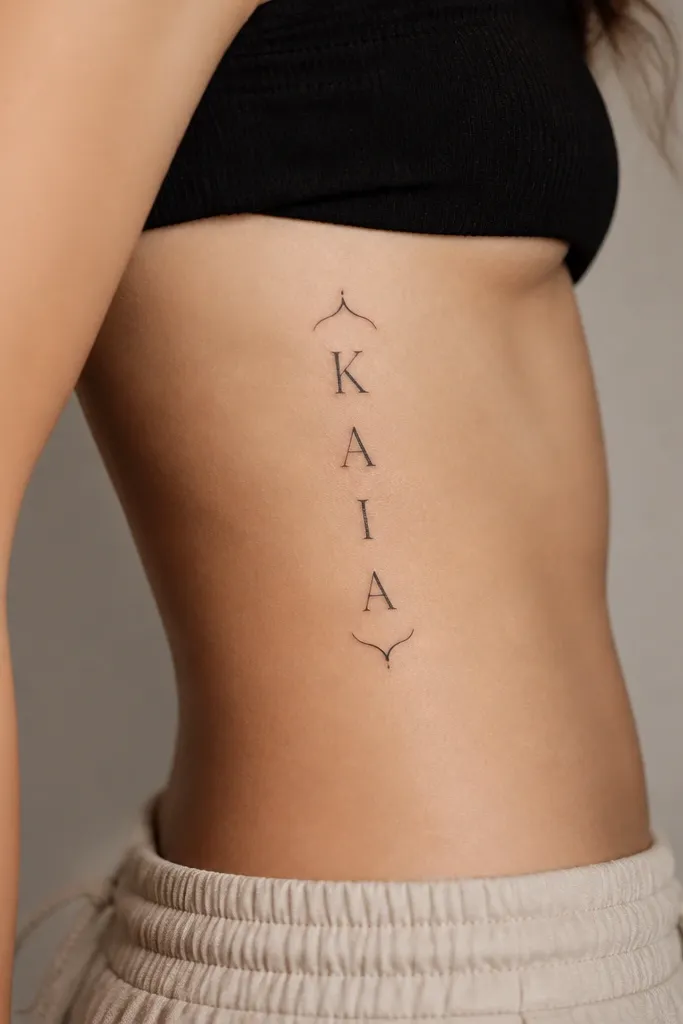
Ribs are tempting because the space is dramatic, but they move with breathing and twisting. If you want a name here, you need thicker line weight and spacing that accounts for stretch. A vertical stack helps because it spreads the letters across a longer area, reducing the "pinch" effect. I've had best results with a simple script that has clear letter shapes rather than ultra-fine curls.
Place the tattoo on the side ribs, not the front center where movement feels sharper. Keep it about 10 to 16 cm tall depending on letters count. Your artist should widen the downstrokes and avoid tiny hairline connections between letters.
Pro tipChoose a font with closed letter counters (like "a" and "e" that are fully formed) so the shape stays readable as the skin shifts.
AvoidDon't use a super delicate font on ribs if you want the name to stay sharp.
6. Thigh Name With a Diagonal Flow
A diagonal thigh name looks classy because it follows how your body moves when you walk. The outer thigh has enough smooth area to keep the script readable, and the diagonal layout hides minor changes in skin stretch. I like this for women who want the name to feel private but still easy to show when they wear shorts. Black ink with controlled spacing keeps the strokes from merging.
Place it on the outer thigh where you have a flatter plane, usually 5 to 8 cm below the hip line. For names longer than 7 letters, a diagonal layout is better than cramming one horizontal line. Ask your artist to keep the baseline slightly curved to match your thigh contour.
Pro tipWear the same type of bottoms during stencil placement that you'll wear most often - jeans versus shorts changes how you see the tattoo.
AvoidAvoid placing it too close to the inner thigh crease where friction and bending can blur fine lines.
7. Calf Name With a Straight, Confident Placement
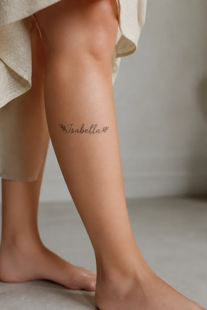
Calf skin is steady enough for crisp lettering, and you get a long viewing area. A straight baseline works because the calf has a smoother plane compared to joints. This is my go-to when someone wants their name to look sharp even months later, not just right after healing. Add small symmetrical flourishes only at the ends so the center stays readable.
Position it on the outer calf, not right on the back center where the muscle changes shape. Keep the tattoo height around 6 to 10 cm for most single-line names. If your name is long, use a slight downward angle instead of squeezing letter spacing too tight.
Pro tipAsk for a stencil that stays centered even when your foot points - that's the real test for calf script readability.
AvoidSkip placing it across the calf tendon area - it drags the ink when you walk.
8. Ankle Name With Tiny Spacing and Bold Downstrokes
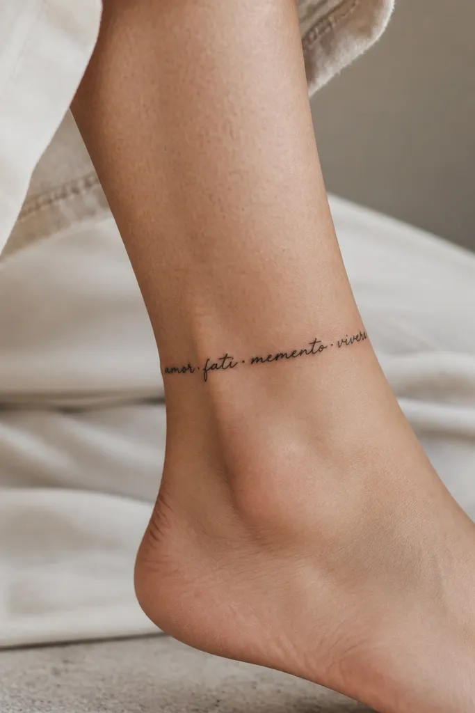
Ankle tattoos can look delicate without turning into a mess, but you have to design for the bone and the constant movement. The trick is to keep the letters a touch thicker than you'd pick for the forearm. Small dots or separators help keep individual letters distinct as the skin heals. If you want a name that looks "floating," this placement can do it.
Place it on the inner ankle where the skin is smoother, about 2 to 4 cm above the ankle bone. Keep the design narrow so it doesn't wrap too far around the leg - wrapping makes letters distort. For spacing, leave a small gap between letters so the ink doesn't merge during healing.
Pro tipChoose a font with thicker vertical strokes so the curves don't fade into a gray smear.
AvoidAvoid very thin script on the ankle if you're active and your shoes rub the area.
9. Back-of-Shoulder Name With a Hidden-But-Serious Look
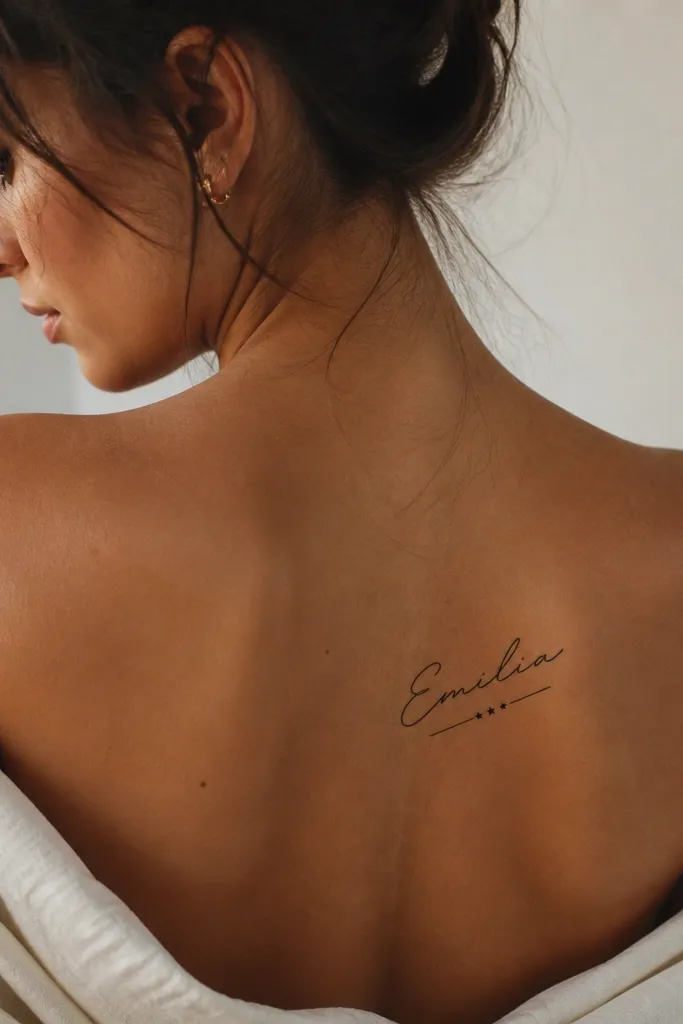
Back-of-shoulder name tattoos feel personal because they show in motion and in certain outfits. The skin here is stable enough for crisp lettering, and the angle makes the name look intentional rather than pasted on. Star dots or tiny marks work well as punctuation when your name is short and needs visual balance. Black ink keeps it classic and readable.
Place it slightly off-center toward the outer shoulder so it doesn't get distorted by your shoulder blade curve. Keep the tattoo about 7 to 11 cm wide depending on length. Make the underline short - long underlines can stretch and look uneven after healing.
Pro tipDo a mirror check with your shirt collar position - the angle of your collar changes how the tattoo reads.
AvoidDon't put the name right over the shoulder blade ridge where the skin folds when you move.
10. Wrist Name With a Bracelet-Style Band Layout
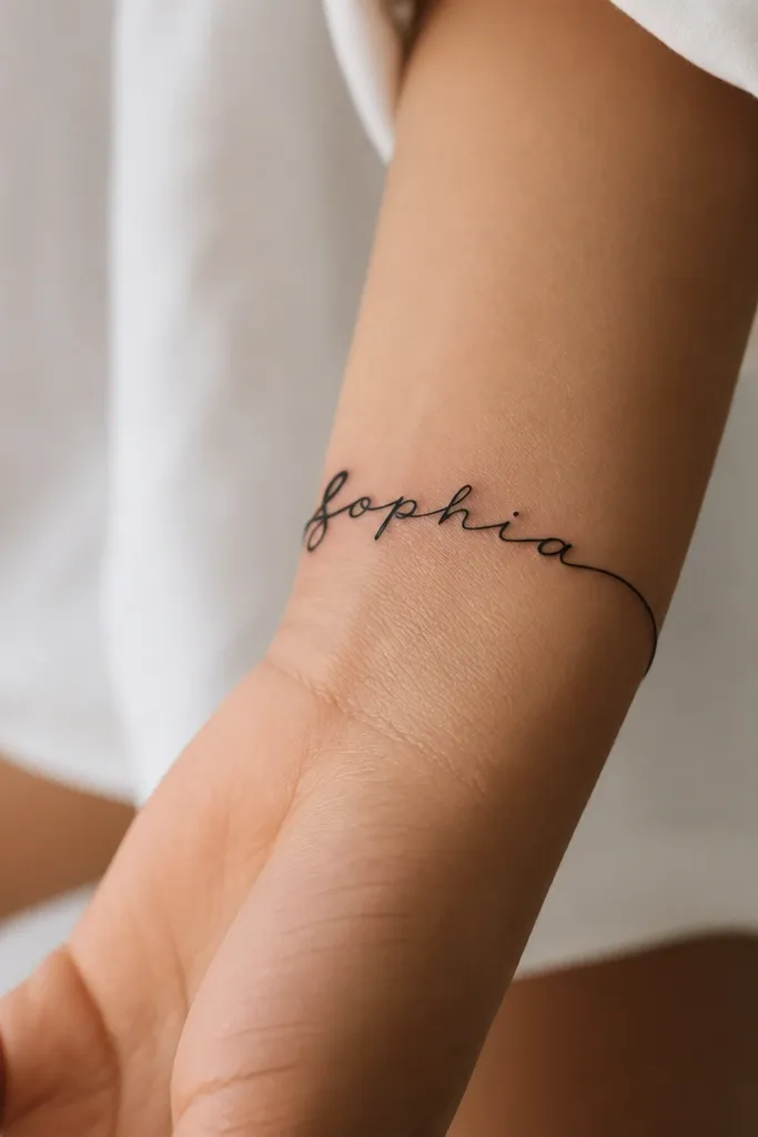
If you want a wrist name, treat it like a mini bracelet design. A bracelet layout gives you structure so the name stays readable as the wrist bends. I like this look because it frames the name and makes it feel designed, not random. Use black ink and keep the strokes consistent - wrist tattoos show blur faster if the letterforms are too delicate.
Wrap the design only 25 to 40% around the wrist so the letters don't warp. Place it about 1 to 2 cm above the wrist crease. For longer names, switch to a tighter cursive with fewer swashes and add a short divider dot between words.
Pro tipBefore you commit, test the stencil while you bend your wrist - the name should not look like it's being pulled apart.
AvoidAvoid placing it directly on the wrist crease where skin folds every day.


