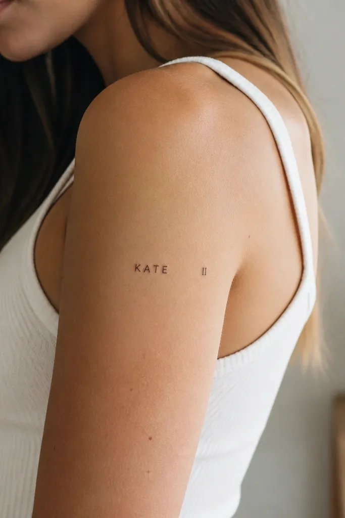
1. Micro block letters on the outer forearm
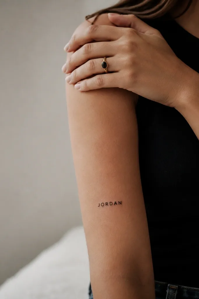
This one feels simple because the letters don't try to be fancy. Block capitals keep consistent strokes, so the name stays sharp as it heals. I like black ink with a slightly matte look - it reads clean against the natural skin tone and doesn't glow like heavy glossy ink. The spacing is the whole trick: each letter has a tiny breathing gap so the word doesn't compress into a dark bar.
Ask for a width around 3 cm for a short-to-medium name. Keep the height of the letters about 1.2 to 1.6 mm in a tiny tattoo - too tall and it looks like a label. Placement works best on the outer forearm where the skin is flatter and easier for the artist to keep straight.
Pro tipBring your artist a font sample where the letters have open counters (the holes inside letters like A, O, and R). Those holes are what keep it readable.
AvoidAvoid condensed fonts - they blur together fast.
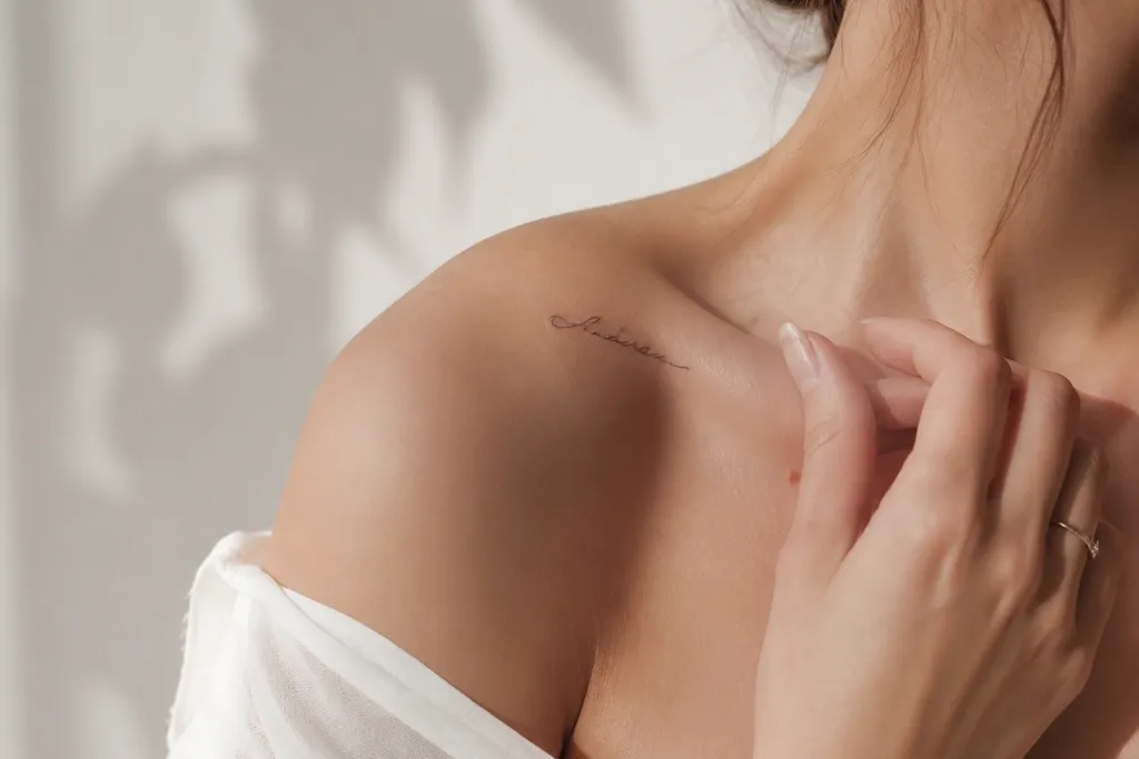
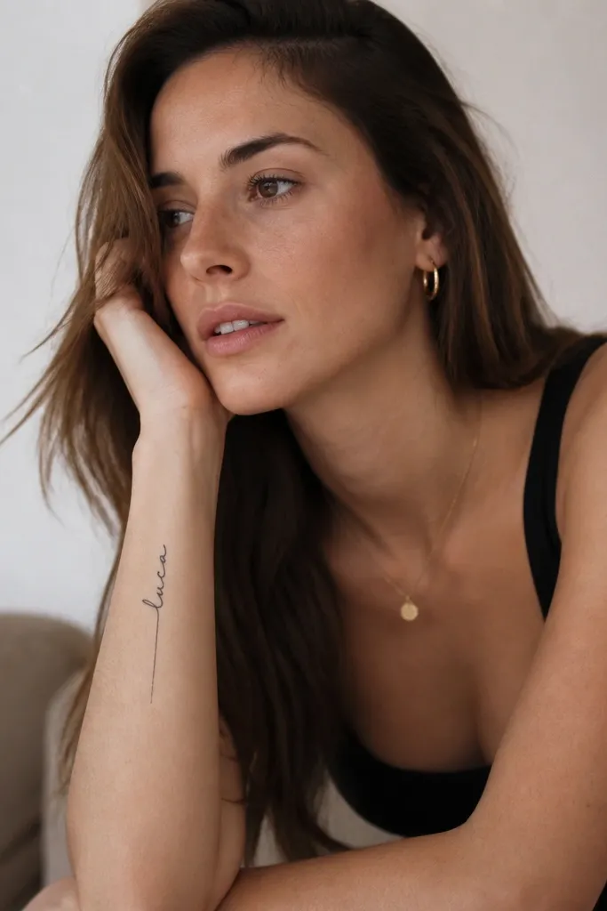
2. Single-line cursive on the inner wrist
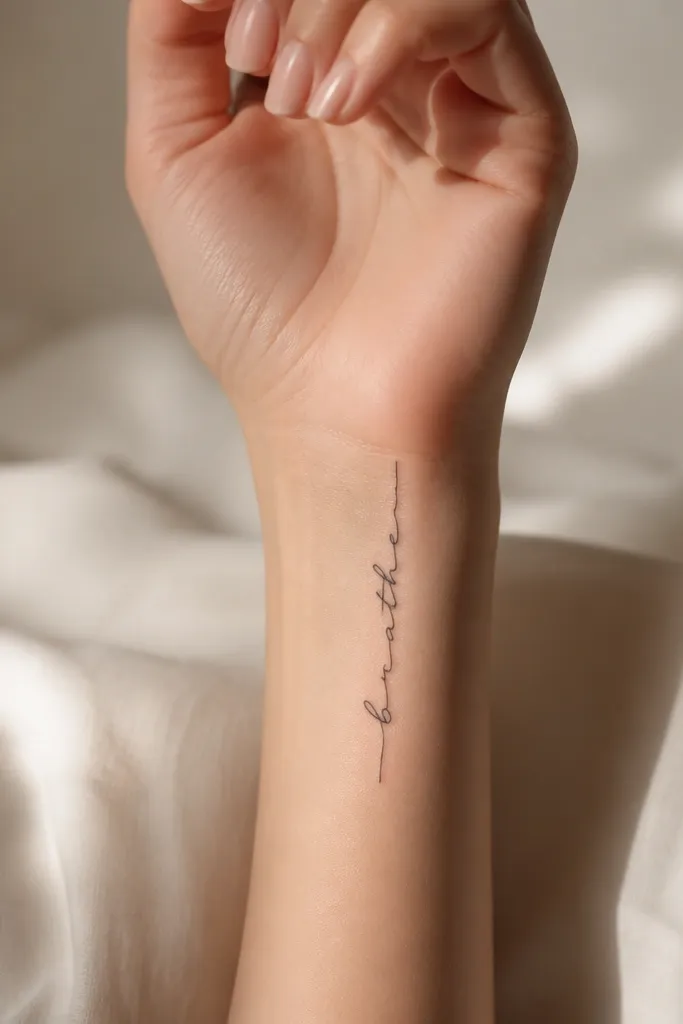
Vertical cursive feels intimate without looking busy. The inner wrist placement reads like jewelry, and thin line weight keeps it from looking heavy. I prefer a cursive style with long, smooth connections and minimal flourishes. Too many loops can trap healing scabs and fade unevenly, so this stays restrained.
Keep it small - around 2.5 to 3 cm long - and ask for a version that sits just off the wrist crease. The artist should place the baseline so it follows the wrist curve but doesn't kink at the middle. Black ink only keeps the look consistent.
Pro tipAsk for a stencil that you can check in a mirror in daylight, not just under salon lights.
AvoidAvoid thick script on the wrist - it heals darker and then spreads.
3. Name with tiny dot accents at letter breaks
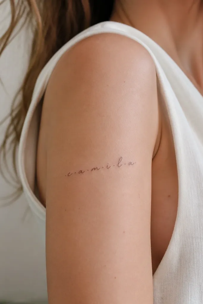
Those tiny dots act like punctuation without adding extra symbols. The name stays flowing, but the dots give your eye a way to read each part. I've seen dot accents make scripts look more organized, especially on names that have repeated humps or similar letter shapes. It also hides minor unevenness because the dots draw attention to the structure.
Use a script font that has clear upstrokes and downstrokes. Place dots only where the stencil shows natural breaks - usually after letters like e, m, or n depending on the word. This looks best on the outer upper arm where you can keep the line slightly curved.
Pro tipKeep the dots the same diameter across the whole name - consistency makes it look intentional.
AvoidDon't add starbursts or lots of dots - it stops feeling simple.
4. Two-line name with a thin underline
Two-line layout is the fastest way to keep a longer name from cramming. The underline makes it feel designed, not accidental, and it anchors the composition. Thin script with a straight underline looks clean because the underline adds structure while the letters stay delicate. I like this style for names that have mixed letters with different heights.
Ask for line spacing about 1 mm between the two lines. Keep the underline about the same length as the longest line, not longer. Place it on the upper arm or the side of the ribs where two lines won't stretch too much.
Pro tipHave your artist show you the stencil with both lines before they commit to the final scale.
AvoidAvoid thick underlines - they overpower the script.
5. Elegant serif name in microcaps
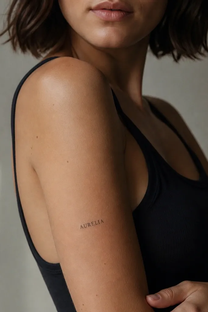
Serifs add a classy finish without turning into ornate art. In small tattoos, the key is keeping the serifs tiny - just enough to suggest style. This design reads like a clean wordmark, which is why it still looks simple months later. Black ink with thin strokes stays legible because the serifs define each letter's edges.
Use a font that doesn't have heavy contrast between thick and thin strokes. For placement, the side of the upper arm gives you a gentle curve so the letters don't look stretched. Keep the tattoo width under 3.5 cm for best readability.
Pro tipIf your name has letters like S or C, choose a serif font where those curves are open, not closed.
AvoidAvoid ultra-thin fonts - they can fade into the skin.
6. Name in fine-line cursive with a tiny heart dot
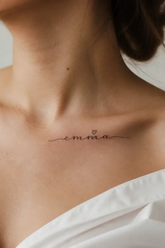
A single heart dot keeps the tattoo personal without turning it into a cartoon. Fine-line cursive gives you that soft movement, and the heart dot becomes the focal point. I like heart dots because they're small and controlled - they don't take over the whole piece. This stays "simple" because there's only one extra element.
Keep the heart dot under 2 mm so it doesn't blur. Collarbone tattoos heal beautifully when the design is small and not too packed, but you need an artist who can keep the stencil from stretching. Ask for a slight curve following the collarbone line.
Pro tipPick a heart shape that's symmetrical. If it looks lopsided on the stencil, it will look worse after healing.
AvoidAvoid placing hearts near the edges of the tattoo - they can distort with skin movement.
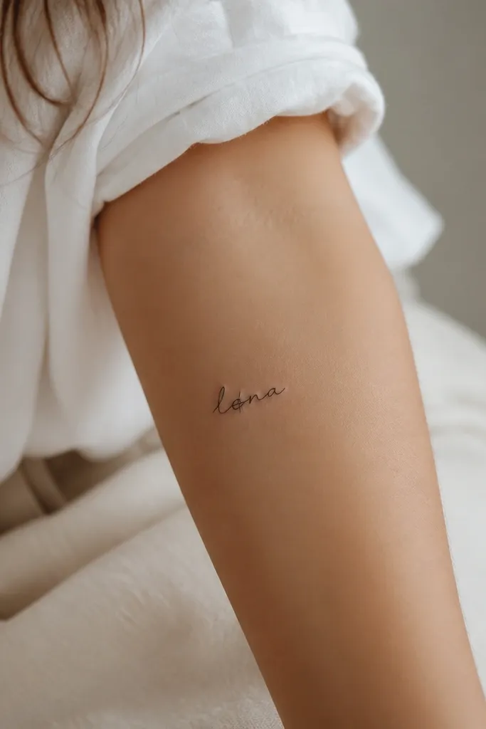
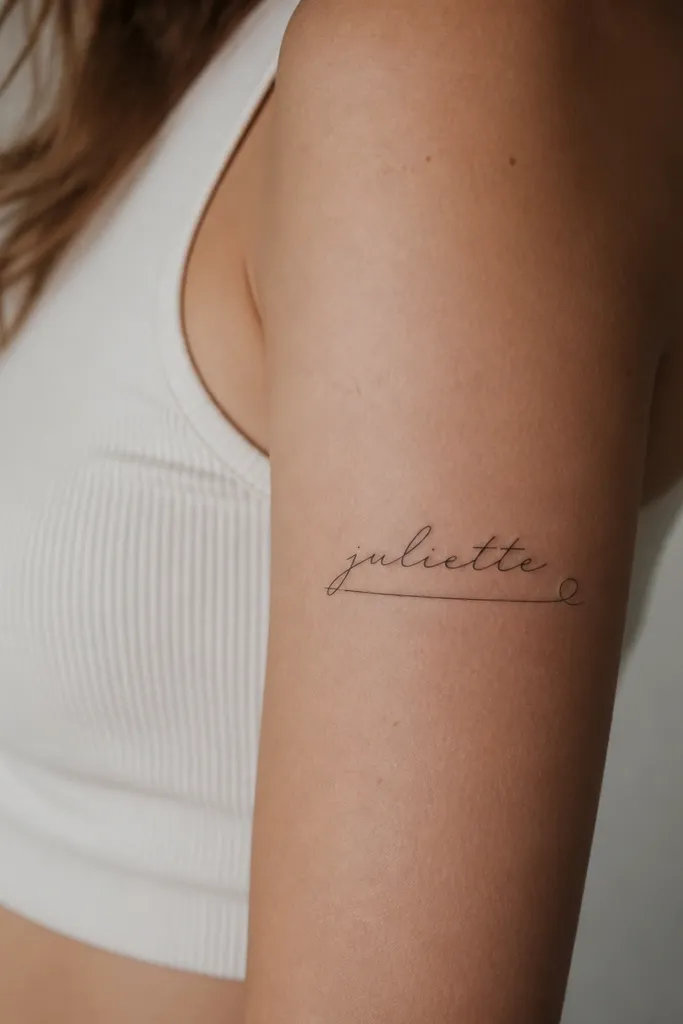
7. Name in handwritten script with a straight tail
This looks simple because the lettering feels like real handwriting, not a decorative calligraphy font. The straight tail gives the eye a clean ending point, so the tattoo doesn't look like it's floating in the middle. I've found handwritten scripts age better when the loops are minimal. The strokes should look consistent, not like they're wobbling to fit the name.
Use a font or reference where the downstrokes are straight. Place it on the outer forearm and size it so the name fits within a 3 cm vertical band. Keep the tail about 0.5 to 1 cm long for balance.
Pro tipPrint the stencil from your artist's preview and compare letter shapes to your real handwriting if you want it to feel personal.
AvoidAvoid shaky loop-heavy scripts - they blur and lose the handwritten look.
8. Name in elegant lowercase with a thin arc
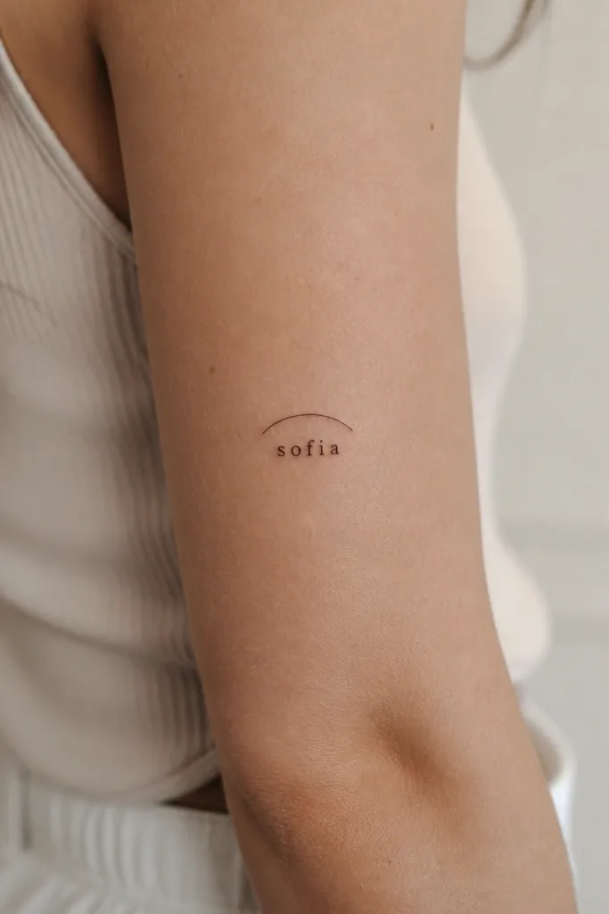
Lowercase letters look softer, and the thin arc adds a gentle frame. This is simple because the arc is one line and the name is the only text element. The arc also helps the word read as a single unit, especially if your letters vary in height. I like black ink for this so the arc doesn't compete with the script.
Make the arc about 2 to 3 mm away from the tops of the letters. Place it on the upper arm where the skin curvature supports a smooth arc. Keep the tattoo small enough that the arc doesn't become a thick banner.
Pro tipAsk the artist to draw the arc first on the stencil - then place the name to match it.
AvoidAvoid arcs that touch the letters - healing can make it look smudged.
9. Name with a single slash through one letter
This is a simple, graphic twist that still reads as your name. The slash mark adds personality without adding extra characters like symbols or dates. I like it because it creates contrast - the rest of the script stays smooth. When the slash is thin and placed intentionally, it looks sharp, not like a cover-up attempt.
Choose one letter that has a straight component, like an A, N, or T depending on the name. The slash should be about 1 to 1.5 mm thick and not longer than the letter itself. Inner forearm is a good spot because it's visible but not constantly stretched like the wrist crease.
Pro tipTell your artist exactly which letter you want marked before they sketch anything.
AvoidAvoid multiple slashes - it stops looking like a name tattoo.
10. Micro name with a tiny botanical stem
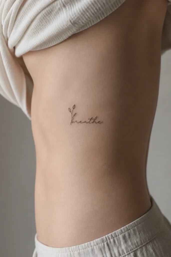
A tiny stem adds life while staying minimal. The stem is small enough to feel like a detail, not a separate tattoo. I prefer simple botanical shapes - one thin line with two or three tiny leaf marks - because they heal predictably. This style works well if your name is short and you want it to feel soft, not strictly decorative.
Keep the stem under 1 cm and place it so it doesn't cross the name baseline. Side ribs heal well for small designs, but you need an artist who understands how skin shifts with breathing. Use black ink only for the cleanest look.
Pro tipIf you're worried about healing, do a stencil placement test for a full minute while you breathe normally.
AvoidAvoid detailed flowers - petals blur and turn into gray dots.
11. Name in thin uppercase with a small roman numeral
This keeps things simple by adding only one extra element. The roman numeral gives context without a full date block. I've done this for names paired with a "chapter" feeling - like a birth order or anniversary - and it stays readable because the numeral is small and separated. Thin uppercase letters make the whole piece look clean and structured.
Place the numeral either top-right or bottom-right of the name with a gap of about 2 mm. Keep the numeral height around half the letter height. Outer upper arm is a great spot because it's less creased than wrist or fingers.
Pro tipUse a stencil that shows the spacing from the first pass; if the numeral feels too close, increase the gap before tattooing.
AvoidAvoid mixing fonts with thick-and-thin mismatch - it looks accidental.
12. Name in fine-line script with a small underline loop
This is simple because the only flourish is at the end. The underline loop gives motion and a clean finish, which makes the tattoo feel intentional even when it's small. Fine-line ink keeps it delicate, but the loop is thick enough to stay visible after healing. It reads as a name first, decoration second.
Keep the underline about 60 to 70% of the name length. The loop should be small, like a teardrop or a gentle "e" shape, not a big swirl. Back of upper arm is a forgiving placement when you want it out of the way but still pretty.
Pro tipAsk for the loop to be centered with the last letter's stroke so it doesn't look like it was added later.
AvoidAvoid large swirls on fine-line tattoos - they fade into streaks.


