1. Micro cursive name with a single dot heart
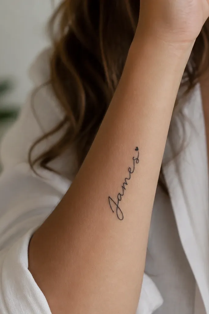
This works because the name stays the star and the heart is just a punctuation mark. I like medium-fine script (not hairline) so the ink doesn't turn into gray fuzz six months later. The dot heart gives you a cute focal point even if the very end of the letters softens with healing.
Place it on the inner forearm, about 2-3 inches above the wrist crease. Keep the name width under 1.5 inches so letters don't get squeezed. Ask for a stencil where each letter has a visible gap; if your artist wants to touch letters together, stop and request spacing.
Pro tipBring a font example that has thick downstrokes, not only thin loops. If the font looks "see-through" on paper, it will disappear faster on skin.
AvoidAvoid ultra-thin hairline script if you're placing it where your skin rubs against sleeves.
2. Split ribbon two-part names (left-right balance)
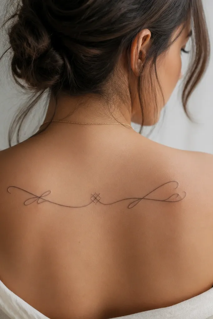
Split ribbons look intentional because they control the shape of two different name lengths. I've seen this design look messy when people try to force both names into the same exact character count. The ribbon solves that by giving the artist a curve to "carry" the letters.
Use the upper back or shoulder blade so the ribbon can follow the natural curve. Keep the ribbon height around 2 inches and center it on your spine line. Use the same font for both names so they match visually even if the names differ in length.
Pro tipHave your artist mock up the split in tape on your skin before ink. If one side looks heavier, adjust the ribbon curve before the stencil goes on.
AvoidAvoid trying to fit very long names into one ribbon line without splitting into a second line.
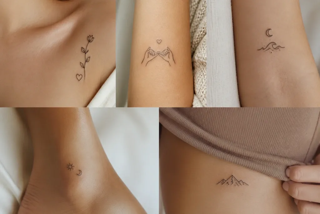
3. Name in fine serif with matching star at the start
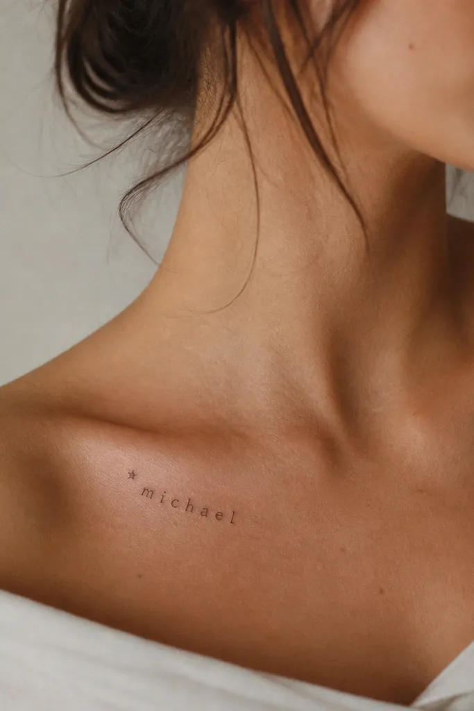
Serif letters stay readable when they have clear stroke weight and consistent spacing. The star at the start gives a "cute but classy" opening without adding clutter. On collarbone skin, this looks delicate but still sharp because the serif shape holds edges.
Place it on the upper collarbone, centered, about half an inch above the top of your bra strap line. Keep the name height under 1 inch for a clean look. Ask for a star that's filled solid, not outline, so the star doesn't fade into a dot.
Pro tipChoose a serif font where the serifs aren't tiny hooks. Big, simple serifs age better than hair-thin decorative ones.
AvoidSkip outline-only stars - they vanish faster than filled stars.
4. Bold name block with thin outline (legibility first)
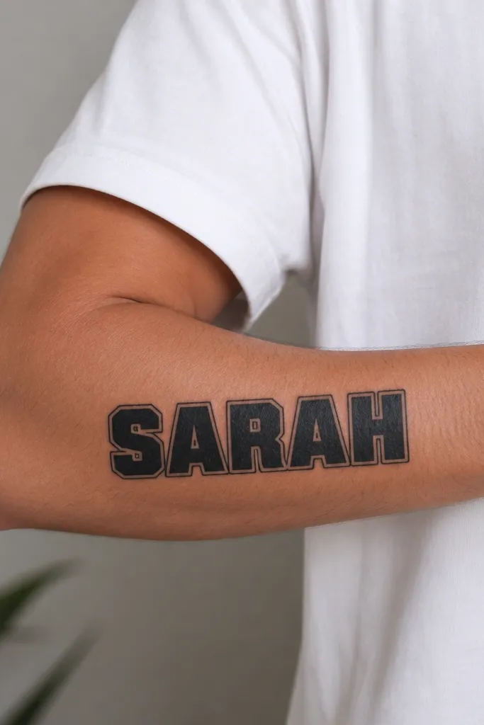
If you want your partner name to stay readable, bold block letters are the most honest choice. The thin outline prevents the letters from looking like a single dark smear as they age. This is the style I recommend when your name has lots of straight lines like A, E, M, N, and R.
Place it on the outer forearm or upper arm where skin movement is moderate. Keep letter height around 0.6-0.8 inches so the strokes stay thick. Ask for outline thickness about 10-15% of the letter stroke so it looks balanced, not heavy.
Pro tipUse a stencil that shows the outline as a separate layer. If the artist merges outline and fill too tightly, the edges blur together.
AvoidAvoid super-tight letter spacing in block fonts - it turns into one black rectangle.
5. Cursive name with heart-shaped loop flourish
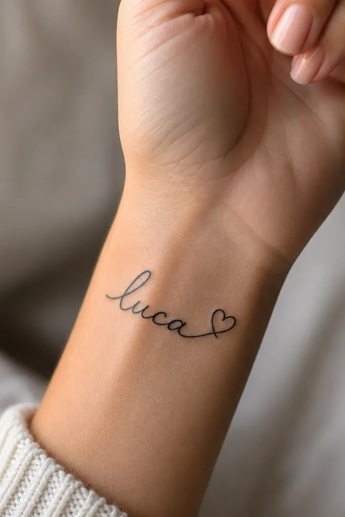
This is cute because the heart comes from the handwriting itself, not a random sticker icon. Negative space inside the heart loop helps the design stay crisp even when the tattoo softens over time. I like it when the partner's name naturally ends with letters that loop well, like e, y, s, or a.
Place it on the outer wrist or inner wrist but toward the side, not the center crease. Keep the flourish small: about 0.25-0.35 inches wide, so it doesn't turn into a blob. Ask for the loop to be a true heart shape with open space, not a filled blob.
Pro tipBring your partner's name in handwritten form from a card or note. Artists match your actual stroke rhythm better than generic fonts.
AvoidAvoid over-filling the heart loop - filled hearts blow out faster on the wrist.
6. Infinity micro with name tucked inside
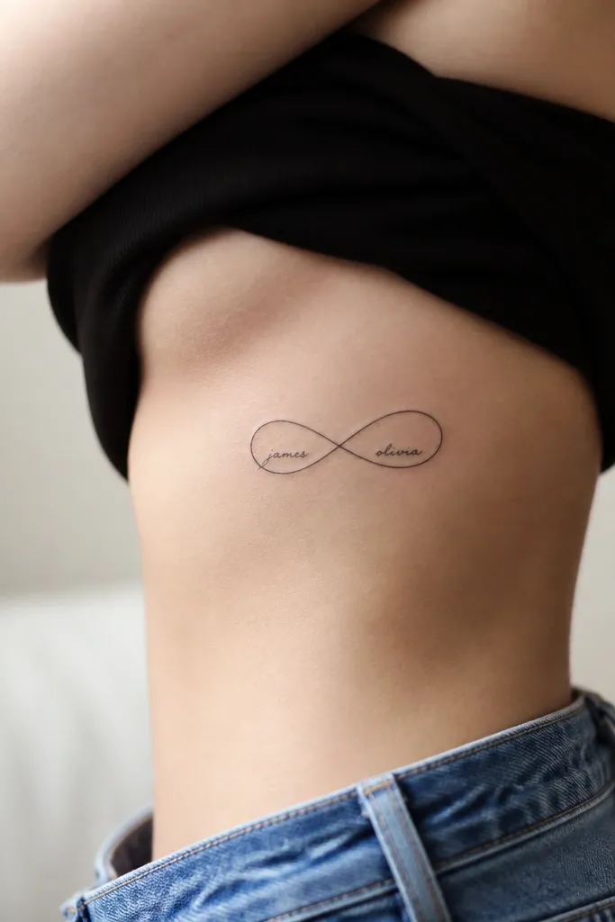
Infinity designs give you a theme even if the names are short. The trick is scale: the name inside must be readable at a normal distance, not microscope-small. I've seen this blur when the name is too tiny, so I push for a bigger infinity and slightly larger lettering.
Place it on the side rib or upper hip where the curve matches the infinity. Keep the infinity width around 1.5-2 inches. Use a font with medium strokes and avoid tiny serifs inside the loops.
Pro tipAsk for a "day 1 vs healed" stencil check in the mirror. If the name looks hard to read on day 1, it will be worse after healing.
AvoidAvoid writing the name in hair-thin lines inside the infinity loops.
7. Name with tiny matching date numbers (MM/DD) under it
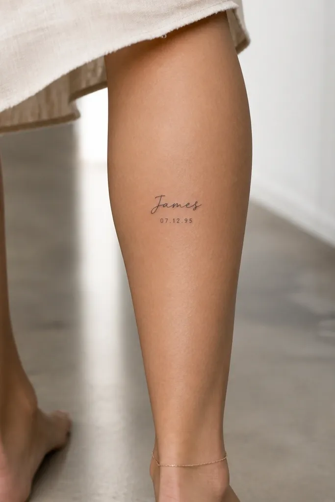
This keeps the tattoo personal without relying on the name alone. The date gives meaning even if one name gets harder to read later. I like it for couples who want a "cute ink" look but also want a memory anchor that doesn't depend on future legibility of thin script.
Place it on the calf or upper arm where skin is less rubbed. Keep numbers small but not microscopic: about 0.15-0.2 inches tall. Use consistent spacing so the numbers don't look like a smudge band.
Pro tipPick a date format that stays short. 6/14/19 reads cleaner than 14 June 2019 in small size.
AvoidSkip long date formats - tiny words turn into unreadable dots.
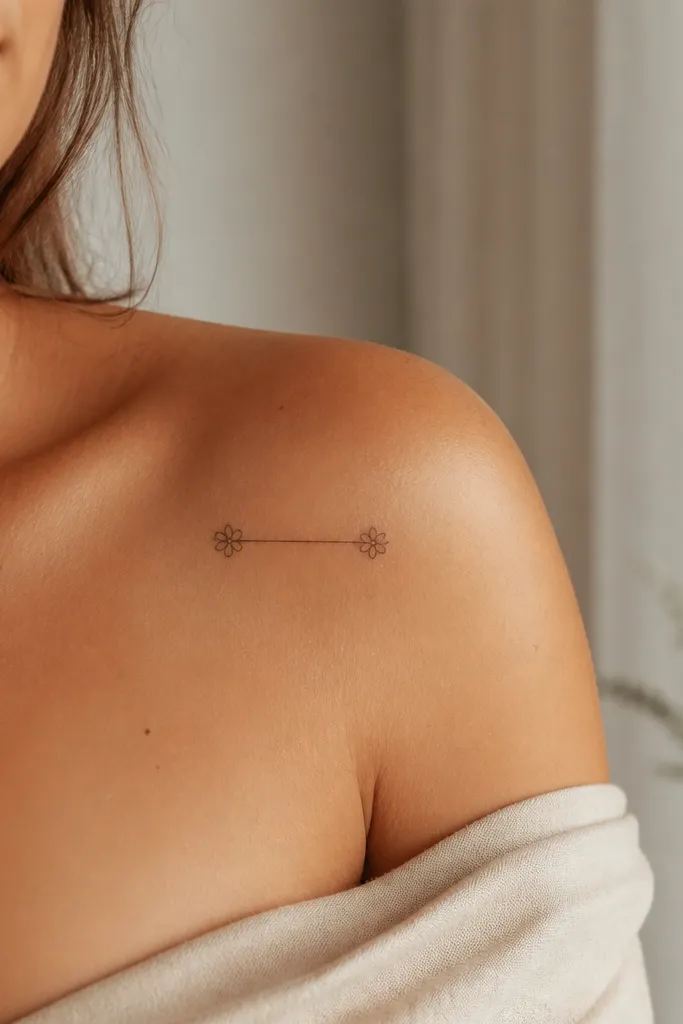
8. Coordinates-style line with partner initials
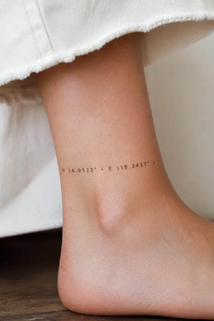
This looks cute when it's minimal and when the numbers are spaced like they're meant to be read. I like using initials instead of a full name here because ankle skin and footwear friction can blur small text. You get the "meaning" feel without betting everything on a tiny full name.
Place it on the ankle bone area, but slightly above the most rubbed spot. Use two initials with a small dot separator between the coordinate-like numbers. Keep everything in one clean horizontal line under 2 inches total width.
Pro tipMake sure the stencil spacing matches the font's natural character width. If the artist squishes letters to fit, it will blur together.
AvoidAvoid full partner names in ankle coordinate layouts - it turns into a gray line.
9. Handwritten name with underline and two spark dots
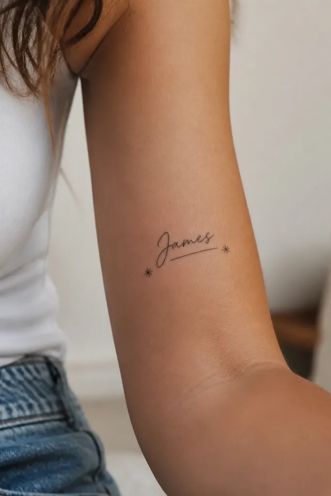
Underline plus spark dots makes the design look finished, like it belongs on your skin. It's also forgiving if the script softens because the underline gives the eye a strong shape to track. I've used this with partners who have names that don't look great in standard cursive fonts.
Place it on the inner forearm for smoother healing and a flatter look. Keep underline length close to the name width, not longer. Choose starbursts that are filled or solid dots with 4-6 spikes - too many tiny spikes blur into a circle.
Pro tipAsk your artist to trace your handwriting from a photo and then adjust the letter heights to match the underline baseline.
AvoidAvoid adding too many spark symbols - two is cute, five starts to look like random filler.
10. Partner name in script inside a small heart outline
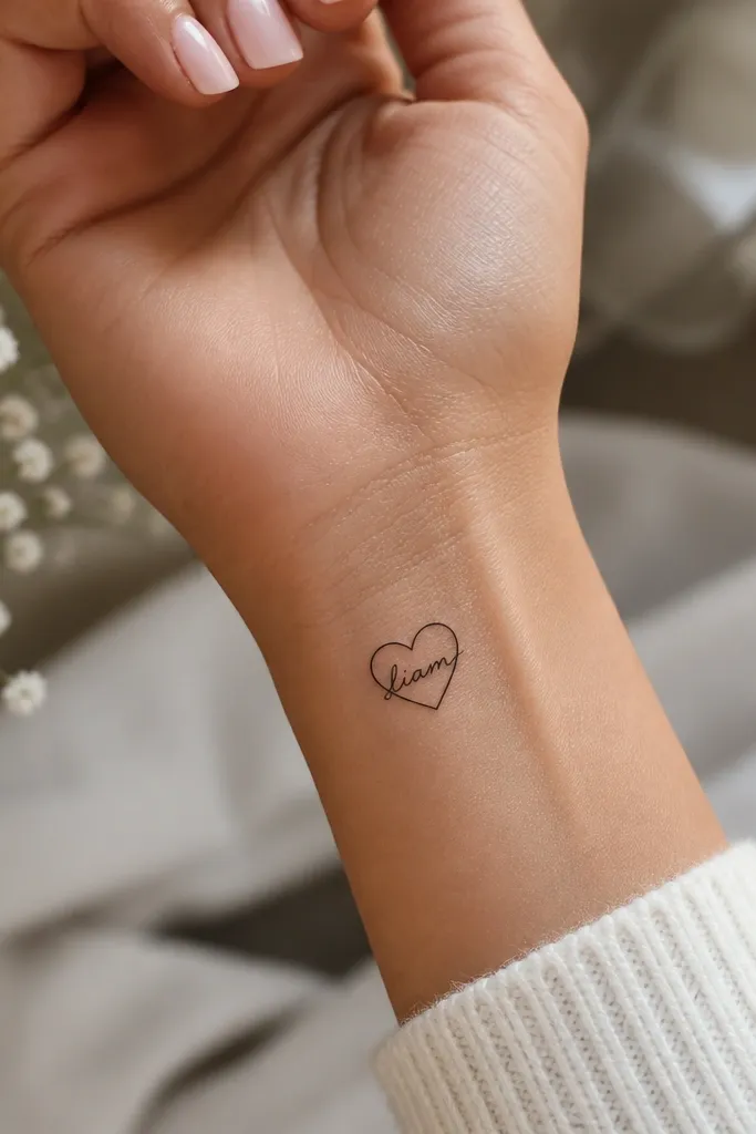
A heart frame makes it look romantic even when the name is short. The outline is the anchor, so the viewer's eye stays on the heart shape. I like this for couples where one name is too short to feel like a "whole" tattoo on its own.
Place it on the inner wrist or just above the wrist crease where the heart stays visible. Keep the heart size around 0.9-1.1 inches wide. Use medium script inside; avoid hair-thin because it will fade into the heart outline.
Pro tipChoose a heart outline thickness that matches your script stroke weight. If the outline is thick and the script is thin, the inside letters look weak.
AvoidAvoid placing this on the wrist crease where folding skin stretches the outline.
11. Two names stacked with a tiny line break and micro flowers
Stacking works when you have one short name and one medium name. The divider line keeps it structured, and micro flowers add cuteness without stealing the focus. I like micro flowers drawn as simple five-petal shapes with a single center dot.
Place it on the upper shoulder or outer bicep where it stays flatter than the ribs. Keep total height under 2.2 inches. Use the same font weight for both names so the divider line doesn't look like it separates different tattoos.
Pro tipIf your names share repeated letters, mirror the font quirks so both lines feel like the same hand drew them.
AvoidAvoid tiny multi-petal flowers with lots of detail - they blur into a gray bloom.


