1. Behind-the-Ear Cursive Name with Micro Dots
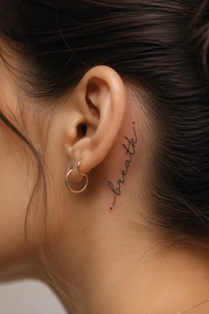
Behind the ear is where a name looks personal but still subtle. I like it with smooth cursive because the curve of the script matches the curve of the skull. The micro dots keep the design from looking like a single blob if the letters fade a little over time.
Ask for a vertical span of about 1.5 to 2.5 inches, with the thickest stroke staying consistent. Keep the flourishes short - no long hairline tails that can disappear with healing. This looks best with straight black ink and a slightly bold script so the loops stay open.
Pro tipWear your hair up during the appointment so you can see the exact edge where the tattoo will sit - the hairline changes the look.
AvoidDon't use ultra-thin fonts with long swashes behind the ear - they blur fast on thin skin.
2. Side Throat Name in Small Caps with a Thin Underline
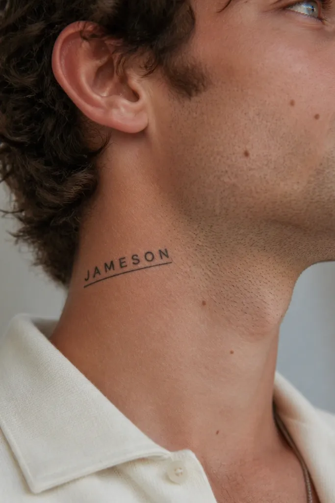
Small caps read well on the side of the throat because they don't rely on delicate curves. A thin underline gives a finished look without adding extra busy shapes. I like this placement for names that are 3 to 7 letters because the spacing stays crisp.
Place it about one finger width behind the jawline on the side of the neck, not on the very front. Keep the letters around 2 to 3 mm wide strokes, and use a straight baseline that follows the neck's natural tilt. The underline should be thinner than the letter strokes, like 0.5 mm.
Pro tipBring a photo of your most common neckline (crew neck, turtleneck, V-neck) so you can position the tattoo where collars won't rub it.
AvoidSkip heavy shading or dense fill here - the side throat already gets movement and friction.
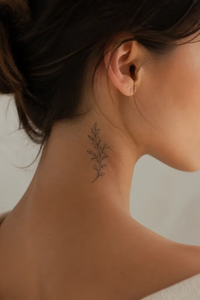
3. Nape Name in Vertical Block Letters with Soft Corners
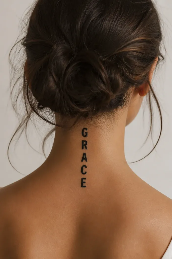
The nape is perfect for names that you want to look "graphic" instead of delicate. Soft-corner block letters survive time better than fine script because the edges stay defined. Negative space between letters makes it look intentional, not crowded.
Aim for a height of 2.5 to 4 inches depending on the number of letters. Keep the letter width consistent and let the tattoo breathe - don't squish characters to fit. Black ink only looks sharp here, especially if your artist uses a stencil with even spacing.
Pro tipAsk for the letters to be centered to your spine line so the tattoo lines up when you bend your neck forward.
AvoidDon't place block letters too low into the shoulder crease - they get flattened by clothing seams.
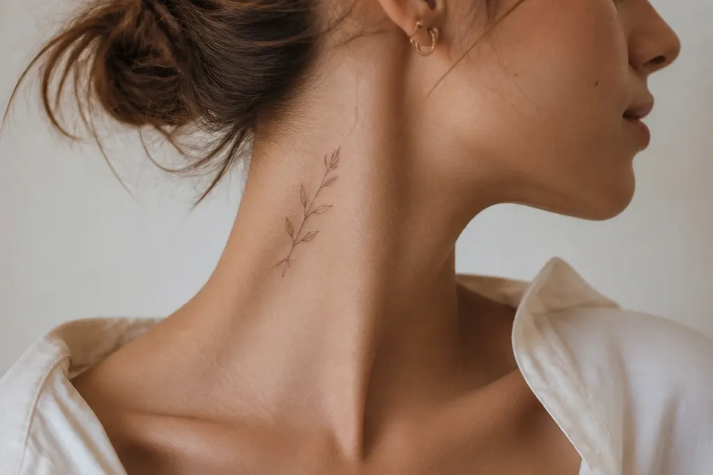
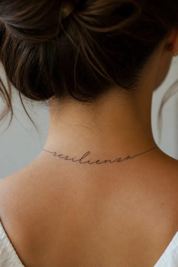
4. Curved Name Arc on the Back of the Neck
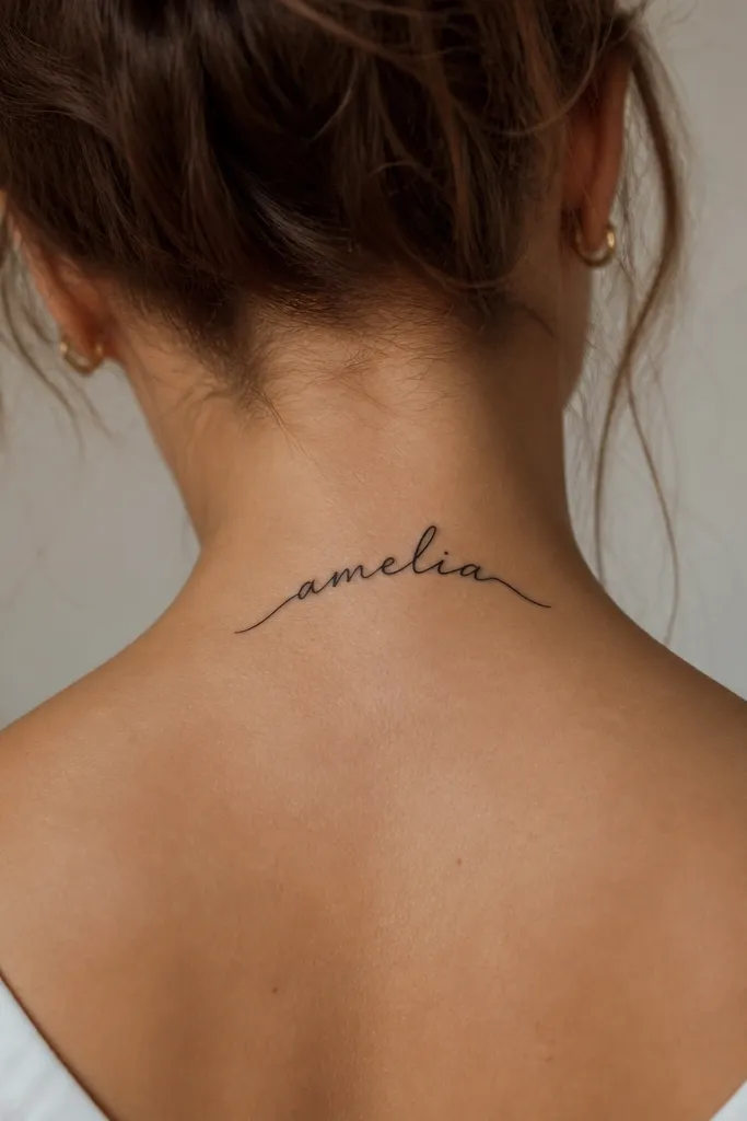
A curved layout matches how the nape naturally rounds, so the name doesn't look stretched. Medium-weight script keeps the loops visible even after some fading. The arc also hides small healing texture differences because the eye reads the curve, not each tiny stroke.
Position it above the top edge of your bra collar line. The arc should span about 3 to 4 inches wide for most names. Keep the font medium weight - if it looks like "pencil writing," it's too delicate for this area.
Pro tipDo a quick test with a flexible tape measure over your neck while turning your head - you want the arc to stay centered from different angles.
AvoidAvoid extremely tight kerning in curved scripts - letters that touch look like a single smear.
5. Front Neck Name as a Minimal Serif Wordmark
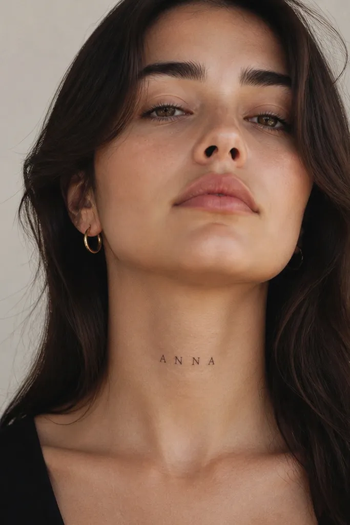
Front-lower neck is a statement spot, but it needs restraint. Minimal serif letters hold their shape as skin stretches, and the spacing makes it look like a designed logo. I like this for names you want to read instantly in photos.
Place it just above the collarbone line, centered. Keep the total width under 2.5 inches and the font weight medium, not hairline. If you want the "fancy" look, ask for small serifs instead of thick flourishes.
Pro tipWear a necklace for a week before your appointment, then mark where it sits. Put the tattoo where the necklace won't rub it every day.
AvoidDon't choose overly thin serif fonts for the front neck - they fade into gray outlines.
6. Side Neck Name with a Single Tiny Star at the End
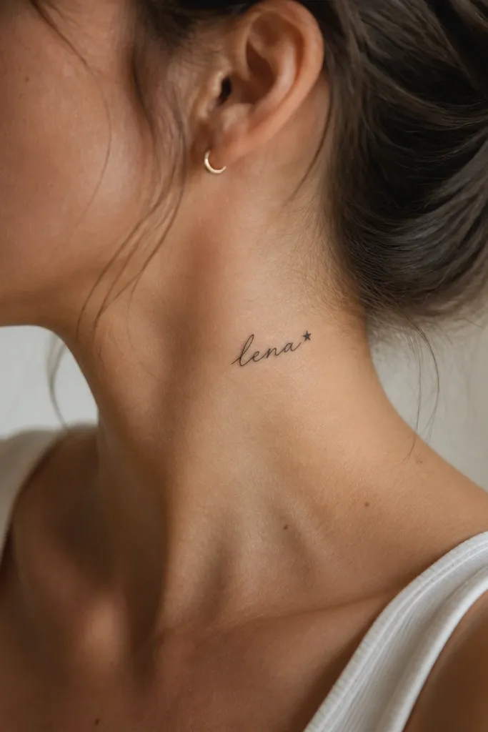
One small symbol fixes the "plain name" problem without turning it into a full design. The star acts like punctuation, so your eye knows where the name ends even as it ages. This works best with a short name so the star stays proportionate.
Place it on the outer side of the neck, halfway between jaw and collarbone. Keep the star about the same height as the lowercase letters. Use a consistent line weight for letters and star so the star doesn't look heavier.
Pro tipAsk your artist to draw the star first, then set the name around it - it keeps the balance right.
AvoidSkip multiple sparkles or micro hearts here - the side neck turns those into clutter.
7. Nape Name with Bracelet-Style Curved Script
This placement looks like jewelry because the letters follow a curved path across the back. Script works because the curve gives the design structure. I've seen this style age well because the strokes are thick enough to survive touch-ups.
Keep the curve centered at the back of your neck, spanning 3 to 4 inches. Don't extend it into the shoulder blade area. The script should be medium weight with no long trailing tails.
Pro tipIf you have short hair, pick a placement slightly higher so it still shows when your hair lifts.
AvoidAvoid placing it too close to the hairline - it gets irritation from styling tools.
8. Name Split Across Two Lines on the Back of the Neck
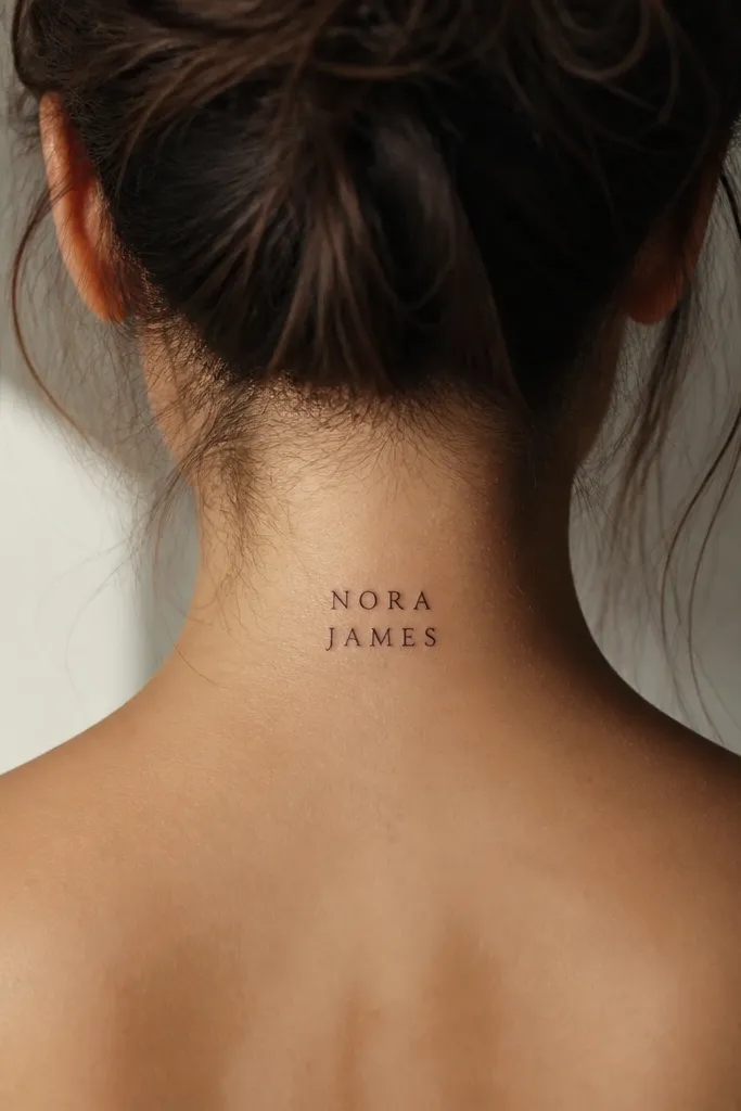
Two lines let you keep letter size readable when your name is longer. The back of the neck gives you room to balance the lines without squeezing. This layout also makes healing easier because each line has breathing space.
Choose a split that feels natural - after a vowel or at a syllable break. Total height should be around 3 to 4 inches. Keep line spacing about the width of one lowercase letter so it doesn't look like a list.
Pro tipTape paper strips on your neck to test the two-line spacing before you commit to the font.
AvoidDon't use tiny font size to force everything into one line - it looks blurry later.
9. Behind-the-Ear Name with a Thin Roman Numeral Date
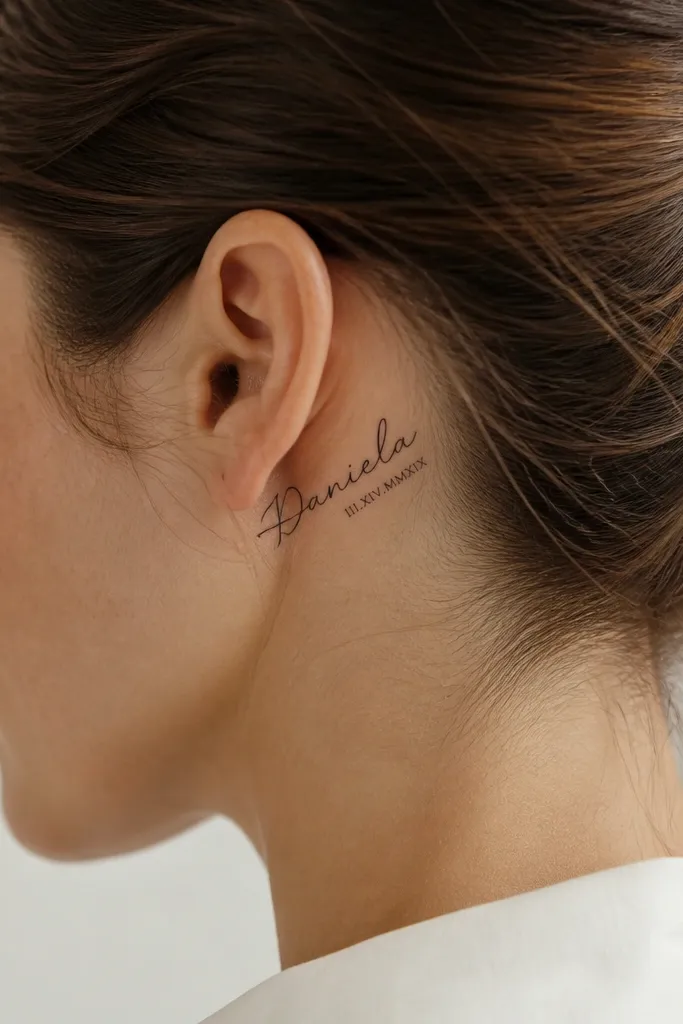
Adding a date gives the tattoo a memory without adding a big graphic. Roman numerals are structured, so they stay readable even when the name script softens with time. This pairing looks clean because both elements share the same line weight.
Keep the date smaller - about 60% the height of the name letters. Place it so it doesn't overlap the ear curve too much. Choose roman numerals with thin serifs but not hairline thickness.
Pro tipWrite the date in the exact numerals you want on paper first - don't rely on guessing the format during the session.
AvoidSkip tiny script dates - they become dots on thin skin.
10. Side Neck Name with a Vertical Line Divider
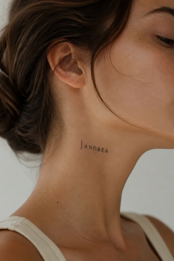
The divider line makes the name look designed and helps with readability. It also balances the negative space on the side neck, where skin texture can distract. I like small caps here because the letter edges stay sharp and the line adds structure.
Place it between the jaw angle and the upper throat, slightly forward. The vertical line should be about the same height as the letters, but thinner. Keep the name centered so the line doesn't pull attention off-axis.
Pro tipAsk for the line to be straight, not slightly curved - straight lines look cleaner on moving skin.
AvoidAvoid thick bars next to small letters - it makes the word look cramped.
11. Nape Name with a Single Leaf Outline Accent
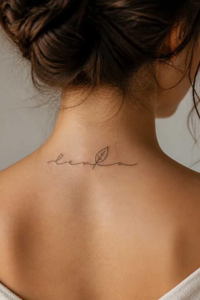
A single leaf outline adds softness without turning the tattoo into a full botanical piece. Outlines tend to look better than filled shapes on the nape because they need less ink density. The name stays the main focus.
Keep the leaf about the height of one letter, placed so it doesn't cover the thickest strokes. Use linework only - no gray wash. The leaf stem should be thin but consistent, around the same weight as the cursive stroke.
Pro tipIf your hair covers the nape often, place the leaf closer to the outer edge so it catches light when you move.
AvoidDon't add multiple leaves or heavy shading - outlines turn into mush if they're too busy.
12. Front Neck Name in One-Line Signature Style
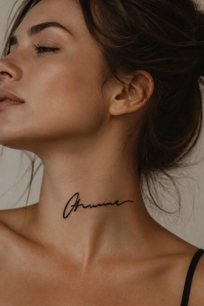
A one-line signature style looks personal and clean in close-ups. The continuous stroke helps the tattoo heal as one shape instead of a bunch of separate letter parts. This works best for names that already look good in cursive.
Place it slightly off-center on the front-lower neck so it doesn't sit directly on a fold. Keep the design width around 2 inches. The line should be medium weight with a short end flick - long flicks fade.
Pro tipPractice the signature on paper with the exact rhythm you want. Bring that to your artist so the stroke flow matches your real style.
AvoidDon't choose a signature font with lots of tiny hooks - they disappear first.


