1. Halo Banner with Husband's Name and Wedding Date
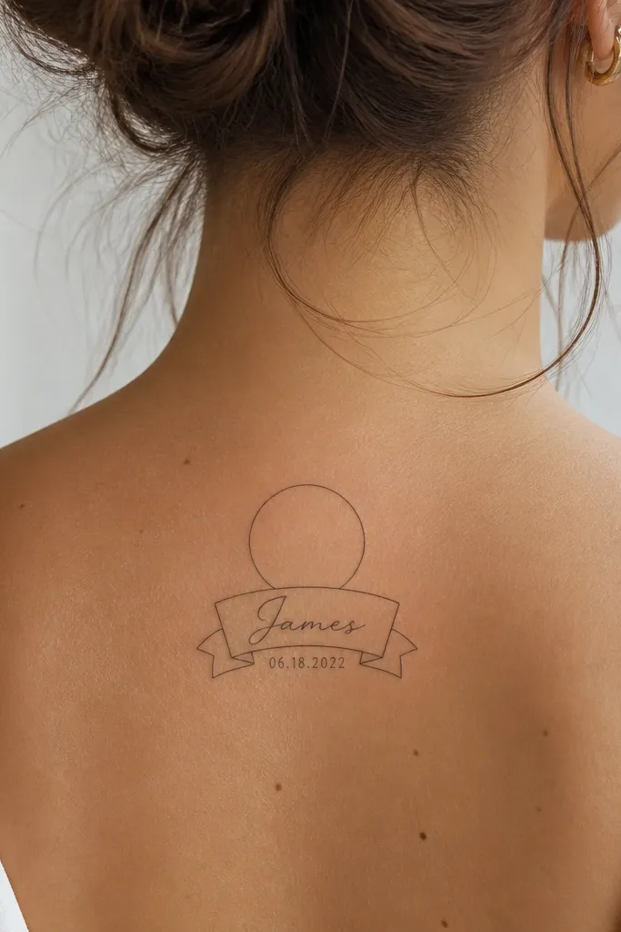
This design keeps the name readable because it sits inside a controlled shape. The halo outline gives you a clean boundary, so the lettering doesn't drift when it heals. I like this with black and one soft accent - a tiny dot cluster in muted gold-brown or light rose ink - to make the banner feel warm without turning into color chaos.
Place it on the inner wrist or the upper forearm near the crease. Make the banner length about the width of your palm crease, and keep the halo line thin at first pass. If you want the date to stay crisp, keep it small but not hairline - think bold enough to see at arm's length.
Pro tipAsk your artist to do a quick stencil with your actual handwriting reference, then adjust letter spacing until it looks balanced in a mirror.
AvoidAvoid putting the date in the thinnest possible font - it fades first and makes the name look like it's floating.
2. Coordinate Lines with Name in a Small Compass
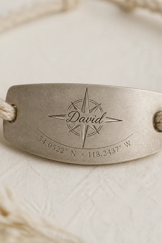
Coordinates are meaningful without needing extra words, and the compass gives the name a purpose. The compass lines create structure, so your name stays legible even if fine lines soften over time. I usually use all black for longevity, then add one muted compass needle highlight in dark gray to keep it from looking flat.
This works great on the outer upper arm or side of the calf where you can keep it vertical. Keep the compass about 25-35 mm wide so the name fits cleanly across the rose. The coordinate numbers should be small but not tiny - leave enough space between digits to avoid blending.
Pro tipBring the exact coordinates written on paper and double-check the order (latitude then longitude) before the stencil goes on skin.
AvoidSkip tiny compass ornaments around the border; they age into clutter next to the name.
3. Ring of Flowers with Name Wrapped Around the Band
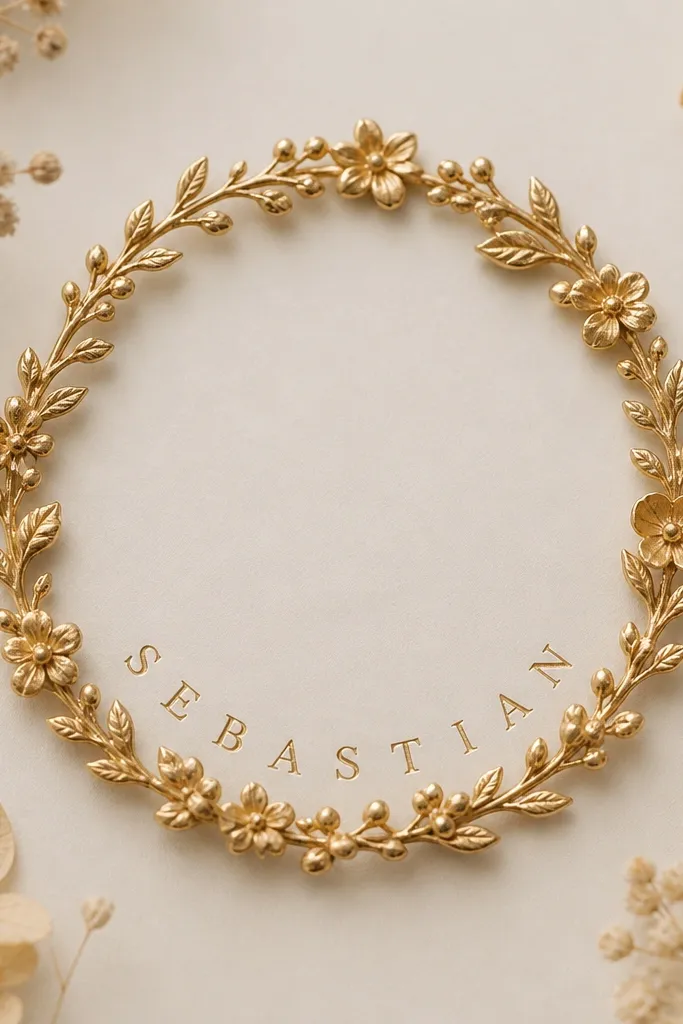
This one looks expensive because it mimics how jewelry sits on skin. The curved band prevents the name from stretching awkwardly, and the flowers give you texture so the tattoo doesn't rely only on lettering. I like black ink with subtle shading in one area - usually the leaf veins - so the ring has depth without turning into a full-color sleeve.
Place it on the upper arm or shoulder blade where the skin has gentle curvature. Size the ring to your comfort - about 45-60 mm across for clear readability. Keep the name thickness consistent with the ring line so it heals evenly.
Pro tipAsk for one dominant flower (like a small rose or daisy) and keep the rest simpler. One focal bloom reads cleaner after healing.
AvoidDon't pack too many tiny petals around the name; they blur and make the letters look cramped.
4. Two-Line Script with a Tiny Heart Split by the Name
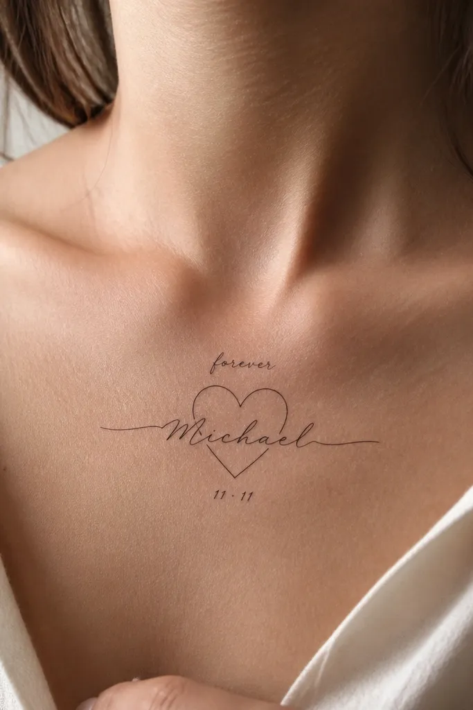
This layout makes the name feel like part of the symbol, not an overlay. The heart outline gives a clear silhouette that survives fading better than standalone script. I prefer black ink with a soft gray wash in the heart's negative space so it looks dimensional without heavy color.
Good placements are the collarbone (center) or upper chest where you can keep it symmetrical. Keep the name line thicker than the top word so it stays the main focus. If you add a date, keep it shorter than you think - two digits pairs look cleaner than long strings.
Pro tipBring a list of your top three nicknames and have the artist mock up spacing for the one you actually use daily.
AvoidAvoid super thin script that matches the top line weight; the top line can fade and the heart then looks off-center.
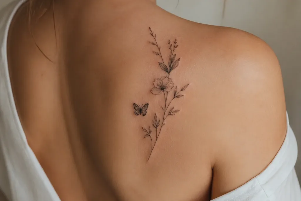
5. Butterfly Wings with Name in the Body Segment
The butterfly solves the "name is boring" problem by giving the ink a natural frame. Vertical body placement keeps letters from warping and gives you a clean read when the tattoo is partially covered by hair or clothing. I like black line work with a light gray gradient in the wings so the butterfly looks alive without needing full color.
Place it on the forearm inner side or down the side of the thigh. Keep the wings large enough to look intentional when you stand - usually 60-90 mm total height. The name should be large enough to read straight-on, not sideways.
Pro tipAsk for the wing veins to stop short of the name area so the letters stay crisp where you need them most.
AvoidDon't add micro dots all over the wings; they make the whole piece look like it's been sanded after a year.
6. Infinity Loop with Initials and Full Name Under
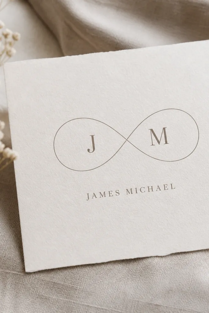
Infinity is a classic for a reason - the shape guides the eye and keeps the composition balanced. Using initials inside the loop gives you a compact meaning, while the full name below provides the emotional payoff. This style stays readable because you're not trying to cram the whole name into a tiny loop.
Place it on the wrist, ankle, or upper hand where horizontal space is limited. Size the infinity about 25-35 mm wide, then keep the name below at least 12-15 mm tall. Use a serif or simple script - anything too curly will blur.
Pro tipIf your husband has a name with a long tail letter (like y or g), choose a font that keeps those descenders controlled.
AvoidSkip matching font styles for both initials and the full name; it usually looks messy after healing.
7. Book Page Margins with Name in the Quote Line
This is a clever way to make a name feel like a story instead of a label. The margin lines and page number give you structure, so the letters don't float. I prefer black ink with light gray shading under the "page" edges so it looks like paper without going into realism.
Place it on the calf or upper arm where you have enough flat space. Keep the "page" width around 45-55 mm. The name should sit on the line with consistent baseline - ask for a stencil that shows the line height.
Pro tipBring a real page reference (a line from a book or a note) and use it to match letter spacing and height.
AvoidDon't add paragraphs of extra text; the tattoo will age into a gray blob.
8. Sunrise Arc with Name Signed Like a Letter
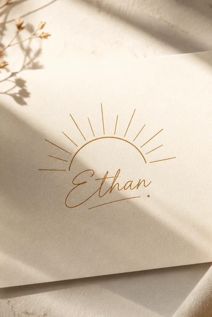
The sunrise arc gives you motion and warmth, and the signature style makes the name feel personal. Because the name is written like a signature, it has natural spacing and stays readable if the strokes aren't too hair-thin. I like black ink with one small burnt umber accent in the sunrise glow so it looks warm under daylight.
Place it on the outer forearm or shoulder where the arc can sit cleanly. Keep the arc about 30-45 mm wide. The name should be the only "freehand" element; everything else stays thin and controlled.
Pro tipIf you want color, keep it in one spot only - the sunrise glow - so the rest stays black for longevity.
AvoidAvoid copying a super cursive signature with lots of tiny loops; those loops blur fast.
9. Small Anchor with Name in the Shank
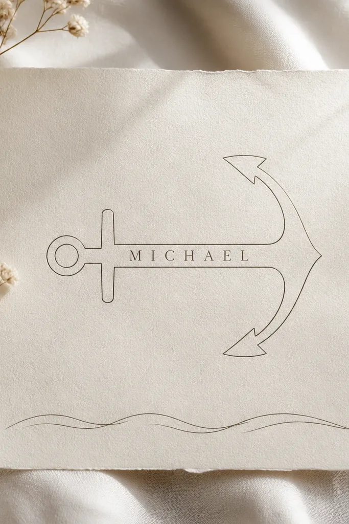
Anchors read clearly and age well because the design has strong negative space. Putting the name inside the shank is smart: the shape holds the letters steady and keeps them from drifting. Use black ink for the anchor and waves, then shade the anchor crown with a light gray wash to give it depth.
Best spots are the inner forearm or outer ankle where the anchor can be slightly angled. Keep the anchor about 35-55 mm tall. The name line should be sized to the shaft width so letters don't touch the anchor outline.
Pro tipAsk for slightly wider letter spacing than normal script so the ink doesn't merge into the anchor line after healing.
AvoidSkip heavy dotwork in the waves; it makes the bottom area turn muddy.
10. Hearth Key with Name Engraved on the Teeth
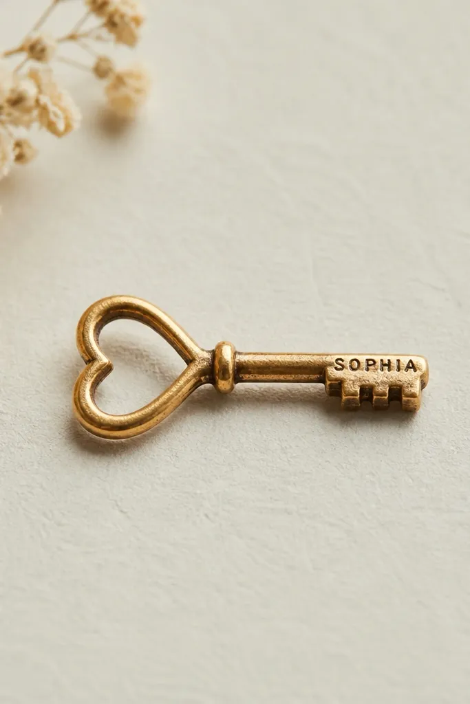
This is one of my favorite ways to make a name feel functional. The key teeth area is narrow, so you get a naturally compact "engraved" look that still reads if you keep the font simple. The heart-shaped bow adds warmth without needing extra icons.
Place it on the wrist crease, forearm, or upper arm inner side. Keep the key length around 45-65 mm. Use uppercase letters with consistent stroke thickness; tiny lowercase curls get mushy on small teeth.
Pro tipIf your husband's name is long, use only first and middle initial on the teeth and put the full name on a thin line beside the key.
AvoidDon't use ornate gothic fonts for the teeth; they clog with ink.
11. Two Dates in Roman Numerals with Name Centered
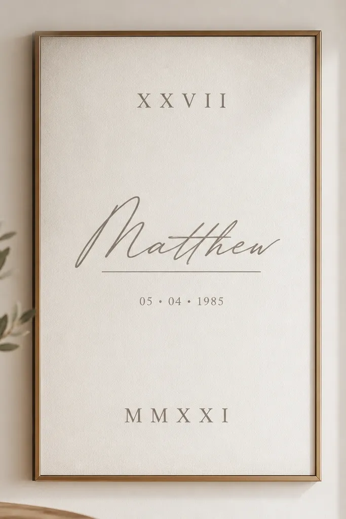
Roman numerals give you meaning without taking over the tattoo, and centering the name keeps it focused. This works especially well when the meaning is time-based - meeting date and wedding date, for example. I keep it black and use a thin underlining rule so the whole piece looks like it was laid out carefully.
Place it on the rib line, upper arm, or thigh. Keep the center name big enough to read from two feet away - about 12-18 mm tall. The numerals can be smaller, but keep digit spacing clear so I, V, X don't blur into each other.
Pro tipAsk your artist to print the numerals and name in the exact font size they plan before tattooing - it saves you from surprise spacing.
AvoidAvoid crowding dates too close to the name; healing makes edges swell and letters look squeezed.
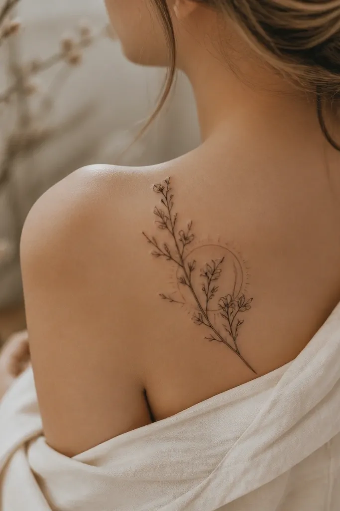
12. Lettered Coordinates with a Tiny Moon Phase
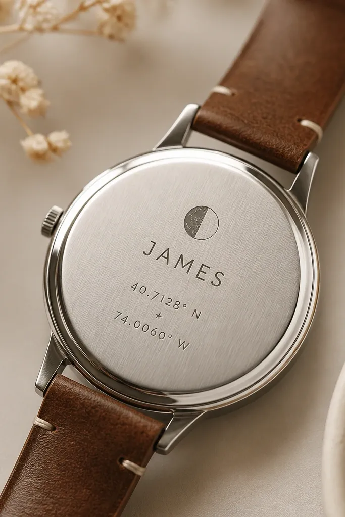
Moon phase adds a poetic anchor, and coordinates add hard meaning. The star separator helps the eye move through the layout in order: symbol, name, location. I keep the moon line thin and add a single black star dot so the tattoo doesn't feel like a cluster of text.
Place it on the side of the calf, inner forearm, or upper back near the shoulder. Keep the coordinate lines short - one line for latitude, one for longitude. Size everything so the name is the biggest readable element.
Pro tipIf your artist proposes tiny stars all around, say no and keep only one - one star reads intentional after healing.
AvoidDon't use script for the coordinates; switch coordinates to simple block numerals.


