1. Mom anchor heart with both daughters' initials inside
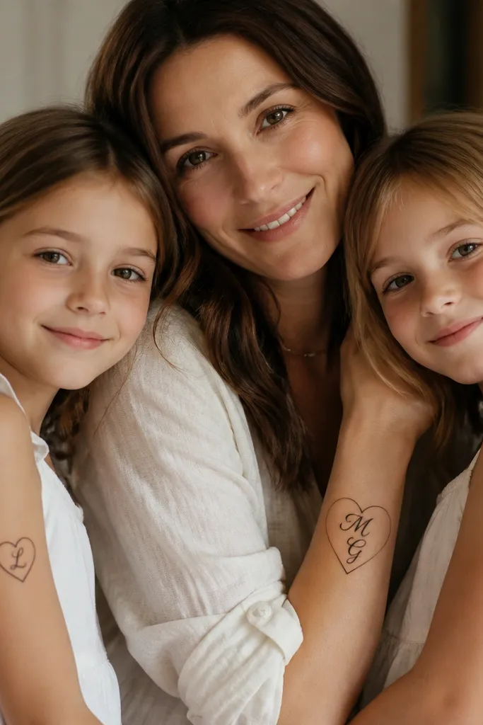
This works because the heart shape is the same geometry for all three pieces, so the set reads as one family motif. The mom version is bigger, which gives the eye a focal point, while each daughter gets a simpler, cleaner single-initial heart. I like using fine-line script inside the heart, but I keep the letters thick enough that they don't blur.
Mom placement: inner forearm or upper arm, 35-45 mm tall. Daughter placement: outer wrist or upper outer arm, 18-30 mm tall. Use black ink only or add one tiny accent dot (like a single red dot) inside each daughter heart for a subtle "family wink."
Pro tipTell your artist you want the initials at least 3 mm tall so they stay readable after healing.
AvoidAvoid hair-thin cursive for the initials - it turns into a gray smudge.
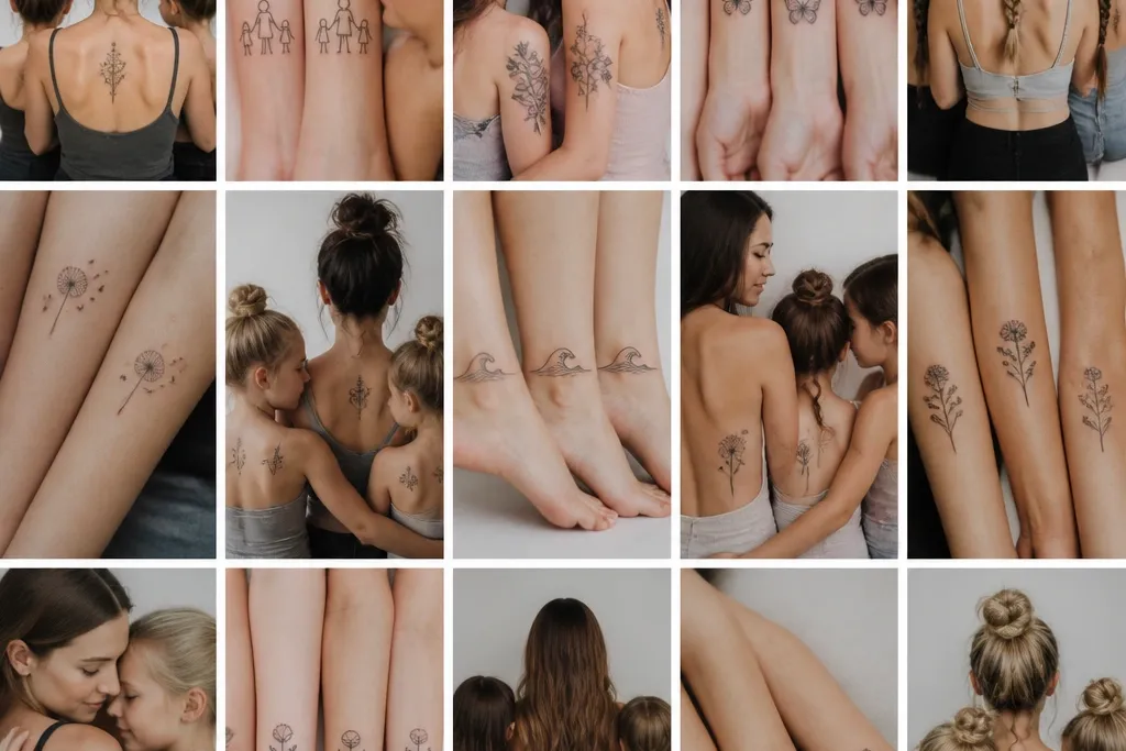
2. Birth flower trio with shared center dotwork
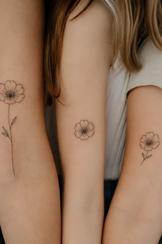
The trick is the shared center. If the center dotwork matches across all three, the flowers feel connected even when the petals differ. I've had this age really well because dotwork softens nicely over time while the outer petals stay recognizable as a flower silhouette.
Pick one flower style for the whole set, then customize petals by month. Keep the mother bloom about 1.6-1.8x the daughters' size. Use black ink with a single soft color accent only if you love color - otherwise, stick to black for longevity.
Pro tipAsk for a dotwork center that uses the same dot spacing in every piece, not just "similar texture."
AvoidSkip tiny petal counts that look great on paper but turn into blobs on skin.
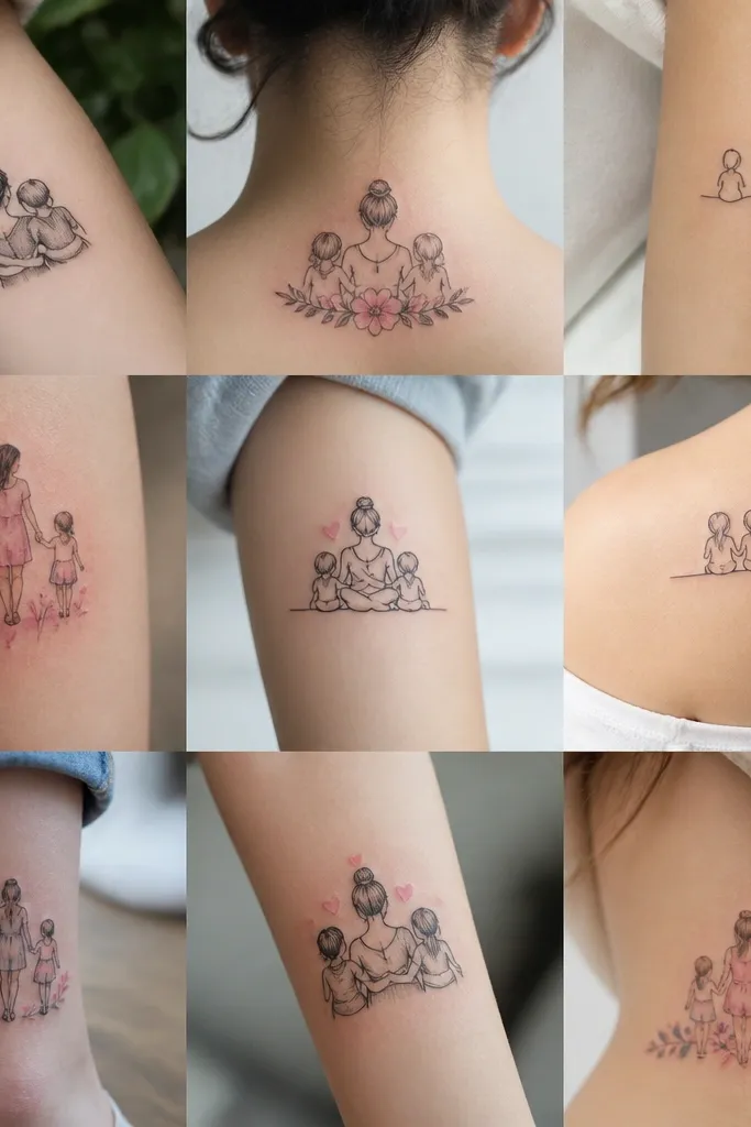
3. Split ribbon lettering across three placements
This is the sweetest setup when you want it to feel like one story. The ribbon line gives a continuous visual rhythm, and split lettering adds emotion without needing three identical full phrases. I've seen this look cohesive even from across a room because the ribbon's curve repeats.
Start with one continuous ribbon sketch, then cut it into three pieces. Use the same font style across all three, with the same line weight for letters. Typical sizes: mom 40-50 mm, daughters 20-30 mm depending on where the ribbon sits.
Pro tipDo a quick measurement with a flexible measuring tape on each placement before the stencil goes on - ribbon curves change how letters fit.
AvoidDon't cram full words into small placements - partial words look cleaner than tiny illegible ones.
4. Constellation trio with matching star sizes
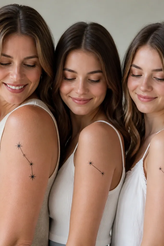
Constellations are forgiving because dotwork and line connections still read even as ink fades slightly. Matching star sizes matters more than matching exact star positions. I like using one larger "anchor" star for mom and distributing the rest as partial constellations for daughters.
Use black ink with dotwork stars and single-needle lines for the connecting segments. Keep each daughter's piece under 30 mm so it heals cleanly without overworking the skin. If you want color, add tiny muted blush dots only to the anchor stars - keep it minimal.
Pro tipAsk your artist to map the constellation using the same star diameter across all three tattoos, not "eyeballed."
AvoidAvoid dense clusters with too many micro stars - they fill in and lose the constellation shape.
5. Tiny matching birds with one shared wing feather detail
Birds feel sweet without being overly literal. The shared wing feather detail is the key - it's a recognizable "family signature" that ties the set together. I've found that small illustrative animals age well when they use bold outlines and simple shapes rather than lots of tiny shading.
Outline thickness should be consistent across all pieces. Mom placement: forearm or upper arm, daughter placements: wrist (back side) or outer bicep. Keep birds around 20-25 mm for daughters so the feather notch stays sharp.
Pro tipBring a photo of the exact bird style you want (not just "cute birds"). The artist needs the same silhouette to match the notch.
AvoidSkip heavy realism feather shading - it turns into gray texture on small tattoos.
6. Script family names with a shared underline date
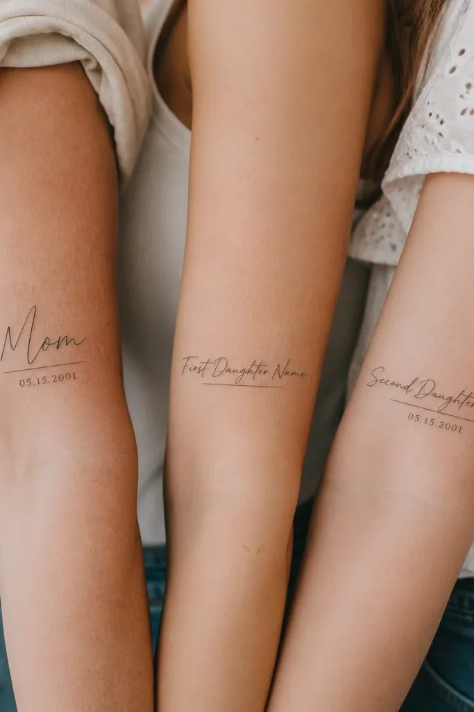
This looks clean when you treat it like typography. The underline date anchors the set so it feels coordinated even if the names are different lengths. I'm picky about script: the letters need thick downstrokes and enough spacing so they don't fuse.
Choose one script style and keep the same baseline for all three pieces. Mom gets the longest version at 45-55 mm; daughters get 22-32 mm depending on letter count. Place on inner forearm for mom and outer forearm for daughters to keep it flat and readable.
Pro tipAsk for a stencil mockup that includes the exact name spelling and the final font size in mm, not "about this big."
AvoidAvoid ultra-thin script lines under 2 mm - they fade into a gray line.
7. Infinity with two matching stars (mom bigger, daughters split)
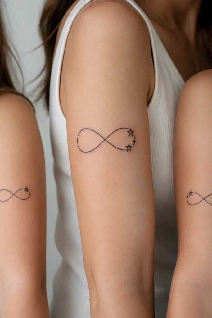
Infinity is easy to scale without losing meaning. The shared star shapes make it feel like a coordinated set, not three separate symbols. I like this because it reads sweet and symbolic without adding a bunch of tiny elements.
Use black ink, clean linework, and star shapes that are the same size across all three. Mom placement: inner arm or upper forearm, daughters: wrist or forearm side. Keep the daughters' infinity width around 15-20 mm so it doesn't stretch when you move.
Pro tipTell your artist the infinity line weight should match your existing tattoos or your skin's natural contrast if you're starting fresh.
AvoidSkip super skinny infinity lines - they break as the skin heals.
8. Moon phases trio with one shared crescent curve
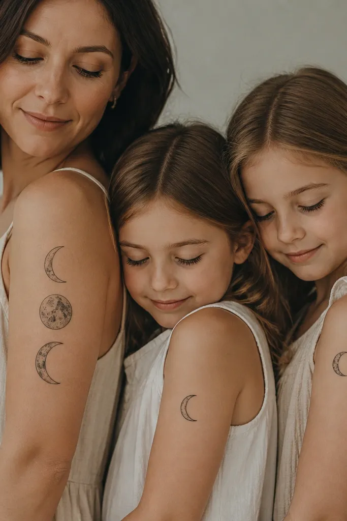
Moon phases look romantic but still graphic, which means they heal with crisp edges. The shared crescent curve thickness is what makes it feel like a set. I like keeping the moons simple: no heavy shading, just clear phase separation.
Pick three phases that relate to your family story (birth months, anniversaries, or just the vibe). Mom gets stacked phases vertically at 40-50 mm; daughters get single-phase pieces 20-30 mm. Place mom on upper arm where it stays flatter, daughters on outer forearm to avoid too much stretch.
Pro tipAsk for the phase cut line to be straight and clean - that line is what stays visible as ink lightens.
AvoidAvoid grayscale moon shading on small sizes - it turns smoky.


