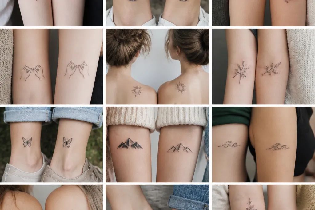
1. Birthstone Constellations, Different Stars
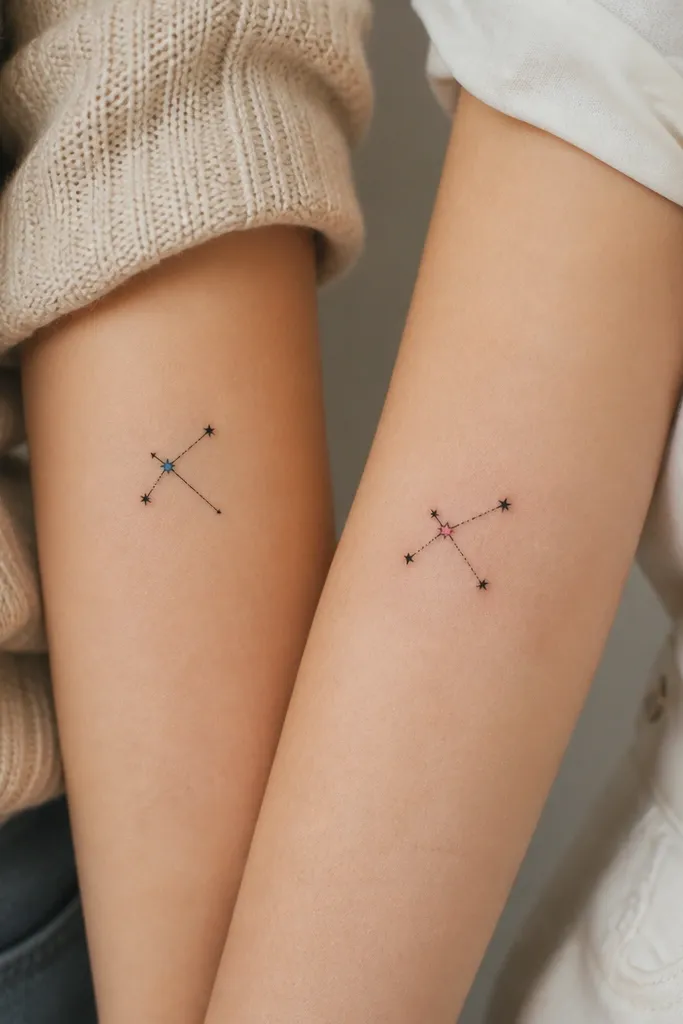
This works because you share the same "map" idea without copying the exact star pattern. The constellation lines read modern when they're thin, straight, and not overly decorative. The single colored star element gives you that special "only ours" feeling without turning into a full-color mess as it heals.
Ask for a constellation size around 2.5 to 3.5 inches long on the forearm. Keep the colored star no bigger than a pencil eraser dot, and use black line work for all the other stars. Place mom's constellation slightly higher toward the elbow, and daughter's slightly lower on the same forearm side so they look like a set even when they aren't identical.
Pro tipBring your birth months as actual star dates - even if you don't use official astronomy, pick a pattern you both like and keep it consistent for the design.
AvoidAvoid thick outlines on the constellation lines - heavy black next to tiny star dots makes it look bulky after healing.
2. Same Quote, Split by Meaning
This is modern because the design is typographic and minimal. You keep the relationship clear by using the same quote split across two placements, but each person gets a different visual weight. The tiny star dots make it feel like a modern system rather than a copied sentence.
Use one font style across both tattoos - either simple connected script or block serif - but give each person a different finishing element. Mom gets a single dot accent; daughter gets two star dots placed as spacing markers. Keep it under 2 inches total height so the letters don't blur on the wrist.
Pro tipAsk the artist to print a stencil at the exact placement size on both bodies before you commit - wrists warp the look if the stencil is only measured on one person.
AvoidAvoid long phrases on the wrist - they heal soft and can turn into a gray smudge.
3. Flower Bud + Flower Bloom Pair
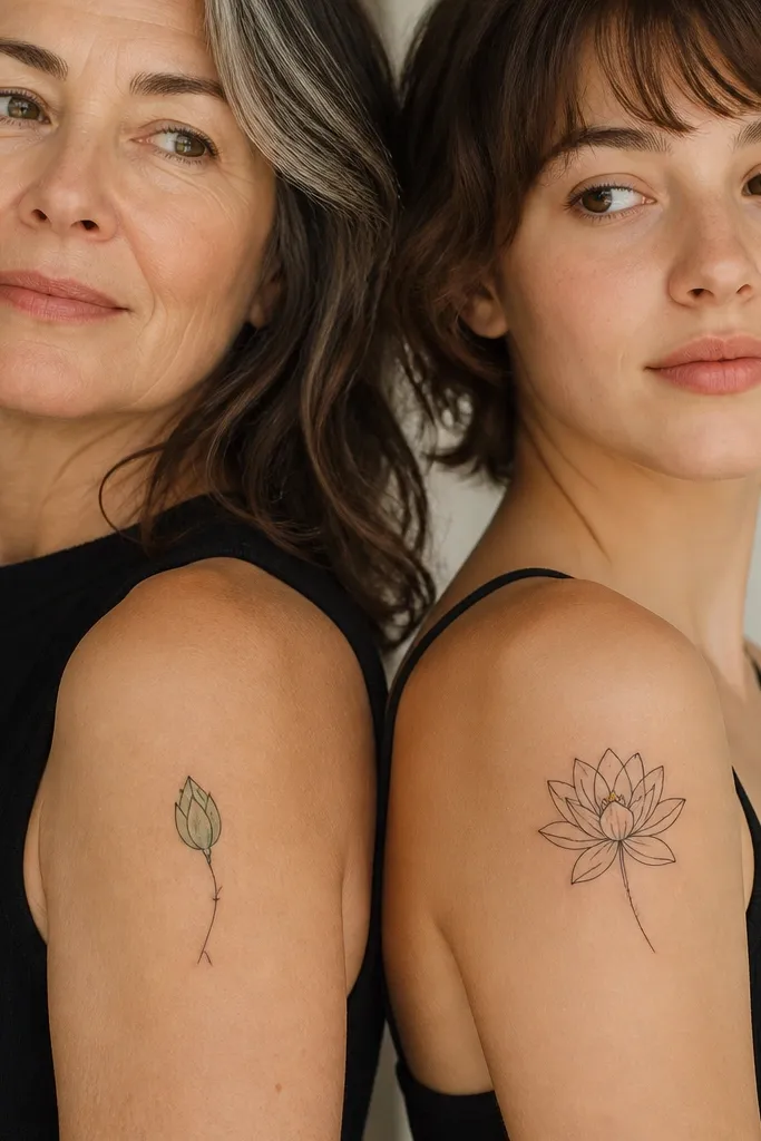
The bud-and-bloom pairing reads like growth without needing matching outlines. Fine-line black keeps it modern, and the tiny color accents (green for the bud, gold for the center) make it feel like you picked it together. From a distance, it reads as one theme; up close, each tattoo feels personal.
Choose a flower with a simple structure you can draw cleanly at small size - like a peony-style bloom or a garden rose silhouette. Keep mom's bud about 2.5 inches tall and daughter's bloom about 3 inches tall on the upper arm. Use the same flower shape in both, but let the bud be mostly line work and the bloom get slightly more petal definition.
Pro tipIf you do color, ask for diluted watercolor-style shading only inside the petal area, not as a full background wash.
AvoidAvoid multiple bright colors across the petals - it looks cloudy once the skin heals.
4. River Lines, One Year Difference
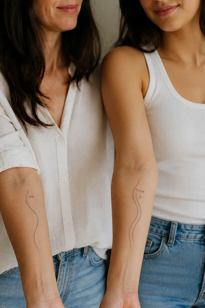
This looks modern because it's basically a graphic line. The shared river motion tells the story of time, and the year label makes it concrete. The parallel line option for the daughter keeps the set from looking like a copy/paste stencil.
Use black ink for both, with numbers in a simple sans-serif font. Keep the river line thickness around the same width as the number strokes so it feels designed, not random. Place mom slightly above the daughter's tattoo on each forearm so they don't visually compete when you stand side by side.
Pro tipAsk the artist to draw the river line with a consistent curve rhythm - if the line wiggles unpredictably, it reads sloppy after healing.
AvoidAvoid putting numbers too close to the curve - they distort as the skin stretches.
5. Infinity Thread With Two Charms
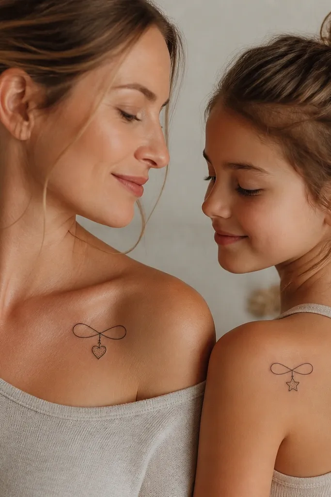
An infinity loop is recognizable, but the charm swap makes it feel special instead of identical. Micro dots inside the charms add a modern texture without shading everything. The thin line style is clean and ages better than thick, filled shapes.
Keep the infinity loop around 2.5 inches long. Make the charm about 0.4 to 0.6 inches tall, centered on the loop. Use the same charm style (outline + micro dots) so both tattoos look like one system even though the charms differ.
Pro tipIf you're placing near collarbone, ask for slightly larger spacing between the charm and the loop so it doesn't mash together when you move.
AvoidAvoid filled-in charms - solid black blocks can blur into a blob on thin skin.
6. Sun Over the Moon, Different Angles
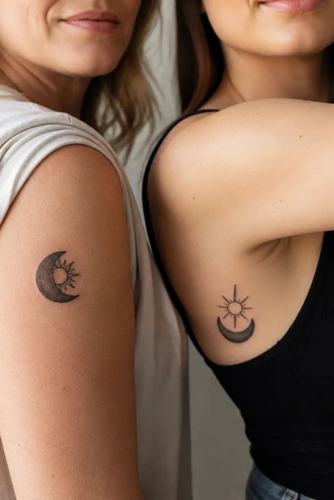
This one reads modern because it's graphic and balanced, not crowded. Using the same icon set (sun + moon) gives instant connection, and changing the angle makes the pair feel like a conversation. Fewer sun rays for the daughter keeps her design lighter and more "airy."
Keep both tattoos under 4 inches across so the rays don't turn into smears. Use black ink only, and keep the moon outline clean with a single crescent cut. Put mom's piece slightly more outer-facing and daughter's more toward the inner arm so their silhouettes look different in photos.
Pro tipAsk your artist to draw the moon first, then build the sun rays from a consistent arc so it doesn't look uneven.
AvoidAvoid too many rays - they thicken during healing and start to look like a fuzzy halo.
7. Paper Crane + Map Pin
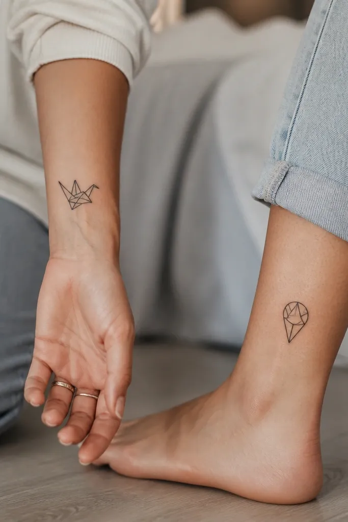
The shared geometry makes this feel connected even though the icons are different. A paper crane is classic, but the modern twist is using crisp fold lines rather than fluffy feathers. The map pin ties it to "home" or a place you both love, and the angular interior echoes the crane's style.
Keep the crane about 2 inches tall and the map pin about 1.5 to 2 inches tall. Use line-only shading, no heavy fill. Match the fold-line thickness between both tattoos so the pair looks intentional.
Pro tipIf you want it to feel more personal, swap the map pin interior lines to match a specific landmark shape you both recognize.
AvoidAvoid soft watercolor clouds around the crane - it makes it look like a clip-art filter.
8. Minimal Heart Beat, Different Stops
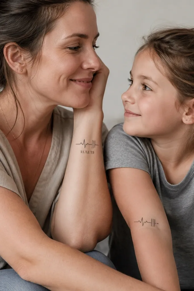
Heartbeat lines look modern when they stay clean and graphic. You share the same rhythm style, but the "stop" points differ so the set doesn't feel like matching duplicates. The dot end for the daughter keeps it subtle and makes photos look crisp.
Use line weight around 2-3 mm for the heartbeat line. Keep dates small (under 0.2 inches tall) and spaced away from the line so they don't collide visually. Place mom's heartbeat slightly closer to the wrist and daughter's slightly closer to the elbow.
Pro tipAsk for a version that includes an extra "smoothing" pass on the line so the curve looks deliberate, not shaky.
AvoidAvoid freehand squiggles - uneven heartbeat lines look accidental, not meaningful.
9. Key and Lock, Same Teeth Pattern
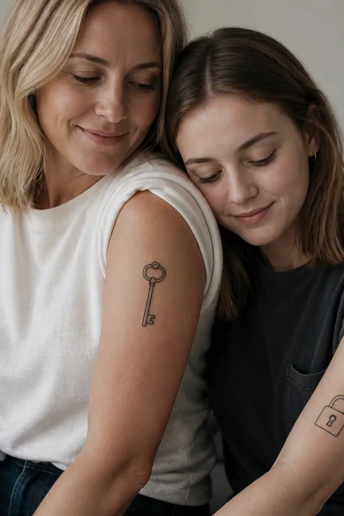
This is one of my favorite modern mom-daughter pairs because it's symbolic without being busy. Matching the tooth pattern makes it feel like one story, not two unrelated icons. Keep it line-only and crisp so it reads clean in everyday lighting.
Design the key and lock with the same tooth count - for example, 7 tooth points - and match the angles across both tattoos. Keep mom's key about 3 inches long and daughter's lock about 2.5 inches tall. Place mom on outer upper arm where it won't stretch too much; daughter on forearm where the lock sits flat when you extend your arm.
Pro tipAsk the artist to make the keyhole interior line thickness the same as the key teeth so it looks engineered.
AvoidAvoid thick fill in the lock body - it turns into a dark blob over time.
10. Moon Phase Wheel, One Missing Crescent
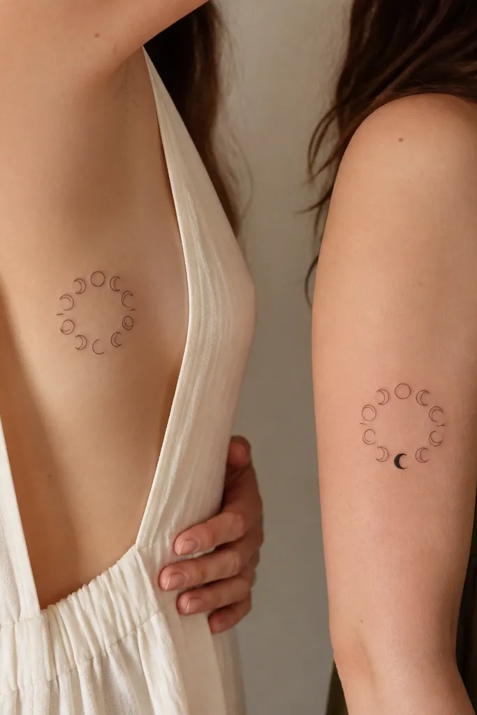
This pair looks special because it's interactive. Mom's piece signals "one part missing," and daughter's piece completes it, but you still get two designs that feel finished on their own. It's modern because the wheel is minimal and uses repetition without clutter.
Keep the wheel diameter around 2.5 inches. Use black linework for all phases and leave one phase blank for mom. For daughter, fill the missing crescent with solid black but keep the crescent edges sharp, not fuzzy.
Pro tipAsk for the wheel phases to be evenly spaced like clock ticks - uneven spacing makes it look rushed.
AvoidAvoid tiny crowded phases - if each crescent is under about 0.15 inches wide, it blurs.
11. Leaf Skeleton Lines, Same Vein Map
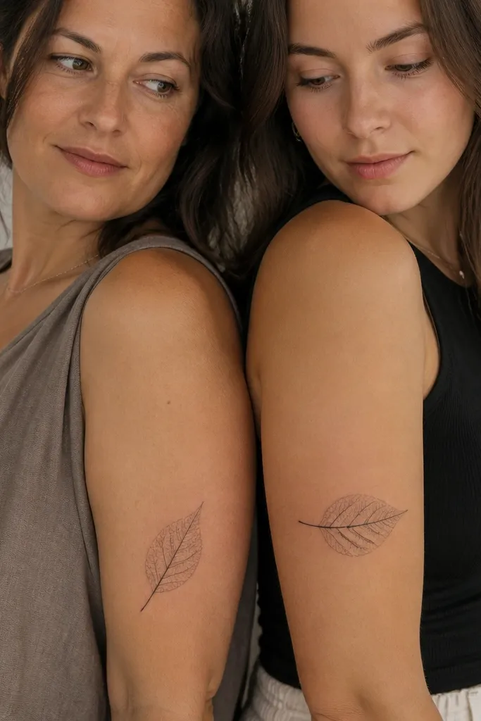
Leaf skeleton tattoos look modern because they're basically line art with structure. The shared vein map gives unity, and rotating the leaf makes it feel personal to each person's body angle. Dots on veins add a subtle "data points" vibe that reads clean in photos.
Pick a leaf shape with strong central vein and simple side veins, like a ginkgo-style silhouette. Keep the tattoo size between 2 and 3 inches long. Make the thicker vein consistent between both tattoos, then add dot markers to only daughter's piece.
Pro tipAsk the artist to trace from a real leaf photo so the vein angles look natural and not generic.
AvoidAvoid heavy shading on skeleton leaves - it kills the airy effect.
12. Coordinates With a Twist: Same Numbers, Different Symbols
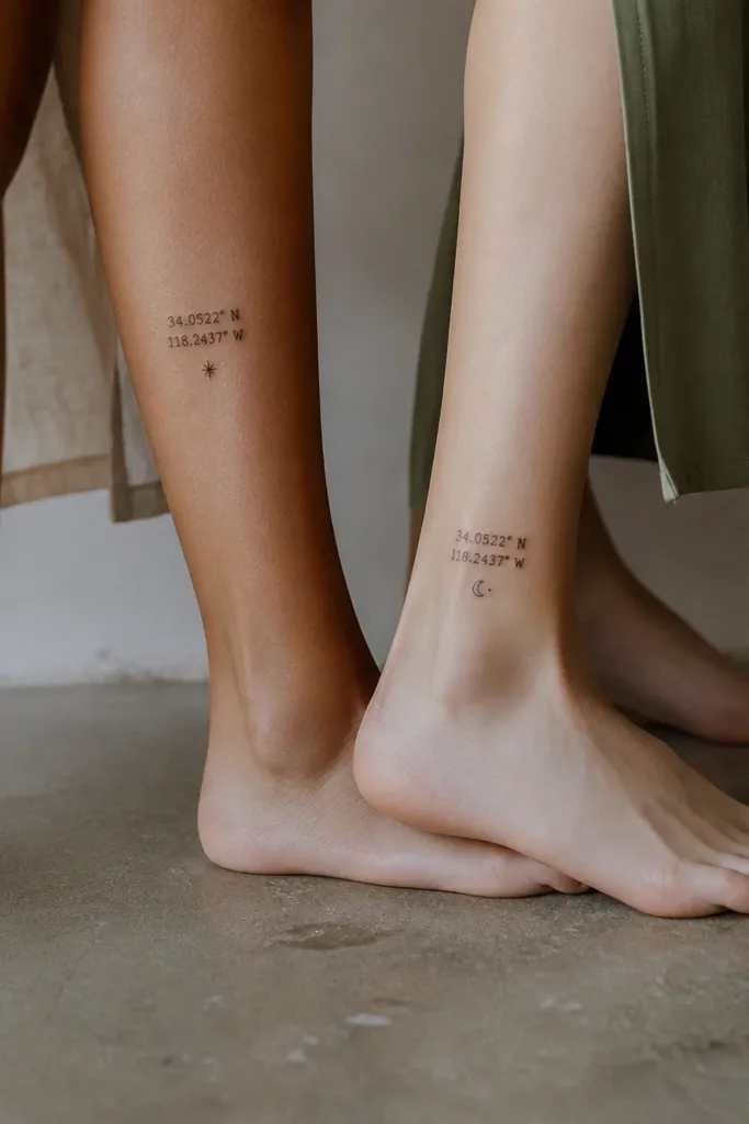
Coordinates are personal and modern when the numbers are crisp and the icons are tiny. You keep the shared meaning by using the same numbers, and you swap the symbol so each tattoo feels like it belongs to that person. The micro icon helps it look finished, not like a random address.
Use the exact coordinate format you both like, like 40.7° N, 74.0° W. Keep the font small but legible, and keep the icon no bigger than the width of the degree symbol. Place numbers on the side calf where the skin is flatter and less wrinkled.
Pro tipPrint the coordinates in the same font size the artist plans to use and compare it to a real ruler on your skin before tattooing.
AvoidAvoid cursive coordinates - they blur fast and turn into unreadable marks.


