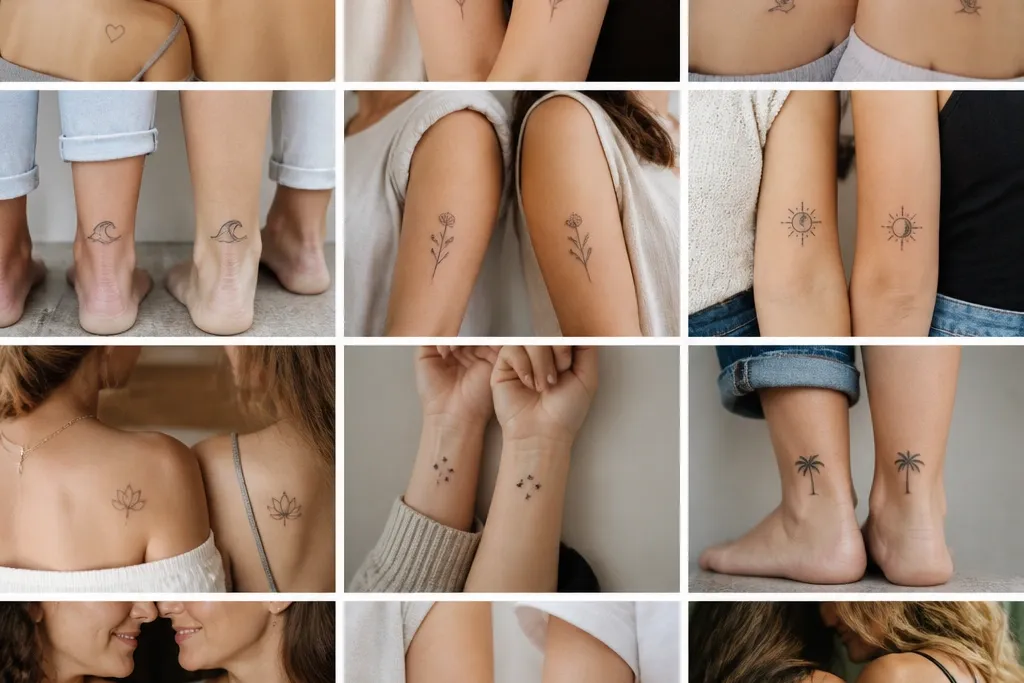
1. Sun + Tiny Constellation Bracelets
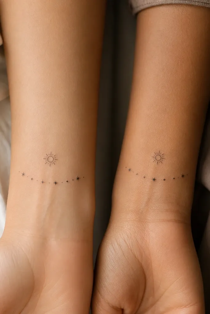
This set works because the sun anchor is instantly readable, and the bracelet arc frames the wrist without crowding. Use a warm palette: soft golden yellows for the sun highlight and black for the stars so the color doesn't depend on heavy saturation. The "stylish detail" is that the stars are not identical - one arm has a slightly larger star, the other has an extra tiny dot. That keeps the match aesthetic while still feeling like your own story.
Have the artist keep the bracelet arc about 1.5-2 inches long, hugging the inner-to-outer curve of the forearm. Place the sun 1-2 inches above the wrist crease so it doesn't get distorted as you flex. If you want color, limit it to the sun's outer ring and one small star dot so you don't end up with faded patches later.
Pro tipAsk for a dot-size plan before the tattoo - have them mark star dot diameters on the stencil in millimeters.
AvoidDon't cram 12+ stars into a small arc; the dots mush together fast.
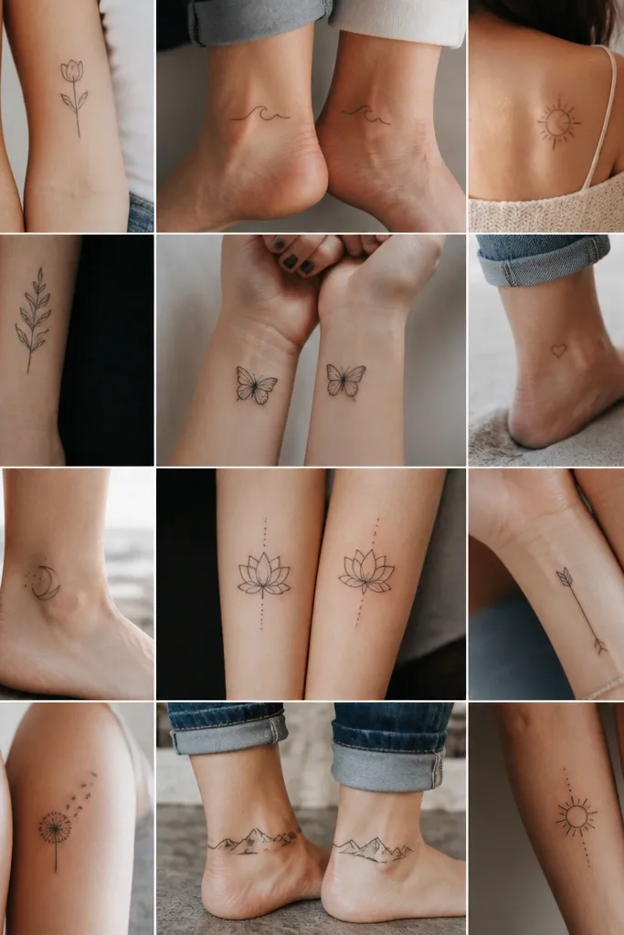
2. Matching Birthflower Stem with One Different Leaf Shape
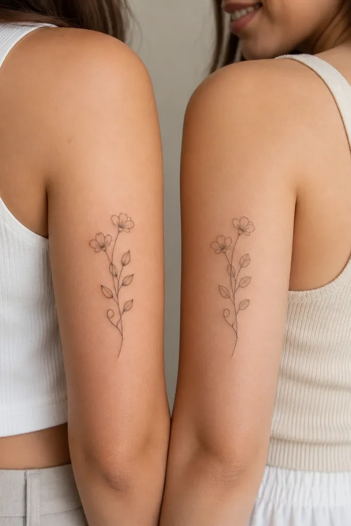
Birthflowers look classy because they're recognizable without needing shading heavy enough to blur. The stylish detail is the leaf-shape swap - same stem rhythm, different leaf silhouette. Keep shading light and mostly line-based; a tiny bit of stipple under the petals is enough for dimension. The shared stem makes it feel like one design, just adapted for each person.
Request a vertical layout 4-5 inches tall so the blossoms don't end up too close to the shoulder. Place it on the outer upper arm where it stretches smoothly when you move. Keep the linework consistent across both tattoos - your match should look like the same hand drew it.
Pro tipBring reference photos of your actual flower - petal count matters more than you'd think for the final look.
AvoidAvoid super fine stippling across the whole petal; it heals unevenly on many skins.
3. Infinity Loop with Hidden Initial in Negative Space
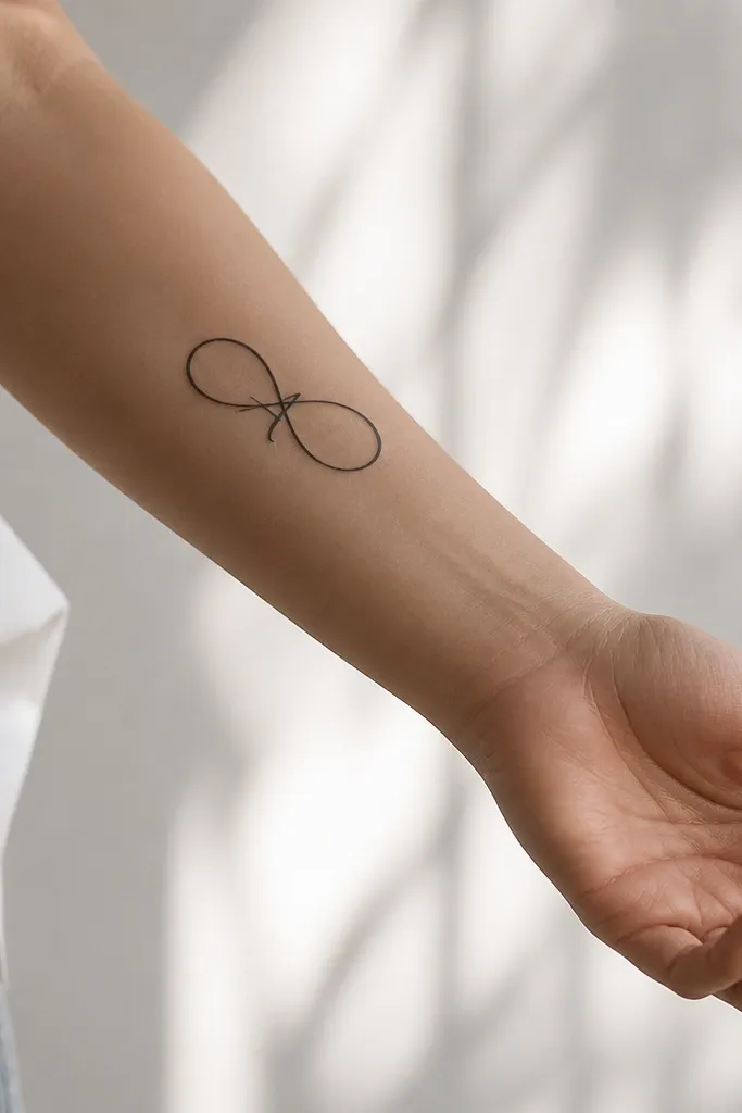
Negative-space initials look sharp because you're not relying on tiny filled ink to stay crisp. The infinity gives you the matching structure, and the hidden initial is the stylish detail that feels private but still connected. Use solid black for the loop lines and keep the negative-space cutouts crisp. When it heals, the contrast holds up because it's based on shape, not fading color.
Place it on the inner forearm or inner upper arm where the skin stays relatively flat. Keep the infinity width around 1.5-2 inches and the line thickness consistent so the negative space doesn't fill in. Your artist should test the stencil from straight-on and at a slight angle to confirm the initial reads.
Pro tipAsk for a stencil mockup with the initial drawn in pencil - then step back and squint a little to see if it reads.
AvoidSkip tiny, filled-letter infinity centers; letters blur into a dark blob.
4. Matching Lockets with Micro Portrait Silhouettes
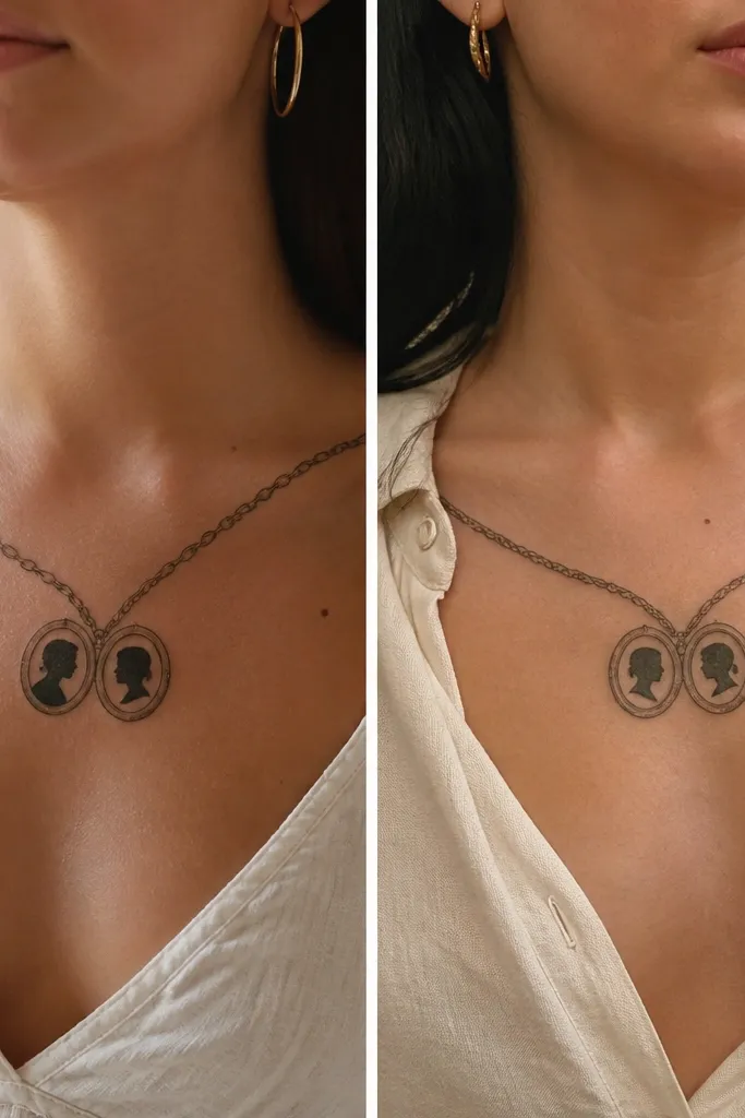
Lockets feel romantic and stylish because they look like jewelry you can wear forever. The micro silhouette is the shared theme, and the chain twist variation makes it personal. Keep silhouettes simple - think profile outline with one or two line details, not full shading. The result reads as tasteful, not busy, and it ages well because most of the tattoo is outline.
Place on upper chest just off the centerline or on collarbone-adjacent outer skin for a clean jewelry look. Size the locket around 1.2-1.6 inches wide so the silhouette stays readable. Use black linework with a tiny gray wash inside the silhouette if you want depth, but keep it minimal.
Pro tipTell your artist what jewelry you actually wear (thin chain vs chunky) so the chain link thickness matches your real life.
AvoidDon't add heavy background shading behind the locket; it tends to blur into gray haze.
5. Matching Wavy Line Names with Birth Year Numbers
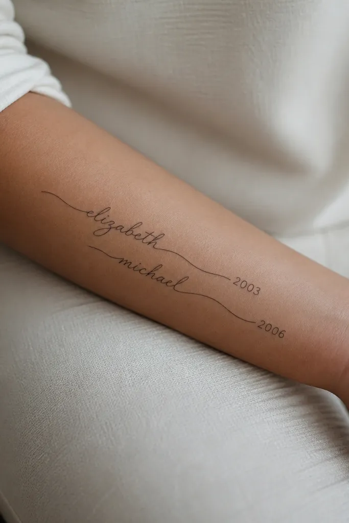
This works because the wave line acts like a visual ribbon - it ties both tattoos together even when names differ. The stylish detail is the birth year numbers tucked at opposite ends, so they feel like a coordinated set rather than identical copies. Script can heal well if it stays bold and not too small. Use black ink with maybe a tiny accent dot on each number for a subtle sparkle effect.
Keep the script height around 0.4-0.6 inches for readability, and avoid hairline-thin strokes. Place on the outer forearm where the skin flex is predictable. Put the year numbers about 0.5 inches tall so they don't end up as unreadable smudges.
Pro tipBring your names in handwriting you like, not a fancy font - the tattoo will look more natural if the strokes have real character.
AvoidSkip ultra-small cursive; it turns into a gray squiggle after a year.
6. Matching Feather with One Side Ombre Tip
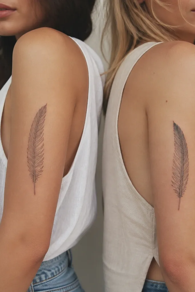
Feathers look classy and light, and they age better when the barbs are not microscopic. The stylish detail is the ombre tip placed on different sides, so the pair stays matching but not identical. Keep the base feather black outline with barbs in black, then add only a small ombre gradient at the tip using one muted color (deep teal or warm brown).
Size the feather around 3.5-4.5 inches long and place it along the direction your arm naturally stretches. Keep barbs spaced enough to stay separated during healing - your artist should draw fewer barbs rather than cramming them. The ombre tip should be under 0.8 inches so it doesn't fade into a muddy patch.
Pro tipPick one color that matches your wardrobe - deep teal looks great under indoor light and doesn't scream neon.
AvoidAvoid full-shading the entire feather; it often heals blotchy.
7. Matching Star Map Frames with One Different Landmark
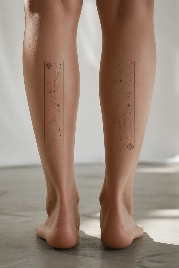
A frame makes the star map look intentional, like a print you'd hang. The stylish detail is swapping one landmark star position so it's a shared theme with a twist. Use dot-only stars in black and keep the frame lines crisp. No heavy lines - just dot clusters and one slightly larger landmark dot.
Place on outer calf or outer upper arm for a flatter canvas when you walk. Make the frame about 3 inches wide and 2.5-3 inches tall. Keep dot clusters spaced so they don't merge into gray. Your artist should do a dot-size hierarchy: tiny dots, medium dots, and one landmark dot.
Pro tipAsk your artist to print the stencil at the final size and tape it on your skin for 10 minutes before tattooing.
AvoidAvoid drawing long constellation lines; they blur and thicken over time.
8. Matching Minimal Heart Hands with Different Finger Knots
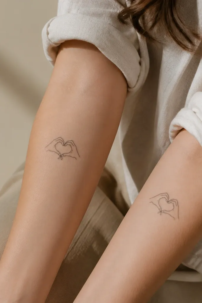
Heart hands are cute without being childish when you keep them minimal. The stylish detail is the finger knot - a tiny line or loop that differs between the two. Use black ink only and keep the heart shape clean, with negative space in the fingers so it stays readable. This style is low maintenance because there's no complex shading to fade.
Place on inner forearm where the design can run along the length of the arm. Keep size around 2-2.5 inches wide so it doesn't get stretched when you flex. Your artist should keep line thickness consistent and avoid adding extra tiny lines that look good on paper but heal muddy.
Pro tipDo a quick mirror check of your tattoo placement before the session - the heart should look centered when your arm is relaxed.
AvoidDon't add tiny nail details; they disappear during healing.
9. Matching Bracelet Charm Trio with Different Charm Order
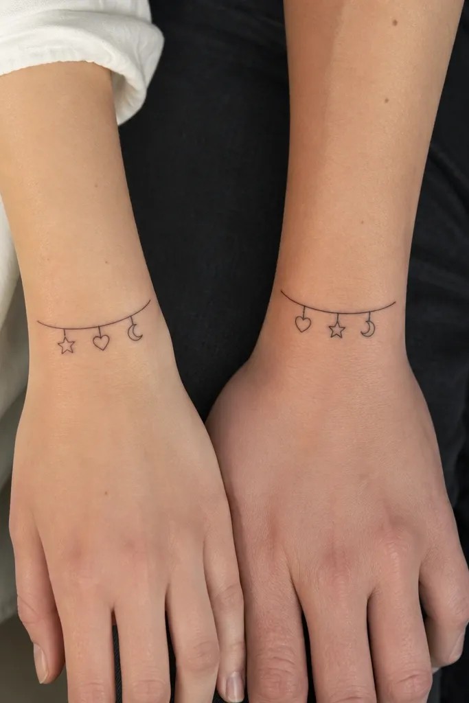
Charm trios look like real jewelry, and they're easy to tailor to your style. The stylish detail is charm order - same items, different sequence. Keep each charm icon simple: star outline, tiny heart outline, small crescent moon. The bar should be a clean line with small hooks, so it reads as a bracelet immediately.
Size each charm around 0.4-0.6 inches so they stay crisp. Place on the top outer wrist side where jewelry usually sits. Keep spacing even between charms - your artist can mark the hook points on the stencil to match both placements.
Pro tipBring a photo of your favorite bracelet chain - link spacing and thickness should match the tattoo bar.
AvoidAvoid tiny filled-in icons; outlines heal cleaner and stay readable.
10. Matching Key + Tiny Word in a Banner (No Cursive Spaghetti)
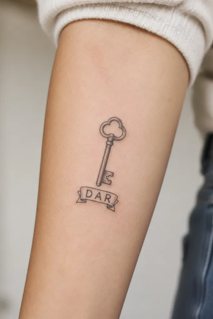
A key tattoo feels meaningful, and the banner makes it stylish instead of plain. Use a short word like LOVE or HOME in block letters, not flowing cursive. The stylish detail is the key's teeth pattern: keep both keys similar but swap one tooth position. Block text stays more readable over time.
Place on outer forearm or upper arm outer. Keep the key about 2.5 inches long and the banner about 1 inch wide. If you want the word to be personal, use four letters max - anything longer turns into mush in small sizes.
Pro tipAsk your artist to draw the letters with thick strokes on the stencil so you can see the final thickness before ink hits skin.
AvoidSkip thin-letter scripts; they blur and look like smudges.
11. Matching Rosebud with One Dot Highlight
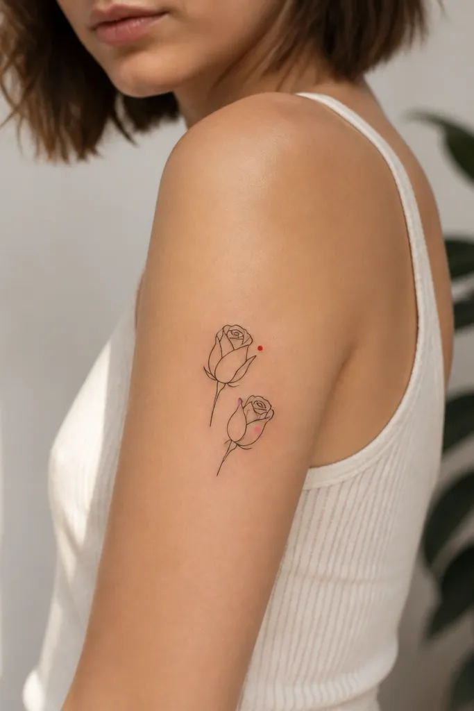
Rosebuds are sweet without the giant shaded rose that fades into a gray blob. The stylish detail is the single dot highlight - you get a pop of color without painting the whole flower. Keep the petals line-based and add very light shading only where petals overlap. This reads soft and pretty in photos and doesn't require heavy color packing.
Size the rosebud around 1.6-2.2 inches wide. Place on upper arm outer or shoulder blade upper where it won't rub. Use black linework and one small dot color placed consistently on each rose so the pair feels coordinated.
Pro tipPick pink and red that match your skin tone - test by swatching those colors nearby on a white background.
AvoidAvoid full color fills in small rosebud tattoos; they fade unevenly.
12. Matching Moon Phases with One Tiny Comet Tail
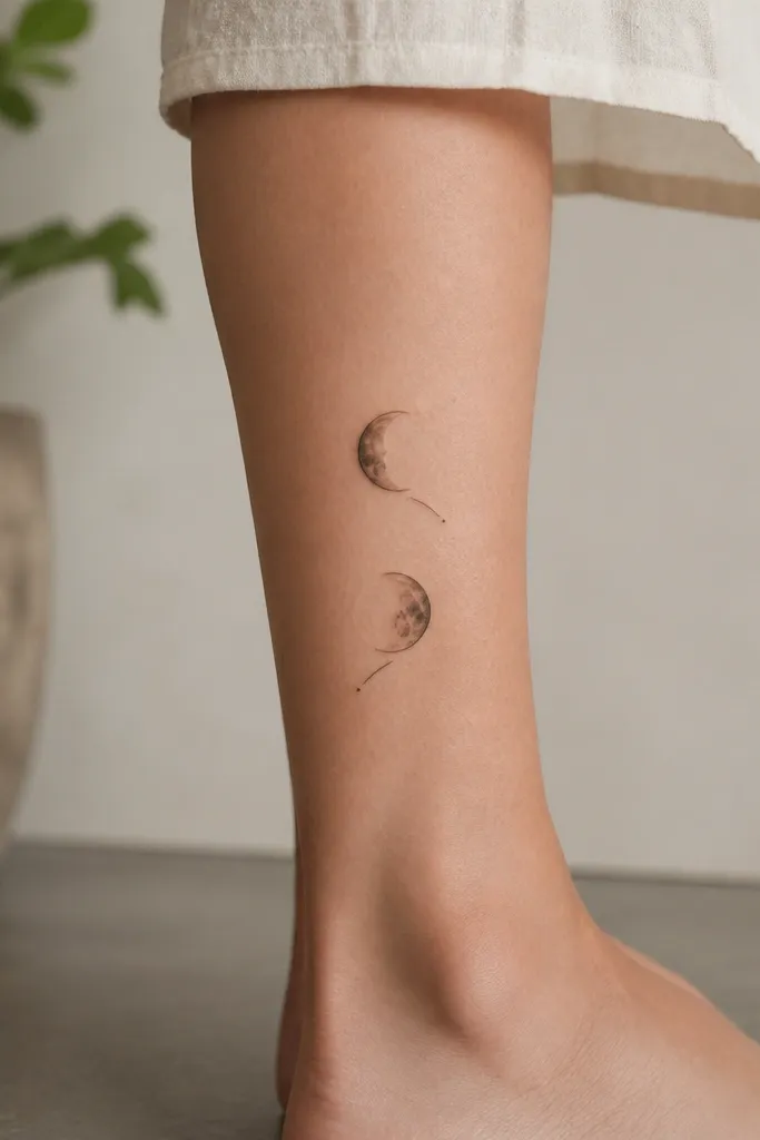
Moon phases look clean when they're simple shapes and not overly shaded. The stylish detail is the comet tail direction swap - it makes the set feel like a conversation. Use black ink for moons with one thin gray wash inside the crescent areas if you want depth. The comet tail adds motion without adding complexity.
Place on calf outer or outer upper arm where the moons can sit vertically 3-4 inches tall. Keep each moon about 0.9-1.2 inches wide. Make the comet tail short, under 0.6 inches, so it doesn't thicken during healing.
Pro tipAsk for the moons to be drawn as crisp crescents, not filled blobs, so the phase reads from a distance.
AvoidDon't add lots of tiny craters; they disappear quickly.


