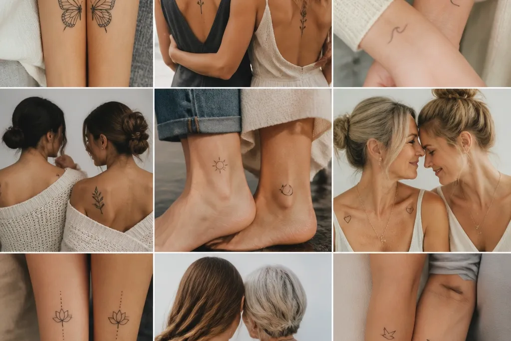
1. Birth Month Flower Buds on Matching Inner Wrists
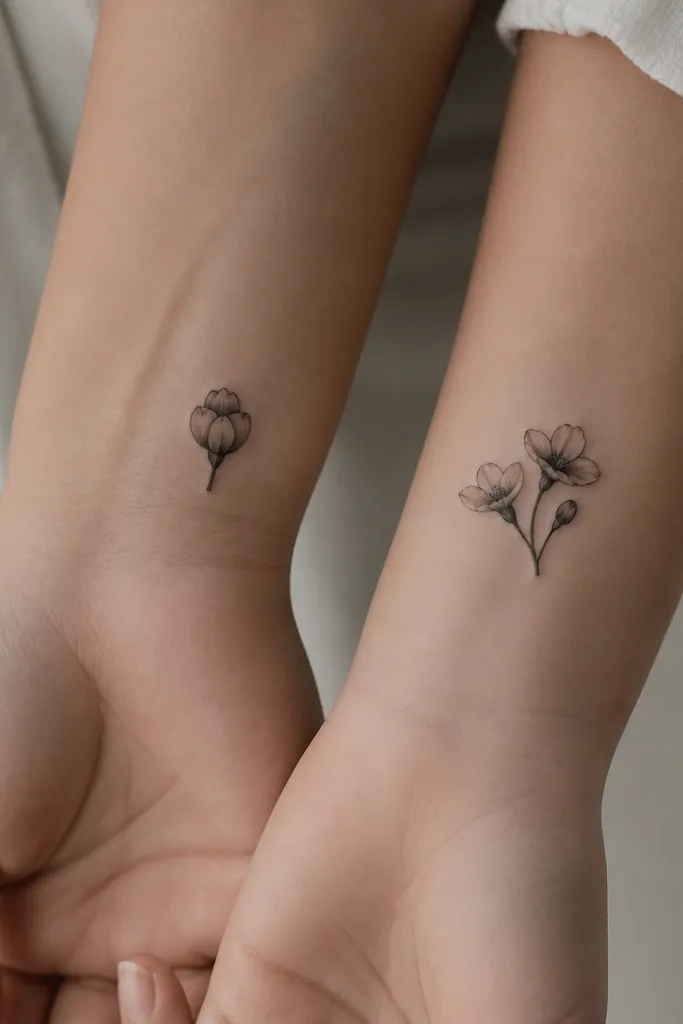
I love this one because it ages like a botanical sketch, not like a photo. The bud shapes stay clear even when the tattoo shrinks visually over time. Black-only work with restrained gray under the petals keeps it looking intentional and "inked," not washed out. The open-versus-closed bud idea quietly shows growth without adding extra symbols.
Keep the entire piece under 3 cm long. Place Mom slightly closer to the thumb side for a cleaner line of sight when you look at your wrist. Daughter's open buds should sit a touch higher so the composition doesn't look lopsided when the arm bends. Use a soft stipple or light shading only in the petal shadows - no heavy full shading.
Pro tipAsk your artist to draw a paper stencil on your skin and check it with your arm relaxed and flexed - the inner wrist creases tell you if the design will distort.
AvoidDon't add tiny veins in the petals - they blur first on wrists.
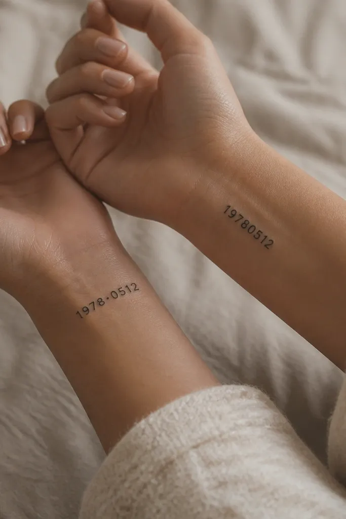
2. Tiny Coordinate Numbers with a Shared Compass Rose
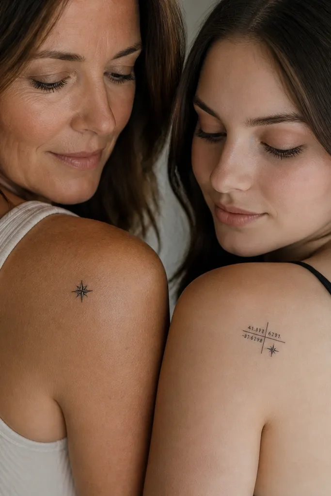
Coordinates feel personal without needing a long story. I've watched this style stay crisp because the numbers and compass lines are built from thick strokes and solid geometry. The compass rose gives the pair a shared visual anchor even when the main elements differ. It looks timeless because it reads like a map mark, not like a trend.
Size the compass rose to about 1.2 cm across. For coordinates, keep each line under 10 characters total including the negative sign and decimals. Put coordinates on a flat surface like the upper forearm or outer ankle; avoid places that fold a lot. Use black ink only, with the numerals in a consistent monospaced block style.
Pro tipIf you want decimals, keep them - just make sure the artist prints a mock-up so the dot spacing stays even.
AvoidAvoid script numerals; thin curvy fonts don't hold up on small_space.
3. Matching Heartbeats with Different Endings
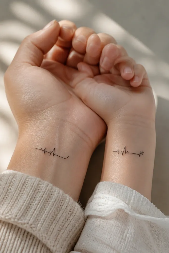
This is one of the most timeless mom-and-daughter pairs I've done because it looks meaningful even years later. The heartbeat line reads instantly, and the ending difference tells a story of "you carry me" without extra words. If the line weight is right, it stays clean instead of turning into a gray smear. The single accent peak adds personality while keeping the overall design minimal.
Pick a placement that stays relatively flat - wrist inner, upper arm, or side of calf. Keep the line length under 4 cm. Use one accent shape at the end only - don't add multiple symbols. Let the artist keep the ECG line thickness consistent throughout.
Pro tipBring a printout of an ECG image and ask for the cleaned version - not a copy of a busy machine readout.
AvoidDon't pack in extra waves or tiny dots along the line.
4. Half-and-Half Infinity with a Hidden Initial
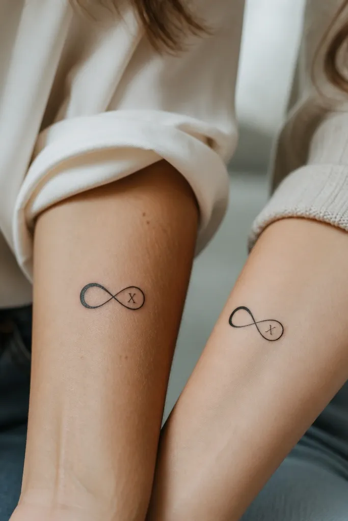
Infinity is classic, but the way you hide the initial keeps it personal and not generic. Negative space initial work looks crisp when the lines are bold and the loops are evenly spaced. Splitting the infinity between two people makes it feel like one shared idea instead of two identical tattoos. It's also easy to keep small without clutter.
Keep the infinity width around 2.2 to 2.8 cm. Make one loop slightly heavier for each person so they feel like mirrors, not duplicates. The hidden initial should be simple and geometric - think two-stroke letters, not cursive. Use black ink only so the negative space stays sharp.
Pro tipDo a quick mirror check in the bathroom: the loops should look balanced when viewed straight on.
AvoidAvoid shading inside the loops - it kills the negative space effect.
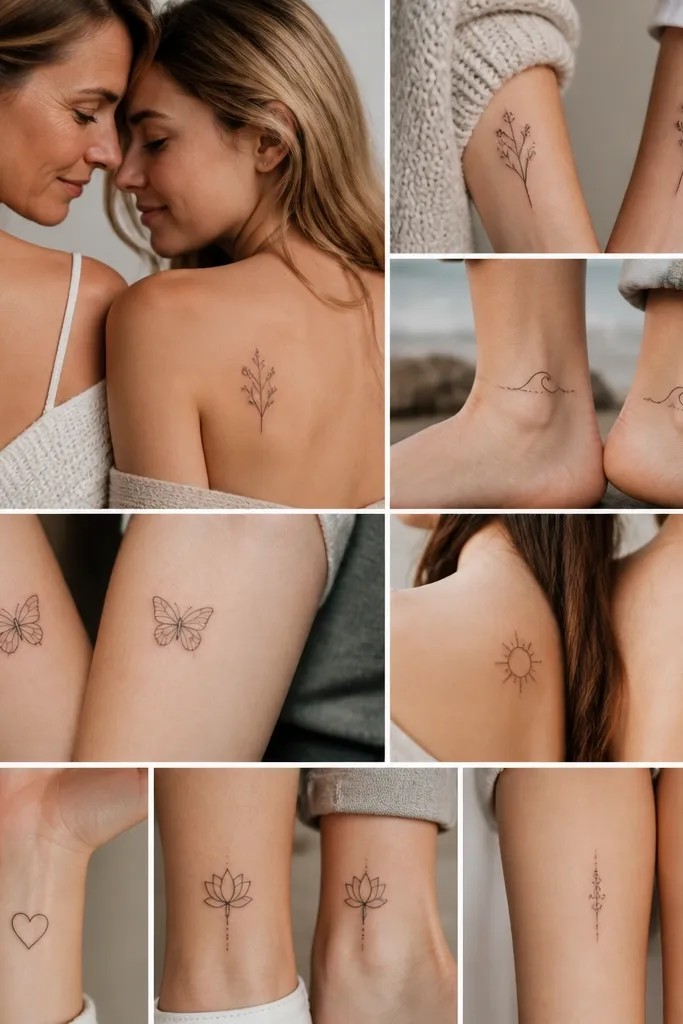
5. Tiny Tree Roots and Canopy Split Between Mom and Daughter
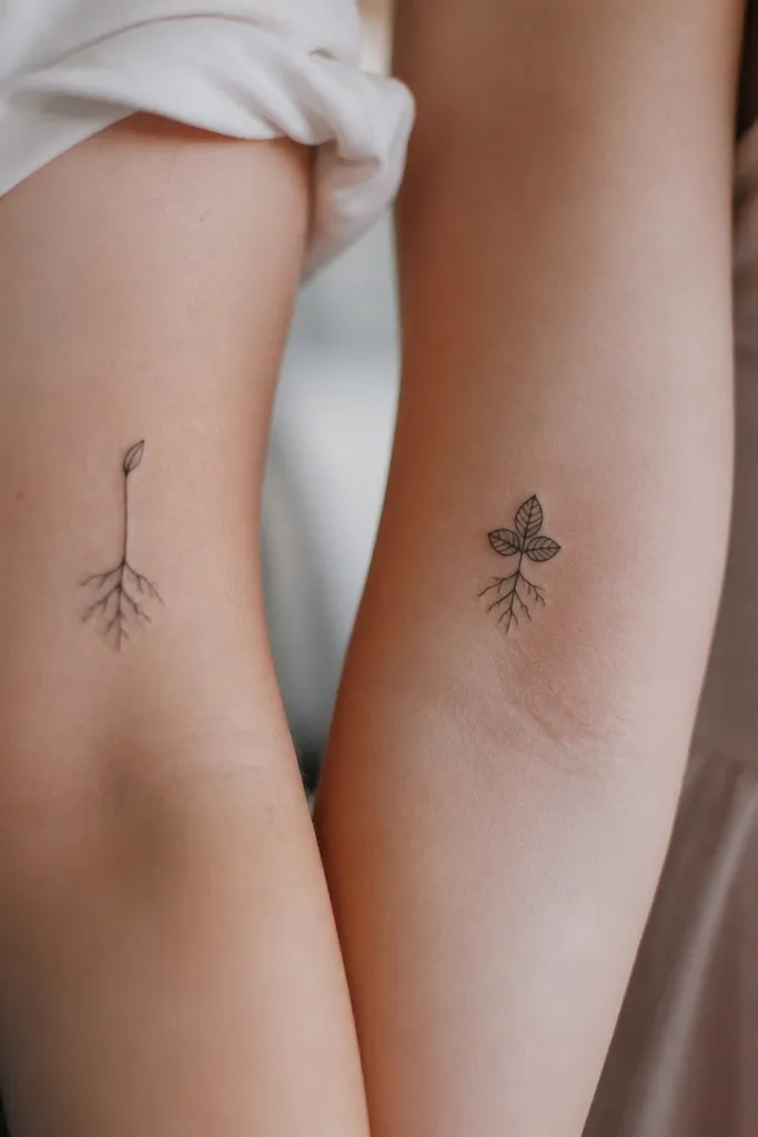
Roots-and-canopy feels like "where you came from" and "where you're going" in one image. It works small because roots can be drawn with clean branching lines and the canopy can stay rounded. The split between mom and daughter makes it meaningful without needing matching size. It also ages well since tree silhouettes stay readable even when fine linework softens.
Place Mom's piece on the inner forearm or upper thigh where the roots can fan out. Daughter's canopy works great on the outer wrist or ankle. Keep the canopy leaves at least 2.5 mm wide each so they don't disappear. Use light gray only for one shadow under the canopy; keep roots mostly linework.
Pro tipAsk for thicker trunk lines than you think you need - trunks hold up better than hair-thin branches.
AvoidDon't add tiny background dots around the roots; they turn into a gray halo.
6. Micro Sun and Moon with a Shared Star Dot
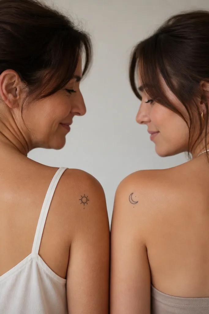
Sun and moon is timeless because it reads from across the room. I like the "shared star dot" trick - it ties the pair together even though the shapes differ. Keeping both pieces minimal means they heal with strong contrast. The star dot also gives you a focal point that stays visible as the skin naturally softens the ink over time.
Size each symbol around 1.8 to 2.5 cm. Place Mom slightly higher on the forearm; place Daughter near the ankle bone or outer wrist for a clean arc. Use solid black fill with crisp edges; no heavy shading. The star dot should be the same diameter on both tattoos.
Pro tipRequest a test dot on skin with the same needle setting your artist uses, so you can see how the dot holds.
AvoidAvoid thin line rays longer than the symbol width - they blur.
7. Small Matching Coordinates in Arabic Numerals
If you want something private and beautiful, Arabic numerals give coordinates a softer look without turning into cursive blur. The key is thick strokes and clean spacing between characters. I've had this design look sharp on both fair and deeper skin tones because the letters are blocky and readable. It still feels timeless because it's a functional mark, not a decorative trend.
Keep it small but not tiny - aim for at least 2 cm width. Put it on the side of the wrist or the outer ankle where the line doesn't bend as much as the palm side. Use black-only ink and avoid gray wash inside letters. Ask the artist to print the characters in the exact tattoo font they plan to use, then trace the stencil.
Pro tipChoose numerals that have natural thick parts; avoid characters with super thin tails.
AvoidDon't add decorative flourishes around the numerals.
8. Mom's Handprint and Daughter's Fingerprint in Two-Color Black and Warm Gray
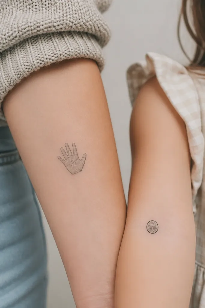
Handprint plus fingerprint feels personal in a way that photos don't. The warm gray keeps it from looking like cold machine ink, and the black ring around the fingerprint helps it stay legible. I've seen fingerprint tattoos fade when they're only made of super fine whorls - adding a bold boundary fixes that. The pair works because one is an outline and one is a pattern, so they don't compete.
Use a warm gray tone instead of pure gray so it looks more skin-like as it heals. Place Mom's handprint slightly larger - about 3.5 cm - and Daughter's fingerprint smaller at 2.2 cm. Keep the fingerprint whorls simplified; you want recognizable pattern, not micro detail. Outline the fingerprint with a solid black ring about 1.5 mm thick.
Pro tipBring a clear ink pad print or a high-res photo and ask your artist to simplify the whorls while keeping the whorl direction.
AvoidAvoid full shading inside a fingerprint - it turns into a gray circle.
9. Matching Bookmarks with a Single Word Each

This is a smart small_space choice because the layout is already vertical and simple. The bookmark silhouette keeps a strong shape even if lines soften. Using one word each gives you the shared theme without forcing identical text. I like bold block lettering here because it stays readable and doesn't collapse into a smudge.
Keep each bookmark outline about 5 to 6 cm tall and under 1 cm wide. Put "Love" and "Grow" in the same font weight and size so they feel connected. Use black ink only, with letters thick and centered. Place Mom higher up where the forearm stays flatter; place Daughter on the wrist side with minimal flex.
Pro tipChoose words that mean the same thing in your day-to-day life, not just the biggest sentimental words.
AvoidSkip thin serif fonts; they look crisp at first and then fade into gray.
10. Tiny Feather with Two Anchors - One for Each Person
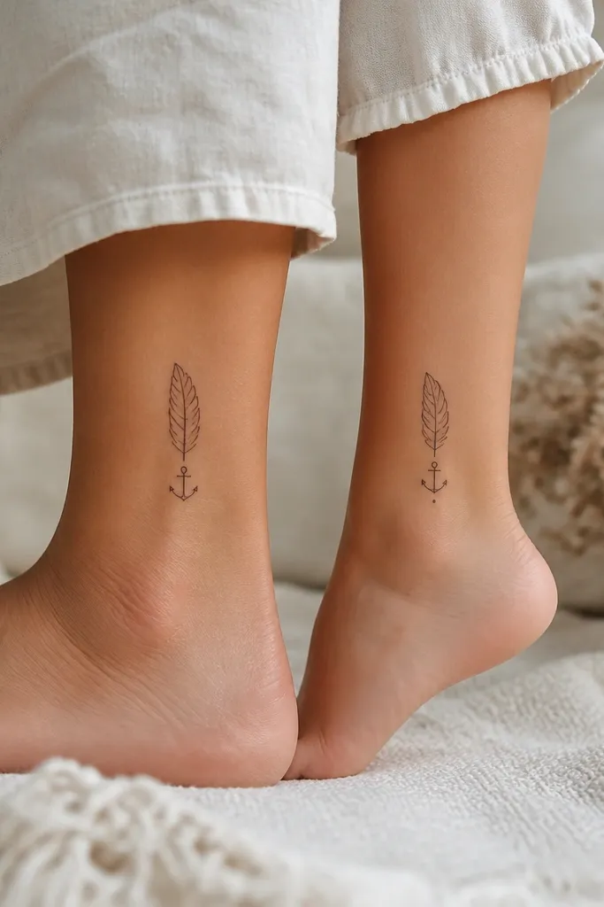
Feathers feel light, anchors feel grounded, and the mix reads as "stay steady." The trick for timelessness is to keep the feather ribs minimal and the anchor shapes solid. Splitting the feather between two people makes it look like a pair, not two separate tattoos. The anchors keep it from looking too delicate for healing.
Use a placement that's not constantly stretched - ankle outer side or upper calf. Keep the feather under 4 cm tall so it doesn't blur from movement. Draw the feather with one clean outline and 3 to 5 rib lines max. Keep the anchor filled or thick-lined, not thin linework.
Pro tipAsk for the feather ribs to be slightly thicker near the quill and thinner only at the edges.
AvoidDon't add shading to the feather; it makes the ribs disappear.
11. Shared Initials in a Circle with a Thin Outer Ring
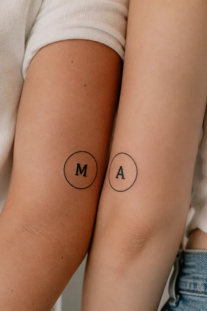
A circle frame is forgiving and reads clean at small size. Thick block initials hold up better than script, and the thin outer ring gives it a finished look. When the rings are slightly offset by placement, the pair feels connected even when you're not standing side-by-side. It's timeless because it's graphic and simple.
Size the circle around 1.7 to 2.3 cm. Place Mom on the inner upper arm and Daughter on the outer upper arm so the circles can "mirror" visually. Keep the outer ring thickness around 1 mm. Use black ink only and center the initial perfectly so the circle doesn't look crooked after healing.
Pro tipPut the stencil on your skin and check it under natural light; a slightly tilted circle looks off fast.
AvoidAvoid cursive initials - they break down into blobs.


