
1. One Sun, Two Rays
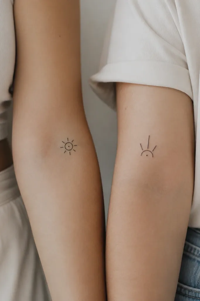
This works because it reads as the same symbol even when the second tattoo is a partial version. The black sun center anchors the eye, and the rays create a "completion" feeling when you stand side by side. I like this in solid black with clean negative space because it stays crisp as skin texture changes.
Place the full sun on the outer forearm, about 2-3 inches above the wrist crease. For the daughter/mom partial, put the three rays on the same outer forearm spot so the rays line up visually. Keep the sun diameter around 1 to 1.25 inches; go slightly bigger for rib placement.
Pro tipAsk for rays with consistent thickness (same width on every ray) so it doesn't look hand-drawn after a few years.
AvoidAvoid super tiny rays under 1mm thick - they blur and turn into a dark smudge.
2. Infinity Knot in Matching Bands
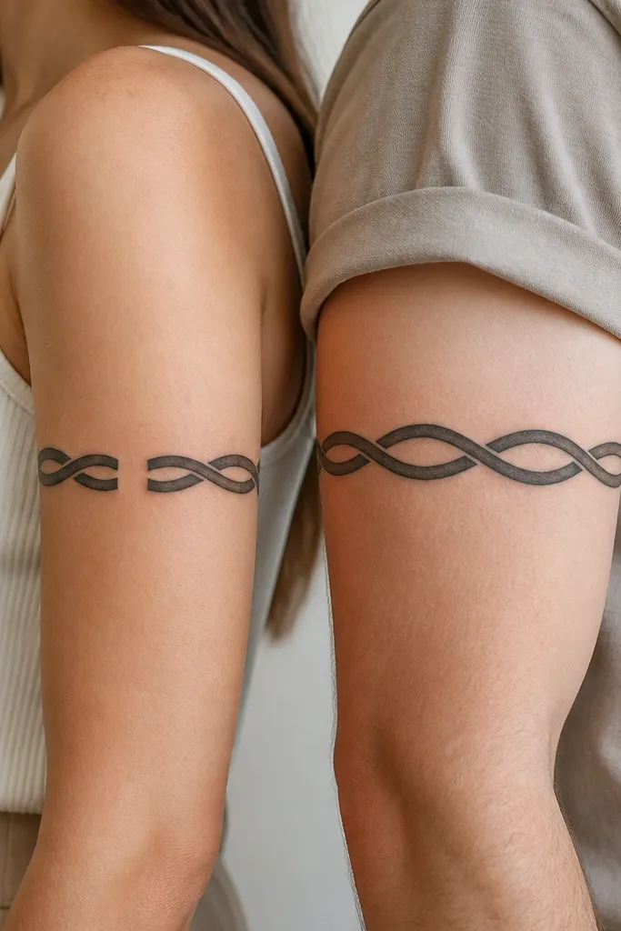
Infinity knots feel personal without being overly literal. The continuous ribbon style keeps it readable from different angles, and the split-gap variation still looks like the same tattoo when you compare them. Black linework with a slight taper looks best because it gives the knot depth without shading chaos.
Upper arm placement: outer upper arm for both, roughly halfway between shoulder and elbow. Size the infinity knot to about 2.25-2.75 inches long. For the split version, keep the gap small - around the width of one line - so it still reads as one knot.
Pro tipUse a stencil that shows the knot's centerline first, then adjust the final orientation so it follows your arm's natural curve.
AvoidAvoid adding lots of interior dots or stars inside the knot - it clutters fast and ages unevenly.
3. Birth Month Flowers With Same Stem
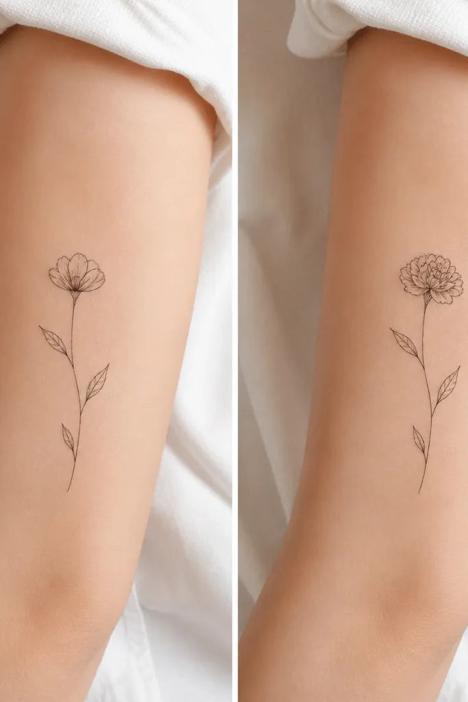
Flower matching works when the stem is the constant and the flower head is the variable. That gives you a "same plant, different bloom" look, which reads as family without forcing the same birth month. Use thin black lines with light gray shading only on the flower head for dimension.
Put them on the inner forearm or upper forearm, about 1.5-2 inches from the wrist. Keep the stem line thickness around the same as the flower outline. Choose flowers that match in visual weight: small daisy-style heads or rosebuds rather than one tiny bloom and one bulky bloom.
Pro tipAsk your artist to draw the leaf shapes from the same reference set so they don't look like different artists' interpretations.
AvoidAvoid watercolor flowers with heavy splatter - they blur unless your artist has a very controlled hand.
4. Lettering That Shares One Layout
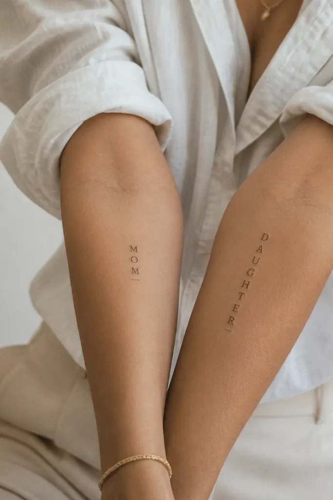
This is the cleanest "matching" option when you want meaning without drawing the same picture. The shared layout is what makes it match: same font family, same letter spacing, same underline height. I've seen this look crisp for years because lettering can stay sharp if line weight is consistent.
Choose a font that has thick-thin contrast but don't go ultra-fancy. Place both on the inner forearm, about 2 inches apart from each other if you'll compare in photos. Keep the text height around 1.75-2.25 inches so it doesn't warp with skin stretch.
Pro tipBring a printed font sample and ask the artist to match the kerning, not just the font name.
AvoidAvoid handwriting-style script for small words - it can heal into blobs.
5. Matching Coordinates With a Star Dot
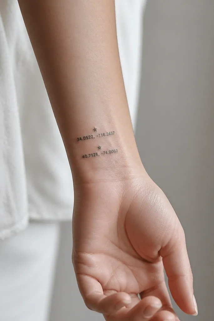
Coordinates are personal, and the star dot gives you the shared identity. Keep the typography simple so it doesn't turn into a gray mess as it fades. I like this setup in black with one small accent - one star - rather than multiple decorative elements.
Placement: outer wrist or inner wrist, along the line where the tendons sit. Size the numbers to about 1.25-1.5 inches tall. Keep the star dot under 6mm wide so it stays crisp.
Pro tipAsk your artist to test stencil visibility under your skin tone with a quick check photo in the mirror.
AvoidAvoid tiny numerals smaller than 1mm stroke width - they blur and become unreadable.
6. Same Feather Outline, Different Shading
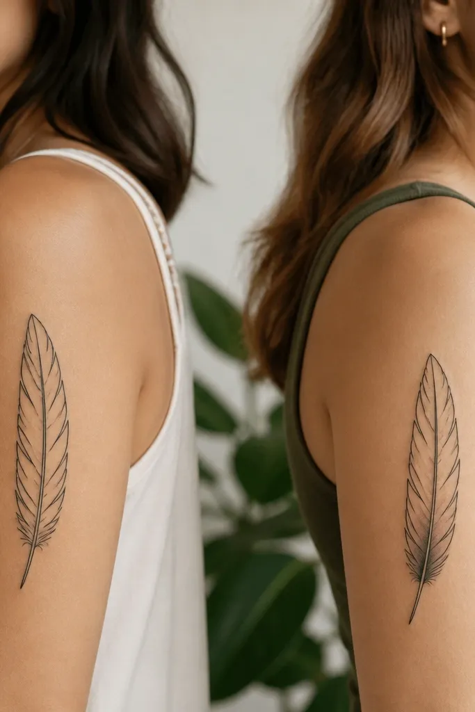
Feathers match well because the shape reads instantly. Keeping the outline identical makes it feel like a set, and swapping the shading creates individuality. Black outline plus light gray shading ages better than full color because the gray fades into a gentle whisper instead of turning muddy.
Upper arm outer side is my favorite spot; it holds shape and doesn't get chewed up by bag straps. Make the feather about 3 inches long. For the shaded version, shade the bottom third only and keep the top third clean for contrast.
Pro tipRequest a stencil that shows the feather's center rib line; that's what keeps it symmetrical after healing.
AvoidAvoid heavy gray fill over the entire feather - it looks smoky when it heals.
7. Two Halves of a Heart in Negative Space
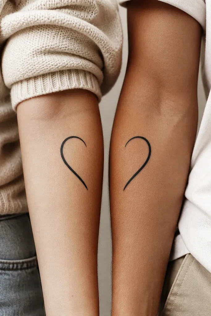
Negative space hearts are bold and clean, and they photograph like crazy because the background skin color becomes part of the design. The key is matching the outline thickness and the exact curve. This is one of the few matching ideas that still looks good even if the tattoos heal slightly differently.
Placement: inner forearm for both, closer to the wrist so the heart sits in the same "photo frame" area. Size around 2.25-2.5 inches tall. Keep the outline thickness consistent - it should look slightly thicker before it heals.
Pro tipMark the spot with a flexible measuring tape on both bodies before you book the appointment so the heart aligns in real life photos.
AvoidAvoid very thin outlines; negative space hearts need enough line to hold their edge.
8. Matching Tea Cup With One Hidden Initial
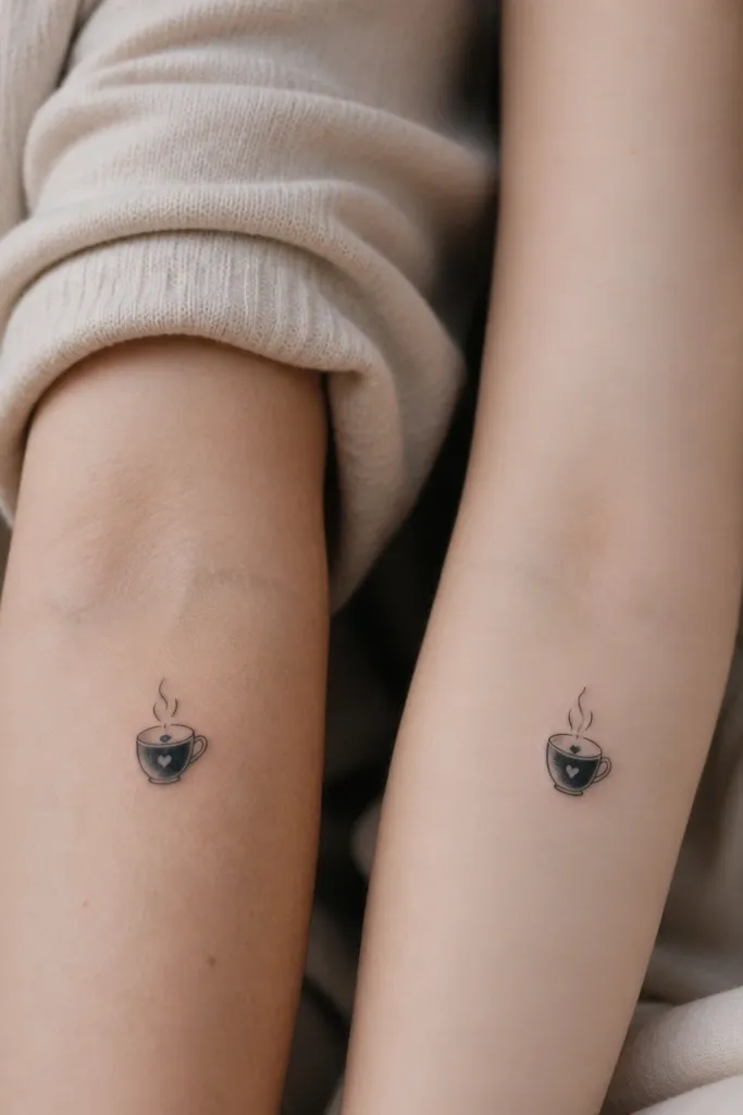
This is a cute "everyday" match that doesn't scream matching tattoos. The steam lines create motion and give you a consistent visual element, while the hidden initial adds real identity. Black linework keeps it legible, and the tiny hidden letter works best when it's printed cleanly rather than cursive.
Place on the outer upper arm or upper rib side where you can see it in short sleeves. Keep the cup about 2 inches tall. The hidden initial should be small but readable - around 6-8mm, not microscopic.
Pro tipAsk your artist to draw the hidden initial in the same line weight as the cup rim so it doesn't look like a separate scribble.
AvoidAvoid shading the steam - it can turn gray and blur into the background.
9. Constellation Paired With One Bigger Point
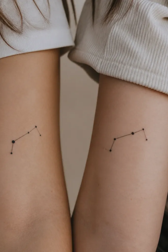
Constellations look matched because the "connect-the-dots" wiring is consistent. Changing which dot is bigger keeps it personal without breaking the visual grammar. I like dot sizes that are distinct but not huge - the bigger point should be maybe 1.5x the others.
Placement: back of upper shoulder or outer upper arm. Size to about 2.5-3 inches wide. Use black dot fill only, with line connections in fine black. Keep line connections short and clean so they don't stretch.
Pro tipBring a photo of the constellation you want and ask your artist to copy the dot spacing, not just the general shape.
AvoidAvoid long, sweeping lines between dots - they blur when the skin moves.
10. Matching Mountain Silhouettes With Different Sun
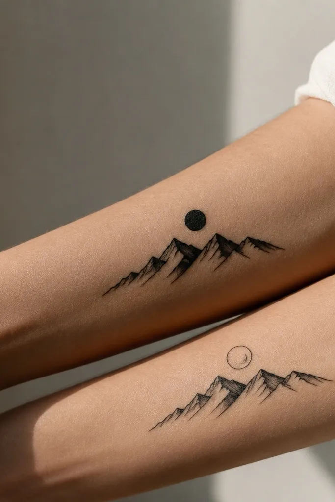
Mountains read as family because they're simple and symbolic without needing a story scene. The shared mountain silhouette keeps the match, and changing the sun style adds identity. Solid black silhouettes age well and keep their edges when you avoid extra shading.
Outer forearm is easiest. Make the mountains about 3 inches wide, with the sun sitting above. Keep the sun circle around 8-10mm. Use one flat black tone across both so the pair stays consistent.
Pro tipAsk for the mountain base to be slightly thicker than the peaks so it doesn't look top-heavy after healing.
AvoidAvoid adding lots of tiny trees or snow dots - they turn into noise.
11. Matching Keys With Different Teeth
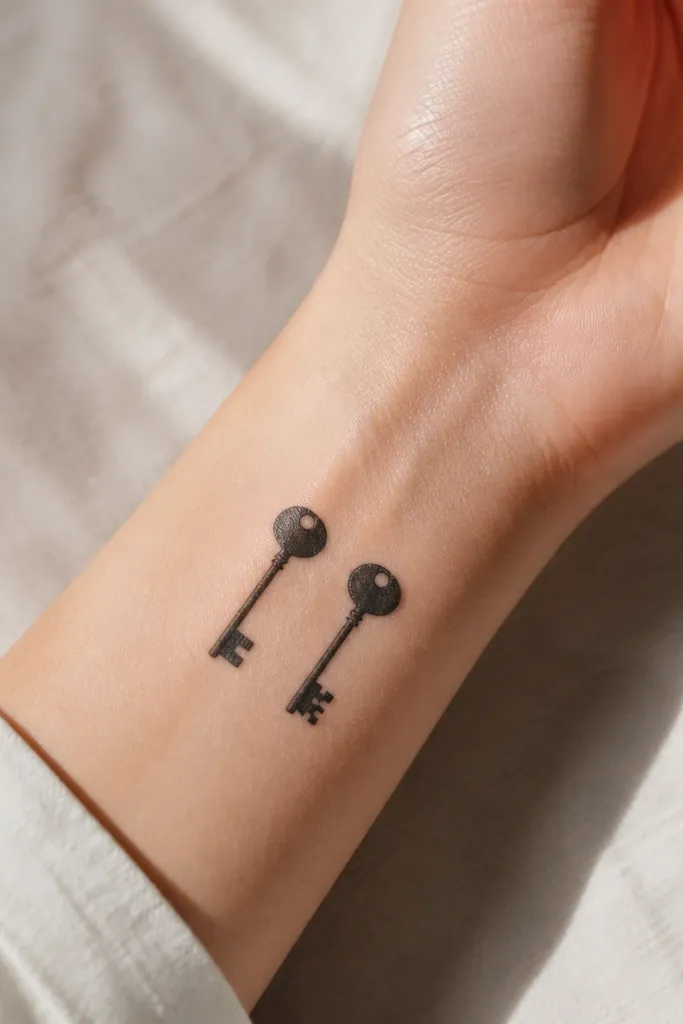
Keys are one of the best matching tattoo symbols because they can share a body shape and still be clearly different. The tooth pattern is where you personalize, while the consistent bow and ring make them feel like the same set. Minimal linework holds up if the lines are not too thin.
Placement: side of wrist or inner wrist. Size each key about 1.75-2 inches long. Keep the shaft thickness consistent and avoid heavy shading. If you want color later, add it only to the ring circle on one key, not both.
Pro tipHave your artist draw both keys from the same reference grid so the bow curve matches perfectly.
AvoidAvoid super long keys - wrist skin stretches and can warp the tooth pattern.
12. Same Ribbon Bow, Different Word Tail
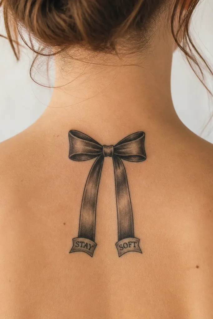
This design looks coordinated because the bow is the anchor. The tails give you room for a short word like MOM or LOVE without turning it into full-on typography tattoos. Black ink with crisp negative space around the bow makes it look clean even months later.
Place on the upper arm or outer thigh where the ribbon can sit flat. Size the bow about 2.5 inches wide. Keep the tail banner text under 1 inch long and use a simple block font so it heals readable.
Pro tipAsk for the ribbon knot to have a shadow-free separation line so the folds don't merge while healing.
AvoidAvoid cursive words on tiny ribbon banners - they blur into one dark stroke.


