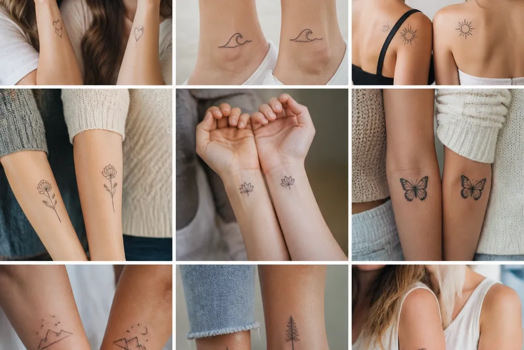
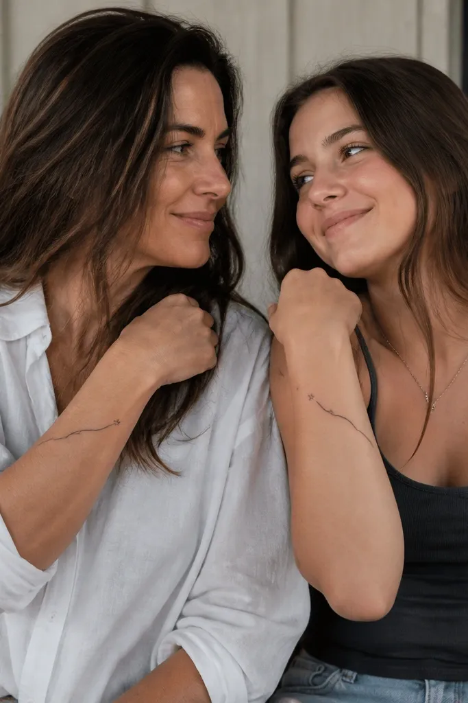
1. Tiny Constellation Hands Link
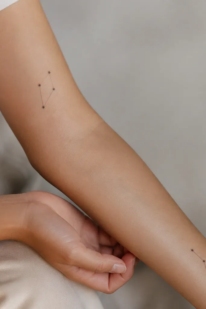
This design works because the "stars" stay legible even when the skin lightens after healing. Use black ink with dotwork - each dot should be a separate point, not a solid blur. The connecting line stays thin so it looks delicate instead of harsh. It also reads as intimate when you're close, since the dots mimic a soft shimmer.
Have the mom place it on the outer forearm while the daughter wears it slightly higher on the inner wrist so it feels like a mirror. Keep the total height under 3 inches for both so the dots don't smear. Ask for dot sizes around 0.5 to 0.8 mm and keep spacing consistent across the pair.
Pro tipChoose a placement that doesn't bend constantly - inner wrist flexes a lot, so keep the design small and let the artist avoid the direct crease line.
AvoidAvoid a thicker "star" fill or solid lines - it turns into a dark blob after a few months.
2. Moon Phase at Different Angles
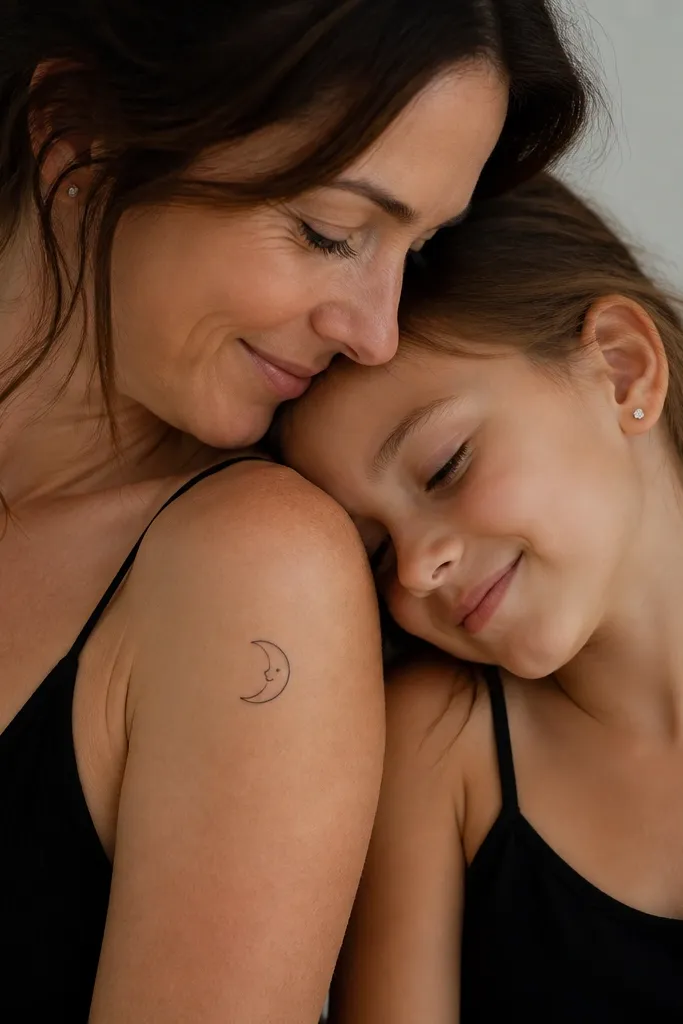
Moon phases are easy to match because they naturally look like a set. The aesthetic comes from consistent line weight across both - same thickness for outline, same dot placement for eyes. Keep the face minimal: two dots and a short curved mouth so it doesn't turn into a cartoon mush. The rotation difference keeps it personal while still clearly connected.
Do mom on the upper arm outer side so the moon sits flat when the arm relaxes. Daughter goes on the collarbone with the moon tilted so it follows the collarbone curve. Keep shading to a tiny stipple on the dark crescent edge, not full gray fill.
Pro tipAsk for the moon to be aligned with your body's natural curve lines - it looks more "designed" and less like it was slapped on.
AvoidSkip heavy gray shading on a small moon - it fades unevenly around the chin-like smile area.
3. Infinity Ribbon with Name Initials Hidden
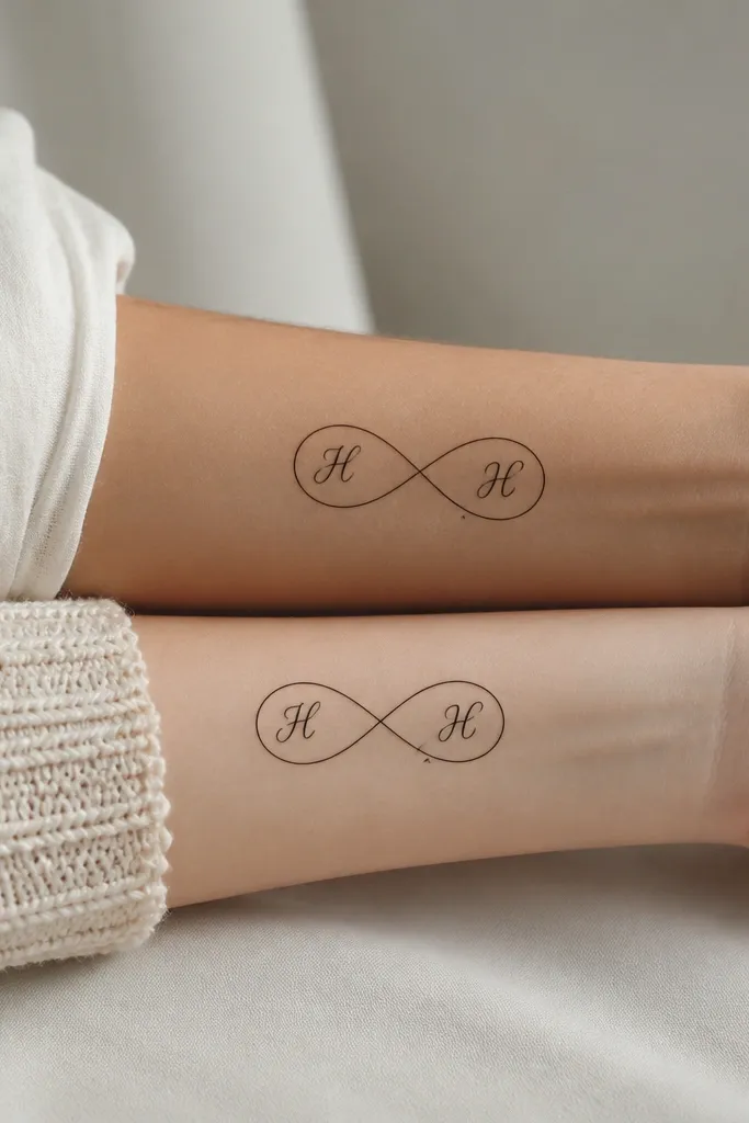
Infinity symbols make matching feel grown-up, not childish. The "hidden initials" give the pair a private detail that only you notice. The key is tiny lettering must be readable after healing, so the font should be simple - no fancy swashes. A thin ribbon outline keeps it clean and prevents the symbol from turning into a chunky knot.
Place the mom's infinity on the outer forearm; daughter's goes on the inner forearm so the loops face toward the body when you flex. Keep the whole piece about 2.75 inches wide. Use black ink only, with initials done in the same ink, not gray.
Pro tipIf you want the initials to stay crisp, pick blocky script like basic cursive without loops, and keep it under 1 inch tall.
AvoidDon't choose micro-lettering smaller than a grain of rice - it will blur into illegible marks.
4. Matching Floral Line Art with One Color Accent
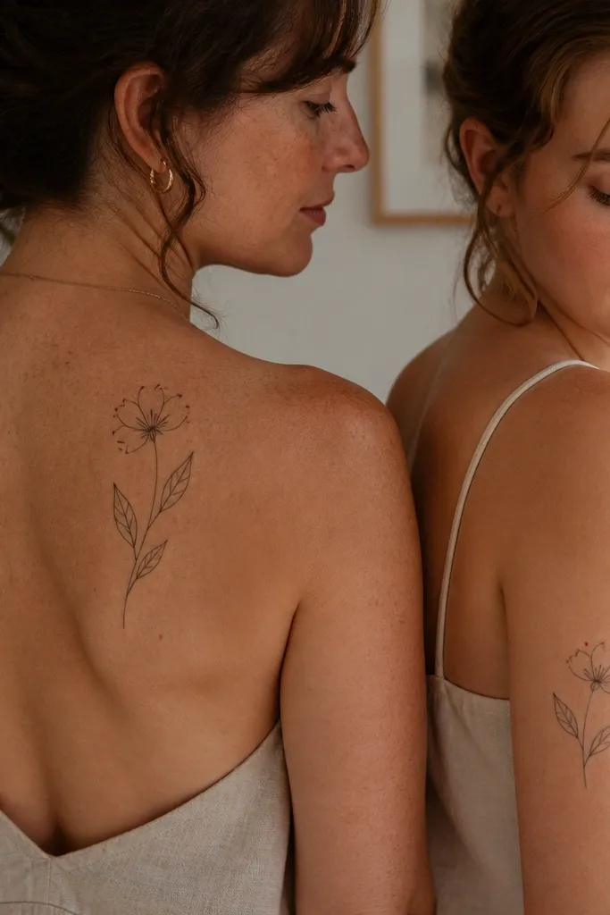
This is my go-to aesthetic match because it looks like "intentional minimalism." Black line work gives structure, and one controlled color accent adds warmth without turning the tattoo into a rainbow. Muted red or dusty rose works better than bright cherry because it holds a softer look long-term. The color should be tiny and placed consistently so both tattoos feel like the same set.
Use a single flower cluster - three buds plus one open bloom - so the tattoo doesn't sprawl. Keep the line weight consistent (not super thin) and ask for the red accent as pinpoint dots or micro teardrops. Do mom on upper back so the petals follow the shoulder blade curve; daughter on upper arm for a similar angle.
Pro tipBring a color swatch or photo of the exact red you want and ask the artist to mix a dusty tone, not a bright red cartridge.
AvoidAvoid multiple colored petals - it ages unevenly and can look patchy.
5. Shared Lily Buds, Different Sizes
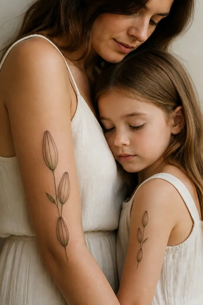
Lily buds look classy because they're naturally vertical and clean. Different sizes make it feel like "your version" instead of copying. The aesthetic comes from spacing: buds must have breathing room so the negative space stays crisp. Use black ink with subtle dotwork in the bud creases, not full shading.
Plan the placement so both tattoos share the same orientation: top bud points toward the elbow. Mom can go slightly wider to balance her arm shape; daughter stays narrower so it doesn't look crowded. Keep the stem line thin and straight, and add a small dot cluster at each bud fold for texture.
Pro tipAsk for a stencil that shows your arm relaxed, not flexed - lily stems look wrong when the arm is bent during placement.
AvoidSkip thick stems - they overpower the buds and make it look heavy.
6. Butterfly Pair with One Wing Pattern
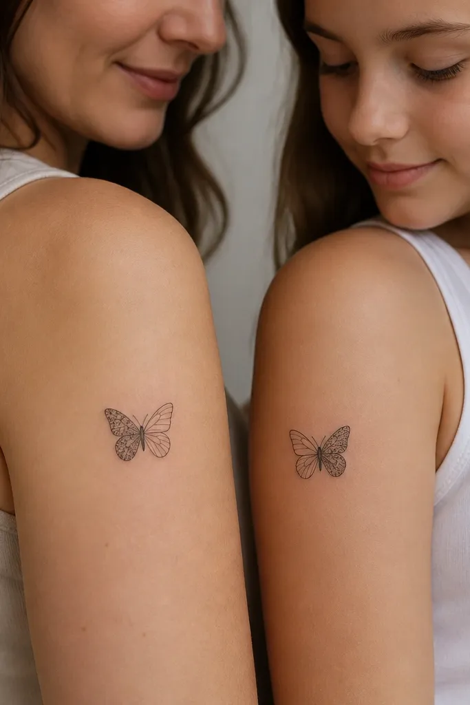
Butterflies read as "mom and daughter" without needing hearts everywhere. Splitting the wing pattern is the trick: you still match the style, but each person has a unique "side." Dotwork in one wing keeps the tattoo airy. Use black ink with a few micro dashes so the wing texture doesn't turn into a flat gray patch.
Place mom higher on the outer upper arm so the butterfly opens outward. Daughter goes slightly lower so it aligns when you stand side by side. Keep each butterfly between 2 and 3 inches wide. The wing pattern should be consistent in dot size and spacing across both.
Pro tipUse a reference photo for dot spacing - ask the artist to match the dot density exactly, not "close enough."
AvoidAvoid full shaded butterflies - they can look muddy on small placements.
7. Two Halves of a Heartbeat Line
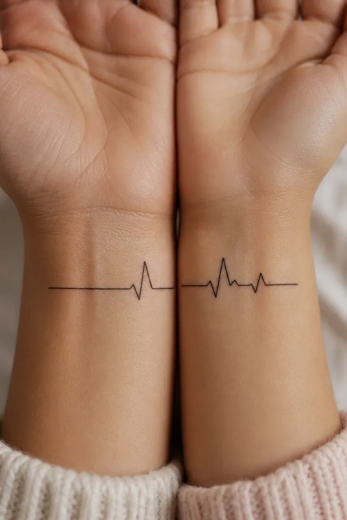
This one feels emotional without being cheesy. The aesthetic comes from a single continuous line style - no extra hearts, no thick frames. The heartbeat curve looks clean when it's drawn with a consistent stroke thickness. Keep it minimal so it stays readable after healing.
Mom wears the line on the inside of the forearm near the wrist; daughter mirrors it on the outside of the forearm so you can line them up during photos. Measure the total rhythm so each half is about 2 inches, with one shared peak spike at the center. Ask for the line to be straight-ish and avoid the direct wrist bone crease.
Pro tipDo a quick mock-up on your skin with a strip of eyeliner to confirm the line length when your arm is relaxed.
AvoidSkip tiny sharp spikes - they blur fast on wrist-adjacent skin.
8. Sun and Moon Same Face, Different Placement
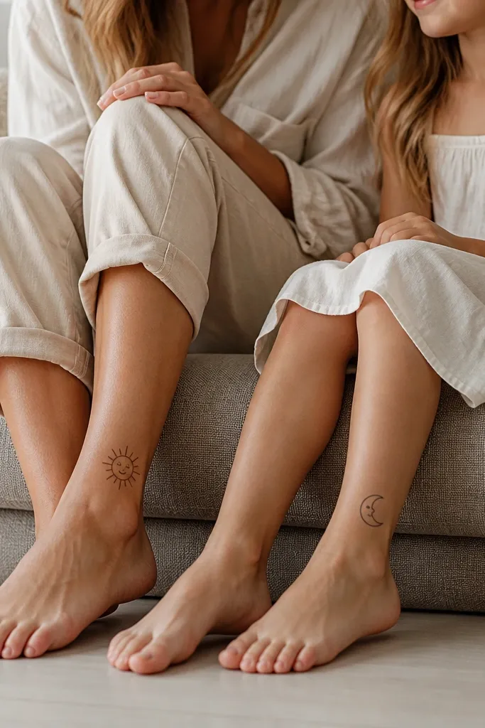
Sun and moon with the same face is sweet and graphic. It works because the face details are consistent - same dot eyes, same curve mouth - so your brains read it as one story. The rays and crescent edge should be thin and evenly spaced. Ankle placement looks cute, but you need the size right so it doesn't stretch.
Keep the sun at about 2.2 inches wide and the moon slightly smaller. Place them on the outer ankle area, away from the bony ridge. Use black ink only with tiny dot shading inside the moon or under the sun rays, not full gray fill.
Pro tipIf either of you has sensitive skin, ask for a slightly thicker outline than "ultra fine" so it heals cleaner.
AvoidAvoid placing on the exact point of the ankle bone - it fades and distorts faster.
9. Matching Coordinates with a Soft Compass Rose
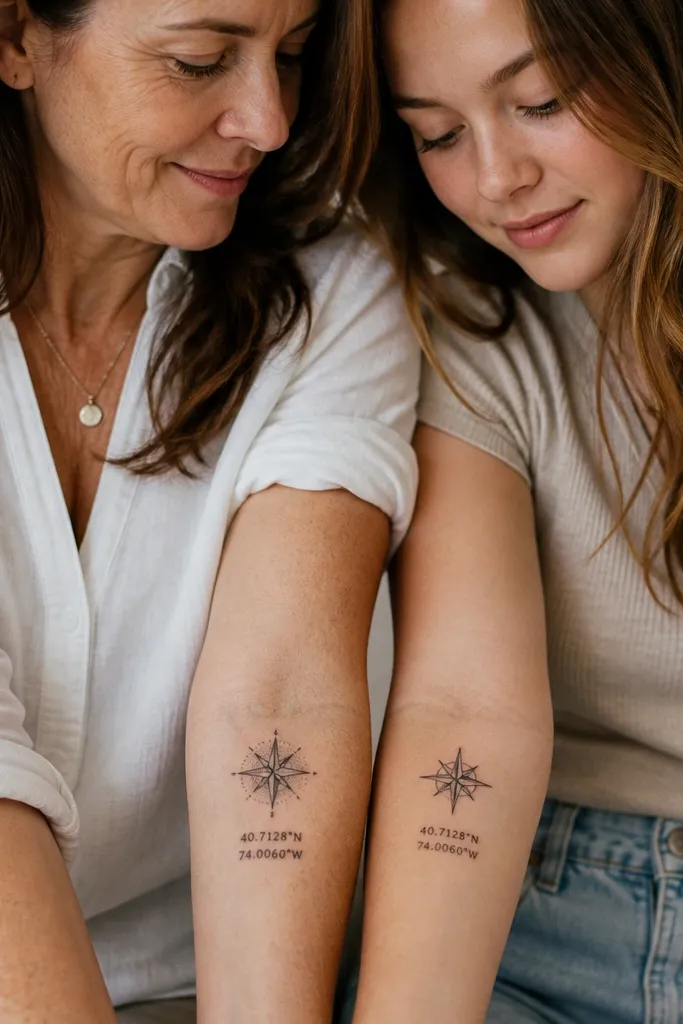
Coordinates look personal fast when the compass rose is understated. The aesthetic comes from the typography and the compass style being consistent. Use a clean sans-serif font for numbers so it doesn't smear into a gray line. Dot shading in the compass rose keeps it soft instead of heavy.
Place mom on the inner forearm and daughter slightly higher on the outer forearm so the tattoos face outward when you hug. Keep the coordinate text to 2 lines max. Ask for the compass rose to be about the same width as the text block, so the layout looks balanced.
Pro tipBring your exact coordinate format (with the degree symbol or decimals) and confirm it with the artist before tattooing.
AvoidSkip tiny serif fonts - they turn into unreadable loops after a few months.
10. Leafy Branch Frame with Hidden Initial Knot
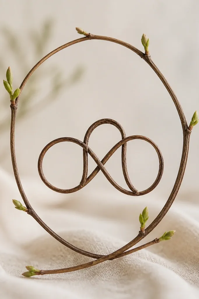
Branch frames look neat because they create a natural boundary. The hidden initial knot keeps it subtle and keeps you from getting "letter tattoo" fatigue. Use black ink with light stipple shading in leaf veins. The oval frame keeps the tattoo from looking like random doodles.
Mom wears the oval on the upper back near the shoulder blade; daughter wears it on the outer upper arm at the same height. Keep the frame width about 3.25 inches. Leaves should be small and consistent in size so the oval stays symmetrical.
Pro tipAsk the artist to stencil with the leaves mirrored exactly - tiny asymmetry reads as sloppy in linework tattoos.
AvoidAvoid thick outlines on frames - they make the leaves look like sticker edges.
11. Matching Script: One Phrase Split by a Star
Splitting one phrase across two people is romantic and still tasteful when you keep the wording short. The aesthetic comes from consistent script height and spacing. Use thin script only if the artist is steady - otherwise it fades into a gray underline. The star acts like the visual glue between the halves.
Pick a phrase length that fits in one line on both arms, like 6 to 9 words max but fewer letters per line is better. Place mom on the inner forearm and daughter on the outer forearm so you can read it when arms are together. Keep the star about the same size in both tattoos, and align it with the same baseline.
Pro tipPractice your arm angle in front of a mirror before you commit - script looks different when forearm rotates.
AvoidAvoid long phrases in one tiny line - it heals illegible.


