
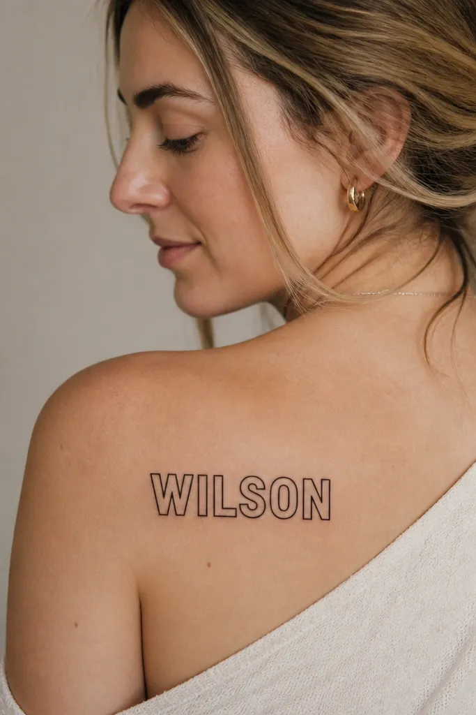
1. Roman Capitals with a Thin Baseline Rule
Roman capitals give you a formal, clean read that doesn't depend on delicate curves. The thin baseline rule acts like a visual anchor, so the letters look intentional even if your name has a few tricky letter shapes (like S, R, or Y). I like this when the maiden name is 6-10 characters because the spacing stays balanced. It also ages well because the strokes are thick enough to hold contrast.
Make the letters about 8-10mm tall for forearm readability. Keep the baseline line the same thickness as the thinnest serif stroke so it doesn't look like a separate doodle. Use blackwork only - no grey wash - and keep letter spacing consistent, especially between M/W and adjacent vowels.
Pro tipAsk your artist to draw a paper stencil that includes a 2-foot readability check in the mirror before they tattoo.
AvoidAvoid ultra-thin "engraving" fonts - they fade into the skin texture and the name turns into a blur.
2. Script Maiden Name with a Single-Loop Initial
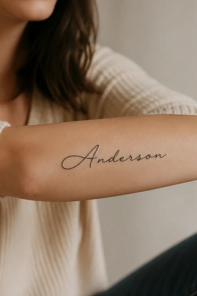
This style works when you want sentiment to look personal but still legible. The larger initial gives your eye a landing point, so the rest of the script has context. A single loop initial looks classy and avoids the clutter of multiple flourishes. I like it for names with one standout letter you can exaggerate without distorting the word.
Keep the script in one line, not stacked. Target 6-8mm letter height across the word and avoid heavy swashes at the ends - they widen as the skin moves. Place it on the outer forearm where the skin is smoother and the ink contrast reads better in natural light.
Pro tipChoose a script font that keeps the crossbars and stems distinct; bring two font examples and pick the one that stays readable when printed small.
AvoidSkip big vine-style flourishes that wrap around the arm - they look pretty healed for a month, then the ends blur.
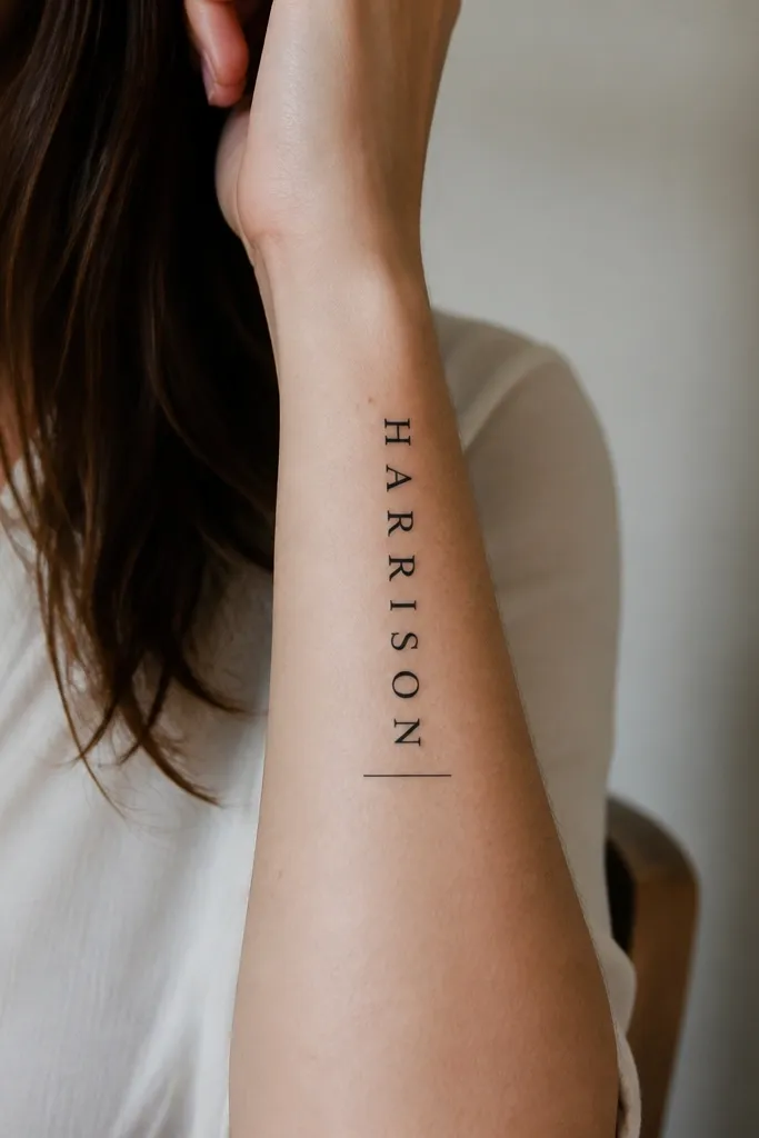
3. Maiden Name in Typewriter Font with Date Teeny Underline
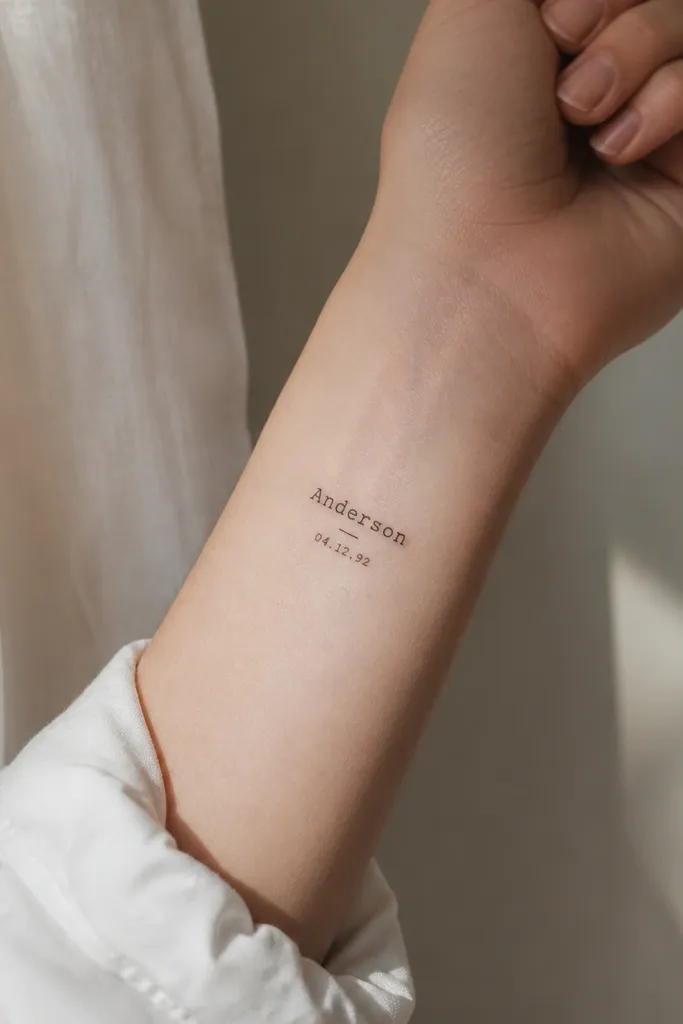
Typewriter lettering gives a lived-in, human feel without the fragility of ultra-fine script. The monospaced look keeps every letter consistent, which helps names stay readable even if your name has multiple thin strokes. Adding a tiny date underline keeps the sentiment centered without turning the tattoo into a full scrapbook page. The black ink stays clean and graphic.
Letter height near the wrist should be closer to 5-6mm if you want it to survive the area's wear and friction. Keep the date numbers to about half the height of the name. Use crisp blackwork only and place it where the skin isn't constantly rubbing against bags or watch bands.
Pro tipIf you wear a watch, put the tattoo above the strap line by at least 1.5 inches so it doesn't get sanded down over time.
AvoidDon't choose a super-light grey "vintage type" effect - the name will fade faster at the wrist.
4. Name Inside a Fine Circle Frame
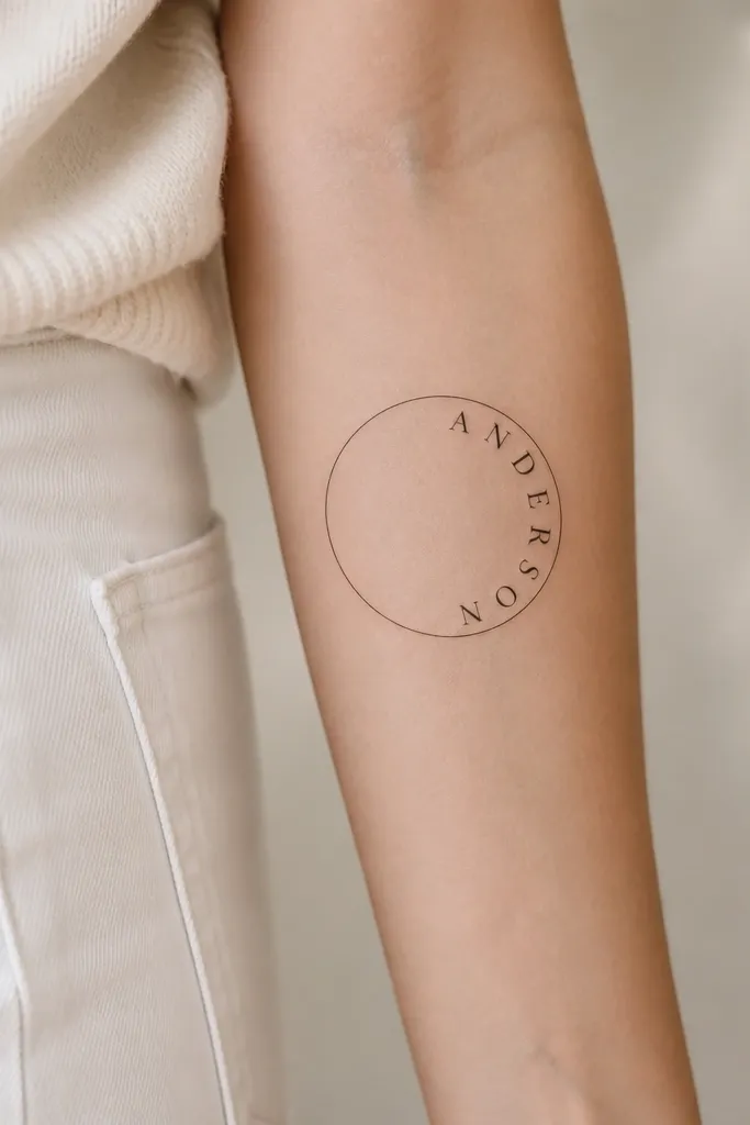
A thin circle frame makes the name feel like a seal without needing extra symbols. The frame also helps the spacing because the arc forces your letters to follow a consistent path. This looks especially good when your maiden name has a balanced length, so the arc doesn't get cramped. I like black ink with a tiny bit of negative space so the circle stays airy.
Use a circle diameter around 35-45mm on the forearm so the letters have room. Keep the frame line thickness close to the stroke weight of the letters, not thicker. Place it on the outer upper arm or outer forearm where the circle won't distort too much when you flex.
Pro tipAsk for a stencil with the circle perfectly centered on your arm bone so the arc doesn't drift when you rotate your wrist.
AvoidAvoid putting a fine circle too close to the elbow crease - the circle warps and the name looks uneven.
5. Maiden Name with Minimal Coordinates and Arrow
If your maiden name is tied to a specific place, coordinates add meaning without crowding the letters. Clean serif typography keeps readability strong, and the tiny arrow gives direction so the tattoo reads like a note. I've seen this age well because the numbers are small but not microscopic, and the arrow is bold enough to stay visible. It feels personal without turning into a full map.
Use a name font with sturdy serifs and keep the name at 7-9mm tall. Coordinate numbers should be about 2.5-3.5mm tall, depending on your name length and spacing. Place it on inner forearm, mid-length, away from the wrist crease.
Pro tipBring your artist the exact coordinate format you want (with or without decimals) so they don't "interpret" it and change your meaning.
AvoidSkip ultra-small coordinate clusters - if the numbers need squinting on day one, they will be gone later.
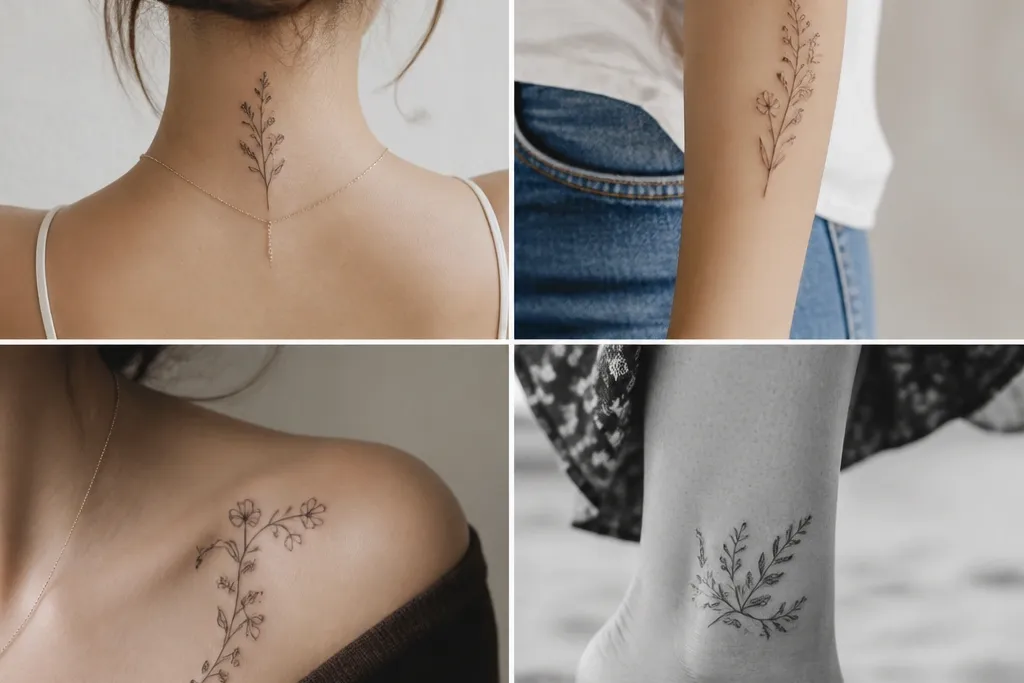
6. Single Flower Undername with Fine Stem
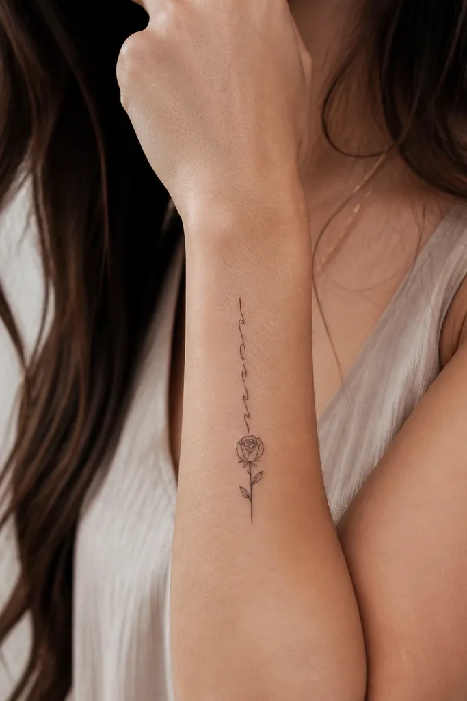
This works when you want the maiden name to feel soft but still like it belongs to you. The flower gives emotional sentiment, and the fine stem creates a gentle visual line that doesn't fight the letters. I like simple black outline flowers (not heavy watercolor) because they stay crisp and don't turn into a grey blob. The name stays the focus; the flower supports it.
Keep the name around 6-7mm tall and the flower about 18-25mm tall. Place it on the inner forearm or upper arm where the stem can run straight with your skin lines. Use black outline with minimal dot work for petals - no heavy shading.
Pro tipAsk for the flower to be slightly lower than you expect so it doesn't collide with the letters when you move your arm.
AvoidAvoid multi-flower bouquets - the name gets visually swallowed.
7. Maiden Name in Bold Serif with Small Crosshatch Shading
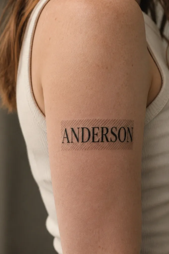
Bold serif keeps the name readable, and crosshatch adds texture without turning into full black-and-grey realism. I like this for names that have a lot of straight strokes because crosshatching looks intentional behind them. The texture also hides tiny skin micro-variation while healing. It's a good middle ground if you want more depth but you don't want a full portrait style.
Make the letters about 9-11mm tall on the upper arm for good contrast. Keep the crosshatch area small - think a band behind the middle third of the name, not a whole background. Your artist should use short, tight lines so the texture stays sharp.
Pro tipGet a healed-photo reference of crosshatch work from your artist, not just fresh tattoos.
AvoidDon't let the shading creep into the letter counters (the open spaces) or the text will fill in over time.
8. Maiden Name with Heartbeat Line Ending in the Last Initial
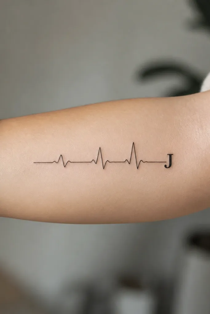
This is one of the few ways I like a name tattoo to feel modern without adding extra icons. The heartbeat line gives motion and sentiment, and ending in your last initial makes it feel custom. Keep the heartbeat line thin but not hairline - it needs enough ink to stay visible. The initial at the end gives the piece a focal point that reads instantly.
Place it on the inner forearm or along the outer forearm where the line can stay straight. Use a heartbeat line thickness around 1-1.5mm and an initial about 10mm tall. Keep negative space between the line and the name if you add letters - don't tuck the name on top of the heartbeat line.
Pro tipBring a rhythm you like on your phone (music track or a recording) and tell your artist the vibe; they can translate it into a heartbeat-like pattern that feels personal.
AvoidAvoid squeezing the heartbeat line too close to the initial - touching edges heal into one shape.
9. Maiden Name in Negative Space Cut-Out Letters
Negative space cut-out lettering looks sharp because the letters have defined edges even when the skin texture changes. It also feels modern and a little architectural, which I like for names that are long. The key is strong outlining and consistent spacing so the "cut" stays clean. This style reads well from distance because your brain sees the outline first.
Use thick enough outlines for the letter interior to stay open - aim for outline thickness around 2mm on forearm scale. Place it on the outer arm or upper forearm where the light hits evenly. If your name has a lot of rounded letters, outline them with smooth curves so they don't look jagged after healing.
Pro tipAsk your artist to do a stencil test with your name printed at final size - negative space lettering is picky about kerning.
AvoidDon't choose tiny outlines - if the black stroke is too thin, the inside fills in and the cut-out effect disappears.
10. Maiden Name on a Slim Banner Ribbon
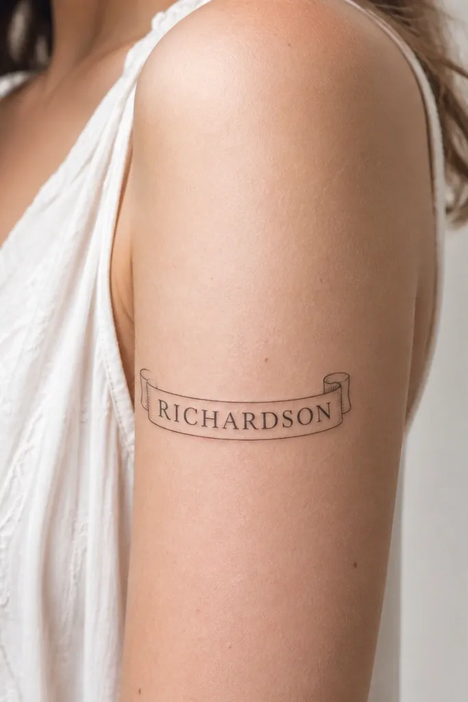
A slim banner frames your name and creates a clear boundary so the letters don't float. The curved banner matches the way your arm naturally curves, so it looks fitted instead of pasted on. This style is especially good when your name has 5-9 letters and you want the tattoo to look "planned." I keep it blackwork with thin outlines so it doesn't get heavy.
Use a banner width around 12-18mm, depending on your name length. Keep the letters centered and sized so no letter touches the banner edge. Place it on the upper arm outer side so the banner curve matches the arm's contour when you bend.
Pro tipTell your artist you want the banner edges to be thinner than the letter strokes so the text stays dominant.
AvoidAvoid thick, fully shaded banners - they make the name look like it's trapped under a label.
11. Maiden Name with Tiny Spark Dots Around the Word
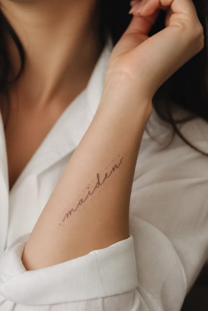
Dot sparks add a celebratory sentiment without turning into a full background. This is a good option when you want the name to be soft but still want visual interest that doesn't compete with readability. I keep the dots sparse, so they look like light catching the ink, not like a random speckle. It also helps hide minor uneven healing because there are extra points of reference.
Use script at 6-7mm height and keep the dot cluster within a 10-15mm area around the name. Dots should be true black with no grey wash. Place it on the forearm where you can see the dots when your arm is relaxed, not only when you flex.
Pro tipAsk for a dot map in the stencil - if dots are freehanded on skin, placement can end up lopsided.
AvoidSkip heavy dot gradients - they can look muddy after a few months.
12. Maiden Name in Hand-Lettered Monoline with Micro-Underscore
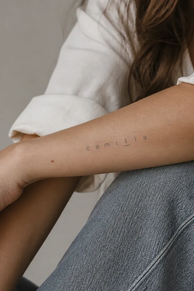
Monoline hand-lettering gives you that custom feel without the flourish overload. The micro-underscore adds focus to a specific part of the name - like the first vowel or the last letter - which makes the tattoo feel intentional. I like this for names that are short enough to keep the letters spaced and consistent. Done with black ink only, it heals cleanly and stays sharp.
Aim for letter height around 7-8mm and keep stroke thickness consistent across every letter. The micro-underscore should be about 1/3 the width of the word segment you emphasize, not a full underline. Place it on the outer forearm so it reads in daylight and doesn't get crushed by folds.
Pro tipBring a reference of your exact letter shapes from a handwritten note - your artist can match the rhythm more accurately than generic fonts.
AvoidAvoid random "handwritten" styles that change stroke thickness letter to letter; they look inconsistent after healing.


