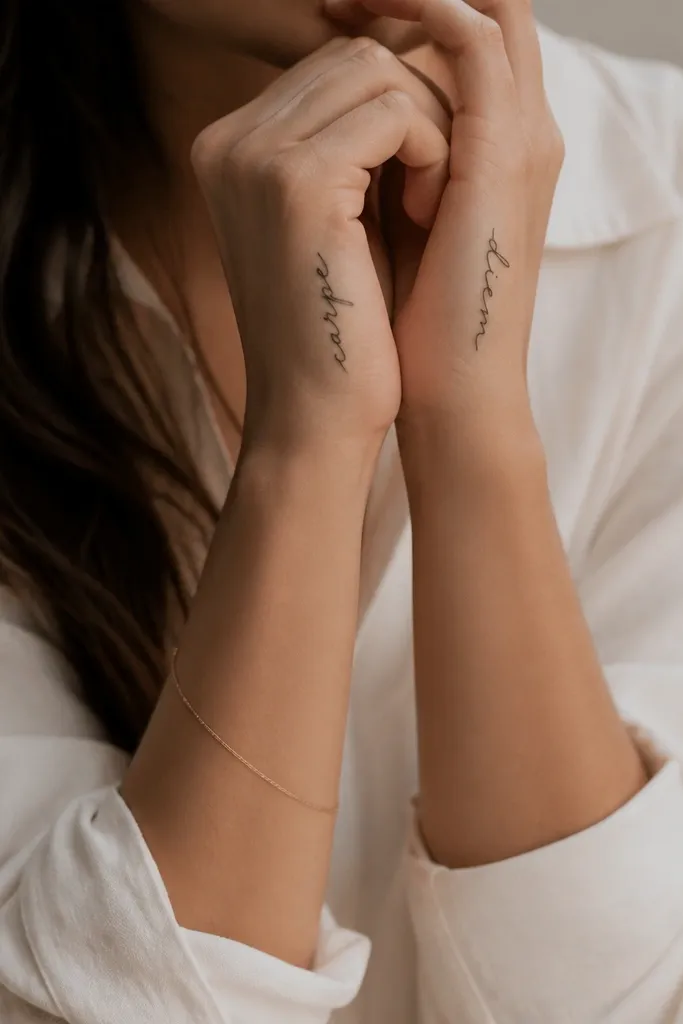
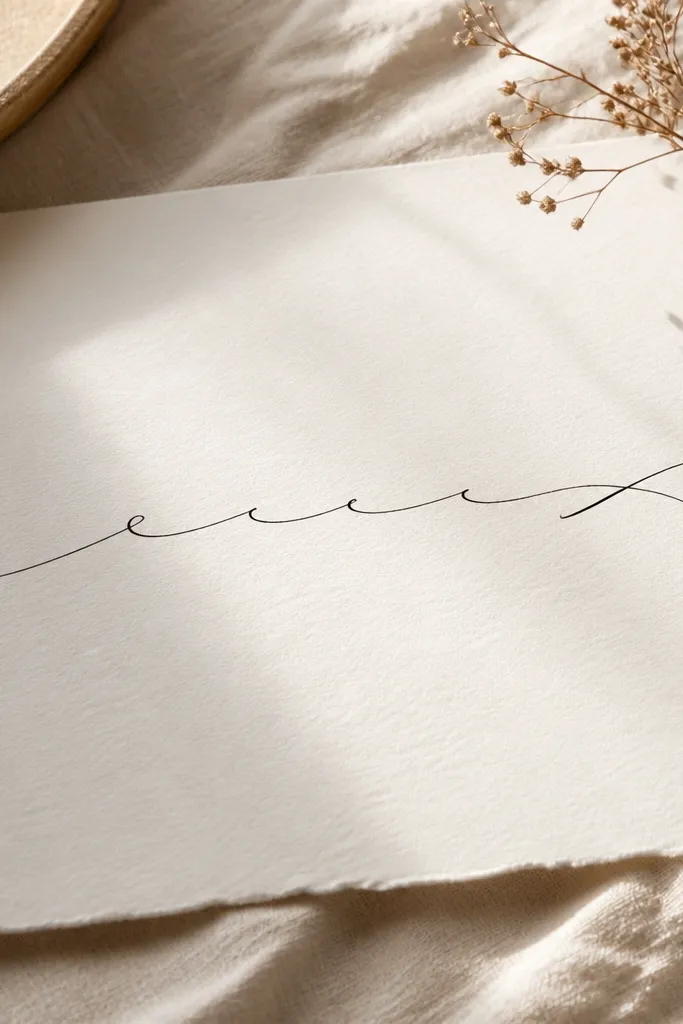
1. Side-Hand Signature Script
This works because the side of the hand has less constant friction than the center of the palm. The lettering stays readable because the lines are consistent in thickness and the ascenders are stretched upward, not sideways. A signature-style script looks natural on skin because it follows the natural contour from thumb base to wrist.
Have the artist place it along the outer edge, about 1 to 2 finger-widths from the thumb webbing. Keep the height around 2.5 to 3.5 cm so it doesn't spread during hand flex. Tell them to avoid heavy curls at the bottom - one small loop max.
Pro tipChoose a font with clear letter separation, even when it's cursive. If the stencil merges two letters, it will merge in healing.
AvoidAvoid thick "marker" scripts that look bold before healing - they blur into one dark line.
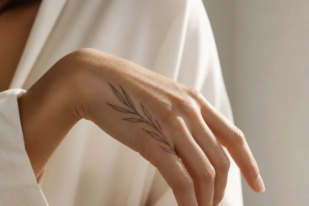
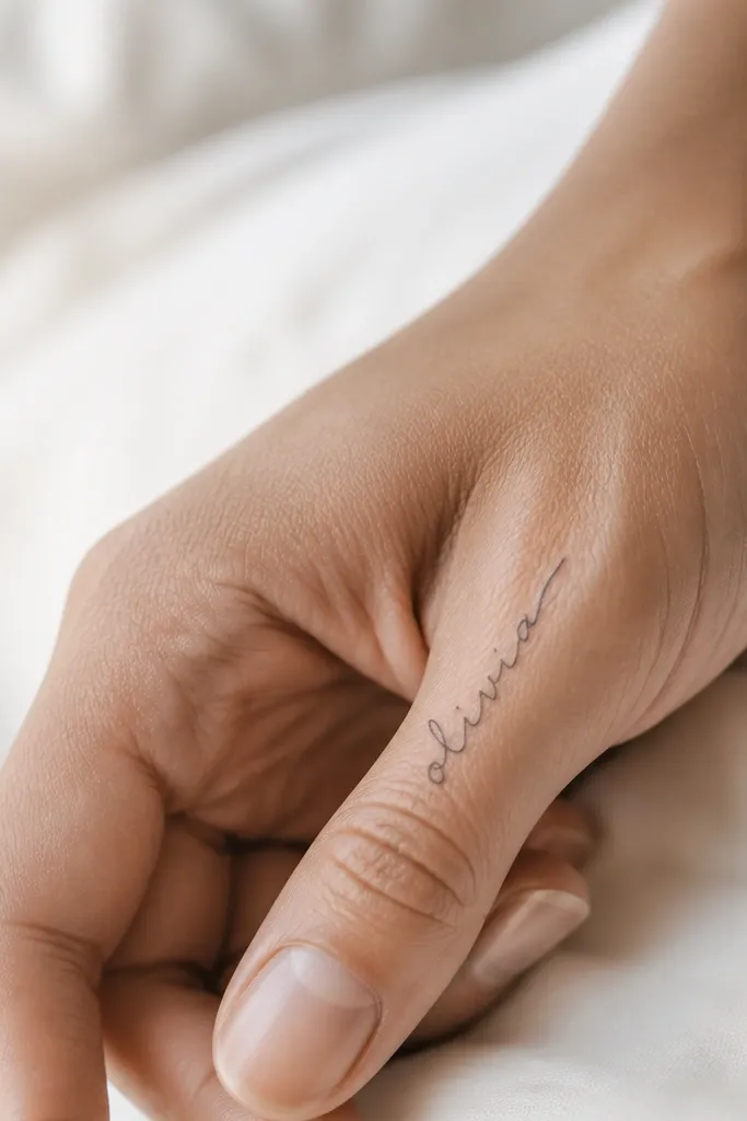
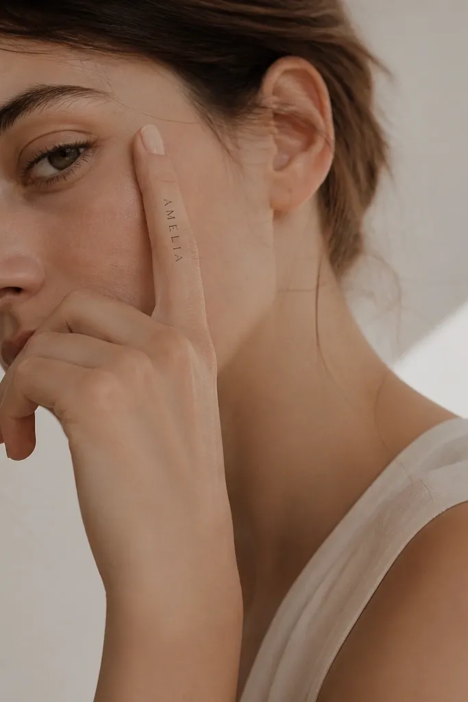
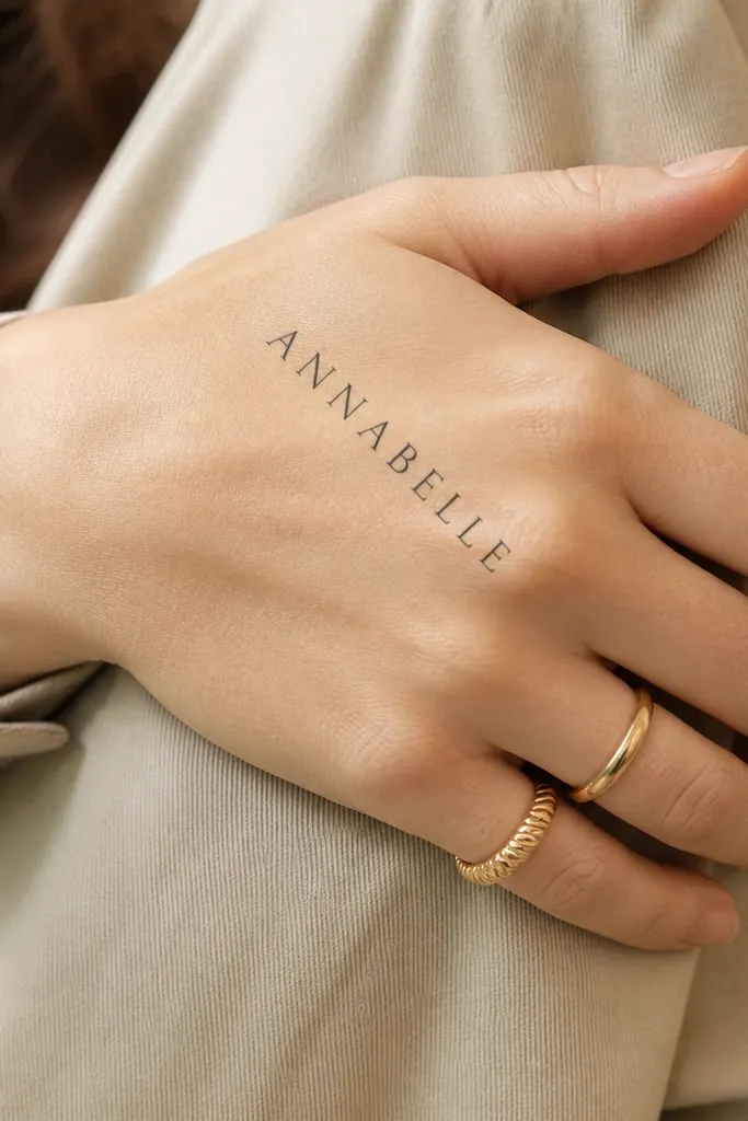
2. Micro Upper-Phalanx Name
Micro placement keeps the design crisp because it sits on flatter skin with less stretching. Thin lines heal cleaner when the tattoo is small - there's less ink volume to spread. The letters look elegant because the viewer reads them as a single word from a distance, then notices the details up close.
Ask for placement across the upper phalanx (the middle-top section of the finger), not the joint crease. Keep the letters short so they don't cross the knuckle. If your name has long letters, split it across two fingers instead of stretching it.
Pro tipBring a reference with the exact spacing you want. Micro tattoos are unforgiving when letters touch.
AvoidSkip designs that cross finger joints - those lines blur within months.
3. Thumb-Web Minimal Name
The thumb web folds a specific way when you pinch and scroll, so a light curve helps the name look like it belongs there. Minimal linework stays sharp because there's no heavy shading to blur. Negative space around the letters makes the script read cleanly even as the skin shifts.
Have the artist keep the name under 3 cm total length. Place it so the center of the word sits between the thumb base and the first crease, not directly on the crease. Use a stencil that leaves gaps between letters - no "ink bridges."
Pro tipIf your name has repeated letters like N or M, ask for them to be drawn with separate entry and exit points so they don't fuse.
AvoidDon't put long underline strokes across the web - friction makes them bleed together.
4. Lower-Finger Wrap Name
Wrapping at the lower finger base looks intentional because it follows the cylinder shape of the finger. Thin lines stay crisp when they're wrapped gently rather than aggressively curved. The wrap also hides minor uneven healing because the design naturally curves with you.
Keep the wrap to about half the circumference so it doesn't look distorted. Place it on the underside edge of the index finger where the skin is smoother. Avoid thick ink - you want a "pen" look, not a "marker" look.
Pro tipAsk your artist to test the stencil with your hand open and slightly bent. If the word stretches during flex, reposition it.
AvoidSkip heavy flourishes on wrapped scripts - curves turn flourishes into blobs.
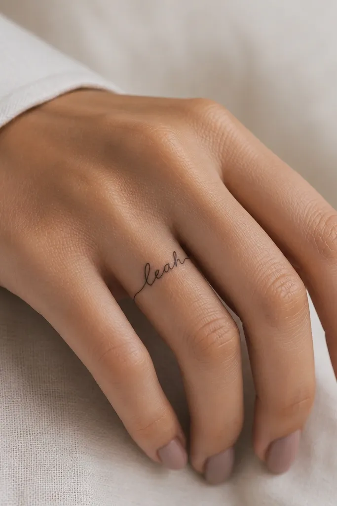
5. Knuckle-Side Blocky Cursive Hybrid
This hybrid style works when you want the readability of cursive but you also want control over where the ink goes. The slightly firmer connectors help the letters hold their shape as your hand moves. Placing it along the knuckle side avoids the highest flex point in the center.
Place the name along the side of the knuckle, not on the top center of the joint. Keep letter height around 2 cm and spacing consistent. Tell the artist to keep connectors short so they don't merge during healing.
Pro tipChoose a name layout that has at least a small gap between each letter. If letters touch in the stencil, they'll touch in skin.
AvoidAvoid putting the thinnest letters directly over the hardest bend - they fade unevenly.
6. Two-Word Name Split Across Hands
Splitting the name keeps each piece small enough for clean healing. It also makes the design feel like a set, not a rushed cover-up. The thin linework stays crisp because each tattoo has less ink density than a full-length hand piece.
Ask for matching script thickness and spacing across both hands. Place the first word on the outer edge of one hand and the second on the matching edge of the other so they look aligned when you clap or hold hands. Keep both words under 4 cm total.
Pro tipTake a mirror photo with both hands relaxed. If the words don't align visually, adjust placement before you ink.
AvoidDon't let the letters scale differently between hands - mismatched sizes look off fast.
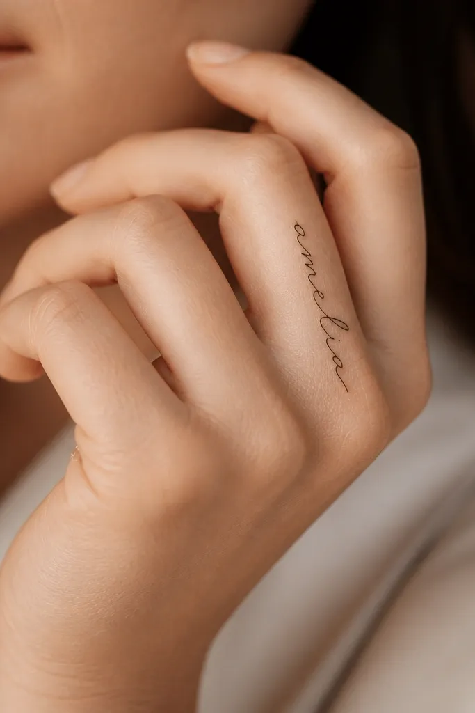
7. Vertical Name Along the Index Finger
Vertical placement reads clearly because the letters grow in the same direction as finger length. Thin strokes heal with sharper edges since the tattoo stays small and doesn't cross big movement lines. It also hides minor scabbing texture because the design has clear spacing.
Place the name on the outer side of the index finger where it bends less. Keep it centered along the finger length, not across the knuckle crease. Keep the total length around 3 to 4 cm depending on the number of letters.
Pro tipUse a script with strong vertical structure. If the font has lots of horizontal swashes, they'll smear with flex.
AvoidAvoid horizontal loops at mid-finger level - they catch on movement and soften.
8. Name With Tiny Dot Accents
Dot accents add personality without adding thick ink areas. The dots also help define letter rhythm, so the name reads even if one line lightens slightly. This style looks good on hands because it stays light and controlled.
Tell your artist to keep dots the size of a fine pen point, not a filled circle. Place one accent at the start of the word and one near the end, or add two to three dots within the script. Keep the overall word width narrow to avoid merging dots into strokes.
Pro tipAsk for dot placement in the stencil first. Dots shift easily if the stencil is too flexible.
AvoidSkip crowded dot clusters - too many points turn into a muddy speckle.
9. Serif Name With Thin Outline
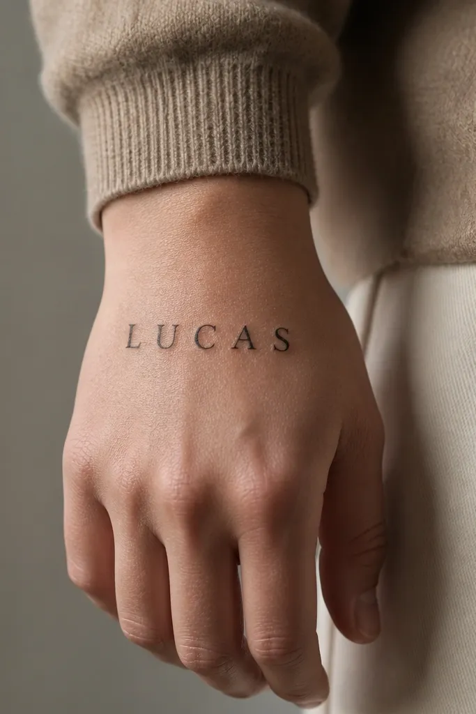
Serifs give the name crisp edges and make each letter look intentional. Thin outlines keep the look fine even after the skin texture changes during healing. On the back of the hand, the skin is less friction-prone than the palm, so the letters hold their structure better.
Place it on the back of the hand near the wrist line, not across the center of the knuckles. Keep letter height around 2 to 3 cm. Ask for no shading - just clean linework with a steady hand.
Pro tipChoose a name layout where letters don't overlap. Serif fonts look sharp only when each character has room.
AvoidAvoid "outline only" with uneven line thickness - patchy outlines look like a mistake.
10. Back-of-Hand Name With Micro Star Break
The micro star breaks up the word so the eye reads the name in sections. That matters on hands because tiny linework can lighten unevenly. The star adds meaning without forcing extra ink mass across the skin.
Have the artist place the star off-center, about halfway through the word. Keep the star small - around 3 to 4 mm - so it stays crisp. Keep the script thin and avoid thick loops around the star.
Pro tipIf your name is short, use the star as a connector between two longer letters. If it's long, use it once to keep spacing clean.
AvoidSkip large stars - they heal thicker and can make the surrounding letters look thinner by comparison.
11. Curtain-Curl Ends Name
Curtain-curl ends look soft but they're controlled. Since only the ends curl, the middle stays stable and readable. This is one of the few flourish styles that doesn't turn into a blob because the curl is narrow and not a thick loop.
Place the name along the outer edge of the hand or slightly over the finger base. Keep the curls under 1 cm each so they don't invade high-flex areas. Tell the artist to taper the curl ends to a fine point.
Pro tipPick one flourish location, not three. More curls means more places for ink to spread.
AvoidAvoid full looping flourishes through the center - that's where it blurs first.
12. Name in Thin Roman Capitals
Roman capitals hold their shape better than fancy scripts on hands because they don't rely on delicate swashes. Thin strokes keep the look refined, and diagonal placement adds style without crossing too many flex points. This is the cleanest option if you want your name to stay readable even as it fades a little.
Place it diagonally from the outer knuckle area toward the wrist, keeping it off the knuckle crease. Keep the letter spacing slightly wider than you think you need. If your name has letters like W or M, ask for simplified internal strokes.
Pro tipTest the angle by holding your hand in a writing position. If the letters distort, adjust the diagonal before the tattoo is inked.
AvoidSkip condensed fonts - tight spacing looks like a smudge while it heals.


