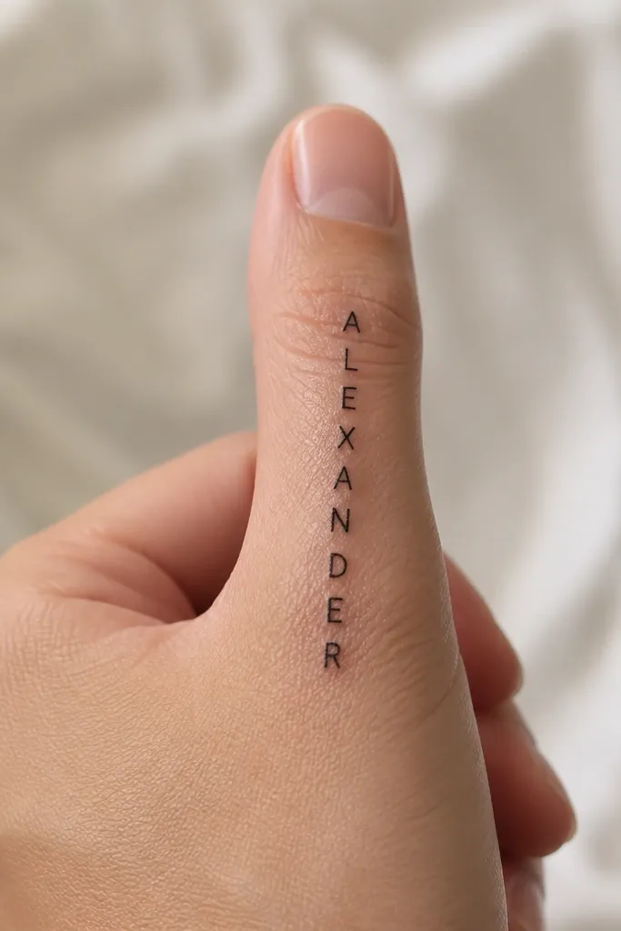
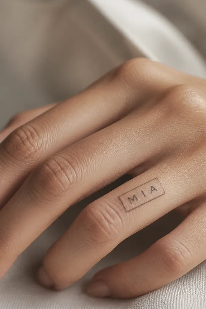
1. Vertical Block Name on the Side of the Index Finger
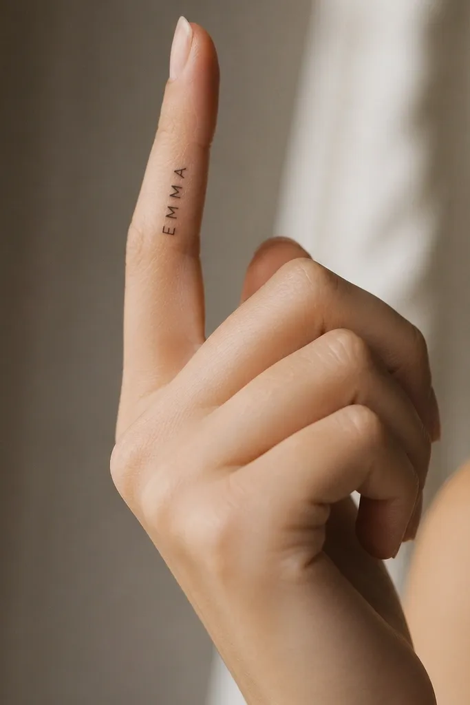
This look stays simple because the letters are built from straight strokes that hold up under friction. Block caps also keep their shape when the skin stretches - the ink doesn't rely on thin curves. I like placing it on the outer side of the index finger since that area gets less constant rubbing than the palm side. The result reads cleanly even in low light.
Keep the tattoo height to about 10-14 mm so it fits without crowding the knuckle. Tell the artist you want line weight around the "medium fine" range - not pencil-thin. Use a stencil that shows letter spacing around 1 mm between characters so they don't merge over time.
Pro tipChoose a name with distinct letter shapes (like L, T, A) if you want maximum long-term readability.
AvoidAvoid tiny all-lowercase lettering with tight kerning - it turns into a dark smudge.
2. Minimal Serif Name with a Single Underline Accent
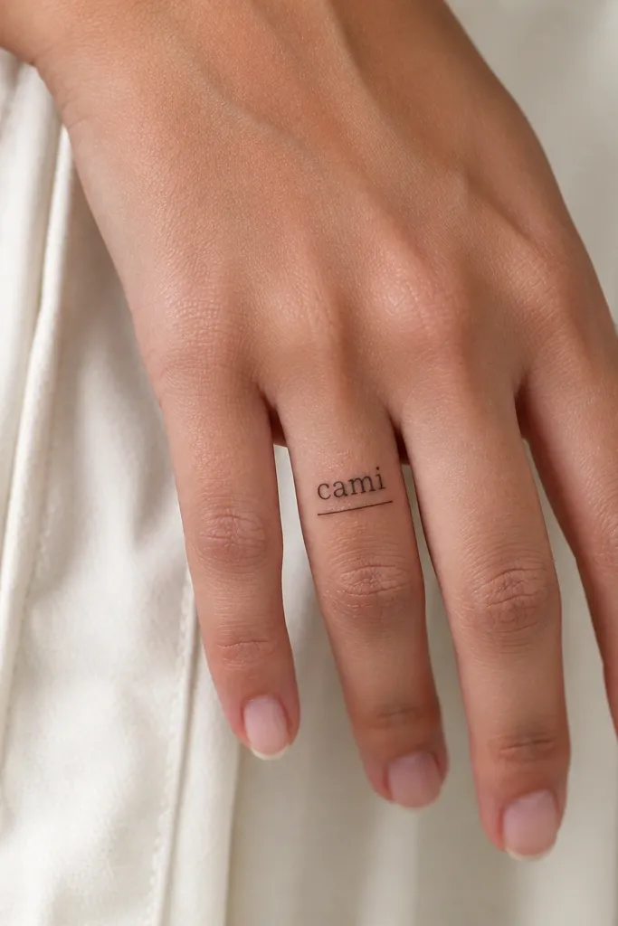
Serif fonts look "fancy" but can still be simple if you keep the details minimal. The underline gives a focal line, so your eye reads the name fast. This works well when you want something more feminine than block caps without going full script. The thin underline also creates structure, which helps the tattoo stay crisp as it fades.
Place it vertically along the center of the finger, from just above the first crease down about 12 mm. Keep the underline about 1-2 mm longer than the first and last letters, then taper it cleanly. Use black ink only - color adds risk of uneven aging on fingers.
Pro tipAsk for serifs that are short and squared, not swoopy - swoops blur quicker.
AvoidSkip decorative swashes at the start or end of letters.
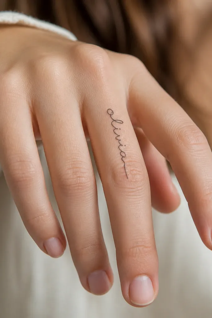
3. Tiny Cursive Name with No Loops on the Ring Finger
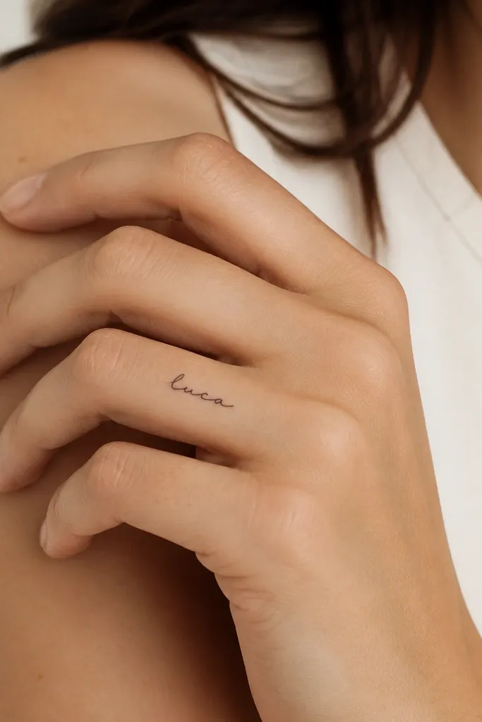
If you want cursive but you're worried about blur, this is the compromise that works. No big loops means fewer places for ink to pool or spread. Connected letters create flow without adding extra "filler" marks. The ring finger placement also feels naturally intentional - it's visible when you gesture, but it's not constantly rubbed like the thumb.
Keep it under 9-11 mm tall. The artist should use a stencil that keeps letter crossings minimal - you want clean overlap, not tangled pen strokes. Choose a name with at least one tall letter (like h, l, t) so the vertical rhythm stays readable.
Pro tipBring a reference that shows your exact preferred script size, not just a font name.
AvoidDon't pick cursive that has a long looping tail - it's the first part to fade into nothing.
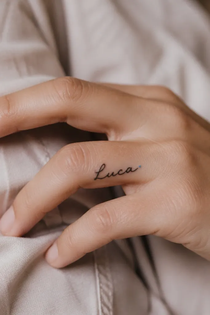
4. Name in Handwritten Style with One Dot Accent
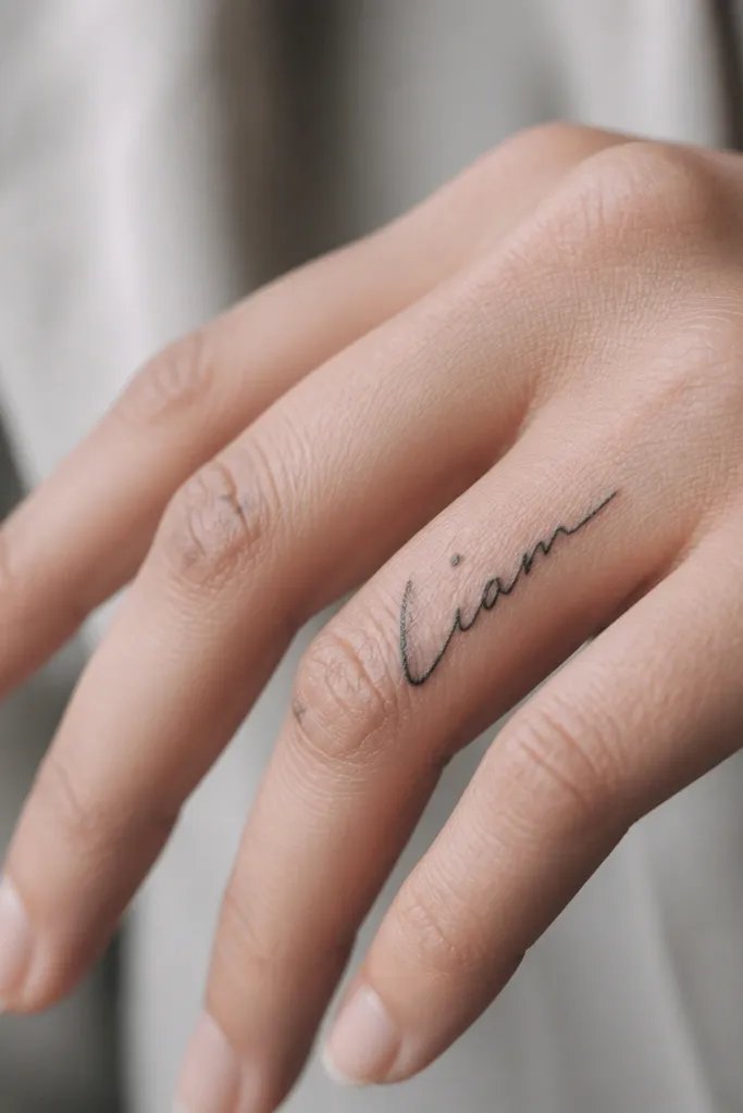
Handwritten style feels personal because it looks like it was written, not printed. The single dot keeps the piece from looking plain while still staying simple enough to age well. I like this for names that are short and have a natural rhythm - the artist can mimic your preferred letter pressure. It also looks good on fingers because the variation comes from the letter shape, not from heavy decoration.
Place it vertically on the inner side of the ring finger, roughly centered between the knuckle and the fingertip. Keep the dot small and solid, about the size of a period in a printed sentence. Use black ink and ask for a stencil that includes the exact spacing between letters so it doesn't look cramped.
Pro tipIf your name has an I or J, use that as the height anchor so the script stays balanced.
AvoidAvoid multi-dot accents or hearts - they clutter fast on a finger.
5. Micro Name with Stacked Letters and Clean Spacing
Stacked letters make a name look simple because each character gets its own space. That spacing is what keeps it readable as the tattoo lightens. It also avoids the problem of cursive connections blurring into one line. This style is especially good for names with 4-6 letters.
Use a narrow column, about 6-8 mm wide total. The artist should size each letter to be similar height, with 0.5-1 mm gaps between characters. Place it on the outer side of the middle finger where the skin is smoother and the letters stay in view.
Pro tipAsk for letter shapes that are bold enough to hold edges - think "clean printed," not "thin pen."
AvoidSkip stacked tattoos that cram letters too close - the gaps disappear first.
6. Name Split Across Two Fingers in One Line
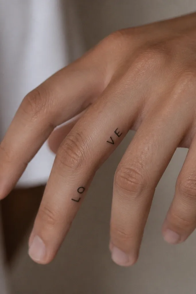
This is one of the cleanest ways to make a finger-name tattoo look intentional without making each finger overly crowded. When both fingers are together, the name reads like one phrase. It also spreads wear across two spots, so the tattoo doesn't rely on one tiny area staying perfect. The line-flow effect looks neat because the font stays consistent.
Choose a name length that fits 2-3 letters per finger. Place the first part on the index finger and the rest on the middle finger so the letters align at eye level. Use a font with straight baselines and consistent letter widths to avoid mismatched spacing.
Pro tipDo a quick alignment check in photos with your fingers naturally relaxed - that's the real placement.
AvoidDon't use a script that curves heavily - the seam between fingers will distort it.
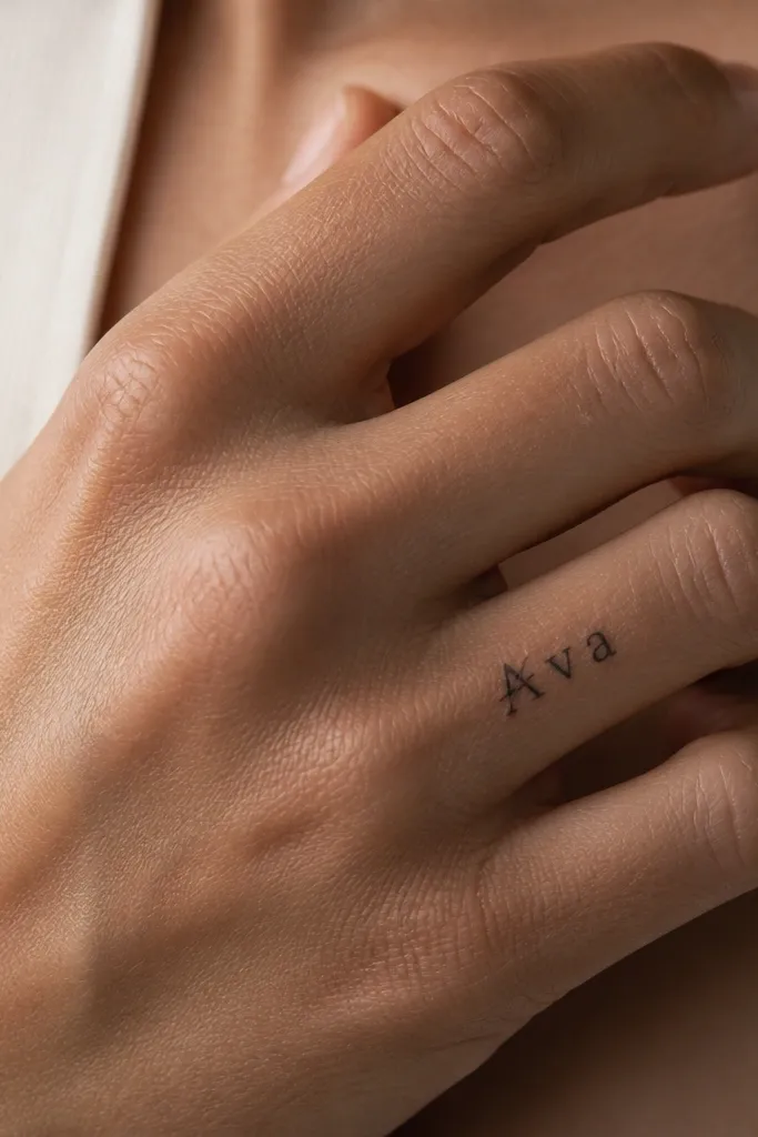
7. Single-Word Name with a Thin Outline-Style Frame
A thin frame makes the name look "designed" without adding extra art. Frames also give you a stable reference for spacing, which helps the tattoo stay neat as it fades. I like this when the name is long enough to feel balanced but short enough to keep the whole piece small. The outline stays crisp if the line weight matches the lettering.
Size the frame to about 12-16 mm tall, with the name occupying the middle 8-10 mm. Use a single continuous outline line rather than double lines. Place it vertically on the ring finger outer side so the frame doesn't get stretched by constant bending.
Pro tipTell your artist to avoid rounded corners - squared edges look cleaner on fingers.
AvoidAvoid thick frames; they overpower the name and blur together.
8. Name with One Small Birthstone-Color Dot (Black Ink Only)
You get a personal "pop" without turning the whole tattoo into a busy design. The name stays the star in black, and the tiny color dot acts like a punctuation mark. I've done this with pale blue and it ages better than larger color fills because the dot is small and controlled. It also looks subtle enough for everyday wear.
Keep the color dot under 1.5 mm so it doesn't spread. The name should be 10-13 mm tall and use a simple font with consistent stroke width. Place the dot near the middle of the word, not at the end, so it stays visible even when the finger bends.
Pro tipChoose a color close to your skin tone contrast - pale blue over a bright neon looks more natural on hands.
AvoidDon't do multiple colored accents; fingers can't handle it long-term.
9. Name in Uppercase with a Tiny Arrow at the Start
A tiny arrow is one of the simplest ways to add meaning without adding clutter. It also gives the tattoo a clear start point, which helps readability as the ink fades. This works best with uppercase because the arrow sits cleanly with straight letterforms. The overall feel is modern and neat, not overly decorative.
Place it vertically on the outer side of the index finger, 11-14 mm tall. Keep the arrow small, about the height of one letter, and centered on the baseline. Ask for the arrow to be filled solid black, not a thin outline.
Pro tipUse a name with a strong first letter like M, N, or T so the arrow and letter balance well.
AvoidSkip curved arrowheads - sharp corners hold up better.
10. Name in a Thin Hand-Lettered Monoline Style
Monoline lettering looks clean and modern because every stroke has the same weight. It reads simple because there's no fill, no texture, and no extra icons. The key is getting the line weight just thick enough to last - monoline doesn't mean "pencil thin." If your artist nails that balance, it stays readable longer than delicate script.
Keep the tattoo height around 10-12 mm. Ask the artist to test the line weight on a practice swatch first if they have one, or show you a healed example of their monoline finger work. Place it on the center of the finger to minimize distortion from side-to-side bending.
Pro tipChoose a monoline font where letters don't overlap - overlapping lines blur into one band.
AvoidDon't let them go ultra-fine; it heals lighter and spreads sooner.
11. Name with a Minimal Slash Through the First Letter
This is one of my favorite "simple but not boring" tricks. The slash acts like a small design element that still keeps the name readable. It's also easier for an artist to execute cleanly at finger scale - one controlled line beats multiple tiny details. The slash gives personality without turning the tattoo into a cluster of shapes.
Place it vertically on the inner side of the ring finger, about 10-13 mm tall. The slash should be diagonal at roughly 30-45 degrees and solid black, not a dotted line. Make sure the slash crosses only the first letter, not the next one - that's where it can get messy.
Pro tipIf your first letter is round (like O), pick a slash angle that doesn't disappear into the curve after healing.
AvoidAvoid adding any extra marks like hearts or stars - the slash already does the job.


