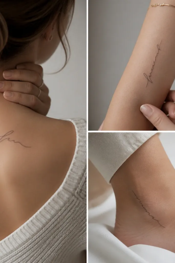
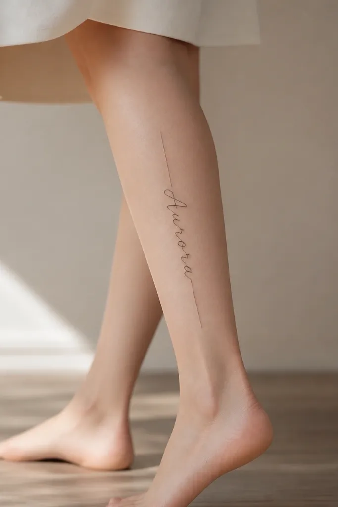
1. Inner Forearm Script Name with Hairline Underline
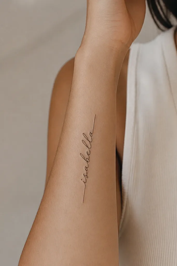
This layout works because the underline gives the script a track to sit on, so the letters don't "float" into each other during healing. The underline is a single continuous stroke, kept very thin so it doesn't overpower the name. I like script forms that have clear upstrokes and downstrokes - they read as letters, not decoration. Black ink stays the most consistent for fine line typography over time.
Place it from about 2 inches above the inner wrist crease down to the mid-forearm, sized so the name height is roughly 7/10 of the forearm width. Keep the underline about 1-2mm below the lowest descenders. This looks best with a clean stencil and a tattoo size that fits the skin without wrapping around too far.
Pro tipAsk your artist to stencil twice: once at your preferred size and once 10% smaller, then pick the one that still reads instantly in a mirror.
AvoidAvoid super-thin "scribble" script where the downstrokes almost disappear.
2. Side of Upper Arm Block Name in Thin Capital Letters
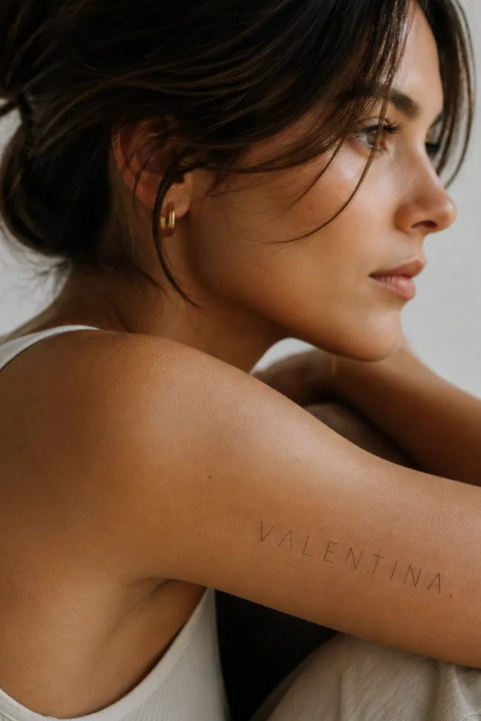
All-caps thin lettering ages more predictably than delicate cursive because the strokes have structure. This style keeps the name readable even when skin texture changes. I also like adding a single end dot - it makes the composition feel finished without adding extra elements. The even letter height helps it look intentional from every angle.
Put it along the side of the upper arm, aligned with your natural arm crease line. Size it so the name spans about 60-70% of the upper arm width, with letter height around 6-8mm per character. Use a font style with straight terminals, not rounded blobs.
Pro tipIf your name has an "O," "A," or "R," keep internal counters (the holes) open - they keep the letters crisp.
AvoidAvoid mixing two font styles (like script + capitals) in one name piece.
3. Ankle Name with Minimal Star at the Start
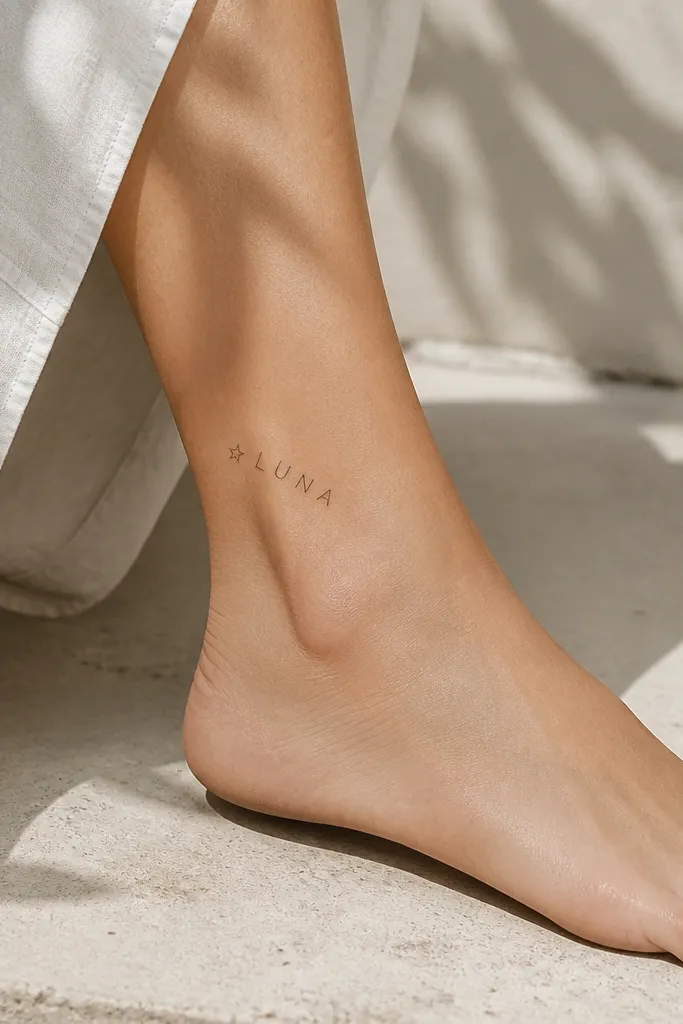
The star outline gives the name a focal point without adding heavy shading. Outlines are forgiving because they don't rely on thick ink saturation to read. This works especially well for shorter names (4-7 letters) because the composition stays airy. On the ankle, the clean negative space between letters matters more than you think.
Place it on the side of the ankle where the skin is flatter, not directly on the highest bump. Keep the name height around 5-6mm per letter and the star about 3mm wide. If you want it to be extra subtle, skip adding a date and let the name stand alone.
Pro tipWear a tight sock or ankle wrap for a day after the appointment to reduce friction while it heals.
AvoidAvoid placing the name so it crosses the ankle crease where your foot bends hard.
4. Forearm Name with Two-Line Initials Frame
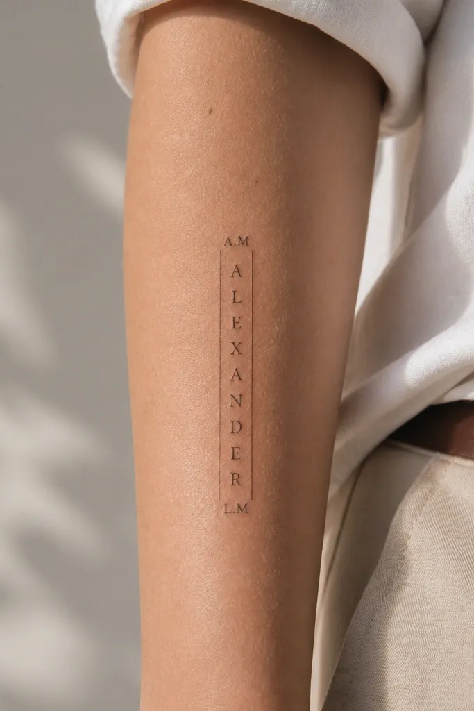
A thin two-line frame makes the name feel like part of a label or signature. It also gives the tattoo a "box" that helps the eye read the letters as one unit. I like this when the name is longer because the frame keeps everything aligned. The parallel lines add structure without turning into a heavy border.
Use a vertical layout on the inner forearm or outer forearm. Keep the frame lines about 2mm from the first and last letter, with the top line aligned to the top of the tallest letter. Initials should be much smaller - roughly 3mm tall - so the name stays the hero.
Pro tipIf your name has tall letters like "h" or "l," align the frame to those, not to the average letter height.
AvoidAvoid a frame with thick ends or rounded caps - it makes fine line look older fast.
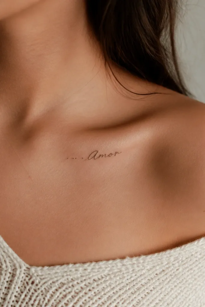
5. Minimal Heart Outline with Name Inside
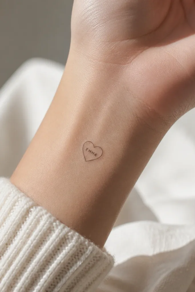
This works because the heart outline acts like a container, and the name sits inside a defined shape. That container helps the name stay readable as a single graphic. Use a heart outline that is symmetrical and not too pointy; pointy hearts can distort with skin movement. Keep the internal font simple and legible at small sizes.
Place it on the upper chest (near the collarbone) or the outer upper arm where skin is flatter. Make the heart about 14-18mm tall, and the internal letters about 3.5-4.5mm tall depending on length. If the name is longer than 6 letters, reduce the font size and widen spacing between letters.
Pro tipAsk for the heart outline to be done first, then the name - it keeps the spacing dead center.
AvoidAvoid filling the heart outline with any shading for a fine line name piece.
6. Tiny Roman Letters Name on the Side Rib Line
Roman-style capitals hold up because the strokes are consistent and the serif points stay crisp. The diagonal placement follows the rib curve, so it looks natural instead of pasted on. Fine line rib tattoos can blur, but Roman capitals keep their identity. This is best for shorter names or a single first name.
Place it on the side ribs below the bra line, around the area that doesn't get pressed by waistbands daily. Keep the name length under 5 inches total, and letter height around 4-6mm. Use a stencil that wraps with your breathing posture, not when you're slouched.
Pro tipSchedule the tattoo so you can avoid tight bras or shapewear for a full week after.
AvoidAvoid putting the name too low where it gets constant friction from underwear seams.
7. Back of Upper Arm Name with Micro Dot Checklist
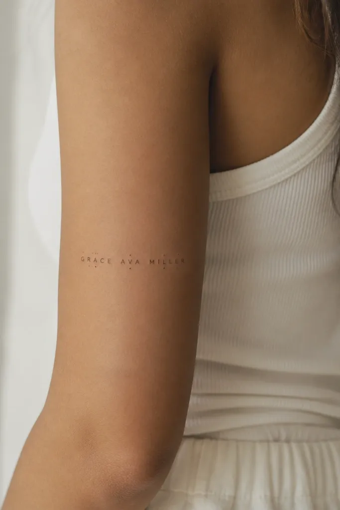
Dot separators look like little punctuation marks, which helps the eye read letter groups. It also adds movement to the layout without adding shading. I like this when your name has repeated letters or tricky combinations, because dots break up the visual density. The dots should be micro - think pinprick, not cartoon decoration.
Place it on the back of the upper arm where the skin is smoother and less stretched. Keep the name horizontal and sized so it spans about 50-65% of the upper arm width. Dots should sit about 1-2mm away from the baseline, with no more than 3-5 dot accents total.
Pro tipAsk the artist to draw the dots in the stencil stage so you can see if the spacing feels balanced.
AvoidAvoid too many dots; it turns into noise instead of structure.
8. Forearm Name with Thin Flower Bud at One End
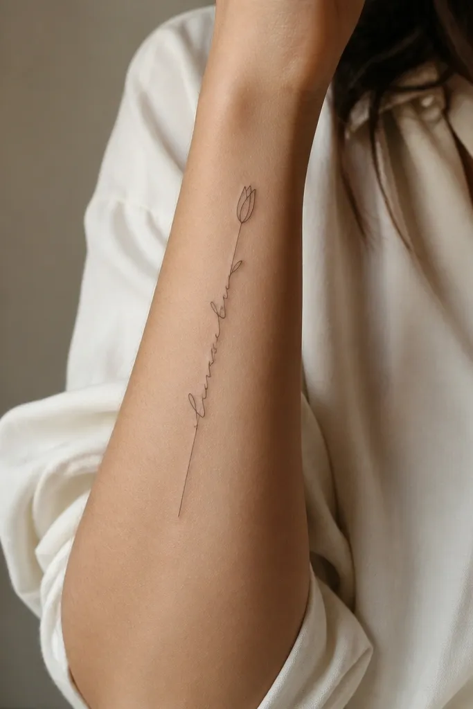
A single bud outline gives a softer mood than hearts or stars, and it still stays fine line friendly. The bud also balances the name so it doesn't feel like floating text. I like buds because their lines can stay thin without needing fill. The contrast is mostly about negative space and clean outlines.
Place it on the outer forearm or inner forearm, vertical layout. Keep the bud about 6-10mm tall and let it sit near the first letter without touching the name. Size the name so the bud doesn't dominate - the name should read first.
Pro tipChoose a bud outline with 3-4 clear petals lines, not a busy sketch style.
AvoidAvoid adding leaves or extra stems if you want the name to stay the main focus.
9. Calf Name with Double Hairline Divider Lines
Divider lines make the name look like it belongs in a design system. On the calf, where your skin has texture and light changes, clean dividers keep the tattoo readable. Double lines also add a sense of depth without shading. This is one of the layouts I'd pick again for longer names because it holds alignment.
Place it on the outer calf, not the shin. Keep the dividers about 3-4mm away from the name edges and align them to the tallest letters. Size the name so it sits comfortably within the dividers without touching. This looks best on a 6-9 inch vertical band.
Pro tipWear shorts or calf sleeves after healing to reduce sun fade, since calf tattoos get constant sun exposure.
AvoidAvoid dividers that curve with freehand - it makes the whole piece look hurried.
10. Wrist Name in Fine Print with a Single Micro Arrow
Wrist tattoos fade faster, so you need a layout that stays readable at a glance. Printed fine line letters plus one tiny arrow gives you a clear focal point even if some lines soften. The arrow also helps with directionality, so the name looks intentional rather than cramped. Keep everything thin and minimal - the wrist is already visually busy with tendons.
Place it across the top of the wrist, slightly angled so it follows the wrist curve. Keep letter height around 4mm and use a font with clear straight edges. The arrow should be about 6-8mm long and centered under the name's middle letters.
Pro tipUse a stencil that matches your wrist flex - if it looks good when your wrist is relaxed, it will look best after healing too.
AvoidAvoid cursive on the wrist if your artist can't keep consistent line weight.
11. Hidden Name on the Collarbone with Tiny Dot Trail
Dot trails look like a breadcrumb path, and they help the name start cleanly. Collarbone skin changes a lot with movement, so fine line works best when the letters are simple and the spacing is consistent. The slight arch makes it look like it's part of your anatomy, not sitting on top. Black dots and thin letters stay crisp when the design stays small.
Place it just below the collarbone ridge, where you can cover it with a shirt if you want. Keep the name length under 3 inches and letter height around 4-5mm. The dot trail should run only about 8-12mm total, with equal spacing between dots.
Pro tipAsk for the dots to be stamped evenly, not hand-drawn - uneven dots make it look messy fast.
AvoidAvoid heavy underline strokes near the collarbone; they blur with movement.
12. Outer Upper Arm Name with Small Infinity Loop Accent
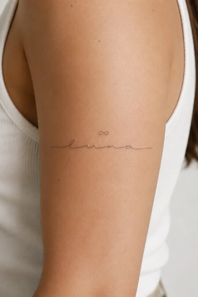
Infinity loops add meaning without turning into a giant symbol. Because the loop is above the name, it frames the text and keeps the letters from competing for attention. This is one of my favorite "name + one symbol" combos because it stays clean as it ages. The key is keeping the loop small and line weight consistent with the name.
Place it on the outer upper arm where your skin is flatter when your arm is down. Keep the infinity loop about 10-14mm wide and centered. Size the name so it spans roughly 55-70% of the upper arm width, with letter height around 6-7mm.
Pro tipChoose a loop shape that has even crossings - if the crossing is too thick, it ages into a blob.
AvoidAvoid filling the loop or adding extra curls around it.


