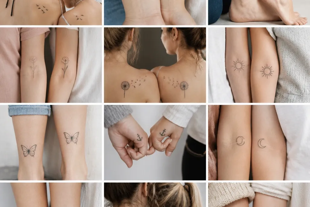
1. Tiny matching crescent moons
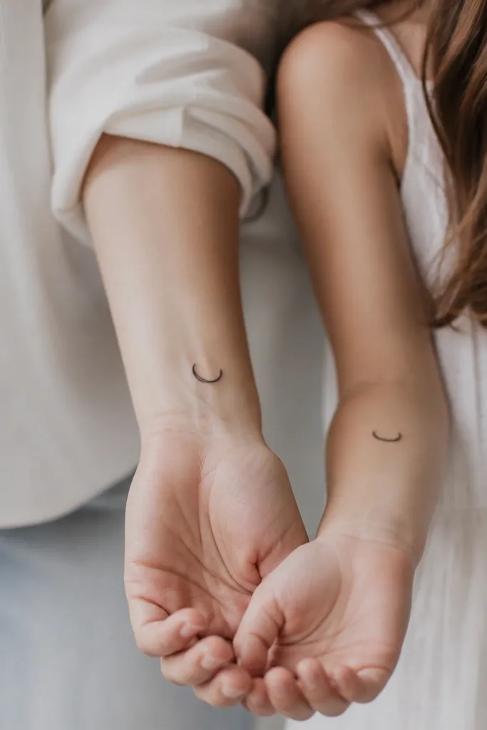
This works because a crescent moon reads instantly even when it softens. I like a single-weight outline with a tiny inner gap, so it doesn't turn into a full black circle as it heals. If you add one micro-star dot near the tips, both tattoos still feel coordinated without being identical.
Have the artist size each crescent to about 0.9 to 1.4 inches tall. Place them on the inner wrist, about 1 inch above the wrist crease, and keep the crescents angled the same way on both bodies. If one person has a shorter wrist, scale down proportionally rather than changing the shape.
Pro tipAsk for a 2-needle line pass on the outline and no gray wash so it stays crisp.
AvoidSkipping a consistent line weight between both pieces makes them look like two unrelated tattoos.
2. Birthstone dot gem duo
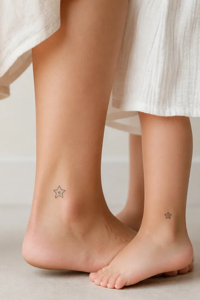
A gem outline stays readable, and the single colored dot gives you that "matching but personal" feel. I've used black-and-sterile-color dots (think small ruby-red or emerald-green) because they fade more predictably than full-color fills. The contrast between the black outline and one color dot keeps it cute even at arm's length.
Choose one gem shape for both, like a classic diamond or a simple teardrop. Keep the color dot no bigger than 2-3 mm so it doesn't blur. Put them on outer ankle or top-of-foot side where the skin is flatter for healing.
Pro tipPick a color that matches your skin tone undertone - cool pink-red on fair skin, deep green for warm undertones, and keep it as a dot only.
AvoidFull gem coloring or heavy shading inside a small outline turns into a muddy patch.
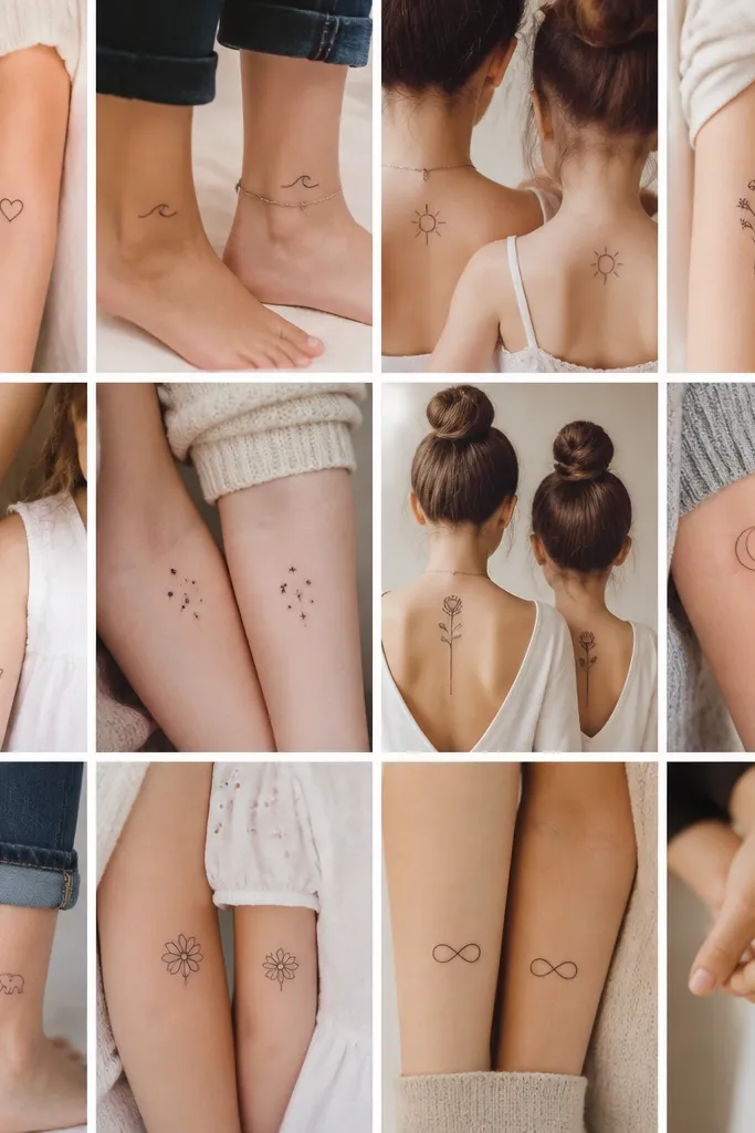
3. Simple matching wave lines
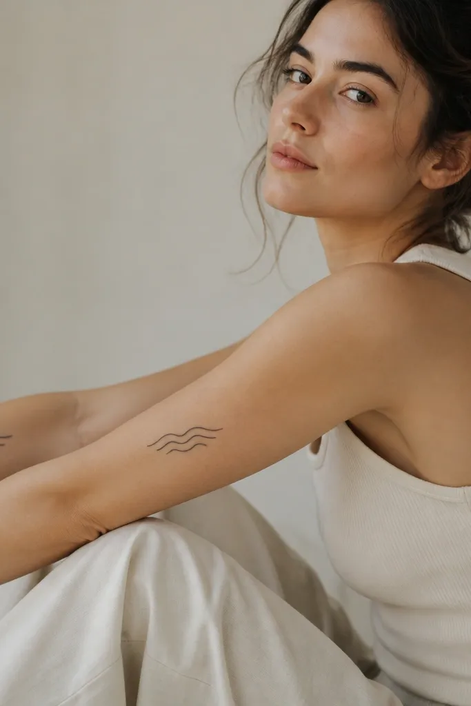
Waves look great because you can keep them minimal and still feel "alive." Thin lines heal better than thick bands, and the repeated curve gives the tattoo a clean rhythm. I like wave sets that are evenly spaced with consistent line weight, so both mom and daughter tattoos feel like the same designer made them.
Size each set to about 2.5 to 3 inches wide. Place on the outer forearm, roughly halfway between elbow and wrist, and align the wave direction so it "flows" toward the hand. If one person has more arm length, keep the wave set the same size and don't stretch it.
Pro tipAsk for the waves to be drawn with one smooth taper on each curve, not a stop-start line.
AvoidOvercrowding the waves with too many lines makes the pattern unreadable after fading.
4. Matching tiny key and keyhole
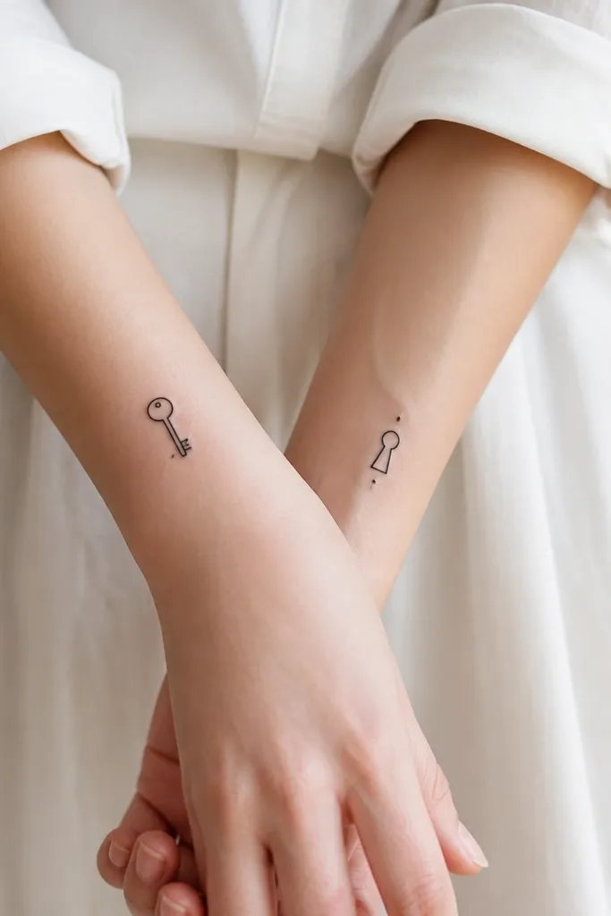
This is one of my favorite "simple matching" ideas because it creates a relationship without needing exact copies. The key and keyhole are easy for an artist to keep symmetrical in linework and still look coherent as the tattoos age. It also photographs well because both pieces are readable in profile.
Put the key on the inner wrist of the mom and the keyhole on the inner wrist of the daughter, or reverse if you prefer. Keep the key about 1.3 inches long and the keyhole about 0.9 inches tall. Use dot highlights sparingly - one or two dots max.
Pro tipTell the artist you want rounded ends on the key teeth so it doesn't look sharp or harsh.
AvoidUsing a detailed antique key design - too many tiny teeth - makes it blur fast.
5. Micro daisy pair with one shared stem
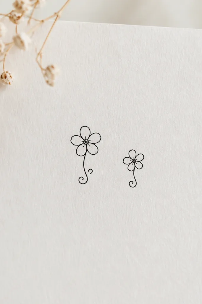
Daisies work because they're instantly recognizable even when the petal tips soften. The secret is keeping the petals consistent and avoiding heavy dot shading inside the flower. If both tattoos share the same stem curl shape, they match even if the flower sizes differ.
Place one on the outer upper arm near the shoulder cap and the other on the same spot on the daughter's upper arm. Aim for 1.8 to 2.6 inches total height. Keep the center as a small filled circle, not a detailed seed pattern.
Pro tipHave the artist leave tiny gaps between petals so the flower still reads as separate petals after healing.
AvoidDoing tiny stipple shading across the whole flower center - it turns gray and flat.
6. Matching triangle with single dot (constellation style)
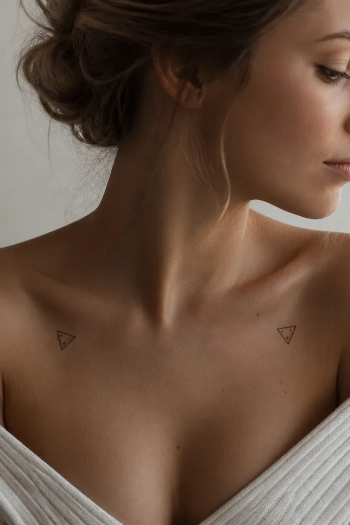
This looks modern and clean because it's geometric but still minimal. The single dot gives a "constellation" vibe without turning into a full star map that's hard to read. I've found geometric linework ages well when it stays thin and when you avoid thick black fills.
Keep the triangle size around 1 inch tall for wrists and up to 1.6 inches on collarbone. Place on the upper chest/collarbone area so it sits flat in photos. Match the triangle rotation on both bodies - one point up, same side left/right.
Pro tipAsk for a 0.25 mm line guide in the stencil phase so the triangle corners stay sharp.
AvoidThickening the triangle lines to make it "visible" - it will look heavy after it settles.
7. Matching tiny stars with one different accent
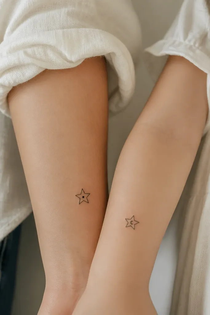
Stars are the easiest matching motif because they read from across a room. The trick is adding one small accent that differs - dot vs cutout - so you get individuality without losing the match. Keep the star outline thin and clean so it doesn't mushroom into a dark blob.
Place on the same side of the body: mom on the inner wrist, daughter on the inner wrist, or both on the outer ankle. Keep each star under 1.5 inches wide. Align the star orientation exactly the same way for both tattoos.
Pro tipUse dot highlights only - no gray shading blocks - for a crisp look after healing.
AvoidAdding multiple stars to fill space; simple looks better and heals more evenly.
8. Matching infinity loop with tiny leaf break
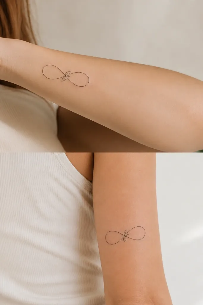
Infinity symbols are romantic, but the one reason I keep them "simple" is to avoid clutter. Adding a tiny leaf at the center crossing gives you a natural element that matches well between two different ages and body shapes. Thin linework keeps the infinity loop airy instead of heavy.
Size the infinity to 2.2 to 3 inches long. Place mom on the inner forearm and daughter on the outer upper arm so both are visible but not stretched over joints. Keep the leaf small - about 6-8 mm long - and centered at the crossing.
Pro tipAsk the artist to leave the inner gap of the infinity wide so it stays readable as ink settles.
AvoidOver-thickening the outline; it makes the crossing look like a single black knot.
9. Matching minimalist hearts with dotted halves
This is one of those designs that looks sweet without being cutesy. The dotted fill adds texture while keeping the heart from turning into a solid black blob. I also like the dotted half because it gives a subtle "handmade" feel that still looks consistent between mom and daughter.
Keep hearts around 1.1 to 1.7 inches tall. Place on upper ribs or side waist near the bra band so the design doesn't get stretched too much. Use dot density that's sparse - five to eight dots per half, not a full stipple field.
Pro tipTell your artist to use dots as accents, not to shade - you want negative space.
AvoidDense stippling across the whole heart; it heals darker and can blur into one shape.
10. Matching spoon and fork for family dinners
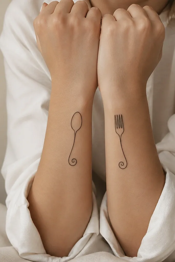
This is personal without needing names or dates. The spoon/fork pairing reads as "food and togetherness," and it stays cute even when it fades because the silhouettes are clear. I like clean single-line outlines with tiny rounded tips.
Place on inner wrist or top of forearm where the tools sit flat. Size each piece about 1.8 inches long. Keep the handles the same curl direction so the pair looks like a set, not two separate doodles.
Pro tipAsk for one tiny dot near the bowl of the spoon and one near the fork tines so both tattoos have the same "detail language."
AvoidAdding lots of engraving lines to the utensils; tiny etchings disappear quickly.
11. Matching small lotus outline with one petal gap
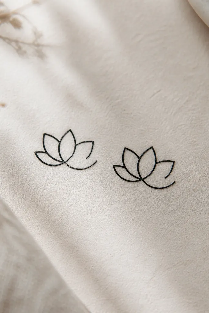
Lotus tattoos can get busy fast, but an outline-only lotus stays elegant and readable. The petal gap is a clever way to keep the design light while giving it a distinct look. Matching the same petal gap position makes the pair feel intentional even if one person scales it slightly.
Place on upper arm outer edge or shoulder blade. Keep size around 2 to 3 inches wide. Use an outline with minimal internal lines - no heavy shading under the petals.
Pro tipRequest smooth, rounded petal tips instead of sharp corners; it keeps the flower soft as it ages.
AvoidFull black lotus fill; it turns into a dark flower patch over time.
12. Matching tiny compass and small north dot
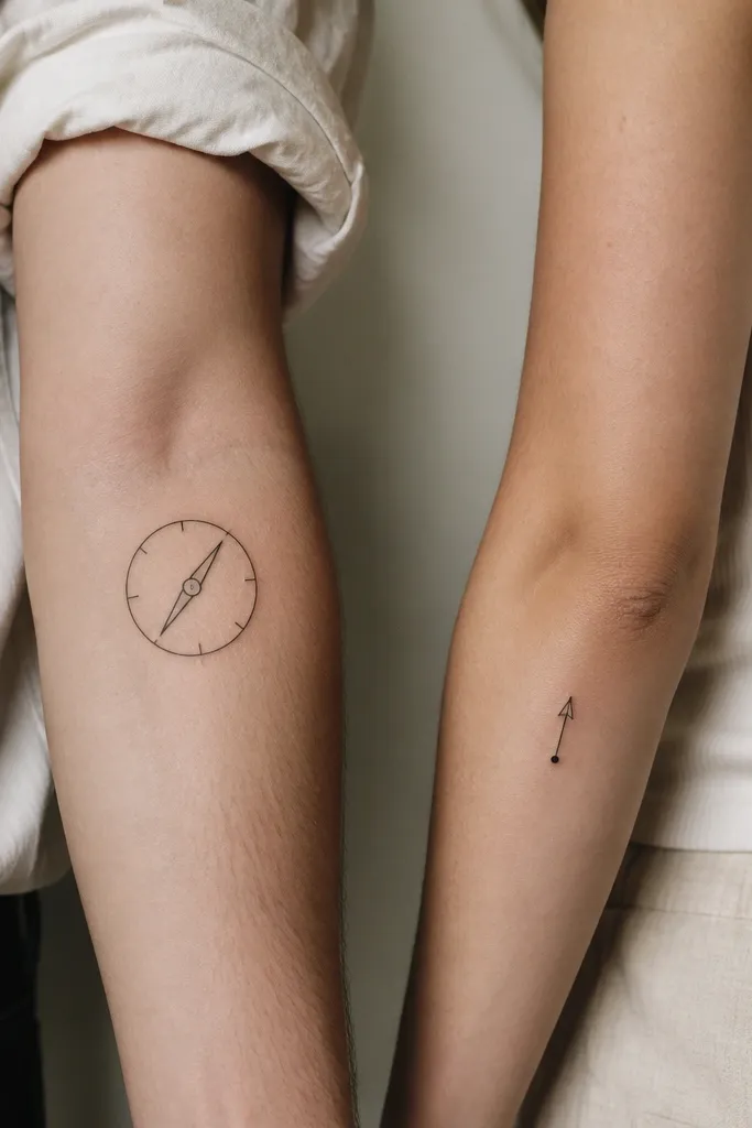
A compass is simple when you strip it down to one ring and one needle. The north dot keeps the second tattoo related without copying the whole compass. I've seen this pairing work well for families because it feels forward-looking but not sentimental in a cringe way.
Size the compass about 1.6 inches across. Put it on the outer forearm near the wrist end. For the north dot, keep it under 1 inch and place on inner wrist at the same height as the compass needle tip when both arms are relaxed.
Pro tipHave the needle point direction match the dot arrowhead so the pair reads as the same idea.
AvoidAdding long decorative flourishes around the compass ring; it clutters the design.


