
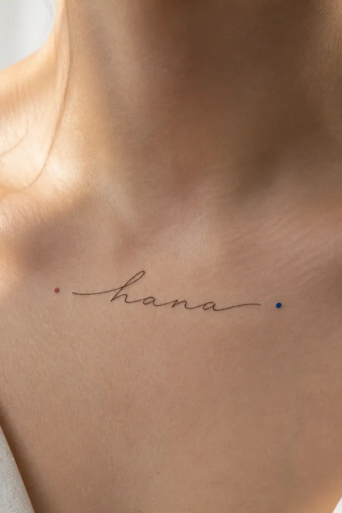
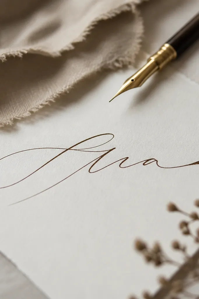
1. Sternum Micro Script With Tiny Date Thread
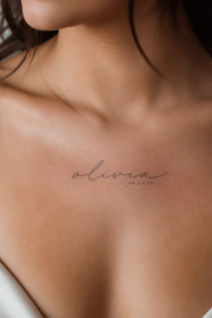
This is the look that reads classy because the name is the star and the meaning is quiet. The micro script should have consistent stroke weight so the thin parts don't fade into the skin. The tiny date adds a factual anchor, not a decorative overload. Dotwork around the date adds softness without turning the piece into a full pattern.
Keep the name width around 25-35 mm and the date around 10-14 mm tall. Place it in the center of the upper sternum, slightly above where your bra band hits. Ask for dotwork done in small clusters, not a heavy stipple - you want subtle sparkle, like fine pen marks.
Pro tipBring a screenshot of the exact script you love and ask the artist to trace one letter at full size before they ink the whole word.
AvoidAvoid a super-skinny signature font with lots of hairline flicks - it blurs fastest on the chest.
2. Left Chest Name With One-Line Heart Outline
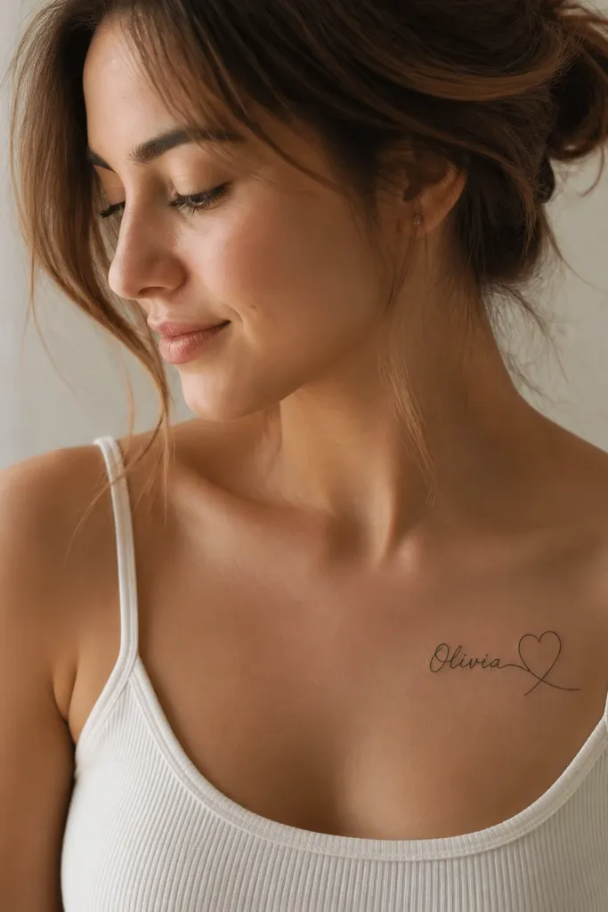
One-line heart shapes look classy because they're graphic, not sugary. The continuous line echoes the motion of cursive and keeps everything cohesive. The heart outline gives you meaning without adding clutter. If you keep the heart thin and the name readable, the whole thing heals crisp and stays elegant.
Use a name width around 30-45 mm. Place it slightly off-center toward the left, aligned with the inner curve of your breast tissue. The heart outline should be 5-8 mm tall beyond the top and bottom of the name, so it frames instead of crowds.
Pro tipAsk for the heart line to be 0.25-0.3 mm thickness so it doesn't compete with the script.
AvoidSkip chunky hearts or thick fill - they turn into a blob once your skin stretches.
3. Collarbone Name Arc in Fine Uppercase
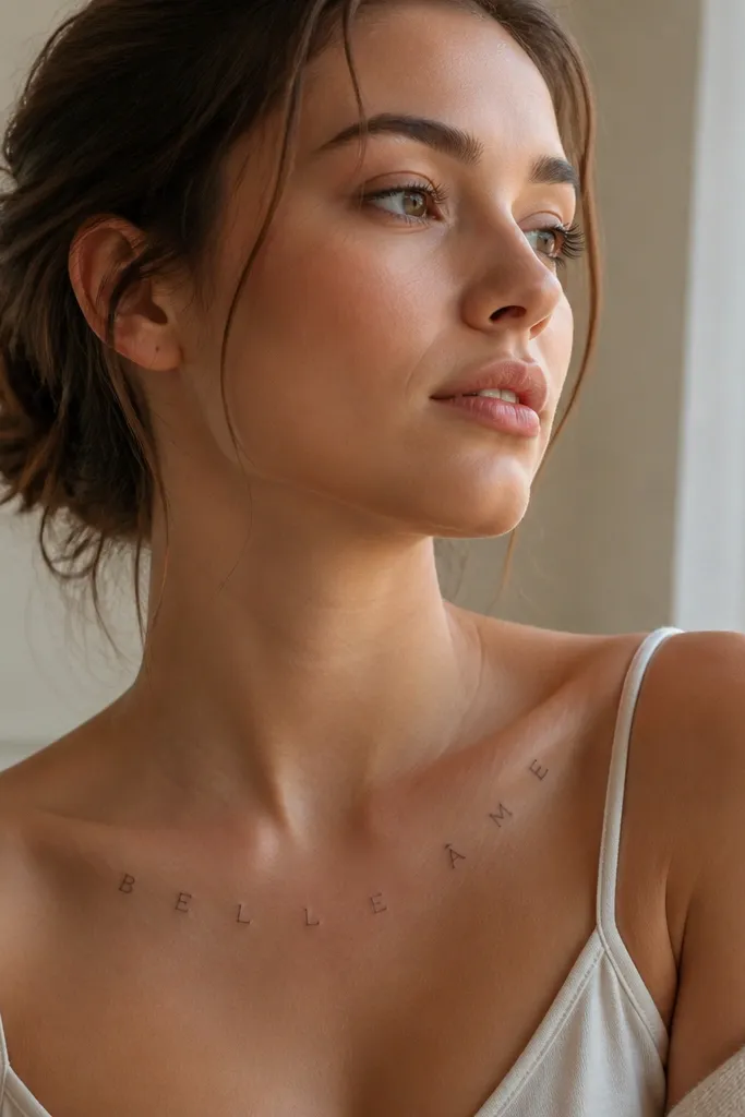
Uppercase letters on the collarbone look classy because they're structured and clean. An arc placement follows your natural collarbone curve, which makes the tattoo look intentional even in casual outfits. The meaning stays personal because it's just your name, no filler symbols. Fine line work here gives a delicate jewelry vibe.
Keep letters tall but not wide: about 8-12 mm for each letter, depending on word length. Place it along the collarbone with the arc centered at the mid-clavicle. If you're planning a bra strap situation, angle the arc so it doesn't get rubbed constantly.
Pro tipChoose a font with squared corners or clear serifs - they heal sharper than ultra-round letters.
AvoidAvoid centering the name too low - if it sits near the bra band, it gets irritated and fades.
4. Name With Minimal Ribbon Banner
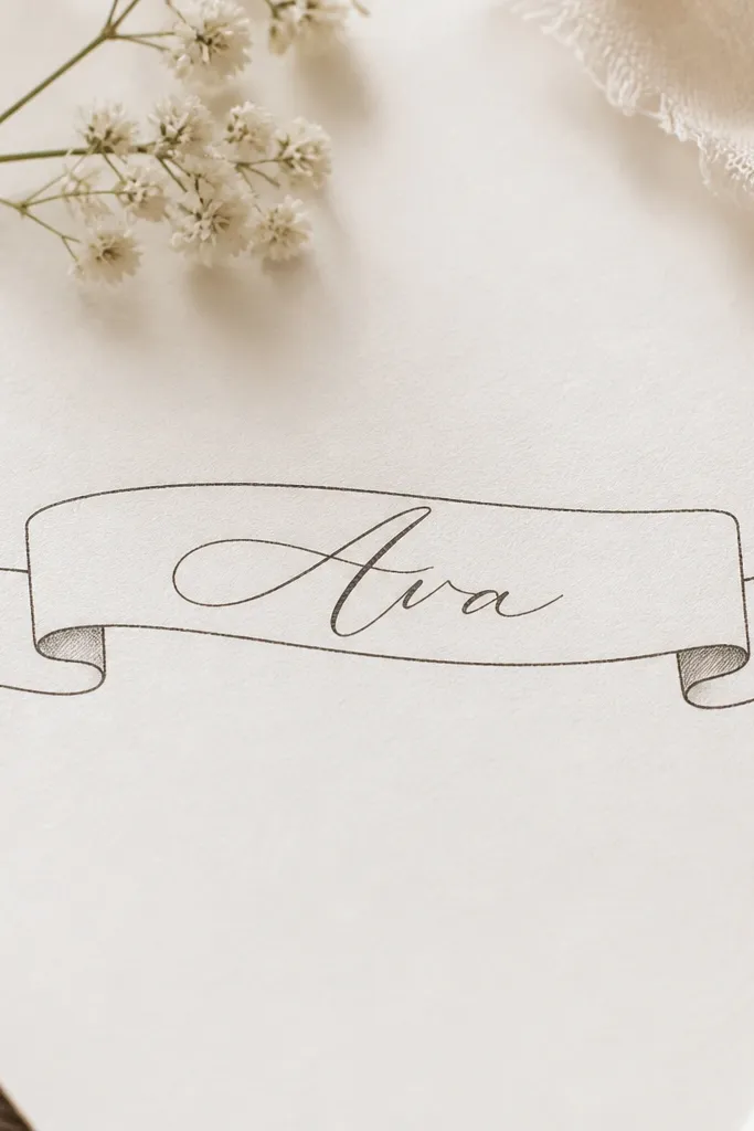
A ribbon banner adds meaning like a "kept promise" without looking like a cartoon. The key is to keep the ribbon mostly linework and only hint shading at the folds. That makes it classy and gives the name a frame. When the ribbon sits behind the lettering, your name stays readable first.
Work with a name length that fits around 35-55 mm wide. Place it on the upper chest near the sternum but slightly angled to match your cleavage line. The ribbon tails should end close to the outer edges of the name - if they extend farther, the piece feels bigger than it is.
Pro tipAsk for shading to be a light gray wash, not solid black, so the ribbon doesn't darken over time.
AvoidSkip heavy black ribbon fills - they swallow the name during healing.
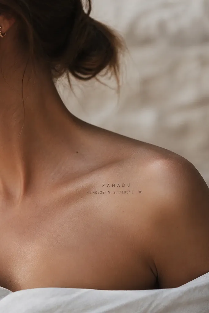
5. Name in Roman Serif With Tiny Coordinates
Roman serif reads classy because it has built-in structure. The tiny coordinates turn the name into a real place memory, like where you met, moved, or promised something. This is the kind of meaning that feels grounded instead of overly romantic. The clean layout keeps it sharp even after months of sun exposure.
Keep the name width around 45-60 mm and the coordinates about 12-18 mm tall. Place it slightly above the breast fold, centered or subtly tilted. Coordinate text needs strong line consistency - ask for crisp micro lettering so numbers don't blur.
Pro tipUse a font sample that clearly shows the difference between 1 and l (ones and lowercase L).
AvoidAvoid coordinates with too many digits in tiny size - illegible numbers look messy.
6. Name With Two Matching Birthstones Dots
Color can look classy on a chest tattoo when it's restrained. Two small colored dots act like jewelry stones and give meaning without turning the piece into a rainbow. I've seen this style heal well when the color is applied as tiny controlled pops, not large filled shapes. The name stays the main readable element.
Choose a name width around 30-45 mm. Place it just off the centerline so the stones feel balanced. Ask for the dots about 2-3 mm each, and pick colors that match your skin tone - warmer reds/amber shades for cool undertones look different than for warm undertones.
Pro tipBring a color reference from the artist's healed work, not a fresh-ink photo.
AvoidAvoid big filled color shapes - chest skin stretches and color can muddy.
7. Vertical Name With Side Micro Feathers
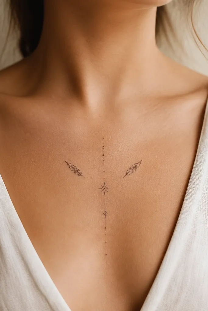
Feather linework looks classy because it stays airy. The trick is to keep the feathers micro and symmetrical so they don't overpower the letters. A vertical script also looks longer and more graceful on the chest. It reads like a personal talisman, not a generic "love" tattoo.
Place the name vertically between collarbone and upper sternum. Keep the name height around 55-75 mm and the feathers around 12-18 mm each. Ask for feathers drawn with single clean lines, no heavy black fill.
Pro tipIf you have a strong cleavage line, angle the vertical name slightly toward the center so it doesn't drift visually when you stand.
AvoidSkip thick feather shading - it turns the whole piece into a dark patch.
8. Name Hidden in a Tiny Sunburst Frame
A tiny sunburst looks classy because it's graphic and limited. The rays create movement and light without needing heavy shading. The name stays centered and readable, and the sunburst adds meaning like "I chose myself" or "new chapter." Fine linework keeps the rays from turning into a spiky blob.
Use a small sunburst diameter around 45-60 mm. Place the name in the center, sized to about 25-35 mm wide. Position it on the upper chest where it won't get rubbed constantly by straps or tight bras.
Pro tipAsk the artist to do a quick stencil test with your bra on - strap placement changes how the sunburst sits.
AvoidAvoid long rays that extend beyond the name - they blur with healing and friction.
9. Name With Tiny Infinity Loop Under the Word
Infinity loops are a clean way to express continuity without adding clutter. When the infinity is small and thin, it looks like a subtle signature detail. The name stays the focus, and the infinity adds meaning that feels intentional rather than generic. This style also heals well because there's less dense ink.
Place the name horizontally across the upper chest with the infinity under the center. Keep infinity size around 12-18 mm across. Ask for the loop line thickness to match the name strokes so it looks like part of the same design.
Pro tipChoose a script where the descenders don't collide with the infinity - spacing matters more than you'd think.
AvoidAvoid thick infinity symbols - they overpower the name and smear faster.
10. Name in Script With Micro Dagger Tip
This one looks classy because it uses one sharp detail for attitude while keeping the rest delicate. The micro dagger tip acts like an underline flourish and reads like strength. It works especially well for women who want meaning that's not "sweet" but still personal. The design stays minimal and crisp if the tip is small.
Keep the name about 35-50 mm long on the upper chest. Place it slightly off-center so the flourish points toward your shoulder. Ask for the dagger tip to be linework only, no fill - filled points can heal thick and heavy.
Pro tipStencil it with your neckline style in mind - a low scoop shows the flourish best, but a high crew neck hides it.
AvoidSkip big gothic flourishes - they can look like a costume font.
11. Name With Thin Wreath Outline
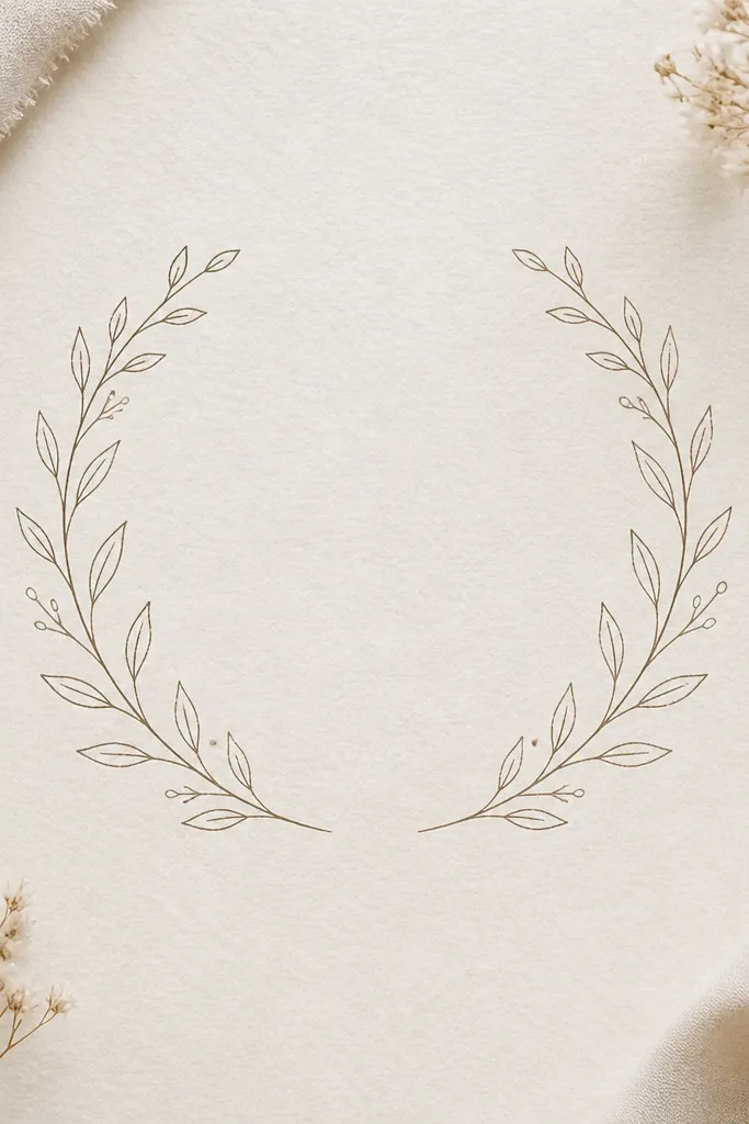
A wreath outline looks classy because it frames the name like a medal. The meaning can be "earned," "protected," or "kept close." Thin leaf branches keep the piece light, and the negative space prevents the tattoo from turning into a dark circle. This works well if you want something more symbolic than just lettering.
Use a wreath diameter around 55-70 mm with the name sized to about 30-45 mm wide. Place it on the upper chest near the sternum so it sits evenly when you stand. Ask for the leaf lines to be consistent thickness and spacing.
Pro tipChoose leaf shapes that match your preferred meaning - small laurel-style leaves read "achievement," olive-style leaves read "peace."
AvoidAvoid thick wreath fills - circles of solid black age badly on moving skin.
12. Name With Coordinates and a Single Star Dot
This style is classy because it's strict and minimal: one name, one factual line, one star. The star dot gives a cosmic meaning without turning into a whole sky scene. It also helps balance the layout on the chest so it doesn't look top-heavy. Fine uppercase keeps it readable.
Keep the name width around 40-55 mm. Coordinates should be tiny but legible at arm's length - about 8-10 mm tall. Place it on the center upper chest, slightly above the sternum line where it won't get stretched by bras.
Pro tipAsk for the star dot to be 2-3 mm and placed with equal visual weight to the coordinates.
AvoidSkip multiple stars - a cluster starts looking like a random pattern.


