1. Inner Forearm Signature Script with Micro-Underlines
This style works because signature script gives you natural rhythm, and micro-underlines add structure without thickening the whole tattoo. The thin-to-thin contrast makes the name look light on skin, especially if your downstrokes are slightly darker than the upstrokes. The underlines act like anchors, so the letters don't drift when your forearm flexes.
Place it from about two finger-widths below the inner elbow crease down toward the wrist crease, leaving a gap at the wrist so it doesn't feel cramped. Keep the underlines short - around 2-4 mm - and taper them so the last third is lighter. Black ink only looks best here; color makes the script look busier.
Pro tipTell your artist you want the underline pattern to follow the baseline, not float under random letters.
AvoidAvoid heavy black shading behind the letters - it turns a signature into a block.
2. Roman Numeral Date + Name in Soft Serif
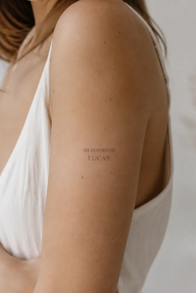
Roman numerals give you crisp structure, and a soft serif name keeps it feminine without getting too flowy. The contrast between straight numerals and slightly curved serif terminals makes the whole piece read fast. It's also easy to customize - you can use the same font style for different names and still keep the layout balanced.
Put Roman numerals on the upper outer arm, about palm-sized from the bicep toward the deltoid. Then center the name underneath, keeping the name width about 70% of the numeral width. Ask for thin serifs (no thick slabs) so the tattoo stays airy even on a larger arm area.
Pro tipIf your name has more than 9 letters, reduce the letter spacing by a hair so it doesn't spread wider than the numerals.
AvoidSkip extra flourishes if your name already has long curves - too many decorative elements make it look crowded.
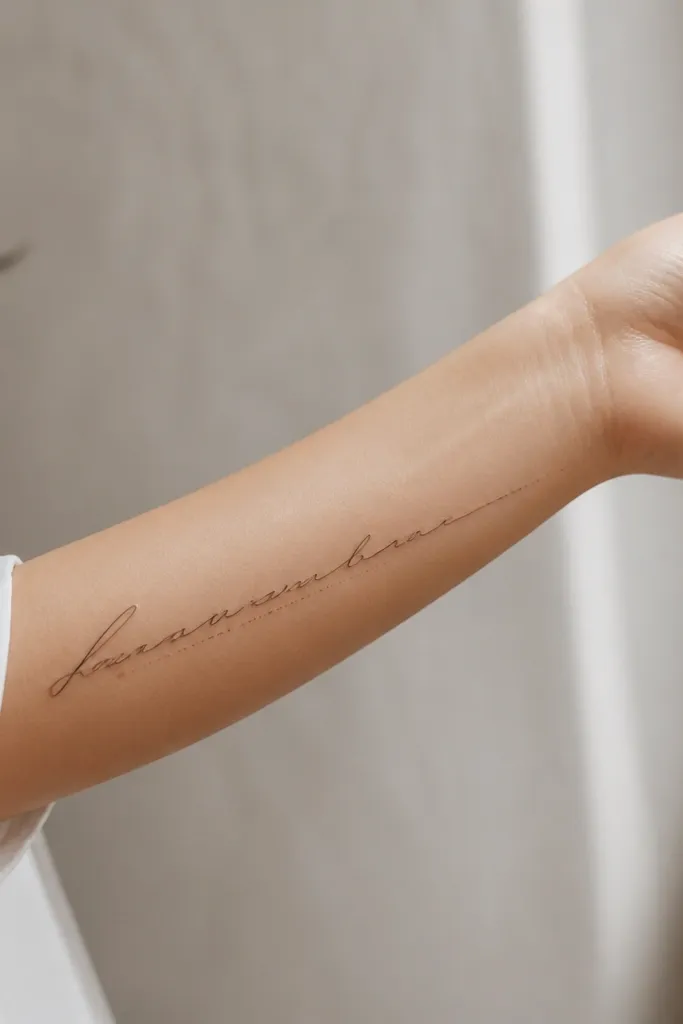
3. One-Line Continuous Name Across the Forearm
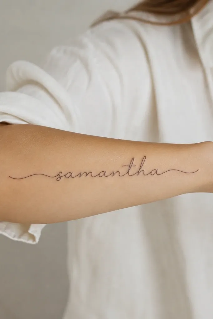
A continuous one-line name looks modern because it has a clean flow and no "start-stop" breaks. The consistent line thickness also hides minor skin texture changes over time. This style is great when you want the tattoo to look intentional even if it's partially covered by long sleeves.
Keep it on the outer forearm or inner forearm depending on your preference, but align the line to run with the forearm length. The line should be about the thickness of a fine pen - think 1.0 to 1.5 mm. Your artist will need to simplify letter shapes so they can connect smoothly; pick letterforms that naturally link.
Pro tipChoose a name spelling where letters like e, a, and r can connect without awkward hooks.
AvoidDon't pick a script font that looks connectable in a font preview - many won't actually connect cleanly on skin.
4. Thin Script Name with Tiny Star at the First Vowel
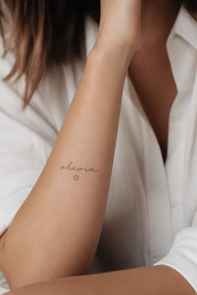
That tiny star is small, but it changes the whole read. It gives your eye a focal point, and because it's placed under a vowel, it looks like it belongs to the word structure. The thin script keeps it delicate; the star adds a touch of personality without turning it into a theme tattoo.
Place the star about 1-2 mm below the vowel's stem and keep it the same thickness as the script's thinnest strokes. Keep the star size small - around 2 to 3 mm wide - so it doesn't look like an afterthought. This works best for names with 3-8 letters because the tattoo stays balanced.
Pro tipAsk your artist to pencil the star placement in the stencil while you flex your wrist - you want it to stay aligned when the skin moves.
AvoidAvoid big stars or multiple sparkles - one small anchor looks expensive.
5. Watercolor Wash Background Behind a Black Name
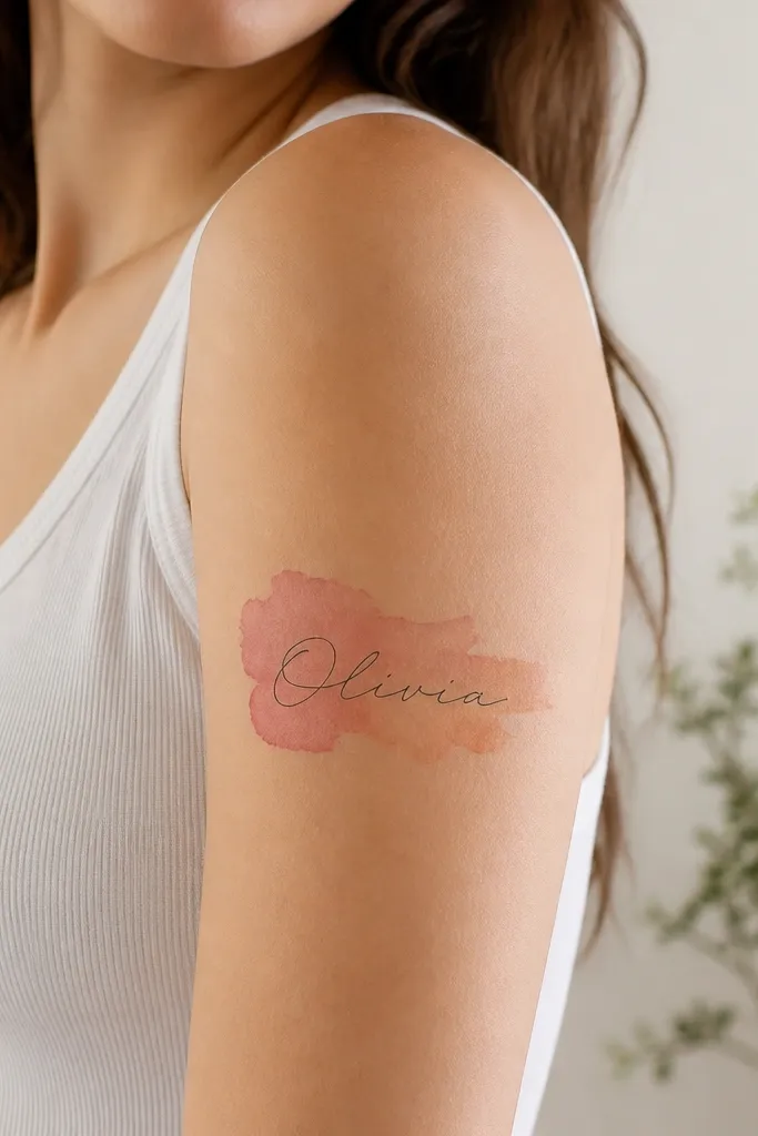
Watercolor doesn't have to mean messy. A controlled wash behind a crisp black name gives you depth while keeping the letters readable. Dusty rose to peach fades nicely on warm skin tones, and the black script acts like a frame so the tattoo doesn't blur into abstract art.
Use a "halo" wash - start behind the middle of the name and fade outward, leaving the letters themselves clean. Keep the wash light enough that the black name stays the first thing you notice. Place it on the outer upper arm or bicep area where you have room for the fade.
Pro tipBring a reference photo with the exact color vibe you want - peachy pink vs magenta looks very different once it's in skin.
AvoidSkip full watercolor splashes behind the whole name - they blur the letters after healing.
6. Knot-Style Ampersand with Name in Italic Script
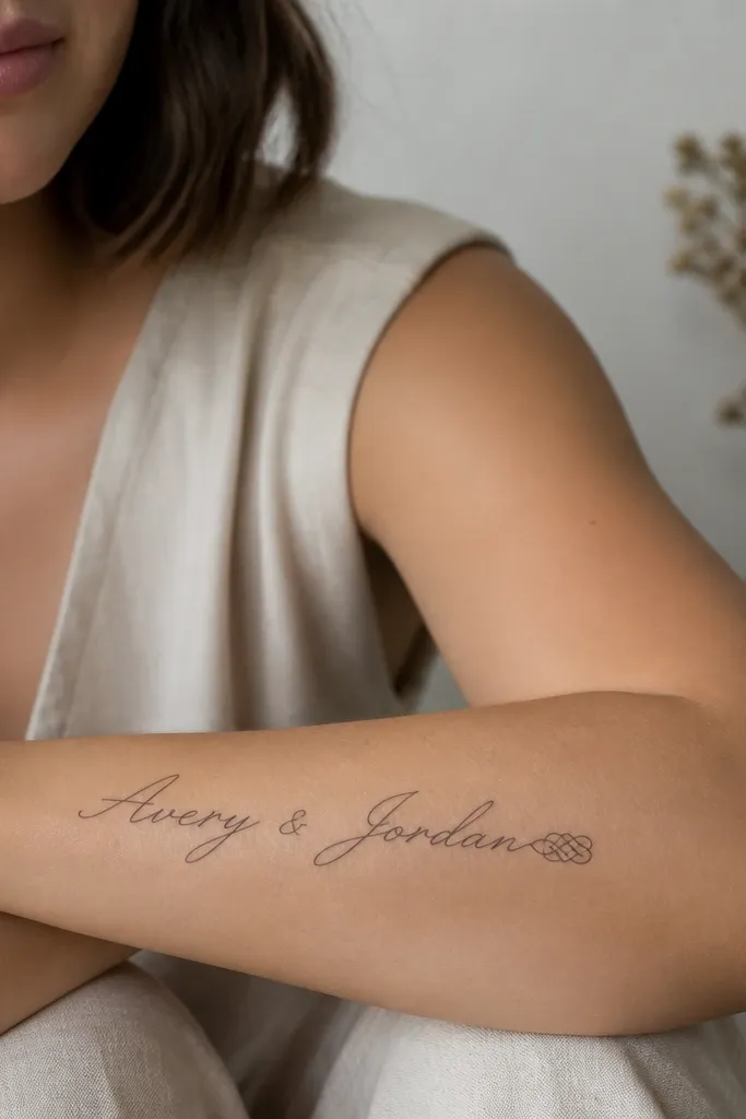
A braided ampersand gives motion and a handmade feel, while italic script keeps the name feminine and legible. This style works even if your name is short because the ampersand adds length and visual weight at the end. The knot detail also photographs well because it has texture contrast.
Place it on the outer forearm so the italic slant follows the curve of your arm. Keep the ampersand knot about 1/3 the length of the full name so it doesn't overpower it. Ask for clean negative space inside the knot lines - that's what makes it look like a braid, not scribbles.
Pro tipIf your name ends with a vowel, place the ampersand knot slightly under the last letter so it balances the shape.
AvoidAvoid thickening the knot lines - it kills the braided illusion.
7. Nameplate Block Letters with Thin Border Line
Block letters look clean on arms when you keep them scaled to the skin and avoid heavy shadow. The thin border line gives you a "label" effect, like a name tag, but with tattoo permanence. It's a good choice if you want your name to look sharp in photos and from a distance.
Keep the letters tall and narrow rather than wide. The border should sit about 3-5 mm away from the outer edges of the letters. Place it on the inner upper arm where the skin is smoother and less creased than the forearm.
Pro tipAsk for a slight letter spacing increase at the center letters so the whole word reads evenly.
AvoidDon't add drop shadows - they age faster and can turn muddy.
8. Calligraphy Loop Name with One Long Descender

Calligraphy loops make names feel personal, but the trick is controlling one "hero" element. A single long descender gives you vertical drama and makes the tattoo look designed for your body instead of copied from a font. The rest stays balanced so it doesn't turn into a tangle.
Choose the letter that will carry the long descender - usually g, y, or p - based on your spelling. Keep the descender about 25-35% longer than the other letters. Place it so the descender ends near a natural crease, usually the wrist crease, without crossing it.
Pro tipTell your artist you want loops to be thin and consistent, not thickened at curves.
AvoidAvoid multiple long descenders on one name - it looks busy and hard to read after healing.
9. Blackwork Micro Name with Negative Space Heart Dot
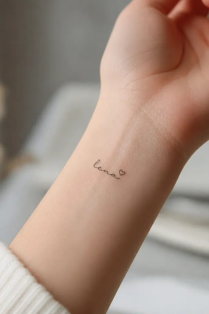
Micro blackwork looks gorgeous when it's crisp and minimal. The negative space heart dot adds sweetness without adding ink coverage, so it heals clean and stays sharp. Because the tattoo is small, it stays readable even when your skin changes slightly.
Place it on the inner wrist, but avoid going too close to the bony ridge. Keep the name height small - about 8-12 mm tall for the tallest letters. The heart dot should be about 2-3 mm, carved in negative space so it stays crisp.
Pro tipAsk for a slightly stronger line weight on the initial letter only - it helps the tattoo survive the wrist's frequent friction.
AvoidDon't pick a super thin line for a wrist tattoo - it fades faster where sleeves rub.
10. Script Name with Geometric Side Arrow
A geometric arrow makes the script feel directional, like it's pointing to the meaning of the name. Straight edges contrast the curves, so the tattoo looks intentional instead of purely decorative. It also gives you a way to "finish" the end of a script without heavy flourishes.
Put the arrow beside the last third of the name, not at the very end. Keep the arrow size subtle - roughly the height of one letter. Ask for sharp corners and clean fill; no gray shading behind it.
Pro tipIf your name ends with a letter that already has a flourish, shorten the arrow so it doesn't compete.
AvoidSkip thick arrow fills - bold blocks can overpower a delicate script.
11. Double-Stack Name with Small Decorative Dots
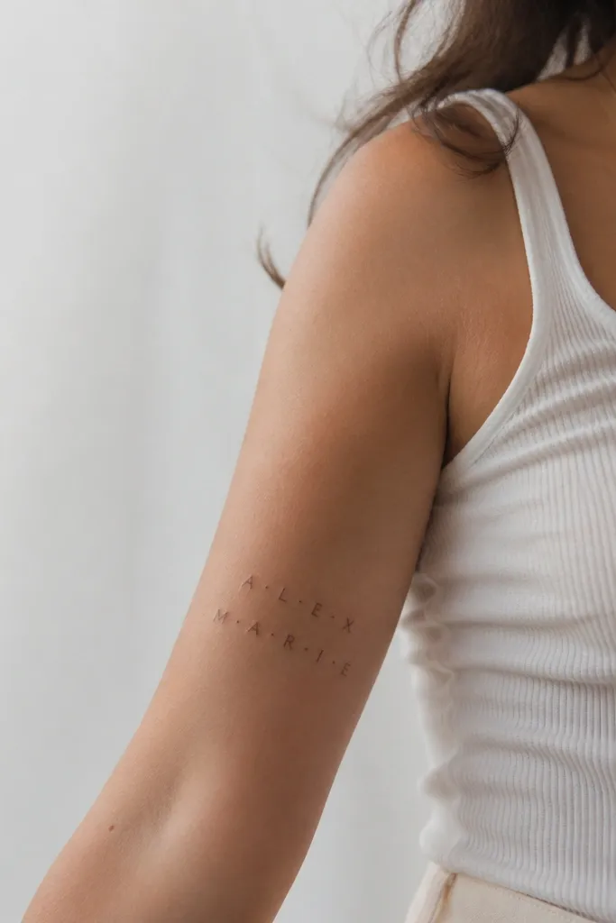
Double-stacking is the best fix when your name is too long for one line. Dots give structure and keep the gaps even so the letters don't squish. This layout also looks good on the upper arm where you have width but want a tidy rectangle shape.
Use two lines only if the name has natural break points - like splitting by syllables. Keep each line centered and match the letter size across both lines. Dot separators should be consistent spacing, usually about the width of one letter stroke.
Pro tipBring your artist the exact spacing you want by marking it on paper first; it prevents "artist interpretation" that can shift the look.
AvoidAvoid uneven line height - it makes the tattoo look like it drifted.
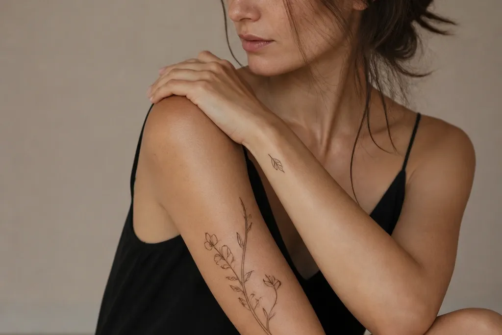
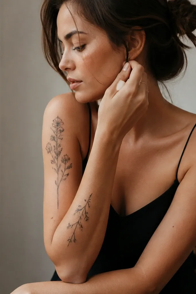
12. Name in Serif with Tiny Leaf at the Start
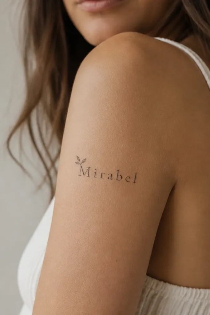
A tiny leaf at the start gives you a soft botanical accent without turning the tattoo into a full nature piece. Serif letters keep it classic and readable, and the leaf adds femininity in a controlled way. If you pick a leaf shape with clear negative space, it stays crisp as it heals.
Place the tattoo so the leaf sits near the outer edge of the upper arm, giving it room to breathe. Keep the leaf about the size of the first letter's height. Ask for no shading under the leaf veins - just clean linework.
Pro tipChoose a leaf sprout that points inward toward the name so it feels like it grows from the word.
AvoidSkip multiple leaves - one accent looks intentional, several look like a sticker.


