1. Micro Script "Stay Soft" with a Thin Underline
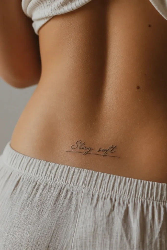
This layout works because the underline gives the eye a stable track while the script does the romantic part. Keep the words stacked on one line and avoid tall swashes; swashes look pretty at first and then they spread into fuzzy tails. I like a clean gray-black ink with a consistent stroke so the letters stay legible as the skin moves.
Place it just above the waistband crease, centered over the sacrum dip. Target about 2.5-3.5 inches wide for the phrase, with letter height around 0.18-0.25 inches. Ask the artist for a script that has no dramatic loops on the first and last letters.
Pro tipIf you want extra clarity, add one tiny dot at each end of the underline so the ends read even when the skin stretches.
AvoidAvoid adding thick shading behind the text; it makes small letters look muddy.
2. All-Uppercase "GOOD VIBES" in Condensed Lettering
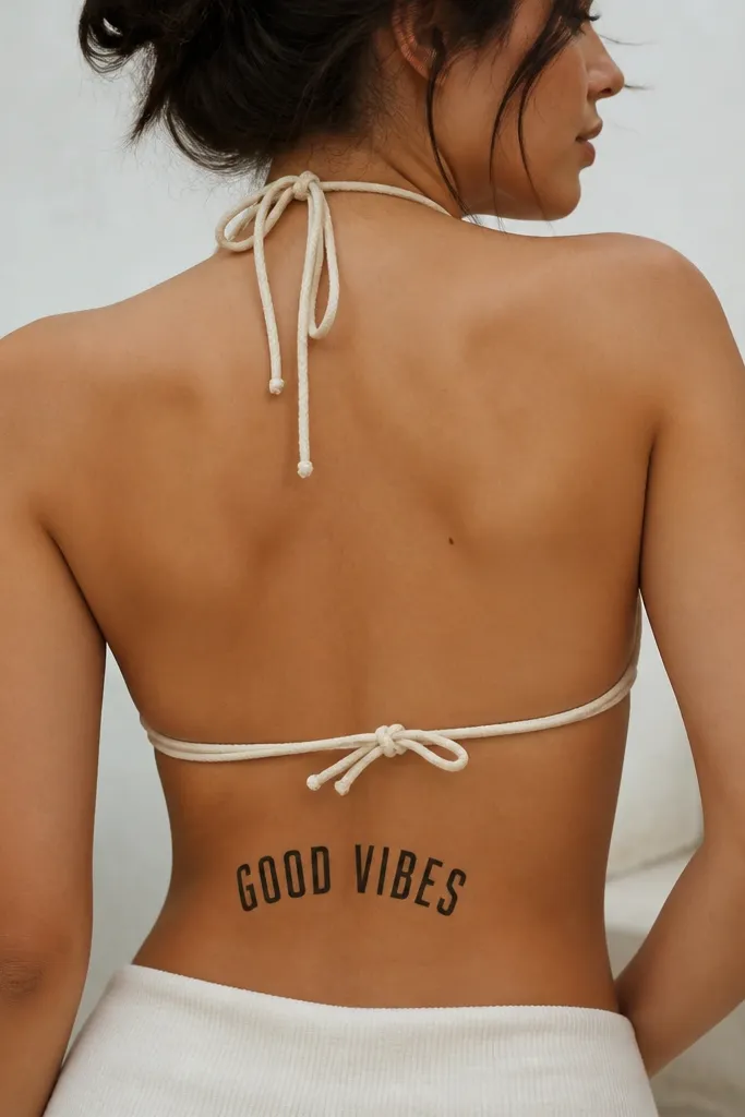
Uppercase condensed words are my go-to when someone wants words that stay readable. Straight strokes survive aging better than delicate script because there's less tapering and fewer thin ends. The slight arch keeps it flattering and prevents the text from looking like it's floating.
Center it where your lower back naturally curves, not too close to the spine. Keep it to 2 inches tall max, with letter spacing tight but not touching. A condensed font with uniform stroke weight is the key - ask for no hairline strokes.
Pro tipAdd a tiny dot between the words (like a small black comma) if you want the phrase to look balanced in photos.
AvoidSkip wide spacing; it makes the phrase look like it's falling apart.
3. Hand-Lettered "Wild & Free" with a Dot-Row Divider
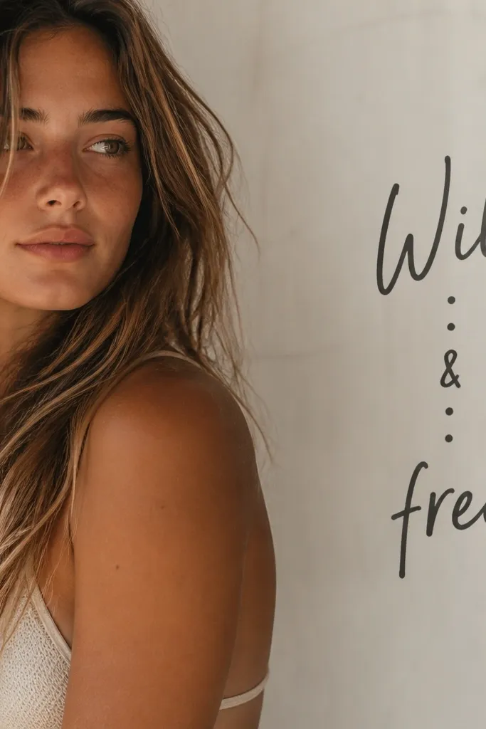
The dot divider acts like a visual pause, so your brain reads the words as a pair even in motion. Hand-lettering can work in a small space if the letters are compact and the ampersand is not oversized. I like dot-work dividers because they add structure without crowding.
Put it slightly off-center toward the side you naturally lean on while standing - it looks more natural and less "sticker-like." Keep total width under 3 inches. Use five dots, each about the size of a small period in a printed font.
Pro tipIf the artist offers to "bold" the ampersand, say yes only if it stays the same stroke weight as the letters.
AvoidDon't use a big decorative ampersand; it steals space from the rest of the phrase.
4. Minimal Roman Numerals + Tiny Word Date
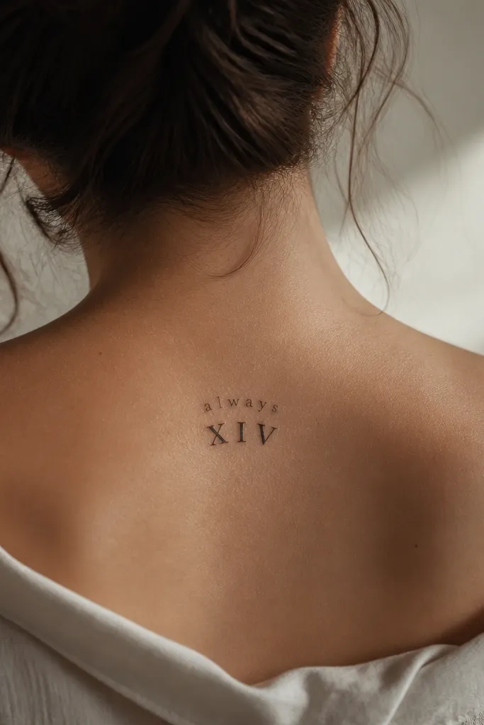
If you want words but you also want it to age clean, pair the word with a simple anchor like numerals. The numerals give the tattoo a "center of gravity," while the tiny word stays light and readable. This also helps when your phrase is short - like one word or two.
Place the numerals in the center of the lower-back curve and keep the word above it by about 0.4 inches. Aim for 1.2-1.8 inches total height. Ask for numerals in a bold serif style with short serifs so they don't blur.
Pro tipUse the same ink tone for both elements, then let thickness differences come from line weight only.
AvoidAvoid overly thin numerals; they fade into gray ghosts.
5. Script "My Favorite Place" with a Micro Heart Above
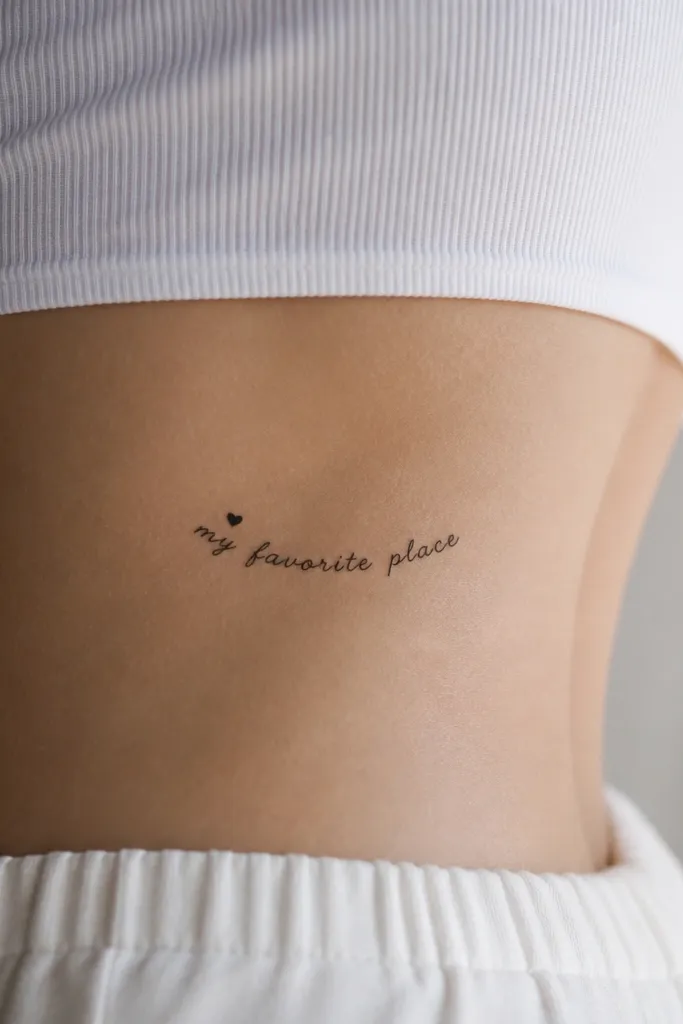
A micro heart gives the phrase a clear starting point, which helps readability in a small space. Solid heart fills hold up better than outline-only hearts if you want it to stay visible years later. The phrase stays delicate, but the heart keeps it from disappearing.
Keep the heart about the size of a pencil eraser head in real life - small, not cute-large. Place it 0.2-0.3 inches above the first word and keep the phrase width around 2.5 inches. Choose a script with tight loops and no long trailing tails.
Pro tipIf you wear low-back outfits, ask for the heart to sit slightly higher so it peeks when your back is bare.
AvoidDon't add heart shading or sparkle dots; it makes the tattoo look busy.
6. Two-Line "BREATHE / AGAIN" with a Center Dot
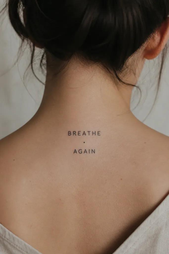
Two-line layouts are perfect when the phrase is short and you want it to stay readable without stretching wide. The center dot stops the eye from sliding and makes the spacing look intentional. Sans-serif uppercase keeps the letters crisp even as skin moves.
Place it slightly lower than you'd think - just above where a thong waistband sits, but not so low it gets hidden constantly. Keep line height around 0.22-0.3 inches, with the gap between lines about 0.12-0.18 inches. The dot should be small and solid, not hollow.
Pro tipIf you want it to look extra clean, keep all letters the same width and avoid condensed fonts.
AvoidAvoid cursive for "BREATHE" and "AGAIN" if you want clear readability.
7. Tiny "NO MORE APOLOGIES" in Tight Gothic Blackletter
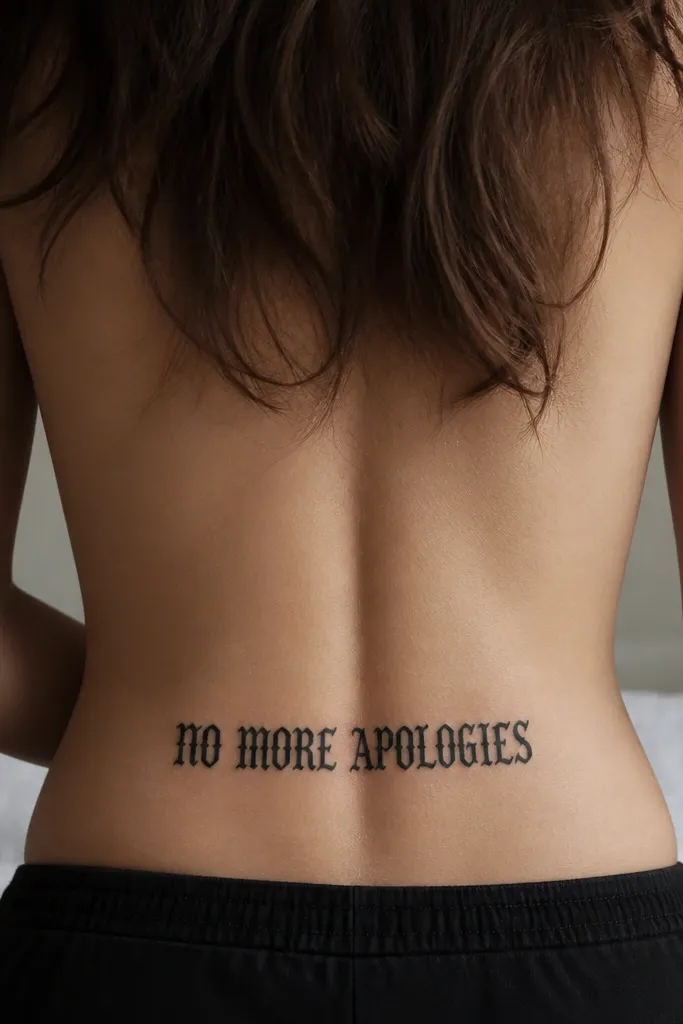
Blackletter sounds dramatic, but tight blackletter can look surprisingly elegant in a small space. The trick is keeping the strokes thick enough that they don't turn into gray fuzz. This works best when the phrase is short enough to stay under 3.5 inches wide.
Ask for the letters to be compact and tall, not stretched wide. Place it along the natural curve with the top of letters about 1 inch below your bra line. Use solid black ink and keep any decorative flourishes minimal.
Pro tipIf you want a softer look, ask the artist to slightly round the serifs instead of making them razor-point sharp.
AvoidAvoid long, spindly blackletter; it fades into a scribble.
8. Curved Underline "LOVE" with Side Micro Dots
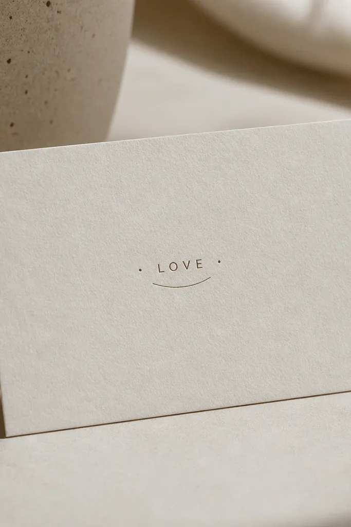
When your word is one to two words, framing matters. Side micro dots act like parentheses, so the word reads as a complete unit even if the skin shifts. A curved underline matches how the lower back naturally curves, so it looks placed, not drawn on.
Keep the word width under 1.8 inches if it's one word. Place the dots about 0.2 inches away from the outer letters. The underline should be thin and slightly arched, not a thick bar.
Pro tipTo keep it from looking too harsh, ask for the underline ends to taper by a tiny amount.
AvoidSkip thick lines; thick frames make small text look cramped.
9. Short Phrase "STAY LIT" in Bubble Script with No Outline
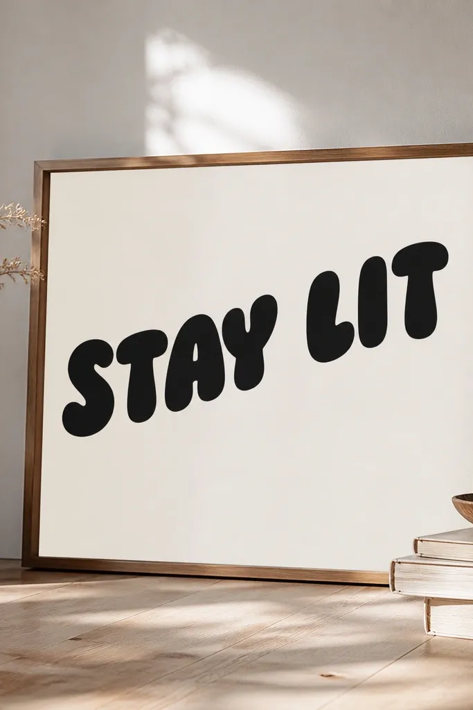
Bubble script works in small spaces because the letters have built-in thickness. Filled lettering holds contrast better than thin scripts, especially on skin that moves a lot. The slight upward angle adds attitude without needing extra graphics.
Keep it about 2.2-2.8 inches wide. Place it just off center so it looks more like a personal message than a centered label. Make sure the artist doesn't add decorative shadows or highlights - just clean filled letters.
Pro tipIf you want it to read even at a distance, ask for consistent letter heights and avoid overlapping strokes.
AvoidAvoid bubble script with a separate outline; it ages like a two-tone mess.
10. Tiny "xoxo" with a Small Bow Tie Accent
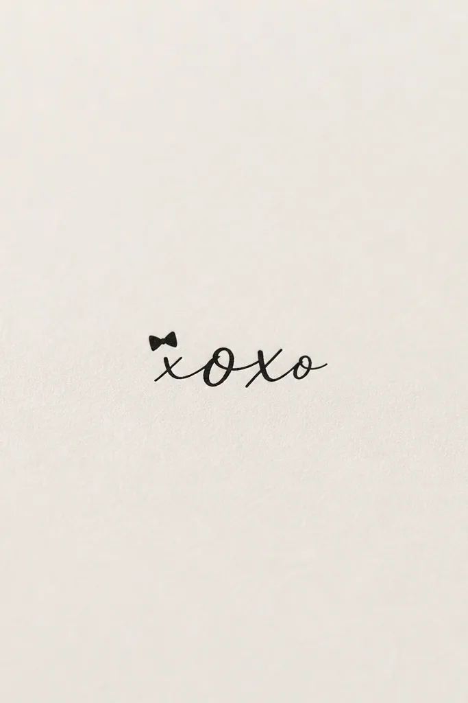
This one works because it's playful but still controlled. The bow tie gives the piece a focal point so the letters don't have to be big to be noticed. Keeping the accent small keeps it from turning into a full cartoon.
Place "xoxo" low on the back curve, with the bow tie just above it, separated by about 0.2-0.35 inches. Keep the letters tight and avoid looping tails. Solid black ink with crisp edges makes it look sharp after healing.
Pro tipAsk for the bow to be symmetrical and slightly flattened - bow tattoos that are too tall look awkward on the lower back.
AvoidAvoid adding tiny hearts everywhere; it makes the center text unreadable.
11. Vertical Word Stack "BE BRAVE" with Side Brackets
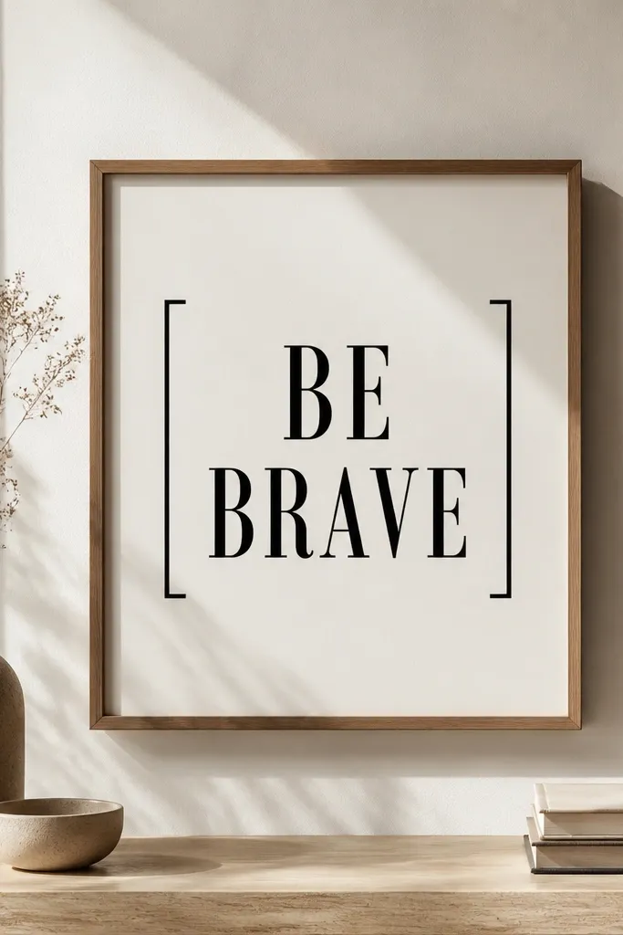
Vertical stacks fit small spaces better than horizontal phrases when you don't have much width. The side brackets keep the eye from wandering and make the tattoo look like it belongs on the body, not floating. Short serif details can look great if they're not too long.
Place it closer to the spine than you think - the vertical line frames the curve nicely. Keep total height around 2.5-3 inches. Brackets should be short and thick enough to stay visible, around the same stroke weight as the letters.
Pro tipIf you want a more feminine look, ask for slightly thinner serifs but keep overall stroke weight consistent.
AvoidAvoid long vertical strokes on brackets; they can stretch oddly when you sit.
12. Micro Cursive "Always" with a Single Star Dot
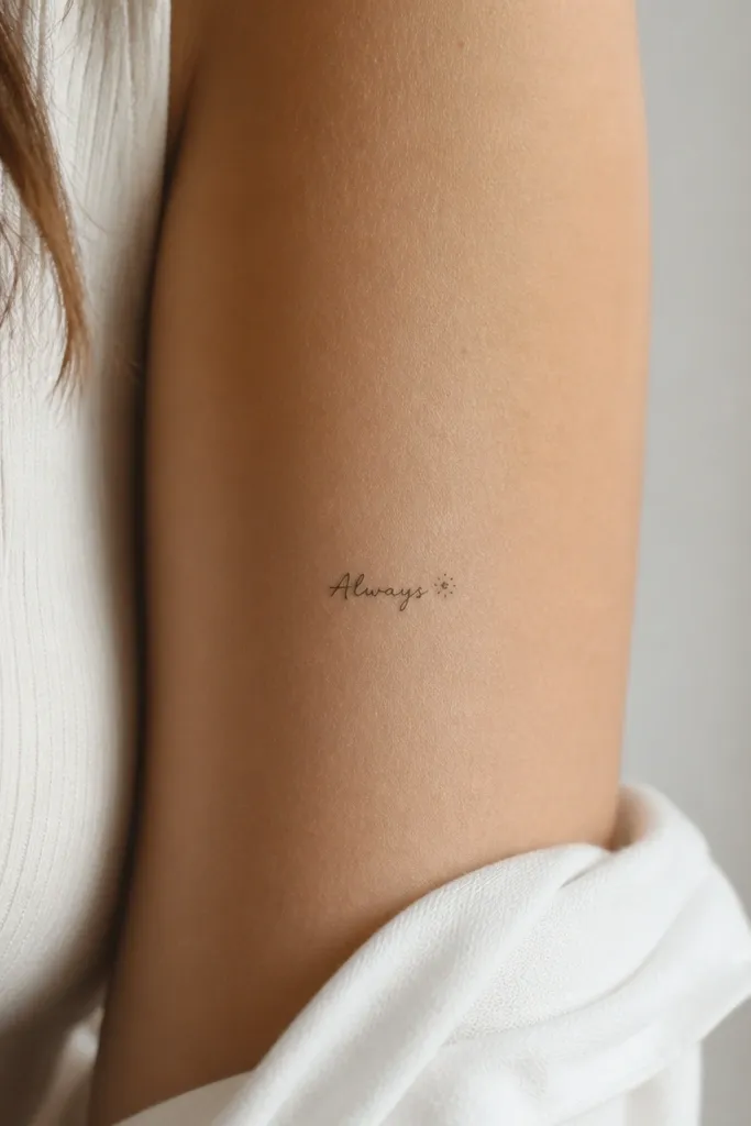
A single micro star dot is a clever trick for small word tattoos because it gives the tattoo an ending point. That ending point helps readability when the last letter is the hardest to see after healing. Dot-work accents also look clean because they don't create big flat areas.
Place the word so the baseline follows the curve; keep the last letter closer to the center than the first. Total width about 1.5-2 inches. Ask for the star points to be evenly sized, with no big empty center.
Pro tipIf you wear bikinis or low-rise bottoms, position the star slightly higher so it catches light first.
AvoidSkip multi-star clusters; they crowd the word and reduce clarity.