1. Crescent Moon + Tiny Stars
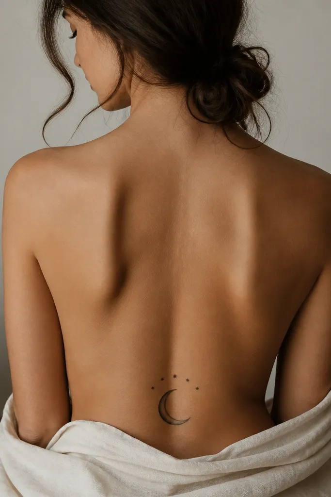
This one looks stunning because the crescent shape naturally hugs your body curve. Black ink stays bold on deeper skin tones, and the tiny stars act like "spark points" without needing lots of fine lines. The shading is simple - one side darker - so it heals with a clean gradient instead of turning gray and flat.
Place the crescent so its horns angle slightly outward toward the hip bones, with the center point aligned to your spine dip. Keep the stars small - no bigger than the width of a pencil eraser - so they don't overpower the moon. Pair with a black lace thong or a low-rise jean waistband to see the silhouette clearly.
Pro tipAsk your artist to stencil the crescent with a slight tilt, then check it while you bend slightly forward - that's when placement mistakes show up.
AvoidSkipping a stencil check while standing and sitting usually makes the crescent look lopsided.
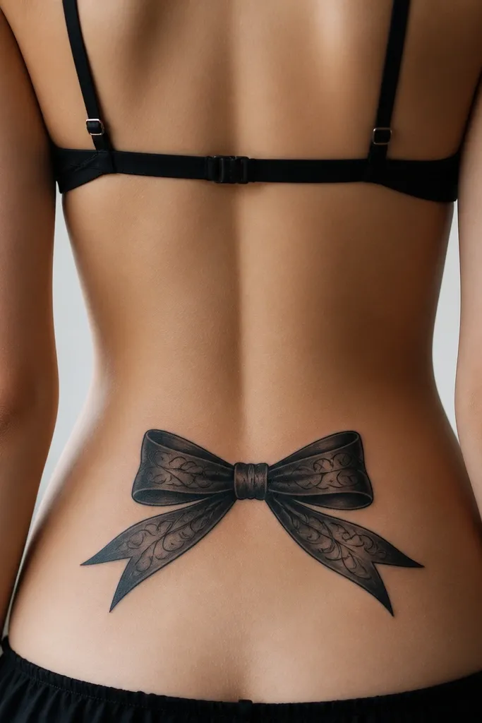
2. Bow at the Spine Dip
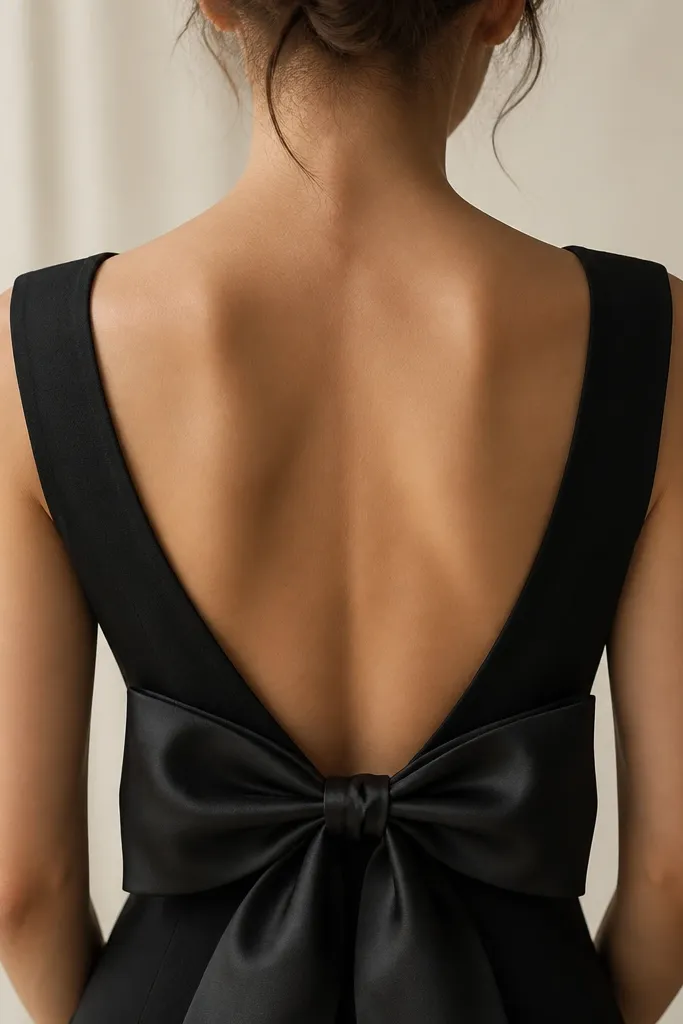
A bow reads feminine fast, and the symmetry makes it look intentional even if your body shape changes. The knot at the center anchors the design so it doesn't look like it's floating. Black linework with light gray fill in the loops gives it a soft look without heavy shading.
Position the bow knot right on the spine dip and keep the bow loops within the space between your hip bones. Make the bow about 4 to 6 inches wide for a true tramp stamp size. If you want extra glow, add tiny white ink highlights only if your artist has experience with it on your skin tone.
Pro tipChoose a bow design with thick outer lines (not hair-thin) so it stays readable after healing.
AvoidToo-thin outlines can turn patchy as the skin flakes and heals.
3. Half-Sleeve Style Floral Band
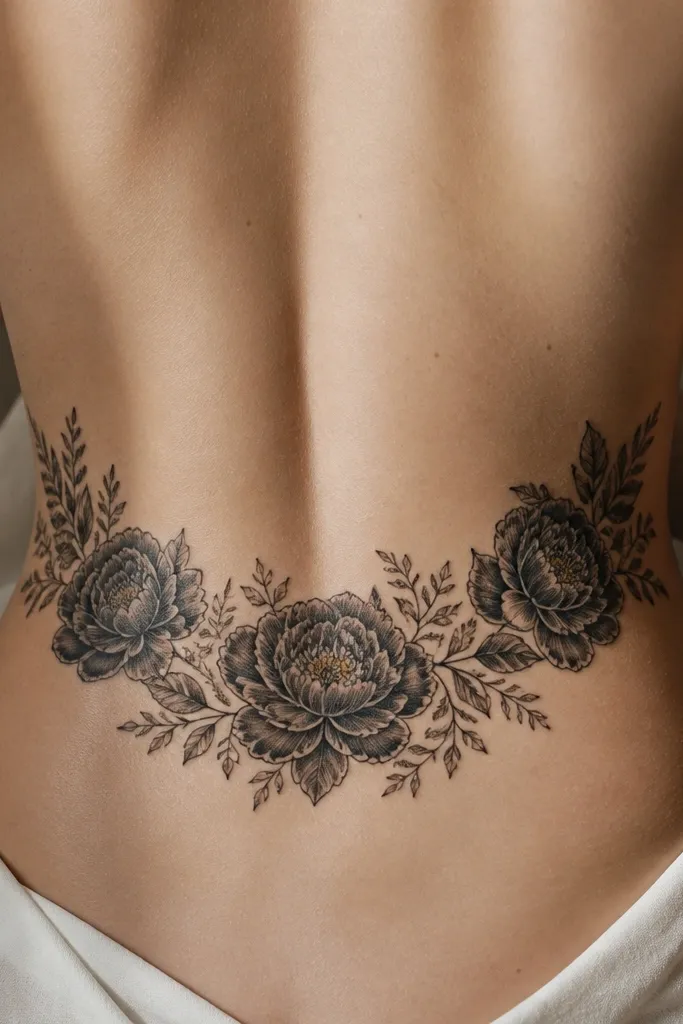
This works because it frames your waist like a garment. The band shape follows your body curve, and the repeated petals create visual rhythm. Black flowers with negative space let your skin tone show through, which makes it look crisp rather than crowded.
Ask for a band that spans roughly 6 to 8 inches wide, with the tallest bloom centered. Keep leaves simple - teardrop shapes - so they don't blur. Black lace underwear shows it best, but it also looks good under a fitted dress.
Pro tipBring reference photos of flowers that have bold petal edges; your artist can translate that into clean petal shapes instead of fuzzy blobs.
AvoidPacking too many tiny buds in one row makes the band look like a black smudge.
4. Script Name in a Ribbon Frame
Script inside a ribbon frame looks classy because the frame gives the letters structure. On the lower back, letters can warp if the placement is off, so the ribbon helps keep everything visually steady. I like this design because it's personal without needing big color blocks.
Keep the text size large enough to read from 6 feet away - think bold script, not delicate cursive. Place the center line of the ribbon on the spine dip and keep the ribbon ends symmetrical within 1 inch of each hip bone. Choose black ink only for the first piece; it ages clean.
Pro tipWrite the exact spelling in the stencil approval stage, then have your artist show it to you in a mirror from standing height and seated height.
AvoidMicro-lettering on the lower back fades faster and turns hard to read.
5. Mandala Underwear Line
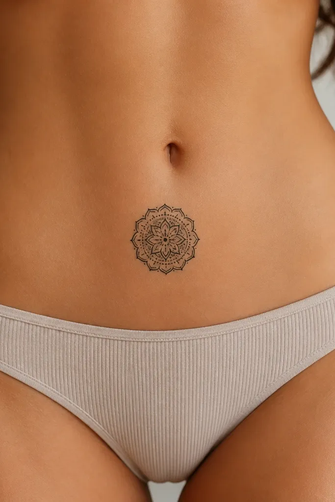
Mandala shapes look stunning because they fill the body curve without needing long lines. Dot-work adds texture, and the thick outer petals keep the design from looking fragile. For beginners, the key is keeping it small and bold - less detail means cleaner healing.
Aim for a 3 to 4 inch diameter mandala, centered on the spine dip. Use dot-work for the inner rings and keep the outer petals filled solid black. This looks great with high-cut swimwear because it sits right where the eye naturally goes.
Pro tipAsk for a stencil that shows dot spacing clearly - if dots are too close, they merge after healing.
AvoidGoing too large with lots of micro details makes it blur and feel messy.
6. Butterfly Pair with Negative Space Wings
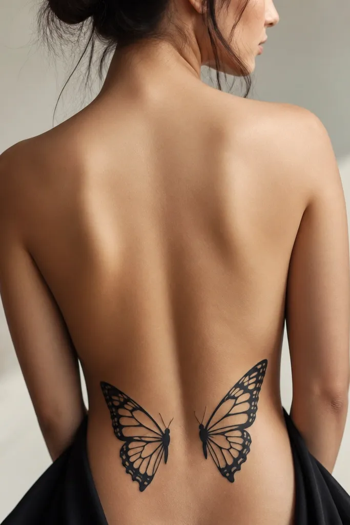
Two butterflies look playful, and the negative space makes the piece feel airy. The wing outlines give you crisp edges, while the empty sections prevent the tattoo from turning solid and heavy. Black ink with a few thicker veins in each wing keeps it readable.
Place the butterfly pair so their bodies sit on either side of the spine dip, with wings extending toward each hip bone. Keep wings about 3 to 4 inches wide each. If you want a feminine touch, add one small accent in deep plum on the body (only if your artist does consistent color packing).
Pro tipHave your artist draw the butterfly veins thicker than you think you need - they heal sharper.
AvoidFilling the entire wings with solid black makes the butterfly look like a blot on the lower back.
7. Geometric Chevron + Dot Outline
Chevron and geometric shapes look clean because they don't rely on tiny details. The dotted border adds movement and makes the center design pop against your skin. This is a great beginner tramp stamp because it's simple to place and easy to adjust during stenciling.
Place the chevron so the point faces down toward the waistband but doesn't cross into underwear line territory. Make it 5 to 7 inches wide and keep line thickness medium (not hairline). The dotted outline should have consistent spacing so it doesn't look uneven after healing.
Pro tipBring a ruler for measurement; ask your artist to keep the top points level across your back.
AvoidUneven line thickness from a rushed stencil makes geometry look cheap.
8. Vine + Rose Bud Corner Clusters
Corner clusters look great on the lower back because they frame your hips without spreading too far. The vine creates a natural flow, and the rose buds keep it romantic. Black linework with light gray shading under the rose petals gives depth without turning into a full-color mess.
Center the vine base around the spine dip and let the rose buds sit about 1 to 2 inches above the waistband. Keep thorns small and spaced so they don't look like random scratches. This style looks best with a bra or top that shows the lower back - it reads better when you can see the curve.
Pro tipAsk for one continuous vine line instead of separate segments - it looks more intentional.
AvoidOver-shading the leaves makes them look muddy instead of crisp.
9. Spiral + Spark Lines
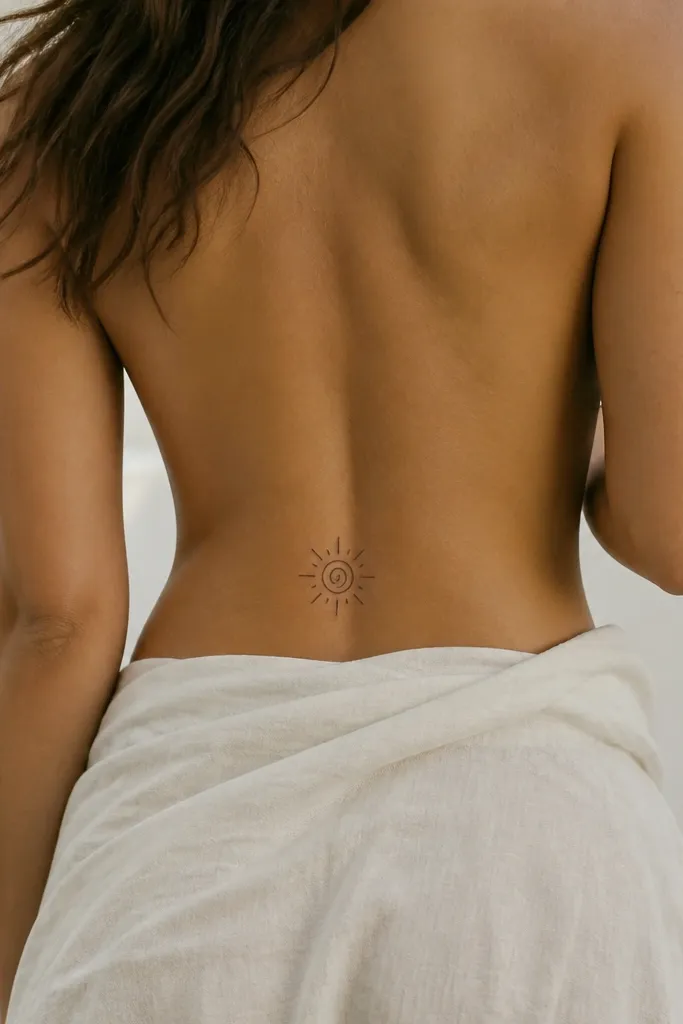
A spiral gives a "movement" effect, and spark lines add energy without clutter. This is beginner-friendly because it's mostly bold lines and simple gradients. The design also looks good after healing because the silhouette stays clear.
Keep the spiral about 2.5 to 3 inches wide and centered. Radiate 6 to 10 spark lines around it, but keep them short so they don't extend into your hip area. If you want extra contrast, add a light gray shadow just behind the spiral curve.
Pro tipGet your artist to test the stencil with you wearing the underwear you plan to show it in - fit changes placement.
AvoidPlacing it too low makes spark lines get cut off by most jeans seams.
10. Sunburst with Center Dot
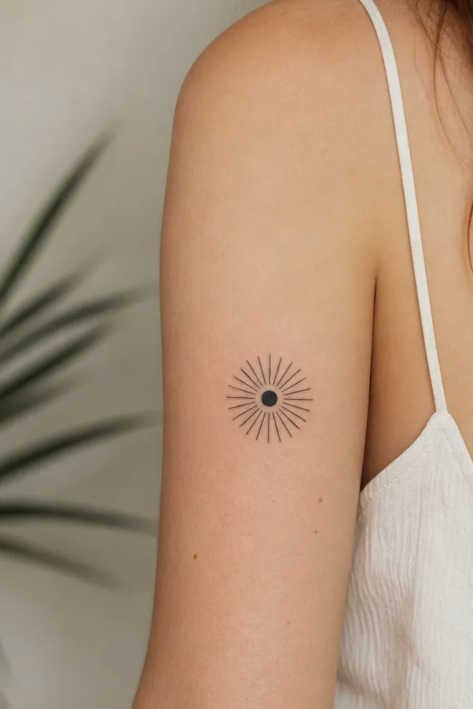
Sunbursts work because the rays create a clean focal point that reads instantly. A filled center dot keeps the design grounded. I like this for beginners because it doesn't require delicate shading, and it stays sharp on deeper skin tones when the lines are packed well.
Place it slightly above the waistband, centered on the spine dip. Make the rays short and consistent, about the length of a grain of rice compared to the center dot size. Aim for 3.5 to 5 inches across depending on your comfort and how much skin you want visible.
Pro tipAsk for slightly thicker rays than the lines in the center so the sunburst doesn't fade into the skin texture.
AvoidToo many rays packed together can blur into a dark circle.
11. Starry Planet Ring
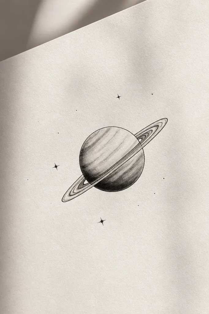
This design looks like jewelry on your skin. The tilted ring adds motion, and the planet gives you a focal point that still reads from far away. Limited shading on the planet keeps it from aging into a gray patch.
Center the planet on your spine dip and tilt the ring so one side points toward your left hip bone. Keep stars minimal - 4 to 7 dots total - to avoid clutter. This looks best with a low-back tank or a swimsuit that exposes your lower back.
Pro tipChoose a ring thickness that matches the ring's outline - if the ring is too thin, it disappears as it heals.
AvoidSprinkling too many stars turns it into a random speckle instead of a planned scene.
12. Koi Fish Outline with Small Splash
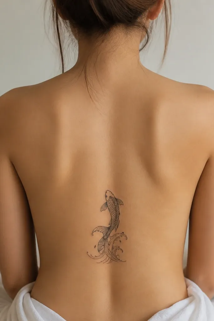
Koi outlines look strong because they rely on clean curves, not tiny details. The splash lines add character and keep the design from feeling flat. Black ink with a couple of gray scale accents on the belly makes it look dimensional without turning into a full realism project.
Place the koi so the head points slightly upward toward your ribs but stays within the lower-back zone. Make it 4 to 6 inches long and keep the splash lines short. This style looks great with black jeans and a fitted top because the motion line catches light.
Pro tipAsk for a thicker outline on the head and tail - those are the areas that get attention in healing.
AvoidThin internal scale details blur fast and make the koi look like scribbles.