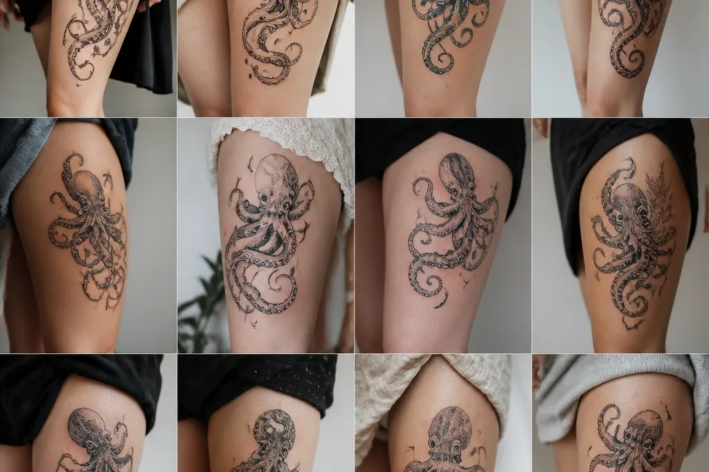
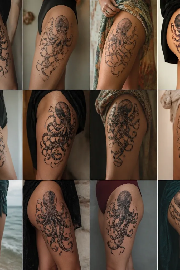
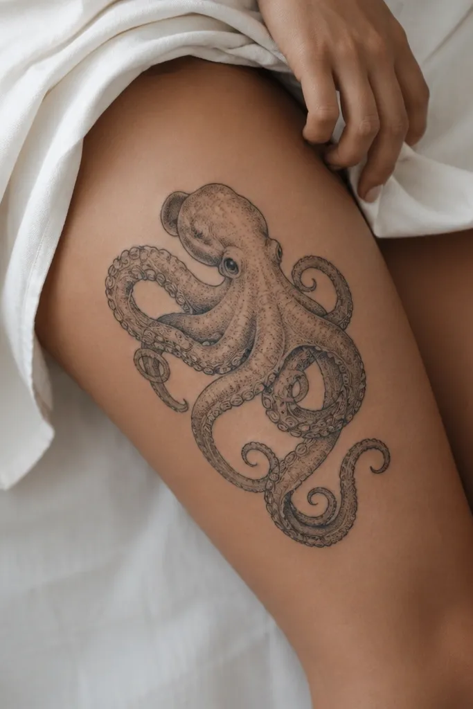
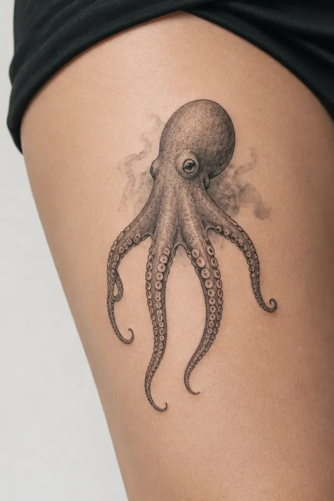
1. Hip-Curve Octopus With Side-Sweeping Tentacles
This layout uses the outer thigh's natural straight line so the tentacles feel like they're gliding. The octopus body is kept compact and dark, then the artist thins tentacles as they travel toward the knee. Grey wash shading under the body gives a slight lift, so the design doesn't look pasted on. The suction cups act like rhythm, guiding your eye along the sweep.
Place the body about 6-8 cm below the hip crease, outer thigh. Keep the widest part of the body roughly one palm-width. Tentacles should spread into a fan - two angled forward, two angled back - so the tattoo stays balanced when you walk.
Pro tipAsk for suction cups that get smaller as they go down; it keeps the flow clean after fading.
AvoidDon't cram all suction cups the same size - that makes it look like a printed pattern.
2. Inner-Thigh Octopus With Clockwise Curl Flow
Inner thigh placement lets tentacles "hug" the curve of your leg, which makes the tattoo look alive. Clockwise curl flow gives a clear direction, so the design reads as motion rather than randomness. The thin-line suction cup outlines add delicacy, while subtle grey shading under tentacle ridges adds depth. It looks especially good with soft lighting because the curls catch highlights.
Anchor the body just above the inner thigh midpoint, about 5-7 cm below the groin crease line. Let two tentacles cross slightly over the other two, but keep crossings minimal so it doesn't turn into a tangle. Aim for a gentle wrap that stays inside the inner thigh - avoid wrapping too far onto the front of the leg.
Pro tipHave your artist sketch the curl direction on your skin with a washable marker while you stand, not sit.
AvoidAvoid symmetrical tentacles that go straight down - straight lines on the inner thigh flatten the whole piece.
3. Full-Length Tentacle Taper From Hip to Knee
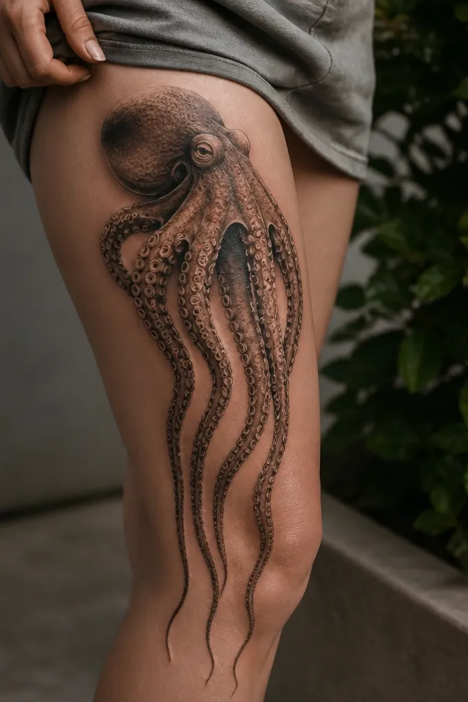
This is the "reads from across the room" version. The long taper makes your thigh look longer, and the suction cups give texture without heavy fill. Realistic shading under each tentacle makes the ribbons look dimensional. The key is that each tentacle gradually narrows - your eye follows the taper automatically.
Start the body around mid-upper thigh and let the lowest tips land 3-5 cm above the knee cap area. Keep at least one tentacle aligned with the center of your thigh so there's a visual spine. Use grey wash gradients under each tentacle to suggest form without muddying the blacks.
Pro tipIf you want this to stay crisp, ask for fewer suction cups per inch on the lower third.
AvoidDon't pack the lower tentacles with dense dots - they blur faster on thicker skin.
4. Blackwork Blob Body With Negative-Space Tentacles
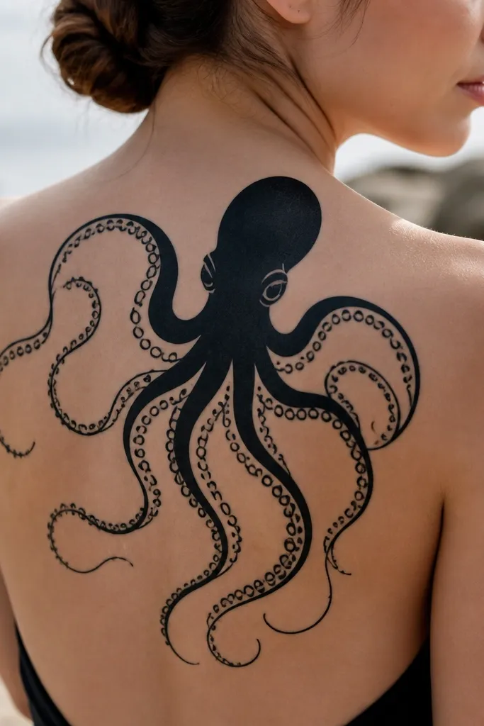
This is a graphic look that stays sharp as it heals. Negative space tentacles create clean edges, so the tattoo doesn't turn into a grey smudge over time. The thick body grounds the piece, while the outlined tentacles keep it from feeling heavy. Small black suction dots give the movement without clutter.
Keep the body solid and the tentacle outlines consistent in thickness, like 3-4 mm line width. The tentacles should have long stretches of negative space between suction cups. Place it so the body sits high enough to remain visible when you wear fitted shorts.
Pro tipAsk for a test stencil line pass - if the outline thickness looks too thin under your lighting, adjust before the first needle hits.
AvoidDon't add grey shading to the negative space areas - it destroys the crisp contrast.
5. Dotwork Suction Cups With Soft Grey Tentacle Shading
Dotwork suction cups give you texture without the "filled-in blob" effect. The tentacles stay soft with grey wash, so your leg's natural skin tone shows through the lighter areas. This combo looks great in person because the dots catch light and the wash keeps it from looking harsh. It also ages better than heavy solid fills because the texture is distributed.
Place the body around the upper third of the thigh, leaning toward the front of the leg. Let tentacles angle outward slightly, so the dots don't cluster in one tight spot. Keep dotwork suction cups spaced so there's visible skin between them.
Pro tipChoose grey wash that transitions gradually instead of banding - ask the artist to blend at least two values of grey.
AvoidAvoid tiny suction cups packed too close - dotwork needs breathing room.
6. Neon-Accent Octopus With Controlled Color Burst
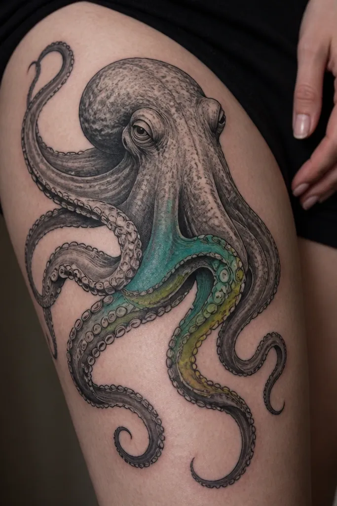
Color works here when it's used like an accent, not a full color tattoo. Teal and lime placed mid-tentacle create a "glow" effect that makes the flow feel faster. Keeping most of the piece black-and-grey makes the color pop without turning the whole thigh into a cartoon. The suction cups stay black so the design stays readable.
Keep color to one zone - roughly a 10-12 cm section across the middle tentacles. Use teal as the base and lime for small highlights on suction rims. Place the color where your shorts or leggings will show it first - around mid-thigh.
Pro tipAsk for color saturation tests on the stencil under your lighting - indoor light and sunlight change how lime reads.
AvoidDon't spread neon across every tentacle - it looks flat and heals unevenly.
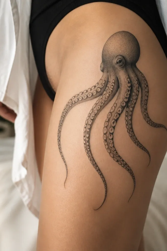
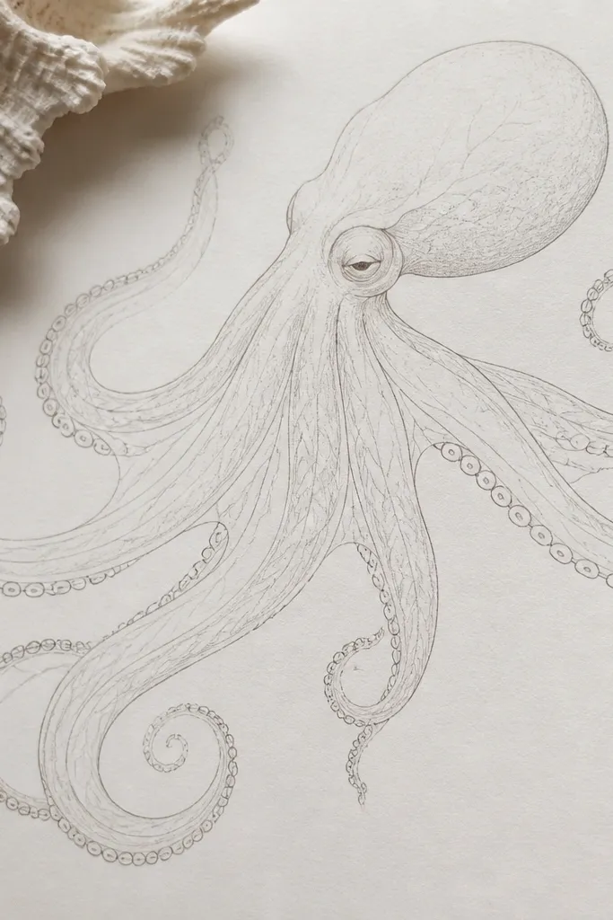
7. Realistic Octopus Body With Raised Ridge Shading
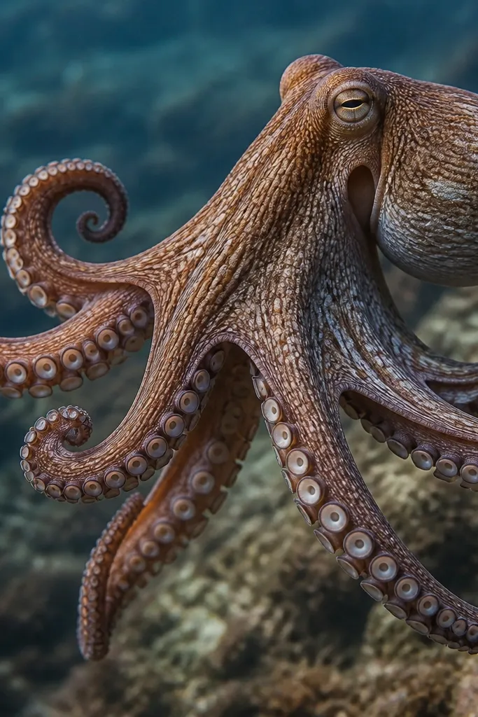
Ridge-like shading makes the tentacles look like they have muscle. This is the kind of realism that doesn't rely on thick black outlines; it relies on value changes. The suction cups look wet because the artist uses darker rings and lighter centers, then blends edges into the tentacle. This tattoo looks expensive because your eye reads depth fast.
Place the body on the upper outer thigh and let two main tentacles run down the front and side. Keep the tentacles slightly curved so the ridges follow the leg's shape. Use a smooth grey gradient under the body so it doesn't look like a sticker.
Pro tipIf you're prone to dry skin, choose an artist who can do smooth blending - rough skin makes ridge lines look scratchy.
AvoidDon't request ultra-dark outlines everywhere - realism collapses into a cartoon outline.
8. Octopus + Seaweed Vine Flow on the Outer Thigh
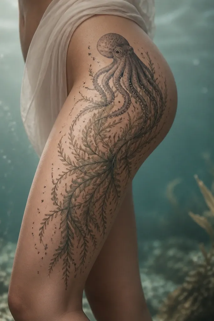
This one gives you extra movement beyond tentacles. The seaweed vines act like secondary lines that guide the eye from hip to knee, and bubbles add a sense of depth without needing heavy shading. The octopus body stays the main anchor, while the vines make the rest of the space look intentional. It's especially flattering because the vines taper like hair.
Place the octopus body high and keep the vine tips ending near the knee. Use thin linework for seaweed, and add a few bubble circles around the lower half for spacing. Keep bubbles light - too many makes it look cluttered.
Pro tipAsk for one vine to cross over another tentacle to create a layered depth effect.
AvoidAvoid thick vine lines - they compete with tentacles and blur together.
9. Suction-Cup Fan Spread With Minimal Background
A fan spread is clean and flattering because it uses the thigh's width. Minimal background keeps the design readable, and the even suction cup spacing gives a structured rhythm. You get that "tentacles in motion" look without a lot of extra ink that can blur. This is a great choice if you want a tattoo that stays crisp even as it fades.
Anchor the body on the upper third, center of the outer thigh. Keep five tentacles - not six or seven - so each one gets space. Let the tips end at different heights, but within a 6-8 cm range, so the overall silhouette stays cohesive.
Pro tipTell your artist you want the suction cups outlined, not filled - outline cups age better on the thigh.
AvoidDon't add full background waves - they turn into a grey haze.
10. Octopus With Geometric Frame and Tentacle Escape
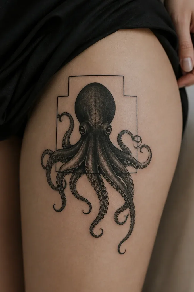
The geometric frame gives structure, and the tentacles breaking out create contrast between rigid and organic. This works because the frame keeps the tattoo from looking too soft, especially if your skin stretches in certain angles. The straight lines make the tentacles pop. It also helps the design stay readable from different distances.
Place the frame on the mid-thigh area and anchor the octopus body slightly above the center. Use thin line geometry - no thick bold box lines. Let only two tentacles escape the frame so the composition has focus.
Pro tipPick one frame style - hexagon, rectangle, or diamond - and keep it consistent; mixed angles look messy.
AvoidAvoid heavy shading behind the frame; it kills the crisp geometry.
11. Watercolor Wash Tentacles With Dark Outline
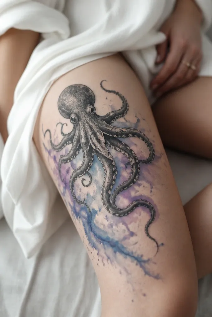
Watercolor-style wash makes tentacles look like they're dissolving into water. The dark outline is the key - without it, the tattoo can look like accidental stains. Blue plus lavender gives a cool underwater feel, and the wash stays strongest near the body where your eye expects color. The result reads playful but still intentional.
Outline the octopus and major tentacles in solid black first. Apply watercolor wash mainly on the upper half of tentacles so it doesn't blur into a uniform grey later. Place on the outer thigh where you get the best light when you walk.
Pro tipAsk your artist to keep wash edges irregular but controlled - you want fade, not splatter.
AvoidAvoid full watercolor fill on the body - it heals unevenly and can look patchy.
12. Thin-Line Suckers With Fine Grey Vein Shading
This is a "light and airy" thigh tattoo that still looks detailed. Fine grey vein shading adds realism without heavy fill, and the thin-line suckers keep the flow crisp. It looks best on thighs with a smoother surface because the tiny lines hold their shape longer. From a distance, it reads like a sketch - up close, it's detailed.
Place the octopus on the front outer thigh where the skin is flatter. Keep tentacles narrow and let them taper quickly so the design doesn't feel crowded. Give the artist permission to simplify suckers - fewer, cleaner rings look better than lots of micro dots.
Pro tipChoose a stencil size that fits your thigh without stretching the lines across too much area.
AvoidAvoid thick outlines over thin linework - it creates a two-style mismatch.