
1. Black-out floral panel with one clean highlight line
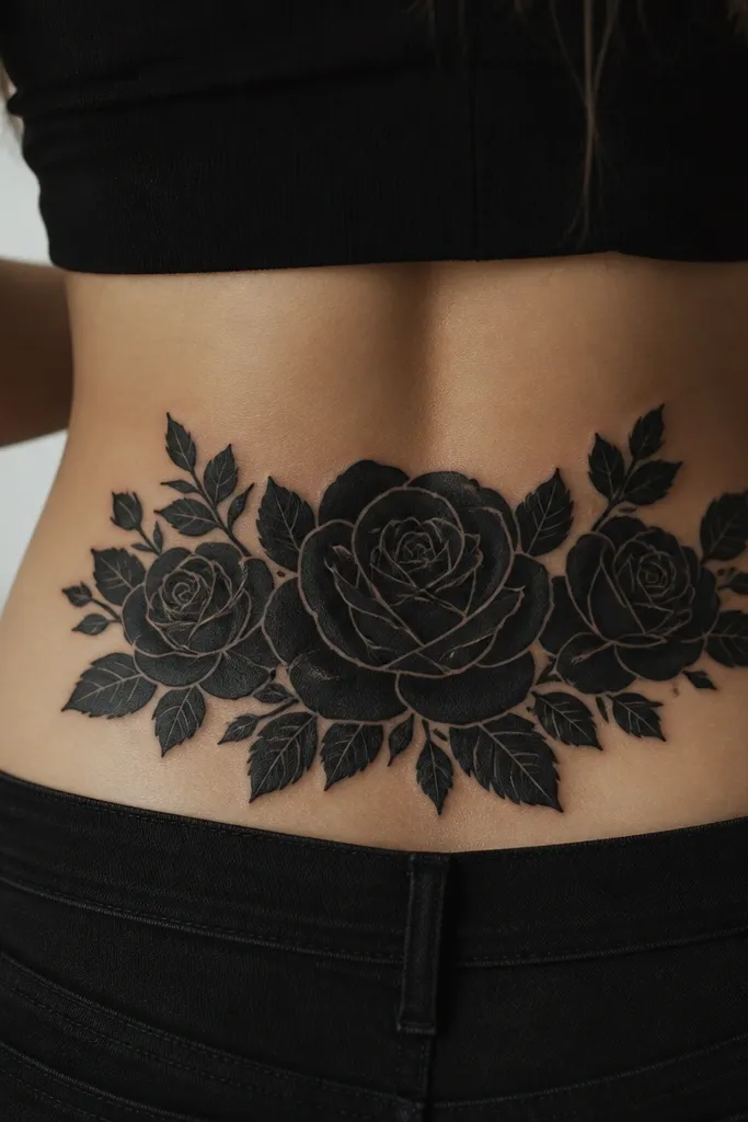
This works because packed black eats old linework fast. The single highlight line gives shape without requiring lots of tiny details that can blur during healing. I like this when the original tramp stamp has dark swirls or a bold outline - the new rose sits on top like a curtain. The gray highlight also helps the cover look intentional instead of like a sticker slapped over ink.
Ask the artist for a rose cluster that spans about 6-8 inches wide and 5-7 inches tall, centered 3-4 inches above your waistband line. Keep the leaves solid and avoid tiny leaflets; one or two larger leaf shapes look sharper after healing. Choose a dark gray highlight (not light gray) so it stays readable on stretchy skin.
Pro tipBring a photo of your old tattoo and point out the darkest area - the highlight line should start near that spot so the eye lands there.
AvoidAvoid thin black outlines around the whole panel; they look patchy once the skin stretches.
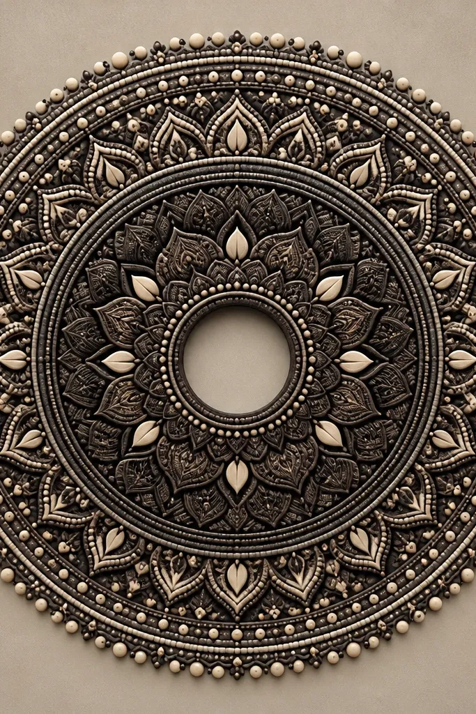
2. Dotwork mandala that turns color into texture
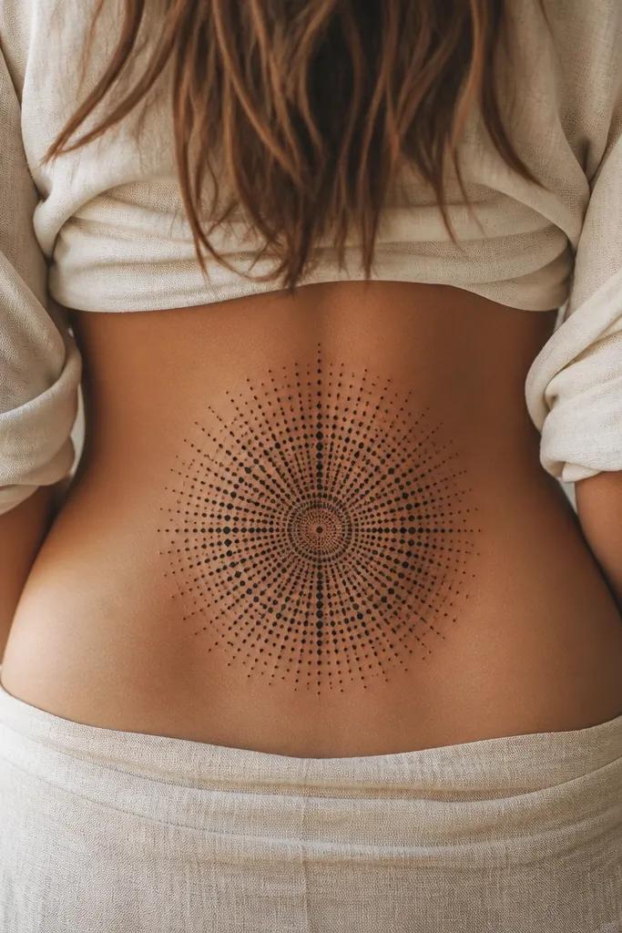
Dotwork is my go-to for stubborn red or blue tramp stamps because the old color gets visually broken up into texture. It also hides uneven healing since dots can land over small scabs and still look consistent. The mandala shape gives the cover a "designed" feel even when you're covering messy previous work. Dense dots create a soft gradient - it reads as full coverage instead of a patchwork cover-up.
Choose a mandala diameter of 5.5-7 inches so it fits the lower-back pocket without hitting bra band pressure. Tell the artist to start with a fully saturated dot base over the old tattoo, then build ring contrast in darker clusters. If the old ink is very dark, ask for a black underpattern first so the dots sit on top instead of fading through.
Pro tipAftercare matters more for dotwork. Use a thin layer of fragrance-free ointment only for the first few days, then switch to gentle unscented lotion once the surface looks dry.
AvoidSkip super light dot spacing; it looks like a cover-up attempt rather than a finished mandala.
3. Geometric band with thick center blocks
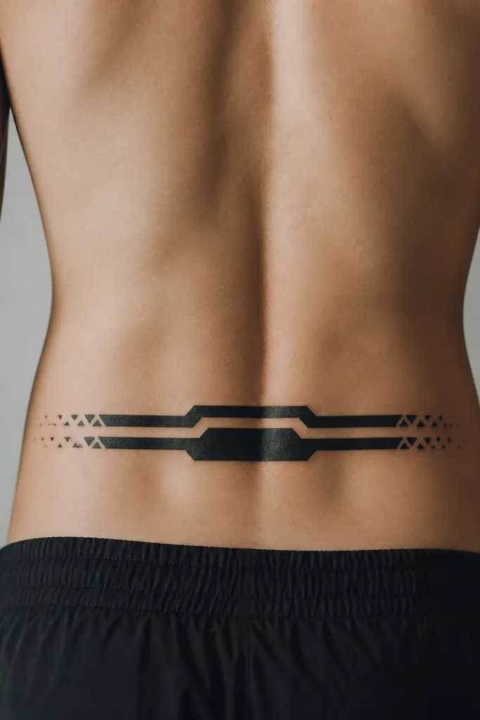
This is the budget-friendly option when you need coverage but don't want a full floral commitment. Thick center blocks cover the densest parts of the old tattoo and stop peeking. The angular shapes also hide irregularities from older ink that healed unevenly. I've used this style to convert a small tramp stamp with heavy outline - the geometry makes the result look like it was meant to be there from day one.
Have the artist measure the old tattoo width, then scale the center blocks to cover it plus 1 inch on each side. Keep the band height around 3-4 inches so jeans and underwear seams don't stretch the edges too aggressively. Ask for sharp corner geometry, not rounded blobs, because rounded shapes can blur and look cheap.
Pro tipPick one accent element - like tiny dot triangles - and keep it consistent on both sides. Symmetry reads more expensive even with a simple plan.
AvoidAvoid thin linework between filled shapes; it's the first thing that fades on lower back tattoos.
4. Dragonfly with packed wing shadows
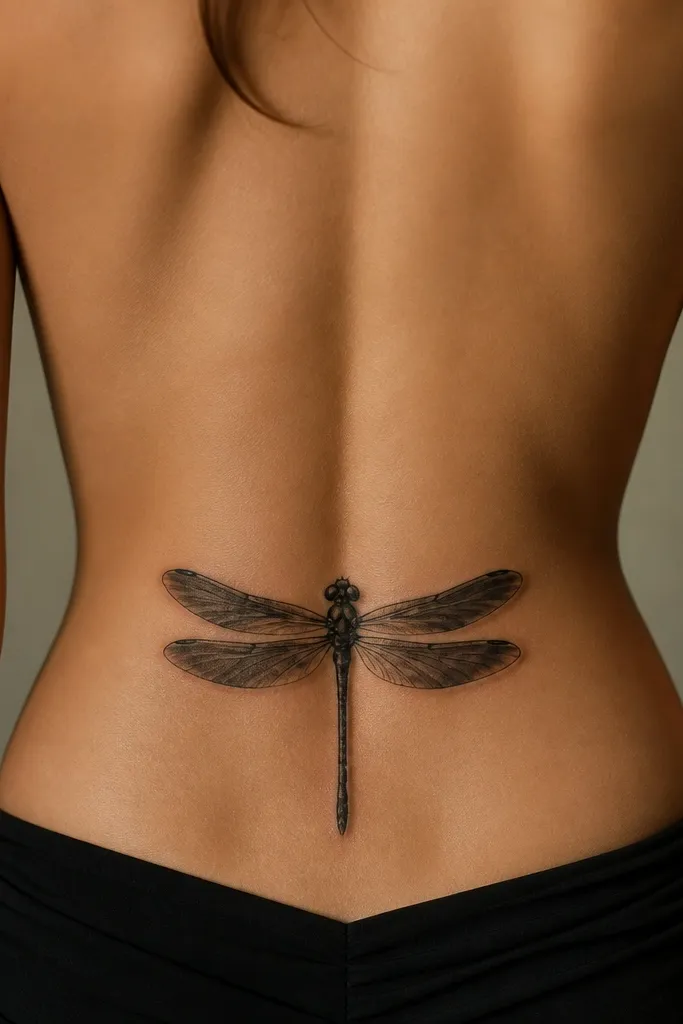
Dragonfly covers work when your old tramp stamp is small text or delicate icons. The wings let the artist pack black where the old ink sits, then taper into lighter shadow so it still looks airy. You get movement without relying on super fine details. The wings also give the tattoo a clean focal point, which makes the cover-up feel like a new design instead of a disguise.
Aim for a size around 4.5-6 inches long. Tell the artist to underprint the wing base with solid black first, then build the gradient outward. Keep the body lines slightly thicker than you'd expect - thin lines can soften fast in that spot.
Pro tipChoose a matte black style for the underlayers. Glossy ink can look shinier during healing and then dull unevenly later.
AvoidSkip tiny segmented wing lines; they look like an unfinished cover when they fade.
5. Roses with blackout leaves and a gray vein pattern
This is one of the best "budget but still pretty" covers because the leaves do the erasing. Leaves are forgiving - they can be solid and still look natural. The gray veins add realism without demanding ultra-fine petal detail. When I've covered mixed-line tramp stamps, this layout hides the old chaos under the leaves and keeps the roses as the hero.
Use a 7-9 inch width total with roses in the center. Ask for the darkest packing in the leaf areas that overlap the old tattoo, not only inside the roses. Veins should be gray wash with a consistent direction so it looks like one drawing, not random shading.
Pro tipIf your old tattoo has a distinct shape, wrap the leaf edges around that shape. That trick makes the cover feel like it was planned.
AvoidAvoid fully detailed rose petals across the whole area; it costs more and fails coverage if the old ink is dark.
6. Feather plume built from stacked black layers
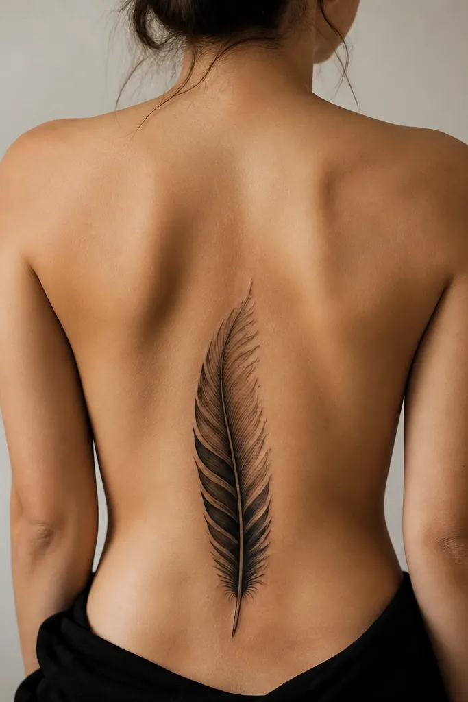
A feather plume is great for covering patchy older work because you can build opacity gradually from the quill outward. Stacked layers hide leftover lines and make the tattoo read as one soft form. I like it for tramp stamps that already have a vertical element or where the old ink is uneven in density. The plume format also looks good even if you wear high-waisted underwear that crops the bottom slightly.
Size it about 8-10 inches tall and 3-4 inches wide. Ask for solid black at the base and progressively lighter gray toward the tip, but keep the overall opacity high in the bottom half where the old tattoo sits. The barbs should be fewer but thicker; too many thin barbs look wispy and weak after healing.
Pro tipTell the artist to place the darkest barbs over the old tattoo edges first, then fill the rest. That order keeps coverage consistent.
AvoidSkip super thin feather outlines - they look like a cover-up sketch once the skin stretches.
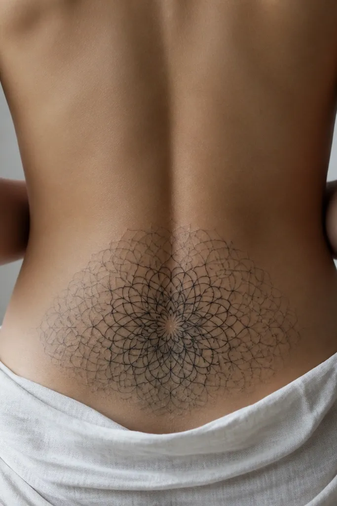
7. Mandala frame with a darker center fill
This style gives you control over what gets erased. The frame can be decorative and lighter, while the center does the heavy coverage. That's how you keep the tattoo looking intentional without paying for full-density everywhere. It also helps if your old tramp stamp sits slightly off-center - the frame anchors the eye and lets the center absorb the mismatch.
Pick a frame diameter of 6-8 inches. Ask for a dark center fill that covers the old tattoo footprint plus 1/2 inch beyond. Outer rings can be dotwork or linework, but keep them slightly thicker than "fine" so they survive lower-back stretch.
Pro tipIf you want it to look more "finished," add two small matching accent shapes on opposite sides of the center - it creates balance.
AvoidAvoid leaving the center too light; it will show the old tattoo through the negative space.
8. Starburst with thick rays and one dark core
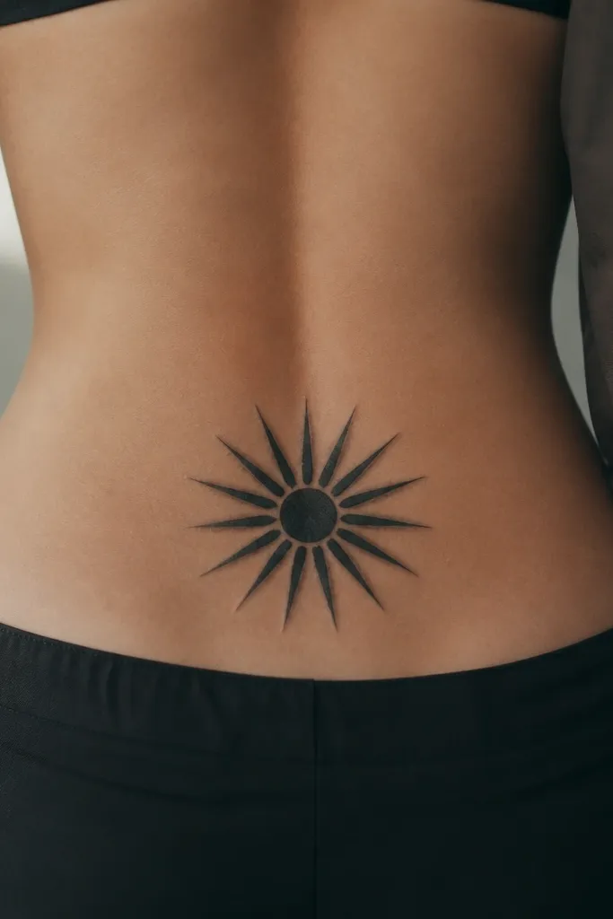
Starburst covers are cheap and fast because they use big shapes. Big shapes are what you need to hide old tramp stamp lines quickly. The thick rays also hide uneven healing - if one ray fades a bit, the rest still reads as a starburst. I've used this when the original tattoo was a small dark symbol or a line-heavy outline.
Size it around 4.5-6 inches across. Tell the artist to pack the core solid black first, then build rays with a slight gray edge for depth. Keep the rays evenly spaced; crowded uneven rays can look like a rushed cover-up.
Pro tipAsk for a slightly off-angle starburst (rotated 10-20 degrees) so it looks like it belongs on the body movement, not like a sticker.
AvoidSkip skinny rays; they fade into gaps and the old ink peeks through.
9. Butterfly with underprint black and controlled color pops
Color cover-ups are tricky on a budget, but a butterfly layout helps because you can control where color goes. The black underprint kills the old hue, then the color sits on top where you want it. Muted colors like dusty teal and faded rose pink tend to age better than bright neon on that spot. The thick outline helps it stay readable as your lower back stretches.
Pick wing width around 5-7 inches. Ask for the underprint to be solid black across the entire wing area, then add color only on the outer third for best longevity. Keep the body lines thicker than usual so it doesn't blur into a blob.
Pro tipBring color references from real healed tattoos, not fresh ink photos. You want the muted, slightly dusty tones.
AvoidAvoid full-color fill across the whole wings if your old tattoo is dark - you'll pay for extra saturation and still get bleed-through.
10. Japanese wave wrap that blends old lines into motion
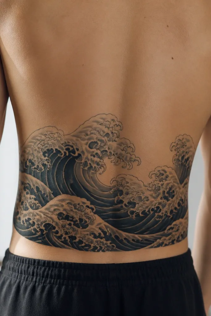
Waves cover well when your old tramp stamp has a horizontal layout. Motion patterns pull attention away from the exact corners where old ink peeks. The foam lines create a "reason" for lighter areas so you don't have flat looking patches. I like this for people who want something different from florals but still want solid coverage.
Scale it to about 7-9 inches wide and 4-6 inches tall. Ask for a dark underlayer in solid black or very dark gray under the foam lines. Foam clusters should be placed where the old tattoo is densest - that's where lighter foam can still read as intentional contrast.
Pro tipIf you're on a budget, choose fewer wave bands. Three to four big waves look better and heal more evenly than ten tiny ones.
AvoidAvoid super fine foam line spirals; they look scratchy after healing.
11. Rosette lattice with black mesh over tribal
When the old tattoo is tribal or heavy linework, a lattice pattern hides the original geometry fast. The mesh creates tons of visual texture, so leftover old lines don't read as "the old tattoo." Rosettes keep it from looking like plain black scribble. This is a good budget move because the pattern can cover without needing perfect realism.
Size it around 6-8 inches wide and 5-7 inches tall. Tell the artist to start with a solid black base where the tribal lines are darkest, then add the lattice pattern on top. Keep the rosettes consistent in size so the pattern doesn't look random.
Pro tipAsk for the mesh to follow body stretch lines - that means the pattern should curve slightly with your natural lower-back contour, not be perfectly flat and straight.
AvoidAvoid giant empty holes in the mesh; the old tattoo will show through those gaps.
12. Sun and moon duo with a dark crescent underlayer
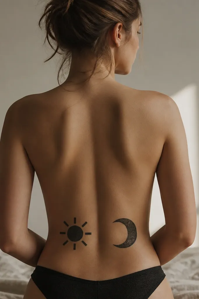
This cover works because the thick crescent and sun centers let the artist pack black where you need opacity. The contrast between the two shapes also pulls attention away from any uneven healing from previous ink. I've seen people get stuck with "pretty but light" covers that don't erase. Sun and moon plans fix that by making the dark shapes the design. It's also a nice option if you want something that isn't floral.
Choose a total width of 6-8 inches. Ask for the moon crescent to overlap the darkest part of the old tattoo, with the sun placed to balance the composition. Rays should be thick and short. Too-long rays stretch and fade in the lower back.
Pro tipIf your old tattoo has text, place the moon crescent so it sits directly over the letters. The crescent edge hides the straight strokes best.
AvoidSkip thin crescent outlines; they fade and expose the old ink underneath.