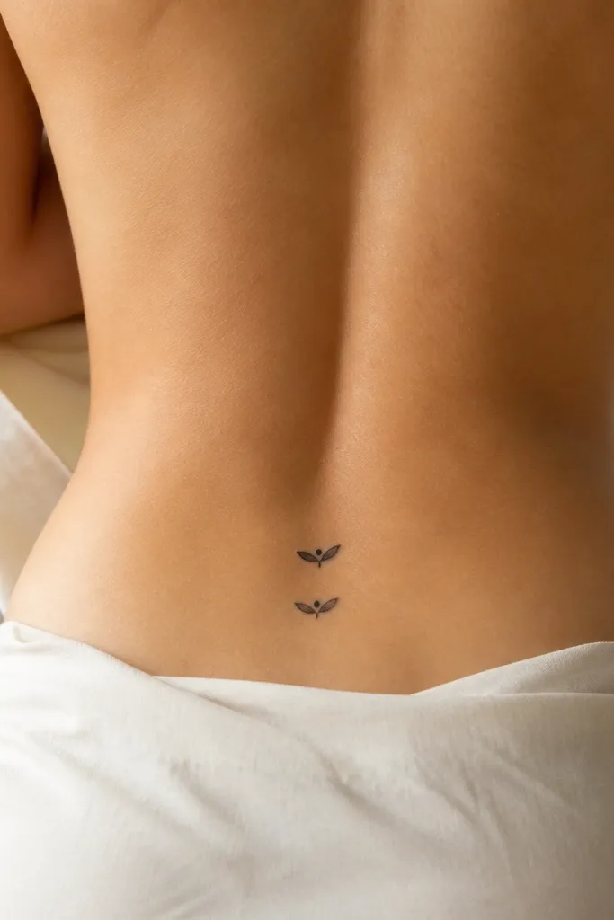
1. Tiny Sideways Heart Duo
A sideways heart reads cute and modern because it breaks the "traditional vertical heart" expectation. Minimal black outline keeps it crisp, and the negative-space interior prevents the tattoo from turning into a dark blob as it heals. Matching works because the shape stays the same - you're just mirroring the tilt and keeping the scale identical.
Keep the heart width around 10-13 mm. Place it 4-5.5 inches above the butt crease, centered between hip bones. If you want a bestie twist, have one heart tilt 10 degrees up on the left and the other tilt 10 degrees up on the right.
Pro tipAsk your artist to stencil with the heart slightly off-center at first, then adjust until it hits your natural waist line when you stand.
AvoidDon't add heavy dot shading inside the heart - it looks grainy after a year.
2. Mini Constellation Above the Hip
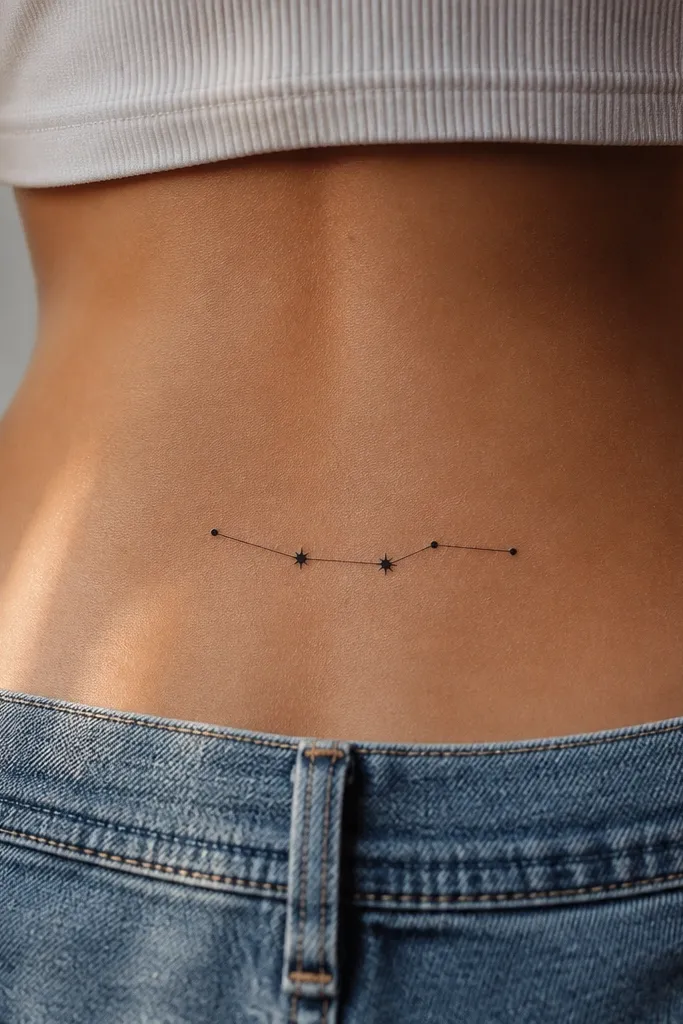
Constellations feel personal but still minimalist when you keep the line connections thin. The dots age well if they're not too tiny, and the pattern gives movement even with no shading. Matching is easy: you pick the same constellation map and keep the same dot count and spacing.
Target 18-22 mm total width for the constellation. Place it 4.5-6 inches above the butt crease, so it peeks out above most low-rise pants. Use pure black only - no blue-gray - for cleaner long-term reading.
Pro tipHave your artist draw the constellation with a single consistent line weight so the connections don't look thicker than the stars.
AvoidSkip tiny 1 mm dots everywhere - they can disappear and leave only a few visible points.
3. One-Line Bow With Negative Space Tail
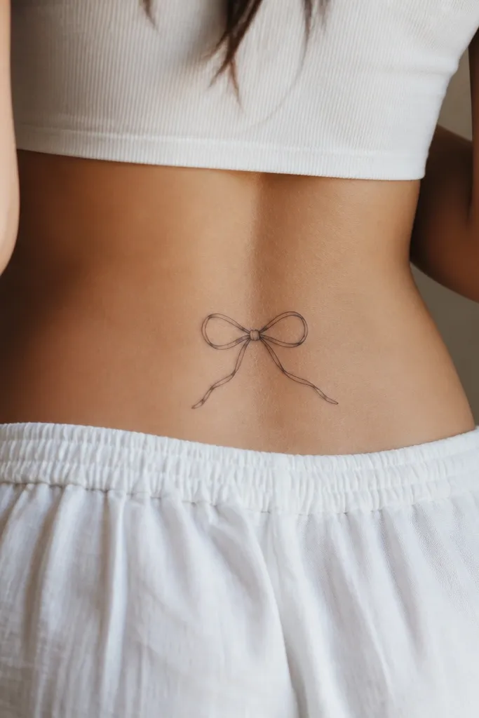
A one-line bow looks modern minimalist because it uses light linework and relies on the shape, not fill. Negative space makes it stay crisp and prevents the middle from turning into a dark mass. Besties love this because you can mirror the tail direction while keeping everything else identical.
Keep it 20-26 mm long with the bow loops about 10-12 mm wide each. Place it slightly higher on one person if their jeans sit higher - keep it aligned to their bra band instead of the butt crease. If you want a tiny accent, add one small dot at the bow center, not full shading.
Pro tipAsk for a stencil that follows your hip curve - the bow should feel like it hugs your body, not sits flat on your skin.
AvoidAvoid thick-filled bows - they look heavy and dated on the lower back.
4. Micro Crescent Moon and Dot
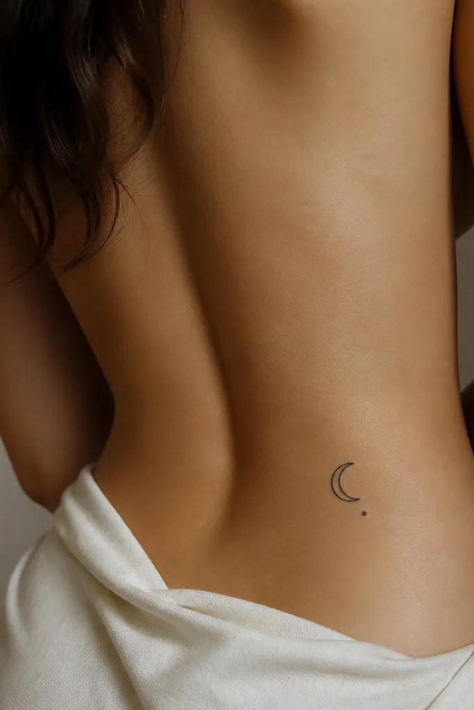
A micro crescent with one dot is the definition of minimalist: one clear shape and one anchor point. The hollow interior keeps it readable, and the dot gives a cute focal balance. Matching is simple because you can keep the crescent size the same and just flip left-to-right between you.
Use a crescent width of 12-16 mm and a dot around 2-3 mm. Place it 4-6 inches above the butt crease, centered or slightly off-center depending on your hip symmetry. Black ink only keeps the aging consistent.
Pro tipIf your skin tends to spread ink, ask for slightly thicker outlines but keep the crescent interior completely hollow.
AvoidDon't add stars or text around it - it will clutter fast.
5. Twin Minimalist Stars (Two-Point Burst)
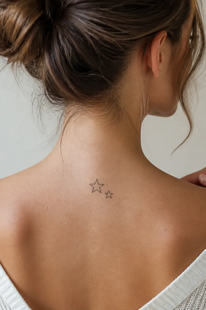
Two stars next to each other reads like "besties" without spelling anything out. Minimal linework stays light on the back and looks modern under lingerie or a backless dress. Matching works because the design is built for symmetry - you can keep the same star sizes and spacing.
Make the larger star 8-10 mm and the smaller star 6-8 mm. Keep the gap between them around 2-3 mm. Place the pair horizontally across your lower back at a height where it sits above your jeans seam.
Pro tipAsk for crisp star points, not rounded "soft" points - rounded stars fade into circles.
AvoidAvoid shading gradients inside the stars - they blur and dull the shape.
6. Thin Line Infinity With One Spark
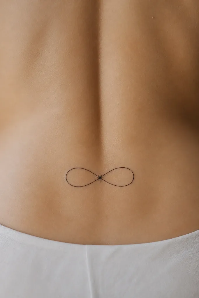
Infinity looks romantic, but minimalist infinity needs clean curves and consistent thickness. The single spark at the center gives a cute focal point so it doesn't look like a random doodle. Matching is easy: mirror the infinity symbol direction between besties and keep the spark in the same spot relative to the crossing.
Aim for 22-28 mm width total. Line weight should be 1 mm or slightly more if your skin doesn't hold fine lines. Place it 5-6 inches above the butt crease, centered so the crossing lands near your spine line.
Pro tipHave your artist sketch the infinity on a paper stencil against your body - the curve should follow your natural lower-back contour.
AvoidDon't make the infinity too long - long symbols stretch and look uneven after healing.
7. Micro Flower Buds (Two-Petal Minimal)
Two-petal buds stay clean because there's less to blur. The center dot anchors the design and keeps it readable even when the petals soften over time. Besties can match by using the same bud size and placing them at the same height with mirrored orientation.
Keep each bud around 10-14 mm tall. Place the pair 4.5-6 inches above the butt crease, with about 8-10 mm between the two buds. If you want a color accent, add one tiny sage-green dot in the center - just one.
Pro tipAsk for the petals to be slightly tapered, not rounded - tapering keeps the shape after aging.
AvoidSkip full mini-flower scenes with five petals and shading - they turn into a smudge.
8. Tiny Geometric Heart Outline
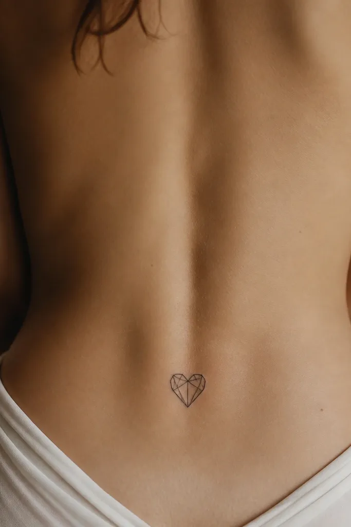
Geometric hearts look modern minimalist because they're structured and sharp. The faceted outline holds up better than fluffy script, and negative space keeps it from looking heavy. Matching is straightforward: same heart outline, same size, mirrored orientation on each friend.
Use a 14-18 mm width heart. Place it 4.5-6 inches above the butt crease, centered. Keep lines consistent and avoid adding extra internal shapes that crowd the heart.
Pro tipBring a reference stencil and ask your artist to keep the facets balanced so one side doesn't look thicker.
AvoidAvoid filled geometric hearts - they age darker than you expect.
9. Minimal Feather With One Side Vane
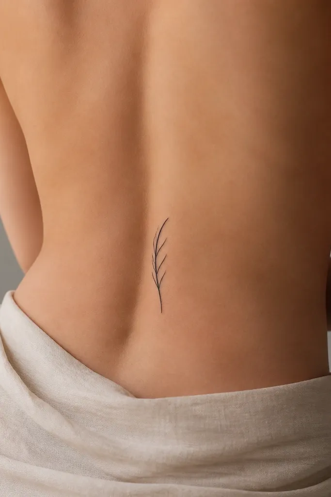
A feather can look soft and cute, but minimalist placement matters. Keeping only one side vane lines prevents the tattoo from turning into a dark scribble. Matching works when you keep the shaft length and the number of vane lines the same for both besties.
Target 25-32 mm length. Place it 5-6 inches above the butt crease, angled slightly so the tip points toward the outer hip. Use black only and keep the smallest vane lines at least 3-4 mm long.
Pro tipAsk for the feather edges to be slightly uneven like a real feather - too perfect looks fake and flat.
AvoidDon't add tiny cross-hatching inside the feather - it fades fast on this area.
10. Micro Script Initials in Lowercase
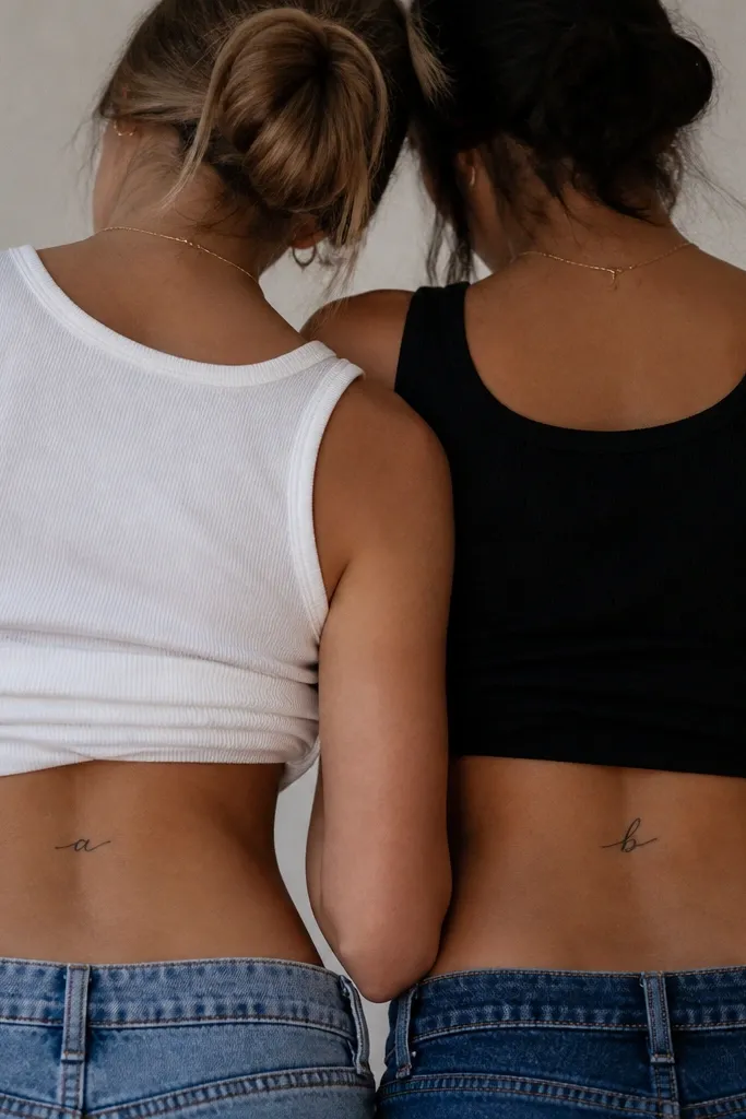
Script initials can look modern minimalist if the letter is simple and thick enough to survive. Lowercase works because it has natural curves that sit nicely on the lower-back curve. Matching is personal: you can do the same style across both friends while using different letters.
Keep the letter height around 14-18 mm. Place it horizontally 4.5-6 inches above the butt crease. Use a line weight around 1 mm so the stroke doesn't break up during healing.
Pro tipBring the exact font example you like and ask your artist to keep the strokes from getting too thin at the ends.
AvoidSkip ultra-thin hairline script - it looks beautiful on day one and then disappears.
11. Tiny Lock and Key (Simple Outline)
Lock and key is cute without being loud when it's just outlines. The shape pairing reads clearly, and minimal lines keep it from looking like a cartoon. Matching works because you can assign who gets the lock and who gets the key, or both get the same pair with mirrored placement.
Aim for 22-28 mm total width. Place it 4.5-6 inches above the butt crease and keep the key length short so it doesn't stretch across your whole lower back. Black ink only - no metallic colors.
Pro tipAsk your artist to leave a small gap between lock shackle and body so it doesn't fuse into one blob.
AvoidAvoid heavy fill in the lock - it turns into a dark square fast.
12. Matching Tiny Swirls With a Dot Center
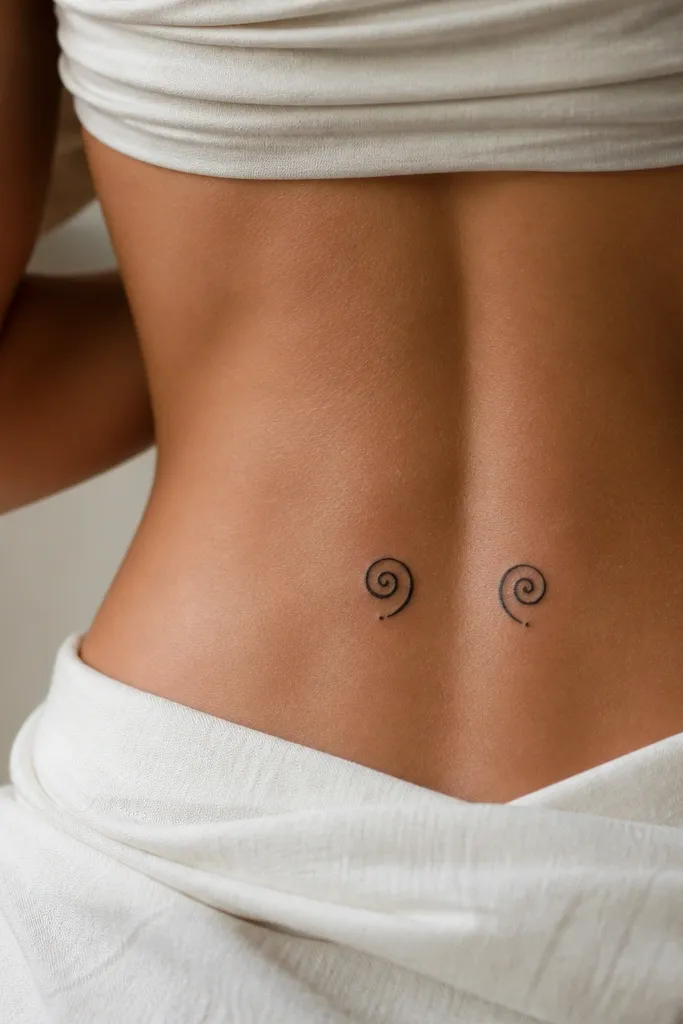
Tight swirls look elegant when the line is consistent and the center dot gives a focal point. The dot keeps the swirl from reading as a random loop. Matching works by mirroring the swirl direction so both designs look like they're reaching toward the middle.
Keep each swirl about 16-20 mm tall. Place it 5-6 inches above the butt crease, centered or slightly offset depending on your spine alignment. Use pure black and keep the swirl line weight around 1 mm.
Pro tipIf you want it extra clean, ask for the swirl to have one controlled taper, not multiple random tapers.
AvoidAvoid lots of tiny curls - they blur into a fuzzy halo.