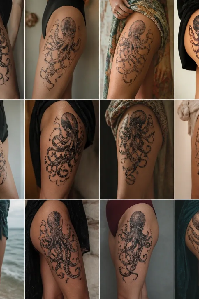
1. Razor-Edge Tribal Vines with Thick Outline
This works because the thick outline gives you a stable silhouette as the tattoo heals and settles. The angular vine tips read like 2000s tribal without turning into a blurry patch. I like using a solid black center spine so the tattoo has a clear "anchor" even as skin texture changes with time. The negative space between vine branches keeps it from looking crowded on a moving area.
Ask for a stencil that spans about 10-12 cm across at the widest point, with the center spine landing slightly above your waistband line. Keep the lines chunky - not thin hairline - and let the vines taper as they reach the outer hip. If you're pale or medium skin, pure black holds best; if you're deeper skin, ask the artist to go slightly heavier on the outline so the contrast stays strong.
Pro tipWear high-waisted underwear for 3-4 weeks after your session so the tattoo isn't fighting a seam.
AvoidAvoid super-fine tribal lines that look crisp in the stencil but fade fast after the first peel.
2. Mini Cherub Bow with Soft Dotwork Halo
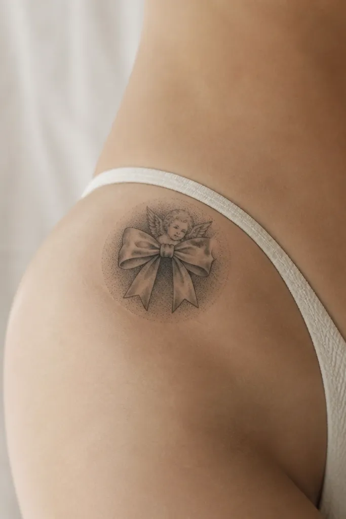
Dotwork is a low maintenance cheat because it heals with a softer, speckled texture instead of relying on heavy smooth shading. The cherub bow gives you that 2000s flirty vibe, while the halo adds depth without a lot of gradients. I've seen this style age better than smooth airbrush-looking shading because the dots keep their read even when they lighten. It also looks cute with minimal dress code - jeans, a crop top, or lingerie.
Keep it small: 7-9 cm wide, with the cherub elements centered and the halo staying behind the main bow shape. Ask for a limited palette - black and gray dotwork only - and tell the artist you want the halo lighter than the bow outline. Place it where your skin is flatter when standing - not centered on the deepest part of the butt crease.
Pro tipUse a thin, fragrance-free moisturizer after washing, and apply it with clean hands for 10-15 seconds only, then stop.
AvoidDon't ask for smooth gradient shading that looks like a photo filter; it's where this placement fades unevenly.
3. Cherry Blossom with One Bold Petal Cluster
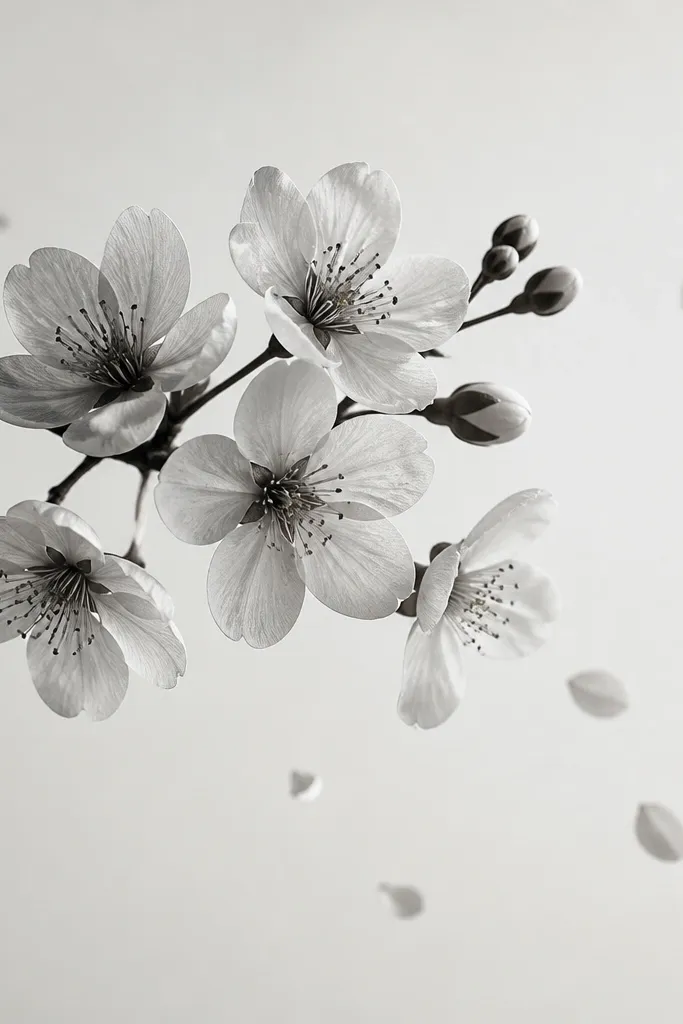
Cherry blossom tattoos hit 2000s energy when the composition is simple and high-contrast. One bold petal cluster keeps the design readable without turning into a busy watercolor mess. I like using black petals with soft gray accents instead of full color because this area gets sun and friction. The drifting petal dots act like a frame, so the tattoo still looks intentional if part of it lightens over the years.
Target a 9-11 cm span. Put the branch curve slightly toward the spine so it hugs your body line, then let the petal cluster sit higher than the waistband. Ask for a clean outline around the main petals, and keep the "drift" dots smaller than a pencil eraser.
Pro tipIf you're worried about fading, choose black and gray over color - it ages cleaner on this spot.
AvoidAvoid multi-color blossoms with lots of tiny details; they look muddy after healing.
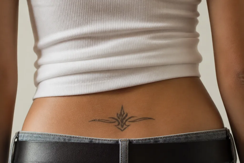
4. Hearts Stack with One Broken Line Detail
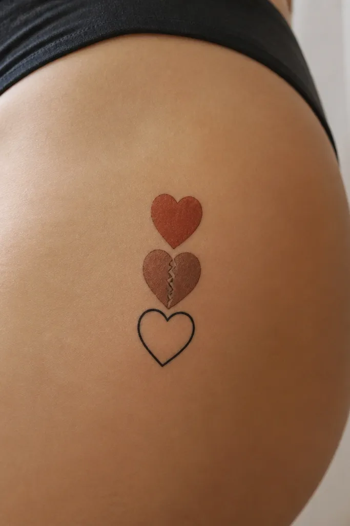
Layered hearts give that classic tramp stamp cuteness, but the broken line detail keeps it from looking flat or generic. The stacked layout is low maintenance because each heart is a distinct shape with clear edges. I like adding one intentional crack because it creates visual interest even if the tattoo softens with time. It also makes the tattoo feel like art, not a decal.
Aim for 8-10 cm tall, with the hearts about 2-3 cm each. Keep the crack line thin but visible, not a tiny hairline. Place it so the stack sits parallel to your torso - the hearts should look upright in a mirror, not angled toward your side.
Pro tipAsk for the hearts to be slightly wider at the base so they don't look top-heavy after settling.
AvoidSkip ultra-thin heart outlines; they vanish faster than you expect.
5. Barbed Wire Wrap with Center Star
This is 2000s edgy done right: barbed wire reads clearly even when it fades because the wire line is bold and continuous. The center star acts like a focal point, so the tattoo still looks "finished" if the outer wire softens first. I've had this design hold up well because the star gives contrast and the barbs create texture. It looks good with both soft outfits and punk looks.
Plan for 10-13 cm width, with the star sitting about 2 finger widths above the waistband. Ask the artist to keep barbs consistent in size so it doesn't turn into random specks. If you want extra longevity, request a slightly heavier wire stroke than you think you need.
Pro tipFor aftercare, avoid tight leggings for the first couple weeks - friction is what blurs barbs.
AvoidDon't crowd the barbs too close together; it turns into a dark blob.
6. Tattoo-Flash Butterfly with Hard Outline and Minimal Fill
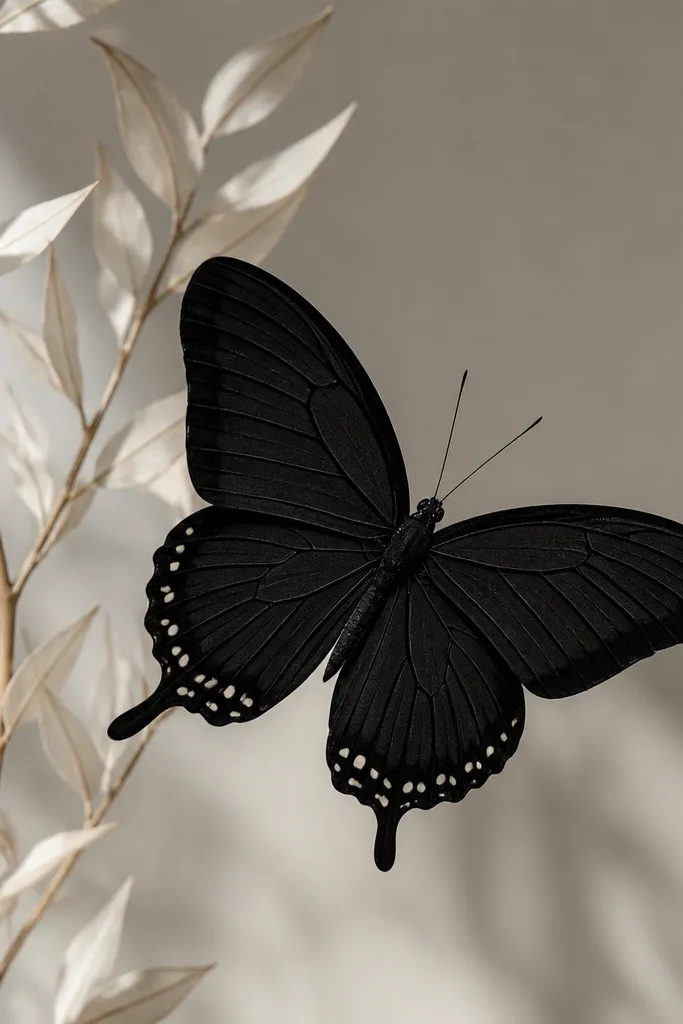
Flash-style butterflies age better than "realistic" butterflies because the shapes are graphic and the lines are confident. Hard outline gives you a clean read, and minimal fill means fewer chances for patchy healing. The small dot cluster adds movement without heavy shading. This is one of the least annoying tramp stamps I've worn - it stays sharp without constant touch-ups.
Keep it 8-12 cm wide. Place the butterfly so the body sits close to the center of your upper hip, with wings extending toward the side seams of your underwear. Ask for a strong outline and internal lines that are slightly thicker than you'd see in a fine-line sketch.
Pro tipIf you get sweaty easily, wash gently after workouts and pat dry - don't rub.
AvoidAvoid delicate watercolor butterfly wings; the fade looks uneven fast on this spot.
7. Delicate Anchor with Ribbon Tail
An anchor reads 2000s coastal even when you keep it simple. The ribbon tail gives you flow, and the tiny chain dots add detail without needing a lot of shading. This design stays low maintenance because it relies on bold shape and controlled linework. It also looks good on different body types because the anchor shape naturally fits the hip curve.
Go for 7-10 cm across. Place the anchor slightly higher than you think so the ribbon tail doesn't end up in a crease. Ask the artist to keep line weight consistent - no super thin chain that disappears after healing.
Pro tipChoose a ribbon tail that has at least two clear bends; it keeps the tattoo readable from the side.
AvoidDon't center it too low on the crease; ribbon lines smear with friction.
8. Sunburst Starburst with Thick Rays
A sunburst is the most straightforward low maintenance tramp stamp idea I've tried. Thick rays hold their shape, and a filled center circle keeps it from looking like a sketch. This style looks bold under a thong or bikini because the contrast is high. Even when it fades a little, the rays still read as a burst.
Pick a size around 10-14 cm wide depending on your hip width. Place it so the center sits near the inner hip, not the outer side. Ask for ray thickness that's close to the width of the center circle - if the rays are too thin, they'll disappear first.
Pro tipIf you want it to look more 2000s, ask for slightly uneven ray lengths - like a hand-drawn flash.
AvoidSkip thin radiating lines; they heal too lightly on moving skin.
9. Script Nameplate with One Thick Underline
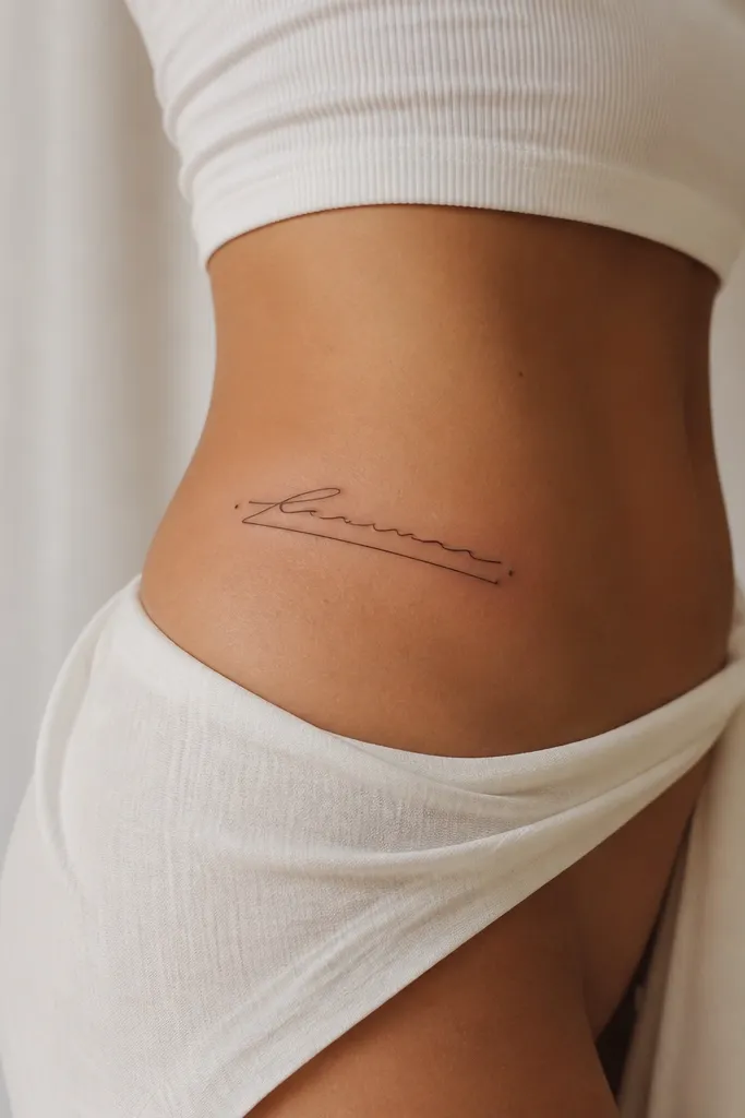
Script can be low maintenance if you treat it like graphic design, not handwriting. The thick underline is the trick: it gives the tattoo a stable base even if the letters soften. I like using a clean, slightly slanted script with consistent stroke width, then adding tiny spark dots at the ends for the 2000s "glam" feel. This looks good in photos because the underline catches light and keeps the composition obvious.
Keep the text short - 6-10 characters max. Make the underline about the same length as the text, with a thickness that matches one of the letter strokes. Place it parallel to your waistband so it reads correct when you stand.
Pro tipBring your exact font preference and ask the artist to redraw it at your body scale - don't rely on a sticker font.
AvoidAvoid super thin script with no bold element underneath; it fades into a gray smear.
10. Crescent Moon with Small Stars and One Dot Shimmer
This is a soft 2000s option that still stays readable. The crescent outline is a strong shape, and the stars are just dots - easy for skin to heal. The one larger "shimmer" dot adds personality without needing gradients. I've seen crescent tattoos last well because they don't depend on tiny shading to look like the original stencil.
Size it 7-10 cm wide. Put the crescent higher than the waistband so the curve sits on flatter skin. Ask for the stars to be consistent in spacing and size, and keep the dot shimmer slightly off-center for a natural look.
Pro tipIf you want it to feel more 2000s, ask for a thicker crescent outline and slightly bolder star dots.
AvoidDon't add tiny star line-work; it turns into speckled noise after healing.
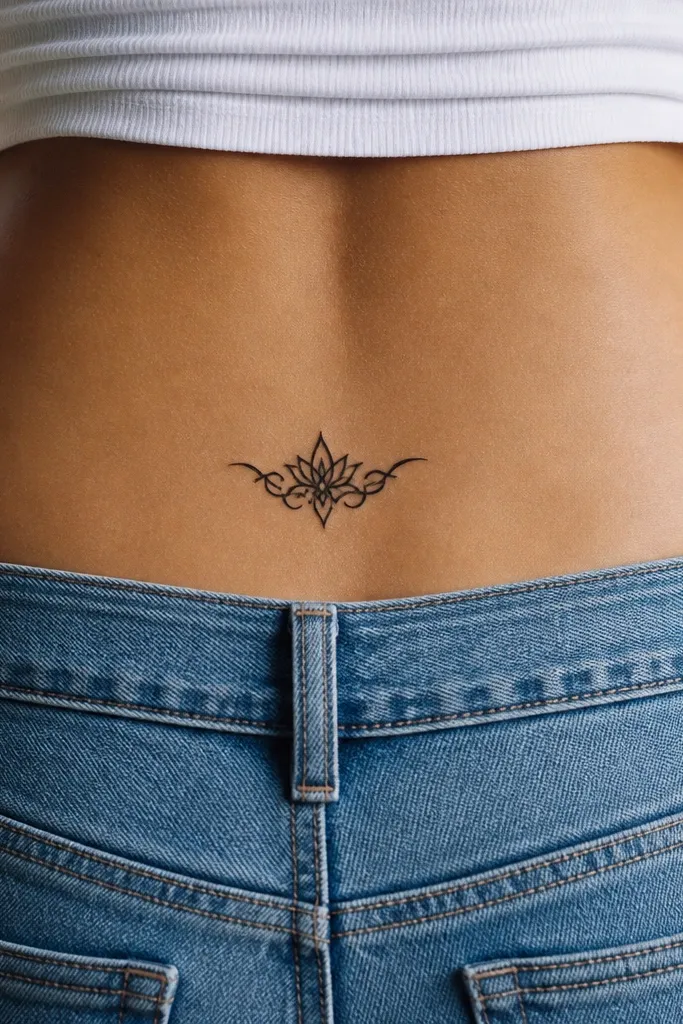
11. Flower Burst with Black Petals and One Red Accent
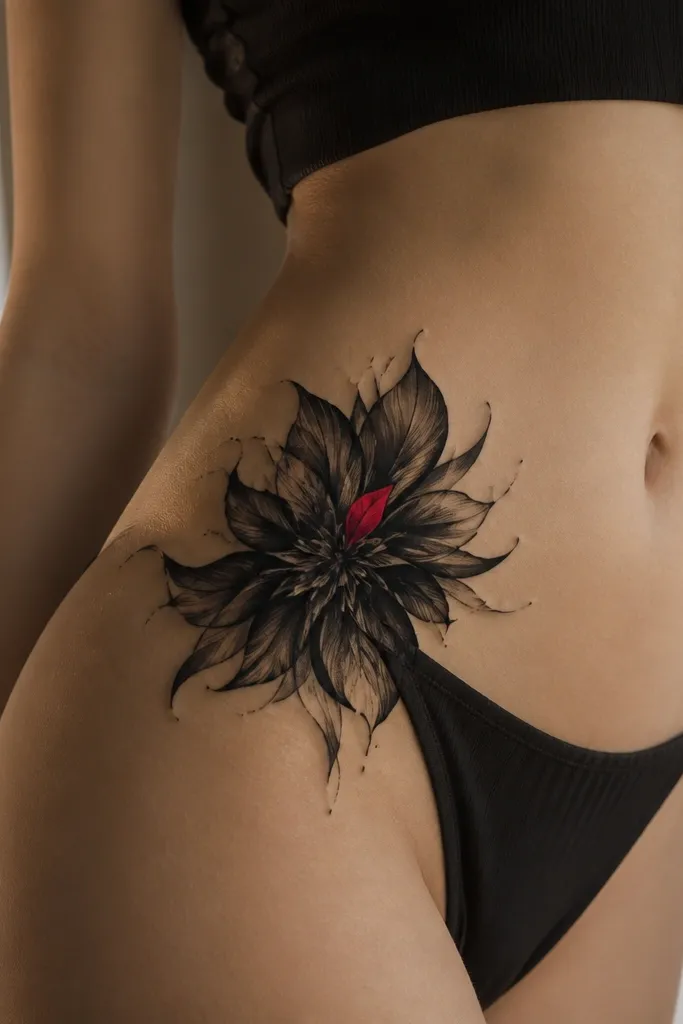
Color doesn't have to be high maintenance. One small red accent inside an otherwise black design gives you the 2000s "girly but tough" look, and black does the heavy lifting for longevity. The red will fade faster than black, but it stays cute because it's tiny and surrounded by strong lines. This design is also forgiving if you get sun - the black still reads clearly.
Keep the red area small - about 1 cm across in the center. The flower should be 9-13 cm wide with bold petal outlines and minimal interior shading. Place it on the upper hip so the petal burst sits on the flatter zone when you sit.
Pro tipWhen caring for it, use a plain, fragrance-free ointment only for the first few days if your artist recommends it - then switch to a light moisturizer.
AvoidAvoid big blocks of red in moving skin; they blur and fade unevenly.