1. Classic Butterfly Duo With a Lace Border
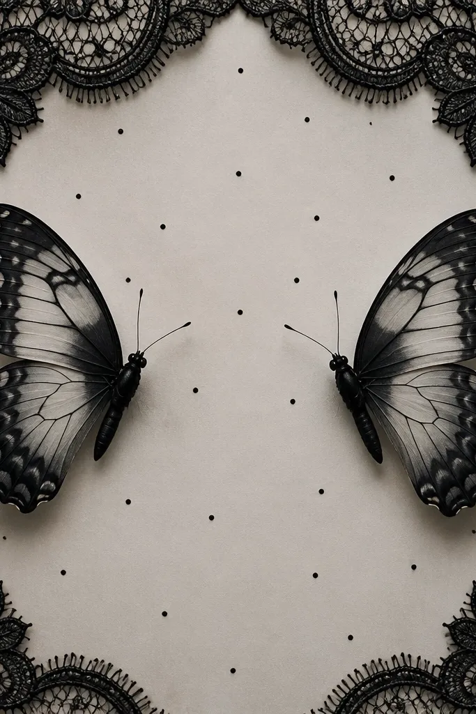
This one works because it follows the back's natural curve without turning into a blob. The butterflies use crisp outlines with grey wash for wing depth, and the lace border creates a soft frame instead of a hard rectangle. The tiny dot specks keep the area from looking empty, which matters on healed skin where fine highlights settle differently than fresh ink.
Ask for a stencil that spans roughly from one hip bone outward to about the next finger width past the other hip bone. The center should sit just below the waistband line. Keep the border line weight lighter than the butterfly outlines so the wings stay the focal point. Placement looks best when the wings angle slightly upward toward the spine.
Pro tipIf you want it to look sharper after healing, choose grey wash shading over heavy stippling for the wings.
AvoidAvoid putting the border too thick; it makes the whole piece look like a stamp.
2. Red Rose Stem With a Soft-Tapered Vine
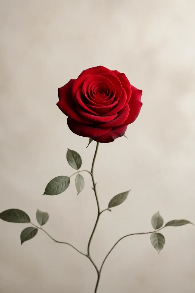
A rose stem looks different after healing because the tapered lines still read as "movement." The red petals usually fade slightly, but the grey-green vine stays legible, so the composition keeps its shape. The taper is key: it makes your waist look narrower and pulls attention toward your center.
Have the artist place the rose head at the midpoint of your waistband line, then let the vine drop 4 to 6 cm below. Keep the rose about the width of two stacked hands (roughly 8-10 cm across) for this placement. Use red for petals with a darker maroon at the base and lighter crimson toward the edges, then keep leaves in desaturated green-grey so they don't fight the rose.
Pro tipBring a reference photo with a side-angle, not a straight-on rose - it helps the artist match the vine's curve to your back contour.
AvoidDon't choose a rose that's too wide; if it spans your full back width, it looks like you glued it there.
3. Ribbon Bow and Micro Stars
This style flatters because the bow sits at your natural centerline and the ribbon tails create diagonal lines. The micro stars add sparkle without filling the whole space, so the tattoo still looks airy once skin texture settles after healing. I like it for people who want something playful but not cartoonish.
Aim for a bow width of 10-12 cm, with tails extending slightly past the waistband line by 1-2 cm. Keep tails thin - about the thickness of a pencil line - so they don't overtake the bow. Use black for outlines, then add light grey shading on the bow folds. Stars should be tiny and spaced, not clustered into a dense cloud.
Pro tipAsk for a couple of stars placed higher near the bow's top edge; it visually balances the tails.
AvoidAvoid making the stars the same size as the bow lines; it turns into a heavy confetti mass.
4. Script Cursive Arc Over the Spine
Script works when it follows your spine's curve instead of sitting flat. The arc creates a gentle lift, and the taper makes the wording look like it belongs to your anatomy. If you add light grey shadow under only a few strokes, it reads dimensional without darkening the whole piece.
Choose a line of text that fits horizontally across your lower back, not too long. For most people, 7-12 letters looks clean in this spot. Place the top of the first letter just under the waistband line, and let the flourish end about 2-3 cm above the widest hip area. Use a stencil mock-up to check spacing because cursive can look too tight once healed.
Pro tipUse a font with consistent stroke width; dramatic thin-and-thick fonts often heal unevenly in this area.
AvoidAvoid all-over grey wash behind the whole sentence; it blurs as it heals.
5. Blackwork Sunburst Behind a Tiny Moon
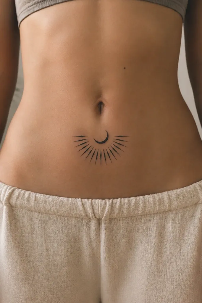
This is bold without being huge. The semicircle sunburst gives a halo effect, and the tiny moon keeps the center sharp. Blackwork ages well when the rays are short and evenly spaced, because the negative space between rays stays readable.
Keep the moon around 3-4 cm wide and place it slightly above the waistband line. The sunburst should extend about 8-10 cm across, stopping before it hits the flattest part of your lower back. Ask for crisp triangle rays with uniform line weight, and keep the rays angled slightly upward to flatter the waist.
Pro tipIf you want it to look cleaner later, avoid packing the sunburst too dense - let the triangles breathe.
AvoidAvoid long rays that reach your hip bones; they stretch visually and can look messy.
6. Geometric Triangle Stack With Negative-Space Cutouts
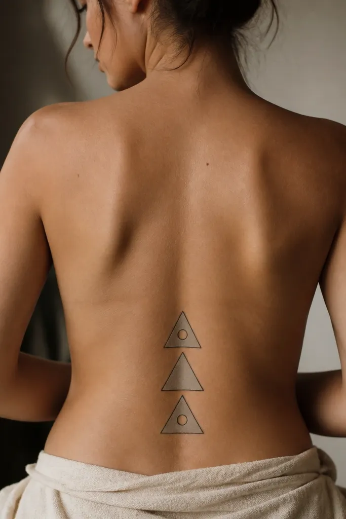
Geometric pieces look crisp after healing because the lines and cutouts keep their structure. Negative space is doing the heavy lifting here: it prevents the tattoo from becoming a dark patch. The stacked triangles also create a subtle vertical pull, which makes the area between waistband and hips look longer.
Use three triangles, with the largest at the bottom and each upper triangle 70-75% of the width. Keep outlines slightly thicker than the fills so the geometry reads from a distance. Place the bottom triangle edge about 1-2 cm below your waistband line. For cutouts, pick circle sizes that are consistent - around 3-4 mm each - so they don't turn into blobs.
Pro tipHave the artist stencil it on in good lighting; geometric symmetry looks wrong if you're squinting at the mirror.
AvoidAvoid heavy black fills in this spot; they fade into a grey smudge faster than linework.
7. Dotwork Mandala Half-Frame
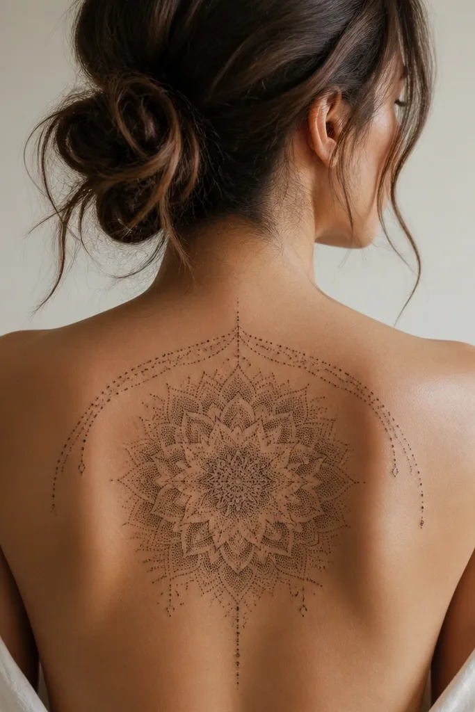
Dotwork looks soft even when it's dark, and that's why it works on the lower back. The half-frame keeps it from wrapping too far onto the sides, so it stays readable as a single unit. Dense dot clusters in the center fade slower than solid blocks, and the gradient gives you depth without harsh edges.
Pick a mandala size that's about 9-11 cm across. Place the top of the mandala just under the waistband line and let the lowest details sit around 2-3 cm above the widest hip. The half-frame should stop short of the spine so it doesn't look like a halo sticker. Use black dots with a few grey dot layers - the grey dots should be sparse, not a full wash.
Pro tipAsk for a flatter dot pattern toward the edges; it helps it heal smoother on textured skin.
AvoidAvoid tiny dot clusters closer than 1 mm apart; they merge as the skin regenerates.
8. Feather With Micro Realistic Veins
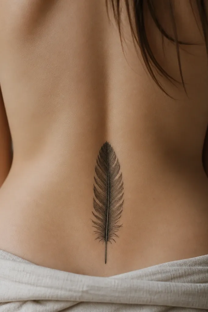
This works because a feather is naturally directional. The central shaft pulls the eye up and down, and the micro veins keep it from reading as a generic outline. Realistic veining also hides uneven healing better than a flat silhouette because there's texture everywhere.
Make the feather about 10-14 cm long, with the tip pointing slightly toward your spine. The shaft should be placed 2-3 finger widths below the waistband line. Use black ink for the main shaft and veins, then add grey dot shading along the feather edges only. Keep the barbs small and spaced so they don't turn into a dark fringe.
Pro tipIf you want a softer look, keep the feather edges in dot shading instead of solid black.
AvoidAvoid thick outlines on micro-detail feathers; thick lines blur and cover the veins.
9. Small Dagger and Rose Combo
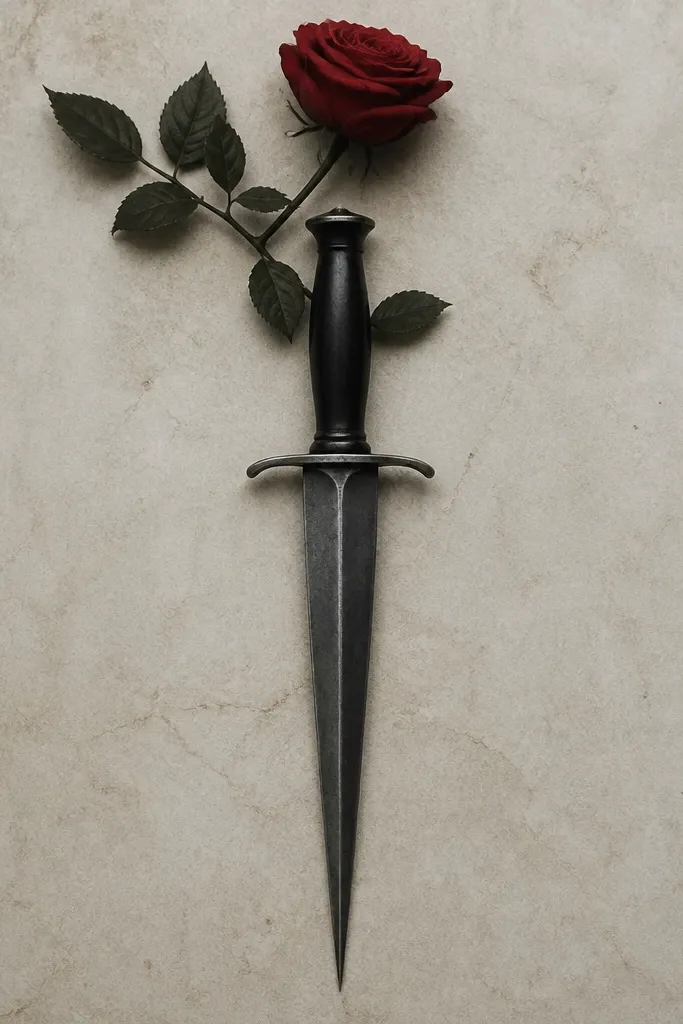
The dagger gives you that vertical length, and the rose adds contrast so it doesn't look cold. When the blade is grey wash with crisp edges, it looks dimensional after healing. This combo also reads well in motion - it catches light differently than flat symbols.
Place the dagger so the guard sits just below the waistband line and the tip ends around the widest hip area. Keep rose petals small, about 4-6 cm across, so the dagger stays the main shape. Use red only in the rose, with maroon at the base and a lighter crimson highlight toward the outer petals. The dagger should have fine line edges and grey shading that follows the blade's curve.
Pro tipAsk for a slightly curved dagger, not straight; straight blades can look stiff on the back's contour.
AvoidAvoid adding too many extra ornaments; clutter makes the healed tattoo look heavy.
10. Lined Heart Chain With Tiny Lock
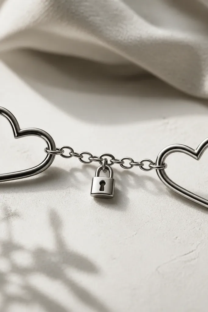
Thin line hearts with a lock charm look clean when they're small and spaced. The chain creates a light curve that follows your lower-back shape, and the lock gives the design a focal point. Minimal shading keeps it from turning into a dark patch as the skin texture changes.
Keep the hearts about 4-5 cm wide each, with the lock charm around 1.5-2 cm. Place the top of the hearts around the waistband line, and let the lock sit at the midpoint between waistband and hips. Line weight should be consistent and thin - think fine pen lines. Use a tiny bit of grey under the lock to show depth, not a full shadow everywhere.
Pro tipBring a photo of your favorite necklace style; the chain thickness should match what you actually wear.
AvoidAvoid thick black outlines on small hearts; they age faster and blur together.
11. Floral Vine Corner Frame
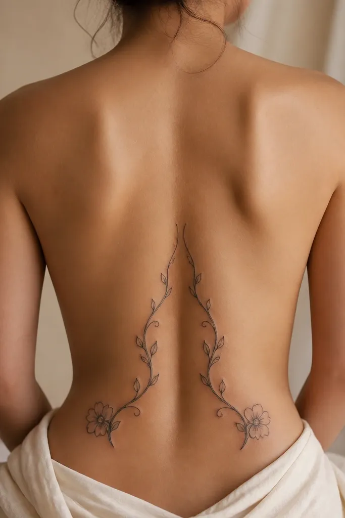
A corner frame makes the tattoo look like it belongs to your body rather than sitting on top. The mirrored vines hug your back shape and stop before the tattoo spreads too wide. Light grey shading on petals makes it look soft even with black linework.
Stencil it so the vines start about 3 cm from the spine and curl outward to sit near the hip bones, not past them. Flower heads should be about 3-4 cm wide each, with 2-3 flowers total per side. Use black outlines, then grey wash only in the petal creases. Keep leaf veins fine so they stay readable.
Pro tipIf you wear low-back outfits, ask your artist to test with a bra or underwear line so the frame doesn't get cut off visually.
AvoidAvoid vines that reach too far down; they can end up looking like they're sagging after healing.
12. Watercolor Wash Rose (Muted Lavender Fade)
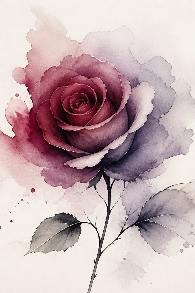
Muted watercolor works when it's placed where you'll see it in good lighting. The burgundy base anchors the rose, and the lavender fade gives that "after" effect where the tattoo looks like it's softening into your skin rather than sitting on top. I like this for people who want color but hate loud, neon saturation.
Keep the rose core smaller than you think - 7-9 cm across - so the wash doesn't spread too wide during healing. Ask for a light black stem line to define direction, but keep outlines minimal. The lavender should fade outward in a controlled gradient, not a full paint blob. Place the center at the waistband line and let the wash extend 1-2 cm below it.
Pro tipUse a reference photo with soft lighting; watercolor placement looks different under harsh flash.
AvoidAvoid bright magenta and heavy black outlines together; it turns muddy as it heals.