1. Crescent Moon + Micro Stars Arch
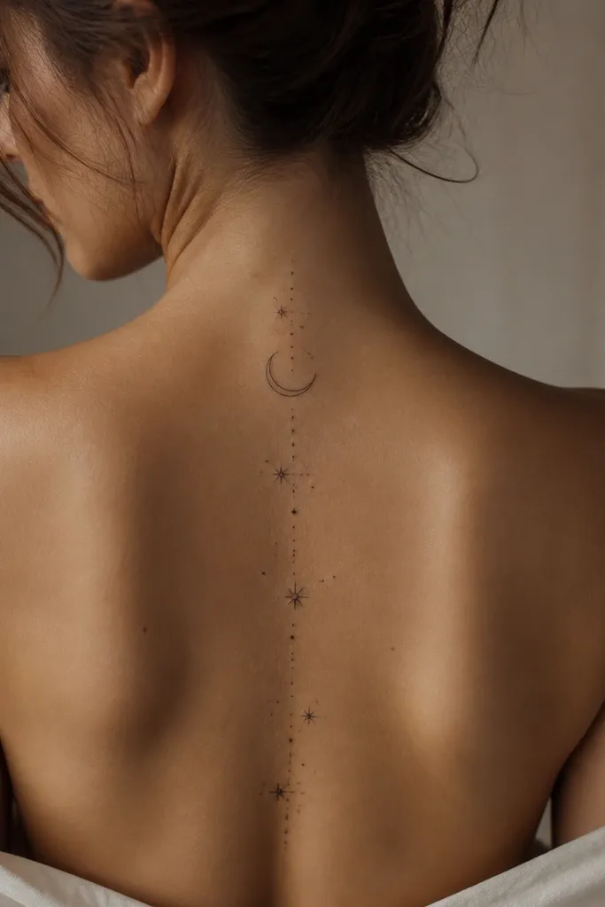
This design works because the crescent naturally echoes your lower-back curve. The micro stars keep it airy instead of heavy, and the light gray shading gives the moon a gentle glow without looking dark and flat. Fine line weight reads clean on skin that moves with you, like the back when you sit.
Place the crescent so its "ends" align about 1.5 inches from the spine each side. Keep the overall width under 4 inches so it stays flattering under a low-back top. Ask your artist to use a light stipple for the moon's interior and reserve solid black only for the outer crescent line.
Pro tipIf you want extra "aesthetic," add one star slightly larger than the rest - it gives the composition a focal point in photos.
AvoidDon't pack the stars too close together; tight clusters blur as they heal.
2. Single Rose With Thin Vines
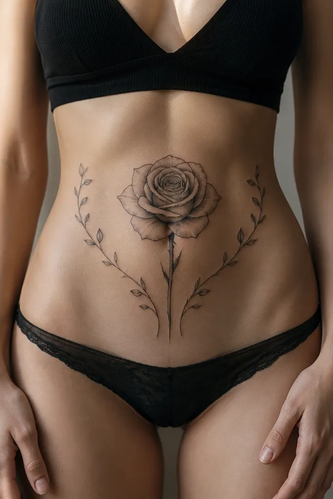
One rose looks classy because it's readable even when you're wearing minimal back coverage. Thin vines add movement and frame your spine line, so the tattoo doesn't feel like a sticker. Black and gray shading stays elegant, and the petal linework gives you texture that holds up over time.
Position the rose head at your 2.5-inch-above-waist mark. Let the vines taper as they descend, ending above the hip bones so they don't get rubbed by underwear edges. For shading, request a mix of soft gray gradients and tiny petal speckling, not large filled areas.
Pro tipChoose a rose with a slightly turned angle (not perfectly flat) so the petals catch light differently as you move.
AvoidAvoid thick, dark fills in the rose center; they can heal like a blob on the back.
3. Butterfly Outline With Soft Dot Shading
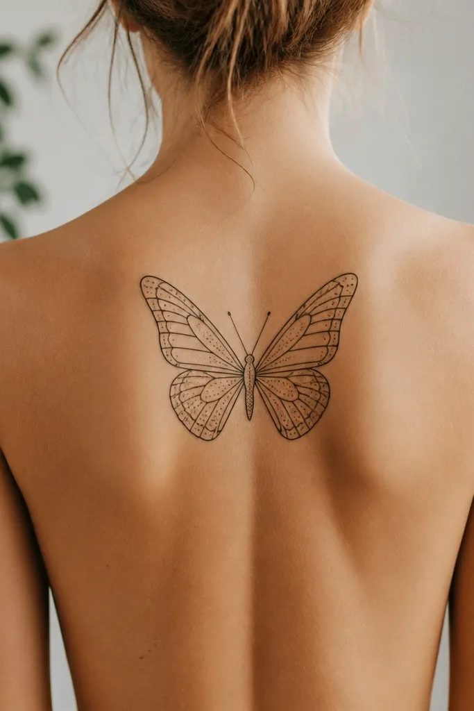
A butterfly looks "pretty" here because it has a clear silhouette that stays flattering under a low-back neckline. The dot shading gives dimension without turning the wings heavy, and the outline keeps it sharp. It also photographs well because the wings create contrast against bare skin.
Keep the butterfly wingspan around 3.5 to 4 inches wide. Place the body line directly on the spine so the symmetry looks intentional. Ask for stipple shading only in the wing halves, leaving small outline gaps for crispness.
Pro tipIf you want a softer look, ask for a slightly lifted tail end - it makes the tattoo feel lighter and more feminine.
AvoidDon't do full solid shading across both wings; it heals flatter and can look like a sticker.
4. Feather With Tiny Featherlets
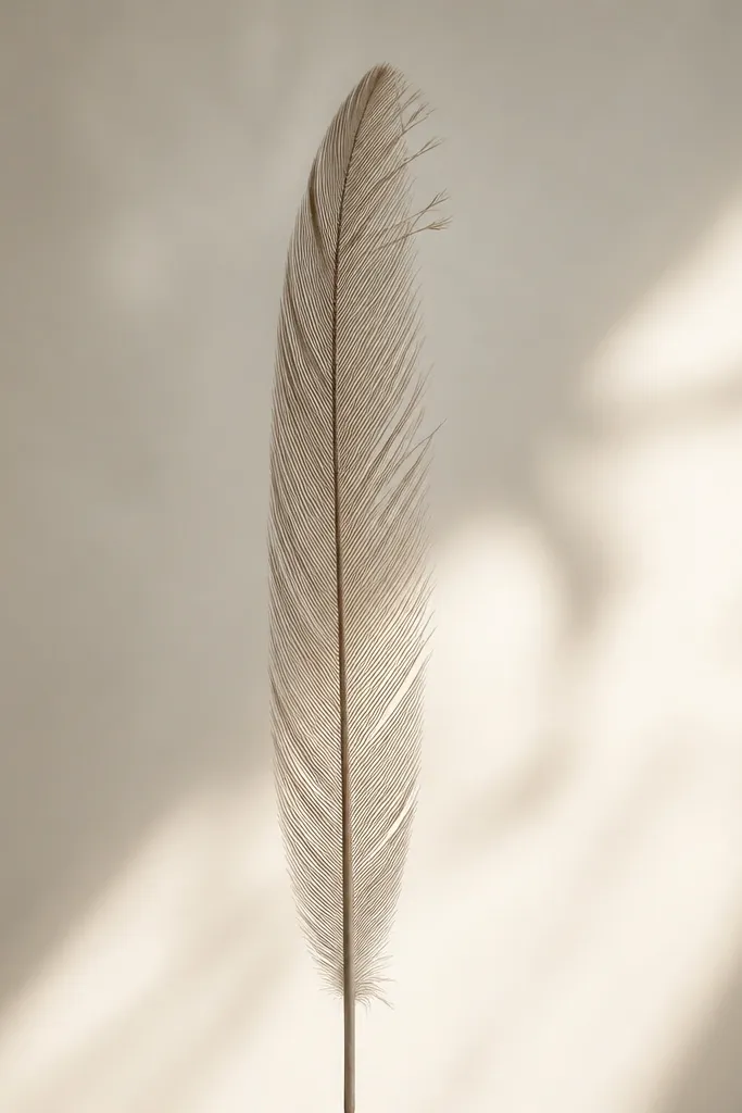
A vertical feather is one of the cleanest tramp stamp choices because it matches the back's natural line and elongates visually. The tiny featherlets add detail without requiring heavy shading. When the barbs are spaced right, the whole piece stays airy and aesthetic.
Place the feather spine at the center of your lower back and aim for a length of about 5 to 6 inches. Keep the barbs thin and consistent; too much variation makes it look messy. Request black outline with light gray shading only along one side of the feather shaft.
Pro tipAsk for the featherlets to start slightly above your waist mark so they don't get hidden by underwear seams.
AvoidSkip thick outline + heavy black fill together; that combo heals harsh on this area.
5. Bow Ribbon Knot With Confetti Dots
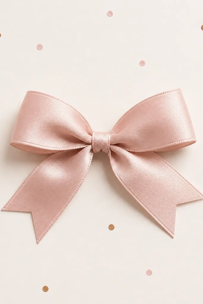
A ribbon bow reads playful and feminine, and the knot gives it structure. The confetti dots add a "designed" feel without clutter. Because the main lines are crisp, the tattoo stays readable even after the back skin stretches a little during healing.
Keep the bow width around 3 inches and place the knot at your 2.5-inch-above-waist line. Let the ribbon tails curve outward slightly, not straight down. Use dot accents sparingly - about 10 to 15 dots total across the area.
Pro tipPick a bow with clean, symmetrical loops; asymmetry is harder to fix after healing.
AvoidDon't scatter dots randomly all around; a loose halo makes it look unfinished.
6. Small Star Cluster With One Longer Star
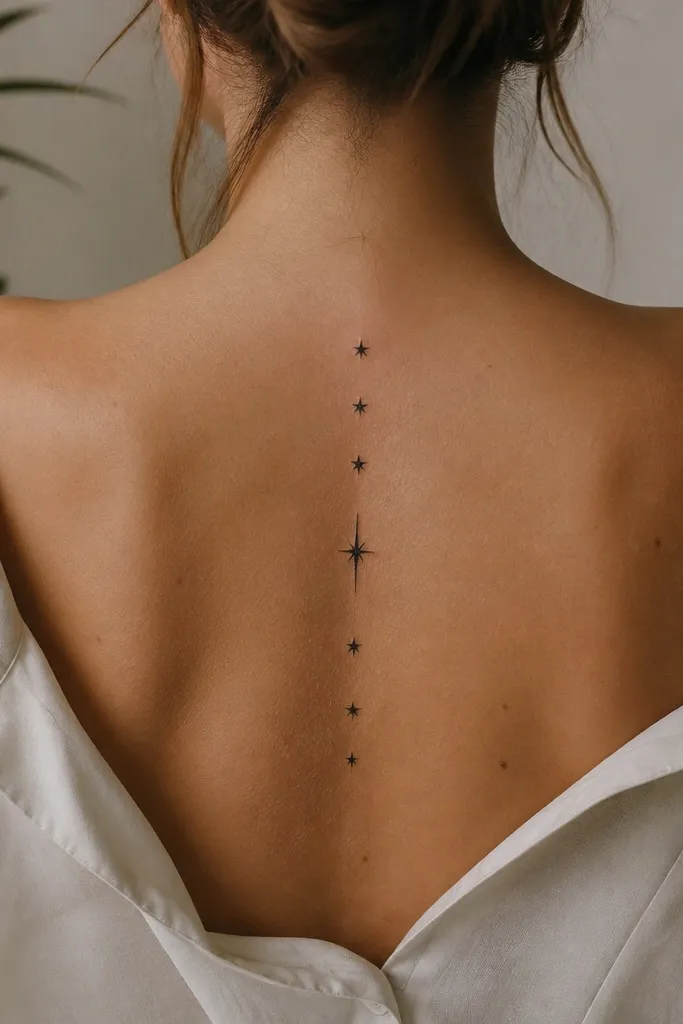
This is the "minimal but not boring" option. Clusters create a focal point without needing big shading, and the longer star gives a natural hierarchy. It also looks good when partially visible - like under a bikini strap.
Aim for 6 to 9 stars total in a compact oval about 2.5 to 3 inches wide. Place it so the oval sits just above the waistband line. Ask your artist to keep outline weight consistent and avoid heavy gray - pure black reads cleaner for tiny shapes.
Pro tipIf you want it to feel softer, request slightly uneven star angles so it doesn't look like a stamp.
AvoidAvoid tiny shapes that are too close; they blur into one dark patch.
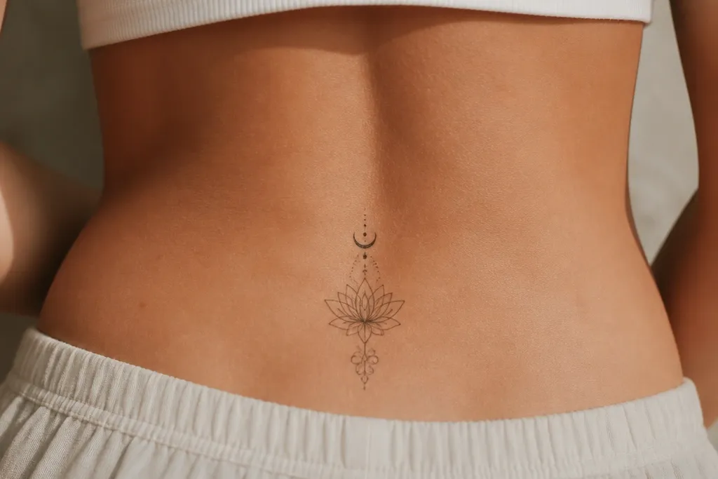
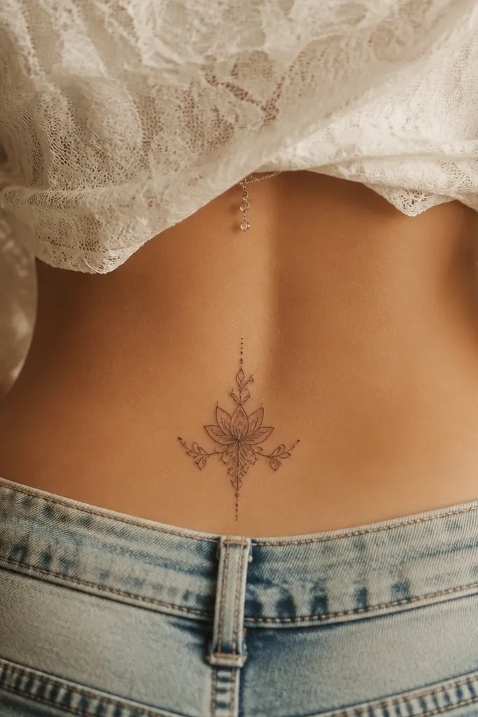
7. Lotus Bloom With Center Dot
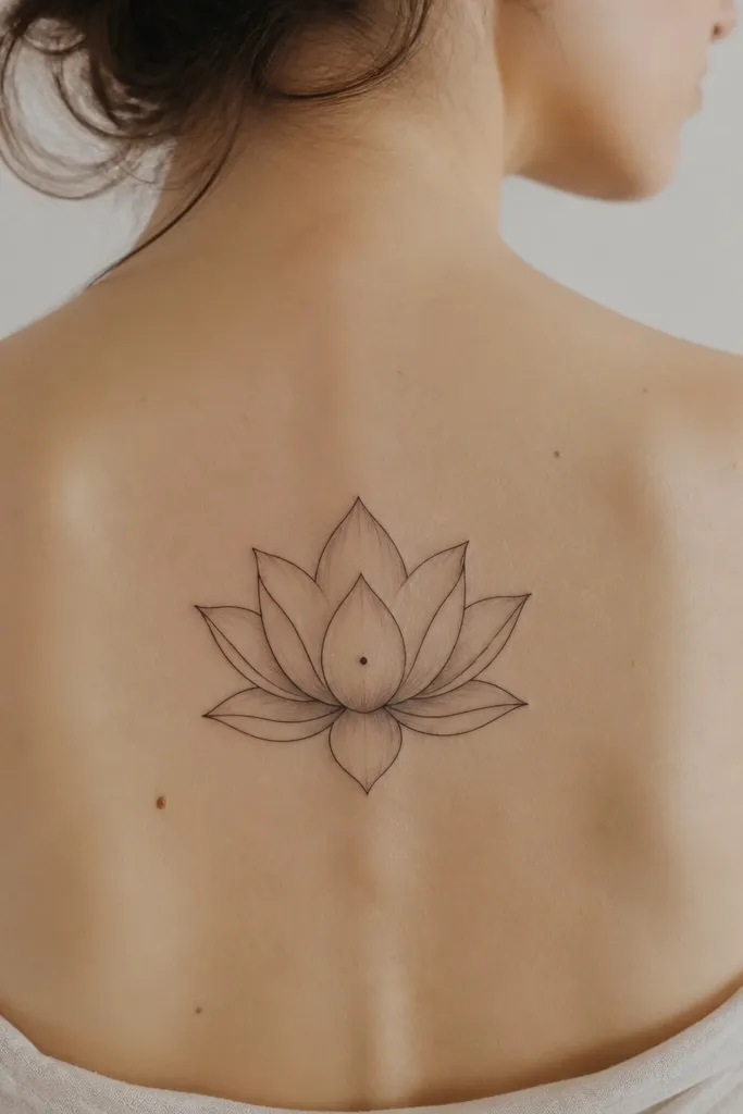
Lotus petals look elegant on the back because they create a natural round frame around your spine line. The center dot adds a crisp focal point, and the light gray shading keeps the petals dimensional. It feels "zen pretty" without needing color.
Place the lotus head at 2.5 inches above the waist seam. Keep the bloom about 3.5 inches across so it stays in a flattering zone. Ask for petal shading only at the base of each petal, leaving the outer edges clean.
Pro tipChoose a lotus with slightly pointed petals; rounded petals can heal flatter and less defined.
AvoidDon't use dense dark shading in every petal; the back will mute it and it turns muddy.
8. Sunburst Linework With Thin Rays
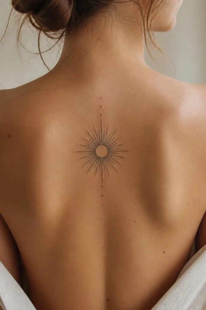
A sunburst is aesthetic because it's graphic and symmetrical. Thin rays read delicate, and minimal gray keeps it from turning into a thick black halo. This also ages well because linework stays legible even when shading fades.
Keep the burst diameter around 3 inches. Place it centered and slightly higher if you wear low-back bras frequently - about 3 inches above your waist. Request linework with consistent ray spacing and no heavy fill.
Pro tipAsk for 14 to 18 rays, not 8 or 24; the middle number looks balanced on this body area.
AvoidAvoid thick rays; they dominate the whole back and look heavy.
9. Half-Sleeve Style Vines Crossing the Spine
Crossing vines create motion, and the X flow guides the eye down and around your waist. Small leaves add texture without needing big shading. This looks especially good if you plan to add more tattoos later, because the vines can "grow" upward or downward.
Place the crossing point right on your spine at about 2.5 inches above the waist. Keep the leaves small - around 0.5 inch each - so it doesn't get bulky. Use fine line black for leaves and light gray for bud shadows only.
Pro tipIf you're adding color later, keep the leaves black and leave tiny highlight spaces so color won't look muddy.
AvoidDon't pack the vines too close to the spine; negative space is what makes it look intentional.
10. Tiny Cherub Face in Soft Gray
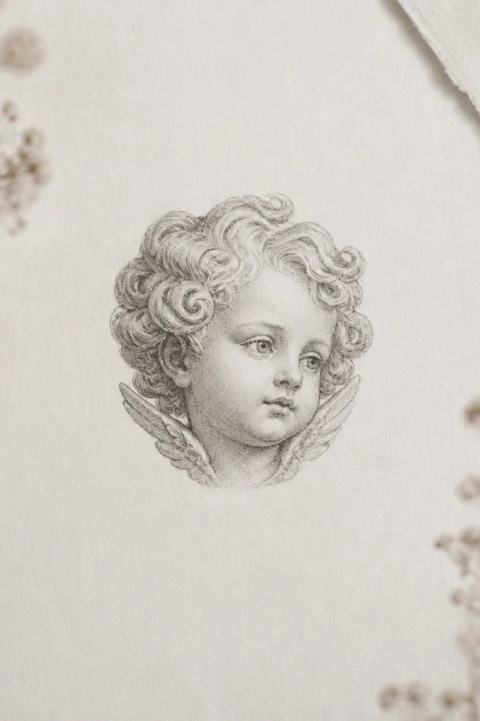
A cherub is cute and surprising, and small scale keeps it from feeling cartoonish. Soft gray shading gives it depth without harsh outlines. Centering it over your spine makes it feel like a "back jewelry" piece.
Keep it small, around 2.5 to 3 inches tall. Place the face at the same 2.5-inch-above-waist mark. Ask for thin linework for the features and stipple shading only around the hair and cheeks.
Pro tipIf your skin scars easily, ask your artist to go lighter on the outlines and focus on clean line edges instead of dark retracing.
AvoidAvoid thick black outlines around the whole head; it can look like a stamp after healing.
11. Pearl Strand Wrap With Tiny Clasp
Pearls look aesthetic because they're naturally spaced and give a delicate, jewelry-like effect. The curve matches your lower-back slope, so it looks like it belongs there. Light gray shading under each pearl adds a "shine" illusion without needing color.
Make the wrap width about 4 inches total. Place the clasp at 2.5 inches above the waist and let the strand taper slightly as it goes down. Request each pearl to be outlined lightly, with a small gray shadow on the lower edge.
Pro tipAsk for the pearls to vary by a tiny amount in size - it looks more realistic than perfectly identical beads.
AvoidDon't outline every pearl with the same thick line; it turns into a dark row.
12. Arch of Hearts With One Broken Heart
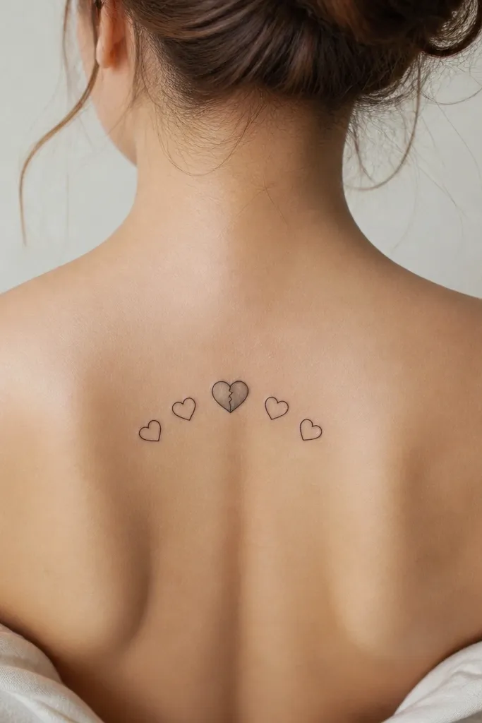
Hearts read romantic, and the arch makes them feel like a frame for your back. Adding one cracked heart gives personality without making the whole design heavy. Gray shading in the cracked section adds contrast while keeping the rest clean.
Place the bottom of the hearts just above the waistband line, around 2.5 inches up. Keep the hearts small - about 0.6 to 0.8 inch each - and aim for 7 to 9 hearts. Request the cracked heart to have thin line breaks and light gray shadow inside the crack.
Pro tipIf you want it to look more "pretty" than "goth," keep all hearts outlined in clean black with no extra dark fills.
AvoidSkip huge hearts; big shapes spread out and lose crispness on the back.