
1. Laundry Day Snark Label
This one works because it reads like a real garment instruction label, but it's playful when it shows under a low-back top. I've done this with thick black outlines and a tight block of text so the letters stay legible. The washer/dryer icons add humor without needing heavy shading.
Keep it about 5 to 6 inches wide, and place the bottom edge just above your underwear band line. Ask for a rounded rectangle label shape with 1-2 small icon lines inside. Blackwork only looks best for this theme; if you add color, use one muted accent like faded navy in the washer icon.
Pro tipPut a tiny starburst around one word like "TUMBLE" to make it pop when it's partially covered. That single accent reads well in photos.
AvoidAvoid micro-text smaller than a pencil eraser - it turns into gray mush after healing.
2. Hot Sauce Inventory Sticker
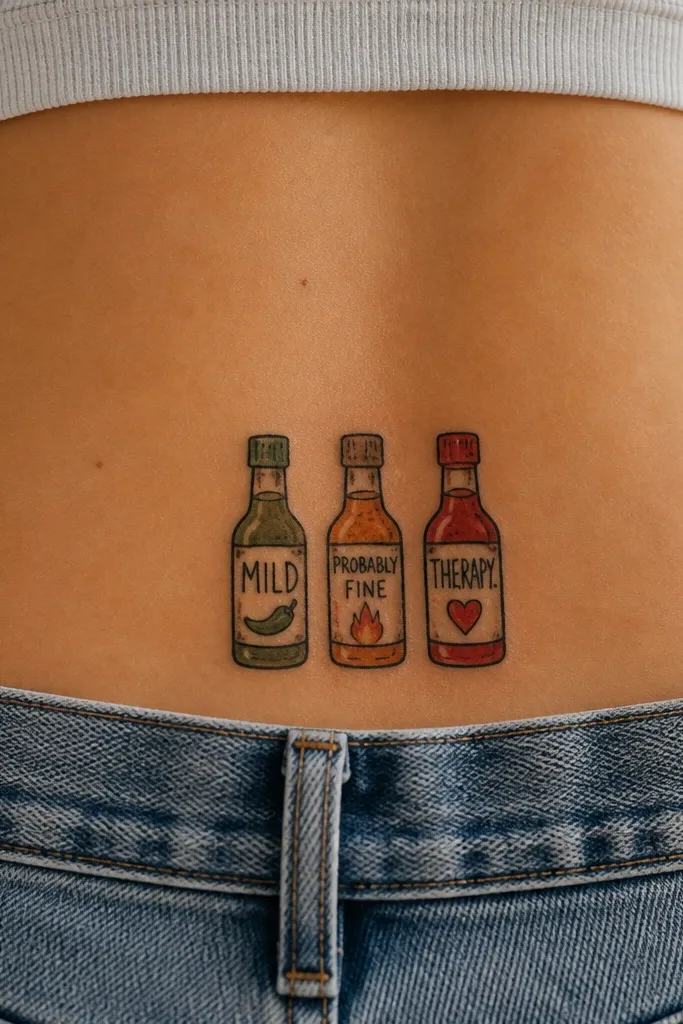
Sticker art is funny because it looks like something you'd actually peel off a bottle. It also holds up if the artist uses clean, bold outlines and keeps the color palette tight. This tattoo works year-round because the theme is already "seasonal" in your life - you're always using it, not waiting for a holiday.
Size it around 4.5 to 5.5 inches across. Use red for the main sauce bottles, a muted yellow for one label, and keep the rest black for contrast. The bottles should be slightly tilted, but the centerline still needs to align with your spine.
Pro tipAsk the artist to add a tiny "smudge" effect on the label edges - it makes it look like a real sticker rather than a printed design.
AvoidAvoid super-saturated neon reds. They fade into a pink blur under daily rubbing.
3. Spine Line Cat Butt (Stylized)
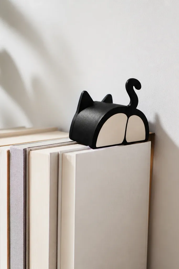
This is the tramp stamp sweet spot: cute without being childish. By placing the design as a spine-following curve, it flatters the body and stays readable even when you're wearing clothes that partially cover your lower back. The cream fill gives it warmth without requiring a ton of color work.
Go for 4 inches max in height. The top of the cat shape should start near where your bra band ends when you stand. Use black outline with a limited cream/white-ish negative space fill (no heavy gradients).
Pro tipIf you want it to look extra clean, choose a stencil style where the outline is slightly thicker on the outer curve of the shape.
AvoidSkip tiny whiskers. They look sharp on paper and turn into a fuzzy line after a few summers.
4. Mascara Application Checklist
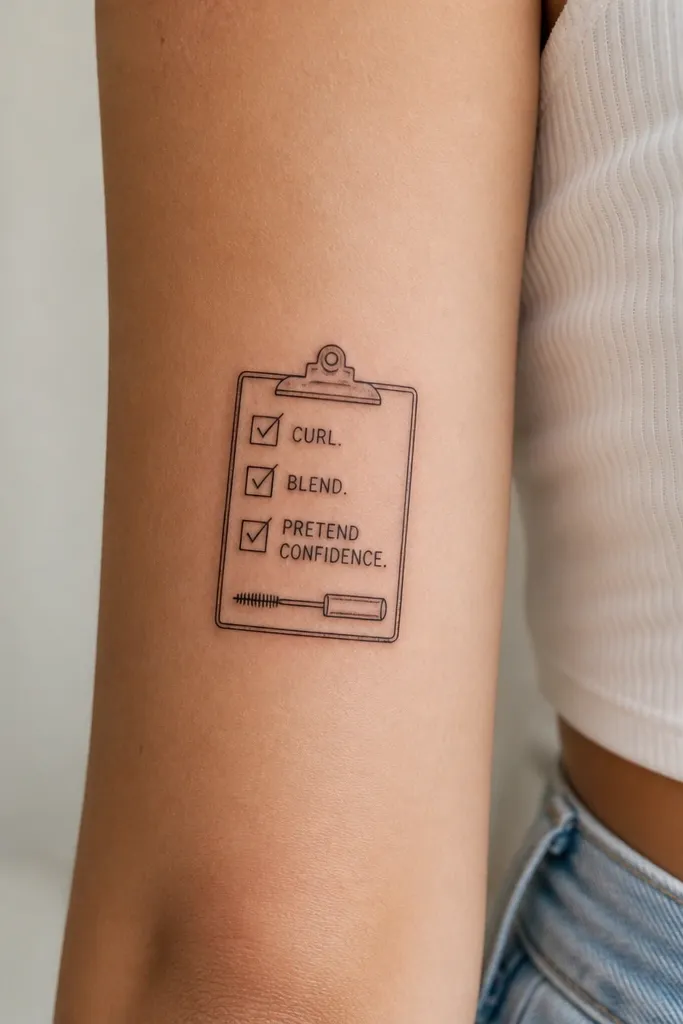
A checklist is funny because it's relatable, and it looks good in a compact area. The clipboard shape also gives you a clear border, so the tattoo reads cleanly even from the side. I like it in black ink with one small highlight dot - it keeps the humor crisp.
Size it about 4 by 3 inches. Place it slightly off-center only if your body naturally has an S-curve; otherwise, keep it centered on the spine for best symmetry. The checklist text should be large enough to read without zooming.
Pro tipAsk for the "PRETEND CONFIDENCE" line to be slightly bolder than the rest. That hierarchy makes it readable after healing.
AvoidAvoid thin checkmark marks. They break up and look like accidental scratches.
5. "BRB" Tiny Comic Bubble Chain
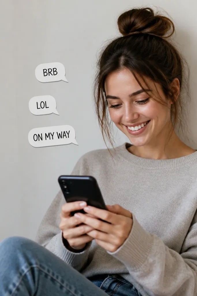
Speech bubbles are funny and also easy to keep consistent across seasons because it's just your attitude, not a weather theme. They work because each bubble has a clear outline - the tattoo stays readable even if the skin texture changes with age. Keep the fonts bold and simple so they don't blur.
Total width should be about 3.5 to 4.5 inches. Place the tails toward the spine, with the largest bubble in the middle. Use black ink outlines, and you can add one flat color fill inside just the middle bubble if you want a pop.
Pro tipChoose a stencil font with thick strokes. If the font looks delicate in the stencil, it will look worse after healing.
AvoidSkip long phrases. Two to three words per bubble is the sweet spot for tramp stamp skin.
6. Tampon Fairy With Tiny Wand
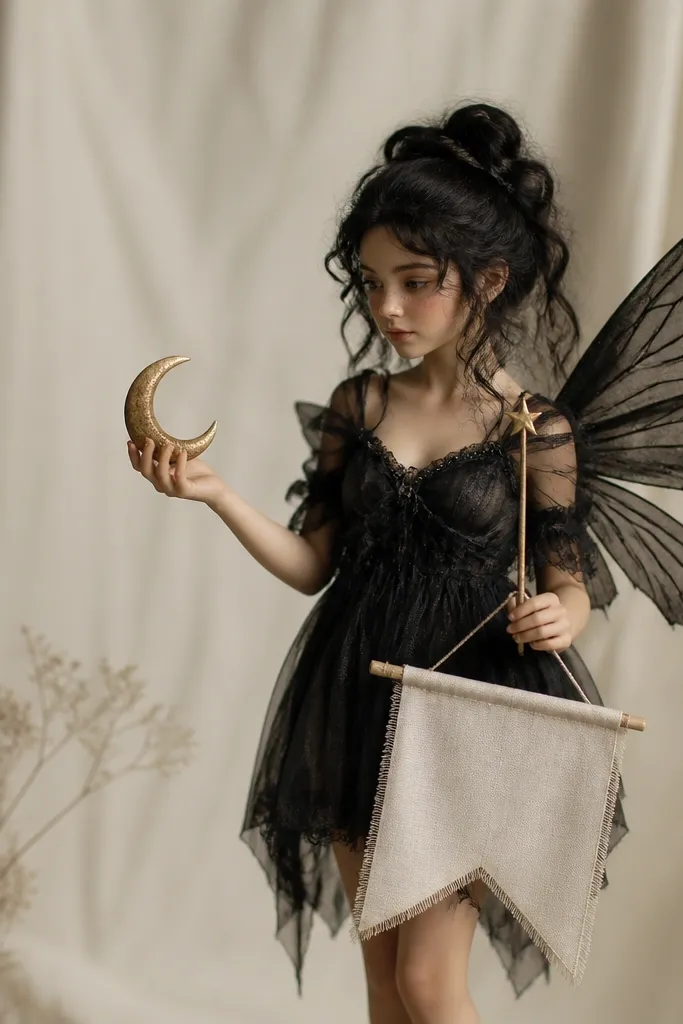
This one is funny because it turns an awkward topic into a cute fantasy. It works best as blackwork with a single accent color in the banner or wand tip. The wings give you texture without needing lots of gradients.
Keep it around 4.5 inches tall so the wings don't stretch too wide when your skin shifts. Place it centered, with the wand angled slightly toward one hip. Use a solid black outline and light gray shading only on the wings if your artist can do it cleanly.
Pro tipAsk for the banner text to be curved, following the fairy's waist - it looks intentional and reads better.
AvoidAvoid heavy gray realism. The lower back heals unevenly and soft shading can turn patchy.
7. Coffee Cup With a Tiny Judge Face
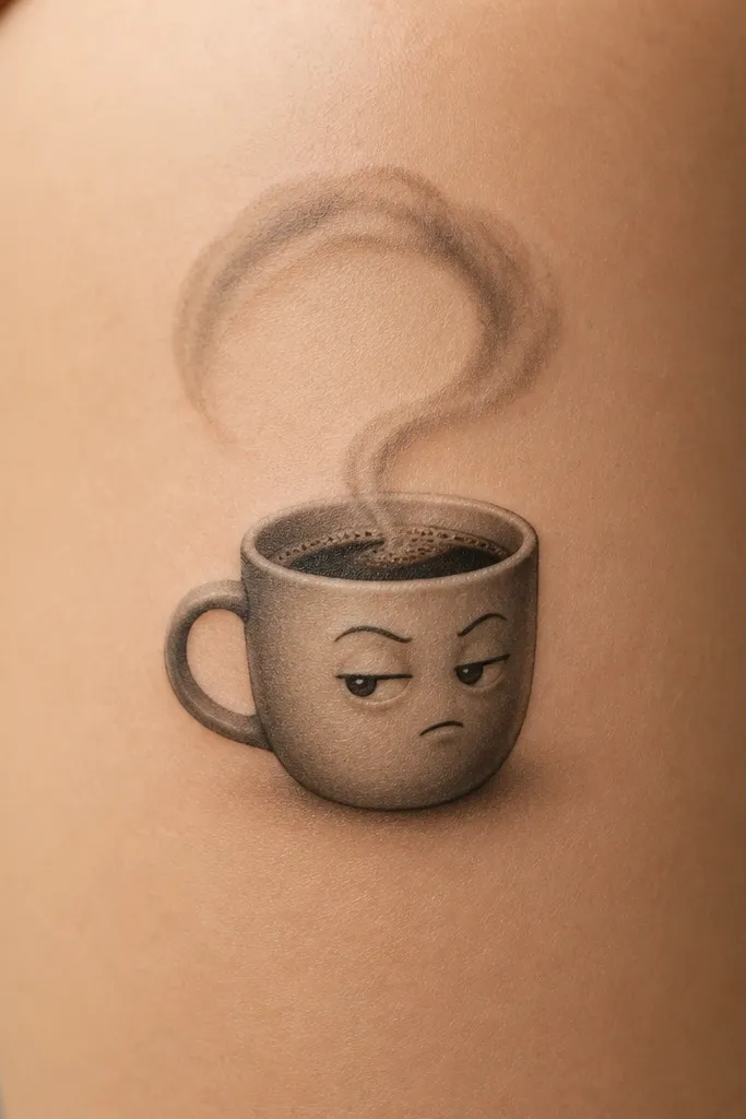
A coffee cup with a tiny face is funny because it's mood-based. It also stays readable because the silhouette is simple. I like this tattoo in mostly black with minimal shading on the steam - it looks sharp even after you've been sweating in summer.
Size it about 4 inches tall. Place the cup so the base sits above your underwear band and the steam stays toward the spine line. Keep the face features thick: two bold dots for eyes and a short curved eyebrow line.
Pro tipIf you want it to look extra crisp, add a thin highlight line on the cup rim using negative space instead of white ink.
AvoidAvoid tiny eye details. They disappear when the ink settles.
8. Half-Sock Mermaid (Comfy Version)
This is the kind of funny that makes people smile because it's specific and slightly absurd. The mermaid tail gives you shape, and the sock adds the punchline. It works year-round because the theme isn't tied to one holiday - it's just your sense of humor.
Make it 5 to 6 inches tall. Place the mermaid torso near the center of your spine, with the tail curving toward one hip. Use black ink and a single muted teal accent on the tail ripples if you want a little color without turning into a messy watercolor look.
Pro tipAsk your artist to keep the sock stripe thick. Thin sock details fade and look like random gray lines.
AvoidAvoid full-color skin tones. Lower back tattoos don't hold soft skin gradients well.
9. To-Do List With a Crown
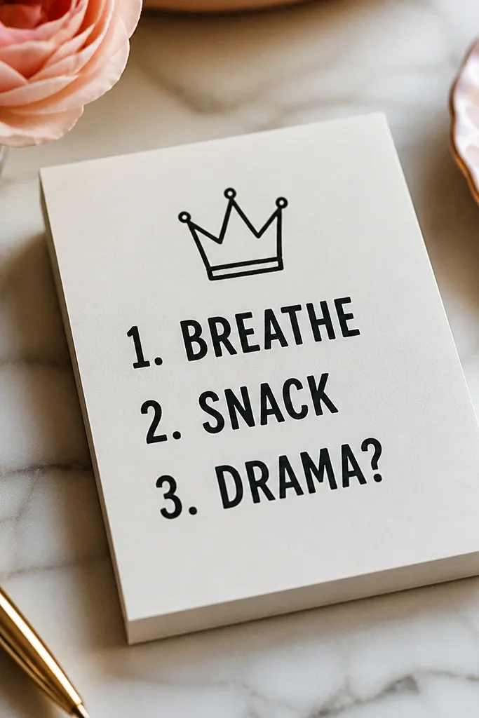
This works because the crown makes it cheeky, not messy. The to-do pad gives a neat border so the tattoo looks designed, not random. It's also easy to scale up or down depending on how much space you have above your waistband.
Keep it roughly 4 by 4 inches. The crown should sit just below your bra band line when standing. Use black ink with one tiny gold-like accent dot on the crown tip (you can translate that as a warm ochre color if your artist offers it).
Pro tipPick fonts that look like marker lettering. They hold up better than fancy script on this placement.
AvoidSkip small punctuation and tiny question marks. They blur and lose the joke.
10. "Main Character" Micro Crown + Spark
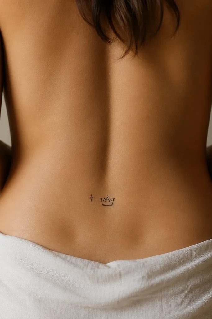
Small tramp stamp tattoos look intentional when the design is clean and centered. A micro crown with a spark is funny because it's a self-aware flex, and it's not dependent on color to land. This is the option for people who want funny but don't want a big piece.
Size it around 2.5 to 3 inches total width. Place it exactly on the centerline of your spine so it reads balanced when you sit. Keep it black only for the sharpest long-term result.
Pro tipAsk for the crown points to be slightly rounded, not razor thin. That shape survives healing better.
AvoidAvoid putting it too low. Near the waistband, it gets rubbed and loses definition fast.
11. Broken Heart With a "LOL" Bandage
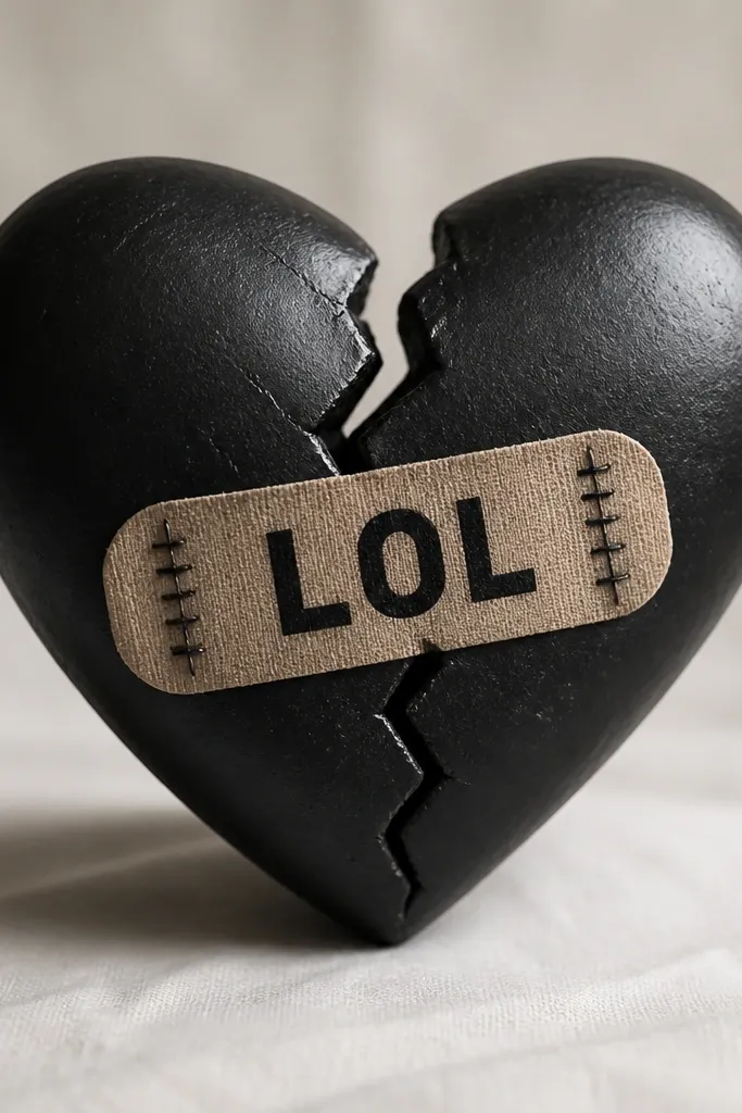
This tattoo is funny because it flips heartbreak into humor, and the bandage makes it feel like a joke you're telling yourself. It works because the bandage strip gives a strong graphic shape - the heart underneath stays readable. Keep it black with one muted red accent in the heart fill if you want it to pop.
Make it 4.5 inches wide at most. Place the heart slightly higher than you think, so the bandage doesn't sit directly under the waistband when you sit. Use simple bandage stitching lines, not lots of tiny stitches.
Pro tipAsk for the "LOL" letters to be slightly thicker than the bandage outline. That makes the punchline survive fading.
AvoidDon't add tiny cracks or too many lines in the heart. It turns into a gray blob.
12. Sunscreen Reminder With a Smiley
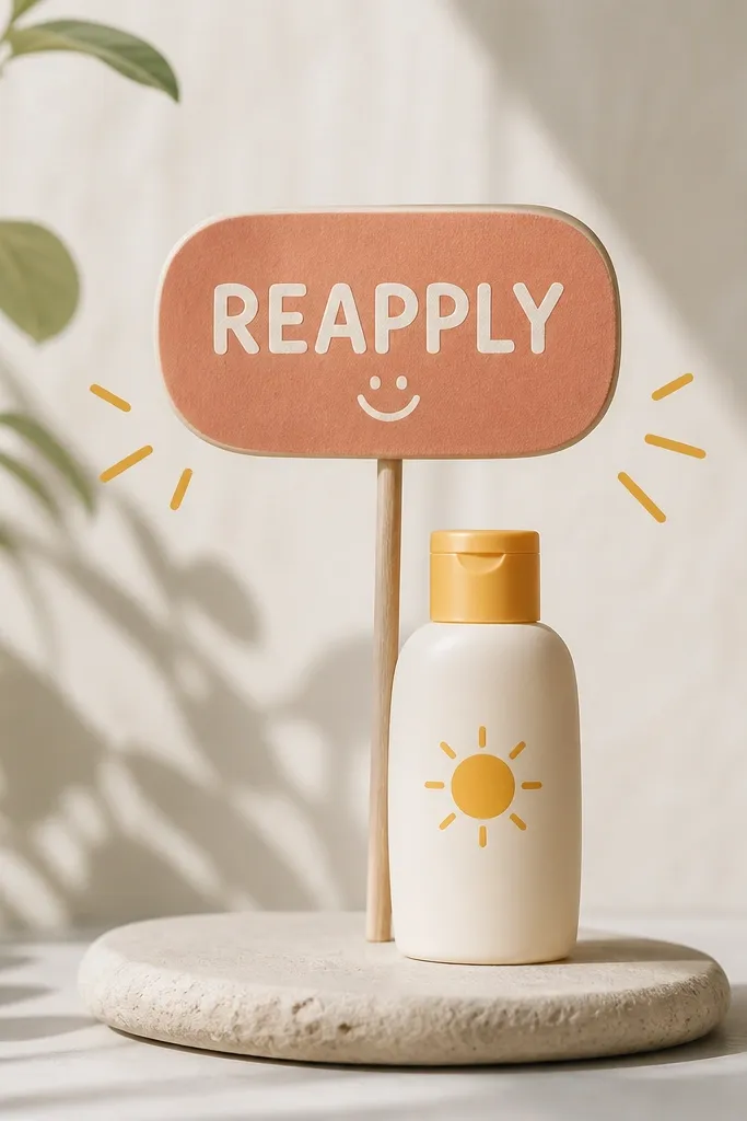
This is a funny tramp stamp that's also practical in real life. It looks cute on vacation photos without being seasonal in a cringe way, because the message fits every summer - and it's relevant in spring too. The sign shape keeps it clean, and the smiley face makes it feel friendly.
Size it around 4 inches wide. Place it so the bottom edge stays above the waistband line, especially if you wear high-cut underwear. Use black ink with a flat warm yellow fill behind the smiley, not across the whole design.
Pro tipIf you want longevity, keep the yellow limited to the smiley background. Big color fields fade and get patchy.
AvoidAvoid watercolor-style sun rays. They look pretty in stencil previews and heal spotty.