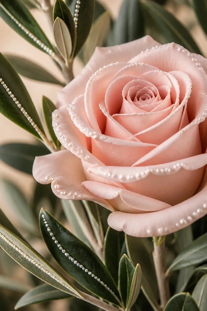
1. Blush Peony With Soft Dot Frame
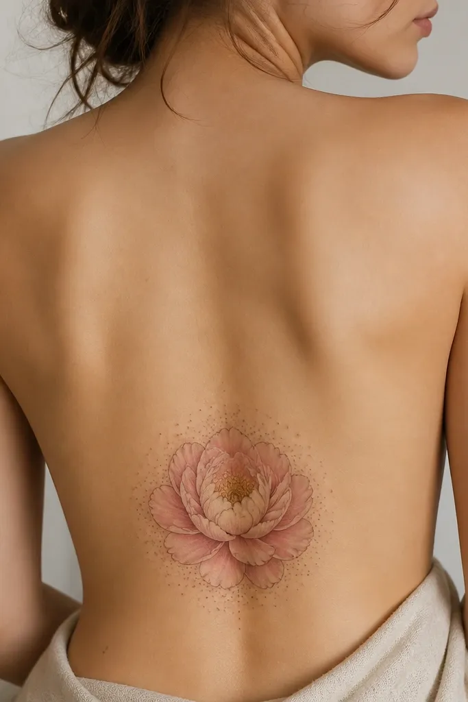
This works because the peony gives you a real focal point, and the dotwork halo makes the tattoo feel finished without adding bulk. I like blush pink mixed with a light cream center because it reads warm under daylight and doesn't look flat at night. The dot frame also hides minor placement changes - if your body curves slightly, the dots still look intentional. It's cozy because it's airy, not because it's "cute."
Aim for 11-13 cm wide and keep the peony slightly tilted so the petals follow the curve of your spine. Ask for outer petals with a touch more line weight and inner petals with thinner lines. The dot halo should stay light and spaced, not a solid ring.
Pro tipBring a photo of your jeans waistband and ask the artist to place a center mark while you stand. That one step prevents the whole tattoo from ending up too low.
AvoidAvoid a solid black circle behind the peony - it turns cozy into harsh fast.
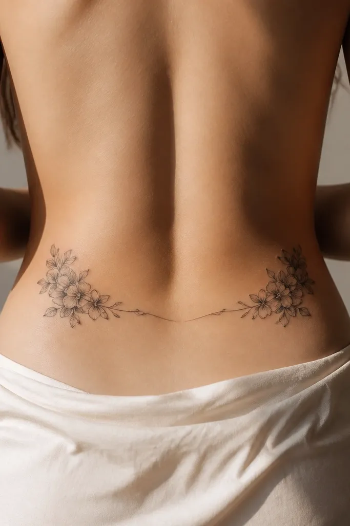
2. Cream Rosebud Cluster On A Curved Arc
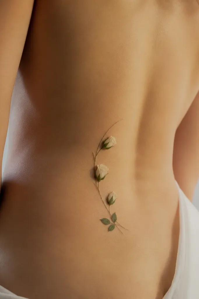
A cluster of rosebuds looks styled because it creates a rhythm instead of a single blob. Cream tones keep it soft, and the curved arc follows the way your lower back naturally bends when you stand. Tiny green leaves add just enough color to feel alive without making it look like a cartoon. The thin vine line ties everything together and gives the tattoo a "designed" finish.
Keep it narrow: about 9-12 cm from top bud to bottom bud. Place the top bud high enough that it won't get stretched when you sit - I've found the waistband test works every time. Use pale green shading on the leaves only, not full heavy color blocks.
Pro tipWear a fitted backless top during the appointment if you can. Seeing how the seam sits helps you judge how the arc will read on your body.
AvoidDon't make the vine line too thick. Thick lines here flatten the whole arc into one straight strip.
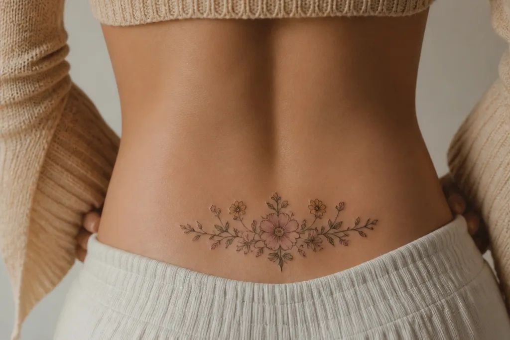
3. Dusty Mauve Wildflower Trio
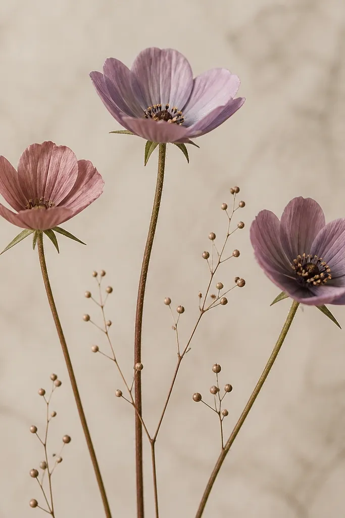
Wildflowers feel cozy when they're small and spaced like they're growing, not when they're packed like a bouquet. Dusty mauve and muted purple look warm on skin tones that get washed out by bright pigments. Thin stems keep the tattoo light and elegant, and the seed dots fill negative space so it doesn't look empty after healing. It reads feminine and intentional instead of "random floral."
Target 10-14 cm wide with the trio slightly wider at the top. Ask for stems to taper thinner as they reach the ends. Seed dots should be fewer than you think - too many makes it look like speckled noise.
Pro tipTell the artist you want "air between flowers." It's a phrase that gets you cleaner spacing in the stencil stage.
AvoidSkip neon purples and thick black outlines. They age faster and make the trio look like sticker art.
4. Peony Outline With Minimal Blush Wash
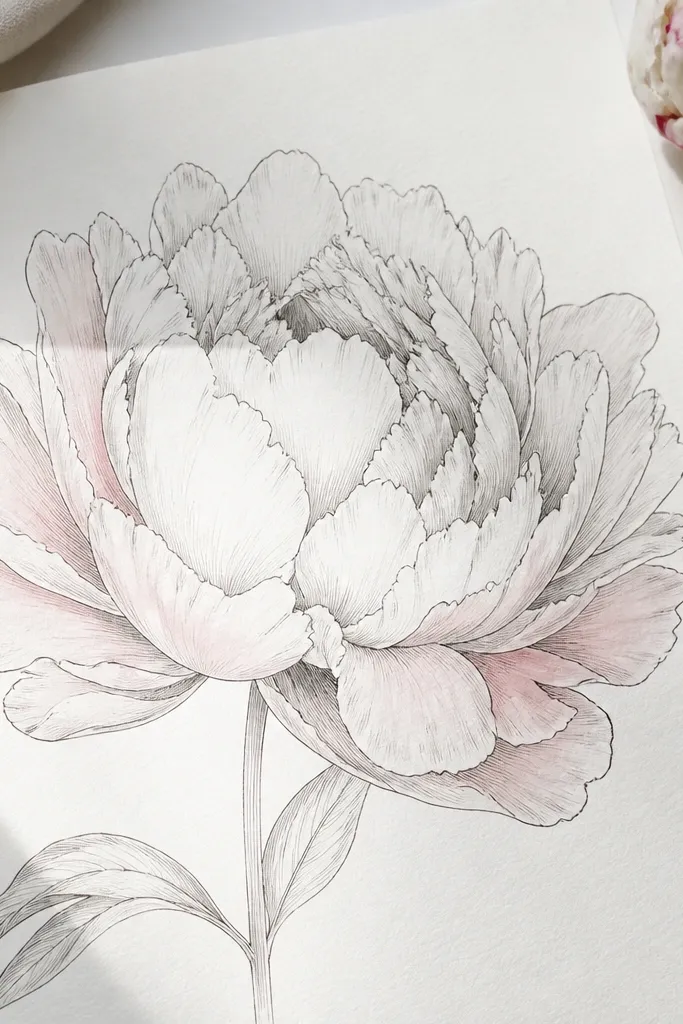
This is for when you want cozy but not heavy. Fine-line peony outlines look delicate at first, and the minimal blush wash adds softness so it doesn't look like a sketch. The highlight on one side gives the petals a slightly glossy, dimensional look. Because the wash is controlled, it stays readable even as it fades.
Size it around 12-15 cm wide so the fine line doesn't get lost. Ask for the wash to be concentrated near the outer petals and lighter near the center. Placement should be upper lower back, not dead center at the very bottom.
Pro tipChoose a stencil with at least 1 cm of breathing room between petal clusters. Crowded petals heal together and lose that cozy look.
AvoidAvoid full-color solid fills. They blur sooner on the lower back.
5. Baby's Breath With Tiny Heart-Like Buds
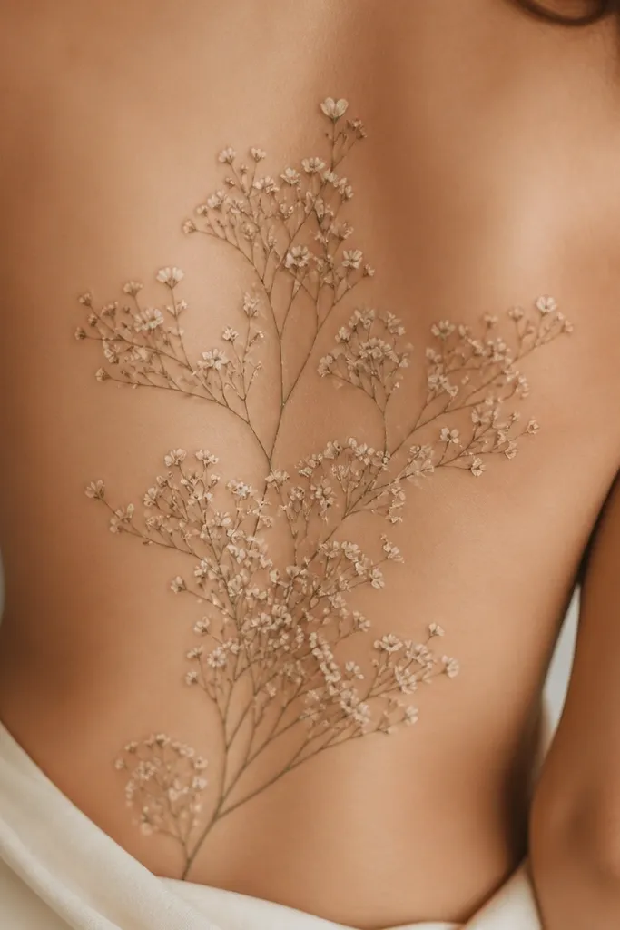
Baby's breath looks cozy because it's naturally airy. The tiny buds add personality without turning into a big "statement" tattoo. The trick is the balance: enough dots to feel soft, but not so many that it turns into a grey haze. When you keep the linework fine and the dots consistent, it looks like a delicate bouquet that belongs on your body.
Keep it 10-13 cm wide and position it so the spray follows your spine curve. Ask for a few slightly larger buds (about 2-3 mm) to anchor the composition. The buds that look like hearts should be subtle - more suggestion than a literal heart shape.
Pro tipPick a placement where you can wear your normal jeans comfortably. If the spray sits under a tight waistband seam, it will stretch and blur.
AvoidSkip big thick outlines around the entire spray. It makes the dots look like they're trapped in a frame.
6. Olive Green Leaf Vine With Blush Roses
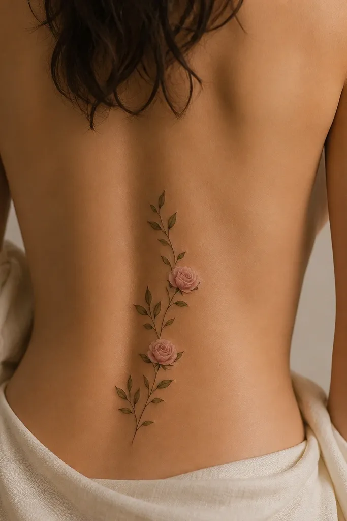
Leaves make it cozy because green shading adds depth without needing bright colors. Olive green looks more mature than neon lime, and it flatters skin tones in a way bright pigments don't. Two small roses keep it from becoming a generic vine. The vine line should look like it's growing, not like it was drawn with a ruler.
Aim for 12-16 cm long, with the vine tapering at both ends. Place the higher rose near the waistband line but not on it. Keep leaf shading in the mid-tone range, not solid dark fills.
Pro tipAsk for the vine line to vary thickness slightly along its length. That variation is what makes it look organic after healing.
AvoidAvoid symmetrical mirrored leaves on both sides. Real vines look staggered.
7. Mini Sunburst Rose With Warm Center Glow
This one feels cozy because it adds gentle warmth around the flower center, like soft light hitting petals. The radiating lines are short and light, so it doesn't become a "tribal sun" look. Cream and faint orange keep it warm, not loud. It's still floral - the rose stays the main subject.
Keep the whole piece around 10-12 cm wide so the sunburst doesn't overpower your lower back curve. Ask for radiating elements to fade outward and stop before they hit the outer edges. Placement should be slightly above the mid-lower back so it doesn't stretch when you sit.
Pro tipIf you're doing color, ask the artist to test the orange glow on a small patch first. You want it subtle.
AvoidDon't add a thick black sunburst outline. It kills the cozy glow and makes it look harsh.
8. Linework Daisy Chain With Peach Petal Tips
Daisies look cozy when the petals are consistent and the chain follows your body curve. The peach tint at the petal tips adds warmth without turning the whole tattoo pink. Fine linework keeps it crisp, and small green stems prevent it from looking like floating flowers. It reads clean in photos because the shapes are simple and the spacing is deliberate.
Target 9-14 cm wide depending on how many daisies you want. Keep each daisy about 1.2-1.8 cm across. Ask for the chain to be slightly higher at one end so it looks flattering when you stand and when you sit.
Pro tipPlan for jeans stretch. If your jeans waistband hits the tattoo area, choose fewer daisies so the piece doesn't smear.
AvoidAvoid uneven daisy spacing. Random gaps read sloppy after healing.
9. Viney Hydrangea With Pale Blue And Blush Mix
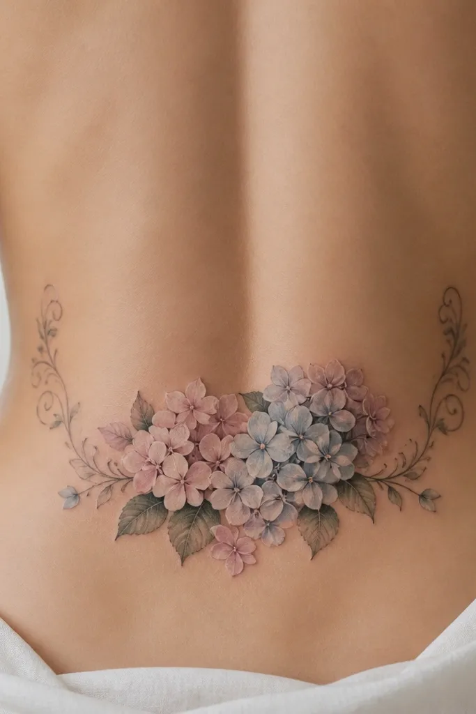
Hydrangea shapes look cozy when they're made of layered petal clusters, not one flat flower. Pale blue plus blush gives a "morning laundry air" vibe - soft and calming. The vine ends at the top corners make the tattoo feel framed, like it belongs under a low back dress. Because hydrangea is naturally full, you can keep the overall size moderate and still get impact.
Size it around 13-17 cm wide, placed higher than you think - the top cluster should sit near the waistband line but not on it. Ask for petal clusters to have soft dot shading, not solid black. Vine ends should be thin and slightly curled, not thick hooks.
Pro tipChoose a muted blue (more grey than bright). Bright sky blue ages into something harsher.
AvoidSkip heavy black outlines on hydrangea. It makes the clusters look like they're filled with ink, not petals.
10. Single Rose With Feathered Petal Edges
A single rose looks classy because it's clean and focused, and feathered petal edges keep it cozy instead of sharp. The faded outer lines act like a soft blend, so the tattoo sits nicely on your skin texture. A small leaf gives it balance without turning it into a full bouquet. This design looks good even when it's smaller because the petals have movement.
Keep the rose about 10-13 cm tall and place it slightly off-center toward your stronger hip for a flattering curve. Ask for the feathering to be built with thin line gradients, not a thick-to-thin outline. The leaf should be minimal - one leaf, one vein line.
Pro tipTell the artist you want "soft edges." It helps them avoid harsh, tattoo-parlor boldness on the outer petals.
AvoidAvoid a big shaded rose with a dark background. The lower back needs breathing room.
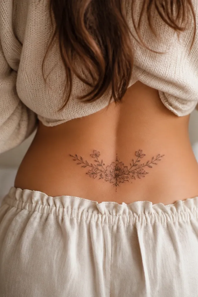
11. Mini Floral Corners With Center Negative Space
This one is for people who want cozy but hate the feeling of a tattoo that looks like a patch. The center negative space makes the design look intentional and makes your body curve the "frame." Soft florals at the corners also age better because they're smaller and more spaced out. Thin vine connection gives a gentle flow without heavy shading.
Size it around 14-18 cm wide total, but keep each corner cluster about 3-5 cm. Place it high on the lower back so the negative space stays visible even with sitting. Ask for the vine line to be thin and slightly curved, not straight across.
Pro tipUse your mirror test again. Negative space tattoos look best when the center area doesn't get constantly rubbed by waistbands.
AvoidAvoid filling the center with dots or extra flowers. It kills the clean, cozy framing.
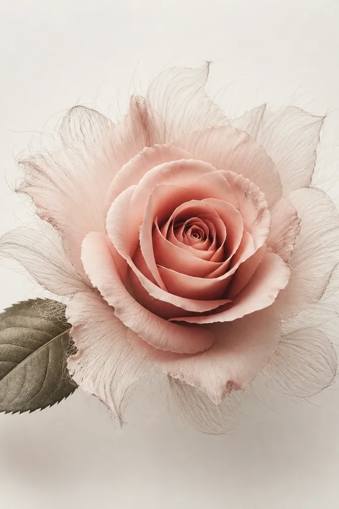
12. Rose And Leaves With Tiny Pearl Dot Highlights
The "pearl dot" highlights are what make it feel cozy and styled. They catch light in a way that looks expensive in person, especially on skin with warm undertones. The rose and leaves give you structure, while the dot highlights keep it soft. You get a subtle sparkle without glittery pigments.
Aim for 12-16 cm wide with a rose as the main flower. Ask for dot highlights only on the top half of petals so it looks like light hits the tattoo naturally. Keep leaf shading olive, not black-green.
Pro tipAfter healing, take a photo in indirect daylight. If the dots don't show, the artist placed too few or too faint highlights.
AvoidAvoid using large white fill dots everywhere. Small highlights look intentional; big ones look like mistakes.