1. Micro Rose With One Curved Leaf
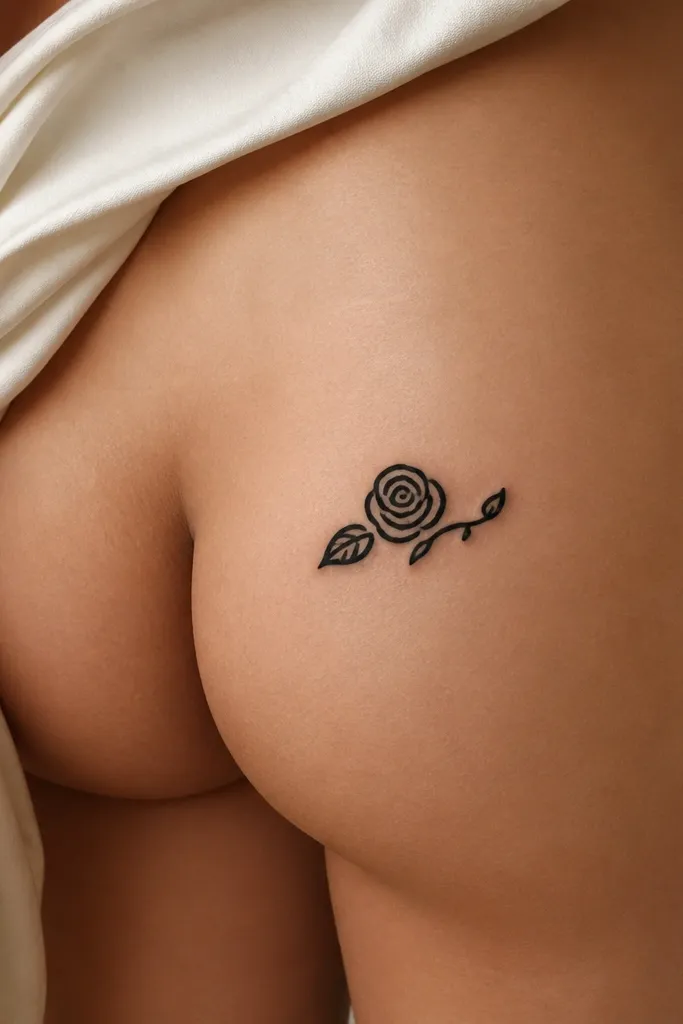
This works because the rose shape reads instantly even at small size. The single leaf keeps the composition from getting busy, and the tight spiral center holds detail instead of turning into a blob. Blackwork also ages more predictably than heavy gradients for small pieces.
Ask for a rose about 2 to 2.75 inches wide, with the leaf placed on the outer edge of the curve. Keep the stem thin but not hairline - about the thickness of a standard marker line. It looks best on skin that has a little natural curve, so wear low-rise underwear in the appointment for placement checks.
Pro tipBring a reference rose that has visible petals even when small. If the artist can't draw the petals without lifting the pen, the design is too tiny.
AvoidAvoid adding extra buds or shading too close to the outline, or it turns into a dark smudge over time.
2. Three Tiny Constellation Dots With a Tail
A constellation is perfect for simple enough because it's mostly negative space and clean dots. The thin connecting line gives movement, while the dots keep it playful instead of serious. Dotwork also hides slight skin texture differences better than ultra-fine single lines.
Request 3 to 4 dots total, each dot around a pinhead to rice-grain size (your artist can measure against your skin). The connecting line should be thin but not razor-thin. Place it slightly above the crease line so it doesn't distort when you sit.
Pro tipChoose a constellation with a short "story" shape (like a gentle arc) instead of a long zigzag - short shapes stay cute in photos.
AvoidSkip tiny script names under it; they read blurry at arm's length.
3. Tiny Crescent Moon and Micro Star
This is one of my favorite simple enough tramp stamp tattoos because it looks like jewelry. The crescent shape follows the body's curve naturally, and the micro star adds a wink without clutter. Keeping it mostly linework prevents aging issues from heavy fill.
Get the crescent about 1.5 to 2 inches wide, with the star half the size of the moon width. Ask for slightly thicker outlines on the crescent edge so it doesn't fade into the skin. It pairs well with a light line highlight style - the inside of the crescent can stay blank.
Pro tipIf you want it extra cute, add a tiny sparkle dot at the end of the crescent tip - just one, not a cluster.
AvoidDon't fully shade the whole crescent black. It makes the shape heavy and harder to read as it heals.
4. Two-Line Butterfly Silhouette
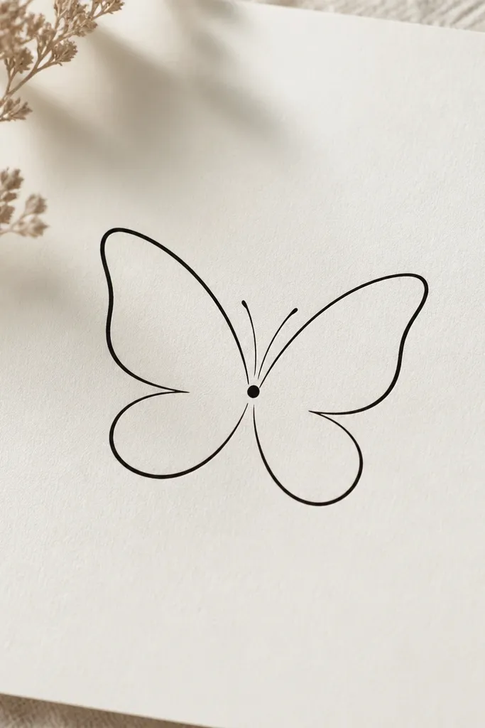
Two-line designs look clean because there's nothing to overwork. The butterfly silhouette reads from far away, and the minimal linework keeps the tattoo light and feminine. This style also heals with fewer "patchy" areas compared to dense shading.
Ask your artist to keep line thickness consistent - about the same thickness as a fine gel pen. The wings should be wide enough to span about 2.5 to 3 inches total, centered along your underwear waistband line. Placement matters: keep the body slightly closer to the inner butt crease so it doesn't look off-center when you sit.
Pro tipBring a reference where the wings touch at the center. If the wings are too separated, the butterfly looks like two random curves.
AvoidAvoid adding thick stippling inside the wings; it makes it look like a stain on small skin areas.
5. Mini Heart Outline With a Dot Accent
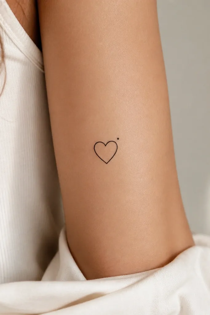
A mini outline heart is cute because it stays readable even when it's small. The dot accent adds personality without turning into a pattern. Outline-only designs age better when the line weight is steady and not too thin.
Go for 1.4 to 1.8 inches tall. Ask for a line weight that's visible in daylight, not a faint sketch. Place it centered and slightly angled so the top point sits just above the natural crease.
Pro tipIf you want it more romantic, ask for a tiny break in the outline at the bottom point - just a hairline notch - so it looks handmade.
AvoidSkip hollow hearts with paper-thin lines. Those fade faster than you expect.
6. Tiny Keyhole With a Micro Spark
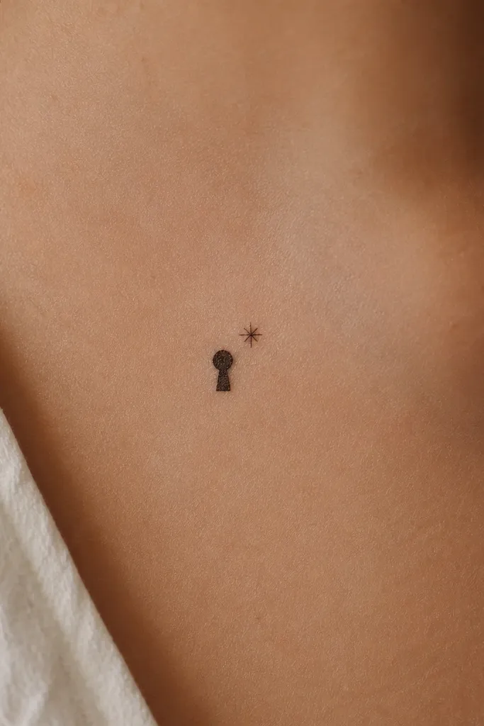
Keyhole tattoos feel playful and a little mysterious without needing a lot of detail. The shape is simple enough for clean lines, and the micro spark makes it look intentional rather than plain. This is a great option if you want something that looks cute under clothes but still stands out in photos.
Keep it about 2 inches tall and 1.2 inches wide. The keyhole stem should be thin but not hairline, and the top circle should be slightly thicker so it doesn't fade into the skin. Place it vertically or slightly diagonal, depending on your comfort, but keep the keyhole centered to avoid drifting when you sit.
Pro tipAsk the artist to stencil it while you sit on a chair. The keyhole should still look centered in that posture.
AvoidAvoid adding ornate handles or swirls - they crowd the small space and blur.
7. Single Bow Tie Line Art
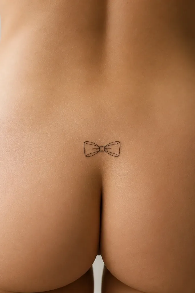
A bow tie reads like clothing detail, which is exactly the vibe for tramp stamp tattoos. The symmetry makes it look neat even when it's small. Line art also stays crisp when the artist doesn't over-shade it.
Aim for 2.5 to 3 inches wide, with the knot centered. Use consistent line weight and keep the interior loops open (no fill). Place it so the bow's center lines up with your body's midline - use the underwear waistband as your reference point.
Pro tipChoose a slightly "chubby" bow shape in your reference. Thin, stick-bow designs disappear over time.
AvoidDon't add shading gradients inside the loops. They turn muddy at this size.
8. Palm-Sized Smile Curve
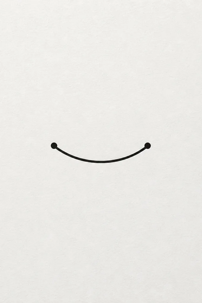
This one looks cute because it's playful and minimal. The smile curve is basically pure shape, so it stays readable even as your skin texture changes. The end dots give it structure and stop it from looking like a random line.
Keep the arc about 1.75 to 2.25 inches wide. The end dots should be small but filled, not hollow circles. Place it horizontally across the upper inner butt, following the curve of your body so the smile looks "upright" when you stand.
Pro tipStencil it, then check it in a mirror from both standing and sitting. If it tilts when you sit, it will look off in half your photos.
AvoidAvoid making the smile too thin. It needs enough ink to survive healing.
9. Tiny Serpent Coil Outline
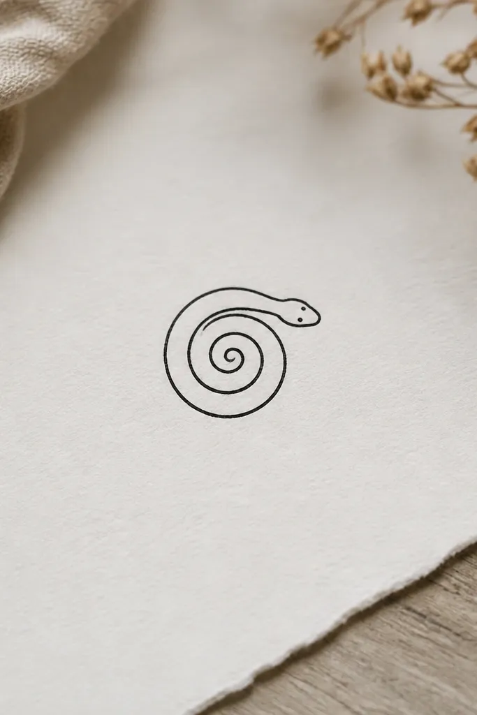
A tight serpent coil is a cool-at-first-glance design that still counts as simple enough. The spiral shape fits the body curve and looks intentional even when partially covered. Linework with minimal shading also ages better than full fill in a small area.
Choose a spiral diameter of about 2.2 to 2.8 inches. Keep the head compact and place it slightly toward the outer side of the upper inner butt so it doesn't look like a random circle. Ask for a clean outline with consistent line weight and tiny dot eyes.
Pro tipIf you want it extra cute, ask for a small blush-like dot cluster near the head - just 3 dots, not a full patch.
AvoidSkip long snake bodies. They stretch and warp fast on this placement.
10. One-Line Sun With Rays
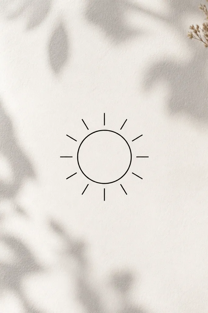
One-line suns look cheerful without being loud. The even rays create an instant shape, and the continuous line feels clean and modern. This design also works in fine-line styles because it doesn't rely on heavy shading.
Request a sun about 2.2 to 2.7 inches across. Keep rays short (half the circle radius) so the design stays legible after healing. Place it slightly higher than you think - the waistband area - so it doesn't get distorted when you sit.
Pro tipPick a sun reference where the rays are uniform. Uneven rays make it look like a doodle.
AvoidAvoid too many rays. More than 10 at this size turns into a fuzzy halo.
11. Tiny Watercolor-Style Dot Splash (Black Ink Only)
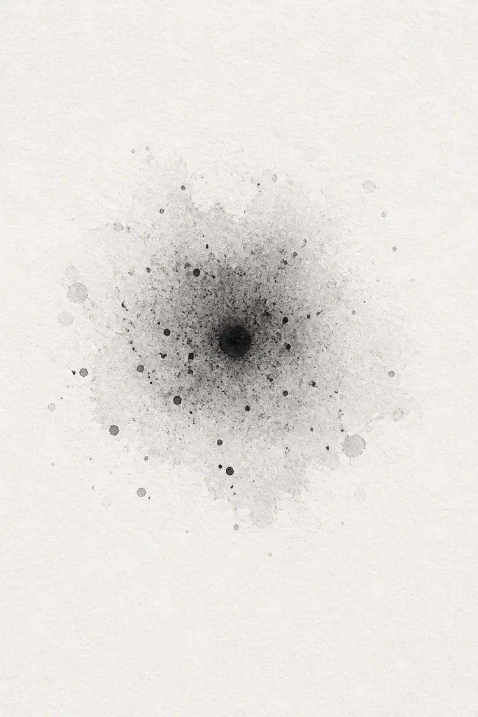
Dot-splash tattoos look like soft texture, which reads super cute on the upper inner butt. The center dot anchors the design, and the fading edge stays subtle under clothes. Keeping it black-only makes it age more predictably than colored watercolor attempts.
Go for a cluster diameter of 1.5 to 2.5 inches. Ask for a tight center and then controlled tapering with dot density - not a hard ring. Placement should follow your body curve; stencil while you sit to see how it stretches.
Pro tipIf you want it to look "clean," ask the artist to leave a little negative space gap between the splash and any other element.
AvoidAvoid big watercolor blobs. They blur fast and look like patchwork.
12. Tiny Pear Shape With Micro Outline Highlights
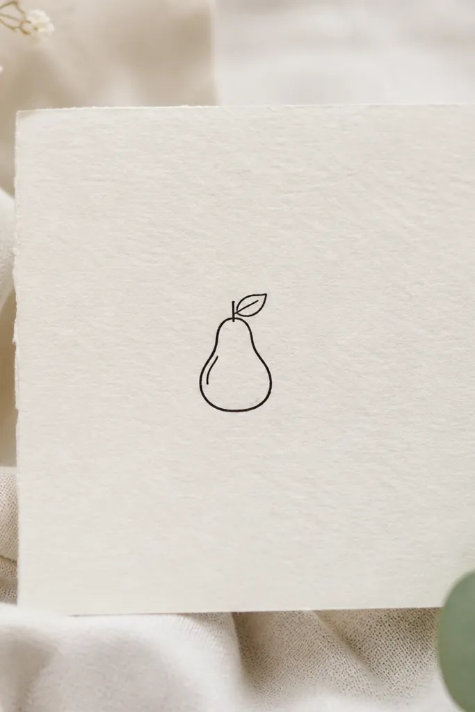
Fruit tattoos can look surprisingly classy when they're small and outlined. The pear shape has natural symmetry, and the micro internal highlight lines keep it from looking like a simple icon. The leaf adds sweetness without adding a lot of extra ink.
Keep the pear around 1.8 to 2.2 inches tall. Use a slightly thicker outline on the outer edge and thinner lines for the highlights. Place it vertically so the leaf points upward - it looks more "intentional" than a sideways pear on this area.
Pro tipChoose a reference pear with a clear outline. If your reference has heavy shading, you're going to end up with a muddy heal.
AvoidSkip thick filled color blocks inside the pear. They look flat and heavy on small skin.