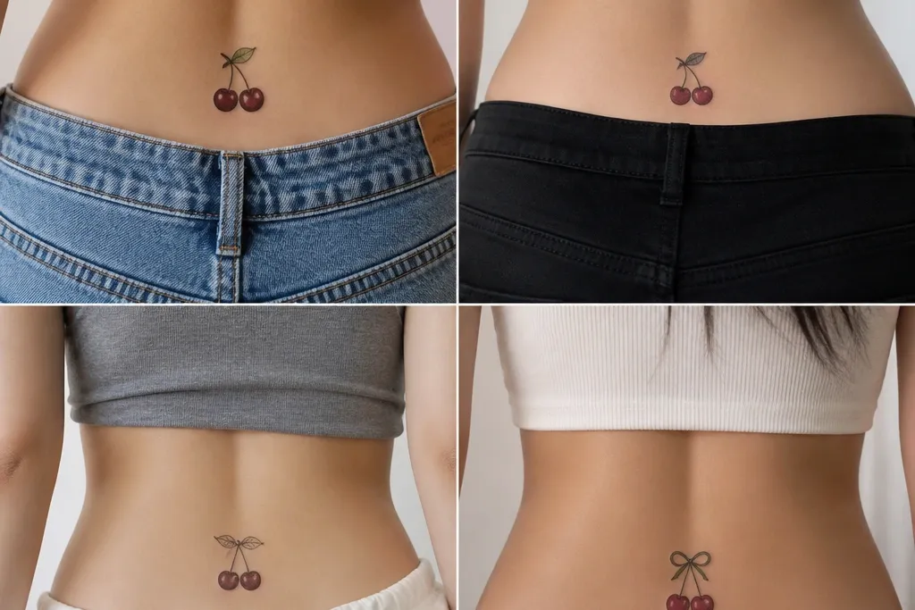
1. Classic Cherry Duo With Tiny Vines
This one reads retro because it uses old-school shape logic: bold outer fruit, controlled shading, and thin stem lines that don't sprawl. The cherries sit like bookends, and the negative space between them keeps the red from merging. I like it when the outlines are crisp and the shadows are a deep wine instead of a bright maroon - it stays cherry-like after healing.
Ask for a size around 4-5 cm wide per cherry, with the pair spanning 10-12 cm total across. Place the centerline of the duo where your lower back naturally curves, not higher near your waist. If you want the retro vibe stronger, keep the vines to 2-3 short curls on each side, no long sweeping branches.
Pro tipWear a low-rise high-waist pant once after it heals and check from the mirror. If the top cherry disappears behind the waistband, go slightly lower next time or rework the placement call.
AvoidAvoid thick black vines with lots of solid fill - they flatten the cherries and make the whole piece look heavy.
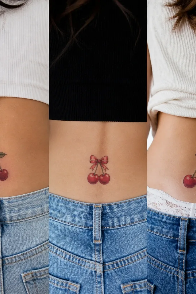
2. Cherry Bomb Heartframe
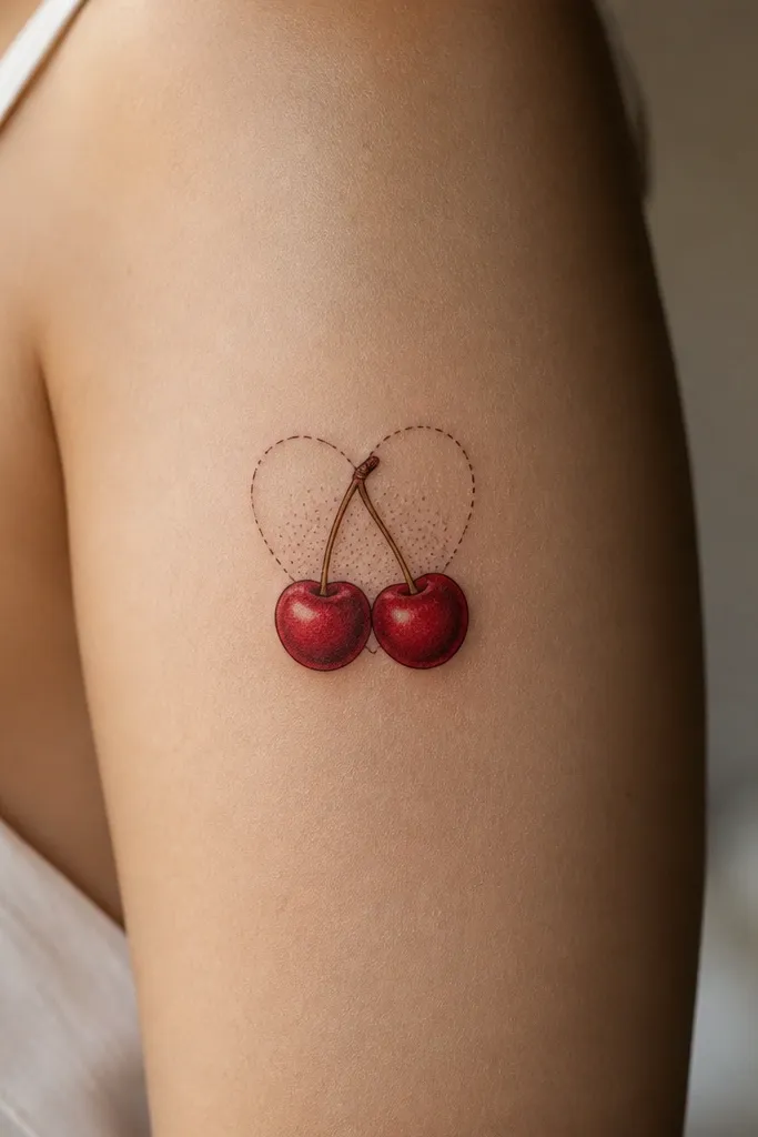
A heartframe gives you that pin-up energy, but the trick is keeping the heart line delicate so it doesn't overpower the fruit. The dashed fill style adds retro texture without turning into a dark block. When the cherries have lighter highlights on top, the tattoo looks glossy instead of flat.
Request a heartframe width of about 11-13 cm, with cherries placed at the top corners of the heart. Keep the bottom point of the heart ending above the widest part of your butt crease - that prevents the design from pulling down visually. The heart outline should be fine line, around 1-2 mm line thickness, while the cherries get deeper shading.
Pro tipIf your artist can do it, ask for two tiny highlight dots on each cherry - one near the stem and one on the opposite side. It makes the red look fresh for months.
AvoidSkip full solid heart shading. It usually heals into a dark smear on skin that moves a lot.
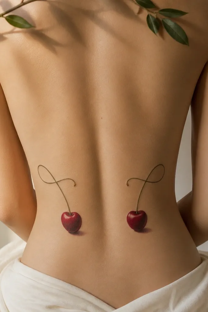
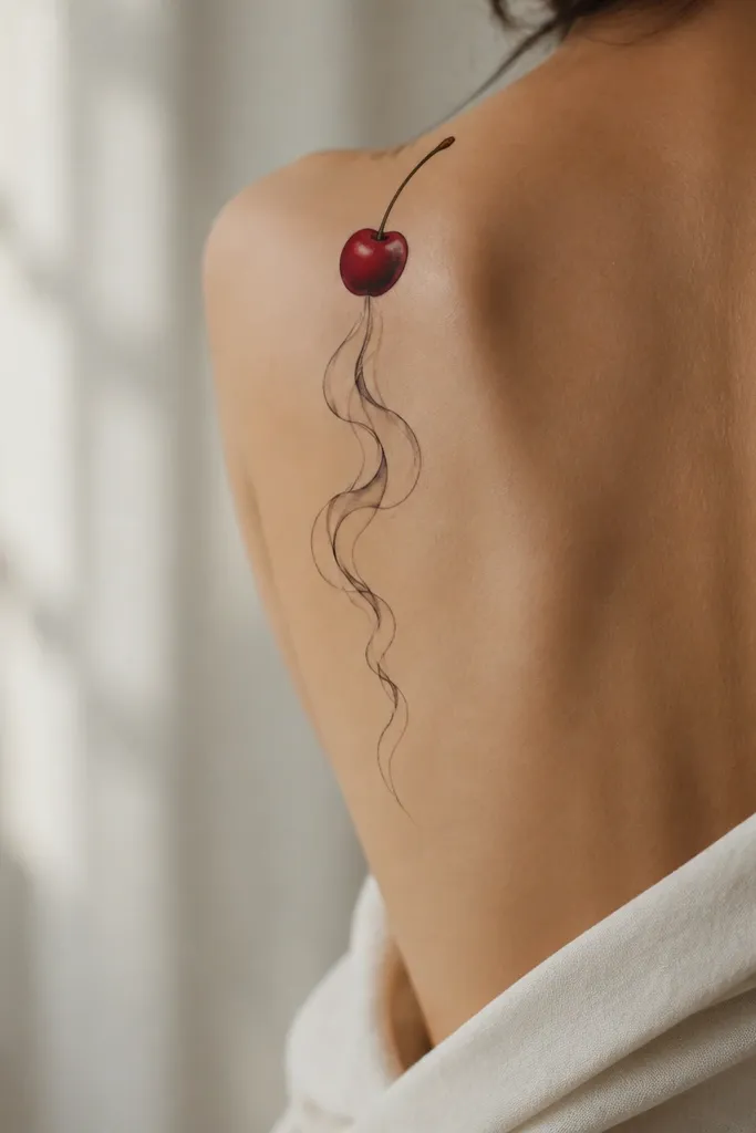
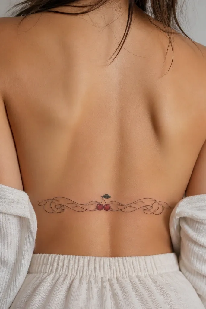
3. Single Cherry Drop on the Spine Curve
This is the cleanest tramp stamp look when you want retro without the clutter. Centering on the spine curve makes it feel intentional and flattering, especially when you wear a bra that sits low but not too wide. The shading gradient gives the cherry dimension, so it doesn't look like a sticker.
Go for 6-7 cm tall total, with the cherry body around 3.5-4 cm wide. Place the top of the cherry about 6-8 cm below your belt line when you stand straight. Keep the stem short - if it's too long, it drifts into a "random doodle" zone.
Pro tipBefore you book, take a photo of your lower back in good light and mark the spine center with a pen. That's where the design should live.
AvoidDon't choose a cherry that's too small. Under 3 cm wide, the shading details disappear after healing.
4. Cherry Checkerboard Band
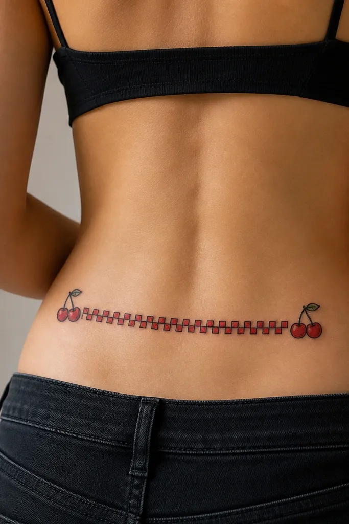
Checkerboard patterns look retro because they read like vintage print - straight edges, repeating blocks, and clear negative spaces. The cherries at the ends act like anchors, so your eyes land on the fruit instead of scanning the whole band. Use deep wine shadows on the cherries and keep the squares consistent so they heal evenly.
Fit the band to about 14-16 cm wide, with a height of 3-4 cm. Place it parallel to your waist line but slightly lower than you think - the skin stretches when you sit. Ask for the squares to be small enough to hold crisp edges, around 4-5 mm each.
Pro tipIf you're worried about fading, ask the artist to pack the cherry squares with a slightly lighter midtone than the outlines so the pattern stays readable.
AvoidAvoid blurry checker edges. If the artist drags the needle, the squares merge into one red stripe.
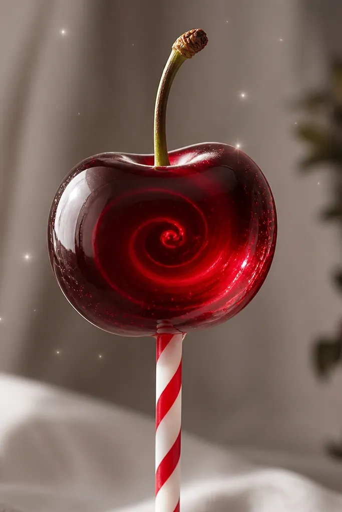
5. Retro Cherry Cigarette-Style Smoke
This one works because it mixes old-school linework with a single bold focal point. The smoke wisps pull the eye down and create motion - it looks great in photos and when your body shifts. The key is keeping the smoke wisps thin and evenly spaced so they don't look like accidental scratch marks.
Keep it narrow: about 7-9 cm across. Place the cherry near the top of the lower back curve, then let the smoke drift toward the center of your butt crease without crossing it. Ask for fine line smoke, not heavy black - the lighter line keeps the retro feel.
Pro tipWear a thong or bikini bottom once right after it heals to see how the wisps land when your skin stretches. Adjust placement if you can feel rubbing or distortion.
AvoidSkip thick smoke shading. It turns into a dark blob on moving skin.
6. Cherry and Lace Outline Frame
Lace outlines give that pin-up "lingerie sketch" vibe without covering your whole lower back. The oval frame keeps it feminine and organized, and the lace pattern adds texture even if the cherry color fades a little. I like lace frames because they still look good in fine line even when the red softens over time.
Aim for an oval about 12 cm wide and 9-10 cm tall. Place the bottom of the oval above the widest part of your butt so it doesn't sag visually. Ask for scallops that are consistent - uneven lace edges look sloppy fast.
Pro tipIf your artist does stencil placement, ask to see the stencil on you in two stances: standing straight and leaning forward. Lace frames shift a lot with posture.
AvoidDon't add heavy black fill inside the lace. It makes the oval look like a stamp, not lace.
7. Cherry Rose Bud Cluster
This is retro because it mixes fruit and garden motifs like old tobacco-card art. The rose buds soften the cherry's punch and make the composition feel balanced. The trick is size control: tiny roses must stay legible, and the cherry should stay the main pop of color.
Total width around 12-14 cm. Put the cherry in the top center, with buds slightly lower and to the sides. Use dark wine shading on the cherry and keep rose petals mostly linework with small red accents, so the cluster doesn't turn into a dark mass.
Pro tipAsk for two leaf sizes: one larger leaf near the cherry, and two smaller leaves near the buds. That depth layering helps it read even after healing.
AvoidAvoid cramming more than three main elements. Too many buds makes the lower back look busy and hard to read.
8. Cherry Pop Bow Tie
Bow tie placement screams retro pin-up, and the cherries make it playful instead of formal. Fine line bowwork keeps it light, while the cherries add color focus. It also ages well because the bow lines stay readable even if the red softens.
Choose a compact size: 10-12 cm wide, 6-8 cm tall. Place it slightly off-center toward your dominant hip so it looks like it's "hanging" on your curve. Keep the bow loops narrow so they don't blur into each other.
Pro tipIf you wear high-cut underwear, position the bow so it sits just above that cut line - the bow becomes visible without stretching.
AvoidDon't thicken the bow outline to match the cherry outline. Mismatched thickness makes it look like two different tattoos.
9. Cherry Pin-Up Banner Script
A banner script makes the retro vibe feel intentional, like a vintage poster element. The cherry in the center anchors the whole piece, so the text doesn't become the main focus. Keep the script light and readable; thick script heals into dark lines that hide the cherry shading.
Make it 15-18 cm wide across, but keep the ribbon height only 2-3 cm. Place the center cherry at the midpoint of your lower back curve. Ask the artist to do script in fine line with consistent spacing, and limit shading to the cherry only.
Pro tipPick a short message or none at all. If you add words, keep them under 6 characters so they stay crisp during healing.
AvoidAvoid tiny script under 3 mm line thickness. It will blur and look like ink spill.
10. Cherry Swirl Pinstripe
Pinstripe lines give a clean retro motion feel without filling a big area. The swirl wraps around the cherry, so the design looks styled even when it's small. I like this when you want a tramp stamp that still looks good from the side, not only straight-on.
Go for 9-11 cm total width and keep the swirl height under 8 cm. Place the swirl's lowest point near the top of the butt crease, not below it. Ask for the swirl line to be 1 mm-ish so it stays sharp.
Pro tipIf your skin gets dry, start moisturizing 3-4 days before your appointment so the stencil doesn't drag and blur.
AvoidAvoid thick swirl lines. It overpowers the cherry and makes the swirl look like a marker line.
11. Cherry Lollipop Pop
Candy-style cherries read retro because they look like vintage candy packaging. The stick spiral adds movement and makes the tattoo feel fun rather than purely floral. Use small sparkles sparingly - too many makes it look like glitter rather than a designed accent.
Size it medium: 12-15 cm tall. Place the top of the lollipop around the upper lower back curve so the stick points down toward the center. Ask for spiral stick lines in fine black and keep the cherry fills separated by highlight spots.
Pro tipAsk for the cherry highlight to be a smooth oval, not dots. Smooth highlights age better on skin that moves.
AvoidSkip large sparkles. They blow out and look like blobs after a few months.
12. Cherry Halftone Print Backdrop
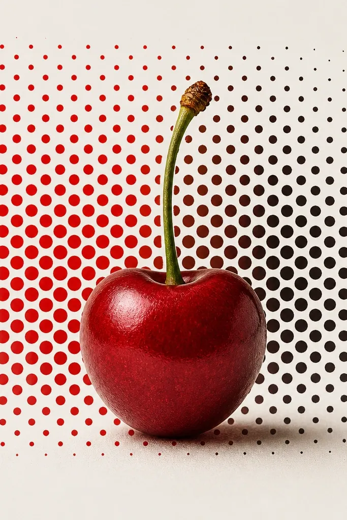
Halftone makes it feel like a 70s print without needing a whole scene. The dot backdrop gives texture so the red doesn't have to be overly saturated. I've found halftone works best when the dots are medium size and not too sparse.
Total piece width 10-13 cm. Place it so the halftone block sits slightly above the widest part of your back curve - it keeps the pattern from looking stretched. Tell your artist you want dotwork that stays consistent, with the cherry outlined cleanly.
Pro tipIf you're prone to redness after tattoos, ask for a calmer red midtone and deeper wine shadows. Too-bright red can stay pinkish longer.
AvoidAvoid tiny halftone dots. They blur into a gray haze.