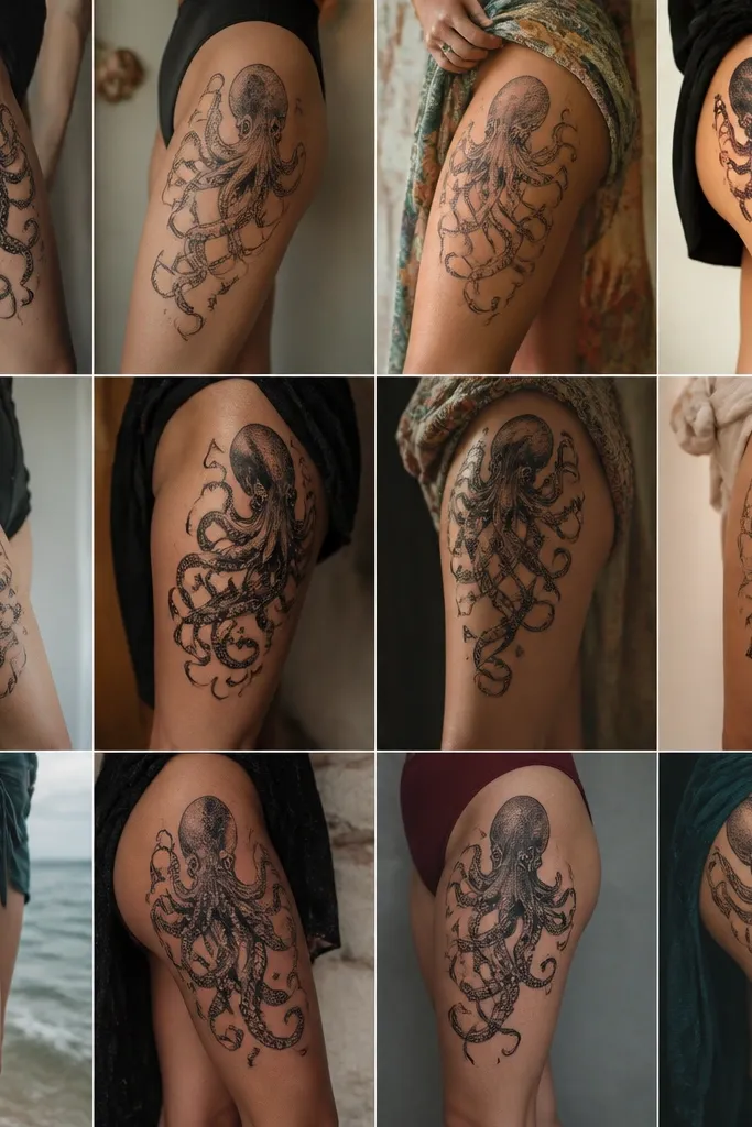
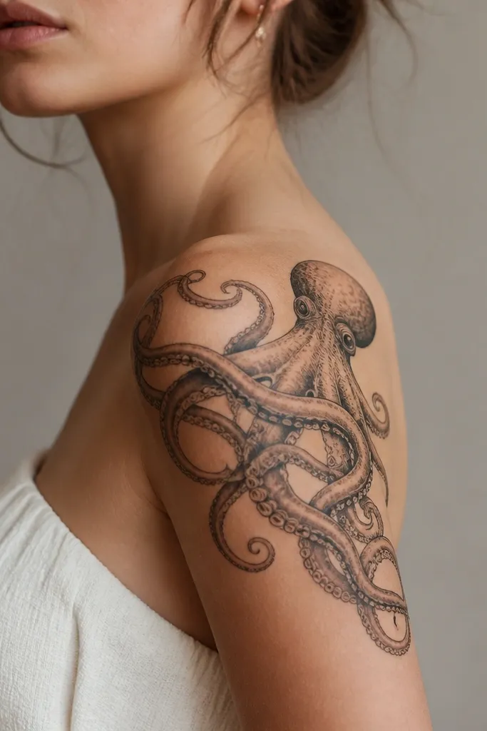
1. Outer Shoulder Octopus With One Reaching Tentacle
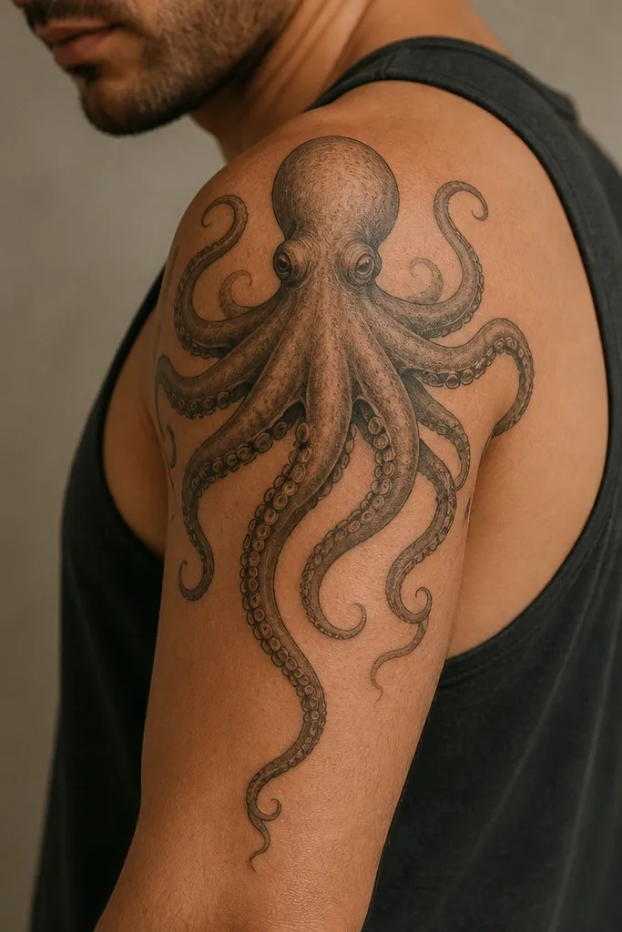
This layout is the easiest way to get movement on a shoulder. The reaching tentacle creates a clear direction, so when your arm lifts, the line looks like it's following your motion. Keep the head slightly higher than the tentacle cluster - it prevents the design from sagging visually as the shoulder curves. Use thin sucker details only on the outer half of the tentacle where they stay crisp.
Size it so the head sits roughly 2-3 finger widths below the shoulder cap. The tentacle tip should land about 3-5 cm down the upper arm. If you're doing black-and-gray, ask for smooth gray wash inside the mantle and leave the tentacle edges slightly darker for crisp contrast.
Pro tipWear a fitted short-sleeve or tank during your appointment so the artist can test the design while you lift your arm once.
AvoidAvoid placing the head dead center on the shoulder - it usually looks too flat when you move.
2. Fine-Line Octopus With 'Air' Negative Space
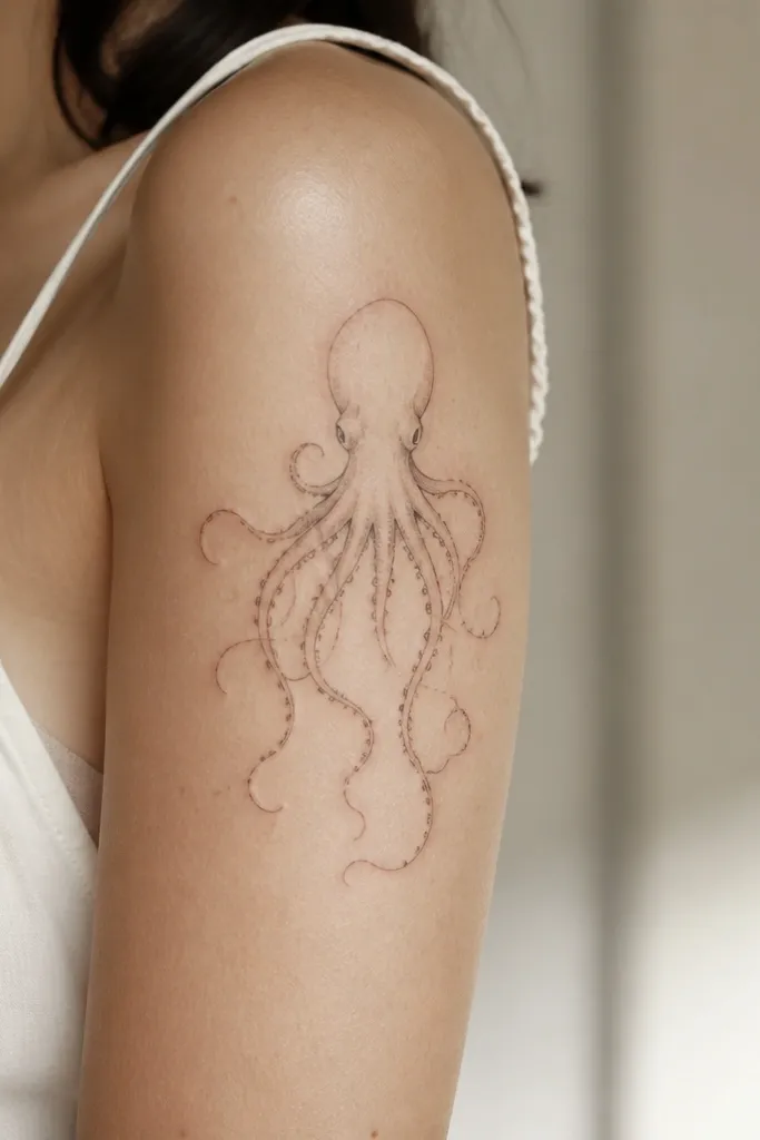
Negative space is what makes this look like it's floating and moving. When you leave clean gaps between tentacles, your skin texture and lighting do the motion work for you. Fine-line octopus designs also look more "alive" when the tentacles taper to hair-thin ends near the outer edge. Keep the head simple so the eye follows the tentacles outward.
Ask for a stencil that covers about 12 cm across the outer shoulder, with tentacles reaching toward the back of the deltoid by 1-2 cm. Use tiny sucker dots only at intervals, not every single segment, so they don't turn into a blur. Pair with light dot shading in the mantle only, not across the whole body.
Pro tipChoose this if you want it to look good in short sleeves; the gaps read best when skin shows.
AvoidAvoid full-filling every tentacle with dots - it heals into a dark patch.
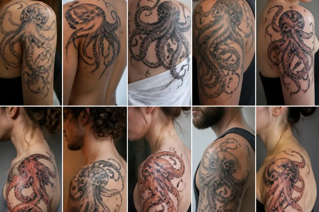
3. Blackwork Octopus Head + Dot-Sucked Tentacles
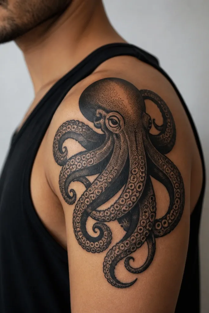
This is the "movement without fragility" option. Thick outline gives you clear edges, while dot-shaded suckers add texture that reads as motion when the arm shifts. Overlapping tentacles create depth, so the tattoo doesn't look like a single flat symbol. The contrast between solid black and skin gaps makes the design feel like it's pushing outward.
Go bigger than you think: aim for 13-15 cm across so the suckers have room to breathe. Keep the tentacle overlaps controlled - you want 2-3 overlaps max, not a tangled mess. If your artist offers a dotwork + lining combo, ask for dots only inside tentacle curves, leaving outer edges cleaner.
Pro tipIf you lift weights, this will hold up better than ultra-fine work because the edges are thicker.
AvoidAvoid placing heavy black too close to the collarbone - it can look like it's creeping upward as you move.
4. Watercolor Wash Octopus Shoulder With Clean Edges
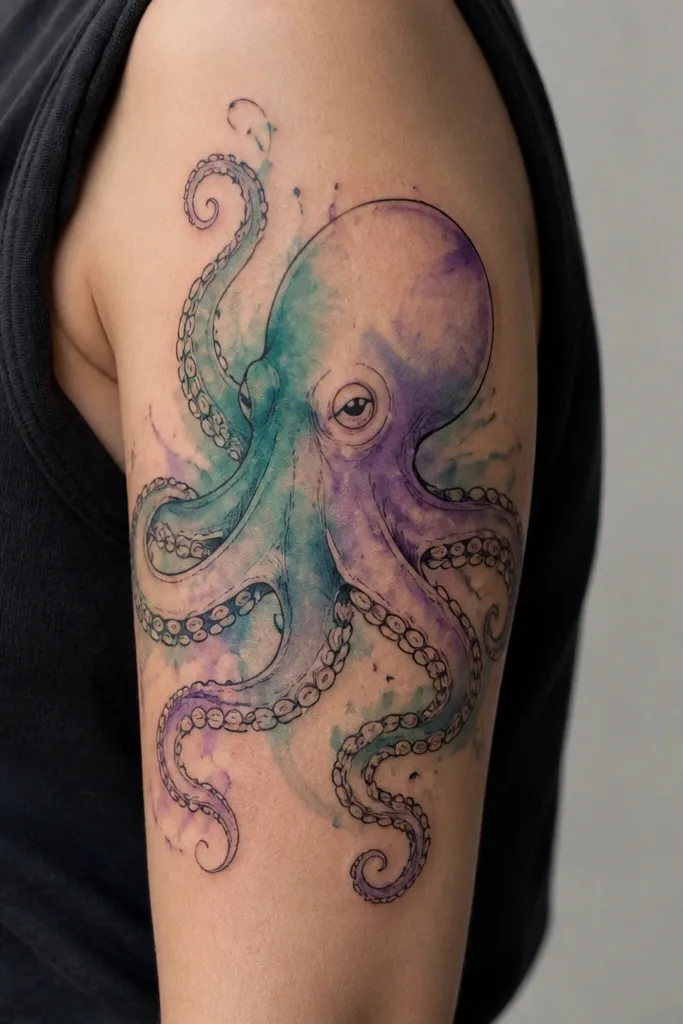
Color wash creates the impression of underwater drift, which reads as movement even when the design stays still. The key is clean edges: a watercolor effect looks messy if the outline bleeds into the wash. Teal plus a hint of purple makes the tattoo look cooler and deeper, like light passing through water. Keep the tentacle lines darker than the wash so your eye tracks the tentacles first.
Ask for a black stencil first, then add watercolor only inside the tentacle "belly" areas, not across the full tentacle length. Use a restrained palette: teal, one muted purple, and maybe a touch of gray wash. Placement should cover the outer deltoid with one tentacle trailing toward the upper arm by 4-6 cm.
Pro tipPick watercolor only if you're okay with slight fading in the color; the black outline should stay sharp.
AvoidAvoid a full watercolor fill that covers every line - it heals into a cloudy blob.
5. Octopus Grayscale With Shaded Mantle Like Silk
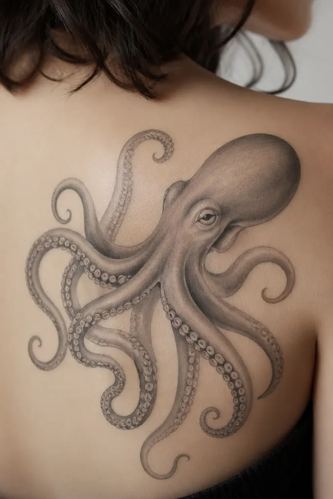
Smooth grayscale shading gives a "weight shift" effect. When your arm moves, the shaded mantle catches light differently, so the tattoo looks dimensional rather than flat. Suckers as ovals instead of dots can look more natural and less cartoonish. This style is also forgiving if your skin texture changes, because the gradients blend.
Ask for a gradient from darker at the top of the mantle down to lighter toward the tentacle origin. Tentacles should have tapering thickness - thicker near the mantle, thinner as they trail. Keep the tentacle tips slightly less shaded so they don't look heavy at the edge.
Pro tipIf you want grayscale to last, keep the lines clean and avoid overworking the same areas in one session.
AvoidAvoid heavy dot-only shading across the mantle - it can look gritty and age fast.
6. Octopus + Small Star Bubbles on the Shoulder
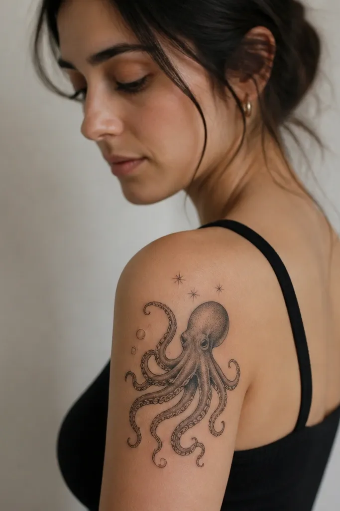
Bubbles and tiny stars add movement cues without changing the placement rules. The bubbles sit around the head and upper tentacles, so when your arm moves, they create a sense of drift. Keep them small and spaced so the design doesn't turn into a crowded sticker. This works especially well if you want octopus energy but you don't want full watercolor.
Place bubbles within 2-3 cm of the head so they stay in the main viewing area when your arm is down. Use light gray fill so they don't compete with the tentacles. The tentacle that reaches down should still be the star of the composition.
Pro tipAsk for one bubble to sit partly behind a tentacle line so it feels layered.
AvoidAvoid adding too many bubbles - three to five max looks intentional; twelve looks chaotic.
7. Octopus With Geometric Shoulder Frame
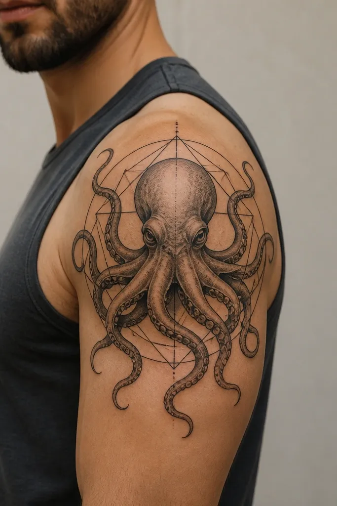
A geometric frame gives the tattoo a "motion direction" because it anchors the composition to the shoulder's curve. You get contrast between strict lines and organic tentacles, which makes the tentacles feel like they're pushing out. This also helps the tattoo look clean at smaller sizes because the frame reads as structure.
Have the artist map the frame to your shoulder shape: one long line follows the deltoid, and the triangle points aim toward the upper arm and back shoulder. Keep the octopus slightly larger than the frame center so at least one tentacle breaks the boundary. Use thin black for geometry and thicker linework for tentacles.
Pro tipIf you wear patterned tops, geometry can hide minor healing unevenness better than watercolor.
AvoidAvoid a frame that fully contains every tentacle - it kills the reaching effect.
8. Octopus 'Sash' Across the Upper Arm Seam
This placement gives a real sense of motion because the tentacles run diagonally, matching how your arm moves forward and back. A diagonal band reads dynamic even in a photo from the side. The octopus head stays near the shoulder high point, so it doesn't drift visually when you lift your arm. Overlapping tentacles create a smooth flow line instead of a fan.
Ask for the design to span from the outer shoulder down toward the front of the upper arm by 6-8 cm. The diagonal band should be about 4-5 cm wide at the widest point. Keep shading minimal; rely on line thickness differences and negative space for movement.
Pro tipThis one looks best with short sleeves that show the upper arm seam.
AvoidAvoid placing it too close to the armpit fold - it stretches and can blur.
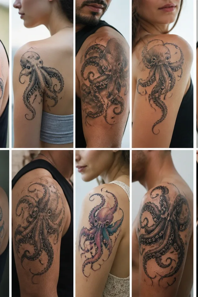
9. Octopus Outline Only With Tiny Sucker Detail
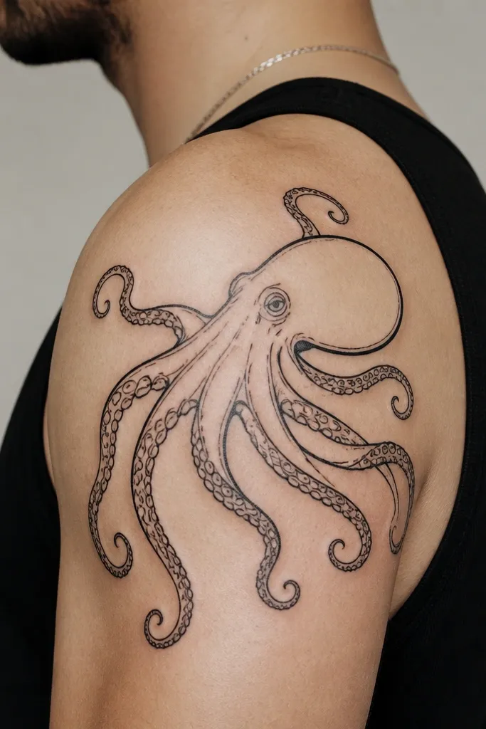
Outline-only looks sharp and stays readable because there's less shading to soften over time. The tiny sucker details create texture that makes the tentacles feel alive. This style also ages better if your shoulder gets sun exposure, because the design has high contrast. Movement reads through the taper and the way tentacles overlap lightly.
Go with a slightly larger size than you would for fine-line. A good target is 11-13 cm across, so the suckers stay rings and don't turn into dots. Ask for tentacle lines to taper at the outer ends and overlap just enough to show depth. If your artist uses a single-needle look, ask for a clean, consistent line weight.
Pro tipIf you hate touch-ups, outline-only is the safest bet for long-term clarity.
AvoidAvoid super-thin outlines if you want it to look bold in daylight.
10. Octopus + Seaweed Trails Behind the Tentacles
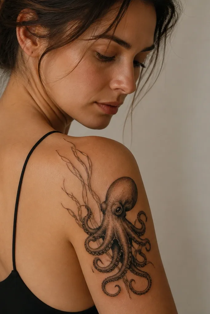
Seaweed trails add a secondary motion layer. The octopus head and tentacles stay anchored, while the trailing lines create a sense of current pulling through. It looks especially good on the back half of the shoulder because the trails can curve toward the scapular area without crowding the front. Keep the seaweed lines thinner than the tentacles so they read as background movement.
Place the octopus head on the front outer deltoid, then let the seaweed trails extend toward the back of the shoulder by 2-4 cm. Keep seaweed trails to 2-3 main strands, not a full background pattern. Use light gray or just black linework for the trails, depending on how bold you want the final look.
Pro tipAsk the artist to sketch the trails while you rotate your arm - you want them to follow the shoulder curve, not fight it.
AvoidAvoid thick seaweed trails - they compete with the octopus and make the design feel heavy.