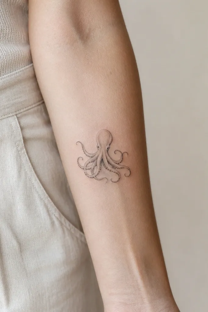
1. Outer Forearm Octopus With Airy Tentacle Flow
This placement makes the tattoo feel graceful because the forearm skin moves in one main direction. The tentacles are drawn as separate strands with space between them, so each one catches light differently. I like a limited palette here - black ink plus soft gray - because it keeps the "soft detail" readable as the tattoo ages.
Size it so the octopus body sits near the middle of the forearm, about 3 to 4 inches tall, with tentacles extending 1 to 2 inches past your wrist crease. Keep line weight lighter at the outer edges of tentacles and slightly heavier around the body to anchor the shape. If you want a touch of softness, add light gray stipple only in the gaps between strands, not as a full fill.
Pro tipAsk your artist to map tentacle direction to your forearm muscles before they start shading. That one step keeps the design from looking "pasted on."
AvoidAvoid heavy black packing across the whole tentacle - it heals into a single dark ribbon.
2. Ribcage Octopus With Sheer Mist Shading
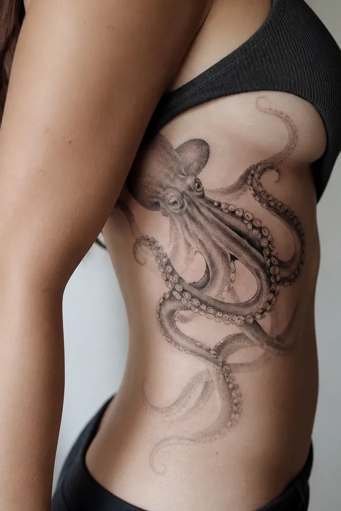
Ribs are where softness looks real because your skin stretches as you breathe. The mist shading gives a gentle gradient effect, and the tentacles can curve with your body instead of staying straight. I always prefer this style with lots of negative space around the tentacles so it doesn't feel heavy under clothes.
Place the body where your bra band would sit, then let two main tentacles trail downward toward the lower rib. Keep it mostly monochrome with gray - if you add color, use pale blue or dusty lavender only in tiny accents around the body. The gradient should be lightest at the tentacle tips and darkest under the body.
Pro tipPlan for swelling during healing. Wear loose tops for the first week and keep the area clean and dry so the stipple stays crisp.
AvoidSkipping a placement test (like marking with a stencil while you stand and breathe) leads to tentacles that look off when you move.
3. Upper Back Octopus With Delicate Negative Space Stars
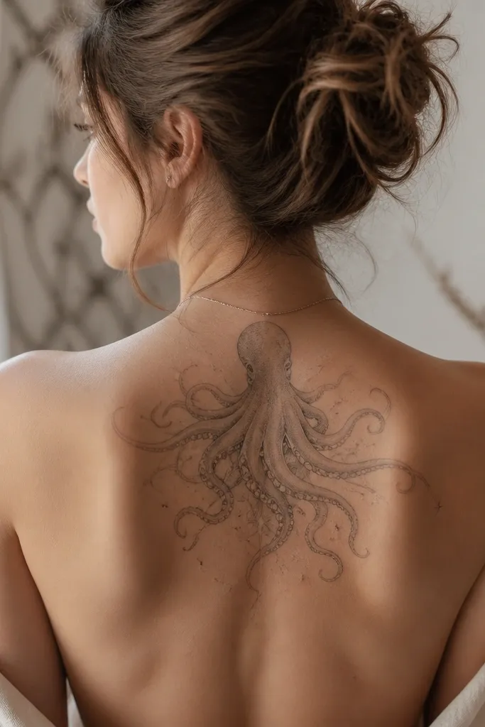
The upper back gives you a wide canvas for thin lines and gentle gradients. By using negative space star shapes around the tentacles, the tattoo looks airy instead of crowded. I like shading that hugs the underside of tentacles - it adds depth without turning the whole piece dark.
Aim for about 5 to 7 inches across for a first octopus tattoo on this spot. Position the body slightly above center, so the tentacles can fan out naturally. Have the artist keep the star shapes as true skin gaps, not filled with ink.
Pro tipBring a reference that shows the octopus slightly angled, not fully straight-on. A slight tilt reads feminine and avoids a cartoon look.
AvoidDon't add too many extra motifs; each extra element steals room from the soft tentacle detail.
4. Collarbone Octopus With Fine-Line Etching
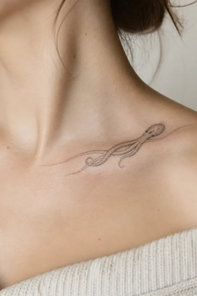
Collarbone tattoos look soft when the artist uses ultra-fine line work and keeps shading restrained. This style reads feminine because it frames the collarbone curve and stays light against your skin. The tentacles should look like they're floating, with lots of skin showing through between strands.
Keep it small, around 2.5 to 3.5 inches, and place the body near the center of the collarbone. The tentacles should drape toward the sternum and toward the shoulder but stay thin. If you want gray, keep it as a whisper shade under the body, not along every tentacle.
Pro tipChoose a design where at least two tentacles have clear separation. When tentacles merge, the collarbone piece turns into a blurry patch.
AvoidAvoid thick outlines on the collarbone - they look harsh right after healing and get thicker-looking over time.
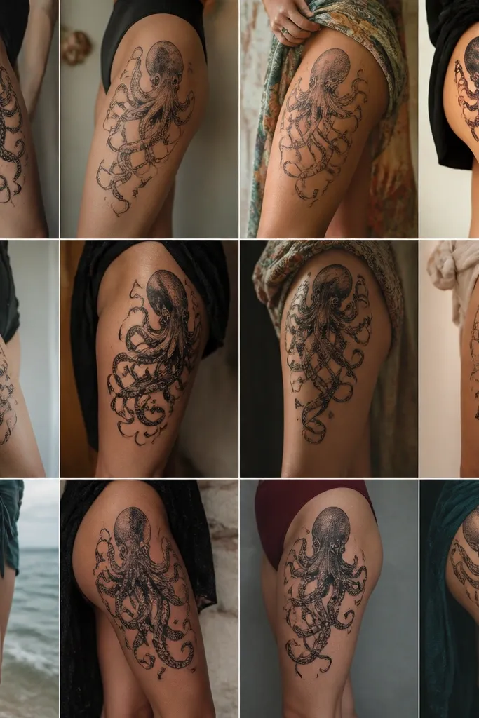
5. Side Thigh Octopus With Watercolor Wash Edges
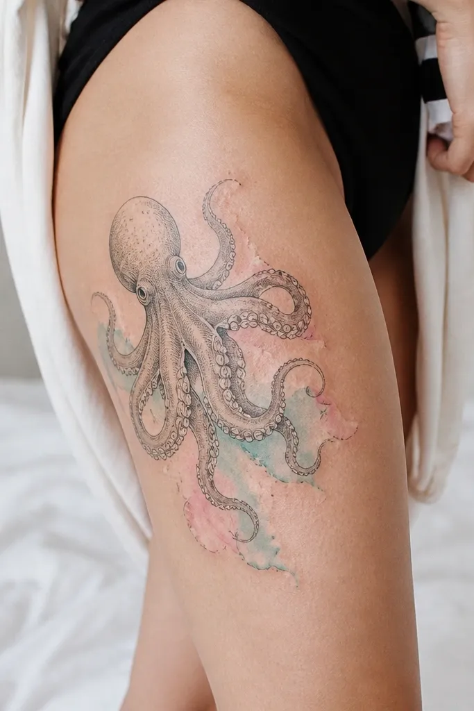
Watercolor-style edges look best where you can let the design breathe, and the side thigh gives you that breathing room. The black linework keeps the octopus readable, while the pale wash edges create softness. I like teal plus blush pink because they mimic skin warmth and cool tones without going neon.
Place the body higher on the outer thigh, about 4 to 6 inches above the knee, with two long tentacles trailing down. Keep the color washes very light and concentrated at the outer edges of tentacles, leaving the center mostly linework and negative space. Use a stencil that follows your thigh's curve so the wash doesn't stretch awkwardly.
Pro tipWear shorts or loose leggings during healing so the wash doesn't get rubbed into dullness.
AvoidDon't pack color inside the tentacles. It turns into a muddy fill instead of a soft edge.
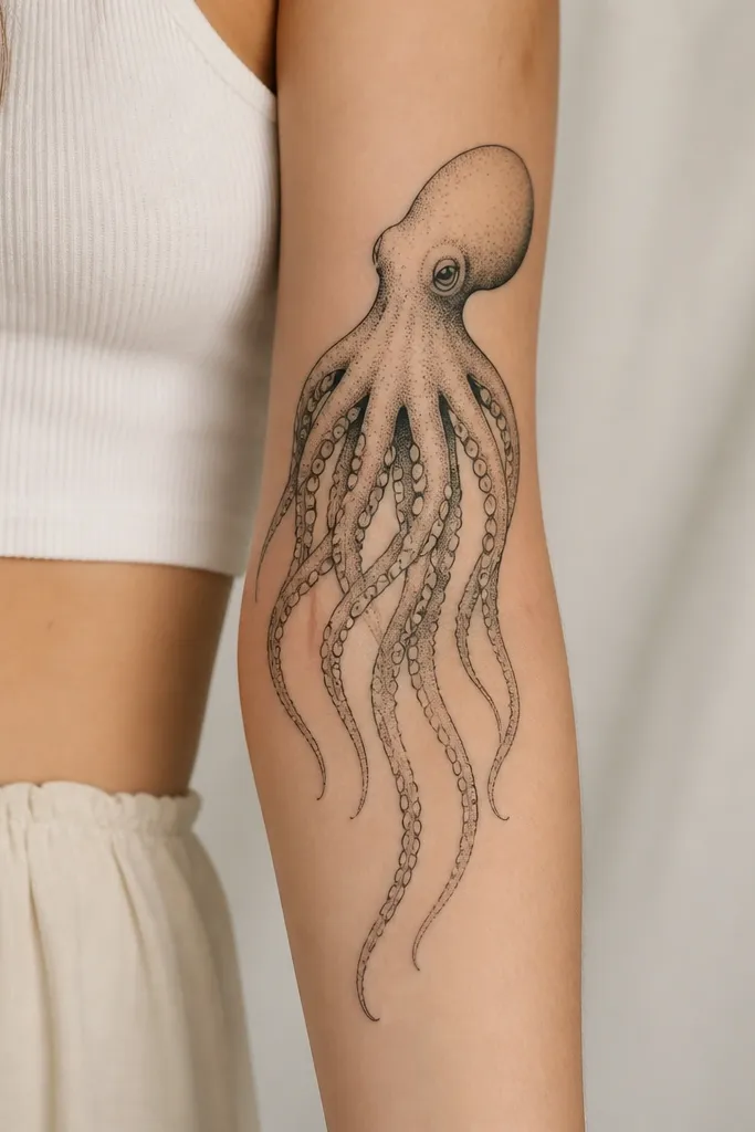
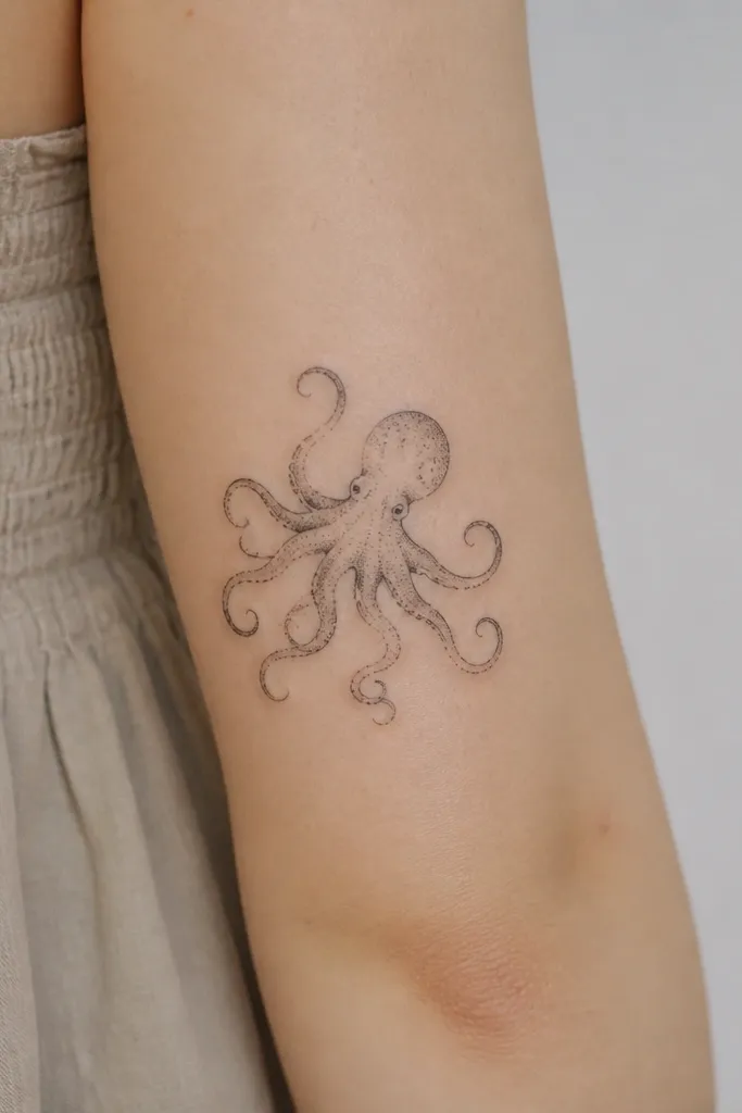
6. Inner Forearm Tiny Octopus With Single-Line Suckers
Inner forearm tattoos can look incredibly delicate if the artist keeps the sucker details simple. Single-line suckers avoid the "dot swarm" effect that can look messy as skin texture changes. This design is feminine because it's small, controlled, and uses negative space like part of the artwork.
Keep it under 3 inches total height. Place it where you can see it when your arm is relaxed, not when it's flexed hard. Ask for light gray under the body only, and keep tentacle lines the same thickness from start to finish.
Pro tipChoose a placement that avoids constant watch band or bracelet friction. That one thing protects the crispness of the fine suckers.
AvoidAvoid dense stippling at this size - it makes the tattoo look aged before it's even healed.
7. Wrist Octopus With Curled Tentacles and Soft Gray Shadow
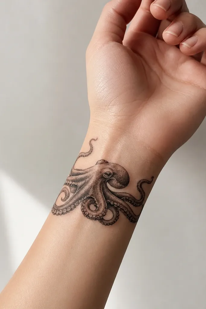
Wrist placements look feminine when the octopus is curled, not stretched. The curve of the wrist bone helps the tentacles wrap in a natural spiral. Soft gray shadow under the body creates depth without turning the piece into a dark blob.
Size it around 2.5 to 3 inches across so the suckers stay readable. Place the body on the outer wrist side and let tentacles wrap slightly toward the palm side but not over the joint. Keep shading minimal and keep all tentacle tips thin.
Pro tipAsk for the stencil to be placed while your wrist is slightly bent. The design should match the curve you'll actually wear day to day.
AvoidAvoid putting the tattoo directly over the most flexed joint - it blurs faster.
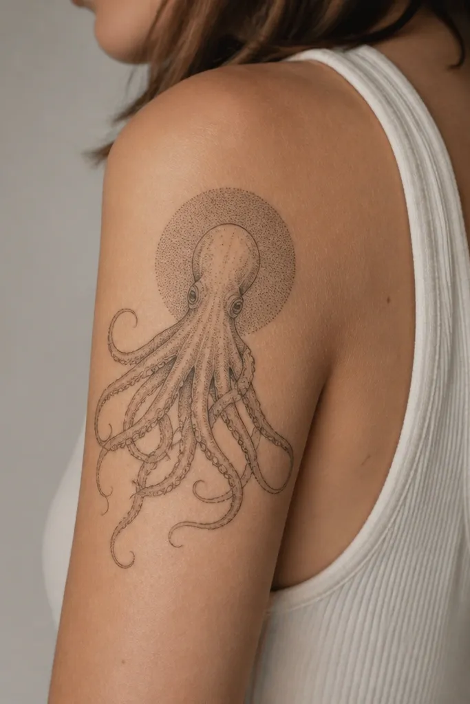
8. Shoulder Cap Octopus With Soft Petal-Like Tentacle Tips
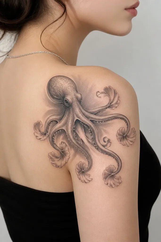
This is the octopus style that reads sweet instead of spooky. The tentacle tips shaped like small petals create a feminine silhouette, and the soft halo shading keeps the body from looking flat. I like using only black plus gray here so the petal edges stay airy.
Place the body on the outer shoulder, not on the front of the shoulder. Keep the tentacles mostly upward and outward so they don't fight gravity. The petal tips should be drawn with thin lines and tiny negative gaps between them.
Pro tipAsk your artist to keep the petal tips slightly lighter than the main tentacles. That contrast keeps the softness intentional.
AvoidDon't make the petal tips too thick. Thick ends make it look like a stamp.
9. Arm Sleeve Panel Octopus With Ombre Tentacle Shading
If you're building toward a sleeve, a panel octopus works because you can control how the shading flows with arm movement. Ombre tentacle shading keeps it feminine - it looks like soft fabric rather than hard ink. The fine sucker dots add realism while the gradient does the heavy lifting for softness.
Keep the panel height about 6 to 8 inches and leave consistent spacing between tentacles. The darkest shading should sit under and around the body, then fade as each tentacle extends. If you add color, keep it minimal: pale peach highlights at the body only.
Pro tipFor sleeve work, ask for a clear "fade plan" so the octopus shading matches the next panel's style and doesn't look like a separate sticker.
AvoidAvoid mixing heavy black realism with soft gradients in the same tentacle - it creates harsh contrast that ages unevenly.
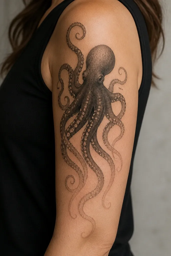
10. Back of Upper Arm Octopus With Fine Dotwork Halo
Dotwork halos make an octopus feel delicate because the dots create texture without filling solid black. The halo also frames your arm shape, which reads feminine in short-sleeve shirts. I like halos that fade outward rather than ending abruptly.
Place it on the back of the upper arm where you have a smooth surface. Keep the body about 3.5 to 4.5 inches wide and let the tentacles extend 1 to 2 inches below the body. Ask for halo dots to start denser behind the body and thin out as they reach the outer edges.
Pro tipWear a loose shirt while healing so the halo dots don't rub off unevenly from friction.
AvoidDon't request a fully solid dot halo. It heals darker and kills the soft look.
11. Hand-Poke Style Octopus With Soft Negative Space
Hand-poke style looks soft because it's built from light marks instead of thick fill. The irregular spacing between dots gives it a lived-in, gentle feel. This is a great option if you want the octopus to look like it's floating rather than shaded like a realistic photo.
Keep it small, around 2.5 inches, on a low-friction area like the outer upper arm or upper back. The artist should use a light dot density and avoid dark outlines. Tentacle lines should be suggested with dots and a few thin strokes, not a continuous bold line.
Pro tipAsk for a placement preview in the mirror. Hand-poke looks best when the tentacles fall with your body's natural angle.
AvoidAvoid placing hand-poke on the inner wrist or inner elbow where it rubs - dotwork blurs faster there.
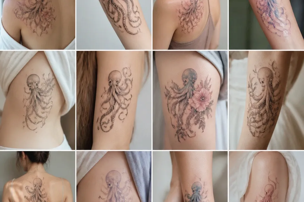
12. Chest Side Octopus With Tiny Floral Accent Between Tentacles
A micro floral accent makes the octopus look feminine without turning it into a themed cartoon. The flower sits in a negative-space pocket, so your eye reads it as a delicate detail, not clutter. This works because the octopus lines stay thin while the flower adds contrast in shape, not in heaviness.
Place it on the upper outer chest near where the armpit meets the rib, but not under the bra strap. Keep the octopus body about 2.5 to 3 inches wide, and let two tentacles frame the tiny bud. Use pale gray shading on the underside of tentacles and keep the bud outline super fine.
Pro tipChoose a bud shape with simple petals - three to five petals max. Too many petals turns into a smudge during healing.
AvoidAvoid adding full flowers or thick leaves. They overpower the octopus soft detail.